Wednesday, August 31, 2022

Commodities say the Fed is pretty tight already


Since Powell shocked the world with an unexpectedly hawkish speech last week, the market has been struggling to guess just how much worse a tighter Fed is going to be for the economy. As a first pass, the market has decided that it looks a bit scary: most risk assets are down. Meanwhile, the dollar continues to trade very strong in the currency markets. A strong dollar and weak commodity markets are classic symptoms of tight money. Commodities (especially Dr. Copper) are widely considered to be canaries in the inflation coal mine; when the Fed is tight, commodities almost always suffer. 

What follows is a collection of my favorite dollar/commodity charts updated for today's prices. If the Fed continues on the inflation warpath, commodities are in trouble. But the fed ought to be seeing a clear message in these charts: commodities have already broken to the downside after a strong inflationary runup. The implication as I see it is that the Fed is already pretty tight and has probably broken the back of inflation. Plus, with the dollar so strong it's hard to see how the general price level can continue to rise at an unusually rapid pace; inflation by definition is a loss of a currency's purchasing power. That's just not happening in the sensitive commodity markets. Moreover, real estate activity has measurably softened, with 30-yr mortgage rates back up to 6%. 

Message: the Fed has pushed up interest rates and the dollar to the point that demand for homes and commodities has taken a beating. This is how the Fed fights inflation. They don't need to do too much more, and they most certainly don't need to crush the economy or put people out of work to get the inflation rate down.

Chart #1

Note the strong, twenty-year correlation between the strength of the dollar and raw industrial commodity prices (Chart #1). I've inverted the value of the dollar to emphasize that a rising dollar almost always coincides with falling commodity prices. The last time the dollar was this strong commodity prices were only about half of what they are today. 

It's a similar story for other commodity prices, as shown in Charts 2-7:

Chart #2

Chart #3

Chart #4

Chart #5

Chart #6

Chart #7

Chart #8

As Chart #8 implies, real estate has almost overnight become extremely expensive, given the huge runup in mortgage rates. This rates as one of the biggest shocks to the real estate market that I can remember. 

UPDATE (9/1/22): The ISM Prices Paid index, released today, provides more graphic evidence that inflation pressures peaked months ago. The index, which reflects the percentage of respondents reporting paying higher prices for inputs, was 87 as of last March, and has since fallen to 52.5. See Chart #9 below:

Chart #9


Thursday, August 25, 2022

M2 says the Fed doesn't need to crush the economy


Yesterday (I'm writing this in Maui just before midnight Aug. 24th) the Fed released the July '22 M2 statistics, and they couldn't have been better. Year over year growth has fallen from a high of 27% in February 2021 (unprecedented!!) to now just 5.3%. On a 6-mo. annualized basis, M2 growth is a mere 0.6%, and on a 3-mo. annualized basis it's 1.0%. In other words, M2 has essentially flat-lined since last January, which was well before the Fed began to take tightening action. This means that the behavior of M2 is obviating the need for the Fed to pursue a typical tightening, which almost always ends with a recession. As I said last June, Fed tightening need not result in a recession

It is now clear that the surge in money growth that began in April '20 was not due to misguided Fed policy. Instead, as I began to argue last May, it was a by-product of massive deficit-financed fiscal spending (aka Covid-era "stimulus" payments). Trillions of dollars were sent to massive numbers of people, and most of those dollars ended up in bank savings and deposit accounts, thus swelling M2. That was fine as long as the atmosphere of the Covid crisis persisted, since the government's supply of extra money was met by an increased demand for it. But by early last year, as the Covid crisis waned, confidence returned, and the economy got back on its feet, that extra money was used to fund an explosion of demand for goods and services everywhere, since it was no longer demanded. And that launched a wave of inflation which now looks to have peaked. 

The issue of how the Fed should respond to all this is coming to a head this week, and it all happens at the Fed's Jackson Hole get-together. The market worries that the Fed will be spooked by all the confusion and tighten too much. That's why prices for equities, real estate, gold, and commodities are down. At the same time, the value of the dollar is soaring and that speaks volumes. When the price of something surges, it's a safe bet that demand for that thing exceeds the supply of it. So a very strong dollar is symptomatic of a world that is desperate for a safe haven—and one that is expected to soon yield more as the Fed panics and hikes rates even more, crushing the economy in the process. And it is also symptomatic of a Fed that is expected to be "too tight."

It doesn't need to play out this way, and I hope the Fed is listening. The world doesn't need a super-strong dollar, and higher rates are not necessary to slow inflation. Not this time, at least.

Chart #1

Since the deficit-financed spending spree stopped late last year, M2 growth has slowed dramatically (see Chart #3 in this post). Chart #1, above, puts the slowdown in a long-term perspective. It's virtually unprecedented. So it doesn't necessarily follow that Fed tightening this time will provoke a recession.

The passage of the recent, so-called Inflation Reduction Act is a step backwards, since it too involves more deficit-financed spending, but on a much smaller scale. So it is more likely to slow the economy than it is to accelerate inflation.

Chart #2

Chart #2 shows the ratio of M2 to nominal GDP. I have called this the demand for money. It is now declining, as I have been predicting. People wanted to hold a lot of money during the Covid panic, but not so much now. People have been spending down their money balances, and this is what has caused the rise in inflation: unwanted money. It is very likely to continue, but any increase in uncertainty, such as we are experiencing these days, is likely to mitigate the drop in the demand for money. Money demand is not in free-fall, at least for now. So inflation is not likely to explode.

Chart #3

Chart #3 shows the level of 2-yr swap spreads. Although they have increased somewhat of late, they are still at a level that suggests that liquidity is abundant and the outlook for the economy is decent, if not robust. 
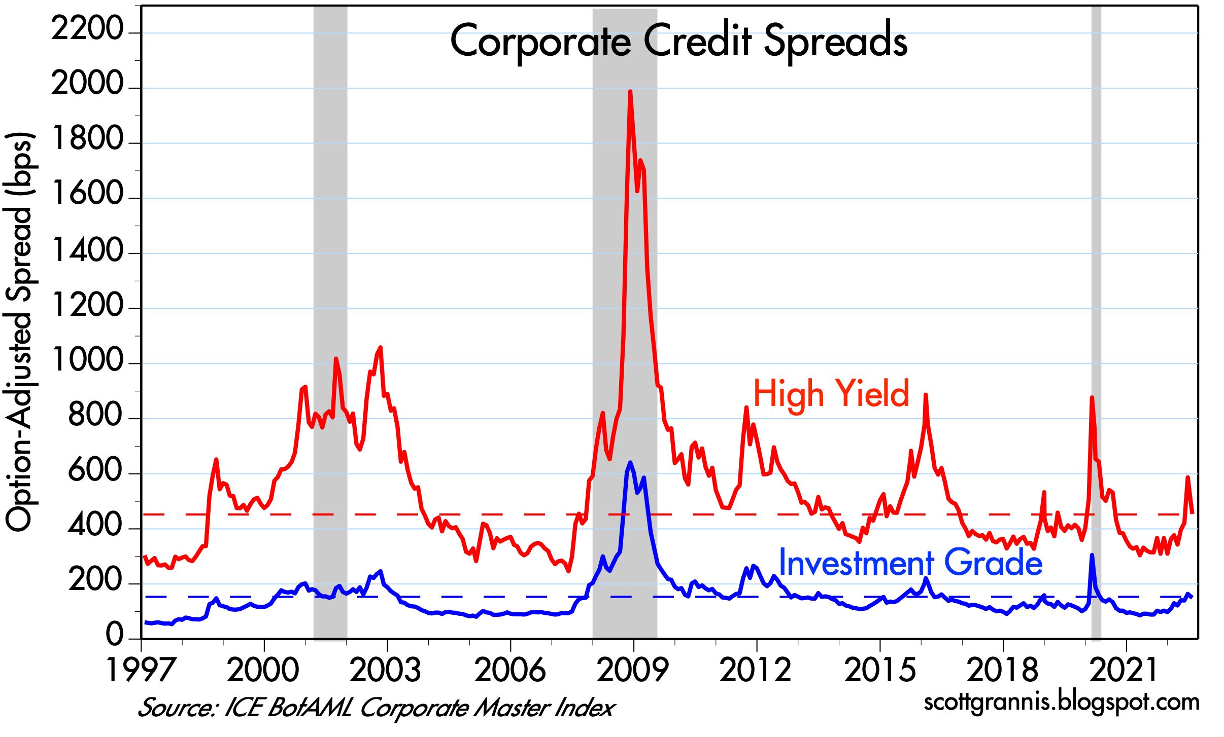
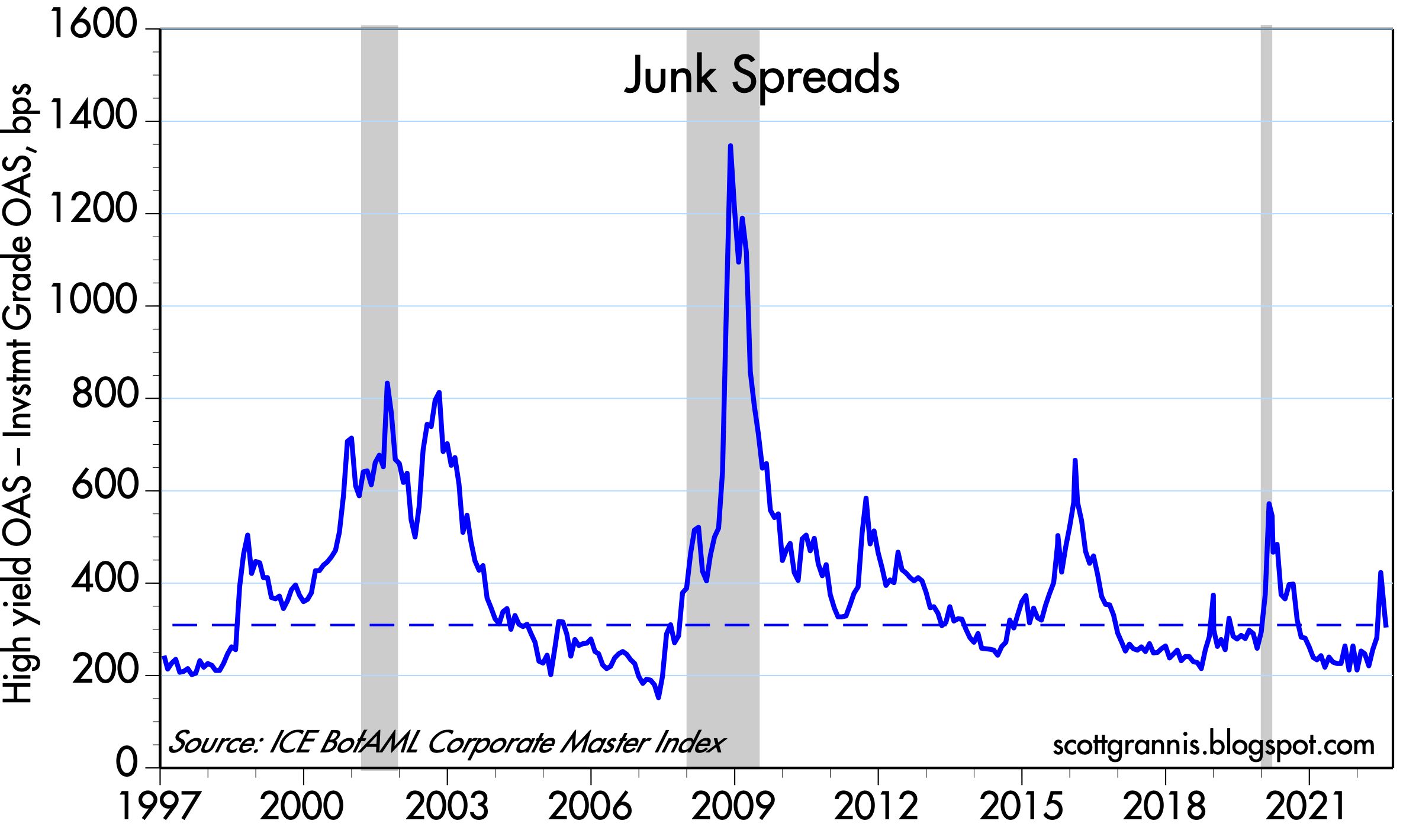
Chart #4

Chart #4 shows the level of high yield corporate bond spreads (junk bond spreads). These too are somewhat elevated, but not nearly as much as one would expect to see if the economy were on the verge of collapse. 

Chart #5

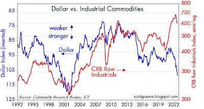
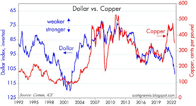
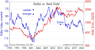
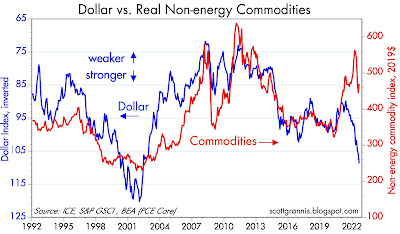
Chart #5 shows the real, trade-weighted value of the dollar vis a vis other major currencies. The dollar is very close to record-high levels. This is not likely sustainable. A super-strong dollar is very bad news for commodities and commodity producers (e.g., emerging markets). 

This is arguably the most important chart of all. The dollar is surging worldwide, and that is a big problem. The Fed should look at this and decide to take baby steps to raise rates, not giant steps. Message to Fed: don't restrict the supply of dollars at a time when the world wants more dollars. 

Chart #6

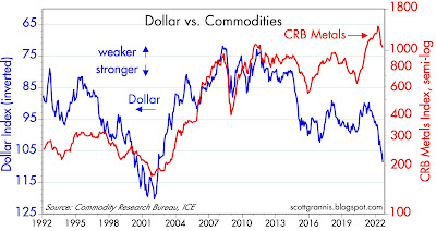
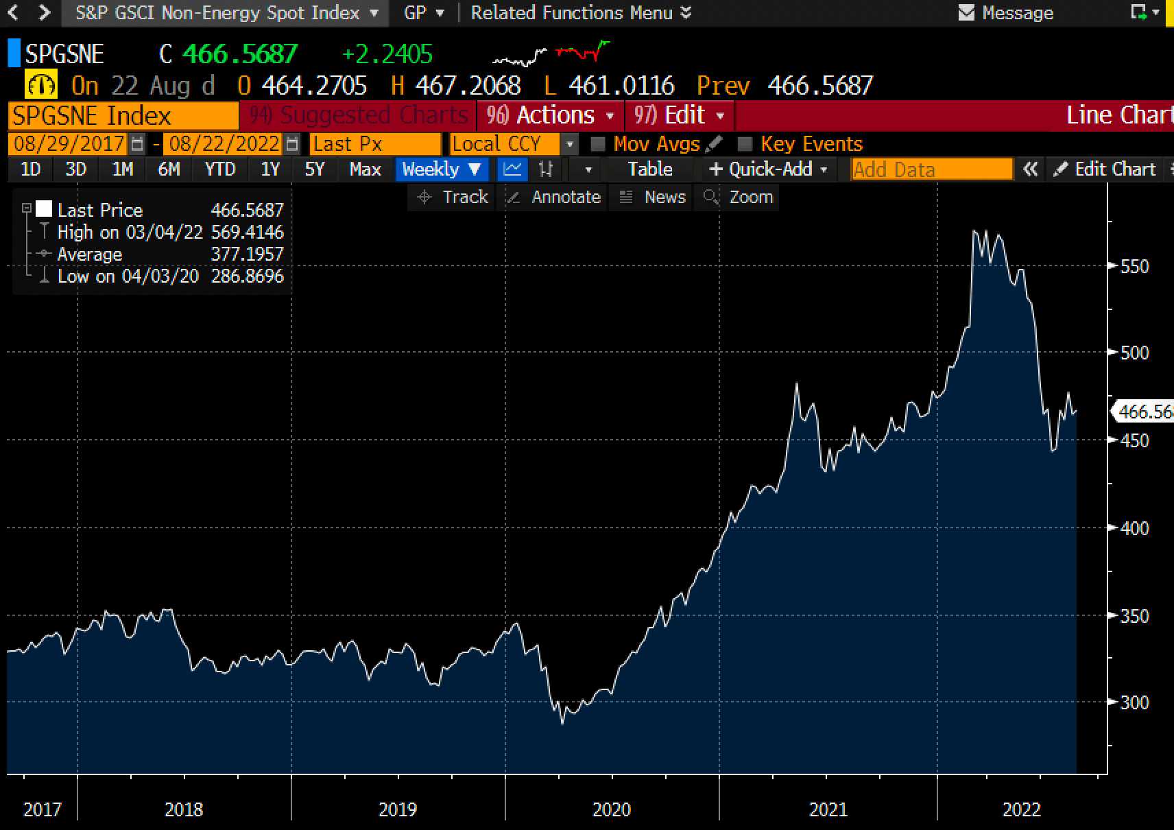
Chart # 6 shows the level of non-energy commodity prices. (Energy prices are far more volatile than most other prices, so it makes sense to exclude them at times.) These prices have experienced a sharp decline since earlier this year, at about the same time that the market began to expect the Fed to raise rates aggressively. Commodity prices are telling us that inflationary pressures have declined significantly.
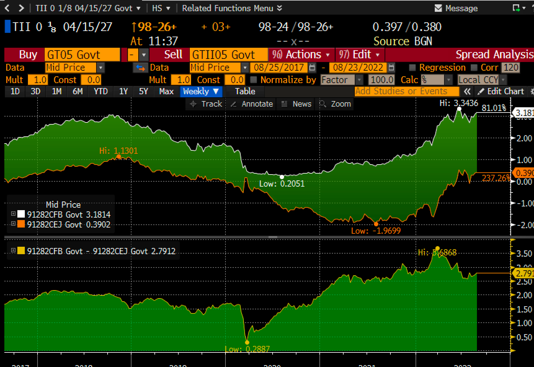
Chart #7

The top half of Chart #7 shows the level of 5-yr nominal and real Treasury yields. The bottom half shows the difference between the two, which is the market's expectation for what the CPI will average over the next 5 years. Inflation expectations have moved up of late, but they remain far below the current level of inflation. Thus, the bond market is telling us that the Fed is not on the verge of an inflationary mistake. I would argue instead that the Fed is on the verge of being too tight. 

I note that 5-yr real yields on TIPS (the orange line on the top half of the chart) have been relatively stable at about 0.5% for the past year or so. This is consistent with a view that says that the economy is going to continue to grow, but at a relatively modest rate. Indeed, headwinds to growth abound, chief among them being Biden's Inflation Reduction Act, which is very likely to instead boost inflation and increase regulatory burdens. To me it sounds like a replay of the early years of the Obama administration, when regulatory burdens increased so much that the economy only managed to grow by about 2% per year. Look for growth in the future to be 2% or less, unless policies change for the better.

Thursday, August 11, 2022

Tax revenues are on the moon; why double the IRS?

Astounding fiscal factoid:

Since just before the onset of the Covid-19 crisis, federal revenues on a rolling 12-month basis have increased 36%, with the lion's share of this coming from surging individual income tax payments. 

Federal revenues now stand at 19.4% of GDP, which is way above the average (17.4%) since 1968. This is the highest reading since June 2001, when it was 19.8%. In the past 5 decades or so, the highest reading for federal revenues as a percent of GDP was 20.2%, in September 2000. (Recall that the federal government enjoyed a brief period of budget surpluses from 1998 through 2001, thanks to booming tax receipts and slow growth in spending.)  

The federal budget would be in surplus today, if not for the continued and profligate spending on the part of Congress. Instead, the deficit in the 12 months ended last month was $962 billion. 

Yet despite these facts, the Democrats want to increase taxes on corporations, double the number of employees at the IRS, and increase spending by $760 billion, lavishing money on, among other things, green energy boondoggles which have virtually no chance of making any measurable change in global temperatures. 

Reason is in short supply in Washington these days.

What this means is that fiscal policy will become yet more of a headwind to growth, and living standards will struggle to increase, all the while Washington acquires more and more power over our lives.

Chart #1

Chart #1 shows monthly federal revenues (white) and the 12-month rolling average of those revenues (red). Revenues have increased from a monthly average of $296.5 billion to $402.7 billion. 

Over the same period and on a rolling 12-month total basis, individual income taxes have increased by a staggering 48%, rising from $1.76 trillion to now $2.6 trillion.

Combine that enormously increased tax burden with the income lost to inflation in the past two years, and the average worker has paid an enormous price for the Covid shutdowns. It's really sickening to contemplate. And yet Washington wants still more.

UPDATE: Here is a better chart of the explosion in tax revenues:

Chart #2

And here is a better chart of how the federal government's tax take is very near record levels relative to GDP:

Chart #3


Aloha


On our 6-mile walk around the Kapalua area (northwest Maui) we came upon this charming photo-op. 


Sunday, August 7, 2022

Inflation Reduction Act is bad for the economy


Over the years I've learned that whenever politicians pass laws that impact the economy, the results, with few exceptions, end up being not only perverse but opposite to the supposed aims of the legislation. The Inflation Reduction Act currently being considered is a perfect example of this. It won't do anything to lower inflation, but it will do lots of things to weaken the economy.

If you want a good analysis of why the Inflation Reduction Act is harmful, just read this analysis by Casey B. Mulligan, a great economist associated with The Committee to Unleash Prosperity. I'm a proud supporter of CTUP, by the way. Reading this analysis is a great way to understand how the real world works.

A short summary:

The Inflation Reduction Act contains multiple negative incentives on work and investment that will have substantial negative effects on the U.S. economy. These negative effects include 1) the reduced incentives for businesses to invest because of the corporate tax increase and the increased tax rate on certain investments (carried interest); 2) the negative effects on work due to the expansions in health care subsidies under the Affordable Care Act - subsidies not tied to working; 3) the negative impact on new drug development due to new federal price controls on the pharmaceutical industry.


Saturday, August 6, 2022

Inflation pressures cool, economic outlook improves


The stock market rally that began in mid-June has been driven almost exclusively by the realization that the risk of the Fed over-tightening in order to fight inflation has declined meaningfully. That realization, in turn, has been driven by a growing body of evidence which points to a perceptible lessening of inflation pressures: an impressive slowdown in the growth of M2 this year (which I last documented here), a rather impressive selloff in the commodity markets (Chart #5 in this post), and a distinct cooling of the real estate market (a sudden slackening in housing demand has allowed mortgage rates to decline from 6% to 5% in just the last month). At the same time, there is very little evidence to suggest that the economy is in distress: swap spreads remain relatively low (i.e., liquidity is abundant, the opposite of what we would expect to see if monetary policy were actually tight), and credit spreads are only moderately elevated (i.e., the outlook for corporate profits remains healthy), and of course jobs growth remains robust (July job creation was surprisingly strong). 

In any event, the debate over whether the economy is in a recession hardly matters. If inflation is cooling, the Fed has no reason to raise rates until the economy collapses. If the bond market is right (and it usually is), then the Fed is likely to raise rates from today's 2.5% to a peak of maybe 3.25% in the next 6 months or so, and that is simply not the stuff of which recessions are made.

Chart #1

Chart #1 shows that business activity in the all-important service sector of the economy (the source of about 75% of GDP) remains healthy. Not booming, but well above levels that would be consistent with a recession.

Chart #2

Since the vast majority of commodity prices having fallen significantly from their recent highs, a much smaller number of manufacturers now are reporting paying higher prices (Chart #2). 

Chart #3

Chart #3 shows the level of spreads of investment grade and high yield corporate debt. This is the difference between the yields on corporate bonds and the yield on comparable maturity Treasury bonds, an excellent indicator of corporate credit risk, which in turn is heavily influenced by the outlook for the economy and corporate profits. This is pretty good evidence that the economy is not in a recession. (I'm no fan of Biden, but he is not crazy when he claims the economy is not in recession.)

Chart #4

Chart #4 is simply the difference between the two lines in Chart #3, which is commonly referred to as the "junk spread." Today, junk bonds (corporate bonds rated below investment grade) are priced to a fairly modest level of risk to the economy. If we were in a typical recession they would be substantially higher.

Chart #5

Chart #5 compares the number of jobs in the private and public sectors of the economy. Private sector jobs have now fully recovered from their pre-Covid levels, but they have yet to make significant gains. In the absence of the Covid shutdowns, they would likely be at least 3-5 million higher. Public sector jobs, in contrast, haven't budged for over a decade! That's progress in my book; private sector jobs are much more productive than public sector jobs.

Chart #6

Chart #6 shows the level of the civilian work force—the portion of the population that is of working age and willing to work. This is an excellent example of the failure to thrive. Today's workforce is at least 18 million people smaller than it might have been with different incentives. Meager growth in the number of people working or willing to work translates directly into subpar growth for the economy as a whole (most small business owners continue to report that one of their biggest problems is being unable to fill job openings). 

Things could be better, but they could also be a lot worse.