Wednesday, August 30, 2017

Something to worry about

Back in early 2014 I argued that the return of confidence was something to worry about, since that would mean reduced demand for money, and that in turn would make life difficult for the Fed. If the Fed didn't respond to declining money demand with sufficient vigor (e.g., by pushing interest rates higher and/or reducing excess bank reserves), that could sow the seeds of rising inflation and eventually lead to another recession. As I've noted many times on this blog, severe Fed tightening designed to combat rising inflation has been the proximate cause of nearly every recession in the past 50 years. Here's one such post, "How to know if Fed policy is a threat to growth."

My concern was obviously premature at the time, but it's been in the back of my mind ever since, and I'm starting to get worried again. Consumer confidence has jumped in the past year, and the demand for money has weakened more than at any other time in the current recovery. My concerns may again prove premature, but this is not a trivial issue and thus it bears close scrutiny.


According to both the Conference Board and the University of Michigan surveys, consumer confidence has risen significantly in the past year. It's not yet at all time highs, but it's certainly a good deal better that it has been for the past 8-9 years.


Small business optimism has surged since the November election. "Animal spirits" are on the rise.


First-time claims for unemployment relative to total payrolls have fallen to the lowest levels in recorded history. This means that the chances of a worker being laid off today are lower than ever before. Job security, in other words, has never been higher. And let's not forget that the unemployment rates has dropped to 4.3%, and it has rarely been lower in recent decades. It's not surprising, then, that confidence is rising and for good reasons.


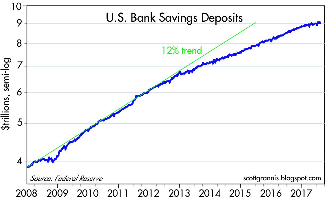
As the two charts above show, the growth of bank savings deposits has slowed significantly in the past 6-7 months, after growing strongly ever since early 2009. Recessions and economic turmoil almost always make bank savings deposits attractive, especially relative to riskier alternatives. Demand for safety typically declines in the latter stages of an expansion, when people's appetite for risk rises in line with rising confidence. So it's normal for rising confidence to be reflected in slower growth of bank deposits.

Bank savings deposits in the past six months have risen at an annualized rate of only 2.5%—that's the lowest rate so far in the current business cycle expansion. Since bank savings deposits comprise comprise about two-thirds of the M2 money supply, slow growth in savings deposits has been matched by a slowdown in the growth of the money supply, which has registered annualized growth 5.3% over the past six months, down from the 6-8% rates of growth that have prevailed over the past six years. Declining growth in the money supply doesn't mean, however, that the Fed has been tightening—more likely it means that the demand for money has been weakening.


The above chart is arguably the most powerful illustration of how strong money demand has been in the past 8-9 years: the ratio of M2 to nominal GDP. Nominal GDP is a proxy for national income, and M2 is arguably the best measure of readily-spendable money. Think of this chart as measure of how much money the average person wants to hold relative to his annual income. It's risen from 50% prior to the Great Recession to 70% today. That's huge, and one of the defining characteristics of the current business cycle expansion—a massive increase in the demand for money.


People now have parked an unprecedented amount of their annual cash flow in retail money market funds, small time deposits, currency and bank savings deposits—and the bulk of the increased money holdings are in the form of bank savings deposits. What's even more impressive, however, is that none of these vehicles pays much in the way of interest. People are holding lots of money not because they like the return on money, but because of its safety.

This huge increase in the demand for money also explains why QE wasn't inflationary. The banking industry, faced with huge infusions of deposits, was happy to lend all that money to the Fed in exchange for the new bank reserves that the Fed created via its QE operations. People wanted more money, and banks wanted more reserves (banks were very risk-averse, just as most people were), and QE effectively accommodated that change in preference. If the banks hadn't wanted to lend all that money to the Fed, but instead to the private sector (and assuming the private sector had wanted to borrow a lot more), the result would have been a massive expansion in the amount of money in the economy, and a lot more inflation. But that didn't happen, thanks to increased money demand.

We now may be on the cusp of a reversal in the huge increase in money demand. With increased confidence, the public is becoming less desirous of accumulating money balances. The growth of bank savings deposits has slowed significantly, and it is now less than the growth of incomes. People may now be desirous of decreasing their holdings of cash relative to incomes. But since cash can't disappear, the public can only accomplish a reduction in their relative holdings of money by bidding up the prices of other things. Less demand for money means a lower price for money and a higher yield on money, plus higher prices for things and eventually higher nominal incomes. That's another way of saying that a decline in money demand is likely to result in an increase in inflation—unless the Fed takes offsetting measures.


Fortunately, the Fed is already in the process of accommodating this new shift in the demand for money. They have raised nominal and real interest rates on money (though the real interest rate on bank reserves is still less than zero), and they have allowed excess bank reserves to decline from a high of $2.7 trillion to now $2.2 trillion. But these are still baby steps.

I note the recent rise in gold prices (+15% year to date) and the decline in the value of the dollar (-9% year to date). Both are symptomatic of an excess of money relative to the demand for it, and thus they could be evidence that the Fed is falling behind the inflation curve.

Much hangs on just how much and how fast the public's demand for money declines, and how fast and how much the Fed is able to offset that by raising interest rates and reducing excess reserves in the banking system. So far things look OK, but it certainly pays to keep an eye on these developments.

Wednesday, August 23, 2017

No looming debt crisis

Perhaps it's the relaxation induced by 12 days on my favorite Maui beach. But try as I might—and I'm spending a few hours each day keeping abreast of economic, financial and political developments—I can't get concerned. The world seems to doing OK, the U.S. economy is still growing at a moderate pace (roughly 2% or so), financial markets display few signs of distress, and there is no shortage of analysts predicting bursting bubbles and general economic and financial mayhem.

President Trump is center stage, distracting the left and the MSM with his absurdities and his tweets, while slowly dismantling burdensome regulations, restoring the rule of law, rebuilding the military, and protecting American interests. We're still saddled with a mess of a healthcare system and an absurdly bloated and burdensome tax code, but even small victories in healthcare and tax reform could unleash significant upside economic potential. Big, stupid government has been a headwind to progress for many years, but the good news is that government is getting slightly less burdensome these days and there is hope that this can continue.

The charts in this post reinforce in part the message of an earlier post, No boom, no bust, by focusing on the absence of evidence of a looming credit crisis. If there's a problem in the credit sphere, it looks to be limited to student loans, and although it's hard dismiss this problem—which has created a huge burden for students and taxpayers—it's nice to know that student loans are no longer growing at breakneck speed.


Student loans grew at a frenzied 68% annual rate in the two years following Obama's 2009 decision to federalize the program and liberalize their issuance (virtually all student loans now come from the federal government). Since then they have grown 360% and now total over $1 trillion. This is problematic: according to the NY Fed, student loan default rates at the end of 2016 were 11.2%, up sharply from the 6.7% rate which prevailed in FY 2007. The good news is that student loans grew at a mere 4% annualized rate in the three months ending June '17. The problem is acute, but improving on the margin.

Whether we will avoid massive defaults and dislocations remains to be seen, but I wouldn't rule out a scenario in which taxpayers pick up the tab for hundreds of billions of defaulted and/or forgiven loans. Handing out mortgage loans willy-nilly is what led to the housing crisis, and it's likely we will see some kind of student-loan crisis in coming years. Fortunately, student loans are still a relatively small share of total credit: 28% of consumer credit, 11% of total home mortgages, and about 7% of total household liabilities. Unlike the housing crisis, in which trillions of flaky mortgages were used as collateral for trillions of financially-engineered securities which in turn were held by investors all over the world, the U.S. government is the one with the most exposure to loss—and these days, $1 trillion isn't a whole lot of money. A bursting of the student loan bubble is very unlikely to precipitate another global financial crisis.


With the exception of student loans, consumer credit has barely increased since 2007. Virtually all of the growth in consumer credit in the past 10 years has been in the student loan category.


C&I Loans, a good proxy for bank lending to small and medium-sized businesses, have grown a mere 2.4% in the past year, after years of double-digit growth. But the slowdown in bank lending to this sector is not necessarily problematic.


Relative to GDP, C&I Loans stopped growing a year or so ago, and are now beginning to decline. The fact that C&I Loans relative to GDP have rarely been higher than they were last year suggests that the slowdown in C&I Loan growth has more to do with a corporate sector that is satisfied with its current debt load than it does with a reluctance of banks to continue lending.

It's very important to understand that the current Fed "tightening" is fundamentally different from previous tightening episodes, thanks to QE. Before QE, the Fed raised rates by reducing the supply of bank reserves; this created a shortage of liquidity and resulted in higher interest rates. Reduced liquidity and higher borrowing costs eventually brought the economy to its knees by squeezing nearly everyone. This time around, the Fed is increasing short-term rates directly while keeping bank reserves relatively unchanged, and rates are still very low in both nominal and real terms. Bank reserves are still abundant (excess reserves today are about $2 trillion, whereas they were a mere $9 billion at the end of 2007), and thus it is not surprising that there is no sign of a shortage of liquidity in the banking system. Swap spreads are quite normal and credit spreads in general are relatively low. Nobody is getting squeezed by the Fed.


The delinquency rate on C&I Loans, as of June '17, was only 1.4%. Very few borrowers are getting squeezed these days. From an historical perspective, it's hard to see that banks are exposed to a collapse in business credit.


The delinquency rate on all bank loans and leases has rarely been lower than it is today. Bank credit totals almost $13 trillion these days, and in the past year this measure of credit has grown by about 4%. That's down from 7-8% annual growth a few years ago, but it's not by any means scary.


Household leverage has declined significantly since its 2008 peak. Household balance sheets are in pretty good condition these days. Compare today's leverage with the high levels that preceded the 2008 financial crisis.


Household financial burdens (monthly payments as a % of disposable income) have rarely been lower than they are today.

OK, it's time to get back to the beach and relax.

UPDATE: The Mortgage Bankers Association today released the Q2/17 mortgage foreclosure data. Foreclosures fell to a mere 1.29% of outstanding mortgages. Only 4.24% of mortgages were delinquent. Both of these numbers are very low. Homeowners are not being "squeezed" by mortgage rates, which have been very low for most of the past 5 years.


Thursday, August 10, 2017

The Nork Wall of Worry

Kim Jong-un is making today's headlines with his threats to attack Guam in short order and somewhere in the US at a later date—and to attack with nuclear weapons no less. He's also sparked a mini panic attack in global markets. But so far, markets have been quite blasé about the threat that North Korea poses. The chart below puts things in perspective, as of 7 am beach time:


Believe it or not, the threat of imminent nuclear hostilities is (so far) just a blip on the market's radar screen. About as big as the threat of a Frexit, but far less than Brexit, collapsing oil prices, or a Chinese economic implosion. If you want protection from a nuclear holocaust, options are still relatively cheap, with the Vix this morning trading around 14-15, up from a very low 10 a few days ago.

So either the market is ridiculously unconcerned, or the market rates the chances of a nuclear explosion as remote. Considering that the So. Korea stock market is down less than 4% in the past few weeks, it's probably the latter. (You would think Seoul has the most to lose if Kim Jong-un gets crazy enough to start pushing launch buttons.) I note as well that gold is up only 2% or so in the past week.

I'm not offering investment advice here, I'm merely laying some facts on the table.


It's also worth noting that industrial metals prices yesterday reached an 18-month high, having risen more that 60% from their January 2016 low, as the chart above shows. That's pretty impressive, and it suggests that global economic activity has definitely perked up.

I'm reminded of the fact that the recession of 2001 ended just a few months after the 9/11 attack. The US economy is amazingly resilient, and the global economy perhaps just as resilient.

Monday, August 7, 2017

Credit spreads tell a bullish story

Credit spreads—the extra amount of yield that investors demand to hold debt that is riskier than Treasuries—are uniformly low these days. That tells us that liquidity in the bond market is abundant, systemic risk is low, and the outlook for corporate profits and the economy is healthy. '


Swap spreads (see a short primer on swap spreads here) are arguably the bedrock and most important of all credit spreads. "Normal" spreads on 2-yr contracts are roughly 20-40 bps. At today's 25 bps, 2-yr swap spreads are perfectly normal. This tells us that bond market liquidity is relatively abundant. Fed tightening has not created a shortage of money, as it usually does in advance of recessions. It also tells us that systemic risk is perceived to be low. As the chart above suggests, swap spreads tend to be good predictors of conditions in the broader economy; spreads tend to rise in advance of recessions and decline in advance of recoveries.


As the chart above shows, swap spreads in the Eurozone are elevated. Conditions are not as healthy there as they are here. Eurozone spreads are not dangerously high, but they do reflect some systemic risk, which is likely related to the perception that the Eurozone still faces existential risks from countries thinking about "exiting" the Eurozone. Given the higher spreads in the Eurozone, it is not surprising that Eurozone GDP growth has been lagging that of the US for a number of years. Riskier markets tend to receive less investment—and consequently less growth—than less risky markets.


The chart above shows credit spreads as derived from the universe of bonds issued by US corporations: $6.3 trillion of investment grade bonds, and $1.3 trillion of high-yield (junk) bonds. Both spreads are relatively low, as you would expect them to be in a healthy, growing economy. They are not at record lows, but they are low enough to be impressive.


The chart above compares 2-yr swap spreads to high-yield corporate spreads. Here we see further evidence of how swap spreads tend to be good predictors of the health of the economy (HY spreads are particularly sensitive to the underlying health of the economy).


The chart above shows 5-yr Credit Default Swap spreads. CDS spreads are derived from generic contracts representing hundreds of large, liquid corporate bonds, so they are reliably good proxies for overall credit risk. Their message is the same as other credit spreads: conditions are normal, and thus the outlook for the economy and corporate profits is healthy.

Commercial real estate still strong

A quick update on the health of the commercial real estate market, which remains quite good. According to the folks at CoStar, their composite (equal weighted) price index rose a staggering 17.5% in the 12 months ended June, 2017. Price gains were strongest in the lower-priced, secondary and tertiary markets. Gains in higher-priced and larger markets were a solid 5% over the same period.


Impressive.

Tuesday, August 1, 2017

No boom, no bust

My reading of the economic and financial tea leaves is that the economy continues to grow at a sub-par pace (about 2%), just as it has for the past 8 years. I don't see evidence of a coming boom, nor of an imminent bust. I think the market expects roughly the same thing; it's not priced to either a boom or a bust, just more of the same. Dull.

Here are a baker's dozen charts, with the latest updates, to flesh out the story:


The chart above is one of my enduring favorites. It shows that the ISM manufacturing index does a pretty good job of tracking the growth rate of the economy. What's especially nice is that the index comes out with a relatively short lag of just a week or two, whereas we usually have to wait months to get a read on the economy. What it's saying now is that GDP growth in the current (third) quarter is likely to be in the range of 2-4% annualized. That won't necessarily mean that the underlying pace of growth is picking up though; it's more likely that some faster reported growth in the current quarter which will make up for the relatively weak growth of recent quarters. Such is the volatile nature of GDP stats.


The two charts above are encouraging, since they show that global economic activity is likely picking up. US manufacturers are seeing relatively strong overseas demand, and Eurozone manufacturers have experienced a significant improvement over the past year or so, after years of weak activity.


The chart above shows that US manufacturers are at least somewhat optimistic about the future of their businesses, since many reportedly plan to increase hiring activity in the months to come.


The chart above shows that the ISM manufacturing index does a pretty good job of predicting corporate revenues. For months now, the ISM index has been telling us that revenues per share for the S&P 500 were likely to increase, and they have indeed in increased by over 5% in the 12 months ended July. 


Not surprisingly, faster growth of revenues has gone hand in hand with increased profits. Trailing 12-month earnings per share (earnings on continuing operations) were up over 9% in the year ending July. No wonder the stock market continues to edge higher. Profits and prices are both at all-time highs and rising.


The current trailing PE ratio of the S&P 500 is just over 21, according to Bloomberg's calculation of earnings from continuing operations. That's a good deal above its long-term average of just under 17, but it's not impossibly high. The inverse of the PE ratio—the earnings yield on stocks—is still a healthy 4.7%.


The chart above subtracts the yield on 10-yr Treasuries from the earnings yield on stocks. Equity investing still gives you a yield that is substantially higher than the risk-free yield on Treasuries. It's not always thus. In fact, during periods of robust growth and strong stock markets—such as the 1980s and 1990s—the earnings yield on stocks was usually less than the yield on Treasuries. When investors are confident and the economy is strong, investors are willing to accept a lower yield on stocks because they expect to more than make up for that with capital gains (i.e., rising share prices). The situation today is quite the opposite: a positive equity risk premium suggests that investors are skeptical of the ability of earnings to grow, and are thus willing to accept a lower yield on Treasuries in exchange for their increased safety.


Not all is rosy, however. As the chart above shows, the dollar has taken quite a hit since the "Trump bump" of last November. It's down about 10% in the past 8 months, in what is surely a sign that the world has become a lot less excited about the growth prospects of the US economy.


The chart above provides more evidence that the market doesn't expect the US economy to be very strong going forward. The current real Fed funds rate—the best indicator of whether monetary policy is tight or not—is about -0.25%. The current 5-yr real yield on TIPS (a good indicator of what the market expects the real funds rate to average over the next 5 years) is only 0.11%. This means the market doesn't expect the Fed to do much more in the way of tightening for the foreseeable future. And that, in turn, means the market holds out very little hope for any meaningful improvement in the US economy.


The chart above suggests there is very little reason to expect a recession for the foreseeable future. Every recession for the past half century has been preceded by a monetary tightening sufficient to raise real short-term rates to at least 3-4%, and to flatten or invert the Treasury yield curve. We're a long way away from either of those conditions today. The Fed is relatively easy, and is not expected to tighten much, if at all, because the economy is not expected to improve much, if at all. 


The chart above compares the 2-yr annualized growth of real GDP to the 5-yr real yield on TIPS. I use a 2-yr measure for GDP to "edit out" the quarterly fluctuations which are more due to statistical vagaries than to any real change in the economy's strength. The chart suggests that the current level of real yields is a sign that the market thinks the economy is still likely on a 2% growth trend. (The latest revision to GDP boosted growth during the 2014 -2015 period, but reduced it in the past two years. That is consistent with my repeated observations that the trend growth rate of jobs has slipped in the past year or so from 2.0% to 1.6-1.7%.)

Another not-so-rosy-sign is construction spending, which has softened and dipped year to date. This could just be a pause that refreshes, but in a worst case scenario—if this weakness continues—it could be an early warning sign of another recession. I doubt that is the case, since mortgage originations and home sales are still relatively healthy, but if you want something to worry about, here it is.


I highlighted this chart a few weeks ago, noting that the stability of China's foreign reserves this year is a healthy sign that the yuan has moved to a level that is balancing capital flows (forex reserves under a floating-pegged currency regime such as China's are a direct measure of net capital flows). The yuan has appreciated a bit more of late, a sign that the situation in China is improving on the margin (more money wants to get in than out). Good news from overseas is always good news for the US, especially for a major player like China.

To sum up: I see no sign of excessive optimism or pessimism in market prices. The market's expectations are for a dull economy to remain dull and for inflation to remain relatively low. 5-year expected inflation, according to TIPS and Treasury prices are 1.7%. There is no compelling reason to worry about a recession, or to get excited about a boom. The market is thus "vulnerable" to signs of emerging weakness or increased strength. If we get a decent tax reform package, look for optimism to emerge. If we don't get tax reform, the downside risk is likely not significant, since reform expectations have not been priced in. Fortunately, we have had some meaningful reform in the area of regulatory burdens so far this year, and this should give the economy enough of a lift to keep things on an even, 2% growth trajectory or maybe slightly better.