Thursday, July 31, 2014

Tribute to Milton Friedman

I had the great privilege and the great fortune of seeing Milton Friedman in person quite a few times in the 1980s and 1990s, and I've read just about everything he's written. He was one of the most amazing and influential people I've known. His good humor, rock-solid logic, and clear thinking were simply astonishing. No one could beat him in a debate. 

Milton was all about freedom, a concept that to this day remains under siege from those who fail to understand how it works. Today, on the 102nd anniversary of Milton's birth, Mark Perry posted a wonderful collection of Milton's quotes. It's so good that I'm going to repeat it entirely, in the hope that it helps to keep the concept of freedom alive for the ages:

There is nothing as permanent as a temporary government program. 
Inflation is always and everywhere a monetary phenomenon.
Inflation is caused by too much money chasing after too few goods. 
Sloppy writing reflects sloppy thinking. 
All learning is ultimately self-learning. 
I’m in favor of legalizing drugs. According to my values system, if people want to kill themselves, they have every right to do so. Most of the harm that comes from drugs is because they are illegal. 
Nobody spends somebody else’s money as carefully as he spends his own. Nobody uses somebody else’s resources as carefully as he uses his own. So if you want efficiency and effectiveness, if you want knowledge to be properly utilized, you have to do it through the means of private property. 
The government solution to a problem is usually as bad as the problem. 
The Great Depression, like most other periods of severe unemployment, was produced by government mismanagement rather than by any inherent instability of the private economy. 
The high rate of unemployment among teenagers, and especially black teenagers, is both a scandal and a serious source of social unrest. Yet it is largely a result of minimum wage laws. We regard the minimum wage law as one of the most, if not the most, anti-black laws on the statute books. 
Industrial progress, mechanical improvement, all of the great wonders of the modern era have meant relatively little to the wealthy. The rich in Ancient Greece would have benefited hardly at all from modern plumbing: running servants replaced running water. Television and radio? The patricians of Rome could enjoy the leading musicians and actors in their home, could have the leading actors as domestic retainers. Ready-to-wear clothing, supermarkets — all these and many other modern developments would have added little to their life. The great achievements of Western capitalism have redounded primarily to the benefit of the ordinary person. These achievements have made available to the masses conveniences and amenities that were previously the exclusive prerogative of the rich and powerful. 
President Kennedy said, “Ask not what your country can do for you — ask what you can do for your country.”… Neither half of that statement expresses a relation between the citizen and his government that is worthy of the ideals of free men in a free society. “What your country can do for you” implies that the government is the patron, the citizen the ward. “What you can do for your country” assumes that the government is the master, the citizen the servant. 
On the difference between public vs. private education: “Try talking French with someone who studied it in public school. Then with a Berlitz graduate.” 
Fair’ is in the eye of the beholder; ‘free’ is the verdict of the market. The word ‘free’ is used three times in the Declaration of Independence and once in the First Amendment to the Constitution, along with ‘freedom.’ The word ‘fair’ is not used in either of our founding documents. 
What most people really object to when they object to a free market is that it is so hard for them to shape it to their own will. The market gives people what the people want instead of what other people think they ought to want. At the bottom of many criticisms of the market economy is really lack of belief in freedom itself. 
The great achievements of civilization have not come from government bureaus. Einstein didn’t construct his theory under order from a bureaucrat. Henry Ford didn’t revolutionize the automobile industry that way. In the only cases in which the masses have escaped from grinding poverty, the only cases in recorded history are where they’ve had capitalism and largely free trade. If you want to know where the masses are worst off, it’s exactly in the kinds of societies that depart from that, so that the record of history is absolutely crystal clear: that there is no alternative way so far discovered of improving the lot of the ordinary people that can hold a candle to the productive activities that are unleashed by a free enterprise system.
The problem of social organization is how to set up an arrangement under which greed will do the least harm; capitalism is that kind of a system. 
With some notable exceptions, businessmen favor free enterprise in general but are opposed to it when it comes to themselves. 
The case for prohibiting drugs is exactly as strong and as weak as the case for prohibiting people from overeating. 
The government has no more right to tell me what goes into my mouth [including illegal drugs] than it has to tell me what comes out of my mouth. 
For more Milton Friedman quotes, see this list here at “The Collected Works of Milton Friedman” project at Stanford University’s Hoover Institution.

The 2.1% recovery gives us 2.5% yields

We now know that the big negative GDP number in the first quarter wasn't the beginning of another recession (I didn't think so). Turns out it was a combination of bad weather and the vagaries of GDP accounting; sometimes those things just happen, and then they are reversed. As we learned yesterday, the first quarter's growth was revised to -2.1%, and the second quarter came in at 4%. For the past five years, the economy has grown at a 2.1% annualized pace, and that's pretty close to what we saw in the first half of this year after all the dust had settled. Ho-hum, not very exciting, and it still looks like the economy is moving forward at about a 2-2½% pace. Things aren't likely to get much better until fiscal policy becomes more growth-friendly. The one thing that could make things worse is the situation in Ukraine; European stocks have taken a 6% hit, and the Euro is 4% off its recent highs. The Vix index has jumped from 10.3 early this month to today's 16.7. The markets are nervous, so equities are down. But the fundamentals have not deteriorated, and there are still plenty of signs of growth, albeit of the modest variety.


The graph above shows the year over year real GDP growth of the U.S. economy. It's averaged only slightly more than 2% in the past five years, comparing poorly to the prior expansion, and especially poorly to the heady growth of the 1980s and 1990s.


This graph shows the 2-yr annualized growth rate, which smooths things out a bit and makes it easier to see how the current recovery pales in comparison to prior recoveries.


As the graphs above show, quarterly growth rates have been quite volatile in recent years, even though the economy has been plodding along in unspectacular fashion on average.


The graph above shows inflation as measured by the GDP deflator, the broadest and most comprehensive measure of inflation. It's been hugging 2% or so per year for the past two decades. Importantly, there is no sign of any dangerous flirting with deflation.


The graph above compares real yields on 5-yr TIPS to the 2-yr annualized growth rate of the economy. The two should normally move together, since the economy's growth potential is an important determinant of real yields, and the real yield on TIPS is the risk-free real yield that all other real yields should be compared to. With real yields on TIPS still in negative territory, it sends a message, I think, that the market expects real economic growth to be somewhere in the neighborhood of 0-1% for the foreseeable future. In other words, the current level of risk-free real yields is indicative of a market that is priced to a very pessimistic growth outlook. Compare today's yields to those that prevailed in the late 1990s, when real growth was a solid 4-5% and the bulls were in charge.


The graph above shows that over time the 2-yr Treasury yield tends to closely mirror nominal GDP growth. But in the past decade it hasn't, especially in the past 4-5 years. 2-yr Treasury yields are equivalent to the market's forecast for the average Fed funds rate over the next 2 years. The market has been very bearish on the economy's prospects, and willing to accept at face value the Fed's promise to keep short-term rates very low for the foreseeable future because the economy really needs help; that's why 2-yr yields have been so low for so long.


Short-term real interest rates are as low as they are because the market holds little hope for any meaningful economic growth. Nominal yields carry an inflation premium on top of real yields that is very much in line with what inflation has been for the past 15 years or so. There is no sign in the above graph of any Fed-induced distortion of interest rates. If the Fed were truly pumping massive amounts of liquidity into the economy, there would be plenty of evidence in the bond market of inflation fears and higher interest rates. But there's not, and the Fed isn't.


Ditto for 10-yr nominal and real yields. Long-term inflation expectations are very much in line with the past 15 years' experience. The bond market is not worried that the Fed will make an inflation mistake as it unwinds QE. Neither is the bond market worried about deflation. The main reason nominal yields are as low as they are today is the market's pessimistic expectations for real economic growth. Growth is expected to be low and boring for the foreseeable future, much as it has been for the past 5 years. That is why 10-yr yields are 2.5% and 2-yr yields are 0.55%.

Whether the market is right to expect growth to be low and boring, and inflation to be relatively low and stable, is the question that investors need to ask themselves.

I'm not worried about weaker growth, and although I expect somewhat stronger growth in the future, I doubt it will happen unless and until we get some relief on the fiscal policy front: lower and flatter taxes (especially a lower corporate tax rate!), and less burdensome regulation. The runup to the November elections should shed some light on this.

Wednesday, July 30, 2014

What's driving the decline in labor force participation?


One of the distinctive features of the U.S. economy's current expansion phase is that it has been the weakest recovery ever. As the graph above shows, the economy is operating significantly below its long-term growth trend; if this were a typical expansion, the economy would have recovered to its trend growth path long ago. In fact, it's only grown at a 2.1% annualized pace from mid-2009 through mid-2014. Not only is growth slow, but the economy likely has a lot of unused capacity; because of that, national income today is arguably about $1.7 trillion less than what it could or should be. 


The next most distinctive feature of the current recovery is the unprecedented decline in the labor force participation rate, shown in the graph above. Beginning in 2009, some 7 million people of working age have dropped out of the labor force or given up looking for a job. But why? One standard answer is demographics—the baby boomer generation is starting to retire. But demographics don't turn on a dime, they take many years to play out. In contrast, the current and ongoing decline in the labor force participation rate started rather suddenly in 2009. 


It may be a coincidence, but there was a significant change in fiscal policy that occurred around 2009 that might explain the decline in the labor force participation rate: a huge increase in government transfer payments. As shown in the first of the two graphs above, transfer payments (social security, medicare, medicaid, unemployment insurance, food stamps, disability insurance, veterans benefits, subsidies) rose from 17.2% of disposable income in September, 2008, to 20.1% of disposable income by September, 2009. In dollar terms, annual transfer payments rose by $300 billion, almost 16%, in just one year. Since then they have largely kept pace with the growth of personal income, and they are now significantly higher relative to disposable income than ever before. In my book, this ranks as a significant change on the margin that negatively affected people's willingness to work.

With the government paying people more than ever not to work, it should not be surprising to see fewer people willing to work. As the graphs above show, the labor force participation rate began to decline just after transfer payments rose to a new all-time high of 20% of disposable income. In the past decade, transfer payments relative to disposable income have increased by fully one-third, with most of that increase coming in 2008 and 2009. It's worth noting that the economy has not experienced robust growth for at least a decade.

With the government being generous to a fault, many folks apparently have found it easier than ever before to "drop out." 


One reason transfer payments reached unprecedented levels in 2009 was the Emergency Unemployment Claims program that Congress passed in 2008. Never before could people receive unemployment insurance benefits for so long—up to 99 weeks and even more. This program alone accounted for a $90 billion increase in transfer payment spending in the 12 months ended September, 2009. Spending peaked shortly thereafter, however, then declined by a $100 billion annual rate between early 2010 and  the end of last year, when the program expired. It's not contributing to transfer payments any more, but nevertheless they have remained historically very high. One out of every five dollars that consumers have available to spend is coming from the government, with no requirement to work.


Another reason that transfer payments rose is the increase in the number of people receiving social security disability insurance since the end of 2008. The growth in the number of recipients has declined in recent years, however, and has been relatively flat for at least a year or so. There are about 11 million recipients of this benefit, which totals almost $1000 per month on average, bringing the total annual spending to about $130 billion, or just over 5% of total transfer payments. Nothing significant changed with this program in 2008 or 2009, however, with growth in the post-recession years substantially the same as before. So it's not the culprit many think it is.


A 15% increase in the monthly food stamp benefits in 2009, plus a relaxation of the eligibility rules in April 2009, helped fuel a huge, 50% increase in the number of people receiving food stamps since the end of 2008. The average SNAP recipient gets about $125/mo., and the program is currently costing about $70 billion per year. That equates to about 2.8% of current transfer payments. In 2009, the increased spending on food stamps in 2009, relative to 2008, was about 40%, or about $20 billion per year. Not a big factor, but certainly a contributing factor.

Another big reason for increased transfer payments was the ARRA, over 75% of which consisted of an increase in transfer payments, much of which, in turn, came in the form of tax benefits, housing assistance, grants, and expanded entitlements that likely continue to exist.

One more thing: marginal income tax rates have increased in recent years, by a not-insignificant amount, especially due to the implementation of Obamacare, which imposes a 3.8% tax on earned income and another 3.8% tax on unearned income for those considered to be "rich." I know people in California who now face marginal tax rates as high as 74%. That is a powerful disincentive to work.

And as Milton Friedman taught us, "spending is taxation." Every dollar of transfer payments from the government is a dollar that comes from the private sector. More transfer payments drain more resources from the productive sector, and thus contribute to slow the growth of jobs and incomes.

I wish I could identify all the pieces of this smoking gun, but I am reasonably convinced that a significant increase in government transfer payments, combined with higher marginal tax rates, have created, on the margin, important disincentives to work, and that, in turn, is an important driver of the ongoing decline in the labor force participation rate.


Tuesday, July 29, 2014

Confidence rises to its long-term average


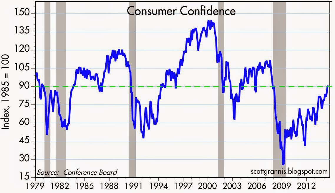
The Conference Board's July survey of consumer confidence came in much stronger than expected (90.9 vs. 85.4), and marked a new post-recession high, as seen in the graph above. I note that the July value of this index is now equal to its average since 1970. The current business cycle set the all-time low-water mark for confidence in February, 2009; from the depths of depression and fear we have now recovered to something akin to "normal." It's taken over five years to get back to normal, but at least things continue to improve.

From this it follows that we are no longer in a risk-averse recovery. As confidence returns, risk aversion is declining. We see evidence of this in gold trading at $1300, down significantly from its all-time high of $1900 three years ago. We also see it in real yields on TIPS now at -0.36%, up significantly from their all-time low of -1.77% 16 months ago. And in the S&P 500's PE ratio, which has risen to 18.1, somewhat above its long-term average of 16.6, and up significantly from its low of 12.2 in September, 2011.


Is the equity market in a bubble? Doesn't look like it to me. We'd need to see a lot more confidence, much higher PE ratios, and much higher interest rates.

Monday, July 28, 2014

Household net worth is up, not down

Over the weekend, the New York Times ran an article titled "The Typical Household, Now Worth a Third Less." It cites a study by the Russell Sage Foundation which claims that "The inflation-adjusted net worth for the typical household was $87,992 in 2003. Ten years later, it was only $56,335, or a 36 percent decline." I've since seen this article widely quoted, since its results are nothing less than shocking.

But is the claim true? I very much doubt it.

Consider the dramatic contrast to be found in the household net worth figures compiled by the Federal Reserve, which I have featured here almost every quarter for the past several years. My most recent post on the subject is here, and I highlight the graphs contained in that post below:


According to the Fed's data, total household net worth rose from $49.5 trillion in 2003 to $81.8 trillion as of March, 2014, for a 65% gain. I adjusted that for inflation (using the GDP deflator) and found that in today's dollars, total household net worth rose from $60.9 trillion in 2003 to $81.8 trillion, for a 34% gain. On a per capita basis, real net worth increased from $209.6K in 2003 to $255.7K in 2014, for a 22% gain. 

If per capita net worth in real terms increased 22% from 2003 to 2014, according to the Fed's data, how can the Russell Sage Foundation claim that real net worth for the typical household fell by 36%? Something's very wrong here, and it's not because of the changing number of people in the typical household. My money is on the Fed's data, which are much more comprehensive than the Russell Sage Foundation's data.

Moral of the story: don't believe everything you see in the newspapers. It is almost certainly the case that the typical household's net worth today is substantially more than it was in 2003.

Friday, July 25, 2014

The $1 trillion tax on cash

One under-appreciated side-effect of the Fed's quantitative easing and zero-bound interest rate policies is the sizable "inflation tax" borne by all those who have been holding cash, cash equivalents, and short-term securities since the end of 2008. By my estimates, this tax could total $1 trillion or more. As the public becomes increasingly aware of this under-the-radar tax, the demand for cash and short-term securities (cash equivalents) is likely to decline, and that will complicate the Fed's QE exit strategy.


The Fed's target for the fed funds rate (the rate banks charge each other to borrow bank reserves) sets the tone for all short-term interest rates. Since late 2008, the nominal target for the the overnight Fed funds rate has been 0.25%, and the Fed has been paying 0.25% on bank reserve balances held at the Fed. As the graph above shows, this extremely low level of short-term rates is unprecedented in modern times. For their part, banks, which have invested essentially all of their savings deposit inflows since 2008 in bank reserves, have paid very low rates to the holders of savings deposits: 1-mo. Libor has averaged 0.24% since the end of 2008 and is currently a mere 0.16%, and most banks and money market funds now pay between 0 and  0.15% on short-term savings deposits. Obviously, banks need to pay less on their deposits than they earn on their assets (e.g., bank reserves). Taking fees into account, the effective nominal interest rate on most savings deposits today is zero or even slightly negative.


The extremely depressed level of nominal interest rates since late 2008 has been exacerbated by the fact that inflation has averaged about 1.5% per year, according to the Core Personal Consumption Deflator, the Fed's preferred inflation measure (see graph above). 


The combination of very low short-term interest rates and 1.5% inflation has resulted in 5 ½ years of negative real short-term interest rates. As the graph above shows, this is the longest and most significant period of negative real interest rates in over 50 years. Recall that the negative real interest rates of the late 1970s occurred during a time of sharply rising inflation.


Negative inflation-adjusted short-term interest rates affect a lot of people and a lot of money. Anyone holding cash and cash equivalents (e.g., currency, checking accounts, savings deposits, money market funds—the things that comprise the M2 measure of the money supply, arguably the best measure of the public's store of readily-spendable cash) during this period has suffered a significant loss of his or her purchasing power—on the order of 7% or so. Bank savings deposits now represent about 65% of M2, while checking accounts ($1.6 trillion) and currency ($1.2 trillion), represent another 25%.

By the end of this year, when interest rates are almost certainly going to remain very close to zero, the cumulative loss of purchasing power suffered by those holding cash and cash equivalents (as proxied by the M2 measure of money and using the real Federal funds rate as a proxy for the real yield on M2) will be, by my estimates, at least $700 billion.

Using M2 as a proxy for cash and cash equivalents gives a lowball estimate of the inflation tax, however, since it does not include the purchasing power lost by those who held short-term notes yielding less than 1.5% (i.e., less than the annualized inflation rate) since late 2008. That would include any Treasury securities with less than 5 years' maturity, since the yield on 5-yr Treasuries has averaged 1.5% over this period. (For example, 2-yr Treasury note yields have averaged 0.5%, so those who held 2-yr Treasuries have suffered a -1% annual real rate of return. For holders of T-bills it's even worse, since the average nominal yield on 3-mo. T-bills since late 2008 has been a mere 0.08%.) It also doesn't include the inflation tax effectively paid by holders of institutional money market funds, commercial paper, and bank CDs not included in M2. So the total inflation tax on cash and short-term financial instruments is probably well in excess of $1 trillion.

The "inflation tax" I'm referring to is the loss of purchasing power that results from holding a monetary instrument with a yield less than the inflation rate. The holder suffers a loss of purchasing power, while the issuer—in most cases the U.S. government and the Federal Reserve, for whom money, bank reserves T-bills, and short-term notes are a liability—benefits because their liabilities can be repaid with cheaper dollars. In other words, the purchasing power you lose every day as a result of holding cash, cash equivalents or short-term securities is equal to the amount the federal government and the Fed benefit. The inflation tax is a direct, and largely underappreciated transfer of wealth from the private to the public sector. And it's big.


The M2 measure of money supply has been growing at about a 6.4% annualized rate for over 7 years. This growth is very much in line with the past history of M2, which has grown at an annualized growth rate of 6.4% over the past 15 years and 6.1% over the past 20 years. The lion's share of M2 growth in recent years has come from bank savings deposits, shown in the graph above. This isn't money that the Fed has "pumped" or "dumped" into the economy, it's money that people want to hold for reasons of prudence and safety. Nobody holds onto currency they don't want, and nobody is being forced or encouraged to hold bank savings deposits, since they yield almost nothing.

For the past 5 ½ years, the public has had a very strong demand for cash, cash equivalents, and short-term securities, even though they "cost" over $1 trillion to hold. The public has been willing to pay this inflation tax because the public has been very risk averse. However, as I've noted before, risk aversion is on the decline. As time passes, the public will be less and less likely to want to hold safe assets that carry with them a significant inflation tax. Banks too will be less willing to hold the current $2.6 trillion of excess reserves that currently pay only 0.25%; they will be more likely to use them to increase lending, which could potentially yield a lot more. All of this will make more urgent the need for the Fed to reverse its QE efforts by draining reserves and increasing the interest it pays on reserves, lest a surfeit of bank reserves lead to an excess of money supply vis a vis money demand—the classic prescription for rising inflation.

As money demand declines, the public will want to reduce its holdings of money and safe assets in favor of assets with a positive real yield. A reduction in money demand will thus put inexorable pressure on short-term yields to rise and riskier asset prices to rise. Some might call this a "melt-up," and it wouldn't be far-fetched.

Thursday, July 24, 2014

Buffet's "Bubble Red" Indicator

You may have noticed a recent post on Zero Hedge ("Forget Shiller's CAPE, Warren Buffet's 'Best Indicator' Is Flashing Bubble Red"). It includes a chart that shows the market value of U.S. companies as a % of nominal GDP, and it does look scary: by this measure equity valuation is almost as extreme as it was in early 2000.


I can't vouch for the data behind the ZH graph, but I can vouch for the data used to create the above graph. In my experience, the S&P 500 index has been the best measure of the performance of the U.S. stock market, and it has also been the best proxy for the value of U.S. corporations. What I think this graph shows is that the ratio of company valuations to GDP is not yet extreme, being approximately equal today to what it was in the early 1960s when inflation was low and stable and U.S. interest rates were low and stable, much as they are today.

If I had to guess, I would say that over the next several years nominal GDP growth will pick up (it was a meager 1% or so in the first half of this year), while the growth of equity prices will slow down. Both of those developments would be consistent with higher bond yields and a leveling off of the equity/nominal GDP ratio. In other words, we're not necessarily in an equity bubble, and an equity bubble is not necessarily inevitable.

Job security doesn't get much better than it is today


First-time claims for unemployment last week came in much lower than expected. This is more good news for the jobs market and the economy, since it means that businesses are facing very low levels of stress.


Relative to total jobs, the current level of claims is now about as low as it has ever been. The average worker has never had such a high level of job security—think of the above graph as a measure of the probability that a worker is laid off in any given week.

Wednesday, July 23, 2014

Recovery rests on solid, not liquid ground

It's not hard to find analysts who argue that this recovery owes everything to the Fed's massive injections of liquidity. By pumping money and keeping short-term interest rates near zero, the Fed has forced liquidity into risky assets, thus propping up equity prices excessively and artificially.

As long-time readers of this blog know, I think that argument is weak at best. The Fed has not been printing money with its Quantitative Easing programs. The Fed has simply been swapping bank reserves (which are functionally equivalent to T-bills) for notes and bonds, and they have been doing this in size in order to accommodate the world's demand for safe assets. The Fed hasn't been dumping tons of new money into the system, the Fed has been supplying liquidity that the market demanded. We haven't seen any unusual increase in inflation because the Fed's supply of money has been equal to the demand for money.

But even if the Fed were "pumping" money into the economy, it's a stretch to think that extra money can translate into real growth. If printing money could make an economy grow, Zimbabwe and Argentina would be economic powerhouses—but they aren't. Printing money that no one wants is the basic recipe for inflation, and that's not been the story of the current business expansion in the U.S. economy.

Here are some charts that focus on the physical growth of the U.S. economy. This is real growth, not make-believe, liquidity-driven growth.


Manufacturing production (the volume output of industrial establishments in mining, quarrying, manufacturing, and public utilities) has increased by 25% in the past five years. It's almost at a new all-time high. The manufacturing side of the economy survived, and has largely recovered from, its steepest plunge in history.


Actual shipments by truck, rail, waterways, pipelines and aircraft, as measured in ton-miles by the Dept. of Transportation, has increased over 25% in the past five years, and is now at a new all-time high.


Truck tonnage, as measured by the American Trucking Association, has increased by almost 30% in the past five years and is now very close to its all-time high. As the above chart shows, there is a decent correlation between the level of truck tonnage and the real value of the equity market. When the physical size of the economy increases, so do equity prices in real terms. Furthermore, equity prices do not appear excessive when compared to the increase in the physical size of the economy. (They did look excessive in 2000, however, and they looked extremely depressed in 2009.)


The nation's architectural firms report an increasing number of billings, a good sign that the commercial real estate market is expanding.


New housing starts are up about 80% in the past five years, and builders appear reasonably confident that construction activity will continue to increase.


U.S. exports of goods have increased 65% in the past five years and are at a new all-time high.


World trade volume has increased almost 35% in the past five years, and is now at an all-time high.


U.S. crude oil production has surged over 70% in the past five years, with the result that the U.S. has surpassed Saudi Arabia as the world's largest oil producer. Back in 2008 this would have been unthinkable, and it's all due to the ingenuity of oil producers (i.e., fracking technology).


A composite index of chemical industry activity has increased 27% in the past five years, and has grown by 4.3% in the year ending June 2014—a good indicator that the U.S. economy continues to grow.


The private sector has created almost 10 million jobs in the past four years, and private sector jobs are now at a new all-time high. 


The jobs market is stronger and unemployment is lower primarily because fixed investment (e.g., investment in new things—new buildings, new homes, new plant and equipment) has increased faster than the overall economy.

There's still a lot of room for all of these indicators to improve. It's still the case that this has been the weakest recovery in history. But it is nevertheless a recovery, and the economy has without question been growing in a real, physical sense. This is a genuine economic expansion, and the rise in equity prices is a reflection of that growth. It's not a liquidity-driven mirage, it's real.

Monday, July 21, 2014

Commercial real estate enjoys double-digit growth


Commercial real estate prices have yet to exceed their pre-recession highs, but they are getting close, according to the repeat-sales indices of the Co-Star Group. As the chart above shows, Co-Star's value-weighted index of commercial property prices has been rising at about a 10% annualized rate for the past four years. That's a pretty impressive recovery in my book, even though prices in inflation-adjusted terms are still 12% lower than their 2007 highs. (The Value-Weighted Index is a more liquid, and thus more reliable and more responsive index, than the Equal-Weighted Index.)

The first thing I think about when looking at a chart like this is that it flies in the face of the Fed's ongoing concern about the health of the U.S. economy. Short-term interest rates shouldn't be at zero in an environment of double-digit price gains for the commercial real estate sector, since it invites excessive speculation.

For the time being, however, it looks like commercial real estate will continue to boom. As Calculated Risk notes, distress sales have been steadily declining for the past 3 years. As Co-Star notes, "in the early-recovery, coastal markets of Los Angeles, San Francisco and San Jose, distress levels are nearly non-existent."

Friday, July 18, 2014

Corporate inversions: the facts

Those who claim that companies seeking to reincorporate overseas in order to reduce their tax burdens are "unpatriotic" are not only ignorant of the law but also ignorant of how businesses operate. If there is any one message that should be making the headlines, it would be "Companies seek to escape insane U.S. tax code." When companies vote with their feet, it's a good sign that something is wrong here in the U.S. 

In case you've missed them, here are three short essays, with brief excerpts, that clarify the issues surrounding corporate tax "inversion."

Miles D. White, "Ignoring the Facts on Corporate Inversions:"

... inversion is legal. Period. It's allowed in the tax code. The tax code even specifies the terms and conditions under which it may be done. 
Inversion doesn't change a company's tax rate. A company pays the same tax rate in the U.S. after inversion as it does before inverting. A company also pays the same tax rates in foreign domiciles before and after inversion. 
Inversion does not relieve any pre-existing tax burden. It does not reduce the tax that any company would ultimately have to pay on past earnings overseas that have been deferred under the U.S. tax system. 
What does change after inversion is a company's access to its future foreign earnings generated outside of the U.S. tax system. Those future earnings may be used for any capital allocation purpose the company may have, including investment in the U.S., without the additional U.S. repatriation tax. 
The U.S. is among only a handful of countries, and the only one in the Group of Seven, that taxes companies on world-wide earnings rather than the earnings in their home domiciles. It's a double whammy: the highest rate, by far, and it's applied worldwide.
Legislation to block inversion is not tax reform. It would make the U.S. even less competitive globally. It would not stimulate economic recovery.

The pace of inversions has been picking up as more CEOs conclude that President Obama isn't serious about tax reform. These executives have a fiduciary duty to their shareholders, and they can't cede a permanent tax advantage to their global competitors. So they decide to move. 
Mr. Lew doesn't know much about economics or he'd realize that his rush to block these inversions will have the perverse effect of driving even more deals in the coming months. If CEOs think Congress will close the inversion possibility, and that tax reform is dead until Mr. Obama leaves office, more of them will decide to move while they still can. 
A real agenda for "economic patriotism" would support a tax policy to make America competitive again as a destination for global investment and job creation.
Michael J. Graetz: "Inverted Thinking about Corporate Taxes:"

Inversions by U.S. companies to take advantage of more favorable corporate tax laws abroad are nothing new. Of the more than 25 U.S. companies that inverted between 1982 and 2002, more than 20 made Bermuda or the Cayman Islands their home.

To ask, "How do we stop American companies from leaving for more favorable tax jurisdictions?" is asking the wrong question. The right question is "How do we make the United States a more favorable location for investments, jobs, headquarters, and research and development activities?" That will require genuine tax reform. The U.S. is the only OECD country that doesn't have a national tax on consumption. Relying, as we do, so heavily on individual and corporate income taxes to pay for federal expenditures hobbles us in today's global economy.
I would add that, in the 12 months ended June, 2014, the federal government received a total of $303 billion in corporate income tax payments. That represented only 10.3% of total federal revenues over the same period. Eliminating that source of revenue entirely would increase the federal deficit from its current 3.1% of GDP to 4.9%, all else remaining equal. This would not be an earth-shaking loss, and it would very likely be offset to a significant degree by increased corporate investment, more hiring, more incomes, and lower prices to consumers.

Corporate tax reform is a matter requiring urgent and thoughtful attention. Let's do it right, please.

Wednesday, July 16, 2014

The U.S. economy just keeps growing

Despite enduring concerns about the health of the U.S. economy and the supposed threat of deflation, the economy continues to grow and inflation is alive and well. A few quick graphs to make those points using data released today:


Producer price inflation is running at a solid 2-3% pace. In the past six months, the PPI has actually increased at a 4.1% annualized pace.


Real Treasury yields are at levels that were associated with rising inflation in the late 1970s. When bond yields fail to compensate for inflation this weakens the demand for money (e.g., by making borrowing cheap, and by increasing the attractiveness of speculation).


It's difficult to understand the Fed's preoccupation with "stimulating" the economy when the U.S. is doing demonstrably better than Europe and doing quite well on a standalone basis. U.S. industrial production is up at a 4.7% annualized rate in the past six months, and U.S. manufacturing production is up at a 4.1% rate over the same period. This is unambiguously strong. What's amazing is the gap between U.S. and Eurozone industrial production, which has become gigantic.


A survey of home builders' sentiment in July was stronger than expected (53 vs. 50), so as the graph above suggests, housing starts are likely to continue to move higher, albeit relatively slowly. The housing market has been taking something of a breather in the past 6-9 months, but that isn't necessarily the precursor to another slump.

Tuesday, July 15, 2014

The outlook for interest rates

Everyone knows that interest rates are going to rise in the future. So the real question is not whether they will rise, but when and by how much. Janet Yellen didn't change the consensus opinion regarding these questions much in her testimony today. The market thinks the Fed is almost certainly going to end the tapering of QE3 in October, and about six months later, give or take a few months, the Fed is expected to start raising short-term rates. They will probably do this by increasing—very slowly—the interest rate they pay on bank reserves, using reverse repo transactions, and by not rolling over maturing Treasuries and MBS.


The above graph shows the Treasury yield curve at different points in time: April 2013 (the all-time low for the 10-yr Treasury yield), today, and two and five years in the future. The latter two are derived mathematically from the current Treasury curve. If you compare this graph to the one in my post last March ("How much are yields going to rise?") you can see that not much has changed of late. The Fed is expected to raise short-term rates in a very gradual fashion beginning next year, and five or so years from now rates are going to be topping out around 3½ to 4%.


There's nothing very scary about this. As the graph above shows, for most of modern history 5-yr Treasury yields have traded well in excess of 3%. That 5-yr yields today aren't expect to rise above 4% for as far as the eye can see is pretty unusual from an historical perspective.

Interest rates aren't expected to rise by much because 1) the market doesn't think the U.S. economy has much chance of returning to its former growth glory, and 2) the market doesn't think that inflation has much chance of exceeding 2-3%. In other words, the bond market today seems fairly convinced that growth will be sluggish and inflation will therefore be tame for as far as the eye can see.

If you disagree with the assumptions behind the market's current consensus, then you can take actions to bet that interest rates will be either higher or lower than current expectations. For example, if you see more potential for growth and inflation, then bet that rates will rise faster than expected: lock in long-term borrowing costs today; keep the duration of bonds you own as short as possible; and avoid excessive leverage (or place hedges to protect against higher-than expected borrowing costs). Consider an increased exposure to real estate, since it should benefit from stronger growth and higher inflation, and it is not necessarily expensive today. Consider also an increased exposure to equities, since stronger growth and higher inflation should have a positive impact on future expected cash flows.

For my part, I acknowledge that I have been overly concerned about rising interest rates for most of the past 5 years or so. Being wrong for so long is humbling, but it is not a reason to shy away from worrying about a faster-than-expected rise in interest rates today. In the end, it's all about what happens to the economy and to inflation.


I'm still an optimist on the economy, since I think the market's growth expectations are overly pessimistic. I think 5-yr real yields on TIPS tell us a lot about the market's underlying expectations for real economic growth. As the graph above suggests, the current -0.38% real yield on 5-yr TIPS points to economic growth expectations of perhaps 1% per year, which in turn is a bit less than we've seen in recent years. If the market were convinced that future growth would be a solid 3% a year, then real yields today would be a lot higher than they are now.


I'm still more worried about inflation than the market is, since I think the market is being a bit too complacent about the inflationary potential of the Fed's massive balance sheet expansion and the Fed's ability to reverse course in a timely fashion. As the graph above shows, the market expects CPI inflation over the next 5 years to average a mere 2.1%, which is actually less than the 2.3% it's averaged over the past 10 years. I'm not predicting hyperinflation or anything like it, I'm just saying that expecting inflation as usual for as far as the eye can see despite the Fed's huge and unprecedented experiment in quantitative easing is a bridge too far for me.

There's nothing scary about expecting interest rates to rise more than expected. Rates aren't likely to surprise on the upside unless real growth expectations and/or nominal GDP expectations rise, and given the pessimism inherent in the market's current expectations, either one of those would be very welcome developments.

Interest rates are a good barometer of the market's expectations for growth and inflation. That they are still so low today means that the market holds little hope for any meaningful improvement in the outlook for the economy and/or any meaningful rise in inflation. We're living in a slow-growth, low-inflation world for now, and—as often occurs just before something hits us from left field—the market is extrapolating that today's conditions will prevail for as far as the eye can see.