Do a search for "economy stall speed" and for at least the past 8 years you will find no shortage of people periodically worrying that the economy is approaching "stall speed" and thus more at risk of a recession. Just the other day Bloomberg asserted that "
The US economy is approaching "stall speed" as factory gauge hits 10-year low." I've argued
many times through the years that this is a flawed analogy; a slowing economy is not at all akin to an airplane approaching stall speed. Economies are perfectly capable of growing at very slow—or even zero—rates for prolonged periods, whereas planes do need a minimum velocity to stay aloft. Consider: the US economy grew at a paltry 0.9% annualized rate in the nine months from July 2015 through March 2016, during which time oil prices plunged—threatening widespread bankruptcies—and the world feared the potential fallout of a Brexit. There was plenty of handwringing and predictions of an imminent recession, but in the end the economy resumed its slow-growth, 2.1% path.
As I put it in a
post three years ago, "recessions typically follow periods of excesses—e.g., soaring home prices, rising inflation, widespread optimism—rather than periods dominated by
risk aversion such as we have today." It's not slow growth that precipitates a recession, it's too much risk-taking and too much optimism that eventually collide with the reality of tight money. Recessions happen when the future proves to be radically different—in a bad way—than it was presumed to be, and people are thus forced to do an about-face.
Today, risk aversion is just as abundant, or even more so, than it was in the latter half of 2015. Instead of plunging oil prices back then, today we have a global slowdown in manufacturing activity. Instead of Brexit fears, we have the fear that Trump's tariff wars will escalate and precipitate a global recession. Meanwhile, monetary policy is not even close to being tight: real and nominal yields are extremely low, and liquidity is abundant. Yes, the yield curve is inverted, but while an inverted yield curve has always preceded a recession, by itself it is not sufficient to provoke a recession. I explored this in detail in this post:
Risk aversion is the big story, not the yield curve.
Risk aversion is everywhere, because for one thing it's hard to find any economy that is prospering these days. China's economy has been slowing for many years and is really feeling the pain of Trump's tariffs; manufacturing conditions nearly everywhere have been negatively affected by higher tariffs; the Eurozone is barely growing; Argentina is suffering through yet another recession; and the "Trump Bump" that propelled US growth to over 3% a year ago has faded. Fed projections of US GDP growth in the current quarter average 2.3%, which would take us almost all the way back to the 2.1% Obama-era range of growth which characterized the
weakest recovery ever.
The following charts lay bare the case for economic weakness and risk aversion, and the rationale for why a recession is nevertheless not baked in the cake.
Chart #1
As Chart #1 shows, big declines in the ISM Manufacturing Index tend to coincide with periods of weak growth. The current level of this indicator suggests US economic growth could be in the range of 0-2%. Caveats: it's important to keep in mind that this index has a subjective component, being calculated based on questionnaires filled out by the nation's purchasing managers. At the current level, it says that a little over 50% of those surveyed see conditions deteriorating. Also, there have been quite a few times in the past when the index has been as low as it is today without a recession following.
Chart #2
Chart #2 is one component of the manufacturing index, and its recent slump makes it clear that Trump's tariff hikes, which began in the first quarter of 2018, were the proximate cause of the current weakness in manufacturing conditions.
Chart #3
Chart #3 suggests that, facing deteriorating export orders, a majority of manufacturing firms are now less inclined to make new hires. This is not good, of course, but keep in mind that manufacturing jobs represent less than 10% of US payrolls. It's a small segment of the economy.
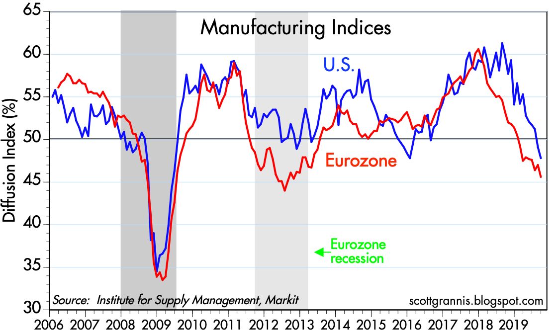
Chart #4
Chart #4 shows that manufacturing conditions in the Eurozone have deteriorated even more so than in the US. Trump's tariffs are having global repercussions.
Chart #5
Chart #5 shows conditions in the service sector, which represents over 70% of US payrolls. Conditions have deteriorated, but not significantly.
Chart #6
Chart #7 shows that the service sector is relatively weak in the Eurozone, and has been for some time.
Chart #7
Chart #7 shows that there has been a significant decline in the hiring intentions of service sector businesses. This chart is probably the most bearish chart I can think of right now. Will there be no net new hiring in the future?
Chart #8
Charts #3 and #7 make a strong case for a slowdown or even a flattening in overall employment growth. And indeed, we've already seen a slowdown in the growth of private sector payrolls, as I've been documenting in several posts this year, and as the recent payroll numbers reflect. Chart #8 shows that over the past six months, private sector job gains have averaged 132K/mo. The September number was just 114K. Jobs growth is definitely slowing—private sector jobs currently are growing at the rate of about 1.2% per year, which is down from last year's 2.1% high—but it's far from going to zero.
Chart #9
As Chart #9 shows, there has to date been absolutely no increase in the pace of layoffs; first-time claims for unemployment today are as low as they have ever been. Moreover, today brought news that the unemployment rate has fallen to 3.5%, a level not seen since 1969. Firms in general may not be anxious to hire, but no one seems anxious to reduce their workforce. What we have today is a case of "failure to thrive," not a case of degenerative economic disease.
Chart #10
Chart #10 illustrates how real yields tend to track the real growth rate of the economy, and that makes perfect sense. When the economy is strong, real yields in general are strong. Which is another way of saying that demand for bonds is weak when the economy is strong. By the same logic, demand for bonds is strong (i.e., yields are low) when the economy is weak. Real yields have declined this year as a weakening economy has boosted demand for the safety of Treasuries. The chart further suggests that the bond market is pricing in the expectation that real growth going forward will be about 2%, a bit weaker than what we saw during the Obama years. That's a far cry from recession levels.
Chart #11
Chart #12
Chart #11 compares the level of 5-yr Treasury yields with the Core CPI inflation rate. Prior to the Great Recession, bond yields moved almost in lockstep with inflation, and yields were reliably higher than inflation. But since 2010, the bond market has virtually ignored inflation. Demand for bonds has been so intense that nominal yields have been bid down to very low levels relative to inflation. That's directly illustrated in Chart #12, which shows the difference between nominal 5-yr yields and core inflation. The current level of ex-post real yields on 5-yr Treasuries is as low as it has been in almost 40 years. By this measure (i.e., the demand for the safety of bonds), risk aversion hasn't been this high in several lifetimes.
Chart #13
Chart #13 shows a long history of 10-yr Treasury yields, which are now only inches above their all-time low. Demand for the safety of Treasury bonds is so intense that investors are willing to pay $66 for $1 dollar worth of annual earnings. (That's the inverse of the current 1.52% yield on 10-yr Treasuries, otherwise known as their PE ratio.)
Chart #14
Risk aversion can also be found in the equity market, as Chart #14 shows. The current PE ratio of the S&P 500 is 19.3, which means that the earnings yield on stocks is 5.2%, a premium of 3.7% over 10-yr Treasuries. Whoa: investors are happy to pay $66 to be assured of an annual return of $1 in Treasuries, but it only takes $19 for the promise of $1 in equities. That is another way of measuring just how risk averse this market is.
Chart #15
Finally, Chart #15 compares the price of gold to the price of 5-yr TIPS (using the inverse of their real yield as a proxy for their price). Both of these assets promise guarantees of sorts. Gold is the classic refuge from economic and political storms. TIPS are default-free and guarantee an inflation-adjusted rate of return. That their prices tend to move together makes sense, since they are both safe havens, and are thus indicative of risk aversion.
With so much risk aversion, and with no sign that monetary policy is too tight or even likely to become tighter, it's highly unlikely that today's slow-growth environment is a precursor to a recession. Maybe we'll see more economic weakness before things get better, but in the meantime there is little reason to think that today's slow growth makes a recession tomorrow more likely.