Friday, February 28, 2020

The Fed needs to cut rates by 50 bps

The prevailing view in the financial media is that the Fed needs to cut rates to mitigate the anti-growth impact of the Covid-19 virus panic. I see it differently. The panic has caused a severe correction in the market for just about all risky assets, and a surge in the price of safe assets. The common denominator behind everything that is happening in the market is that investors' demand for cash, cash equivalents risk-free short-term securities has surged. In short, the demand for "money" has surged. The Fed should, and really must, offset the increased demand for money by reducing the attractiveness of money—and that means lowering short-term interest rates. To judge by current financial market pricing, the market is effectively signaling the Fed that a cut of 50 bps is called for, and it needs to happen ASAP.

A Fed rate cut along the lines the market is calling for will not strengthen the economy. Easier money can never generate growth all by itself, but easier monetary conditions can make it easier for the market to cope with adverse conditions. Smooth-running financial markets are an essential ingredient to the health of the economy. Right now, financial market conditions are an impediment to growth, and the Fed can and should remove that impediment by acting soon.

Chart #1

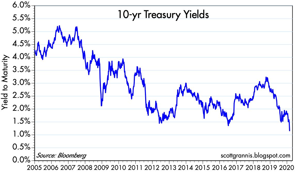
As Chart #1 shows, 10-yr Treasury yields have fallen to new, all-time lows—currently 1.17%. 5-yr Treasury yields are now just under 1%, a level last seen/exceeded only during the panic surrounding the PIIGS and Brexit crises (2011-2013).

Chart #2

Chart #2 is the best way to judge whether the Fed is keeping short-term rates too high. The red line (5-yr TIPS yields, which are the market's expectation for what the real Fed funds rate (the blue line) will average over the next 5 years, has recently fallen below the current real Fed funds rate by about 50 bps (the 5-yr TIPS yield is -0.44%, and that is about 50 bps below the difference between the current Fed funds target, 1.75%, and the current Core PCE inflation rate, which is about 1.7%). In short, the market now thinks the Fed is "too tight." The pricing of Fed funds futures shows that market fully expects the Fed to cut rates by 50 bps within the next few months. Given the panic, the sooner this happens the better.


Chart #3

Chart #3 shows the prices of gold and 5-yr TIPS (using the inverse of their real yield as a proxy for their price). Both have surged of late, reflecting the market's strong desire for safe and safe-haven assets.

The Fed can't provide a cure for the Covid-19 virus, but it can mitigate its adverse effects by easing monetary conditions in response to the market's increased desire for money and money equivalents. Doing so is simply doing the Fed's principal job, which is to maintain a balance between the supply of money and the demand for it. Right now the Fed is not doing enough, and we can see that in the fact that inflation expectations have fallen by roughly 25 bps in the past 10 days, to a relatively low 1.4%, as shown in Chart #4.

Chart #4

P.S. Be sure to check the updates to my last post for insights into the degree to which the market has panicked.

UPDATE: as of March 4. Yesterday the Fed did indeed cut rates by 50 bps, but there is still some pressure from the market for at least one more cut and likely two. In light of the majority of comments I see in the press to the effect that the Fed pulled a "shock and awe" move, and that it might be running out of ammunition, I feel the need to reiterate that the Fed's move has nothing to do with "stimulating" the economy or an otherwise positive "shock" to sentiment. It's simply a recognition of market realities.

The current real (inflation-adjusted) Fed funds rate is about -0.45%. But the current real yield on 5-yr TIPS (which is essentially the market's forecast for what it thinks that rate will average over the next 5 years) is -0.60%. Thus the market expects the Fed to cut at least once more and/or inflation to rise a bit from current levels.

It may also be the case that the very low level of interest rates on short-term securities like TIPS and T-bills is the market's way of telling the Fed that there is a shortage of such securities. Perhaps the Fed should consider increasing the level of excess reserves. The press would shout "another round of quantitative easing!" but in reality it would just mean accommodating the market's desire for more T-bill equivalents (bank reserves are in effect T-bill equivalents). The Fed can expand reserves by buying notes and bonds and paying for them with reserves, just as it did in three QE episodes. When the demand for reserves is intense, as it is now, transmogrifying notes into T-bill substitutes is not inflationary, nor is it necessarily stimulative. It's just supplying more short-term securities to the market to satisfy the demand for such. That would presumably allow the financial markets to function more smoothly, and that, in turn, could make it easier for the economy to deal with the uncertainties of the Corona virus

UPDATE: as of market close March 5th: The Fed is almost certain to cut rates by at least another 50 bps. Chart #5 provides the rationale:

Chart #5

I've long argued that the Fed usually follows the market. Chart #5 shows partial proof. The orange line is the 3-mo. T-bill rate, and the white line is the upper bound of the Fed's funds rate target. Note that in the early stages of Fed tightening (2015-2017), the Fed tended to lead the market: T-bill rates moved up several months after the Fed raised its target. But since 2019 the Fed has been following market rates on the way down. T-bill rates were always ahead of the Fed, and each ease was merely an attempt to bring the funds rate in line with T-bills. Since Tuesday's cut of 50 bps, T-bill rates have plunged. This suggests the Fed will need to cut rates by at least 75 bps just to keep up with the market!

When the Fed cuts rates in order to follow the market down, this is NOT monetary ease. It's NOT stimulus. It's NOT money printing. It's passive monetary policy. The big story is NOT Fed easing. The big story is the market's insatiable demand for safe and liquid securities. The virus-induced panic has caused a tremendous increase in the demand for money and money-equivalents, which are now demonstrably in short supply. The Fed MUST accommodate this demand by lowering its target rate and by increasing the supply of bank reserves (i.e., QE4). 

Tuesday, February 25, 2020

Quantifying the pandemic panic

The Coronavirus (Covid-19) is spreading, and panic is spreading throughout global markets. Unfortunately, it's difficult to know whether this will be a true pandemic or just a panic. We'll know more before too long, but I was encouraged this morning to read in a Reuters article that

Mainland China reported nine new coronavirus cases outside the epicenter of Hubei on Monday, the lowest since the national health authority started publishing nationwide daily figures on Jan. 20.

Several provinces have lowered their coronavirus emergency response measures, allowing more flexibility on transportation and helping firms resume production.

About 180 million workers have left their hometowns to return to work since Feb 10, when China ended the prolonged Lunar New Year holiday due to the virus outbreak, according to Reuters calculations based on transportation ministry data.

At the current daily travel flow rate of more than 14 million people, about 192 million people are likely to return to cities where they work during the last two weeks in February, beating a government projection of 120 million.
Nevertheless, it appears to be spreading rapidly in other parts of the globe. One expert predicts that the virus "will ultimately not be containable." (HT: reader "Johnny Bee Dawg")

The following charts are my contribution to understanding the degree of panic that is priced into the market as of this morning. By some measures we have reached very high levels of panic, but not by others. Thus, I think the situation will remain in flux for awhile until we can better assess the degree to which the virus has spread outside of China and how lethal and it ends up being. 

There is likely to be more downside risk before this is over. Whether that means you should sell now, consider what might happen if someone were to announce the availability of an anti-coronavirus vaccine and/or a way to reduce its severity. A reversal of today's panic pricing levels would almost certainly result in a huge market rally. Just today we learned that "Drugmaker Moderna Inc. has shipped the first batch of its rapidly developed coronavirus vaccine to U.S. government researchers." It will be months, however, before we learn if the vaccine is indeed effective and safe to use.

Chart #1
 

Chart #1 compares gold prices to TIPS prices (using the inverse of their real yield as a proxy for their price). Both assets are what might be considered to be true "safe havens." Gold is a refuge against all sorts of evils, while TIPS are free of default risk and government-guaranteed to pay a given real rate of interest. Both prices have surged of late, but they are still short of the levels they reached some 8 years ago, when global markets were still reeling from the shock of the Great Recession and its global financial crisis.

Chart #2 

Chart #2 shows how real yields on 5-yr TIPS tend to correspond to prevailing levels of real GDP growth. With the real yield currently trading at about -0.4%, the chart suggests that the market is priced to a substantial slowdown in US economic growth to something a bit below 2%. That's meaningful, but it's not yet disastrous. A virus is not likely to kill the US economy, but it could definitely slow down overall growth.

Chart #3 

Chart #3 shows how panic attacks (spikes in the ratio of the Vix index to the level of 10-yr Treasury yields) almost always result in sharply lower equity prices. Today the ratio is much higher than it has been during other panic attacks which resulted in much bigger equity market sell-offs. The next three charts show the components of the ratio to better understand why it is so high today.

Chart #4

Chart #4 shows the history of 10-yr Treasury yields. Today they hit an all-time low of 1.3%. This is a big reason why the Vix/10-yr ratio is so high today.

Chart #5

Chart #5 zooms in on the data in Chart #4. Here it becomes clear that today's 10-yr yield marks the lowest closing yield in history. The previous record low was set in mid-2016, when markets were panicked over collapsing oil prices and the threatened breakup of the European Union (i.e., Brexit). 

Chart #6

Chart #6 shows the history of the Vix index. Here we see that by this measure, today's level of "panic" is far below that of past panics. Markets today are pessimistic about economic growth, but markets are not expecting recession nor are participants willing to pay exorbitant prices to avoid downside risk. 

Chart #7

Chart #7 shows Credit Default Swap spreads, which in turn are a highly liquid measure of the market's confidence in the outlook for corporate profits. Credit markets today are worried, yes, but hardly in a state of panic.

Chart #8

Chart #8 compares the inverse of the dollar's value against other major currencies to the inflation-adjusted price of gold. In general, the dollar's value tends to strengthen as gold prices weaken, and vice versa. But it's notable that in the past two years, just the opposite has been the case. Gold prices have surged and the dollar has strengthened. I take this to mean that the current rise in the price of gold is driven almost entirely be fear, and not at all by concerns that the Fed is making a policy mistake which will erode the dollar's intrinsic value. Gold is not rising because of inflation fears. Inflation expectations have been relatively steady at modest levels (1.5-2.0%).

Chart #9

Chart #9 compares the inverse of the dollar's value to an inflation-adjusted index of non-energy commodity prices. As with Chart #8, we see that a stronger dollar tends to correlate to weaker commodity prices and vice-versa. Commodity prices today are behaving much as we would expect, given the relative strength of the dollar. Gold is the one significant outlier in the commodity universe, which again suggests that it is being driven much more by fear and the desire for safety than by monetary fundmentals. 

Chart #10

Chart #10 shows the level of 2-yr swap spreads in the US and the Eurozone. Both are trading well within "normal" ranges, which suggests that liquidity is abundant in the major markets that count the most. Monetary policy is not threatening, and systemic risks are low. This further suggests that the panic over Covid-19 is just that—the virus has yet to make a material impact on global financial and economic fundamentals. 

In sum, while there are obvious signs of panic out there, we are not yet in the midst of a "run for the exits" panic. Things could get worse as the virus spreads, but the outlook could quickly change for the better if science finds a vaccine or a mitigating treatment. 

What to do in the meantime is a tough call which depends on your tolerance for pain. 

UPDATE as of market close Feb 25. The Vix/10-yr ratio has moved higher, and the equity sell-off has intensified. It's still a relatively modest sell-off however. The S&P 500 is only down a little more than 7.5% from its all-time high.

Chart #11

UPDATE: as of market close Feb 27. We are now entering true panic territory. The Vix/10-yr ratio, now at 31 (see Chart #12), is way above its last all-time high, which was 22.4 in late 2011, at the height of the Brexit/PIIGS default fears. As I mention above, the main reason for this very elevated level is the extremely depressed yield on 10-yr bonds, which today fell to a new all-time low of 1.26%. As Chart #13 shows, the Vix index is hardly in record territory. Nevertheless, it's fair to say that never before has the world been so pessimistic about growth and so desirous of safe assets (as witnessed by the 10-yr yield), but not yet in true panic mode (which would be reflected in a much higher Vix index). Things are ugly, but nobody is jumping out of windows yet. The problem is that we're dealing with an unknown variable (Covid-19) that could have a significantly negative impact on global GDP.

On the positive side, progress on a vaccine is underway. And should the virus fail to achieve pandemic status, the upside would likely be just as dramatic as the current sell-off. 

Chart #12

Chart #13 

UPDATE: As of Friday, Feb 28, 10:30am EST. The market is now in full panic mode, and things are getting very ugly. 10-yr Treasury yields are down to a new all-time low, 1.17%. The fear and panic that is surging around the world have the effect of greatly increasing what was already a strong demand for money and save assets. The entire Treasury curve is now inverted relative to the Fed's target (currently 1.75%), so the Fed will need to cut rates at least twice to offset the strong demand for money. Every day they don't makes things worse. And with the panic eroding confidence and weakening global economies, politics has now entered the fray, with the left accusing Trump of making things worse. Schumer on Tuesday said "the administration’s handling of the virus has been marked by 'towering and dangerous incompetence.'" This arguably improves the chances that Sanders becomes our next president and unleashes a wave of growth-damaging tax hikes and government power grabs. 

It's the stuff of nightmares, and the market reflects this. Consequently, the seeds for a recovery are being sown. All it takes to spark a rebound is news that suggests things are not as bad as everyone fears. As Chart #15 shows, the Vix "fear" index is now at levels that have been the high-water mark for previous panics, with the sole exception being the full-blown global financial panic of late 2008.

Chart #14

Chart #15


UPDATE: as of 1:45 EST. The panic is slowly receding. 

Chart #16

I've shortened the time frame for Chart #16. Now it covers only three years. Last Friday (Chart #14) the Vix/10-yr ratio soared mid-day to over 40, then retreated. It's now down to 31.

Chart #17

Chart #17 shows the Vix index by itself. Each bar represents one month of data, with the low, high, and closing levels. Note how the current Vix reading, about 30, is far below last Friday's high of almost 50. That day may well mark the max height of the current wall of worry. 

Wednesday, February 19, 2020

Housing starts are truly impressive

For the past several months, the news from the residential construction sector of the economy has been truly impressive, greatly exceeding forecasts. Only one caveat: building activity in the winter months is typically depressed, so seasonal adjustment factors are large and that can turn a modest increase in actual starts into something bigger than it actually is. Winter weather has been milder than usual, so we need to take the recent data with a grain of salt. Regardless, the outlook for residential construction looks impressive, especially when coupled with the fact that mortgage rates are at or near all-time lows and households' finances have never been so healthy.

Chart #1

Chart #1 may be the most economically bullish chart in my collection. It compares actual housing starts to a measure of homebuilder sentiment. Sentiment has been a good leading indicator of starts, and starts in recent months look to have responded to a dramatic increase in sentiment that began about a year ago. Both now point to a robust environment for residential construction activity which in turn could help power the economy to new heights.
 
Chart #2

Chart #2 shows the history of housing starts going back to the late 60s. The residential construction sector is still recovering from the bursting of the housing bubble in the late 00s, and there looks to be plenty of upside potential left.

Chart #3

Chart #3 shows residential building permits, which essentially predict future housing starts by several months. This chart reinforces the message of the first two: we are in the midst of a burst of new activity in the residential construction sector after several years of meager gains.

Chart #4

Chart #4 shows 30-yr fixed mortgage rates for conforming and jumbo loans. Both are at historically low levels. The world's seemingly insatiable desire for 10-yr Treasuries (which I featured in Chart #7 of my previous post) provides an ample source of funds for mortgage lending. There's every reason to believe that financial market conditions will support continued growth in housing activity.

Chart #5

Chart #5 shows that the delinquency rate for home mortgages has never been as low as it is today.

Chart #6

The message of Charts #5, #6, and #7 is powerful: households are in great shape financially. Delinquency rates are at historic lows for all types of loans, and households' financial burdens are also at historic lows.  

Chart #7

So much winning! Trump has a strong housing wind at his back as the November elections approach.

Friday, February 14, 2020

Updated key market-based indicators

I'm a big fan of market-based indicators—the kind that are determined by the daily decisions of hundreds of millions of savers, investors, and money managers all over the world. Traditional economic indicators (e.g., payroll employment, GDP, CPI) come out with a lag, are subject to revisions, and are based on assumptions that do not necessarily reflect the reality on the ground. Opinion polls are helpful, but they are only an approximation of reality using relatively small samples, and they are subject to bias on the part of the questioner and psychology on the part of the responder. Market-based indicators can be viewed in real-time and they dynamically reflect how "the market" interprets all the information currently available. Markets are where people put their money on the line.

So here is a collection of a dozen or so up-to-date charts that show the status of the market-based indicators that I believe merit ongoing scrutiny. My overall interpretation of these indicators is that the economic and financial fundamentals look sound, and although risk asset prices are high from an historical perspective, they are not high in relation to other variables, and they are undergirded by a healthy degree of skepticism and caution. In short, if the threats of the Kung Flu and Bernie Sanders fade, there is still substantial room on the upside for equities.

Chart #1

Chart #1 compares the level of the real (ex-post) Fed funds rate (blue) with the slope of the Treasury yield curve from 1 to 10 years. Note that every recession on this chart has been preceded by a substantial rise in the real funds rate (and a substantial increase therefore in real borrowing costs) and a flat or negatively-sloped yield curve. Today those conditions are nowhere to be found. Real borrowing costs are historically low, and the yield curve is not inverted. (As other charts below will show, substantial portions of the yield curve are still positively sloped.) This means that the Federal Reserve's monetary policy poses no threat to the economy. It would be fair to say that the Fed's current monetary policy stance is broadly neutral.

Chart #2

Chart #2 compares the real yield on 5-yr TIPS (blue) with the nominal yield on 5-yr Treasuries (red). The difference between the two (green) is the market's expectation for what the CPI will average over the next 5 years. At 1.6%, the market expects inflation will be below the Fed's upper target (2% on the PCE deflator, which would correspond to abut 2.4% on the CPI). While this might be disconcerting to those who believe that a 2% inflation rate is optimal, I would argue that 2% is unnecessarily high; I would always prefer inflation to be as close to zero and as stable as possible. Regardless, there is no indication in market-based signals that the market is worried about the Fed being too easy, and that is the one thing I would really worry about, since that would pose the specter of a tighter Fed to come and a likely recession to follow.

Chart #3

Chart #3 compares the real yield on 5-yr TIPS (red) to the real (ex-post) yield on the overnight Fed funds rate (blue). The former is essentially the market's expectation for what the latter will average over the next 5 years. As such, today the market is not expecting the Fed to do anything that might jeopardize the economic outlook. Indeed, the market currently expects the Fed to lower rates at least once in the next year or so, and then to keep rates flat. From several perspectives it is clear that the Fed does not pose a risk to markets or the economy. Thank goodness!

Chart #4

2-yr swap spreads are very significant coincident and leading indicators of financial market and economic health. In normal circumstances they would trade in a range of 5-35 basis points. At current levels, swap spreads tell us that liquidity both here and in the Eurozone is abundant—central bank monetary policy is non-threatening, to say the least. This further suggests that the outlook for the global economy is healthy, and systemic risks are low.

Chart #5

Chart #5 shows 5-yr Credit Default Swap spreads for generic investment grade (blue) and high yield corporate bonds (red). This is a highly liquid market, and an excellent proxy for the market's confidence in the outlook for corporate profits. Current levels are relatively low, and this implies that the market is not concerned that profits will disappoint. That, in turn, would imply a favorable economic climate in the years to come.

Chart #6

Chart #6 shows two measures of actual corporate credit spreads. As with Chart #5, it is clear that the market is relatively confident regarding the future health of corporate profits.

Chart #7

In contrast to the preceding charts, which paint a picture of optimism regarding the future, Chart #7 reflects a lot of concern regarding the future. Since inflation is expected to be at least as high as current 10-yr Treasury yields (which are within inches of all-time lows), the market is pricing inflation-adjusted, risk-free returns to be somewhere in the neighborhood of zero. The only way this makes sense is to first recognize that Treasury bonds are the world's top choice for a hedge against future risk. The market is generally optimistic about the future, but at the same time there is intense demand for an asset that can hedge against the possibility of that optimism proving wrong. Sovereign yields throughout the developing world are all trading at very low levels, consistent with a view that says there is a lot of caution priced into the markets. Risk assets are pricey, but not many are willing to bet the ranch that the future is guaranteed to be rosy. What this says is not necessarily crazy: the market is optimistic, but unwilling to throw caution to the wind. That's healthy.

The time to worry, of course, is when everyone expects the future to be rosy and no one is concerned enough to hedge their risks. That was the case, by the way, in late 1999 and early 2000, when PE ratios were on the moon and real yields were trading in a range of 3-5%. 

Chart #8

Chart #8 looks at the slope of the Treasury curve from 2 to 10 years. Here we see that the curve has only a modest upward slope, but nevertheless one that is consistent with conditions in the mid- to late-90s, when the economy was growing at a healthy pace. As Chart #1 reminds us, a flat yield curve is not something to worry about unless real yields are also relatively high.

Chart #9

Chart #9 looks out further along the yield curve, from 10 to 30 years. Here we see that the curve has a very normal upward slope. Nothing alarming here at all.

Chart #10

Chart #10 shows the 6-month annualized rate of growth of bank savings deposits, which comprise almost two-thirds of the M2 money supply. Since these deposits pay little or nothing in the way of interest, the growth in these deposits is arguably a good proxy for the world's demand for safe-haven "money." What stands out of late is the sharp increase in the rate of growth of savings deposits over the course of last year, a time when the world became quite worried about the possibility that Trump's tariff wars could lead to a big slump in global economic activity. Lots of demand for money suggests that lots of people were worried the future might turn out to be disappointing; lots of the world's money was seeking the safe harbor of bank savings deposits. This is very similar to what happened to the demand for 10-yr Treasuries in the past year: demand proved so strong that yields fell to extremely low levels.

Chart #11

Chart #11 compares the level of the S&P 500 index to the ratio of the Vix index to the 10-yr Treasury yield. This ratio is a good proxy, I would argue, for the market's level of fear, uncertainty and doubt about the future. Increases in this ratio have usually been accompanied by falling stock prices and vice-versa. Today, concerns are ebbing and stocks are once again rising.

Chart #12

Chart #12 shows the adjusted PE ratio for the S&P 500, according to Bloomberg's calculations (which use only earnings from continuing operations). PE ratios are above average today, but they are still well below the extremes they reached in early 2000. Earnings per share today are 175% above the levels of 2000, but equity prices are up only 125%. This is not necessarily a bubble.

Chart #13

The inverse of PE ratios is the earnings yield on stocks, which in turn is what the dividend yield on stocks would be if companies paid out all their earnings in the form of dividends. PE ratios must be taken into consideration relative to the yields on risk-free Treasuries in order to judge valuations. 10-yr Treasury yields were north of 6% when PE ratios hit 30 in late 1999, whereas today they are 1.6%. Chart #13 looks at the spread (premium) between equity yields and 10-yr Treasury yields. Today that spread is almost 3%, whereas in late 1999 it was -3%. Back then the market was extremely optimistic about stocks and the economy, because equity investors were willing to give up tons of yield for the supposed "privilege" of owning risky assets. Today the market is far from those levels of optimism. Indeed, equity investors demand an unusually large yield premium to hold equities instead of rock-solid-safe Treasuries.

This is not the stuff of which bubbles are made. There is still a lot of caution priced into the market. If the outlook brightens, there is plenty of upside for risk asset prices.

One other market-based indicator that fascinates me currently is the market for predictions about the upcoming elections. As you can see here, the market is saying that as of today, Trump has a 55% probability of winning in November, with Sanders having a 25% chance of becoming our next President. If you don't agree with those probabilities, I suggest you open an account and buy the contract you think is mispriced. Putting your money on the line has a powerful way of focusing your thoughts. I happen to own the Trump-to-win contract, for which I paid 50 cents on the dollar.

Friday, February 7, 2020

Good economic news overshadowed by Kung Flu and Sanders risks

January private sector jobs growth solidly beat expectations (206K vs 155K), but benchmark revisions going back many years reduced the number of people currently working in the private sector by 440K. Jobs growth in earlier periods was revised downwards, but growth in the past six months was increased. A mixed bag, to be sure, but in the end neither worrisome nor cause for celebration. At worst, the economy appears to be on a slightly slower growth track now than it was in the first two years of Trump's administration. At best, the economy appears to have picked up a bit in the past six months, and this reinforces news from the service and manufacturing sectors that the worst of the negative impact of Trump's tariff wars has passed—capped, of course, by the recent signing of Phase 1 of the U.S.-China trade agreement.

In any event, the signs of improvement in recent data is for the time being eclipsed by the global spread of the Coronavirus (which one wag suggested should be called the Kung Flu). The U.S. actually faces two significant risks, neither of which seems likely, but either of which would have devastating consequences: a viral pandemic and a Bernie Sanders presidency (socialism always results in tears). In prediction markets, Sanders leads the Democratic pack by a wide margin, but Trump leads overall with (currently) a 55% chance of being re-elected. Needless to say, both risks bear watching, but it's premature to run for the exits at this time.

Chart #1 

Chart #1 shows the monthly change in private sector payrolls—the private sector being the only sector that truly counts. The green dashed line is meant to highlight the fact that jobs growth in the past few years has been slower than it was in earlier years. However, there does appear to be a pickup in the past six months or so.

Chart #2

One of the most salutary—yet widely overlooked—trends in the current business cycle expansion has been the absence of growth in public sector jobs (see Chart #2). There were 22.7 million public sector jobs at the recession-era peak in April '09 (not counting the temporary boost from the census), and there are just as many public sector jobs today. Never before in recorded history have we seen such a dramatic relative shrinkage in the number of public sectors jobs. The ratio of private to public sector jobs hasn't been this high since 1957! This dramatic relative shrinkage of the public sector is akin to turning an economic headwind into a tailwind, because private sector jobs are inherently more productive, on average, than public sector jobs.

Chart #3

Chart #3 shows the 12- and 6-month rates of growth of private sector jobs. Here again we see the decline in jobs growth in recent years, and the noticeable pickup in the past six months.

Chart #4

A pickup in the labor force participation rate, shown in Chart #4, is another piece of good news to be found in today's January jobs report. This confirms that workers who were sidelined (of working age but unwilling to work or look for a job) are now being enticed to get back in the game. The economy has plenty of room to expand if this recent trend continues, and I see no reason it won't. Unless, of course, a viral pandemic emerges and/or a socialist takes control of the U.S. government.

Chart #5

Chart #5 compares the ISM manufacturing index to the quarterly annualized growth rate of the U.S. economy. The two have become less correlated in the past decade than in previous decades, but it is definitely encouraging to see the recent surge in the ISM index. At the very least this rules out the prospect of a significant near-term weakening in the economy. At best, it confirms that we've seen the worst of Trump's trade war, which has almost certainly been a significant headwind for the past year. The price we've paid to force a change in China's behavior has been steep, but it may yet prove a worthwhile gamble on Trump's part.

Chart #6

Chart #6 focuses on the export orders component of the ISM manufacturing index. Here we see solid evidence that the negative impact of Trump's tariffs and China's retaliations—which began in early 2018—has not only faded but substantially reversed.

Chart #7

Chart #7 shows the ISM service sector business activity index, which also provides evidence that things have improved significantly of late.

Chart #8 

Unfortunately, despite all the signs of improvement in Charts #1-7, the economy's animal spirits, which were perking up in the latter half of 2019, have since reversed. This can be seen in Chart #8, which shows a remarkable correlation between 10-yr Treasury yields (red line) and the ratio of copper to gold prices (blue line). The 10-yr Treasury yield tends to rise as confidence in the economy improves, and it tends to fall as growth expectations fade and risk-aversion rises. Similarly, copper tends to rise relative to gold as growth expectations improve, and copper tends to fall relative to growth as growth expectations fade (less growth means less demand for copper) and risk aversion rises (which increases the demand for the safety of gold).

The current low level of yields and the low level of the copper/gold ratio are two important signs that the market is quite cautious about the future (i.e., few have ignored the threats of a global pandemic and the new enthusiasm for socialist polices). Needless to say, all eyes should be glued to the prices of copper, gold, and Treasuries.

In the meantime, there is still much encouragement to be found in the fact that 1) swap spreads are very low, which means liquidity is still abundant and systemic risk is low, 2) credit spreads are quite low, which means the outlook for corporate profits is healthy, 3) real yields are very low, which means the Fed is not a threat to growth, 4) inflation is relatively low and stable, which means the Fed has no need to tighten policy, 5) the dollar is relatively strong and stable, which means the Fed has not been "printing money," and 6) the market still displays lots of signs of caution (e.g., gold is up, money demand is strong, and interest rates are extremely low).