Thursday, December 9, 2021

Record-setting gains in wealth threatened by rising inflation


Today the Federal Reserve released its estimate of the balance sheet of US households (which includes non-profit organizations) as of Q3/21. It's basically a summary of the assets and liabilities of the US private sector. Once again, things look better than ever. Private sector net worth now stands at a record level of $144.7 trillion. That's up 24% (+$28 trillion!) since just before the Covid crisis hit, and it's up 105% since just before the 2008-9 Great Recession. Financial assets top the scorecard, with a gain of 111% since their 2007 peak. Tangible assets are up 55% since their 2006 peak.

Chart #1

Chart #1 shows the evolution of households' balance sheets over the past 20 years. What stands out the most is the relatively small increase in household liabilities. They are up only 21.% since their 2008 peak. Meanwhile, net worth has more than tripled in the past 20 years, up from $45 trillion to now $145 trillion. 

Chart #2

After adjusting for inflation, we see that over the past 70 years, households' net worth has increased eleven-fold! A caveat, however: note how net worth has moved above its long-term trend line. This could be a replay of what we saw in 2000 and 2007, when some markets got very overextended. By that I mean that for the next several years a mere reversion to trend would mean very modest returns for investors.

Chart #3

After adjusting for inflation and population growth, net worth has sextupled (see Chart #3), soaring from about $72,000 to now $432,000. That works out to annualized gains of more than 2.3% in real, per capita net worth. Same caveat as with the prior chart: the blue line has moved substantially above its long-term trend. 

Chart #4

Not only are households wealthier than ever by any measure, their finances have improved dramatically relative to the peak of Q1/2008. Leverage (total liabilities as a percent of total assets) has plunged by 43%, and now stands at levels not seen since 1973. This wealth boom was not debt-fueled, as was the boom that occurred from 2002 through 2008. Private sector finances are on solid ground. This mitigates some of the fears that I refer to in the previous charts. Also bear in mind that short-term interest rates are extremely low, as are real yields. Those rates are not the sign of irrational exuberance; investors are paying huge multiples for safe assets (e.g., the PE ratio of a 10-yr Treasury is about 70).

Chart #5

Ahhh, but you say, isn't the federal government in debt up to its eyeballs? In a sense yes: federal debt outstanding was an astounding $23.2 trillion at the end of Q3/21, up 30% since the end of 2019 (+$5 trillion), making it equal to 96% of GDP. But the burden of that debt (interest payments as a percent of GDP) was as low as it's been for many decades, as Chart #5 shows. Federal debt is astoundingly large, but it's quite manageable.

But, you say, isn't the burden of federal debt going to skyrocket when interest rates go up, as they surely must, given the elevated level of inflation? Not necessarily. In fact, we will likely see a huge reversal of fortunes in the years ahead. The government has leveraged up as the private sector has leveraged down, but leverage—especially when interest rates are extremely low relative to inflation—is not always a bad thing. Also bear in mind that even if market interest rates soar, the average maturity of federal debt is 7-9 years, so total interest costs on the debt will only rise slowly as low-interest debt matures and is replaced by higher-interest debt. In contrast, federal revenues will soar as inflation rises (inflation boosts incomes, and that in turn boosts tax revenues), and we're already seeing that: in the 12 months ended this past October, federal revenues were up 18% relative to the same period two years ago (i.e., before the Covid crisis). That's an extremely fast pace of revenue growth. Of course, what's good for the federal fisc is bad for the taxpayer, since he/she will be paying a hefty inflation tax as their incomes push them into higher tax brackets. 

Furthermore, the federal government stands to benefit enormously in coming years as high inflation and very low interest rates effectively transfer wealth from the private sector to the public sector. This could be the driver of below trend growth in household net worth in coming years. As Chart #2 and #3 suggest, real net worth is significantly above its long-term trend, so a reversion to trend would mean much smaller gains in the years ahead. In fact, it would not be surprising to see net worth fall below its long-term trend, as it did during the high-inflation 1970s.

With inflation running at 7% and the average interest rate on existing federal debt outstanding running just over 2%, the real value of federal debt is currently declining by about 5% per year. In other words, inflation is subtracting over $1 trillion of the real value of federal debt outstanding every year at the same time inflation is boosting government revenues and nominal GDP. This means that the private sector is effectively paying an additional $1 trillion per year in taxes to the federal government (aka the inflation tax). 

If I were a cynic, I would argue that the Fed's easy money posture is perfectly designed to bail out the federal government. I've seen this happen time and again in Argentina.

In any event, don't cry for the federal government; it will do just fine. It's taxpayers who will suffer from rising inflation.

UPDATE (12/10/21):

Chart #6 shows federal revenues by source, updated with the November figures released this morning. Note the huge jumps in individual income tax and corporate income tax. Payroll taxes are flat to slightly down, because total payrolls are still 4 million below what they were pre-Covid (Feb. '20). Chart #7 shows total spending and revenues. Both charts use a rolling 12-month sum. Although spending is through the roof, at least it is declining and should decline further in the months to come, thus further narrowing the deficit. The 12-month deficit peaked at $4.1 trillion as of Mar. '21, and over the 12 months ending Nov. '21, it fell to $2.7 trillion. Things are headed in the right direction, thank goodness, even though the situation is still far from normal. 

Chart #6

Chart #7


Wednesday, November 24, 2021

The Fed is too easy, but profits are spectacular


Despite numerous signs that inflation is running well above the Fed's target, the FOMC today showed no signs of panic. Instead, they hinted that the current tapering of Treasury purchases is now likely to be accelerated modestly, and that might bring forward by a few months the first hike in rates (late summer '22?). In my view, a true tightening of monetary policy (i.e., a draining of reserves, a hike in real short-term interest rates, and an inversion of the yield curve) is still far in the future. Meanwhile, corporate profits have set new all-time highs, both nominally and relative to GDP (third quarter profits were released today in the first revision to third quarter GDP numbers). With a profits boom and a gentle Fed as a backdrop, the downside risk to equities of a Fed tightening is minimal and far enough in the future to ignore for now.

Chart #1

Chart #1 tells us that the bond market is not unaware of the fact that inflation is rising. 5-yr inflation expectations (green line) have jumped from 0.2% in March of last year (when deflation and depression fears were rampant) to now 3.07%. The Fed has been telling us they want to see the CPI over 2% for at least a few years, and now the bond market sees the CPI averaging over 3% for the next 5 years. The Fed's inflation-boosting efforts have thus been more than accomplished. If I were running the Fed I'd be pushing for—at the very least—an immediate end to bond purchases. I think they are way too easy at this point.

Chart #2

Chart #2 is a reminder of what true Fed tightening looks like. Every recession in the past 50+ years (with the exception of last year's recession) has been preceded by a sustained tightening of monetary policy which takes the form of high real interest rates (blue line) and a flat or inverted yield curve (red line). Today we have just the opposite. Furthermore, to judge by the level of real short-term interest rates, monetary policy has never been so easy.

Chart #3

Chart #3 shows how Treasury yields tend to track inflation fundamentals. But today, yields are far below the current level of inflation. Yes, yields have jumped from the lows of last year, but they are still far below where they should be given the current level of inflation. I predict the red line will be rising for at least the next few years.

Chart #4

Chart #4 is one of the MOST IMPORTANT charts that the world is apparently still blissfully unaware of today. This is the elephant in the living room; the 800-lb gorilla that nobody sees. Inflation is up beyond all prior expectations because the money supply has exploded in the wake of the Covid lockdowns. By my estimates, there is an extra $4 trillion sitting in bank accounts held by the public, relative to what we would have expected to see in a normal environment. Moreover, M2 has been growing at about a 12% annual rate so far this year, and that is about twice what its growth rate has been over the past several decades.  

Don't just take my word for it: check out John Cochrane's discussion of this issue here. Briefly, he says that the Fed has done a massive "helicopter drop" of money, and that is the source of the inflation that is staring us in the face. It's not transitory, it's going to be with us for awhile, and it is going to be significant. (John Cochrane is one of my favorite economists.) You can read more about this in many of my prior posts.

At some point the Fed is going to have to take major steps to bring money growth back to some semblance of normality, but it's not going to happen soon. Meanwhile, the market seems willing to give the Fed the benefit of the doubt.

Chart #5

Chart #6

Fortunately, there is plenty of good news these days to offset the bad. Chart #5 shows corporate profits compared to nominal GDP. (This measure of profits is the best measure of true economic profits that exists, and it has been consistently calculated in the GDP accounts since the late 1940s.) Both are at all time highs. Chart #6 shows that profits relative to GDP are also at an all-time high.

The economy is growing and corporate profits are on the moon. What's not to like?

Chart #7 

Chart #7 compares corporate profits as calculated in the GDP accounts (red line) and trailing 12-month earnings per share (profits from continuing operations) as calculated by Bloomberg (blue line). Not surprisingly, both tend to track each other over time. But since the red line is a quarterly number, it tends to lead the blue line. This suggests that reported corporate profits are going to be very impressive for the foreseeable future.

Chart #8

Chart #8 is my calculation of a PE ratio for the S&P 500 that uses NIPA profits (the red line in Chart #7) as the E in a standard PE calculation. I've normalized the result so that the long term average of PE ratios for both series are the same. Yes, PE ratios are elevated today, but they are much lower than they were in the "bubble" that formed in the late 1990s. They are also elevated because the market is expecting trailing 12-month earnings to rise over the next year. Relative to forward expectations, today's S&P 500 PE ratio is a relatively modest 21.

That's all for now. My attention now turns to making some of the ingredients for our family Thanksgiving gathering tomorrow; my sister is hosting 36 of us! 

Wednesday, November 10, 2021

Recession risk is very low, but inflation risk is high


The Fed, not supply chain bottlenecks, is to blame for a significant rise in inflation. If the Fed were targeting low and stable inflation correctly, supply chain bottlenecks would result in an increase in some prices, but not all. Think of stable monetary policy as putting the economy on a fixed spending budget; if you spend more on some things, you perforce need to spend less on others. Today, consumers have a super-abundant spending budget which is allowing a wide variety of price increases, some of which are sizable. (How many prices are declining these days? Offhand, I can't think of any.) This inflation episode is not transitory, it is semi-permanent, and it will last until the Fed decides to tighten monetary policy, an event which still resides uncomfortably far into the future. Unfortunately for Biden, his administration will carry the burden of the blame for higher inflation; unfortunately for consumers, they will carry the burden of paying for the Fed's mistake.

Unfortunately, the bond market is still in the early stages of pricing in the likelihood of higher inflation. Interest rates are thus likely to rise further, and this will periodically weigh on asset prices because it increases the chances of a significant tightening of monetary policy which would inevitably lead to another recession. Fortunately, this risk is not imminent because the Fed has taken great pains to insist that it won't happen for at least another year or two. 

Curiously, the bond market is currently pricing in the expectation that the outlook for economic growth in the US will be dismal. We can see this in the exceptionally low level of real yields on TIPS. I, however, remain convinced that growth will be stronger than expected, just as inflation will prove to be higher than expected. Regardless, I continue to believe that the future path of economic growth in the US will be sub-par; that is what I forecast in 2009, and that continues to be my forecast. Sub-par growth is the natural result of a burdensome tax and regulatory environment which began under the Obama administration and is now with us again in the Biden administration. 

Regular readers of this blog will know that the events I'm describing are unfolding in an unsurprising fashion. I first noted the huge jump in M2 in May of last year, and how it could boost inflation if the Fed failed to respond to a subsequent decline in money demand. In August of last year I inaugurated the mantra "borrow and buy," as the best way to profit from easy money and rising inflation. In practice, that meant avoiding cash and buying assets with roots in the nominal economy (e.g., property, commodities, and productive assets such as equities). Last March I said the Fed was too easy, and I also wrote about the problem of unwanted money. I argued last April that rising inflation was not temporary. Last May I said the Fed was playing with fire. Last June I wrote about my experiences with inflation while living in Argentina, and how it was a lesson for the US. I emphasized last July that inflation had broken out to the upside. A month ago I described monetary policy as a slow-motion train wreck

So here we are today: despite all its exhortations to the contrary, the Fed has made an inflationary mistake which it's very unlikely to correct anytime soon. (In fact, monetary policy has never been so easy.) And despite the economy's rather impressive recovery this past year (both real and nominal GDP are now higher than just before the Covid shutdowns began), the market remains convinced that the future of economic growth is bleak. 

I'm more pessimistic than the market about the outlook for inflation, but I'm more optimistic about the outlook for growth. As a result, I'll stick with "borrow and buy" until real interest rates rise significantly. I'll avoid cash and embrace debt; I'll be a seller of bonds rather than a buyer; and I'll be a buyer of property and equities. 

What follows are my customary charts which illustrate many of these points.

Chart #1

Chart #1 (M2 less Currency) is the virtual elephant in the room: the biggest story not being told. The explosion of the US money supply since March of last year is unprecedented and widely unremarked. There is now some $4 trillion of extra money sitting in retail bank, checking, and savings accounts in the US—above and beyond the amount we would have expected to see at this time. At first, all this extra money was fine, since the public's demand for the safety of money was intense in the months surrounding and following the Covid shutdowns. But now that the economy is chugging along and almost fully recovered (more on that below), there are trillions of dollars that are no longer wanted. As consumers attempt to spend down their money balances, they simply push prices higher. High inflation will be with us until this begins to change, and that is not going to happen soon, so swears the Fed.

Chart #2

Chart #2 shows the 6-mo. annualized increase in the CPI (both total and "Core" versions). I believe this is the best measure of the rate at which inflation is currently running, and it hasn't been this high since the early 1980s. At this rate the CPI should post at least a 7% rise for the current calendar year.

Chart #3

Chart #3 illustrates how changes in housing prices impact the CPI with about an 18-month lag. The big rise in housing prices began in the middle of last year and now we're just beginning to see how this is contributing to a rise in the rental portion of the CPI (which is about one-third of the total CPI index). (It takes time for higher home prices to feed into higher rents.) This means that today's higher housing prices will contribute to higher inflation for at least another year. 

Chart #4

Chart #4 shows the ex-inflation version of consumer price inflation. It makes sense to strip out energy prices since they are by far the most volatile component of the CPI. Yes, gasoline prices have surged, but so have a lot of other prices. In the past six months, this measure of inflation has risen at a 6.3% annual rate.

Chart #5

Chart #5 shows nominal and real 5-yr Treasury yields, and the difference between the two (green line), which is the market's expectation for what the CPI will average over the next 5 years. Inflation expectations by this measure have surged from about 0.5% in mid-2020 to now 3.1%. That's a huge increase, but it's still far below where inflation is running currently. The bond market has been slow to catch on to the rising inflation seeds that the Fed has been sowing for the past year. Expect all of these lines to rise further in the future. 

Chart #6

Chart #6 strongly suggests that interest rates are still far below where they should be given the current level of inflation.

Chart #7

We all know there is a chip shortage which has seriously hampered the ability of factories to turn out new cars. At the same time, consumers' appetite for buying cars has surged, thanks at least in part to the $4 trillion of "unwanted" money that consumers have been accumulating in their bank accounts over the past 18 months. The result is an explosion of used car prices unlike any we've ever seen before (see Chart #7). This speaks loudly to the thesis that there is simply too much money these days chasing too few goods. A classical case of rising inflation. 

Chart #8

Chart #8 shows us that over half of the small businesses in the US are reporting paying higher prices for a wide variety of things. We haven't seen conditions like this since the high-inflation 1970s. If there weren't an excess of money out there, higher prices for some things would perforce result in lower prices. Thus, the current inflation episode is very unlikely to prove transitory. It won't end until the Fed hits the monetary brakes, and that won't happen until we see real and nominal interest rates move up in a big way.

Chart 9

Chart #9 shows the finished goods version of the Producer Price Index (as contrasted to the final demand version which has become more popular in recent years). Here we see an astounding 12% increase in the past year. This foreshadows more inflation in the pipeline for the CPI, since producer price hikes tend to be passed on to consumers.

Chart #10

Chart #10 is a new one for me, inspired by a similar chart in a recent version of Steve Moore's daily newsletter. The different lines represent different age cohorts. The green line represents the mature segment (over 55) and it's also the most productive (due to experience). Youngsters (the blue line) have almost all gone back to work, but a whole lot of older folks have not. As he notes, "Older workers who dropped out of the workforce when Covid hit (they were the most vulnerable) have not come back." 

Charts #11 & 12

The reason for this looks to be related to all the transfer payments lavished on the private sector. 

Chart #11 shows transfer payments (e.g., social security, welfare, food stamps, medicare, unemployment benefits, subsidies, etc., all of which are income received not in exchange for work) as a percent of disposable income. Incomes were hugely boosted by lavish benefits and profligate subsidies voted by politicians in an attempt to mitigate the damage caused by shutting down the economy. 

Chart #12 shows the labor force force participation rate (the age-weighted average of the lines in Chart #10). Funny how the surge in transfer payments in the wake of the 2008-09 Great Recession coincided with the beginning of a big drop in labor force participation, and how the same thing happened last year in the wake of the massive wave of Covid payments.

Big transfer payments are thus one reason the economy is likely to grow at a sub-par pace going forward: millions of our most productive workers are staying at home, either retired or living off their Covid-era savings.

Chart #13

Chart #13 compares the value of the dollar (inversely represented by the blue line) and an index of industrial commodity prices. These two lines tend to move together, since a stronger dollar tends to depress commodity prices and vice versa. There's been a huge divergence in this relationship in the past year, however, as the dollar has been fairly steady against other currencies but commodity prices have surged. A possible explanation for this is that the global economy has rebounded very strongly from the Covid slump, resulting in very strong demand for industrial commodities. This is corroborated by strong capital goods orders in the US, and a noticeable increase in manufacturing activity. This foreshadows continued economic growth both here and in the rest of the world, and thus it casts doubt on the bond market's apparent belief (as shown in the form of negative real yields) that future growth will be dismal.

Chart #14

Chart #14 suggests that it is too early to worry about the negative consequences of future Fed tightening for stocks and the economy. With the exception of last year, every recession in my lifetime has been preceded by very high real interest rates (blue line) and a flat to negatively-sloped yield curve. Neither condition holds today. Indeed, this chart today suggests that the future looks bright. Unless the Fed does an about-face soon, it could be years before real interest rates are high enough to depress economic activity. In the meantime, credit spreads are very tight and liquidity is super-abundant. 

Consequently, the outlook for corporate profits is still quite positive, and the economy is nowhere near the brink of another recession.

Wednesday, October 27, 2021

Miscellaneous chart updates


Here are a few updated charts that track important information:

Chart #1

Today saw the release of September capital goods orders (Chart #1). Once again they were pretty strong. Capex (shorthand) is important because it is business investment in things that will enhance worker productivity in the future. This is therefore a good sign that future economic growth will be at least decent.

Chart #2

As Chart #2 shows, inflation expectations continue to move higher. 5-yr breakeven rates are now up to almost 3%, while the average rate for the next 10 years is now up to 2.7%. With the exception of early 1997, long-term inflation expectations are now up to 24 year high. The chart highlights another disturbing development, which is the very low level of 10-yr real interest rates, now -1.1%. That, combined with the -1.8% real yield on 5-yr TIPS is a sign that the bond market expects real economic growth to be quite anemic for the foreseeable future. Taken together, rising inflation expectations and negative and declining real yields add up to something approaching "stagflation." No wonder Biden's approval ratings are cratering.

Chart #3

Yesterday's release of national housing price statistics revealed continued and impressive strength in housing prices, which are up 20% in the past years. As Chart #3 shows, housing prices are at record highs, both nominally and in inflation-adjusted terms. 

Chart #4

Despite the huge increase in housing prices this past year, houses remain generally affordable, as Chart #4 shows. You can reach this same conclusion by comparing home prices to disposable income; that ratio today is roughly the same as it has averaged since 1987.

Chart #5

Household finances on average are in excellent shape today, as Chart #5 shows. Total financial obligations (payments for mortgage, consumer debt, auto leases, rents, homeowner's insurance and property taxes, all as a % of disposable income) are almost at their lowest level in over 40 years. 

Chart #6

Moreover, with M2 continuing to grow at a 12% annual rate and retail bank accounts swollen with over $4 trillion of extra money (see Chart #6), households have never been so flush. No wonder demand is outstripping supply these days. From the looks of things, these conditions are not about to change any time soon. Be prepared for more bad news on the inflation front.

Thursday, October 21, 2021

The bond market is waking up


It looks like the bond market is beginning to wake up to the reality of higher inflation. Yields have moved significantly higher in recent days, and inflation expectations are rising. That the stock market is taking this in stride—so far—suggests that higher interest rates are not necessarily bad for the economy. I think we are still in the early innings of the adjustment to higher interest rates. There's a lot more to this story that will play out soon.

Chart #1

Chart #1 compares the nominal yield on 5-yr Treasuries (which is roughly equivalent to what the market expects that the Federal funds rate will average over the next 5 years) to the ex-energy rate of consumer price inflation (I remove energy because it is by far the most volatile component of the CPI). Despite recent jumps in yields, the chart strongly suggests that the level of yields is still way below what it "should be" given the current level of inflation. But yields are moving in the right direction.

I've been making the point of late that negative yields (i.e., nominal yields below the rate of inflation are unsustainable long-term because the existence of negative yields gives consumers and investors a strong incentive to "borrow and buy." When real yields are negative it pays to short the dollar (i.e., borrow dollars) and go long anything that has roots in the nominal economy (e.g., houses, commodities, cars, equities). This incentive weakens the demand for money, which then leaves the economy with a lot of unwanted money—which provides the fuel for higher inflation. Eventually, rising yields and rising inflation expectations will prod the Fed to ignore the supposed weakness of the economy and begin the long process of normalizing interest rates. 
Chart #2

Chart #2 shows the level of real and nominal yields on 5-yr Treasuries and the difference between the two (green line), which is the market's expectation for what the CPI will average over the next 5 years. Inflation expectations by this measure (now 3.0%) are the highest they have been since 1997, when TIPS were first introduced. Inflation expectations have now surged by 250 bps since March 2020. As the chart also shows, nominal yields are the ones that have risen the most. 

The economy won't be at real risk of higher interest rates until real short-term interest rates are much higher than they are today (probably 3% or more) and the yield curve is much flatter than it is today (currently it is still steepening). 

Fasten your seat belts, because we've just begun what could be a long and wild ride to higher interest rates.

Wednesday, October 13, 2021

Monetary policy is a slow-motion train wreck


There is no shortage of things to worry about. 

That's a phrase I have used several times over the past decade. I used it as a foil to argue that since the market was quite cautious (and nervous), then a surprise downturn or selloff wasn't a serious risk. Recessions usually happen when nearly everyone is feeling optimistic. Today there again is no shortage of things to worry about, and the market is within inches of its all-time high. Most disturbing, however, is that neither the Fed nor the administration nor Congress nor the bond market are very worried about inflation. Inflation and all its nasty consequences are, arguably, big things to worry about today.

Fed policy, as laid out in today's FOMC minutes, is amazingly blasé about the risks of higher inflation. The Fed currently plans to begin "tapering" its purchases of Treasuries and mortgages sometime next month, and to finish tapering by mid-2022. That's not a tightening of monetary policy; it's only making policy less accommodative over a prolonged period. Actual tightening—which would consist of draining reserves (i.e., selling bonds) and/or raising the interest rate it pays on reserves (i.e., higher short-term interest rates)—won't begin until sometime late next year. 

The market has apparently agreed that this is a sensible course of action. Inflation expectations embedded in bond prices are somewhat high, but still a relatively tame 2.75% per year (average) over the next 5 years. The bond market is currently pricing in one or two 25 bps "tightenings" by the end of next year (i.e., short-term interest rates of roughly 0.4% to 0.5%), and a 1.5% fed funds rate 3 years from now. By any standard, that would be a supremely gradual pace of monetary tightening. But at a time when inflation is at levels not seen in over 30 years? 

This is almost certainly an unsustainable situation. The Fed and the bond market are almost certainly underestimating the risks of higher-than-expected inflation. 

How do I know this? It's all about incentives. Today, the incentives to borrow are huge. Short-term interest rates are below the current level of inflation and will likely remain so for at least the next year. (Even 30-yr fixed rate mortgages are lower than the rate of inflation.) Smart investors and consumers won't find it hard to arbitrage these variables. In fact, the process is already underway. You simply borrow money and buy anything that is a productive asset and which also has roots in the nominal economy (e.g., commodities, equities, farms, factories, cars). Leverage is your friend and ally in a high-inflation, low-interest-rate world.

How does one place a bet on an asset (in this case the dollar) that is expected to decline in value (because of inflation eroding its purchasing power)? You sell it if you own it, or you sell it short (you borrow it and then sell it). You buy it back when inflation settles back down and/or interest rates rise to a level that is greater than inflation. One way to "short" the dollar is to simply borrow dollars. And a common way to do that is to get a loan from a bank. And when the bank lends you money, the bank can actually create the money it lends you, which in turn expands the money supply. Banks are uniquely able to create money, provided they have sufficient reserves on hand to collateralize their deposits. Since the banking system currently has upwards of $3 trillion in "excess" reserves, thanks to the Fed's gargantuan purchases of notes and bonds, banks have an almost unlimited ability to increase their lending.

So it's not surprising that the M2 money supply has expanded at an unprecedented rate over the past 18 months, a time in which the Fed has bought almost $3 trillion of notes and bonds and bank deposits have swelled by some $5 trillion. And it's also not surprising that in the past six months consumer price inflation has posted a 6-7% annualized rate of growth—a rate last seen in late 1990. 

As for Biden, his approval rating is now down to an abysmal 38%. His administration has committed a series of blunders, most notably with the Afghanistan withdrawal. His top priority now is to pass two bills chock full of new social spending and new taxes which he preposterously claims will cost the economy "zero." Meanwhile, inflation has risen to multi-decade highs, yet both the administration and the Fed keep insisting it's just transitory. Things will almost certainly get worse if trillions of new taxes and spending, additional layers of bureaucracy, and hundreds of billions of dollars of new handouts and subsidies get lavished on the middle class. My good friend and talented artist Nuni Cademartori sums it up in this cartoon:


As the battle in Congress over Biden's "Build Back Better" agenda rages, I would urge everyone who thinks this agenda will actually help the economy grow and prosper to read the recently released study by the Texas Public Policy Foundation in collaboration with my good friend, Steve Moore of the Committee to Unleash Prosperity.

The key findings:

• The cost of the Biden Build Back Better plan spread across two bills will reach $6.2 trillion over the next decade.

• The higher tax rates on corporate income, small business income, capital gains, and so on will raise the cost of capital and reduce national investment and the capital stock.

• Compared to baseline growth, the negative impact of these taxes over the next decade will result in 5.3 million fewer jobs, $3.7 trillion less in GDP, $1.2 trillion less in income, and $4.5 trillion in new debt.

While I'm on the subject of Steve Moore, whom I've known since the mid-1980s, I will once again recommend you read and subscribe to the Committee to Unleash Prosperity's free daily newsletter. I read it every day, as do more than 100,000 citizens and Washington policymakers. (One of his recent issues featured Nuni's cartoon, and another featured some of my recent charts.)

In the study mentioned above you will find details on a plethora of Biden's tax proposals (e.g., a 12.5% payroll tax on all income over $400K, a reduction in the estate tax exemption of $8 million, and an increase in the top marginal tax rate to 65%) and their likely negative impact on the economy and employment. It's frightening to think that the people who came up with these proposals apparently believe that the overall impact of BBB will be stimulative. Have they no common sense? Here's a fundamental supply-side truth: when you tax productive activity and success more, you will get less of it. And when the government borrows trillions only to redistribute the money to favored groups and industries, you get a weaker, less efficient economy. And you also risk boosting already-high inflation.

I'll wrap things up with some updated charts and commentary:

Chart #1

Nothing illustrates better the supply-chain bottlenecks that currently plague the global economy than Chart #1. Used car prices have literally skyrocketed; in inflation-adjusted terms, used car prices are higher than they have ever been. In nominal terms they are up over 50% since March '20. 

Chart #2

Chart #2 shows how almost half of small businesses in the US report paying higher prices. The last time this occurred was in the 1970s. It's hard to escape a higher inflation deja vu conclusion.

Chart #3

As Chart #3 shows, bank reserves are very near their all-time high. The vast majority of these reserves are "excess" reserves, meaning they are not required to collateralize bank deposits. Banks thus have enough reserves on hand to collateralize an ungodly increase in deposits via new lending (i.e, money creation). If the Fed doesn't increase the interest rate it pays on these reserves by enough to make them more attractive, on a risk-adjusted basis, than the interest rate banks can expect to earn on new lending, bank lending will surely continue to expand, and that will fuel a prolonged expansion of the money supply and ever-higher inflation. 

Chart #4

Chart #4 shows the 6-mo. annualized rate of growth of the CPI (including the ex-energy version). I think this is a fair way to measure what's happening now, since we are well past all the distortions of last year and the turmoil earlier this year. Inflation by this measure hasn't been this high since late 1990. 
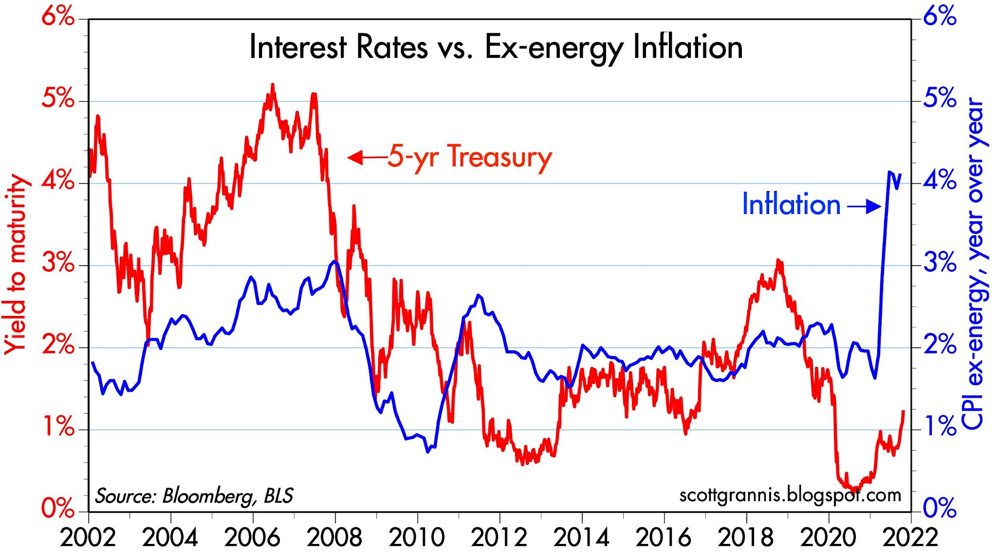
Chart #5

Chart #5 compares the year over year growth in the CPI (I'm being conservative with this) to the level of 5-yr Treasury yields. Yields haven't been this low relative to inflation since the 1970s. Recall what happened back then: millions of households made a fortune borrowing money at fixed rates and buying houses. Negative real interest rates cannot be sustained for long, mainly because of the incentives they create to borrow and buy. 

Chart #6

Chart #6 is an updated version of the one featured in Steve Moore's newsletter. It's important to note that the multi-decade trend rate of M2 growth is 6-7% per year. This has been blown away in the past 18 months. If the public tires of holding $3.8 trillion more in bank deposits than they normally would at this time, that's a tsunami of money that could float higher prices for nearly everything in the next year or so. It's also worth noting that M2 has been growing at a 10-11% annualized rate so far this year. 

What worries me the most right now is how this all sorts out. The Fed seems determined to avoid even the semblance of tightening for the next 12 months. Yet if inflation turns out to not be transitory as they currently expect, how long will it be before policy becomes tight enough to threaten the economy's health?
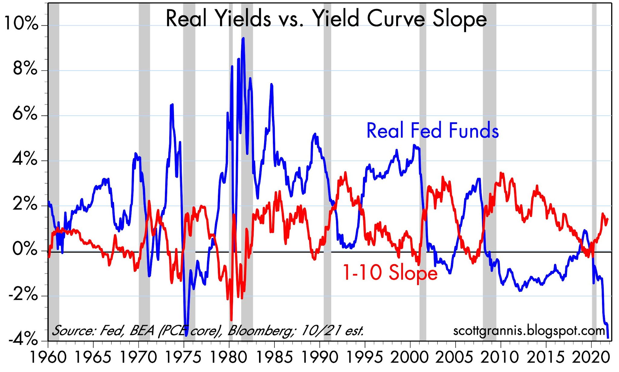
Chart #7

Chart #7 provides some historical context which may help answer that question. Note that every recession on this chart (shaded bars), with the exception of the last, was preceded by 1) a flat or negatively-sloped Treasury yield curve, and 2) a very high real Fed funds rate. Both of those conditions confirm the existence of very tight monetary policy that was intended to keep inflation pressures at bay. Neither condition is in place today, however, which strongly suggests that monetary policy poses no threat to the economy at this time.

Past Fed tightenings, however, were different from what a tightening would look like today. To really tighten policy, the Fed would have to 1) start raising the interest rate it pays on reserves, and 2) start draining reserves by selling bonds. It might take years to get rid of all the excess reserves, however, and no one knows for sure how the economy will respond to higher short-term rates in the presence of abundant reserves—that's never happened before. In the past, the Fed simply drained reserves until they were in such short supply that the banks were willing to pay ever-higher interest rates in order to acquire enough of them to collateralize their deposits. A scarcity of reserves led to a liquidity shortage, and high real borrowing costs led to bankruptcies and weak investment. Eventually, economic growth ceased, and the inflation cycle was broken. 

The dilemma for investors: we might be years away from a return to these conditions, so selling risky assets right now might be premature. And, by the way, holding cash is a guaranteed way to lose money. But how long can you wait, knowing that another economic collapse looms on the horizon? 

In the meantime, the prospects for Biden's Build Back Better lollapaloosa are declining by the day, thankfully, and the spreading disarray in Washington only makes that more likely. I'm willing to bet that if any of his bills survive, it will be in greatly reduced form, and thus much less damaging to the economy. Just letting the economy sort things out on its own would be a great relief to everyone, in my view.

Nobody said investing was easy. There are a lot of things to worry about these days. But I wouldn't panic just yet. The next year or so might be likened to watching a train wreck in slow motion.

Tuesday, October 5, 2021

Important charts to watch


We're in the midst of what is so far a moderate selloff in the equity market. And as usual, in such circumstances (at least in the past decade or so) there is no shortage of bad news. China is ramping up its military threat to Taiwan, Congress is struggling to pass damaging tax hikes and massive and wasteful social spending, equities have soared by almost 550% since their March '09 bottom, 10-yr Treasury yields have jumped by 30 bps in the past two months, the Fed is about to start tapering it bond purchases, Biden's popularity is plunging, and our southern border is being overrun. In the background is the growing sense that we don't know if anyone, even Biden, is in charge. That in turn contributes to a global policy vacuum which our rivals and enemies are unlikely to ignore. 

That's an uncomfortably long list of things to worry about—no wonder the stock market is uneasy. Indeed, it's a wonder it has done so well of late.

I won't pretend to be able to predict whether now is a good time to buy or not. But I can offer some charts and thoughts which are reassuring in the sense that they offset at least some of the bad news, and also because they are not being talked about much these days (the things the market is overlooking can often be very important). Meanwhile, I'm pretty sure that inflation is going to be a lot higher for longer than the Fed currently predicts, and the eventual realization that we have an inflation problem (sometime next year?) will pose a threat to the economy because it eventually will lead to some serious Fed tightening. That just so happens to be the scenario that has preceded every recession in my lifetime save the last one (which was entirely the fault of Covid and politicians' overreactions to it). 

Chart #1

Chart #1 shows the level of M2 less currency in circulation. It's the total of all the retail bank savings deposits and checking accounts, plus a small amount of retail money market funds. This is money that the public has socked away, and it is money that is easily spendable. What we see here is a shocking and totally unprecedented increase in the money supply immediately following the Covid lockdowns. The amount of spendable money in the economy is almost $4 trillion higher than it would have been had the money supply grown at its long-term rate of about 6% a year. Notably, the Fed's three waves of Quantitative Easing in the 2009-2018 period hardly register on this chart. It's remarkable indeed that this explosion of money (a REAL BIG quantitative easing!) is hardly mentioned in the press these days.

It's hard to see the economy stumbling when liquidity is super-abundant and borrowing costs are incredibly low. It will take a looonnng time for those conditions to reverse.

Chart #2

I didn't just make up the 6% growth rate shown in Chart #1. Chart #2 shows the same 6% growth rate trend going all the way back to 1995. For the past year, M2 has grown by about 12%, and the annualized growth rate of M2 over the past three months has been about 12% as well. Money continues to grow about twice as fast as it ever has before! It's hard to imagine, given this explosion of money, that the inflation we've seen so far this year is going to prove transitory. This is a big deal that is not getting much news. For more color on how inflationary psychology works, see my post from last June on my experiences with inflation in Argentina.

Chart #3

Chart #3 is one of my all-time favorites, since it makes clear that every recession in modern times (except for the last one) has been preceded by a prolonged period of Fed tightening. The blue line is the real Fed funds rate (the Fed's policy target minus the year over year change in the Core PCE deflator). Note that it rises to at least 3-4% just prior to every recession but the last one. This is the best measure of how "tight" Fed policy is, because high real interest rates equate to very expensive borrowing costs; the Fed raises this rate in order to discourage banks from lending and to discourage the public from borrowing—this results in a shortage of liquidity and that in turn puts downward pressure on inflation. The red line is the slope of the Treasury yield curve from 1 year to 10 years. Note that it falls to zero or less just prior to every recession. A flat to negatively-sloped yield curve is the bond market's way of saying that Fed policy is so tight that it threatens the economy; that will eventually force the Fed to ease in the future—thus making long term interest rates lower than short-term rates.

In the meantime, even if the Fed finishes its tapering and starts raising its target funds rate well before anyone currently expects them to, they will still have to counteract the super-abundance of bank reserves. In the past, Fed tightening meant a shortage of bank reserves and a general lack of liquidity–conditions that proved lethal to over-extended borrowers. It would take extraordinary measures and a lot of time for those conditions to return in the future. So the threat to the economy of Fed tightening today is not nearly as imminent as one might think based on past experience. 

Chart #4

Chart #4 compares the price of gold (blue) to the 3-yr forward yield on eurodollar futures contracts. This latter is a good proxy for what the market expects the Fed's target overnight rate to be 3 years in the future. There is a strong inverse correlation between the two (I've plotted the eurodollar yield in inverted fashion). When the Fed is expected to ease in the future, gold prices tend to rise. Today, the market is pricing in future Fed tightening, and gold is declining. Gold today is not reacting to rising inflation; on the contrary, it is reacting to the expectation that the Fed will eventually have to tighten policy in order to rein in inflation. Flat to falling gold prices today suggest the gold market is pricing in a future of Fed tightening and an eventual return to lower inflation. 

Chart #5

Chart #5 shows the inflation-adjusted price of crude oil futures contracts. This price has averaged about $55/barrel for the past 47 years. Today, crude is trading just under $70/barrel. The big jump in crude prices in the early 1970s was triggered by Nixon's decision to take the dollar off the gold standard. Both gold and crude prices (and nearly all other prices) rose following this effective devaluation of the dollar. 

Chart #6

Chart #6 shows the ratio of gold prices to oil prices. This ratio has averaged about 20 (i.e., one ounce of gold tends to be worth 20 barrels of oil. Today the ratio is in the mid-20s, which suggests that oil is somewhat cheap relative to gold. In any event, gold and oil prices seem to be in rough equilibrium these days, and neither one is out of line with historical experience.

Chart #7

Chart #7 shows the level of capital goods orders in both nominal and real terms. Capital goods orders are a good proxy for corporate America's confidence in the future: more orders mean greater productivity for workers in the future. Business investment hasn't been this strong for many years (but it was even stronger in the late 1990s). Strong business investment today suggests a stronger economy in the years ahead. This is a very optimistic sign, and good evidence that we are not facing a future of stagnant economic growth. We may have a lot of inflation, but the economy is still likely to grow. High inflation is eventually destructive of an economy's growth potential, but that might take years to play out. In short: in may be premature to worry about "stagflation."

Chart #8

Chart #8 is very important, since it shows how inflation expectations are built into bond prices. The green line is the difference between the yield on nominal and real 5-yr Treasury notes, and thus it is the market's explicit expectation of what consumer price inflation will average over the next 5 years (currently 2.7%). That's near the high end of historical experience, which tells us that the bond market is only just beginning to believe that the Fed is wrong to predict that the current spurt of inflation will prove transitory. It also tells us that if future inflation expectations rise to the 4-5% level that exists currently, the bond market will have an awful lot of painful adjustment to endure (e.g., nominal yields will have to rise significantly and/or real yields will have to hold steady or fall). 

Chart #9

Chart #9 compares the level of housing starts (blue) with an index of home builders' sentiment. Sentiment tends to lead starts, not surprisingly, so the current level of sentiment points to continued strength in the housing market. One reason home prices have been so strong of late is that the nation has acquired a meaningful housing deficit after the collapse of new home building which began in 2006. It could take years to make up for this. The major risk facing the housing market today is rising mortgage rates, which are currently still incredibly low (~3% for 30-yr fixed rate mortgages). Borrowers may well be intimidated by soaring home prices, but the prospect of borrowing cheap money in a rising inflation environment is very appealing. What we are seeing today (rising housing prices and cheap borrowing costs coupled with rising inflation) is a virtual replay of what happened in the 1970s. Recall that mortgage rates eventually topped out at double-digit levels in the early 1980s. 

And by the way, it took the Fed quite a few years to break the back of double-digit inflation back in the early 1980s.