Wednesday, September 30, 2009

The employment outlook is improving (2)


Here's another update of the chart I first showed last month, comparing monthly changes in jobs according to both the Bureau of Labor Statistics and the folks at ADP. The ADP data for September were released today, and although they were not quite as good as expected, the numbers for the prior two months were revised upwards (to show fewer losses). The picture we get is the same, however: the economy is still losing jobs, but at a declining pace. At the current pace, the economy isn't like to actually start adding jobs on net until late this year or early next year.

While this sounds like painful progress, it is nevertheless a recovery, and of the V-shaped variety, as the chart shows. Earlier this year we were losing about 750K jobs a month, and now only about 250K.

Tuesday, September 29, 2009

Consumer confidence is slowly rising


The consumer confidence index dipped in September, and was disappointing relative to more optimistic expectations. Is this a good reason for the equity market to slump and for T-bond prices to rise? Not in my view.

This chart puts the latest move in perspective: you can't even seen the September dip. The big-picture story that is slowly playing out is one of recovery from the extremely low levels of confidence that accompanied the February plunge in equity prices. No index moves in a straight line, and no recovery is unmarred by periods of doubt. I think you have to look past minor setbacks such as this. Things are a whole lot better today than they were last February. There is still room for lots of improvement, to be sure, but that will come with time.

More signs of a housing bottom


The Case Shiller Home Price has risen for the past three months. In fact, it rose at a 15% annual rate over the past three months, and the August value of the index was higher than it was last February. In real terms, the index has fallen almost 35% from its peak, and is back to levels first seen in March 2002. The housing bubble has popped, and could indeed be beginning to reflate.

This is very bullish news for financial markets, because it means that the health of the world's banks, and that of any financial institution which holds a significant position in mortgage-backed securities, has improved significantly. Take away the risk of falling housing prices, and you immediately improve the valuation of securities backed by residential mortgages. In addition, you improve the prospects for household net worth and consumer confidence.

Of course, many people still worry that this is not a real bottom in housing, because there is a wave of foreclosures yet to come. I think that prices have fallen by enough to stimulate demand, especially considering that mortgage rates are very near all-time lows. Housing affordability, both in nominal and real terms, has improved hugely, enough to mark a bottom, in my estimation. Demand has improved enough to absorb the wave of foreclosures.

Monday, September 28, 2009

New York bound

I'm on my way to New York this morning to spend a week with our daughter. Blogging will probably be a bit on the light side. Not much timely news until the jobs data on Friday.

Sunday, September 27, 2009

Monetary policy update


As the first chart shows, the Fed has continued to practice "quantitative easing" to the max, as of the most recent data (Sep. 23). The monetary base today is essentially as big as it's ever been. The second chart, which comes to us courtesy of the Wall Street Journal, shows what the Fed has been buying in order to expand the monetary base. As the chart shows, the Fed has been gradually winding down things like TALF, Commercial Paper Facilities, and Central Bank liquidity swaps, as it has been gradually expanding its holdings of Mortgage-backed Securities, Agencies and Treasuries.

Interestingly, Treasury holdings today are almost the same as they were in late 2007. They fell last year as the Fed frantically sought to satisfy the world's demand for Treasury securities. When its holdings of Treasuries became seriously depleted, quantitative easing became the only remaining remedy. By the looks of things (a weak dollar, $1000 gold, rising commodity prices, and an expanding economy) they have done at least what the market was asking for, if not more.

This massive expansion of the monetary base, fueled these days by direct Fed purchases of Treasury, Agency, and MBS, remains the most potent argument in favor of a significant rise in inflation in coming years. That it has not yet shown up as higher measured inflation is probably due to the long lags that occur between monetary policy actions and when they finally impact the economy. Nevertheless, these two charts are among the most important things to keep an eye on.

Many, including most Fed governors, fear that an early reversal of quantitative easing, which would undoubtedly require higher short-term interest rates, might jeopardize the economy's nascent recovery. I think it makes more sense to worry about what might happen if the Fed waits too long. I seriously doubt that this economy is so fragile that it can't support short-term interest rates of at least 2-3%. I really worry that an inflationary error from the Fed at this point, which would weaken the dollar and undermine confidence in the U.S. economy, would do far more damage. Far better to pursue a path that builds confidence in the strength of the dollar, rather than gambling everything to boost the economy. Monetary policy was never designed to be a tool for raising or lowering the economy's growth rate.

Friday, September 25, 2009

The early 1980s recession was much worse than today


This is a great chart put together by Mark Perry of the Carpe Diem blog. The unemployment rate today is almost as bad as it was in the early 1980s, but by many other standards this recession has been a far less problematic. Double-digit inflation and interest rates in the early 1980s presented a huge challenge to the economy, yet we survived. See Mark's comments on the subject here.

Mortgage rate update--the deal of a lifetime


Rates on 30-year fixed rate mortgages are only 0.5% above their all-time lows, and the Fed recently reiterated its intention to buy another $700 billion of agency and mortgage-backed securities over the next six months. (They've already bought about $800 billion this year, and plan to buy up to $1.45 trillion by March of next year.) Whether Fed purchases of MBS are causing borrowing rates to be lower than they otherwise might be is an issue over which reasonable men can disagree (I don't think they do, but there are many who would disagree with me). Regardless, the Fed's actions promise to ensure that there will be no shortage of money available for those wanting to finance the purchase of a home at historically low interest rates, at a time when prices in many areas of the country are sharply lower.

If this isn't nirvana for homebuyers, I don't know what is. Interest rates are virtually at rock-bottom lows, money is plentiful*, and prices in many areas are back to levels we haven't seen for over six years, according to the Case-Shiller home price indices.

Yet many people are still worried about a coming wave of foreclosures. I don't get it. I think the public is smart enough to figure out that we have the makings here of the deal of a lifetime. It's not at all surprising to hear of bidding wars for foreclosed properties. And it's not surprising that homebuilders' stocks have more than doubled from their lows, and that existing home sales have risen to a 2-year high.

* Jumbo mortgages are not as easy to get these days as they used to be, because banks are requiring down payments of up to 30%. But if you can meet the down payment requirement, you should have no trouble getting a loan.

UPDATE: This is completely anecdotal, but very interesting: On Friday I spoke with a good friend who is one of the heads of a well-known design/construction firm specializing in remodels in the San Gabriel Valley, and he mentioned that his business turned up significantly starting about 8 weeks ago. A lot of customers had put things on hold last year due to all the uncertainty, but now with the economy doing a little better and the market up, people are reconsidering. Business had brightened so much, in fact, that he had just rehired the two architects he laid off last year.

Thursday, September 24, 2009

Household financial burdens ease


This chart includes recently-released data through June '09. As the dotted green lines suggest, households' debt service and total financial burdens (i.e., payments as a percent of disposable income) have not increased at all since the end of the 2001 recession, and they have even eased a bit over the last year. This is not to say, of course, that many households haven't been ruined by excessive debt obligations (bankruptcy rates are unusually high), because indeed they have. But it does suggest that, in aggregate and on balance, household financial conditions are not at all precarious, and have not changed meaningfully for quite some time.

Housing market continues to improve


A modest downtick in existing homes sales in August (barely visible in the third chart above) was the reason that the market sold off today, according to a Bloomberg headline, but I think that's a stretch. As all three of these charts show, there has been a distinct turn for the better in the housing market. The months' supply of unsold homes has dropped significantly, thanks mainly to a pickup in sales activity, and the vacancy rate of homes nationwide as dropped, although the rate is still among the highest ever recorded.

Credit default swap spreads are narrowing (5)


Another update on this measure of corporate default risk. This chart shows the spreads on generic, 5-year credit default swaps, a proxy for the level of default risk associated with the 5-year debt of companies rate investment grade and below investment grade (junk). Corporate bonds have enjoyed fabulous performance this year as spreads have plunged. The import of all this is that the market is realizing that the economic outlook is much brighter now than it was at the end of last year, and thus the likelihood of defaults is much lower. Easy money also has played a role here, since easy money greases the cash flow wheels and makes it easier for borrowers to service their debt. Even with the huge decline in spreads, however, they remain at levels that in the past would have been consistent with a recessionary environment. So the message of spreads is this: at the end of last year the market was expecting nothing less than a true economic calamity to occur; now it is merely expecting a nasty recession.


This next chart shows the difference between investment grade and junk spreads. This too has declined hugely, but remains at levels that in the past would have signaled considerable economic distress. If you think that the prospects for an economic recovery are at least decent, then corporate bonds still offer attractive valuations

It is very important for equity-oriented investors to pay attention to corporate credit spreads. Analyzing default risk is different from stock-picking, to be sure, but in the end corporate bonds and stocks are part of the same capital market. You can't have one priced to a fabulous outlook for the economy without the other largely in agreement. In this case, while the pricing of corporate bonds has improved dramatically, they still reflect an unusually high degree of risk and uncertainty. I think this gives us a strong clue that equity market pricing is definitely not overly optimistic and most likely very cautious if not cheap. There's still a lot of bad news priced into stocks and corporate bonds. 

Wednesday, September 23, 2009

FOMC wimps out again

Not surprisingly, the Fed continued to ignore the value of the dollar, and it fell in the wake of the FOMC announcement today. The Fed did acknowledge that the economy is picking up, however. But despite all the encouraging signs out there, they will continue with their plan to buy over a trillion dollars of mortgage-backed securities, albeit at a somewhat slower pace.

So the market continues to bid up stocks, since the outlook is less grim than previously thought, and continues to bid up Treasuries, since the Fed has given no indication that it will raise short-term interest rates anytime soon. The Fed's promise to keep rates low for a long time, coupled with the steepness of the yield curve, is a powerful incentive for the market to buy 10-year Treasuries, even if easy money and a weaker dollar continue to fuel inflation pressures.

Fear subsides, prices rise (12)


A quick update to this chart which I have shown at least a dozen times in the past year. The VIX index hasn't been as low as it is today for over a year, which was right before the Lehman disaster. Slowly but sure the market is recovering its balance, and investors are regaining their confidence. It's not surprising then that the equity market keeps making new highs for the year. This is a virtuous cycle and is likely to continue, even though ever-higher prices on equities seem to increase some investor's fear that a correction is right around the corner.

Dollar nearing a critical level


This chart is arguably the best way to look at the dollar's value vis a vis the currencies of our trading partners, because it uses a very large basket of currencies and makes adjustments for cross-border inflation differentials. As you can see, the dollar is about 7% above its all-time low, a level that has provided solid support three times in the past.

In today's world of floating currencies, almost every currency rises and falls against other currencies at one time or another. But a currency that is persistently weak or continually falling relative to others presents a problem. If the dollar's value were to continue to fall to new lows, eventually this would trigger rising inflation pressures. Indeed, supply-siders usually assume that any significant decline in a currency's value (particularly against gold) is a sign of easy money and therefore rising inflation risk. That's because inflation can be defined as the loss of purchasing power of a unit of currency.

Weak and falling currencies are also bad for growth, since they scare away investment. Who wants to invest in a country if there exists the real possibility that one's investment will be eroded by a falling currency? At the very least investors require special incentives (i.e., premiums) to invest in an economy with a weak currency.

Weak currencies are symptomatic of a variety of factors: easy money, weak economic growth prospects, lack of confidence, weak currency demand, and bad fiscal policies (e.g., wasteful spending, high tax rates). Strong currencies, on the other hand, typically reflect tight monetary policy, strong growth prospects, confidence, strong currency demand, and good fiscal policies.

So as the dollar nears its all-time low and the Fed is concluding its deliberations, the world wants to know what the Fed thinks about the weak dollar. If the Fed is unconcerned about the dollar because it is only worried about engineering a recovery, that will be bad news for the dollar and it will likely test its lows.


This next chart compares the dollar to the euro (it goes back in time by using the DM as a proxy for what the euro would have been worth). The green line represents the inflation-adjusted level of the exchange rate that would theoretically make prices in the U.S. and Europe roughly equal. Again we see that the dollar is with 5-10% of its all-time low (1.60) against the euro.

I'm guessing that the Fed is not going to make a fuss over the dollar, and that it will therefore continue to decline. But before too long, either the Fed will have to pay attention or the world will suddenly come to reasses its opinion of the U.S. economy and the Fed's monetary policy.

At this point I doubt that the dollar will make new lows, even though there is no shortage of problems weighing on the dollar: easy money, bad fiscal policies, falling dollar demand (i.e., rising money velocity), weak growth prospects, and a general lack of confidence. I'm inclined to be a contrarian when everything seems pointed in the same direction and valuations reflect an extreme.

There are two things that could turn the dollar around at this point, and I would expect to see one or both surface before the end of the year: 1) a Fed that becomes concerned over the dollar's weakness, and is thus willing to tighten policy sooner than expect, and/or 2) a growing perception that the U.S. economy is not as weak as so many seem to think. (This latter development will rebound to the first, since a stronger-than-expected economy would give the Fed plenty of cover to tighten policy.) I see plenty of signs that the economy is doing better than most people give it credit for, and I see no reason the economy can't grow at a 3-4% rate for the next few years.

Monday, September 21, 2009

Oil factoids


It's been awhile since I've posted anything on the energy market, and I happen to have some interesting charts on the subject to share. This first chart is the real (in constant 2009 dollars, per the PCE deflator) price of crude oil going back to 1960. Oil has been trading around $70 for the past 3 months, and there is lots of talk about how inventories have risen and demand is on the verge of weakening, and thus we could see a big decline in oil prices soon. I'm not an expert on oil, so I don't have any strong views one way or another.

But I would note that oil today is almost as expensive as it was in the early 1980s. It stayed up at these levels for a few years, then it came crashing down and remained relatively cheap from the late 1980s to the late 1990s. The reasons for the big drop in oil prices were simple: the economy became more energy efficient, and world oil production increased. High prices do indeed work to bring prices down over time, though sometimes it takes many years for this to play out.


This next chart shows the percentage of personal consumption expenditures that is devoted to energy goods and services. Note that spending on energy was exceptionally high in the early 1980s, when oil was about as expensive then (in real terms) as it is now. Yet today, consumers are spending about half as much of their budget on energy as they were in the early 1980s. This is truly remarkable, and one reason that we are able to spend so much more of our budgets on healthcare.

This next chart shows why it is that energy consumes so little of households' budget. Simply put, it takes about half as much energy to produce a unit of output today as it did in 1980. Our economy has become far more energy efficient, thanks to technological improvements in fuel efficiency changes in consumers' buying habits (e.g., smaller and more fuel efficient cars, etc.).


The last chart shows how remarkable all of this is. Despite the fact that the U.S. economy has more than doubled in size since 1980 and the population has increased by some 35%, we consume about the same amount of oil today as we did back then. That's a truly remarkable fact: U.S. oil consumption has not changed on balance for the past two decades.


This collection of facts tells me a few things. For one, it will likely be very difficult for the U.S. to increase its energy efficiency as much in the next 20 years as it did in the past 20 years, regardless of whether we impose some form of carbon tax on ourselves. That's because there is likely a limit to the efficiencies that can be wrung out of oil-based energy technology—surely we have picked much of the low-hanging fruit already. Two, while energy is still quite expensive in real terms today, it represents a relatively small part of households' budgets; thus households don't have as much incentive to become more energy efficient today as they had two decades ago. Thus, a carbon tax might have to be punitive in order to produce the desired effect, and that in turn would have very negative (and politically undesirable) consequences for the economy. Finally, all of this illustrates that the free market is able to respond rather dramatically—given time—when rising prices signal a relative shortage of some key commodity like energy.

Leading Indicators confirm recession end


I don't pay much attention to the "Leading Indicators" because they never tend to lead by much and can sometimes be mis-leading. But as this chart of the year over year change in the Leading Indicator index shows, it's pretty clear that we have come out of a recession. It also suggests that this latest recession was nowhere near as bad as the recessions of '70, '74, '80-82. Reasonable men can disagree on that, on course, but the economy has for quite some time been showing signs of recovery, and this news just makes it official.

Honduras update

As Mary Anastasia O'Grady at the Wall Street Journal has consistently pointed out, the U.S. government is incorrectly calling the ouster last June of Honduran President Zelaya a military coup. In fact, he was exiled from the country for an offense and in a manner that is specifically spelled out in the country's constitution. As she notes in her article today, our own Congressional Research Service now agrees: "Available sources indicate that the judicial and legislative branches applied constitutional and statutory law in the case against President Zelaya in a manner that was judged by the Honduran authorities from both branches of the government to be in accordance with the Honduran legal system."

To my great dismay and even shame, her article also points out that the Obama administration persists in trying to pressure the Honduras government to reverse its decision despite its constitutionality. Earlier it suspended hundreds of millions of foreign aid, and now our State Department has revoked the visas of all 15 members of the Honduran Supreme Court.

Given Zelaya's known ties to Venezuela's Chavez, it seems clear to me that Obama is a better friend of Latin dictators than he is of Latin democracies.

Friday, September 18, 2009

Why the bond market is so complacent

This issue—why T-bond yields are so low with gold over $1000 and the dollar falling and commodities rising—seems to be a hot topic, so I thought it worthwhile to repeat and clarify my views. I had a post on the subject last week, but here is another shot at making things more concise:


From a supply-side perspective, gold at $1000/oz. is clearly indicating rising inflation pressures. So is the rise in most commodity prices, and the weakness of the dollar. All suggest the Fed is oversupplying dollars to the world and that will eventually show up as higher inflation.

Meanwhile, equities are rising, suggesting the economy is recovering.

Why is the bond market so complacent, with 10-year Treasury yields at 3.5%, in the face of these facts?

Answers:
1) The bond market has never been very smart about inflation, and neither has the Fed. Everyone underestimated inflation throughout most of the 1970s, and everyone overestimated inflation throughout the 1980s and 1990s. 

2) All the internals of the bond market are consistent with the view that inflation is not a problem. TIPS spreads today say inflation will be 2-2.5% for the foreseeable future. Short-term rates say the Fed will keep rates at close to zero for a long time. 10-yr yields are very low from an historical perspective, consistent with the economy remaining weak and inflation remaining low.

3) The widespread belief in the Phillips Curve theory of inflation (which says that economic weakness leads to falling prices) explains why the bond market and the Fed are complacent: the economy is perceived to be so weak that inflation is almost impossible. 

4) Although stocks are way up and credit spreads are way down, that is not necessarily an indication of a strong economy or a recovery. Credit spreads are still wider today than at the peak of the 2002 credit wipeout. Equity prices have only recovered to levels first seen over 10 years ago, despite the fact that corporate profits (according to the NIPA data) are much higher. So credit spreads and equity prices are consistent with a view that the economy is going to be very weak and a double-dip recession is a real threat. The improvement in spreads and equity prices is due mostly to the fact that the economy appears to have avoided a catastrophic depression/deflation.

5) The 2-10 spread is about as wide as it gets. That shows the bond market is not completely stupid, since lots of Fed tightening is priced in over the next 10 years. But with the Fed insisting that they will keep rates at zero for a very long time, the curve is about as steep as it can get for now.

6) You don't need to rely on Fed purchases of Treasuries and MBS to account for the apparent complacency in the bond market. (In other words, Fed purchases have not kept interest rates artificially low by any meaningful amount.) All of the observations above seem internally consistent. There is no sign of mispricing in the bond market. MBS spreads are perfectly average. Credit spreads are still very wide, suggesting a very weak economy. A very weak economy supports the Phillips Curve belief that inflation is almost impossible, supporting the low level of bond yields.

7) So the Fed is really the key. If the Fed is not concerned about inflation (and they aren't because of the Phillips Curve), then the bond market isn't.

But that doesn't make the bond market right.

It's getting better all the time


The world is getting back to normal at the pace of about $1 trillion per week these days. Not bad! The market cap of global equity markets is now about $44 trillion, up $18 trillion (72%) from the March lows.

Household Net Worth stabilized in Q2/09


The Federal Reserve recently updated its Flow of Funds data, which includes the very interesting stuff summarized in this chart. From my perspective, the most important news in the latest report is that the decline in household net worth, which began in early 2008, was reversed in the second quarter of this year. Thanks, largely, to the rise in the equity market, but also to the stabilization of the real estate market.

It's been a painful recession, with households losing about $10 trillion in wealth, but it's over. Debt ratios are up, but households are now beginning to deleverage. So we have weathered the storm, and the healing process is underway.

Thursday, September 17, 2009

The storm has passed

I've changed the banner picture on the blog, after just over a year of using a photo that was shot (by my son-in-law) just after a storm. I thought the stormy picture was appropriate given the extreme degree of stress in the markets at the time. It's now clear to me, and I think to many others (but certainly not all, especially those who think that 3.5% yields on T-bonds represent an attractive proposition) that the worst of the economy and the markets has passed. A return to normality may still be a ways off, but it is not so far off that it's impossible to see. So it's time for a photo of the beach that is representative of what it looks like most days. It's not as exciting as the stormy photo, but it is more tranquil, as I hope the markets will be in the coming year.

Unemployment claims continue to decline slowly


Claims continue their slow but relatively steady descent from the highs of last March. At this rate we might see claims back to some "normal" level by perhaps the fourth quarter of next year. The unemployment rate is unlikely to go much higher than it already has, but it is not going to drop significantly by the time elections roll around next year. Another "jobless recovery" is likely to be one of the election memes.

Wednesday, September 16, 2009

Emerging markets stage a dramatic comeback (2)


Measured in dollars, Brazil's stock market has rebounded 164% since its lows of last November. I've highlighted this chart several times in the past, remarking that the outlook for emerging market debt and equity was very promising. So far that advice has been spot on. One key to the emerging market economies' recovery is easy money. Easy money helps push commodity prices higher, and it helps weaken the dollar. Both of these result in a big rise in cash flows for these economies. Another factor is that they suffered terribly in the crash last year, so their rebound should be stronger. Yet another, which is relatively unremarked, is that for the most part these economies enjoyed better monetary policy than the U.S. did in the years leading up to the crash. Most emerging market currencies appreciated significantly relative to the dollar because of better monetary policy. Without the easy money-goosed speculation in real estate markets, their economies weren't so damaged in the crash. They suffered mostly from a big drop in commodity prices, but that problem has faded fairly rapidly with the return of easy money. Finally, I would say that one reason these economies had better monetary policy was because they have managed (with some exceptions, notably Argentina) to mature at the fiscal policy level. Policies have been generally more stable and more respectful of the power of free markets than they have been in the past. When you introduce stability and maturity to an economy that has struggled for years only to keep falling behind the progress in the industrialized world, you have the potential for some spectacular growth catch-up, and that is what we are seeing now.

Full disclosure: I am long EMD, CHN, and SLAFX at the time of this writing.

Putting the equity rally in perspective


The rally that began just over six months ago has lifted the S&P 500 by a powerful 58%. Quite exciting, and I'm happy to have been bullish all the way. I thought it might be appropriate to put this rally into a long-term context with this chart. The trend lines (which represent 8% annualized growth) seem to make sense given the 6.8% annualized growth in nominal GDP over this same period. The only points I'm trying to make are 1) it doesn't seem like stocks are even close to being overvalued at these levels, and 2) there is a lot of upside potential from here.


In response to one of the comments on this post, I've drawn a different trendline on this chart, using as a slope the annualized rate of growth of GDP over the 60 period represented in the chart. I did this because in my response I asserted that stock prices should tend to grow at the rate of GDP over time. Sometimes they grow faster, sometimes slower. The divergences from that line could be a way of measuring whether stocks are "rich" or "cheap." Food for thought.

Housing bottom in place


Too different views of the state of the residential real estate market both suggest rather strongly that we've see the bottom. The top chart is a survey conducted by the National Assoc. of Home Builders that covers current sales rates, 6-mo. sales expectations, and traffic of prospective buyers. The second chart is a cap-weighted index of the stock prices of 18 leading home builder stocks. More good news and yet another sign that this is a V-shaped recovery. Residential construction spending had fallen 64% from the highs of early 2006, so the rebound from exceptionally low levels could be quite impressive from a percentage change standpoint, if not from an absolute dollar standpoint.

Roadblocks to healthcare reform


Medical roadblock: A recent Investor's Business Daily poll reveals that the nation's doctors are not at all enthusiastic about Obamacare. Fully 45% said they would consider leaving their practice or taking early retirement if the plan passes; 71% do not believe the administration's claims that more people can be covered with cheaper and better quality care.

Legal roadblock: Where in the Constitution does the federal government get the authority to require that all citizens purchase health insurance? Someone ought to be preparing to challenge the constitutionality of this plan, should it pass.

I note that according to online betting at Intrade, the odds of a government healthcare plan passing before year end have dropped from 50% in June to less than 20% today. There are just too many problems with this plan, and it is a relief to see that the public is coming out against it. What's bad news for Obama ends up being good news for the economy and the markets, since we are on track to have less government in our future than the market feared only a few months ago.

UPDATE: The constitutionality of the federal government requiring people to buy health insurance or else pay a penalty is highly questionable, as noted in this article by David Rivkin and Lee Casey.

U.S. exports are rebounding (6)


August data covering outbound container shipments from the ports of Los Angeles and Long Beach continue to support the case that U.S. goods exports are rebounding quite strongly after last year's collapse. Container data appears to lead official trade data (the blue line) by a few months, so this means we should be seeing stronger export numbers as the year progresses. This is another sign that we have a V-shaped recovery underway.

Tuesday, September 15, 2009

Best article I've read in ages

This article by Jeffrey Lord, "Media Malpractice: Tom Brokaw's World Implodes," is an absolute must read in my opinion. It is so well written, and so accurate, that I am in awe. The age of Old Media is passing before our eyes, and the internet is ascendant. The world will never be the same.

P.S. The article is long, but well worth your time.

HT: Lynn

P.P.S. For those whose interest was piqued by the relationships between Mary Meyer, JFK, the CIA, and the press, check out this article. I don't think you can make this stuff up; it's worthy of a spy novel. HT: Ashby Foote

Medicare and Medicaid plan to ration heath care

There is a big debate about whether or not a universal healthcare plan such as Obama is proposing would result in the government deciding to ration health care services. To me it's obvious that a government takeover of healthcare would result in rationing: how can you make something universally available at a fixed cost without shortages developing? If you don't allow prices to rise, you will have to cut back on services rendered.

Well, it's already happening, as noted in this article: "Medicare facing cancer, cardiac care cuts." Excerpts:

If enacted as scheduled on Jan. 1, 2010, policy changes recommended by the federal Centers for Medicare and Medicaid Services (CMS) -- the government's insurer for the elderly and disabled -- will severely cut current Medicare reimbursements to cardiologists and oncologists for critical care services that are provided to patients in physicians' offices or other out-of-hospital setting, such as chemotherapy to treat cancer, and various cardiac procedures to monitor and treat heart disease, such as nuclear imaging and heart catheterization.

These cuts will force cardiologists and oncologists to limit care to their Medicare patients, withdraw from treating Medicare patients altogether or require their patients to pay more out of pocket to make up the difference in the cost of these services.

The changes certainly will force the closing of outreach clinics in rural areas, leaving many people without easily accessible cardiac or cancer care.

The policymakers at CMS, who base their decisions on numbers and statistics, are unilaterally and dramatically changing the delivery of heart and cancer care by proclaiming that care for heart disease and cancer is too costly, while treatment for other diseases has greater value.

HT: Glenn Reynolds

Rising money velocity drives the economy

Here's another update to this chart. I show it because it illustrates a point I made in my previous post, about rising money velocity being an important source of economic growth. Rising money velocity is the flip side of falling money demand. When demand for the dollar falls, the dollar weakens unless the Fed takes steps to offset the decline in demand. That's the case today. Money demand is falling (because we know money velocity is rising), and the dollar is falling as well because the Fed remains extremely accommodative. As money gets spent instead of being stored under mattresses, economic activity picks up. It's "payback" for the surge in fear and trembling which tanked the global economy in late 2008. The economy is getting back on track, thanks to improving confidence and declining money demand. That's why the equity market is rising, because it realizes that the outlook for cash flows is improving.

No shortage of money (13)


A few readers have raised the issue of whether we should be worried about the negative growth of money and credit in recent months. M2 money supply has fallen about $70 billion from its March high, and total bank credit has dropped by almost $400 billion since its peak of last October. Despite these declines, my argument continues to be (this is the longest-running theme on this blog I think) that there is no shortage of money in today's economy, and therefore no need to worry that the economy is being starved of money and therefore at risk.

This first chart illustrates the sharp swings in M2 money growth over the past year. David Rosenberg worries that "the deflation in credit, wages and rent is a toxic brew." But when money and credit growth were surging in late 2008, he was even more bearish on the economy than he is now. The problem lies in taking things out of context. The recent slowdown in money growth should be seen as a reversal of the explosive growth of money in the Sep. '08 through Mar. '09 period. Money growth took off because of a surge in money demand which was accommodated by the Fed's ultra-easy monetary policy. That surge in demand was in turn a by-product of extreme fear that the global financial system was on the verge of collapse. Now that these concerns are fading, it is only natural that money demand should fall and money balances should shrink. And in any event, the year over year growth rate of M2 is still a very healthy 7.6%. Any faster and monetarists would start worrying about a big acceleration in inflation.


This next chart shows the velocity of M2 (how many times each dollar of M2 is spent per year). I've used reasonable estimates for the growth rates of nominal GDP and M2 in the third quarter: 5.6% and -3.3%, respectively. I've highlighted the uptick in velocity that these numbers reflect, which works out to an annualized rate of growth of about 9% in the current quarter. If money velocity continues to rise at this rate, then money balances can shrink by 3-4% and the economy can still enjoy 3-4% real growth. That velocity is now rising is a very important development, since velocity is the inverse of money demand. Money demand is falling, and money balances are getting spent, and that is a major factor pushing the economy forward.


This next chart shows M2 growth over the past 50 years. As should be obvious, money growth almost always picks up in advance of recessions and almost always slows down as the economy moves from recession to recovery. The current pattern of declining money growth is exactly what we should expect to see. Indeed, this chart suggests that money growth could slow a lot more and the economy could still enjoy healthy rates of growth.


Finally, this last chart shows the growth in Total Bank Credit over the past 15 years. I've estimated a trend growth line of 7.5% per year, which is a bit more than the 6% average growth in M2 over this same period, and just a bit slower than the 7.8% annualized growth in this series since 1973. What you see is that the slowdown in bank credit since last October is mainly "payback" for the unusually rapid growth in bank credit in the 2005-2008 period. One reason for the slowdown in bank credit is that banks have tightened their lending standards, and that is reflected in surveys of lending officers. Another reason is that a lot of people want to reduce their debt burdens these days; deleveraging is being actively pursued by individuals and corporations alike. Another reason is that government borrowing has surged and is displacing private borrowing. Taken in isolation, any of these reasons could be cause for concern, but in today's context it's not obvious that the economy is starved for money. Indeed, the growth in M2 money balances remains very healthy, and above all, the Fed remains extremely accommodative. The current level of bank credit outstanding is exactly in line with historic growth trends.

UPDATE: As supply-sider, I should add that while the availability of credit certainly facilitates growth, it is not essential for growth. Growth is not created by extending credit; growth is fueled by work, productivity, investment and risk-taking. The bulk of the credit extended in any given year comes not from newly-created money, but from money that has been earned by others and subsequently lent to borrowers.

Credit spread update


To back up my comments in the previous post, I offer this updated chart of option-adjusted spreads on investment-grade corporate bonds. Note that while spreads have literally collapsed from their year-end, all-time highs, they are have not yet declined below the peak levels reached in late 2002 at the height of the corporate bond market panic. At the time (October 2002), the market was terrified that the bankruptcy of Enron and WorldCom were harbingers of massive corporate defaults yet to come. Spreads reached levels then that were the highest seen since the Depression.

So the market feels a lot better today than it did at the end of last year. But by the standards of the recent past, the market is still priced to conditions that were considered terrifying.

Monday, September 14, 2009

Implied volatility update (2)

For the offer of a dinner in Chicago I probably won't be able to accept (no reason at this time to go there), I'm happy to provide this updated chart on the implied volatility of stock and bond options. And with it, to elaborate on my current investment thesis.

The story is still the same as it was a few weeks ago, except that vol has declined in both markets. Interestingly, declining volatility has been good for stock prices, but T-bond yields have drifted up a bit. The main point of this chart, however, is that while vol has dropped quite a bit from the all-time highs of the past year, the current level of volatility in both markets is still well above average and still way above the lows we have seen in the past two decades.

In my previous post I inferred that this relatively high level of nervousness and uncertainty was an outgrowth of the tensions that have shown up in sensitive asset prices. Stocks have been rallying for the past six months and commodity prices are up strongly across the board, suggesting that both the U.S. and the global economies are in recovery mode. Not everyone is prepared to accept this, however, and for a variety of reasons. Those who understand that the Keynesian stimulus that has been applied by the Democrats is more likely to impede the economy's progress rather than help it have real trouble seeing anything like a healthy recovery on the horizon. Those who worry about the coming wave of commercial real estate defaults, interest rate resets on mortgages, and the high unemployment rate, are convinced that this recovery is a false dawn that will soon be replaced by another slump. Those who think of inflation using a Phillips Curve model are urging the Fed to keep the pedal to the metal if only to forestall another slump. Still others worry that inflation is baked in the cake but that any attempt by the Fed to raise rates will kill the economy.

I think this adds up to an equity market that is still cheap and probably priced to another slump, and a bond market that is up against the limits (i.e., in terms of the steepness of the yield curve) allowed by the Fed's stated intention to keep short-term rates very low for a long time (see prior post for more details). I shouldn't leave out credit spreads, since while they have declined significantly, they are still at levels that in the past have been consistent with recessionary conditions; this also supports my contention that the equity market is still cheap.

The tensions in the market are likely to fade with time, as evidence accumulates to support either the growth case, the double-dip case, and/or the inflation case. In my mind, the sensitive and leading indicators strongly support the growth case (and have since late last year), while bad fiscal policy will act to limit growth to only 3-4%, far less than we might otherwise experience if all the stars were aligned correctly. Standing with the majority of supply-siders and Austrian economists (who are, however, in a distinct minority overall), I am fearful that the Fed is not going to be able to withdraw its liquidity injections in a timely fashion (and truth be told, it seems to me they should have already started), so I believe the inflation case will gradually reveal itself and hasten the day the Fed has to start raising rates.

And when they do, I won't be surprised to see that they are slow to react, and reluctant to tighten as much as they should, and that will add fuel to the inflation fires. That was the story of the 1970s in a nutshell, and it looks like history could repeat itself, although I doubt we'll see double-digit inflation like we did then. Nevertheless, as soon as the Fed or the market begins to worry about tightening, the bond market is going to be in for a very unpleasant shock. This may send some shock waves through the equity market, but if the Fed is even just a little bit close to doing the right thing, higher interest rates could be a very encouraging development, since they would reduce the degree of inflation uncertainty, improve confidence in the dollar, and enhance the outlook for investment. Higher bond yields in the midst of a recovery might also give legs to the argument that we should cancel what remains of the faux-stimulus plan and concentrate our efforts on limiting spending.

Market expects an easier Fed, despite signs of recovery


This chart shows the market's expectations for where 3-month Libor will be trading in September 2010. By subtracting 30 bps you get the approximate level of the market's expectations for the Fed funds rate over time; currently the market is expecting the funds rate to be about 1.0% a year from now. What strikes me about this chart is that short-term interest rate expectations have dropped  since the end of last year—the yield on the Sep '10 contract has declined from 1.9% then to 1.3% today—despite all the obvious signs of an economic recovery that have since emerged. This is one more example of the dichotomy that I mentioned in my post last Tuesday. Some things—like T-bond yields and short-term interest rate expectations—seem to be priced to a very dismal economic outlook and/or low inflation, while other things—like copper prices, gold prices, a weaker dollar, and swap spreads—reflect strength and a portent of rising inflation.

What follows is my attempt to explain how this all fits together.

At the end of last year the mood of the market was extremely pessimistic, fearing a combination of depression and deflation that would be more terrible than what happened in the 1930s. Since then, the Fed has taken extremely aggressive steps to eliminate the threat of deflation, with the result that monetary policy is now far easier than anyone could have imagined late last year. In addition, the Fed has taken pains to assure the market that policy will remain accommodative for a long time. Fed governors feel comfortable in projecting an extended period of low short-term interest rates given the degree to which the economy is operating below its capacity; this is the Phillips Curve thinking that I've referred to time and again, which can be summarized like this: as long as the economy has lots of idle capacity, then monetary policy needs to remain very accommodative in order to counteract the risk of deflation. Put another way, with a near-10% unemployment rate, the last thing we need to worry about is inflation. (Note: this is not my view, rather what I think is driving the market and the Fed's view of the current situation.)

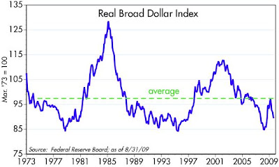
Looking back to the end of last year from today's vantage point, we see that on the margin, there has been a huge change in the market's perception of monetary policy. The market has shifted from expecting monetary policy to be so tight as to generate a prolonged bout of deflation, to now expecting policy to be easy enough to allow inflation of 2 – 2.5%. Such a dramatic easing of policy goes a long way to explaining why the dollar is weaker today than it was at year-end, and why gold is stronger: the supply of dollars has increased relative to what the market expected, and so the value of the dollar has dropped. It also helps explain why 10-year Treasury yields are up 135 bps over the same period, and TIPS breakeven inflation rates are up 160 bps.

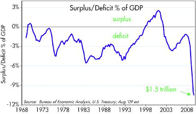
But why are 10-year Treasury yields still so low from an historical perspective? (They were only lower on a sustained basis during the Depression.) Why isn't the Treasury market pricing in a higher rate of inflation, given the Fed's massive easing of monetary policy? Why is the market still so apparently eager to buy Treasuries, knowing full well that deficits will be on the order of a trillion dollars or so for as far as the eye can see?

A good friend of mine, 
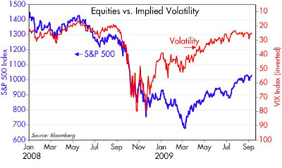
David Malpass, suggests that the dichotomy (relatively low Treasury yields versus rising equity and commodity prices) reflects a market that is investing for two extremes (a "barbell" trade), trying to protect against inflation and deflation at the same time. Buy Treasuries to protect against deflation, since deflation would mean lower yields, while buying equities and commodities to protect against rising inflation. I'm not sure this is a robust explanation (TIPS spreads should be quite narrow, for example, if deflation fears were motivating Treasury purchases), but it does have some appeal and it squares with the continued relatively high level of implied volatility in both stocks and bonds, because it reflects a great deal of uncertainty about the future.

I think we have to look at the mechanics of the bond market for an answer to these questions, and to the pervasive and strongly-held belief that the U.S. economy will be very weak for a long time.


No matter how hard you look, you can't find any evidence today that the bond market thinks the Fed is going to make an inflationary mistake, or that there is any risk of deflation. The breakeven spread on 10-year TIPS is a benign 1.8%; and the 5-year, 5-year forward inflation rate implied by the TIPS market is about 2.25%. As far as the bond market is concerned, the Fed has addressed the deflationary concerns of late last year without jeopardizing the long-term outlook for inflation.

Furthermore, the market apparently agrees with the Fed that there is no need to raise short-term rates for quite some time, since it will be years before the unemployment rate comes back to levels even approaching full employment (variously estimated to be about 5 or 6%). According to the pricing of fed funds and eurodollar futures, the funds rate is expected to be unchanged for another six months or so, and then to creep up only gradually. 2-year Treasury yields today tell us that the market expects the funds rate to average only 0.9% over the next two years. That means you can finance 10-year Treasuries yielding 3.4% for two years and only pay 0.9%, earning a spread of 2.5% per year on average. That's a compelling investment for the bond market, since the Fed is essentially promising that it won't upset the carry trade applecart by raising rates prematurely; the Fed wants people to borrow and buy things.

As the next two charts show, the slope of the yield curve from 2 to 10 years (which is a good proxy for the appeal of the carry trade) is about as steep now as it has ever been. The steep curve makes for a compelling carry trade. 10-year yields are being held down because 2-year yields are very low. T-bond yields are thus unlikely to rise unless and until the market realizes that the Fed needs to raise short-term rates sooner than currently expected. When that happens is anyone's guess, of course, but I think it is likely to happen sooner rather than later. That better be the case, however, since being short bonds in a steep yield curve environment has a big negative carry cost. Indeed, it costs over 3% per annum to be short the 10-year Treasury right now. Unless you have a strong conviction that the Fed is going to have to surprise people by raising rates sooner than expected, you would be very reluctant to short Treasuries right now. The Fed, in short, holds the key to why T-bond yields are so low today.


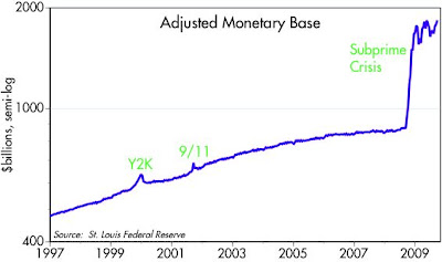
I've been pointing out since late last year that forward-looking, market-based indicators of inflation have all been flashing warning signs: rising gold prices, a weaker dollar, rising commodity prices, a steep yield curve, and rising breakeven spreads on TIPS are all signs that inflation risk is picking up, not to mention the extra $1 trillion of bank reserves the Fed has dumped into the banking system. The market has been studiously ignoring these harbingers of rising inflation because the economy has fallen so far below its potential. Yet these same signs are telling us that the Fed's generously low level of interest rates is progressively weakening the demand for money; people are increasingly willing to borrow (and less likely to hold onto existing money balances) and increasingly willing to buy things like other currencies, gold, and commodities. Which is another way of saying that the Fed is oversupplying money to the system, and this will very likely fuel a higher rate of inflation in the future.

The tension that this creates—the market's confidence in a low inflation future versus the warning signs of rising inflationary pressures—can be found, I submit, in the continued, relatively high level of implied volatility in both the bond and stock markets. And that's how I tie everything together in what I hope is a coherent story.

Swap spread update


It's been a while since I have posted charts of swap spreads. I relied heavily on this forward-looking indicator of systemic risk last October and November, when I asserted that they were telling us that the worst had passed and that we should look forward to an improvement in the economy and the markets in the months to come. Swap spreads have done a terrific job over the years of reacting early to emerging systemic problems (note how they rise well in advance of recessions), and reacting early to the unwinding of these systemic problems (note how they fall well in advance of the end of recessions).

Currently, swap spreads are just about where they should be during times of relatively tranquility in the markets and the economy. They tell us that the storm passed many months ago, and that conditions should continue to improve in the months ahead. Swap spreads are good indicators not only of systemic risk, but also of counterparty risk, the market's appetite for risk-taking, and the market's general liquidity. Today they tell us that all of those important things are going to be normalizing in the future. This is undoubtedly one of the reasons that the equity market has been rising since early March, and it ties in well with the message of rising commodity prices. The U.S. economy is getting back on track, despite all the bad policies coming out of Washington these days (e.g., tariffs on Chinese tires, massive deficit spending, promises of higher taxes, increased regulation of healthcare, etc.), and despite all the concerns still out there (e.g., the coming wave of foreclosures, the 10% unemployment rate).

Here is a basic primer on swap spreads that I wrote last May that explains them in greater detail.

Commodity prices up 30%

Spot prices on a range of basic industrial materials are up about 30% from their lows of last December, having now recovered a little more than half of what they lost last year. I like the parallels between the commodity price recovery and the market cap recovery highlighted in my previous post. There is a strong connection here, since the collapse in both price series was the result of a financial market panic which caused a sudden and dramatic reduction in global commerce.

At the depths of the panic late last year, markets feared the onset of a global depression and deflation unlike anything seen in modern times. Fortunately that possibility now appears extremely remote, mainly because central bankers successfully matched the world's demand for liquidity and safety. There is plenty of damage left to be repaired, but as both these charts show, there is plenty of room on the upside for those willing to take the risk that the global economy can continue to right itself.

I'm mindful of the potential threat of all the liquidity that has been pumped into the system, but for now it appears to have done the job. The unwinding of the liquidity injections will be the big story in the months to come.

$17.5 trillion and counting


The market cap of global equity markets is now up $17.5 trillion (+68%) from its March '09 lows. It has now recovered almost half of what it lost ($36.4 trillion) from its highs ($62 trillion) of late 2007.

Saturday, September 12, 2009

Obama punishes Chinese success at the expense of U.S. consumers

Obama has decided to impose a 35% tariff on Chinese-made tires, invoking a 2000 law that allows the imposition of tariffs on any surge in Chinese imports that damages a U.S. industry. We're not talking tariffs to remedy an allegation of dumping, we're talking about tariffs on products that prove so successful that they "harm" domestic producers. Now, not only will Chinese producers find it harder to sell their products here, but U.S. consumers will find that tires are unnecessarily expensive. The real problem with this, however, is that it could be the first in a series of tariffs that could escalate into a trade war, and that would be very damaging indeed. One need only recall the Smoot-Hawley tariffs that were one of the principal causes of the Depression.

The real losers in any tariff war are the countries that impose tariffs, since they deprive themselves of cheap goods. It's akin to cutting off your nose to spite your face. Bush was stupid to impose tariffs on steel in his first term, and now we see the same stupidity reemerging with Obama. We can only hope this is an isolated incident.

UPDATE: The NY Times reports that Obama's decision was a response to a complaint by the United Steelworkers union. Tire retailers opposed the decision. HT: Mark Perry

Friday, September 11, 2009

Federal budget update

The federal deficit in the 12 months ending August was just over $1.5 trillion, or about 10.5% of GDP. The major causes of deficits in the past have been collapsing revenues. This time we have not only collapsing revenues but soaring expenditures. Revenues look like they might bottoming later this year, with the  3-mo. annual spending rate falling at an 11% rate today versus a 28% rate just a few months ago. But spending is growing at almost a 20% annual clip over the past 3 and 6 months, and we have yet to see the bulk of the $787 billion spending package get spent. And then of course there is the additional spending that would be triggered by healthcare reform if it passes, according to the CBO.

John Stossel had a nice piece yesterday on reason.com that outlines what Obama should have said to Congress the other night. If the numbers above paint a grim picture, then the long-term budget outlook looks downright catastrophic. Excerpts:

In 1964, President Johnson won a landslide victory—quite similar to mine. His election also brought liberals into Congress. The next year, they created the first government-run health care plan: Medicare.

They meant well, but unfortunately, this was the height of fiscal irresponsibility. I know Medicare is popular with the elderly. Of course it is. Everyone likes getting free things. But it is unsustainable.

Retirees believe that their Medicare bills are paid from a "trust fund" that was created with deductions from their paychecks. But this is a politician's lie.

In truth, our predecessors spent every penny of those contributions immediately. They spent them on wars and pork that helped them get re-elected. The money for current retirees' health care is taken from today's workers.

This Ponzi scheme worked for a while. But then ... the average life span increased from 71 to 78 years. When Medicare began, there were five workers for every Medicare recipient. Now there are only four. And by 2030, the Board of Medicare Trustees expects there to be just 2.4. Unless millions of new young workers suddenly arrive from some other planet, there is no way that there will be enough workers to pay the Medicare benefits that we politicians have promised. Medicare's unfunded liability is $37 trillion.

Therefore, today I apologize for defending the absurd health care bills that have emerged from your committees—proposals that would add trillions of dollars of additional debt to an already unsustainable system.

The only way to avoid Medicare's collapse is to get retired people onto private insurance plans that they pay for themselves.

And the only way to address our overall budget deterioration is to rein in spending and entitlement programs, not to keep expanding them. 

Thursday, September 10, 2009

Weekly claims still trending down


As I read this chart of weekly unemployment claims, there has been a steady decline in claims since reaching a high in late March. Claims are down from 674K per week to now just 550K, a drop of almost 20%. That's nice, but at this rate of decline it could take a little over two years for claims to return to the 325K level that would be consistent with a "normal" economy. It's clear improvement, but the return to healthy conditions is likely to be prolonged and painful, and we're likely going to be hearing a lot about how this is a "jobless recovery."

(The big drop in claims that occurred in the first week of July was due to faulty seasonal adjustment factors relating to auto plant closures. That's now history, and shouldn't be interpreted to mean that things have gotten worse since then.)

Trade data point to a V-shaped recovery


Trade figures for July confirm what we already knew: the U.S. and the global economy are recovering. Our exports are up at a 25% annual pace since hitting a low in April, which can only mean that global commerce is back and making up for the ground lost last year. U.S. imports are up at a 29% pace over the same period, a good sign that consumers are getting back on their feet and recovering their confidence. The strength of the bounce from the lows also confirms that this is a V-shaped recovery.

But even though this is a V-shaped recovery, it will still take us a long time to get back to where we were a year ago. For example, even if exports continue to grow at a 25% annual pace, it would take about 18 months for them to rise to the levels we saw in July of last year. As long as the economy remains below the levels of a year ago, this is going to feel like a disappointing recovery, even though the pace of improvement could continue to be fairly rapid.

Obama's healthcare speech

Powerline (John Hinderaker) has a very good, point-by-point analysis of Obama's address to Congress yesterday. Bottom line: "This was not, to put it kindly, a speech that was directed at thinking people."

UPDATE: Don't miss this superb article by Shikha Dalmia in Forbes: "Obama's Health Care Plan: Put Up and Shut Up."

UPDATE: Don't miss this very sensible approach to healthcare reform by the Dean of the Harvard Medical School. (HT: Greg Mankiw)

Wednesday, September 9, 2009

Fear subsides, prices rise (11)

 
Another update to a very long-running series of posts that show how fear and uncertainty (as represented by the implied volatility in equity options, aka the Vix index) have been very important factors in the pricing of risky assets such as equities.

Challenge your assumptions on healthcare

When faced with deep-seated controversy, it's always a good idea to challenge your assumptions. More often than not, faulty assumptions are the root cause of the problem. Russell Roberts and Don Boudreaux lay out four questions that proponents of Obamacare have failed to ask themselves:

Why does the impending fiscal disaster known as Medicare justify increasing the role of the federal government and reducing the role of prices which are the essence of Medicare?

Why is the fact that “every other industrial nation provides universal health care coverage” considered evidence for its desirability?

Why do proponents of universal care argue that demand for health care is vertical when a major cause of the expanded use of health care over the last 40 years is the fact that so many people now pay so little out of their own pocket?

Why does there exist a widespread sense that each of us, as individuals, is incapable of — or should not be obliged to — providing for our own health-care needs in the same way that we provide for our own grocery needs, our own household-furniture needs, our own automobile-insurance needs, and many other of our needs?
UPDATE: Don't miss Holman Jenkins' brilliant expose (tongue in cheek) of the logical flaws inherent in Obamacare.