And that means inflation has peaked and will be headed down in the months to come.
Inflation as measured by government indices (e.g., CPI, PCE Deflator) is a lagging indicator of true inflation. True inflation is defined as the loss of purchasing power of a currency. Right now that is just not the case: the dollar is soaring against nearly every currency in the world and virtually all commodity prices are collapsing. Don't pay attention to inflation; pay attention to sensitive market-based prices—they tell you where inflation is headed.
The Fed was very slow to see the inflation problem which showed up in surging M2 growth in 2020, and they are being very slow to see that inflation fundamentals have improved dramatically this year.
Chairman Powell has it all wrong: the way to kill inflation is not to kneecap the economy, it's to reduce the supply of money and increase the demand for it by raising interest rates. The Fed has already succeeded in doing that! There's no reason at all that we need a recession to get inflation down. In fact, a growing economy can actually help to bring inflation down by increasing the supply of goods and services. I just don't see the Fed continuing on the inflation warpath for very much longer.
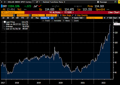
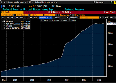
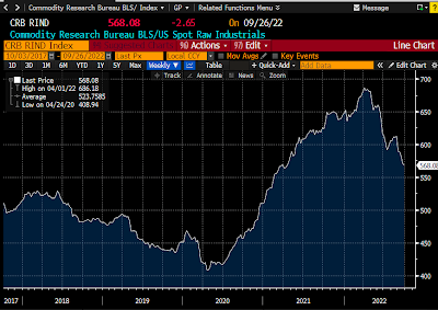
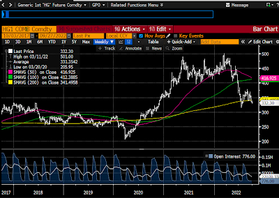
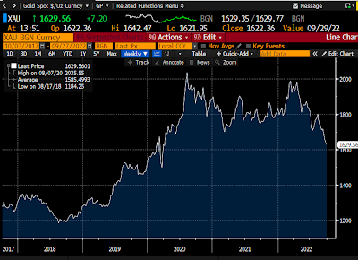
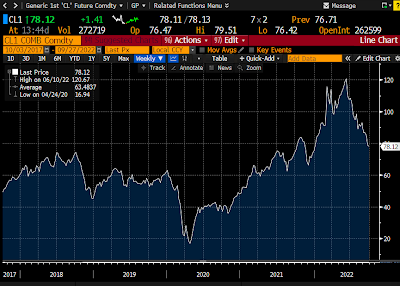
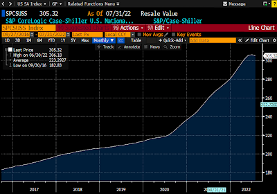
Chart #7 shows the best measure of US housing prices. Note that prices stopped rising a few months ago according to this measure. However, since the index is based on an average of prices over the previous three months, it's quite likely that the actual peak in housing prices happened some time in the March-April time frame. And it's not at all surprising that housing prices have peaked considering that mortgage rates have more than doubled so far this year (most recent quote is 6.7% for a 30-yr fixed conventional mortgage). This is how monetary policy impacts prices and inflation: higher rates increase the demand for money and reduce the demand for borrowed money; people become much less anxious to own things when interest rates are high. It's better to hold on to your money than spend it; better to rent than buy, which is why rents are increasing as housing prices soften.
Chairman Powell has it all wrong: the way to kill inflation is not to kneecap the economy, it's to reduce the supply of money and increase the demand for it by raising interest rates. The Fed has already succeeded in doing that! There's no reason at all that we need a recession to get inflation down. In fact, a growing economy can actually help to bring inflation down by increasing the supply of goods and services. I just don't see the Fed continuing on the inflation warpath for very much longer.
This bad Fed dream will be over soon. This is not the time to be cashing out of risk assets.
Chart #1

The dollar is very strong and rising against virtually every currency in the world (Chart #1). That means that most prices outside our borders are going down. Come to Argentina, where I am at the moment, and you won't believe how cheap things are. Great wine for $3-5 per bottle. Steaks for $3. A 1-mile Uber ride for $1. Tip a cabby with 1000 pesos (the largest-denomination bill, but worth only $3.33 US) and they will sing your praises. We have a 3-room suite in a nice hotel for only $70 a night. To worry about US inflation at a time like this is crazy.
Chart #2

The M2 money supply (Chart #2) has risen at a paltry 2.3% annualized rate over the past 9 months, and M2 has been flat for the past 6 months. If rapid M2 growth beginning in 2020 was the fuel for inflation (very likely), then the inflation fires are already dying down. The surge in M2 that began in 2020 was the spark that triggered rising inflation about a year later; the lack of M2 growth that began late last year will undoubtedly result in a decline in measured inflation before year end.
Chart #3

The CRB Raw Industrials index (Chart #3) is down 18% since its early March high. Nearly every commodity has exhibited the same behavior, as the following charts show.
Chart #4
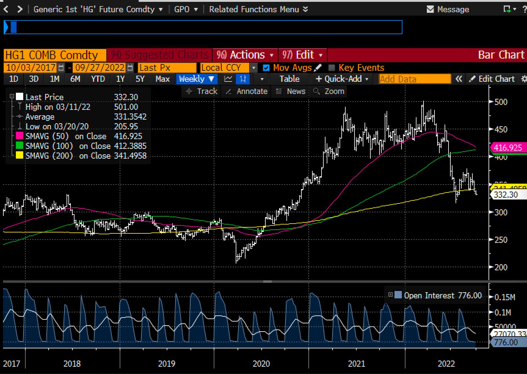
Chart #4 shows copper prices, which are down 35% since March. "Dr. Copper" is telling us that the Fed has no reason to worry. But maybe they should worry because they are threatening a whole lot more tightening when none is needed. This is what is called "closing the barn door after all the horses have left."
Chart #5

Chart #5 shows gold prices, which are down 22% from last March's high. Gold is traditionally very sensitive to changes in monetary policy. This is a strong signal that the Fed may have already tightened too much.
Chart #6

Chart #6 shows crude oil prices, which are down a whopping 35% since mid-June. This is a very significant decline that will have the effect of lowering the prices of all things that depend on energy.
Chart #7

Chart #8

Finally, as Chart #8 shows, the market's expectation for what CPI inflation will average over the next 5 years has now fallen to 2.33% (the bottom half of the chart), thanks to a huge increase in market interest rates (top half, representing 5-yr Treasury yields and 5-yr TIPS yields.
Markets these days are a lot more worried that the Fed will needlessly kill the economy than that inflation will do anything but decline.
UPDATE: We've been in Argentina for a week now, and it's painful to see the sorry state of the economy and the abysmal level of prices. Food here costs about one-fourth what it does in the U.S., not because unemployment is high (which it is), but because no one earns enough to afford to spend more. Those pundits who argue that the Fed needs to tighten by enough to push unemployment higher so that inflation will come down should come to Argentina to see the results of high unemployment. Prices for basic things may be low, but the inflation rate here is about 100% a year. Anything produced outside of Argentina comes in at international prices, and sooner or later the prices of basic things will necessarily rise to international levels. Things are cheap here only temporarily. The lower and middle classes are being robbed of their purchasing power by inflationary monetary policy, and the only one benefiting from the theft is the government. That's called the inflation tax. The government prints money to pay its bills, and anyone who touches that money loses purchasing power on a daily basis, while on the other side of the coin the government gets to keep on spending. Bottom line: Argentine M2 is growing by leaps and bounds—70% a year at last count, whereas in the US, M2 is flat. The US is on the cusp of disinflation, while Argentina is on the cusp of hyperinflation.
If higher unemployment were necessary to bring inflation down, Argentina would be suffering from deflation by now.