I've been predicting the demise of inflation for at least a year now, and today's CPI report makes it official—there's no denying that inflation has fallen to within spitting distance of the Fed's target. Not coincidentally, the market has finally acknowledged what I've been
expecting for many months: the chances of another Fed tightening at this point are zero. The only issue now is when the Fed starts to cut rates; the market thinks the first cut comes at the May 1st FOMC meeting, while I think it happens much earlier.
Chart #1
Chart #1 compares the year over year change in the CPI to the CPI minus its shelter component (which comprises about one-third of the CPI index). Absent shelter costs, which we know have been artificially inflated due to the BLS's flawed methodology (see Charts #2 and #3), the CPI is up only 1.5% in the year ending October '23. In fact, by this measure, inflation has been at or under the Fed's target for the past six months.
Chart #2 shows the 1- and 3-mo. annualized rate of change in Owner's Equivalent Rent (the major component of shelter costs). Here we see that shelter costs have been rising at a 5-6% annualized rate for the past several months. Contrast this to the fact that nationwide housing prices, according to the Case-Shiller index, have only increased 1.4% since mid-2022. Bottom line, the OER is substantially overstating inflation.
Chart #3 is designed to show that the BLS methodology effectively uses changes in housing prices from 18 months prior to drive changes in Owner's Equivalent Rent. Big changes in housing prices thus feed into the CPI calculation with a lag of as much as 18 months! This chart also strongly suggests that the big deceleration in housing prices that began a year ago last summer will cause the change in OER to fall to close to zero over the next 9-10 months. That in turn strongly implies that the contribution to inflation that comes from shelter costs will be declining for many months to come. It wouldn't be surprising, therefore, to see overall CPI inflation fall into negative territory in the next 3-6 months.
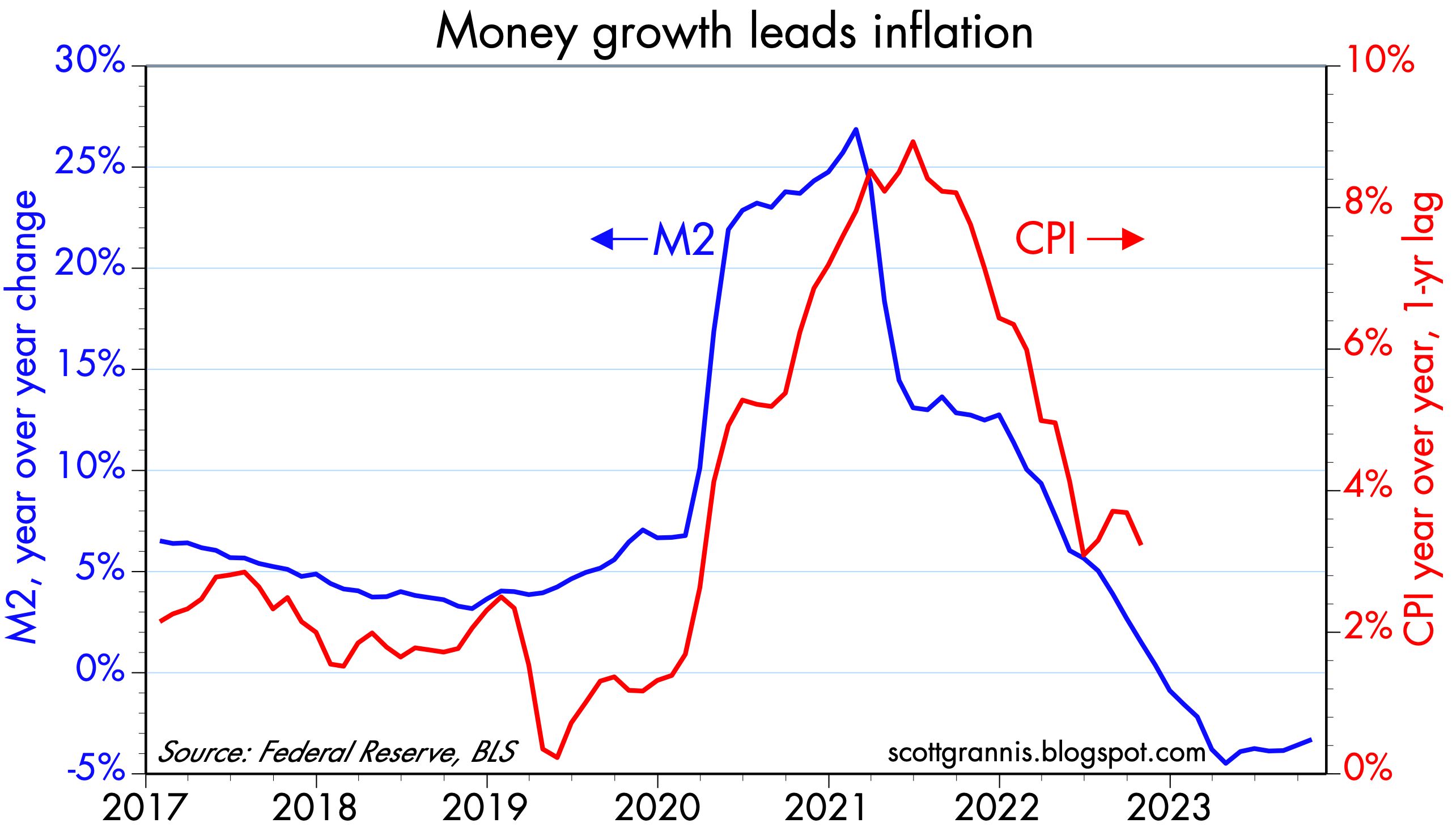
Chart #4 shows that changes in the growth rate of the M2 money supply tend to show up in similar changes in the rate of inflation with about a 1-year lag. This is strong evidence that the recent bout of inflation we have endured had a monetary origin. As I've explained numerous times in the past year or two, the source of our inflation surge can be traced to the monetization of some $6 trillion in federal deficit spending in 2020-2021. Happily, there has been no further debt monetization since 2021.
Chart #5 shows the 6-mo. annualized rate of change of overall and core producer prices (producer prices tend to be upstream of consumer prices, so this is like seeing a preview of the trend of the CPI in the months to come). By this measure, inflation is running at a 0-2% rate. Moreover, the producer price index has not changed at all since June '22.
Inflation is dead, may it Rest In Peace.
Is there any reason at all for the Fed to hold off on lowering rates until May? Not that I can see.
Monetary policy is manifestly tight, as reflected in a variety of indicators: 1) a significant deceleration in the rate of nearly all price increases, 2) a 57% plunge in new mortgage originations since early 2022 (i.e., high interest rates have severely impacted the housing market), 3) a 20% decline in non-energy commodity prices since early 2022, 4) at 2.3%, real yields on 5-yr TIPS (an excellent barometer of how tight monetary policy is) are substantially higher than their 28-yr average (1%), and 5) the yield curve is still inverted.
If the Fed remains true to form, they will wait too long to lower rates, just as they waited too long to raise rates two years ago. And that, in turn, means that when they eventually do lower rates, they will have to lower them faster and by more than if they were to start now.
The good news is that there is still little or no reason to think that the economy is at risk. Swap and credit spreads are low, implied volatility is low, initial jobless claims are low, and liquidity is abundant.
UPDATE (11/16/23): Here is an updated bonus chart showing how the federal deficit was monetized in 2020 and 2021, and how that link was severed about a year ago. Today we have big and ongoing deficits measured in trillions of dollars, but they are no longer translating into big increases in the money supply. This is how it should be. Deficits should never be monetized, and as such they needn't be inflationary. But since today's deficits are the by-product of excessive spending, they represent a drag on growth. The government is borrowing money and spending it wastefully. That squanders scarce resources and depresses the economy's long-term growth potential. Our children and grandchildren will pay the price in the form of living standards that could have been higher.
Chart #6