Wednesday, March 30, 2022

Steve Moore's must-read Hotline


I've recommended this newsletter quite a few times in the past year or so. It's published by my good friend Steve Moore's Committee to Unleash Prosperity, and subscribers number over 200,000. Today's edition was issue #503, and it's published every weekday. It's a must-read for me and every member of my extended family and friends, and it deserves to be read by a much wider audience.

I don't recommend it, however, for anyone who doesn't like reading about the wrong-headed thinking of our politicians and bureaucrats. 

For example, today's edition explains why it's NOT true that secretaries pay higher tax rates than billionaires with capital gains income. It also explains why the economy suffers from a capital gains tax that is not indexed for inflation. What is true is that successful businesses are the lifeblood of the economy and the source of our prosperity; taxing them at all is foolish.

It's short, easy to read, and packed with useful facts and statistics such as this: 


You can sign up here to receive this newsletter free.

Links have been fixed.


Tuesday, March 29, 2022

Bond market says no recession in the cards


The financial press currently is obsessed with the significance of the slope of the Treasury yield curve, because it's thought that a flat or inverted curve is a predictor of recession.

Sure, a flat or inverted yield curve almost always precedes a recession, and I've been making that point for many years. But you need other things going on to make a recession happen. Inverted curves are a necessary but not sufficient condition for a recession. The following charts illustrate 4 other important indicators of an impending recession.

Chart #1
♻︎

Chart #1 compares the slope of the Treasury yield (measured by the difference between 1-yr yields and 10-yr yields) to the level of real short-term interest rates. Note that two things reliably precede recessions: a flat or inverted yield curve (red line) and very high real interest rates (blue line). 

The yield curve inverts when the market senses that the Fed is so tight that the economy is at risk of collapsing, and that collapse would then prompt the Fed to ease. As many have noted, there are parts of the yield curve that today are inverted: 5-yr Treasury yields today closed at 2.50%, while 10-yr yields closed at 2.40%. But it would be premature to think that this materially increases the chances of a near-term recession.

Regardless, I think it makes more sense to compare a short maturity yield (i.e., something with less than 2 years' maturity) to 10-yr yields, because short maturity yields are dominated by what the Fed is doing now and is widely expected to do over the near future. Once you get out to 2 or 5 years, lots of factors come into play, such as inflation and economic growth, and these can contribute different pressures to different areas of the curve. 

As the chart shows, the spread between 1-yr and 10-yr yields is just over 70 bps, and that represents a fairly typical condition. It directly reflects the expectation that the Fed is going to be raising rates for at least the next year or so, and that beyond that the economy and inflation are likely to moderate. Nothing scary or crazy about that.

It's also very important to note that an inverted curve today is not necessarily a sign of an impending recession. As the chart also shows, inverted yield curves often precede recessions by several years.

In my view, the level of real yields is arguably more important than the slope of the yield curve. Very high real yields, e.g., 4-5%, exert a powerful influence on the economy because they are driven by Fed tightening (which restricts liquidity) on the one hand, while they impose very high borrowing costs on the economy on the other hand. Very high real rates encourage people to avoid borrowing and and the same time they encourage people to increase their saving: both equate to an increase in the demand for money, and when taken to an extreme, high real rates can shut down consumption and growth.

Today, real yields are the lowest they have ever been. This encourages borrowing and it discourages saving. Cash is trash, since it is losing purchasing power rapidly. Better to borrow and spend these days than to save or pay down debt. Nothing about that is going to hurt the economy. If anything, today's very low real rates are likely to pump up spending and give us a bigger inflation headache.

If the Fed doesn't get nominal yields to rise to at least the level of inflation (which is currently running 7-10%), then monetary policy will remain very stimulative, and that's not likely to cause the economy to collapse.

Chart #2

Chart #2 shows the level of Credit Default Swap spreads, which is a very liquid and reliable measure of the market's confidence in the future health of corporate profits and the economy. Low spreads mean the market thinks the economy is going to be healthy and corporate profits are going to be solid. Currently, spreads are somewhat elevated from their recent lows, but they are nowhere near levels that have preceded recessions in the past. This is the bond market's way of saying it is confident that corporate profits will remain reasonably healthy for the foreseeable future.

Chart #3

Chart #3 shows the level of 2-year swap spreads in the U.S. and in the Eurozone. Swap spreads are similar to CDS spreads, but they are more generic and reflect the risk of borrowing and lending between large institutional investors. A normal level of this spread would be roughly 15-35 bps. Levels of 70 bps and above are symptomatic of rising risk aversion and a general shortage of liquidity. Liquidity is being squeezed in Europe (not surprisingly) but it is still plentiful in the U.S. And that's very important, because liquidity shortages can intensify other financial market stresses. With abundant liquidity, markets can trade efficiently; those who are averse to risk can shift the burden of risk to those who are willing and able to bear risk. Those who wish to run for the exits will have no trouble getting out.

Chart #4

Chart #4 compares the level of the Vix index (the "fear" index) with the level of the S&P 500 index. Rising fears almost always accompany market declines, and vice versa. Currently the level of fear is declining and the stock market is recovering, presumably because tensions in the Russia/Ukraine war are subsiding. 

Technically, the Vix index measures the effective cost of buying options (buying options is an effective way to reduce your exposure to risk). Very high Vix levels make buying options very expensive, which is another way of saying that it becomes very expensive to hedge one's exposure to risk. So high levels of the Vix are a clear sign of just how nervous the market is. Today the market is breathing easier than it was just a few weeks ago, and investors are more willing to take on exposure to risk.

I don't see anything in these charts that makes me worry about a near-term recession.

Tuesday, March 22, 2022

M2 growth slows, but it's still too fast


This is a quick post, but on a very important and almost completely overlooked statistic: the growth of the US money supply. I have been highlighting this for at least the last 18 months. Until recently, money growth was at all-time and very inflationary highs—well into the double digits. This all but guaranteed that the inflation which appeared to be ignited by supply-chain bottlenecks would instead be durable and pervasive.

With the release today of the M2 numbers, I'm breathing a bit easier. The Fed is still extremely accommodative, but on the margin monetary policy is becoming less so. Monetary policy is far from being "tight" but it is now becoming "less easy."

The tapering of Fed asset purchases is good, but they need to reverse course as soon as possible, and they need to raise rates much more than they have been hinting up until recently. It's encouraging to see several members of the FOMC saying the same thing, and the market has been reacting appropriately, by bidding up short-term interest rates rather aggressively. 5-yr Treasury yields—a proxy for what the market expects the Fed funds rate to average over the next 5 years, have risen by 80 bps so far this month. And despite this, the stock market has rallied.

In the past I have rarely agreed with Larry Summers, but in an interview last week with Bloomberg, he expressed similar views. We both think that as a first approximation, the Fed needs to raise short-term rates to at least 4-5%. I think we would both agree that ultimately, the Fed needs to raise rates until they are above the rate of inflation. Negative real rates are inflationary, since they make borrowing (which is what expands the money supply) profitable.

In any event, the market is saying what I've said all along: if there is a good reason for the Fed to raise rates, and they do so, this is good news, not bad news. We are still far from seeing conditions that would signal an imminent recession. Credit spreads are still relatively low, swap spreads are square in neutral territory, and the yield curve is still positively sloped. There is no sign that liquidity is in short supply—and that's all-important. This economy is not being starved of liquidity, so it's very unlikely to suffer a collapse. It's still worrisome, however, to see commodity prices moving higher, and real rates still deep in negative territory. 

We haven't seen the end of this story.

Chart #1

Chart #1 is my choice for "most important chart." It shows the growth of M2—the best measure of the money supply—less the currency component, which is about 10% of M2. I've subtracted currency because whatever the supply of currency is, it is always equal to the demand for currency, and thus it's not inflationary. But if the growth of the rest of M2 exceeds the demand for it–which I suspect is true—then this is inflationary. Regardless, it is very encouraging to see that in the past few months the growth of this key indicator has fallen from 12-13% annual rates to now 8-9% annual rates. That's still rapid, but on the margin it represents change for the better. A good portion of the slowdown in recent months, I should note, is due to downward revisions of previous data.

We'll have to see more such declines before we're out of the inflation woods, of course, but anything that is positive in today's environment is quite welcome. 

Monday, March 14, 2022

Inflation, Net Worth, and Federal debt burden updates


Last week we received new data on inflation, the net worth of the U.S. private sector, and government finances. Inflation looks uncomfortably high, ingrained and troublesome, but net worth looks fabulous. Federal debt has reached alarming levels—almost 100% of GDP—but the burden of the debt is historically low, thanks to high inflation and very low interest rates. Not everything is as it seems on the surface. 

Chart #1

February consumer price inflation came in as expected (+0.8% for the month, 7.9% for the past 12 months). (See Chart #1) Price increases were spread across the board, further supporting the idea that this is an inflation that affects nearly all sectors of the economy, and thus an inflation that has its origins in a monetary policy mistake by the Federal Reserve: without the significant increase in the broad money supply over the past two years a generalized inflation like this would not be possible.

Please see Chart #1 in this post for a look at just how much the M2 money supply has increased. I continue to be amazed that the great majority of analysts and economists are completely ignoring the monetary origins of our current inflation. I would cynically add that early last year the Fed decided to publish M2 only once a month, around the 21st of each month, and they made this change (previously it published money supply data weekly) right around the time that inflation began to soar. 

Chart #2

Chart #2 shows that almost two thirds of small businesses are paying higher prices these days. This is the highest level on record, and it again shows that we are dealing with an inflation that is affecting nearly everyone. 

Chart #3

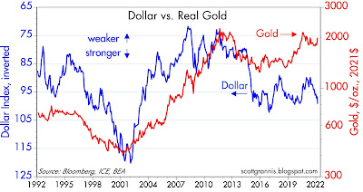
Inflation is very obviously exceeding nearly everyone's expectations, yet gold prices have barely budged. Gold is widely regarded as an excellent hedge against inflation, so why aren't gold prices much higher? Over the past year I've been answering that question by pointing out that gold prices likely rose long ago in anticipation of today's inflation; the market is always very forward-looking. For further insight into this, consider Chart #3, which shows the inflation-adjusted price of gold going back to 1913. Gold has been within inches of its all time high (in real terms) for the past year or so. In other words, gold is very expensive, because investors have been buying gold in order to hedge against rising inflation, and they have been willing to pay very high prices to do so. 

Chart #4

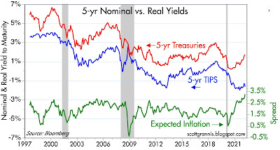
Chart #4 shows that the bond market has been adjusting—slowly—to the realization that inflation is going to be higher than expected and probably for longer than expected. The bond market currently expects that the CPI is going to increase a little over 3.5% per year on average for the next 5 years. Note that the rise in expected inflation (green line) has been driven mostly by a rise in nominal Treasury yields (red line). Real yields have change very little, and they remain exceptionally low, which further suggests that the bond market does not expect the economy to be very strong—rather weak, actually. Call it "stagflation." 

Chart #5

Chart #5 shows how those who have owned bonds have suffered serious losses (in real terms) because of the significant and unexpected rise in inflation. Similar losses (and even worse) were suffered in the 1970s. This is not a good time to hold bonds, obviously, and it could easily get worse. The long bull market for bonds that began in the early 1980s is over.

Chart #6

Moving on to net worth (Chart #6): The Federal Reserve on Thursday released its estimate of household net worth as of the end of last year: $150 trillion. Net worth is soaring, thanks to strong gains in stocks and real estate, and only modest increases in debt. Households have been behaving quite prudently since the 2008-09 Great Recession.

Chart #7

Chart #7 adjusts net worth for inflation. It also suggests that real net worth tends to increase by about 3.6% per year. That in turn is driven by population growth and productivity increases—and in recent years by plunging interest rates, which greatly increase the present value of future income streams. This latter factor is likely to reverse as interest rates rise (i.e., real net worth is likely to grow at a much slower rate in coming years). 

Chart #8

As a counterpart to our profligate federal government, the U.S. private sector has been steadily deleveraging since the Great Recession. The average amount of leverage for the typical person or corporation has fallen back to levels not seen since the late 1960s. This is one under-appreciated bright spot, since it suggests that the financial situation of the private sector of the U.S. economy is quite healthy.

Chart #9

Chart #9 shows the level of real net worth divided by the size of the U.S. population. It appears to be running at the upper end of its historical range, and that could be a by-product of super-low interest rates; I'd expect to see this reverting to mean in coming years. For now, the average person living in this country benefits from a record amount of wealth creation.

Chart #10

Changing gears, Chart #10 shows the evolution of federal spending and revenues. Note the explosive growth of revenues in the past two years. That's due to a combination of the economy re-opening and rising inflation which boosts incomes and, in the process, pushes people into higher tax brackets. Meanwhile, federal outlays have slowed somewhat, but remain almost absurdly high. There's a strong argument to be made that all the many trillions of extra spending that occurred during the Covid period were effectively monetized by the banking system, and thus fed directly into higher inflation: the magnitude of the increase in M2 in recent years is quite comparable to Covid-related "emergency" spending.

Chart #11

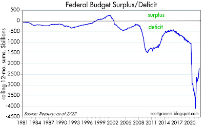
Chart #12 shows the difference between spending and revenues, otherwise known as the budget deficit. Happily, the deficit has declined by almost 50% from its peak, but it remains huge—almost 10% of GDP. 

Chart #12

Surprisingly, despite the fact that outstanding federal debt is just shy of its highest level in history relative to the size of the economy (currently about 96% of GDP), the burden of that debt is as low as it has been in many decades (see Chart #12). This is due to the fact that interest rates are extremely low—lower than they have ever been in recorded history, and much lower than inflation. The federal government is a direct beneficiary of today's very low real interest rates. In fact, anyone who is highly indebted these days should thank their lucky stars that inflation is high and interest rates are low. High inflation erodes the real value of debt and low interest rates make it easy to service. Moreover, high inflation boosts government revenues because incomes rise and taxpayers are pushed into higher tax brackets.

For years I've been recommending that people "borrow and buy," and that's been a winning strategy. Unfortunately, those who have been prudent—the lenders and the savers—have forfeited a lot of purchasing power. Inflation is ultimately destructive because it transfers wealth from lenders to borrowers and wreaks havoc on the economy in the process.

Monday, March 7, 2022

Currencies & commodities in perspective


Things are really heating up and changing by the hour. Markets are getting pretty nervous, but they are not predicting (yet) the end of the world as we know it. This post attempts to put the dollar and commodity prices in some long-term perspective. What stands out the most is that the dollar is relatively strong vis a vis most other currencies, but commodity prices are also very strong; this conjunction of events is without historical precedent, so it's tough to draw any conclusions (historically, the dollar and commodity prices usually move in opposite directions). The only clear threat remains the "nuclear option." That would indeed take us to an "end of the world as we know it" scenario, and in the process render all predictions useless.

Chart #1

Chart #1 shows the Fed's calculation of the dollar's value relative to other major currencies and relative to a a broad basket of currencies. Both measures show the dollar is well above its long-term average value, but not extremely so.

Chart #2

Chart #2 shows the value of the Russian ruble vis a vis the dollar. Few currencies (with the notable exception of the Argentine peso) have experienced such a dramatic decline over time. In the past 2 ½ weeks, the ruble has lost about 50% of its value against the dollar. While not unprecedented, this is clearly a terrible shock for the Russian economy and its citizens. Imported goods have effectively doubled in price almost overnight. This represents a massive tax increase on the citizenry. In a sense, Russia is paying for this war by stealing money from the pockets of anyone who holds rubles. Inflation is sure to skyrocket, and public unrest is sure to soar. 

Chart #3

Chart #3 compares the value of the dollar (blue, inverted) to an index of industrial commodity prices. Note how the two tend to move together (i.e., inversely). But they've done just the opposite in the past few years: the dollar has been strong and commodity prices have been soaring. This tells us that the value of the dollar is not driving higher commodity prices. But since commodity prices are rising in terms of nearly all currencies, it's possible that the world's central banks are way too accommodative. In other words, it's possible that all currencies are being debased, and that's why hard assets are rising. In that case, look for inflation to be rising nearly everywhere.

Chart #4

Chart #4 compares the dollar (inverted) to the price of oil. Here we seen the same pattern as with industrial commodity prices.

Chart #5

Chart #5 shows the inflation-adjusted price of oil. Note how virtually every recession has been preceded by a a very high real level of oil prices. Energy is so essential to growth that when oil becomes very expensive growth tends to weaken. It would be tempting to say that this chart is good evidence that recession risk is high, both here and in the Eurozone. But I think it takes a few more things to happen before recession becomes imminent. I go back to previous posts in which I point out that recessions are almost always preceded by very high real interest rates, a flat or inverted Treasury yield curve, and a significant increase in 2-yr swap spreads. Currently we have none of these conditions. Real yields are very low, the yield curve is still positively sloped, and swap spreads (in the U.S., but not in the Eurozone) are still within normal ranges. Liquidity is therefore abundant, and abundant liquidity is one of the best ways for an economy to avoid a recession. With liquidity, markets can efficiently shift risk to those willing to bear it; without liquidity, panic can ensue, much as happens when someone yells "Fire!" in a crowded theater.

Chart #6

Chart #6 compares the inverse of the dollar to industrial metals prices. Metals prices typically go up as the economy strengthens, but in this case it's not hard to argue that higher metals prices are part and parcel of the general rise in all commodity prices, and that this is all a function of very accommodative monetary policy worldwide. It's also not hard to argue that the current surge in commodity prices will also feed back into higher measured inflation in the months to come.

Chart #7

Chart #7 compares the dollar to copper prices. Same story as above.

Chart #8

Chart #8 compares the dollar to gold prices. Here the correlation is not as high as with commodity prices. Gold has its own mind. Note that I've used the inflation-adjust value of gold. Gold is now approaching its highest inflation-adjusted level in history, by the way. So you may like gold as a safe haven, but you should know that it's extremely expensive at today's levels. People all over the world are willing to pay a very high price for gold because they are very concerned about all the bad stuff happening. And as I pointed out in a recent post, both gold and TIPS prices are very close to all-time highs. The risk-off trade is quite crowded these days.

Chart #9

Chart #9 is quite impressive, in that it shows that the prices of gold and crude oil tend to mean-revert over time, averaging about 20 barrels of oil per ounce of gold. By this measure, oil prices are only moderately expensive given the level of crude. If gold were to hold, say, at $2000/oz., then oil prices might continue to climb to $200/bbl without violating historical patterns (i.e., the ratio of gold to oil prices might fall to roughly 10). By inference, gasoline prices at the pump could break out to new all-time highs before this is over.

Chart #10

Chart #10 compares the dollar to non-energy commodity prices. Here again the same pattern as with all commodity prices. 

Chart #11

Chart #11 shows an index of food prices. The recent surge is likely understated, since many food items (e.g., wheat, of which Ukraine is a major producer) surged today and are not yet reflected in this index. Be prepared to pay even higher prices at your nearby grocery store. The Russia/Ukraine war is touching our lives in many ways.

Chart #12

Finally, Chart #12 shows how rising uncertainty and escalating fears are depressing stock prices. We're not at extremes yet, so this can continue to vex investors. I don't pretend to know when this will end, but I do think that we will avoid an "end of the world as we know it" scenario.

Saturday, March 5, 2022

The Great Siege of Russia


Russia, in the midst of laying siege to cities in Ukraine, is now realizing that its entire country is under siege from all corners of the world. This siege will make history, and I hope it marks the beginning of the end of Putin’s rule.

It seems like every country in the world, save China and Washington DC, is joining Ukraine in solidarity: seizing Russian oligarch’s bank accounts, villas, jets and yachts; refusing to process credit card transactions; disallowing Russian banks the use of the international clearing functions of the SWIFT network; canceling purchases of Russian oil (with the notable exception of the Biden administration, out of fear that might further escalate gasoline prices and further erode his polls); refusing to sell goods and services to Russia (e.g., computers, mobile phones); closing their skies to Russian airplanes; and shutting down social media accounts.

Meanwhile, in the past 2 ½ weeks, the Russian ruble has lost nearly half of its value. Russian is self-sufficient only in the realm of energy; it must import large quantities of just about everything else. How long before Russian citizens can no longer find, pay for, or afford the necessities of life? With Boeing and Airbus refusing to provide spare parts, how long before Russian airliners are no longer able to fly? With no access to global financial markets, how long before the Russian economy is starved of liquidity?

The world has become so interconnected that no country can long survive without the cooperation of others. Putin thought he could seize control of Ukraine in short order, but he underestimated the fighting spirit of the Ukrainians, and he never gave a thought to how the rest of the world might react to his actions.

How long before Russian citizens and/or its oligarchs rise up against the madman Putin?

We are witnessing a new form of warfare: global blockades of information, goods, and services.

Soon, we may learn that the world has defeated Putin without firing a single shot.

Friday, March 4, 2022

Interesting charts


I don't pretend to know how the Russia/Ukraine war will play out, but I can shed some light on how it has impacted the U.S. and Eurozone economies. Not surprisingly, the U.S. economy continues to grow, while the Eurozone economy has taken a serious hit. Everyone, however, is suffering from higher-than-expected inflation. Central banks live in fear of the risks of war, and so are reluctant to tighten. As a result, monetary policy is still very accommodative nearly everywhere, and unlikely to pose a serious near-term risk.

Chart #1

The February jobs report was quite strong, and contained the welcome news that the labor force participation rate (see the bottom chart above) has risen significantly. Chart #1 also suggests the reason for the surge, namely the big decline in transfer payments. Funny how things work: if you pay people who aren't working, you won't find very many willing to work, and when you stop paying them they are more inclined to work. (Our economy is not suffering from a lack of jobs, that's for sure.)

Chart #2

Chart #2 compares the level of private and public sector jobs. Two bright spots: private sector employment has recovered almost all its Covid-related loss, while public sector jobs have recovered less than half. (In my book, private sector jobs are much more productive than public sector jobs.) Government has become less obese, and that's good news.

On the other hand, the level of private sector jobs today is still at least 5 million short of where it might have been in the absence of the Covid crisis.
  
Chart #3

Swap spreads, shown in Chart #3, are excellent indicators of a) liquidity conditions and b) the outlook for corporate profits and economic health in general. Swap spreads have risen a bit in the U.S., but not enough to be worrisome (in a normal economy, you'd expect these spreads to be 15-35 bps). Conditions in Europe are not so good, however, with swap spreads having jumped to recession-era levels. Limiting Russia's ability to use the SWIFT payment system is a big factor reducing liquidity overseas.

Chart #4

Chart #4 is my favorite chart for gauging recession risk. Every recession except the last one was preceded by very high real yields and a flat or inverted yield curve. We're not even close to either at this point. Real yields on the Fed funds rate are at record-setting (and mind-blowing) lows, which means liquidity conditions are flush and the Fed and the banks are practically begging people to borrow money. Combine this with Chart #3 and you see that all three of the indicators that normally precede recessions are not at all in worrisome territory, at least in the U.S. 

Chart #5

Chart #5 compares the price of gold to the real yield on 5-yr TIPS (inverted, so as to be a proxy for their price). This tells us that both TIPS and gold are highly sought-after for their risk-reducing properties—which in turn means the market is very worried. There is no shortage of things to worry about, and from a contrarian viewpoint, that's bullish. The last time the markets were this worried was in the 2011-2014 period, when Europe faced the risk of national defaults and the collapse of the Euro. 

Chart #6

Chart #6 shows nominal and real yields on 5-yr Treasuries, and the difference between the two (green line), which is the market's expectation for what the CPI will average over the next 5 years. Inflation expectations are now at new highs (about 3.3%), as the market is slowly coming around to seeing that the burst of inflation that started early last year is not going to be transitory. I would expect these expectations to continue rising over the next year or so, which means that nominal interest rates are almost certain to rise meaningfully.

Chart #7

Chart #7 compares the real yield on 5-yr TIPS to the current real yield on the Fed funds rate. In effect, the red line is what the market thinks the blue line will average over the next 5 years. In short, the market thinks the Fed is going to keep short-term rates negative in real terms for a long time. Borrowing at a floating rate of interest is thus likely to be attractive for awhile. 

Unfortunately, as I've explained many times in recent posts, the persistence of negative real yields helps weaken the demand for money, and this in turn adds fuel to the current inflation fires. The Fed will need to do a lot of tightening at some point to bring inflation down.

Chart #8

Chart #8 compares the Vix index (the worry index) to the level of the S&P 500. Whenever the market gets very worried, stock prices (unsurprisingly) decline. The level of worry today is not yet at an extreme, however, so things may get worse before they get better. On the other hand, a healthy amount of worry means the market is prepared for bad news, and that acts as a buffer.