Some charts that help put things into perspective:
Chart #1

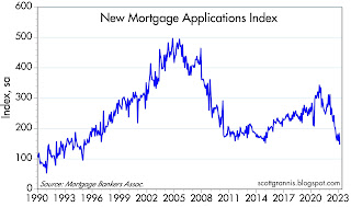

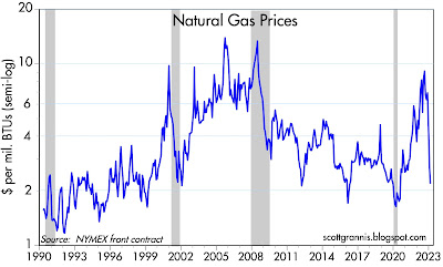
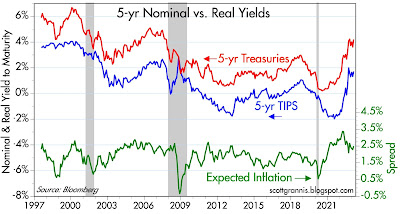
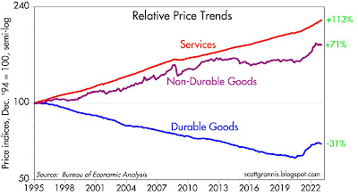
Chart #1

Chart #1 shows that existing home sales have fallen by 36% in the past year. This is extraordinary. Given the lags in reporting this data, the reality is likely worse. We are in the midst of dramatic weakness in the housing sector.
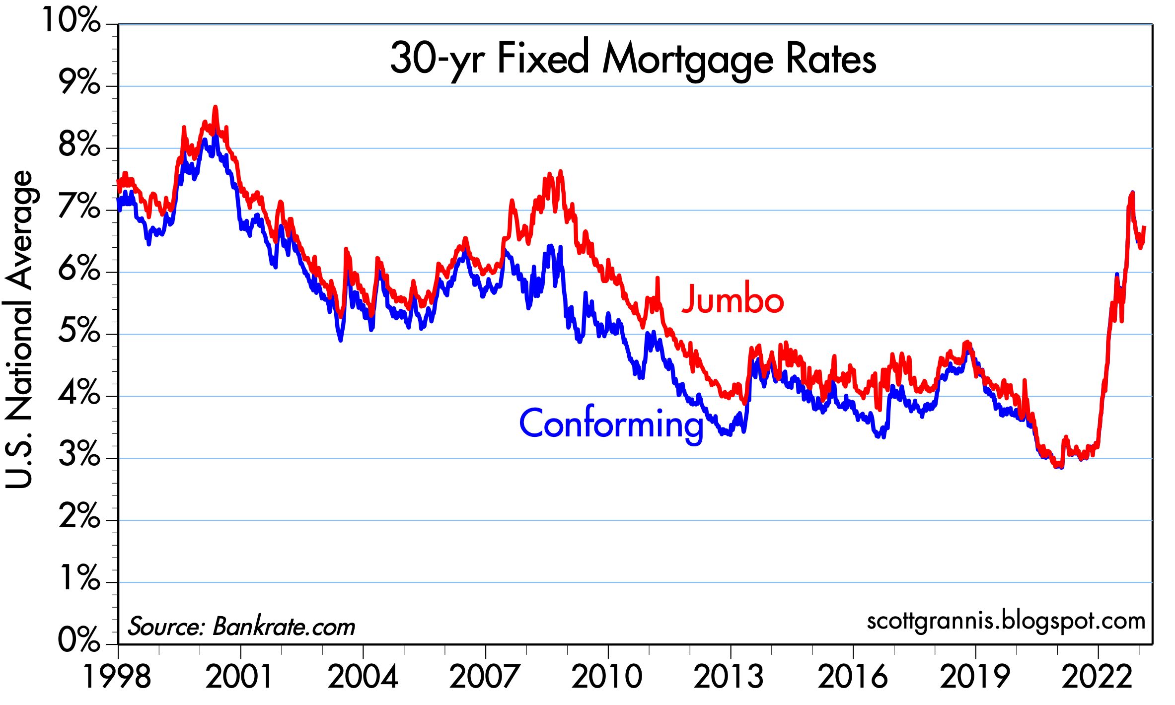
Chart #2

Chart #2 shows the likely culprit: a once-in-a-lifetime surge in the cost of borrowing money to buy a house. 30-yr fixed rate mortgages are now back to 7%, which is more than double the level that prevailed just over a year ago. Combined with rising home prices, this has increased the cost of buying a house by at least one-third in a very short time span. It's likely that the market has not yet had time to fully adjust to this new reality. It can only mean further weakness in the housing market.
Chart #3

Chart #3 shows that applications for new mortgages have dropped an astonishing 58% in the past year. The Fed missed the signs of rising inflation (they should have been watching M2 growth years ago) and now they have slammed on the brakes and are talking tough. Sharply higher interest rates, in turn, have dramatically affected the public's ability and willingness to buy a home. There is no question that monetary policy has had a dramatic impact on the real economy and on prices. Conclusion: the Fed should stand pat and watch how things evolve from here.
Chart #4

Chart #4 compares the level of 30-year fixed mortgage rates (white line) with the 10-yr Treasury yield (orange line), and the spread between the two (bottom half of the chart). This is what happens when bond yields surge unexpectedly: investors in bonds and mortgages have been burned (it's been the worse bond market in many lifetimes) and now they are twice shy. Demand for these securities has collapsed, pushing mortgage rates to an almost-unprecedented level above that of 10-yr Treasury yields. Normally this spread would be about 150-200 bps, but now it's over 300. The bond market has amplified the Fed's tightening efforts. It's VERY expensive to borrow at fixed rates these days.
Chart #5

Chart #5 shows that natural gas prices have truly collapsed, falling by way more than ever before in a short span of time. Traders say it's due to warm weather in the East. Regardless, this is an important source of energy for vast swaths of the economy, and it equates to a powerful deflationary force. And let's not forget that oil prices have plunged 35% from their highs last May. It's not just the weather; commodity prices are down across the board over the past 6-12 months. Monetary policy is undoubtedly one of the reasons.
Chart #6

Chart #6 tells us that the bond market feels pretty good about the outlook for inflation. The spread between 5-yr Treasuries and 5-yr TIPS is now less than 2.5%, which means that the bond market expects the CPI to average less than 2.5% per year for the next 5 years. Higher interest rates have convinced bond traders that the Fed has done enough. Chairman Powell, are you listening?
Chart #7

Chart #7 compares the relative prices of services, non-durable goods, and durable goods. What an amazing divergence! Service prices are largely driven by wages, and durable goods prices have fallen thanks in large part to Chinese exports (which began to get underway in 1995). Durable and non-durable goods prices have been flat for the past 5-6 months, while service sector prices continue to rise. The Fed presumably worries that wages and low unemployment rates will continue to drive inflation higher. Do they really want to see bread lines showing up all over the country? Wages don't cause inflation: they are driven by productivity and the imbalances between the supply and demand for money.
As for productivity: since 1995 service sector prices have increased 3 times more than durable goods prices! In rough terms, that means that one hour of the average worker's time today buys 3 times as much in the way of durable goods than it did in 1995. No wonder nearly everyone is able to afford to carry a super-computer, high-end camera, and internet connection in his or her pocket.
Chart #8

Chart #8 shows the year over year changes in the Personal Consumption Deflators (with the Core version being the Fed's favorite measure of inflation). Both rates came in a few tenths of a percent higher than the market expected. Does that sound like inflation accelerating? Or running hot? No. Inflation pressures peaked many months ago. Both of these measures are on track to show year over year gains that are much lower than their current level. It takes time for monetary policy–which is undoubtedly tight—to work its way through the economy. We just need to be patient.
Next Tuesday we'll have the all-important release of the January M2 money supply number. I expect it will show a continued decline, which will strongly reinforce the outlook for slowing inflation in the months to come.