Monday, November 30, 2009

Blogging will be light

We are in the Virginia countryside at a remote and charming B&B for
the next two days. So bogging will be very light. Maybe some pictures
when I get the chance.

Sent from Scott's iPhone

ClimateGate update

If you believe this, you'll believe anything:

'Leaked emails won't harm UN climate body,' says chairman. Rajendra Pachauri says there is 'virtually no possibility' of a few scientists biasing IPCC's advice, after UAE hacking breach.
 The UN apparently believes that science only operates under its auspices, and that inconvenient facts may be safely ignored.

Wednesday, November 25, 2009

Another V-sign


As a supply-sider, consumer spending is not one of the things that I pay a lot of attention to. Spending is the by-product of production, so it's better to know whether jobs are increasing or likely to increase, and whether people are working harder and/or more productively, than it is to know how much people are spending. As the late Jude Wanniski used to say, as a nation we can't spend our way to prosperity. It's amazing to me, really, how much attention people and governments pay to spending, as if it were truly the key to prosperity. How can we grow the economy by spending more? Common sense tells you that the economy can only grow by producing more.

Here's an easy example: If I invented a machine which turned the labor of a $10/hour worker into enough food to feed 100 people per day, a lot of things would happen. To begin with, food would get a lot cheaper, and that would allow just about everyone in the world to spend more money on things other than food. A lot of the people employed in the food-production business could devote their energies to other pursuits instead. Some could build me an office. Others could make more food machines. Others could manage all the money I made, by investing it in new startups. And so on. They key to all these changes would be my invention, which allowed one worker to become hugely more productive.

When you consider the world as a closed economic system, it's a mathematical fact that total world spending can only be equal to total income—we can only spend to the degree that we earn, and we can only consume to the degree that we produce. On the margin, changes in spending are not what drive growth, it's changes in income, and income grows only if we produce more. In short: work—and the investment in new stuff which allows people to work more productively—comes first, then spending.

Back to the chart above. What it shows is that the downturn in spending has been much deeper (with the negative growth lasting longer) than in other recessions. But it also shows that the turnaround has been just about as sharp as in other recessions, hence my claim that this is a V-sign. The turnaround has nothing to do with cash-for-clunkers, since that washed out of the numbers by the end of October (i.e., some spending was accelerated, followed by some payback). On balance, real spending increased in 5 out of the six months ending October, and it rose at a 2.6% annualized rate in the four months following the likely end of the recession in June.

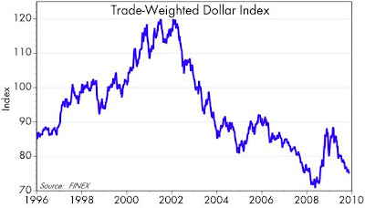
This recovery will likely be a little different from past recoveries, however, since the recession was precipitated by a major shock to confidence, and that in turn resulted in a sudden pullback in spending worldwide. So to the extent that confidence returns—and there are lots of signs that it is returning, if for no other reason than that the world didn't end as everyone feared it might—spending could be a leading indicator of improvement. Skeptics argue that fiscal stimulus is responsible for the improvement, but I've been highlighting evidence all year long that confidence was returning and that was a very strong argument for a recovery. We know that money velocity turned up in the third quarter, following steep declines in the prior four quarters; we also know that the demand for money has declined significantly, as reflected in a sharp slowdown in the growth of currency and M2, and in the value of the dollar.

Those are big macro variables that count for a lot more than the meager amount of stimulus that has come from Washington. After all, most of the stimulus is still unspent, and most of what has been spent was in the form of transfer payments that do nothing to stimulate investment or increase people's work effort, and thus do absolutely nothing to grow the size of the economy.

Looking ahead, I see the economy continuing to grow by 3-4% or so. That's not a very robust recovery given the depth of the recession, but it is a lot more than most people are forecasting. Growth is likely to be driven by increases in productivity, something that has been very evident in recent months, and by the natural growth in the number of people entering the workforce. Over long periods, productivity tends to average about 2% a year, while the labor force tends to grow about 1% a year, so add the two together and you get a 3% baseline for growth. But if that's all we get, then it means that the economy is going to have a lot of unused capacity and a lot of unemployment. In a typical recovery, productivity tends to be very strong coming out of the recession, due to strenuous efforts on the part of businesses to cut costs and wring more work out of a smaller workforce. The recovery then strengthens and extends as businesses invest in new plant and equipment and hire more workers.

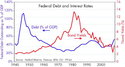
What will keep growth from being robust during this recovery is weak investment. The Obama administration has shown itself to be very hostile to capital, and the prospect of trillion-dollar deficits for as far as the eye can see makes everyone fearful of higher tax rates on work, investment, dividends, and capital. As Art Laffer always says, if you tax something more, you are likely to get less of it. To make the fallacy of Keynesian pump-priming obvious, take the analogy to an extreme: you can't make an economy grow by borrowing money from those that are working and giving it to those who aren't working.

I'm very encouraged when I see that, after a big lurch to the left earlier this year, the political pendulum is now swinging back to the right. The polls have been saying this, and the elections in November confirmed it. There's a lot more work to be done, but my sense is that Congress is going to run out of energy as public support for a "tax and spend without end" agenda continues to wilt. Simply removing the threat of a further increase in spending and regulation could be enough to revive interest in new investments, and that could help the economy in coming years.

Things could be a lot better, to be sure, but there are things to be thankful for this Thanksgiving. One year ago we were standing on the edge of a fearsome abyss, while today we are arguing about how fast the economy is going to grow.

UPDATE: Mark Perry adds to this meme, noting that "Another V-sign of economic recovery is the turnaround in overtime hours for manufacturing workers. The 23.1% increase over the last seven months, from 2.6 hours in March to 3.2 hours in October, is the largest 7-month percentage increase in manufacturing overtime hours since 1983 following the 1982 recession."

Capital spending still modest


New orders for capital goods, the "seed corn" for future productivity gains, fell in October, and so far they are up only modestly (5.5%) from their low of earlier this year. It would appear that businesses are not in a rush to invest their rising profits. The improvement to date doesn't seem significantly different from what happened following the 2001 recession, and that recovery was notorious for being a "jobless" recovery that took several years to get off the ground. Policies out of Washington are not helping the situation, as businesses contemplate the impact of rising taxes and a more burdensome regulatory environment.

Indeed, if we compare capital spending and corporate profits, we see a glaring disconnect. Corporate profits have increased 75% since the end of 2001, but capital spending has increased only 9% over the same period. This is speculation, but it might be the case that much of the unspent profits have ended up being invested in Treasury bills and bonds, lent to the government to fund transfer payments and make-work projects, instead of being invested in new plants and equipment.

The lack of business investment, and the dearth of policies designed to encourage new investment, are the main factors driving bleak forecasts of economic growth.

Weekly claims decline more than expected


The good news just keeps piling up, but the mood of the market remains depressed. First time claims for unemployment last week fell by much more than expected, to 466,000. Claims are now down over 30% from the high reached last March. If claims were to continue to decline at last week's rate, the run rate for claims would reach a "normal" level of about 325,000 before the end of this year. Not that I expect that, but if this happened it would be rather remarkable, as it would equate to a much more rapid return to normal (only six months) than we saw after the last three recessions, when it took well over a year.

Tuesday, November 24, 2009

More good news on corporate profits


Here's a 50-year history of corporate profits (adjusted, after-tax) as a percent of GDP. Besides noting the obvious, that profits relative to GDP have improved sharply this year and are above average, I think it's very important to note the following: Profits relative to GDP fell during the 1968-80 period, and this period also saw miserable performance from the stock market. Then profits rose relative to GDP from 1980 through 1998, and this marked one of the great bull markets in history. Profits fell relative to GDP from 1998 through 2002, and the stock market collapsed. Profits have risen sharply this year relative to GDP, and stocks have soared. I don't think these observations are coincidences. I do see a legitimate rationale for equity market gains.


This next chart shows my calculation of a PE ratio for the stock market, using NIPA after-tax profits as the source for the E, and the S&P 500 index (normalized) as the source for the P. Note that the ratio was ridiculously high just before the stock market collapsed in 2000-2002, while the current PE ratio is quite low by historical standards, suggesting that the market is quite conservatively valued. Again, another reason to be bullish on the prospect for equities.

Alert readers would be pointing out at this juncture that PE ratios calculated using GAAP profits are significantly higher today (north of 20) than this chart is suggesting. The reason for this is that GAAP profits are extremely depressed relative to NIPA profits, as this next chart shows. GAAP profits are traditionally much more volatile than NIPA profits due to the vagaries of corporate accounting practices, whereas NIPA profits are based on IRS data and adjusted to reflect "economic" profits. This chart further suggests that we are likely to see some exceptionally strong gains in GAAP reported profits in the next year or so, since NIPA profits generally lead GAAP profits.


Housing prices are rebounding (2)


Given the lags involved in the calculation of the Case Shiller Home Price Index, it looks like U.S. housing prices on average hit bottom some time in the first quarter of this year, after falling 36% in real terms from their all-time high. This index of course masks a considerable degree of variability among major markets, but nevertheless it is impressive that it increased five months in a row despite a nasty recession. (The latest datapoint, for September, reflects the average prices in the May-July period, and the recession probably ended in late June or early July.)

Corporate profits very strong


With today's revisions to third quarter GDP came the first look at corporate profits, and they were huge. Profits after tax are up 16% since the end of last year. This chart compares profits to GDP; note that the scales on both y-axes are similarly calibrated. What jumps out to me is that despite a wrenching recession, corporate profits today have risen substantially more than nominal GDP since the 2001 recession. Profits have essentially doubled in the past 8 years, while nominal GDP has increased by 40% and the S&P 500 has made no progress at all. It would be quite difficult to conclude from this that equities are overvalued, in my opinion.

Obama continues to slide in the polls


As these charts demonstrate, Obama suffers from an ongoing decline in his approval ratings that is of serious proportion. In the first chart, his Approval Index has plunged from +30 to -15. A majority of the country, according to the Rasmussen polling, now disapproves of the job he is doing. In the Gallup polls, the gap between those approving and disapproving has reached its smallest point ever: 49% vs. 44%.

For the markets, this is a significant development, since it means that the Democrats' ability to ram through economy-unfriendly and capital-unfriendly legislation (e.g., universal healthcare, cap and trade) is declining on almost a daily basis. From my perspective, this is extremely important, since it reaffirms my belief that the country was never ready for nor desirous of the radical left-wing agenda that Obama is trying to push. I think this marks a very important rightward shift in U.S. politics that could have huge and positive ramifications in the years to come.

Monday, November 23, 2009

The global warming crowd is in big trouble

I have long been a skeptic on the issue of whether global warming was a man-made phenomenon. The cause of skeptics has now been hugely advanced by the spectacular hacking of the email and data archives of the University of East Anglia's Climatic Research Center. John Hinderaker of Powerline sums up the current state of affairs thusly:

Climate science is in its infancy, and every proposition is controversial. What climate scientists like those at East Anglia don't know dwarfs what they do know. They can produce a model for every occasion, but are the models any good? If so, which one? One thing we know for sure is that they don't generate reliable predictions. In every scientific field other than global warming, a scientific hypothesis that generates false predictions is considered disproved. When it comes to global warming, however, there is no such thing as falsification. Which is the ultimate evidence that the alarmist scientists are engaged in a political enterprise, not a scientific one.

This can only be good news for the economy, since it means that the scientific community has virtually no proof for the proposition that we must effectively roll back the industrial revolution in order to "save the planet." An extremely important inflection point has been achieved in the past few days. The burden of proof is now on the politicians, and they have no way to defend themselves.

UPDATE: Here is a very good summary of the issues as of Nov. 24th, written by CBS correspondent Declan McCullagh. This story just keeps getting bigger.
UPDATE: Now the London Times tells us that the original data disappeared long ago.

Mortgage valuation: how much is due to Fed purchases?


This chart from Bloomberg shows the option-adjusted spread (OAS) on current coupon Ginnie Mae MBS, as calculated by Merrill Lynch. Spreads peaked about a year ago, just after the Fed began its quantitative easing program which ended up more than doubling the monetary base. In the context of the widespread belief that Fed purchases of MBS have pulled mortgage rates down to artificially low levels, I would note that the Fed didn't start buying MBS in earnest until mid-March. As this chart shows, mortgage OAS had already declined from a high of 166 bps last November to about 35 bps before the Fed began buying the stuff. Since then, and for the most part, spreads haven't come down all that much further, and have been fairly steady for the past six months. With a negative OAS, mortgages sure aren't cheap, but they've been amazingly stable vis a vis Treasuries for quite some time.

I can't say definitively that the Fed is not keeping mortgage rates at artificially low levels, but that may be a moot point in any event. If rates are going to rise in the future (and I think they will), it will not be because the Fed stops buying MBS, it will be when the Fed and the market realize that policymakers and market participants have mistakenly assumed that inflation risk is extremely low because of the economy's excess capacity (aka slack).

More foreclosure sales, please


With the surge in sales activity, the number of unsold homes on the market is falling rapidly. Recovery skeptics keep arguing that there is a second "wave" of foreclose properties that is set to hit the market sometime in the next several months. Banks are said to be sitting on a ton of properties  and when they begin to release them, prices might plunge again, setting the economy up for another slump, or so the theory goes. It may well be the case that there are lots of properties that will be hitting the market soon, but the way things are going, the market soon is going to be begging for more inventory. At the right price, which it appears we have found, the market can handle a huge volume of transactions without suffering indigestion.

The dollar and the gold market


I'm a fan of keeping things in perspective. There's been lots of attention recently on the decline in the dollar and the rising price of gold, with the Fed's easy money providing the common denominator. But as this chart shows, the dollar has been flat for the past month, while gold prices have risen 10%. (Gold prices are shown inverted in the chart, so a falling red line means rising gold prices.) If rising gold prices are a good indicator of easy money, then what this tells us is that the inflation threat is spreading globally; it's not just the problem of the U.S. Indeed, if you look at gold prices and currency values over the past year, gold has risen in terms of every single currency in the world. The dollar has been the weakest currency over the past year (and since they are tied to the dollar, so have the Hong Kong dollar and the Chinese yuan), but every currency has been weak when measured by the gold standard.

Home sales strong


Existing home sales have exploded to the upside in recent months. Undoubtedly, the approaching expiration of the the $8,000 tax credit for first-time buyers had something to do with this. But even if that were the whole story, doesn't it just go to show that the resolution of the housing crisis is a matter of finding the right price? We know that home prices have fallen significantly, and obviously the tax credit makes them more affordable; the combination of the two has been enough to spur the market to levels of activity not seen for over two years. This is a market that is clearing, and this is another sign that we have seen the bottom in real estate.

Take away the tax credit and the level of sales would likely decline, but in lieu of the credit, lower prices (5-10% lower) would apparently be enough to greatly stimulate sales. So if we're not at the absolute bottom we're pretty close. Plus, as this next chart shows, we also have mortgage rates that are very close to all-time lows. The way to fix the housing crisis (i.e., the glut of homes) was always to find the price that would clear the market. The takeaway from all this is that it sure looks like we've found that price.


Friday, November 20, 2009

Commodity update


Here are two more charts to add to my commodity reflation recap post on Wednesday. The first chart is the Journal of Commerce index of 18 industrial commodities; the second chart is the textile subset of this same index. I think it's quite interesting that textile prices—hardly the stuff (cotton, burlap, and polyester) one might think would be the subject of commodity speculators—are at a new all-time high. This bolsters my view that the rally in commodity prices is a good indicator of global growth, and of growth that belies the cautious growth forecasts that I'm seeing from most sources. Accommodative monetary policies are also playing a role, but for now it would appear to be a secondary role.

Note: I've reindexed the values of both indices so their Nov. '01 values are equal to 100. I chose that date because that was when the great commodity price rally of the 2000s began.

Exports still looking strong


Here's an updated version of a chart I've been showing for awhile, which suggests that outbound container shipments from the ports of Los Angeles and Long Beach are a good leading indicator for U.S. goods exports. The most recent news shows that container shipments are still going strong. Mark Perry has a related post, in which he notes that "Container counts at the LA Port have increased in six out of the last eight months, and reached the highest total level since last November."

Thursday, November 19, 2009

Bill yields return to zero


Yields on 3-mo. T-bills have gone to zero, once again. The last time this happened was in December of last year. At that time, the world was in full panic mode, with markets braced for a double-deep depression and years of deflation. The stock market was about 20% lower than it is today, credit and swap spreads were on the moon, the Vix index was almost double what it is today, and 10-yr Treasury yields were approaching 2%.

So now that the signs of panic have receded hugely, why are bill yields again approaching zero? It could be year-end pressures, as portfolio managers unwind risky positions and build up cash so their year-end statements reflect some prudence. Or it could be that, as I've mentioned in recent posts on TIPS, the market is capitulating to the idea that the Fed is going to keep the funds rate near zero all throughout the coming year. Alternatively, it could be that the prospect of the Fed being on hold for a prolonged period is awakening inflation expectations; if you're a bond manager afraid that bond yields may be rising in the future, you'll want to sell bonds and park the money in cash and TIPS. The facts seem to support this last explanation best, since the yield curve is unusually steep and breakeven inflation expectations have risen meaningfully as bill yields have collapsed.

So I'm tempted to say that the best explanation for why bills are trading near zero is that the bond market is feeling very uncomfortable with the idea of one more year of zero rates from the Fed. I sympathize with that feeling, since I find it very hard to believe that the Fed will actually deliver on its promise to keep rates at zero for a very long time. I see too many positive developments in the economy on the margin, and I see too many signs of rising inflation pressures on the margin. I think the Fed could and should raise rates much sooner than most people suspect.

In any event, bill yields approaching zero are one way the market has of telling you to watch out for surprises that could be lurking behind the next corner.

TIPS valuation update (2)


This post is a follow up to my post yesterday on TIPS valuations. The purpose of this chart is to show that real yields on TIPS are largely determined/driven by changing expectations for Fed monetary policy. The red line represents the real yield on 5-year TIPS, and the blue line is the market's one-year forward expectation for 3-mo. Libor (as determined by the fourth eurodollar futures contract), minus the current year over year change in the Core PCE deflator. Thus the blue line is a proxy for what the market expects the real Fed funds rate to be in one year.

It is expectations of future Fed tightening or easing that drive TIPS yields, and the logic is simple. If you expect the Fed to be reducing the real Fed funds rate in the future, then your desire to own TIPS increases, because an easier monetary policy increases the risk of rising inflation, and thus increases the demand for TIPS. In the past month or so, the market has sharply reduced its expectation of where the Fed funds rate will be at the end of next year, and this has almost exactly corresponded to a sharp decline in the yield on TIPS. At the same time (though not shown on this chart) the market's 5-year, 5-year forward expectation of inflation has risen sharply. It all ties together.

As a thought experiment, assume that the Fed were to raise the funds rate unexpectedly tomorrow. This would likely cause the market to shift upwards its expectation for the level of the funds rate in one year. According to my model, that would in turn result in a sharp increase in the yield on TIPS, as well as a decline in the market's breakeven inflation expectations. The implications for the Treasury market would be a rise in both nominal and real yields, but with real yields rising more than nominal yields.

Wednesday, November 18, 2009

Commodity reflation recap

As this collection of charts shows, there's an awful lot of upward price action out there in the world. Two things can explain this: a global revival of demand, and a global monetary reflation. Most importantly, the information revealed by these real-time, market-determined prices is directly contradictory to the pervasive concerns about the durability and breadth of the current recovery and the effectiveness of monetary policy. All of these charts reflect prices as of today or yesterday, and they are all at or very near their highs for the year, and not very far from reattaining their previous all-time highs that were set last year.


Bond market volatility returns to "normal" levels


This chart highlights the attainment of yet another "milestone" in the market's recovery from last year's panic recession. This is the MOVE index as calculated by Merrill Lynch: a weighted average of the implied volatilities of 1-month options on 2, 5, 10, and 30-year Treasuries. The implied volatility of the bond market has now subsided to levels not seen since 2007, and it is even lower today than its average since 1990. (The Vix index of implied equity volatility is still above its lows of 2008, in contrast.)

Skeptics would be quick to note that today's low bond market volatility owes much to the Fed's insistence on keeping short-term interest rates low for a long time. Yet they have been saying much the same thing for the balance of this year, and that did not keep bond market volatility from skyrocketing.

When I combine today's relatively low level of bond market volatility with the observation that the market's expectation for 3-mo. Libor at the end of next year has fallen from 1.77% to 1.2% in just the past month, and that credit spreads remain well above normal levels, I conclude that the bond market has finally capitulated to the Fed's way of seeing things. That view of the world says that a) the economy is going to be very sluggish and could easily slip into at least a mild recession within the next year or so, and b) inflation is going to remain relatively low.

Since the bond market belongs to the same capital market in which equities reside and trade, it is hard to escape the corollary to the above conclusion: stocks are nowhere near "bubble" territory and in fact are still cheap if one believes that the economy can grow at some reasonable rate (3-4% being quite modest given the depth of the latest recession) and avoid another recession.

TIPS valuation update


TIPS continue to rise in price (which is shown in this chart as a decline in their real yield to maturity), as demand for their inflation protection increases. This has been the salient feature of the bond market since the beginning of last month: real yields have declined across the board, and they have declined relative to nominal yields of comparable maturity.


This rise in inflation concerns is a somewhat belated response to the revival in inflation itself, as this second chart shows. The year over year decline in the CPI which started late last year, and has dominated the headlines, has masked the 2.7% annualized rise in the index for the year to date, and the 3.5% annualized rise over the past six months. Inflation is alive and well, despite the enormous amount of "slack" in the economy that, according to the Fed's inflation model, should be producing active deflation by now.

The inflation implied by the difference between real yields on TIPS and the nominal yield on Treasuries has risen significantly from its low of late last year (when the market expected CPI inflation to average almost zero over the next 10 years), to now 2.2% over the next 10 years. The 5-year, 5-year forward inflation expectation has risen from 0.7% to 2.7% over the course of this year. By either of these measures, however, TIPS are still priced to future inflation being equal to or less than what it has been so far this year, and well within the range of where it has been in the past 5 or 10 years. In other words, the bond market has not yet begun to price in any increase in inflation beyond the ordinary, despite the enormous expansion of the Fed's balance sheet in the past year, and the Fed's repeated assurances that they will keep short-term interest rates very low for a very long time.

So, while the first chart suggests that TIPS on a standalone basis are relatively expensive at current levels of real yields, they are a risk/reward bargain compared to Treasuries.

Global equity recovery continues


Good news like this just doesn't get enough attention. The capitalization of global equity markets has risen 78% from the lows of last March, and now stands at $45.6 trillion. We've filled a huge valuation hole that was precipitated by the collapse of Lehman last year, and the next step is to get things back closer to where they were before the financial panic of last year. I remain confident we'll get there.

Tuesday, November 17, 2009

Industrial production and commodity prices


Supply-siders try whenever possible to look at market-based indicators of what is happening in the real world, rather than indicators that come from government statistics offices. Government statistics can be misleading, they can lag reality by months, they can be revised after the fact, and they can be subject to distortions and incorrect adjustments. Market-based indicators, however, are real-time, and they reflect the combined actions and wisdom of hundreds of millions of people all over the world. If I want to know what is happening today, on the margin, I would always prefer to look to market prices rather than government statistics.

So these two charts are quite different in that the top chart comes from government offices whereas the bottom chart comes from the market. But as I think should be evident, they tell approximately the same story. The top chart shows the path of industrial production in most of the industrialized world, while the bottom chart shows an index of spot industrial commodities. The message: stronger production tends to correlate with higher prices and vice versa. Both prices and production are rising on the margin, so this reflects a positive picture of growth around the world.

The differences in these charts are also instructive. Note that industrial production has fallen so severely, even despite this year's rebound, that is has effectively wiped out most or all of the gains of the past 10 years. Yet commodity prices have almost doubled over the past 10 years. I take this to be a sign that accommodative monetary policy has been an important source of commodity price gains, and that is a portent of price inflation that could find its way into prices throughout the global economy in coming years.


The other message of these charts is that all central banks are probably guilty of pursuing overly-accommodative monetary policies. All currencies have lost significant value relative to gold and commodity prices in recent years. Rising commodity prices are telling us that the global economy is rebounding and that inflationary pressures are percolating. It's past time that central banks started taking their feet off the monetary accelerator, particularly the Fed, since the dollar has fallen much more than other currencies.

Monday, November 16, 2009

It's not as bad as you think


While recovering from what was most likely a case of the H1N1 virus (which wasn't as bad as I had feared), I've spent some time with good friend and fellow supply-sider Brian Wesbury's new book It's Not as Bad as You Think. He and I share an innate optimism regarding the future of the U.S. economy, even though we both agree that fiscal and monetary policies present serious headwinds to progress. Our optimism is driven by a belief that capitalism, free markets, and people's desire to better their lot in life add up to a force that can drive progress in spite of the roadblocks set up by misguided politicians and policymakers. His book is well laid out and easy to get through, and he brings a lot of common sense to bear on all the problems leading up to last year's panic recession, and how things are likely to sort themselves out going forward. I should add that he also does a terrific job of explaining the key differences between how supply-siders view the world and how most of the other economists in the world (the Keynesians) do. It's a refreshing antidote to what you see in the press these days.

Dollar approaches critical levels


The dollar continues to trade lower, and is now only a few percentage points above its all-time lows against other currencies, both nominally and in inflation-adjusted terms, as shown in these two charts above.

Bernanke's speech this morning provided no comfort for dollar bulls, since once again he all but guaranteed that monetary policy would extraordinarily accommodative for a long time, while also remaining relatively downbeat on the prospects for the U.S. economy. He promised the dollar would remain a strong currency, however, and he noted that the Fed was watching the dollar's value, but he utterly failed to say how the dollar might rise from all-time lows to a level that might be considered strong. He also failed to comment on the significance of gold reaching another all-time high of $1140/oz., and what that says about the dollar's value and the Fed's stewardship of the currency.

A dispassionate observer would undoubtedly conclude from all this that the fundamentals couldn't be much worse for the dollar than they are today: weak economic growth prospects, astoundingly profligate fiscal policy, massively accommodative monetary policy, and an almost total absence of any official concern for the value of the dollar. But the same observer would also note that the dollar's value today is largely consistent with these fundamentals.

So where does that leave us? When the fundamentals are awful and the pricing is awful, then awful things must happen, otherwise the market is going to have to rethink its position. I think that as the dollar approaches its all-time lows the situation is increasingly ripe for some big shocks to consensus thinking. Perhaps the economy isn't as weak as everyone seems to think. Perhaps the Fed won't have to keep short-term rates at zero for another year.

Meanwhile, dollar weakness continues to go hand in hand with equity market strength, as this chart, which I have been showing repeatedly, shows. My theory for why a weak dollar is good for the stock market is that the dollar's weakness is a reflection of a rebound in money velocity, and that in turn is fueling an expansion of economic activity worldwide. There is at least one silver lining to the dollar's otherwise miserable condition.


Friday, November 13, 2009

Baltic and trade update


Both these measures of shipping costs for bulk commodities have strengthened meaningfully over the past two months. U.S. goods exports are up at a 34% annualized rate in the five months ended September. Spot industrial commodity prices are up 33% from their lows of late last year. Clearly, the wheels of global commerce are spinning back up. Skeptics continue to claim that this huge and pervasive rebound in activity and pricing is being driven by mindless Chinese stockpiling of commodities. I think it must go far beyond that. Everything I see is consistent with a global recovery in confidence, in demand, and in production.

Accommodative monetary policy undoubtedly is playing a role here, but for now I view it more as facilitating the recovery in confidence that is necessary to get things going. At the end of last year, the world's investors and businesses were frozen by the terror of counterpary risk, and the demand for money was almost overwhelming. This demand desperately needed to be satisfied by the world's central banks, and they have complied. Now that things are back on track, however, they should start to reverse their massive liquidity injections. The longer they wait, then the greater the risk that the upturn in demand that we are seeing will get blown out proportion by speculation.

Thursday, November 12, 2009

Federal budget update


October budget data released today show a modest improvement in federal government finances, thanks mainly to the fact that spending in October of this year was about $90 billion less than it was in October of last year, when the frenetic bailouts and TARP legislation were launched. Still, spending growth is likely to continue to outpace revenue growth, with the result that the federal debt will continue to rise in relation to the economy. As this next chart shows, there does not appear to be any solid relationship between debt outstanding and long-term Treasury yields. Indeed, the relationship appears for the most part to be counter intuitive, with bond yields moving inversely to the size of the debt. Within reasonable limits (which we are still within), there is no reason for large deficits to impact interest rates, mainly because the latter are driven by inflation. Inflation, in turn, is ultimately controlled by the Fed, whose purchases this past year of $1 trillion or so of Treasuries and MBS threatens to push inflation higher in coming years.


Mortgage market update


I decided to post these charts after seeing a headline to the effect that new applications for mortgages had fallen to a 9-year low. Could this have something to do with the phasing out of the tax credit for first-time buyers? The first chart here would say in answer to that: not much. New applications for mortgages have been steadily declining for the past four years, even though mortgage rates today are almost as low as they've ever been (which should be worth at least as much as the tax credit). I think it's just the tail end of the housing bubble deflating. Ten years ago, today's level of new applications would have been considered extremely healthy; it was when the market became frenzied in the early 2000's that things started spinning out of control.

Another side of the story is mortgage refinancings, shown in the second chart. With the exception of a few brief spikes in the past 10 years, refi activity has been gradually trending up as mortgage rates have trended down. This is exactly what one would expect to see.

This is a good time to put in a plug for fixed rate mortgages. Fixed rates, as shown in the next chart, are very close to all-time lows. Refinancing an existing mortgage or planning to get a new mortgage? Go with a fixed rate. If interest rates go up, you have locked in a very low rate from an historical perspective. If rates go down further, you simply refinance, and the cost to do so is generally quite low. Adjustable rates might be very tempting, but they are also very risky. It's not a question of if short-term rates rise, it's a question of how much they rise. If inflation starts to heat up, short-term rates (the basis for adjustable rate mortgage rates) could rise by much more than the market currently expects.


Unemployment claims update


No changes here, just slow but continued progress.

Wednesday, November 11, 2009

Commodity update


Commodity prices and gold prices continue to rise. This chart makes two important points: 1) in real terms, commodities are still quite cheap from an historical perspective, and 2) monetary policy plays a very important role in commodity prices. I've broken the past 40 years down into three separate monetary regimes: first, the easy money policies of the 1970s, followed by the tight monetary policy of Volcker and then Greenspan, and lastly, the easy money policies of Greenspan and then Bernanke. One might argue with my classifications, but in a gross sense I think they make sense. Tight money is bad for commodity prices, while easy money is good. It would appear that commodity prices today have plenty of upside potential.

P.S. Blogging has been light since I was hit with the flu yesterday.

Monday, November 9, 2009

Inflation expectations continue to rise


Here's an interesting chart that strongly suggests that 10-year Treasury yields will be trending higher. The blue line is the 5-year, 5-year forward breakeven inflation rate as calculated by Barclays and as reported by Bloomberg. It's a way of extracting future inflation expectations by looking at the relationship between nominal and real Treasury yields along the yield curve. The blue line shows a tendency to lead the red line, which is another way of saying that the T-bond market is a little slow to pick up on underlying inflation fundamentals. Inflation expectations, as embodied in the breakeven spreads of TIPS—as well as gold and commodity prices—are rising. Treasury yields are perhaps being suppressed by Fed purchases of Treasuries and MBS, but I don't feel comfortable making that argument. I think it's just a case of the bond market being slow to the party as usual.

The blue line is something to watch very closely (especially now that it is within 8 bps of a multi-year high) since the Fed has said many times that this is its preferred measure of the market's inflation expectations, and the FOMC recently cited inflation expectations as one of the key indicators they will be watching for signs of whether or not they should tighten monetary policy. If inflation expectations continue to rise, the chances of a tightening will increase significantly, even though it will take a long time for the other indicators the FOMC cited (resource utilization and actual inflation) to sound alarms. Resource allocation (aka economic slack) and actual inflation are notoriously lagging indicators.

Full disclosure: I remain long TBT and short a 30-yr. fixed-rate mortgage at the time of this writing.

Credit spread update


I've been chronicling the evolution of swap and credit spreads for over a year now because I think they are key, market-based indicators of financial and economic fundamentals. If I had to choose between knowing what the unemployment was or knowing what the option-adjusted spread on corporate bonds was (see chart above), I wouldn't hesitate to choose spreads. The unemployment rate is flawed because it is impossible for the government to measure accurately (they can't possibly survey a workforce of more than 150 million people, so the government is forced to rely on surveys and guesstimates), and because it is backward looking—people don't get fired or hired until well after the economic fundamentals deteriorate or improve.

Swap and credit spreads, on the other hand, are determined daily by many millions of people around the world who do their part to clear the supply and demand for credit in this massive global economy. No surveys, no guesses: there is real money at stake here, and the market in aggregate has access to information that government bureaucrats can't possibly obtain.

Swap spreads typically lead the way, and they returned to "normal" last summer, as I noted here. The big decline in swap spreads that occurred in November and December of last year was the first serious indicator that the economy was on track for an eventual recovery. Credit spreads take longer to react to changing fundamentals, but as the chart above shows, they too have narrowed significantly since peaking at previously-unimaginable levels last year.

When I look at credit spreads today, I see great optimism in the fact that they have narrowed so dramatically. But if I just look at the level of spreads today and compare that to the history of spreads prior to last year's economic collapse, I see great pessimism. Credit spreads today are at levels that would have been consistent with the onset of recession at any other time in the past. This forms the basis for my statement in an earlier post today that, whereas the market was braced for a massive depression earlier this year, it is now braced for a simple recession. I see no signs of unfounded optimism in this market, since there are still plenty of signs of deep fear, uncertainty, and pessimism: implied volatility, credit spreads, and consumer confidence are still well above normal levels, and Treasury yields are well below normal levels. The market, like the economy, is still recovering from a massive blow.

The fatal flaw in healthcare reform

In their urge to have everyone covered by health insurance, Democrats have made sure to include a provision in their healthcare reform bills that would prevent insurance companies from denying coverage to those with preexisting conditions. Wisely, they realized that smart consumers might take advantage of this feature and wait until they came down with a serious illness before signing up for an insurance policy, so they mandated that everyone must buy health insurance from day one. To enforce that mandate, they added penalties for those who refused to cooperate.

But as Martin Feldstein explains, the penalties won't be enough to keep rational consumers from deciding it is in their best interest to be uninsured.

Consider: 27 million people are covered by health insurance purchased directly, i.e. outside employer-based plans. The average cost of an insurance policy with family coverage in 2009 is $13,375. A married couple with a median family income of $75,000 who choose not to insure would be subject to a fine of 2.5 percent of that $75,000, or $1,875. So the family would save a net $11,500 by not insuring. If a serious illness occurs--a chronic condition or a condition that requires surgery--they could then buy insurance. Since fewer than one family in four has annual health-care costs that exceed $10,000, the decision to drop coverage looks like a good bet. For a lower-income family, the fine is smaller, and the incentive to be uninsured is even greater.

And as Mark Perry notes, "What would make this choice to drop insurance and pay the penalty even more rational is the convenient, low-cost availability of basic health care from 1,200 retail clinics around the country, or through pre-paid plans like the No Insurance Club, or concierge medicine."

Ok, Congress, bring on your healthcare reform, if you dare! I'm looking forward to saving lots of money by dropping my own plan since I'm pretty healthy these days.

Fear subsides, prices rise (14)


I've posted these charts numerous times this year because the enduring relationship between equities, the value of the dollar, and implied volatility has been so fascinating.

The first chart isn't so hard to understand: it basically says that equities do better as fear and uncertainty decline. That makes perfect sense—how could any asset market prosper if the future became less certain and more variable? In the past several months there have been several equity selloffs, each one accompanied by a spike in the Vix index, which is a proxy for the market's fears, doubt, and uncertainty. Since these selloffs have been driven by "panic," rather than by any change in the fundamentals, they have proved to be only temporary. I pointed this out most recently in this post.

The second chart is more difficult to understand. In fact, it's counter intuitive, since it suggests that a falling dollar is good for the stock market. For a supply-sider, that goes against all common sense. Supply-siders would normally view a strong currency as a necessary condition for a strong economy, since it reflects confidence, a willingness to invest, and a low-inflation outlook. So how can 8 months of a falling dollar (the dollar is down 15% against other major currencies and down 19% against gold) coincide with a 60% rise in the stock market?

The answer that ties everything together is that the big changes in the dollar's value since early last year have been a reflection of big changes in money velocity. The economic collapse of last year was largely driven by a huge and relatively sudden collapse in money velocity. Consumers and businesses alike were panic-stricken by fears of a collapse of the global banking system, so everyone stopped spending money and tried desperately to increase their holdings of money, by selling other assets and by paying down debt. Then we had the big collapse in the equity market that hit bottom in early March, and that collapse was driven by fears of a looming fiscal train wreck in the U.S. Once again fear drove investors to stock up on cash. The dollar ended up being the chief beneficiary of the world's desperate desire for safety and liquidity.

What we have seen since March is therefore the gradual return of confidence and the unwinding of flight-to-safety trades. Dollar cash is no longer so desperately desired, and we see evidence of this in a huge decline in the growth rate of dollar currency and M2 since March. This next chart documents the big slowdown in money growth which began at the same time as the equity market started to turn up last March. Note also the huge increase in M2 growth which started in Sept. '08, around the time of the Lehman bankruptcy.


Equities have turned up because the economy has been recovering from shell-shock. Cash is being spent again, and the economy is gradually recovering the ground that it lost last year. In economic terms, we are enjoying a rising velocity of money; in a sense, money that had been "stuffed under mattresses" is now being spent, and that is powering a rise in economic activity. Contrary to what many pundits are suggesting, I think equities are far from signaling a bubble—they are rising because the market is experiencing the equivalent of a big sigh of relief. In early March, markets were braced for a super-double depression and deflation. Now that it is clear that we are not going to fall into an economic black hole, risky asset prices are slowly returning to levels that, in my estimation, reflect the expectation of a run-of-the-mill recession.