Wednesday, April 20, 2022

Bonds and the Fed are still way behind the curve


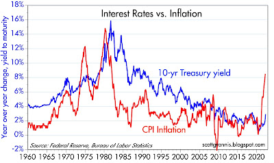
For more than a year I've been arguing that monetary policy was way too easy and thus the risk of higher and persistent inflation was very high. (Check out my posts over the past year in the Blog Archive to the left.) With consumer price inflation now approaching double-digit territory, the bond market is beginning to catch on (as recently as last January I noted that the bond market was failing to catch on). The following charts show that only in the past month or two has the bond market begun to adjust to a higher-inflation reality; unfortunately, it still has a lot of adjusting left.

Chart #1

Chart #1 shows the long-term history of bond yields and inflation. Although the recent rise in yields has been rather sharp, yields are still an order of magnitude below where they should be if inflation is indeed persistent.

Chart #2

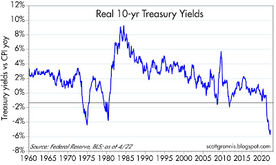
Chart #2 adjusts the yield on 10-yr Treasuries for the rate of inflation. Never have real yields been so low. What that means is that bond investors are beginning to learn that owning bonds is a great way to lose substantial purchasing power. How much longer will it take for bonds to at least compensate investors for inflation? By similar logic, anyone borrowing money at recent interest rates has made a killing if he or she used the borrowed money to buy real assets (e.g., property, businesses, commodities).

Chart #3

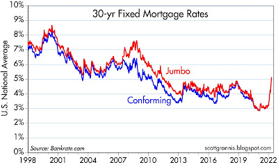
Chart #3 shows the nationwide average rate on 30-yr fixed rate mortgages. It has surged from 3% to now 5.25% in a very short period, but it is still way below the rate of housing price inflation, which has been in double-digit territory for the past year or two. Lesson that is being learned: buying homes with leverage at current mortgage rates can be extremely profitable. That lesson will translate into more demand for houses and more borrowing, which will only exacerbate the inflation fundamentals at work in the economy today. It will also erode the demand for money, which will effectively require the Fed to raise rates even more.

Chart #4

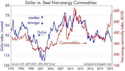
Chart #4 compares the strength of the dollar vs. other major currencies (blue line, inverted) with the prices of non-energy commodities. This chart is actually quite interesting, because the typical correlation of the dollar and commodity prices has completely broken down: it used to be that a weaker dollar correlated with higher commodity prices; now it seems that the stronger the dollar, the higher commodity prices go. This can only mean that artificially low interest rates are stimulating demand for hard assets, but they are not weakening the dollar—perhaps because most major currencies have exceptionally easy monetary conditions. The dollar is benefiting mainly from its safe-haven appeal.

Chart #5

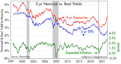
Chart #5 compares the nominal and real yields on 5-yr Treasuries (red and blue lines) with the difference between the two (green line), which in turn is the market's expectation for what the CPI will average over the next 5 years. Inflation expectations have indeed risen, and now stand at an historical high (recall that TIPS only came into existence in 1997). But the market is only expecting inflation to average a bit less than 3.5%, which is way less than the 11% annualized rate that we saw in the first three months of this year. In other words, the bond market is expecting inflation to fall significantly in coming years. 

But since the Fed has not even begun to tighten, this is a rather brave assumption.

Wednesday, April 13, 2022

Tax revenues soar, spending still in la-la land


Deficit spending was off the charts during the Covid pandemic, and it's finally beginning to come back to earth. Biden has indeed overseen the largest reduction in the federal deficit in history, but the deficit is still in la-la land despite having fallen precipitously. What's saving the day is a massive surge in income tax revenues fueled by a recovering economy, significant inflation, and soaring stock prices. 

Chart #1

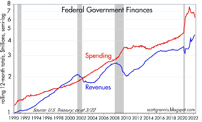
Chart #1 shows the 12-mo. rolling sum of federal spending and revenues, plotted on a log scale to emphasize  rates of change (i.e., straight lines reflect a constant rate of growth). Revenues have surged and spending has dropped from outrageously high levels, but spending is still miles away from what formerly would have been termed "normal."

Chart #2

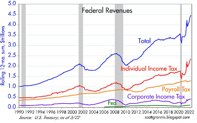
Chart #2 shows the composition of federal tax revenues. All sources of revenue have improved, but individual income taxes account for the lion's share of improvement for the federal fisc. This in turn has been driven by a huge recovery in the number of people working, rising incomes, inflation, and surging stock prices (some of which translates into capital gains taxes). 
 
Chart #3

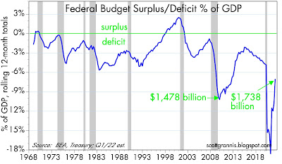
Chart #3 shows the federal budget surplus or deficit as a percent of nominal GDP, with dollar amounts shown for two periods. The deficit has shrunk dramatically in the past year or so, but it is still at levels (relative to GDP) that in prior years would have been considered unimaginably high.

Chart #3

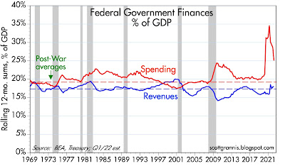
Chart #3 shows spending and revenues as a percent of GDP, in addition to the post-war average for each. Note that revenues have recovered to their post-war average but spending remains extraordinarily high.

Chart #4

Chart #4 compares the unemployment rate to federal spending as a percent of GDP. It should be pretty clear that spending is largely driven by the unemployment rate, which is another way of saying that Congress attempts to alleviate the pain of recessions by spending lavishly. In the case of our recent Covid-lockdown recession, Congress effectively went berserk and over-spent ridiculously. Spending is still in la-la land, and by an order of magnitude which goes a long way to explaining why we have so much inflation. Why? Because the surge in spending was largely financed by money printing, as I have documented repeatedly with my charts of M2 growth.

The last thing this economy needs is more spending (affectionately referred to by politicians as "stimulus"). If there's a silver lining to the Biden/Harris incompetence cloud, it's that Congress is unlikely to be able to muster the votes to authorize yet another round of "stimulus."

Long-time readers and supply-siders know that government spending never stimulates. It's just a headwind for the economy because government is commandeering the economy's resources and effectively wasting them. The government can never spend money as efficiently and as effectively as the private sector can.

Friday, April 8, 2022

Better measures of the yield curve


The shape of the Treasury yield curve continues to be a subject of great interest to the market, due to the now-widespread belief that a flat or negatively-sloped yield curve is a sure-fire harbinger of recession. I've disagreed with this of late, because while a negatively-sloped yield curve has in fact preceded almost all of the recessions in the past 50 years (with the notable exception of the economic collapse brought on by Covid shutdowns), there are other indicators (e.g., real yields, swap spreads, credit spreads) which also must be observed if one is to reliably anticipate recessions.

So the shape of the yield curve can help, but it's not bullet-proof. And to complicate things further, there are a variety of ways to measure the shape of the yield curve, and they often give conflicting signals.

Most discussions of the shape of the yield curve revolve around the spread between 2- and 10-yr Treasuries (the 2-10 spread), but increasingly I'm seeing market pundits refer to the 2-5 spread, the 5-10 spread, and the 10-30 spread. Anyone attempting to follow these various spreads can become quickly confused. As I write this, the 5-10 spread is negative (-5 bps), while the 2-10 spread is positive (20 bps) and the 10-30 spread is almost flat (3 bps).

This begs the question: which measure of the slope of the yield curve is the most reliable guide to recessions?

The spread I have generally preferred is the 1-10 spread (shown in Chart #1), but there's one I think is even better: the spread between the real Fed funds rate and the real yield on 5-yr TIPS (Chart #2). Here I'm referring the real yield curve, not the commonly-used nominal curve. Real yields, after all, are far more important than nominal yields because they reflect the true cost of borrowing and the true returns to saving, and those are what create the most powerful incentives in the economy. The Fed is right when it says that it is not actually targeting the nominal Fed funds rate, but instead the real Fed funds rate; that is the best measure of the stance of monetary policy, and that is what a good yield curve analysis should focus on as its starting point (i.e., the overnight Fed funds rate after adjustment for inflation).

Chart #1

I have been featuring numerous updates of Chart #1 for as long as I can remember. It compares the real Fed funds rate (blue line), which is derived from the difference between the current funds rate and the most recent 12-mo. change in the Core Personal Consumption Deflator (the Fed's favorite measure of inflation), to the difference between the yield on 1- and 10-yr Treasuries (red line). Note that the red line is zero or less in advance of every recession and the blue line reaches at least 3-4%. I think it takes both conditions to equate to a high probability of an impending recession. Today, neither suggests an impending recession—not even close.

Chart #2

Chart #2 compares the real yield on 5-yr TIPS (red line) to the real Fed funds rate (blue line). (It only goes back to 1997 because that was the year the Treasury began issuing TIPS.) I would argue that this chart gives us a very accurate indication of the slope of the Treasury curve for several reasons: 1) it uses real yields, which are the best measure of how Treasury yields are perceived by the market and how they impact the economy, 2) the Fed itself prefers the real funds rate as the most accurate indicator of the effective stance of monetary policy, and 3) it uses 5-yr real yields on TIPS as the best measure of what the market expects Fed policy to do in coming years. (In bond market-speak, the real yield on 5-yr TIPS is equivalent to what the market expects the real Fed funds rate to average over the next 5 years.) According to this chart, the real yield curve is very positively sloped, with the difference between overnight real yields and 5-yr real yields being more than 5%.

So this chart shows us what the Fed is doing now and what it is expected to do in the future. Clearly, the Fed is "behind the curve" because it is going to have to be doing a lot of rate-hiking in coming years. That's what a very positively-sloped real yield curve tells us. The risk of recession will rise only as the real yield curve flattens. 

In other words, when the red line exceeds the blue line, the market is expecting the Fed to tighten policy in the future, whereas when the blue line exceeds the red line, the market is expecting the Fed to ease policy in the future. The former is consistent with the Fed being behind the inflation curve, and the latter consistent with being "tight." Note that each of the three recessions shown here were proceeded by a period in which the blue line exceeded the red line: those periods were witness to very tight Fed policy—so tight that the market became convinced that the Fed would inevitably ease policy because the economy would be negatively impacted. And the economy indeed subsequently collapsed.