Wednesday, June 21, 2017

Real yields on TIPS are a key, must-watch indicator

With the advent in 1997 of TIPS (Treasury Inflation Protected Securities), markets received a long-desired, market-based measure of real yields. Prior to the launch of TIPS, real yields could only be observed ex post, by subtracting inflation from nominal yields. With TIPS, we know today the risk-free real yields that investors expect to receive in the future—a notable addition to both market knowledge and to investor's portfolios. Moreover, TIPS are quite liquid and abundant: with $1.24 trillion of marketable TIPS outstanding, representing 9% of outstanding marketable Treasury debt, their real yield to maturity—a function of their market price—is a valid and valuable indicator which has a variety of uses, as discussed below.


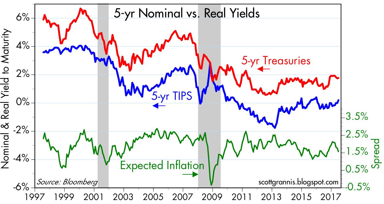
As the chart above shows, TIPS give us direct insight into the market's inflation expectations. Subtracting the real yield on 5-yr TIPS (blue line) from the nominal yield on 5-yr Treasuries tells us the market's implied inflation forecast, which today is 1.6% (i.e., the market expects the CPI to average 1.6% over the next 5 years). Although this is a bit below the Fed's professed target of 2% or so, it is very much within the range of historical experience, and nothing to be concerned about.


As the chart above suggests, the recent decline in inflation expectations is quite likely due to the recent decline in oil prices, not to any change in Fed policy.


As the chart above suggests, the real yield on TIPS also gives us insight into the market's expectations for real economic growth. Real yields on 5-yr TIPS have generally tracked the economy's trend growth rate for the past two decades. Real yields have traded in a narrow and relatively stable range (but with a modest upward trend) for the past four years, and real GDP growth has averaged about 2% over this same period. When real growth averaged over 4% in the late 1990s, real yields on TIPS were just under 4%. That risk free real yields on TIPS should tend to be somewhat less than the real growth of the economy should come as no surprise. The best investors can hope for from the broad market on average is whatever real growth happens to be, whereas TIPS guarantee a real rate of return ex-ante. A bird in the hand should always be worth more (yield less) than two in the bush.


Skeptics might object that TIPS and Treasury prices have been distorted by massive QE-related Fed purchases. But the chart above, which compares the Fed's share of marketable Treasuries to their yield, shows little if any reliable correlation between the two. Today the Fed owns just under 18% of outstanding marketable Treasury debt, and that is about the same share as they held in the pre-2007 period—yet yields today are less than half what they were back then. The Fed currently holds about 9% of outstanding marketable TIPS, so Fed purchases of TIPS have had even less impact on the TIPS market than on the Treasury market.


Not surprisingly, the real yield on TIPS today is heavily influenced by ex-post real yields on Treasuries, as the chart above shows. Fed purchases of TIPS, in other words, are not distorting the real yields on TIPS today. Market-driven real yields are grounded in observable real yields over recent history. And the difference between Treasury and TIPS yields (expected inflation) is very much in line with historical inflation. Again, there is no evidence to suggest that the Fed or the market is distorting the prices or the message of TIPS and Treasuries.


Real yields on 5-yr TIPS are by definition the market's expectation for what the real yield on the Fed's fund rate target will average over the next 5 years. There's an arbitrage that makes this work: you can invest in the Fed funds market for five years or you can buy 5-yr TIPS; in the presence of liquid markets it is reasonable to think that the expected real yield of both strategies is approximately equal. 

The Fed makes much of its nominal interest rate target, but it is the real yield on the funds rate that is the most important, and it plays a key role in the Fed's deliberations. Low nominal yields sound like "easy" money, but money is really easy only when real borrowing costs are negative, as has been the case throughout the current business cycle expansion. Real overnight yields are now rising, and beginning to be positive in real terms. That is fully consistent with the Fed's belief that the real equilibrium funds rate is rising as well, since the economy is enjoying improving economic fundamentals (e.g., a low rate of unemployment, steady jobs growth, improving confidence, low implied volatility, low and stable inflation, and reduced regulatory burdens). The current real yield on 5-yr TIPS strongly suggests that the market is expecting the Fed to continue to increase short-term real and nominal rates in coming years, but not by very much. In fact, the market currently expects the Fed to raise its target rate only twice over the next 18 months.


It's also worth noting that the prices of 5-yr TIPS (as proxied in the chart above by using the inverse of their real yield) have been positively correlated with gold prices over the past 10 years or so. This is rather remarkable, given that these two assets are fundamentally different in almost every respect. The one characteristic they share, I would argue, is that both are "safe havens" of a sort. Gold protects against all sorts of risks to one's purchasing power, and TIPS protect against the ravages of inflation of a monetary origin.

Higher real yields on TIPS would therefore be a signal that the market is expecting stronger real growth in coming years. We already see a hint of that in the modest upward trend in TIPS real yields over the past four years, as evidenced in the chart below:


One other thing that we can deduce from this analysis is that there is little if any evidence that the market is overly optimistic about the prospects for US growth. Thus, if Trump and Congress manage to deliver serious tax and regulatory reform, then I would expect to see much higher real yields, much lower gold prices, and a stronger stock market.

Friday, June 16, 2017

Weak housing starts misleading

May housing starts were much weaker than expected (1092K vs 1220K) and on the surface suggest that the housing boom that started back in 2011 has run its course. However, continued gains in the prices of homebuilders' stocks suggests that the May print was an outlier, driven mainly by weak multi-family starts, and that there is a rotation underway from multi-family to single-family home construction that continues to be strong. Calculated Risk has more details.


The chart above compares starts to an index of homebuilders' sentiment. Sentiment among those closest to the housing market continues to be healthy, even though starts have been roughly flat for the past two years. Homebuilders see things improving, not stagnating as starts would suggest.


The stock market appears to agree. As the chart above shows, the stocks of homebuilders continue to rise in price. This confirms the sentiment index referenced above.


The chart above compares housing starts (white line) to the index of homebuilders' stock prices (orange). The two are highly correlated, and it appears that the index of stock prices leads housing starts by at least several months. Note that the orange line turned down six months prior to the early '06 downturn in starts, and in 2009 it turned up significantly almost a year before starts did.

At the very least this suggests that it would be premature to conclude that the recent weakness in reported housing starts marks the end of the housing construction boom.

Thursday, June 15, 2017

Recommended reading: Camille Paglia on Trump, Democrats, Transgenderism, and Islamist Terror

That's the title of an interview with Camille Paglia published by The Weekly Standard. She's one liberal who's had my total respect for many years. She knocks several balls way out of the park on both sides of the aisle, and in grand style. Here's one excerpt I especially liked, in which she skewers political correctness:

Liberalism of the 1950s and '60s exalted civil liberties, individualism, and dissident thought and speech. "Question authority" was our generational rubric when I was in college. But today's liberalism has become grotesquely mechanistic and authoritarian: It's all about reducing individuals to a group identity, defining that group in permanent victim terms, and denying others their democratic right to challenge that group and its ideology. Political correctness represents the fossilized institutionalization of once-vital revolutionary ideas, which have become mere rote formulas. It is repressively Stalinist, dependent on a labyrinthine, parasitic bureaucracy to enforce its empty dictates.

Read the whole thing.

13 key charts say things are OK

Yesterday the FOMC raised its target short-term interest rate by a quarter point to 1.25%. This was as expected, but markets today are a little on edge. Since the rate hike came against a backdrop of a still-weak economy, a softening in inflation, and a flattening of the yield curve, there were questions: Is the Fed now too tight? Is inflation, now running at 1.5% or so, too low? Will the unwinding of the Fed's balance sheet (also announced yesterday) pose problems for the market in the future?

For now, I don't see any significant concerns.  The unwinding of the Fed's balance sheet will not likely start for several months, and it will be very gradual in the beginning, giving the Fed plenty of time for a mid-course correction should it prove problematic. Reading the bond market's entrails, I see no sign of distress, and no shortage of liquidity. Inflation has slipped modestly below 2%, but that's hardly something to lose sleep over, and it's likely due to the weakness in oil prices. Which is actually a boon for the economy, since cheaper energy makes it easier to generate growth. The world is "suffering" from a glut of oil that has been caused by a surfeit of supply, not a shortfall in demand.

If there's anything to worry about, it's that the market apparently is not very worried about anything. The implied volatility of stocks and bonds is quite low by historical standards, which means the market is reasonably certain about what it foresees. What it foresees is a continuation of what we have seen in recent years: modest economic growth of 2% or so, relatively low and reasonably stable inflation of 1.5% to 2% or so, modest growth in corporate profits, and a modest pickup in global growth.

The market is apparently unconcerned about the potential for geopolitical nightmares, such as might follow from further destabilization of the Middle East or a nuclear attack by North Korea. Few seem to worry about a failed Trump presidency, despite an unprecedented media onslaught—and it's hard to find evidence that the market is priced to a successful Trump presidency, in which tax rates are slashed and prosperity once again washes over the land.

Is the market too complacent and are valuations too high? We'll only know in the fullness of time. We've seen implied volatility remain low for extended periods without anything untoward happening. Then again, big shocks usually come at times of great complacency. About the only thing that one can say at times like this is that hiding out in the safety of cash is still relatively expensive. Cash only pays about 1% per year, at a time when the earnings yield on equities is 4.6% and 10-yr Treasuries yield less than 2.2%. Think back to the last time stocks were egregiously overvalued (late 1999/early 2000). Cash paid 5-6%, 10-yr Treasuries offered a 6.5% return, and the earnings yield on equities was only 3.5%. It was a lot easier to hide out in cash back then than it is now, but PE ratios back then were in the neighborhood of 30, whereas today they are 22. In short, it's not obvious that stocks today are overvalued, especially in the context of alternative investments.

What follows are 13 charts that illustrate key market and financial fundamentals, in no particular order, with some brief commentary on each. I want to get this out soon, because my oldest grandson is graduating from elementary school today and I don't want to miss the ceremony.


2-yr swap spreads are at very reasonable levels. This tells us that liquidity is abundant and systemic risk is low. If anything, the recent decline in swap spreads both here and abroad is a harbinger of better things to come. If the Fed were putting the squeeze on the banking system and/or the economy, these spreads would be a lot higher and rising.


As the chart above shows, there are two things that tend to happen in the bond market in advance of recessions: real yields become significantly positive, and the yield curve becomes flat or negatively-sloped. We may get there in a year or so, but for now neither of these indicators is threatening. The Fed hasn't so much tightened as it has become less loose.


Here's a closeup of the real Federal funds rate, using my estimate of the current level of inflation. Still quite low by historical standards. If you put your money in safe investments, you are probably going to lose some purchasing power. Not very exciting, nor very threatening.


The chart above shows two points on the real yield curve: overnight and 5 years. The red line is the market's expectation for where the blue line is likely to be in 5 year's time. The real yield curve has flattened, because the market doesn't expect the Fed to do much more tightening for quite awhile. The time to worry is when the bond market senses that the economy is so weak that in the future the Fed is going to have to cut rates.


Inflation expectations over the next 5 years have fallen to 1.6% or so, as evidenced by the price of 5-yr Treasuries and 5-yr TIPS.


As the chart above shows, the decline in oil prices probably explains the decline in inflation expectations. This is a good thing.


The prices of TIPS and gold have been falling on the margin, though they remain elevated. I take this to mean that the market is somewhat less willing to seek the safety of these two securities, which is another way of saying that the market is gradually losing its fear of the unknown. If the economy were really healthy, both of these prices would be a lot lower.


The decline in TIPS prices (and the rise in real yields) is the market's way of saying that it thinks real GDP growth could pick up a bit in coming years, as the chart above suggests.


Treasury yields generally track the ups and downs of inflation, but the level of yields is still relatively low compared to the current level of inflation. I take that to mean that the market is still willing to pay up for the safety of bonds. If the market were wildly optimistic and/or overvalued, Treasury yields would be much higher than the rate of inflation.


The implied volatility of both equity and bonds is historically quite low. It's not unprecedented for this to happen, and it doesn't necessarily argue for any negative surprises around the corner. Sometimes we get extended periods of relative calm like today's. If it means anything, it's that a negative shock would come as a shock to the market. If something bad happens, it's going to be bad, because the market is not expecting it. Shocking, I know.


All this chart says is that the market tends to sell off when fear and uncertainty raise their ugly heads. Nothing terrible is happening currently, according to the market, so equity prices are floating gradually higher. Shocking.


For over a decade the rate of consumer price inflation ex-energy has averaged about 2%. Currently that rate has slipped a bit from that trend, but by a very tiny amount. The decline in oil prices may be "leaking" into other prices. Terrible (not).


The TED spread (the difference between 3-mo. LIBOR and 3-mo. T-bills) today is quite normal, right around 25 bps. This means that the Fed has been successful in guiding short-term rates higher. T-bill yields are lagging the Federal funds rate by about 25 bps, while overnight bank lending rates are tracking the Fed's rate target; that's almost a textbook-perfect picture.  The Fed is not pushing on a string, and it has figured out how to push market interest rates higher without starving the banking system of liquidity (as it did in past tightening episodes, when the only way it could push rates higher was by draining bank reserves). This is good news, since it means the Fed is still in control despite never before having executed a tightening of policy in the presence of an abundance of bank reserves.

Monday, June 12, 2017

Commercial real estate alive and well

REITS (e.g., VNQ) have underperformed the broad market (S&P 500) by over 20% since early July of last year, thanks at least in part to concerns that e-commerce (e.g., Amazon) has rendered shopping malls obsolete. To illustrate this point, one REIT, SPG (Simon Property Group, the largest shopping mall and retail center owner in the country), has underperformed the broad market by over 40% since the end of last July. The graph below illustrates the divergences:


According to the latest data (April) from CoStar, prices for larger commercial real estate properties slumped beginning in mid-summer last year, but have rebounded of late. Meanwhile, their equal-weighted property price index (which captures the much larger volume of transactions for smaller properties) jumped an impressive 15% in the year ending last April, and has been posting double-digit gains for the past four years:


I point this out because the pessimism priced into REITs in general, and especially those that specialize in large commercial properties and shopping malls, may have reached extreme levels. Caveat emptor, of course.

UPDATE (6/21): The May release of the Architecture Billings Index rose to 53, marking the fourth consecutive month of growth. This is a good indicator of increased future spending on commercial real estate, and fully supports the thesis of this post. See Calculated Risk for more details.


Thursday, June 8, 2017

Richer than ever

This post is the latest in a series of updates on the fabulous wealth that has been created in the U.S. economy.

Today the Fed released its Q1/17 estimate of the balance sheets of U.S. households. Once again, our net worth reached a new high in nominal, real, and per capita terms. We have been struggling through the weakest recovery ever for the past 8 years, yet we are better off than ever before, and by a lot.


As of March 31, 2017, the net worth of U.S. households (including that of Non-Profit Organizations, which exist for the benefit of all) reached a staggering $94.84 trillion. That's up $7.3 trillion in just the past year, for an impressive gain of 8.3%, and up $27.2 trillion since the pre-2008 peak. Of note, household liabilities have increased by a mere $510 billion since their 2008 peak, for a gain of only 3.5%. The value of real estate holdings is up about $1.9 trillion (+7.6%) from that of the "bubble" high of 2006, and financial asset holdings have soared by almost $24 trillion (+45%) since pre-crash levels, thanks to significant gains in savings deposits, bonds, and equities. The gains in wealth are not just due to a raging stock market, since the market cap of all traded U.S. equities has risen by only $8.4 trillion since its pre-2008 high, according to Bloomberg. 


In real terms, household net worth has grown at a 3.5% annualized rate for the past 65 years, as seen in the chart above. That works out to almost a 10-fold gain in wealth roughly three generations, and that's impressive by any standard. Perhaps more importantly, there is no sign that this rising trend has been compromised or degraded in the past decade.


On a real per capita basis (i.e., after adjusting for inflation and population growth), the net worth of the average person living in the U.S. reached a new all-time high of $292K, up from $63K in 1950. This measure of wealth has been rising, on average, about 2.3% per year since records were first kept beginning in 1951. By this metric, life in the U.S. has been getting better and better for generations. Real per capita net worth has almost quintupled in three generations.


The ongoing accumulation of wealth is not a house of cards built on a bulging debt bubble either, regardless of what you might hear from the scaremongers. As the chart above shows, the typical household has cut its leverage by one third, from a high of 21% in early 2009 to 13.8% by the end of last quarter. Households have been prudently and impressively strengthening their balance sheets over the past eight years by saving and investing more and by reducing the use of debt financing.

Inevitably, skeptics will point out that although the amount of wealth created in the U.S. economy is spectacular, the distribution of that wealth is heavily skewed, being held mostly in the hands of relatively few. Zero Hedge has a good summary of the relevant facts. I (and many others) would argue, however, that the distribution of wealth is not nearly as important as the per capita amount of wealth. Consider: an employee of Apple, now the world's most valuable company (market cap of $808 billion as of today) may have zero personal net worth, but he or she enjoys a job that never existed before. Or consider users of Apple's iPhones who also may have zero personal net worth, but now enjoy more computing power and knowledge in their pocket than was even conceivable just 10 years ago. Increased wealth means more jobs, more opportunities, and more productivity for everyone. Society's accumulated net worth can be seen in buildings, factories, homes, gadgets, streets, and transportation networks, and all of this can be enjoyed and exploited by nearly everyone for their personal gain and/or happiness. It doesn't matter who owns the factory; what matters is how good the jobs are in that factory.

Free markets and capitalism have proven to be the greatest creators of wealth and prosperity in the history of the world. They maximize wealth creation and opportunity for all, but they can't possibly deliver equality of wealth distribution. To expect it would be to fail to understand how free markets and capitalism work. Some people's comparative advantage lies in building companies and accumulating wealth, while others' advantage lies in supplying the labor that allows capital to be put to work for the benefit of all. Everyone needs each other, and everyone enjoys the fruits of our prosperity. You can't have an Apple without a Steve Jobs becoming fabulously wealthy, and you can't have an Apple without millions of people working to produce and use its products.