Faced with much-higher-than-expected inflation, the Fed is nevertheless taking great pains to assure markets that they will address the problem in a slow and gradual fashion, by taking 25 bps baby steps per month to raise the federal funds rate beginning next month. They seem to be aligning with a school of thought that says the economy these days is too weak to sustain a rapid increase in interest rates, so it's better to be slow and gradual than shock and awe.
While this reinforces the point of my
last post (i.e., the Fed poses no near-term threat to the economy), it will likely only make things worse in the long run. Why? Because by pre-announcing a gradualist approach they have given investors and the public a green light to take advantage of incredibly cheap financing costs, and that will only make inflation harder to control in the future. Why harder to control? Because increasing the incentive to borrow money to buy
things (cars, houses, commodities, property, plant and equipment) is equivalent to decreasing the incentive to hold money. Borrowing money means going short money: you win if the value of the dollar declines. Paying off debt means going long money: you win if the value of the dollar increases. With the supply of money (e.g., M2) obviously in over-supply, the Fed is incredibly trying to undermine the demand for holding that money. They couldn't be more wrong.
From a monetary perspective, the U.S. faces a gigantic, two-sided problem: a huge surplus of money and a lack of demand for all that money. That adds up to a turbo-charged inflation environment wherein money becomes a hot potato that no one wants to hold because it is losing value. To better understand that process, once again I recommend my post from last summer: "
Argentina inflation lessons for the U.S."
What follows are some charts that help illustrate what is going on.
Chart #1
Chart #1 shows the real and nominal value of used cars, as calculated by the folks at Manheim Consulting (and using the CPI to determine inflation-adjusted prices). Prices in nominal terms have nearly doubled in the past two years! Sure, a lot of this is due to supply chain problems—with no chips they can't build and sell new cars, so with demand pumped up with lots of transfer payments, car prices have nowhere to go but up. That's the argument for the current inflation spike to be transient. But that ignores the fact that a whole lot of prices are up and people are paying those prices and still want more. Those who are flush with cash can pay those higher prices, but that doesn't reduce the cash available to spend, since the cash that buyer A hands over then sits in the account of seller B. More rapid spending doesn't deplete the stock of excess cash, it simply spreads it around. Without excess cash there could not be a general increase in prices.
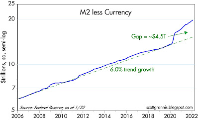
Chart #2
Chart #2 is one of the
most important yet
largely ignored chart in the world today, in my view. It's a graphic depiction of just how much extra money is sitting in the bank accounts of the U.S. public (M2 excludes corporate cash, by the way). Relative to what we would have expected M2 to be today, there is an extra $4.3 trillion dollars that has landed in bank accounts in the past two years. At first, with Covid lockdowns and general panic reigning, the public was happy to have all that money socked away, but now that life is getting back to normal, people are trying to spend it. And it shows—just look at the soaring prices of homes, cars, commodities, food, etc.
There are two ways the Fed can fix this problem, but those solutions are not yet even on the table. For one, they can reduce banks' ability to increase their lending by dramatically shrinking the Fed's balance sheet (i.e., the Fed needs to sell trillions of bonds in order to soak up trillions of excess reserves held by the nation's banks—a process otherwise known as Quantitative Tightening). Alternatively, and additionally, they can raise the interest rate they pay banks that hold those extra reserves, thus making lending to the private sector less appealing than lending to the Fed (lending to the Fed by holding bank reserves is a no-risk proposition, unlike lending to the public). And of course they can and most probably will do both—eventually. But to do it right they need to act swiftly and decisively. If they don't, troublesome inflation is going to be with us for years.
Chart #3
Chart #3 shows the history of rates on 30-yr fixed rate mortgages. Just a few months ago they were trading at all-time lows—less than 3%! Just think of all the happy people who refinanced their mortgage in recent years and then discovered that housing prices have risen over 20% in just the past year. Do the math: if you got a 3% mortgage with a 20% down payment ($100,000) to buy a $500,000 house a year ago, you have paid only $15,000 in interest and your house has gone up by 20% ($100,000). That equals a total return on your down payment of 85% ($85,000)! There's a handy shortcut to figure out how much profit you can make by borrowing money to buy property: If the required down payment is 20%, then you are taking on 5 times leverage (100/20). Multiply the amount of leverage by the difference between the asset's annual appreciation and your annual interest cost (in this case, 5*(20% - 3%) = 85%, and you get your profit.
I'll bet lots of people today are looking at borrowing costs and comparing that to their expected returns. If you bought a car a year ago with a 3% loan and 10% down, you could realize an obscene profit by selling the car today. Say you sell it for only 25% more than its initial selling price (I'm being really conservative here). That would give you a profit of 10*(25% - 3%) = 220%!
With interest rates so low relative to inflation, it's no wonder the money supply is surging: when banks make loans, they create money out of thin air by crediting the borrower's account. Rising inflation expectations encourage borrowing, and more borrowing expands the supply of money.
So, is the recent 1-point jump in mortgage rates likely to crush the housing market? I seriously doubt it, as long as home prices rise by more than the current mortgage rate, which is about 4%.
Chart #4 shows the level of single family home sales, which has been rising for the past decade. Over that same period, national home prices have increased by an annualized rate of just over 7%, according to the Case Shiller data, and 30-yr fixed rate mortgage rates have averaged about 3.8%. Someone lucky/smart enough to buy a home a decade ago with 10% down has made a profit of 32%.
Charts #5 and #6 are the natural result of these factors: people are buying homes faster than they come on the market. Nationwide, the supply of unsold homes has never been so low relative to the pace of sales. And of course that only keeps upward pressure on home prices. One caveat: Chart #6 suggests that real home prices tend to rise, on average, by about 1.1% per year. Current prices are running hot (over trend), so they might not have a lot further to go. I would expect them to cool off; in real terms, that means they continue to rise by something less than prevailing rate of inflation. The Fed needs to jack rates higher—much higher to avoid this.
Moral of the story: when interest rates are low relative to inflation, people are incentivized to borrow and buy. Which is what I've been recommending for
many years, by the way. And that in turn fuels inflation by expanding the money supply. Unless, of course, the Fed takes steps to unwind the perverse incentives that are in place today.
Now back to the bond market and what it is thinking about inflation. That's summarized in Chart #7, which show 5-yr real and nominal Treasury yields and their difference, which is what the market expects that consumer price inflation will average over the next 5 years. Inflation expectations have now reached their highest point since the introduction of TIPS in 1997: 2.9%. (Prior to that we had no way of directly measuring inflation expectations.) But expectations are still far short of where actual inflation is, which means the bond market is pretty confident that the Fed will get things right before too long. But I'm not so sure.
Chart #8 compares the real yield on 5-yr TIPS to the current real yield on Fed funds. The former is best described as the value that the market expects the latter to average over the next 5 years. Apparently, the bond market expects the Fed to raise the real yield on overnight assets significantly over the next 5 years from its current abysmally low level of almost -5% at the same time that inflation falls significantly. Regardless, the market doesn't expect real yields to be positive until many years in the future, which implies the market is quite pessimistic about the long-term health of the economy. So: the bond market thinks the economy will be quite weak for the foreseeable future, and inflation will soon return to levels that the Fed is targeting (2-3%). Those are courageous assumptions, I would argue.
Chart #9
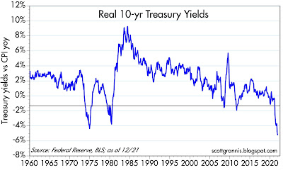
Meanwhile, we can't lose sight of the fact that interest rates are currently WAY below the level of inflation. As explained above, this by itself creates incentives which work to push inflation higher. It's useful to compare today to the 1970s to fully appreciate the Fed's predicament today. Back then, inflation surprised to the upside and it took the Fed more than 10 years to get it back under control. The Fed broke the back of inflation only after it raised rates (by curtailing growth of the M2 money supply and jacking up the Fed funds rate) to a level which exceeded the rate of inflation. They may well have to do that again. Unfortunately, almost no one expects that to happen. So the next several years could be a bumpy ride, but the bumps won't start coming for awhile.
Note also that once inflation started to decline in the early 1980s, the bond market was very slow to react. Real interest rates (the difference between the blue and red lines) were very high initially and then gradually subsided. Today real interest rates are decidedly negative, much as they were during a portion of the 1970s (see Chart #10). Negative real rates tend to occur during times when inflation exceeds expectations and the Fed is slow to respond—that is what happened in the late 1970s, and the past looks set to repeat.
I will be watching breathlessly for the monthly M2 numbers to be released around the end of the third week of each month. I will only breathe easy if they start showing a declining rate of growth, which is currently around 12-13% on an annual basis. I will be pleased if the Fed becomes more concerned about inflation and starts raising the Fed funds rate more aggressively at the same time they start selling the bonds they hold (to reduce bank reserves) more aggressively. The Fed desperately needs to address the perverse incentives they have created.
Although the market might well react negatively to an aggressively tightening Fed, I would see it as a reason to be optimistic. How could it be bad for the Fed to do what they should be doing?