


Tuesday, January 31, 2023
Recommended reading: Steve Moore's Hotline
I've known Steve Moore since the 1980s, and he's one of the best economists out there, especially when it comes to understanding and explaining the relationship between government policies, the economy, and what creates prosperity. For several years now he has been publishing a daily Hotline newsletter that is always full of must-know facts and figures. And it's free, just for the asking.
Today’s edition features Chart #2 from my last week's post. I used the chart to make the point that bad economic policies have resulted in very slow growth for the US economy for the past 14 years. He translates that into a number that people can more easily relate to: "if we had stayed on the 1984-2004 growth path, the average American would be about 22% richer today – or at least $15,000 more income per median income family."
Once again I would encourage all to subscribe to the Hotline.
Thursday, January 26, 2023
GDP up, inflation down
Conventional wisdom these days is that in order for the Fed to bring inflation down, they are going to have to kneecap the economy. So with the Fed continuing to talk tough, it's no wonder that a majority expect to see a US recession some time this year.
Wrong. As I've been explaining for a long time, inflation has already dropped significantly, and the economy remains reasonably healthy. In fact, a healthy economy and a vigilant Fed are a tried-and-true prescription for low inflation.
The facts back me up:
Real GDP growth for Q4/22 came in slightly above expectations (2.9% vs. 2.6%), and inflation, according to the very broad GDP deflator, was also slightly above expectations (3.5% vs. 3.2%), although it was substantially less than the 9.1% rate of just six months ago. Looking back at last year as a whole, real GDP shrank at a 1.1% annualized rate in the first half of the year, and grew at a 3.1% annualized rate in the second half of the year. Inflation, according to the GDP deflator (the most inclusive index we have), was running about 8.7% in the first half of the year, and 3.9% in the second half. So inflation fell by more than half over the course of the second half of the year, even as real growth almost tripled! So much for "conventional wisdom."
Some charts to illustrate:
Chart #1

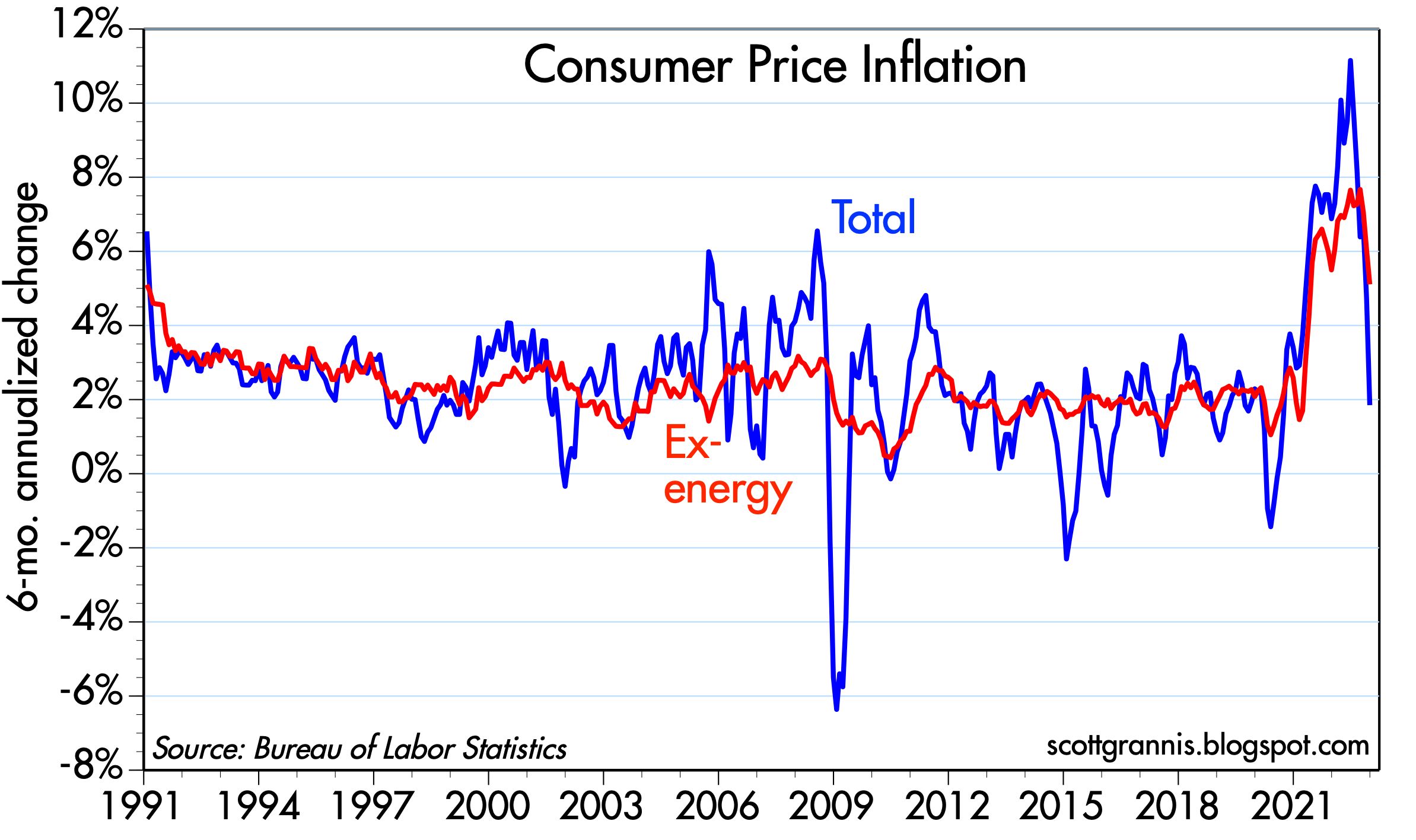
Chart #1 shows the quarterly annualized change in the GDP deflator, the broadest measure of inflation. Last year it peaked at 9.1% in the second quarter of last year, and fell to 3.5% in the fourth quarter. That's a huge decline that I would wager most people are unaware of.
Chart #2

Chart #2 is also one that I believe most people are unaware of. The blue line represents the size of the US economy in inflation-adjusted terms (aka real growth). It's plotted on a logarithmic axis which turns constant rates of growth into straight lines. The green trend line extrapolates where real GDP would be if the economy had continued its 3.1% trend growth rate that was in place from 1950 though 2007. The red trend line is the 2.2% annual growth trend that has been in place since the recovery started in 2009. What we see in recent years is a perfect example of Milton Friedman's "plucked string" theory of economic growth. It says that the economy tends to grow at a steady rate unless or until it meets a disturbance (e.g., a recession); and once that disturbance has passed, the economy "snaps back" to its former trend line.
Voilá! The economy is growing at about 2.2% annual rate. Nothing special or surprising about that at all. But the real tragedy is that we could be growing at a much faster rate if our fiscal policy were sane instead of being dominated by burdensome regulations, green energy mandates, and egregious tax rates.
Chart #3

Chart #3 makes yet another appearance—it's one of my favorites. It shows that when the market gets very nervous (as measured by a rise in the Vix index), the stock market tends to swoon. And when confidence returns and the Vix index drops, stocks tend to rally. Confidence these days is slowly returning and the stock market is moving higher.
Let's hope this continues; let's hope the Fed doesn't feel compelled to squeeze the economy just because inflation is a little higher than they would like to see. The truth is that on the margin, inflation pressures are receding (and by some measures inflation is already back down to 2%—see Chart #1 in this post) and the best way to keep inflation low is to allow the economy to continue to grow while keeping interest rates high enough to keep the demand for money from plunging. A greater supply of goods and services, after all, will help absorb any extra money that is still sloshing around.
UPDATE (Jan 27): Today we learned that the growth rate of the Core Personal Consumption Deflator for December continued to fall. That's the Fed's preferred measure of inflation. As Chart #4 shows, the 6-mo. annualized rate of growth of this index is 3.7%. The total PCE deflator is up only 2.1% on a 6-mo. annualized basis. Inflation is rapidly ceasing to be a problem.
Chart #4

Tuesday, January 24, 2023
M2 news continues to impress
For the past 18 months or so, I have argued that the surge in inflation which began about two years ago was fueled by a surge in the M2 money supply that began in the months following the Covid panic. The M2 surge, in turn, was created by the effective monetization of some $5 trillion of government checks (politely termed transfer payments) sent out to the citizenry, ostensibly to "stimulate" the economy.
As Milton Friedman might have described it, Congress printed up $5 trillion in new cash and hired a fleet of helicopters to drop it all over the country. He would have been surprised, however, that this didn't lead to an immediate surge of inflation. He theorized that people would rush to spend the cash they discovered in their backyards, thus giving inflation, and prices, a one-time boost. But I think he would understand that in this case, people simply stuffed the cash under their mattresses—they were under lockdown and couldn't spend it and, besides, there was so much uncertainty at the time that most people were content to just sit on their cash. For awhile at least. But by early 2021 Covid fears were easing and many people were anxious to get back to their normal lives. They started spending the money they had stashed away, and that was when inflation started to surge.
Today we received the M2 number for December '22, and it showed that the money supply has been shrinking at an unprecedented rate since its peak last March. People are spending down their excess cash balances and paying off loans, and that has been supporting a substantial rise in real GDP and a substantial rise in inflation as well. If the Fed has done anything right in this whole inflationary episode, it is to jack up short-term interest rates in unprecedented fashion (albeit too late); overnight rates have soared from 0.25% last March to now 4.5%. Higher interest rates worked to increase the demand for the excess cash, thus slowing the surge in spending and keeping inflation from exploding. Given the many signs that inflation is indeed cooling—commodity prices are down, real estate sales have ground to a halt, rents are falling, producer price inflation has plunged, oil prices are down by one-third—it looks like Fed rate hikes have substantially offset the inflationary potential of trillions of "excess" money supply.
Chart #1

Chart #1 shows the growth in the M2 monetary aggregate. Since 1995, M2 had been growing on average by about 6% per year (green line), with occasional mini-bursts of growth which were later reversed. But the Covid helicopter drop saw by far the largest expansion in M2 in history. The peak in M2 occurred last March, at $21.7 trillion, which was $4.7 trillion above its trend growth. Since then M2 has shrunk, and it is now only $3.4 trillion above trend; "excess" money has thus dropped by almost 30%. Over the past six months, the annualized rate of growth of M2 has been -3.7%; over the past 3 months, M2 is down at an annualized rate of 5.4%. This is very good news.
Chart #2

Chart #2 is powerful evidence that the surge in M2 growth was fueled by a massive increase in the federal deficit, which was effectively monetized as people deposited their checks and held on to the funds. Although it's a shame the deficit has started to rise again, it's nice to see that this time it is not being monetized. If Congress fails to reform its spendthrift ways it will be a shame because excessive government spending just weakens the economy. But there is reason to believe it won't aggravate inflation.
Chart #3

Chart #3 suggests that there is a 12-16 month lag between the growth of M2 and the rise in inflation. It further suggests that the significant decline in M2 over the past 9 months means that consumer price inflation is likely to continue to fall for the balance of this year and possibly well into next year, thus meeting the Fed's objective.
Chart #4

Monday, January 23, 2023
Federal debt is not as bad as you might think
The federal government has once again run up against its borrowing limits, and it's going to be Silly Season in Washington DC for the next few weeks. The debt limit will obviously have to be raised, but at what cost? None, according to the Democrats; spending discipline according to the Republicans. Sadly, both parties are complicit in the larger problem: Congress continues to spend money like a drunken sailor, and it has been ever thus, as the charts below show.
Chart #1

Chart #1 shows the staggering growth of federal debt held by the public, which is now $24.6 trillion. It is not $31.5 trillion, as many claim, because that figure includes money that Treasury has borrowed from social security and other government agencies. What the government owes itself is irrelevant; what matters is what our government owes to the public. As the chart shows, debt has been growing at about a 9% annual rate for the past 50+ years. This is not a new problem. (Note: the y-axis is logarithmic, so a straight line equates to a steady rate of growth; a steeper line equates to increases in the rate of growth.) Debt in the past (e.g., mid-1980s, and 2009-2012) has grown at much faster rates than it has recently.
Chart #2

Chart #3

The "burden" of debt is not the nominal amount, nor is it the size of the debt relative to GDP. The true burden is the cost of servicing the debt, which is a direct function of the level of interest rates. As Chart #3 shows, the size of our debt is indeed huge, but interest rates are historically low. Let me point out a curious fact: a rising debt/GDP ratio tends to coincide with falling interest rates, and a falling debt/GDP ratio tends to coincide with rising interest rates. Not what you've been led to believe, I'm sure.
Chart #4 shows the true burden of our debt, which is the cost of servicing the debt as a percent of GDP. That makes sense for the government, just as it makes sense for those who buy a house with a mortgage: what is your monthly mortgage payment as a percent of your income? A bigger economy can easily handle higher debt loads. But rising interest rates added to a very large nominal debt can be explosive. Fortunately, we're not there yet. In fact, the current burden of our federal debt is historically rather low. Sure, it's going to be rising by leaps and bounds in the years to come if interest rates continue to rise and the government continues to borrow. But maybe we'll get lucky (once again) and Congress will rein in spending and inflation will return to the Fed's target without the Fed having to jack rates to the moon. Our debt burden was about 60% larger in the 80s and 90s than it is today, and the sky never fell.
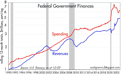
Chart #5 sums it up. Spending in the Covid years exploded, far outstripping the ability of surging tax collections to keep up.
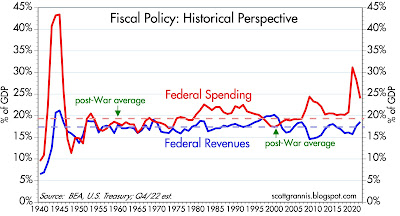
Chart #4

Chart #4 shows the true burden of our debt, which is the cost of servicing the debt as a percent of GDP. That makes sense for the government, just as it makes sense for those who buy a house with a mortgage: what is your monthly mortgage payment as a percent of your income? A bigger economy can easily handle higher debt loads. But rising interest rates added to a very large nominal debt can be explosive. Fortunately, we're not there yet. In fact, the current burden of our federal debt is historically rather low. Sure, it's going to be rising by leaps and bounds in the years to come if interest rates continue to rise and the government continues to borrow. But maybe we'll get lucky (once again) and Congress will rein in spending and inflation will return to the Fed's target without the Fed having to jack rates to the moon. Our debt burden was about 60% larger in the 80s and 90s than it is today, and the sky never fell.
The big reason debt rose so much was spending. In the 12 months ended February 2020, federal spending was $4.6 trillion. In the 12 months ended December 2022, federal spending was $6.3 trillion, up 1.7 trillion (36%) from Feb. '20. Taxpayers couldn't keep up the same pace, but the results may surprise you: in the 12 months ended February 2020, federal revenues were $3.6 trillion. In the 12 months ended December 2022, federal revenues surged to $4.9 trillion, up $1.3 trillion (+36%).
Chart #5

Chart #5 sums it up. Spending in the Covid years exploded, far outstripping the ability of surging tax collections to keep up.
Chart #6

Chart #6 puts things into even better perspective. As a percent of GDP, tax revenues today are somewhat higher than their post-war average, but spending remains extremely high relative to its post-war average. Taxpayers are not responsible for our towering debt—Congress is.
No amount of tax increases can fix our problem. We need to rein in spending!
Thursday, January 12, 2023
Why inflation has declined but the economy remains healthy
The December CPI report released today supports everything I've been saying for months. Inflation pressures peaked in June, with the year over year CPI registering 9.0%, the 6-mo. annualized rate 11.2%, and the 3-mo. annualized rate 11.0%. As of December those same measures were significantly lower, registering 6.4%, 1.9% and 1.8%. Quite an impressive decline! Inflation is no longer a problem.
The ex-energy version of the CPI showed the same decline, only on a smaller scale, with the peak also occurring in June: YOY 6.6%, 6-mo. 7.6%, and 3-mo. 8.6%. As of December, those same measures were 6.4%, 5.1%, and 3.5%.
The core version (ex food & energy) declined as well: June 5.9%, 6.8%, and 7.9%. December: 5.7%, 4.6%, 3.1%.
Some observations:
1) Energy prices traditionally are by far the most volatile component of the CPI, and this past year was no exception. Ex-energy and ex-food & energy measures of inflation were lower overall than the total and much less volatile, which means a lot of the inflation we experienced was of energy origin and temporary.
2) Any change in the trend of a measure of growth over time (e.g., inflation, disinflation) should show up first in the 3-mo. annualized numbers and later in the year over year measures. This is exactly the pattern we have seen with the recent surge in inflation which began in January 2021, when year over year inflation was 1.4%, 6-mo was 2.9%, and 3-mo. was 2.9%. We haven't come full circle yet, but we're getting pretty close, since the 3-mo. annualized measures of inflation (total, core and ex-energy) are now in the range of 1.8% to 3.5%.
Check out these posts from last year, which show I was way ahead of the crowd in seeing the peak in inflation pressures. Moreover, I have consistently argued that the Fed did not need to crush the economy in order to bring inflation down and that is even more true today.
Fed tightening need not result in a recession (June)
Market to Fed: no need to panic (July)
Inflation pressures cool, economic outlook improves (August)
M2 says the Fed doesn't need to crush the economy (August)
More predictors of lower inflation (September)
Fed's Rx for the economy should be a tincture of time (October)
Higher interest rates have solved the inflation pr... (December)
As for the Fed, I would hope they realize that inflation pressures were worse in the first half of last year at a time when the economy suffered two quarters of negative growth (inflation adjusted), while inflation declined significantly in the second half of last year, when the economy enjoyed two quarters of roughly 3% growth (inflation adjusted). This, of course, runs completely contrary to Phillips Curve thinking, which holds that just the opposite is true: namely, that a weaker economy is a prerequisite for reducing inflation.
Moral: the Fed doesn’t need to crush the economy to bring inflation down. Why? Because inflation is caused by too much money, not too much growth. M2 growth started slowing early last year, and the Fed raised interest rates in an unprecedented fashion; that combination worked to bring inflation down because it reduced the excess supply of money and at the same time gave the public a strong incentive to hold on to their unusually large money balances instead of spending them (which would have aggravated inflation pressures). From a broader perspective, stronger economies almost always go hand in hand with low inflation, while chronically weak economies (e.g., Argentina) suffer from persistently high inflation.
There is every reason to think that inflation will continue to cool without the need for further Fed rate hikes. And contrary to what so many pundits are fond of saying these days, the unemployment rate needn’t have to rise in order for inflation to fall. Inflation has been falling quite nicely, thank you, even as the unemployment rate has fallen to historically low levels.
And don’t overlook the unique fact that, despite the Fed’s aggressive monetary “tightening,” credit and swap spreads have been declining for the past three months. If “tight” money were a problem, we should have seen credit spreads widen. But they haven’t. Why? Because higher interest rates are not necessarily bad for the economy, at least to the degree we have seen this past year. What’s so bad about 4-5% interest rates? I’m so old I remember when it was heresy to predict that 10-yr Treasury yields would decline to 7%. And at the time the economy was doing just fine.
“Tight” money came to have that moniker not because the Fed drove interest rates higher, but because in order to push rates higher the Fed had to drain reserves from the banking system. That made money scarce, and that was why monetary policy came to be known as “tight.” The Fed restricted liquidity and that caused marginal players to go bankrupt, which eventually slowed the economy and caused the demand for money to skyrocket, which in turn brought inflation down, but at a huge cost.
Everything changed in late 2008, because that was when the Fed decided to pay interest on bank reserves and simultaneously adopted a policy of abundant reserves (aka Quantitative Easing). Money today is not scarce, bankruptcies are not exploding, yet inflation is coming down. Why? Because higher interest rates have served to balance the demand and the supply of money, and when that happens, inflation declines. Money in the bank pays 4% or so today, and that’s a lot more attractive than the 0% you could earn on money balances a year ago.
That, in a nutshell, is why inflation is down and the economy is still OK. Chairman Powell, are you listening?
UPDATE, Jan.14: I have access to my charts again, so I want to post just this one to illustrate the above text:
Chart #1
It's true that the year over year growth of CPI is still way above the Fed's target (i.e., 6.4% vs. 2%), but that ignores the much more important changes on the margin. If an MBA teaches you anything it is that you must always focus on the changes that are happening on the margin, not what has happened over the past year. On the margin, the housing market is definitely turning down. Yet about one-third of the CPI is based on the government's calculation of what homeowners would be paying if they were renting the house they own, and that is a very lagging indicator—as much as a year behind the reality of today's housing prices. We know for a fact that housing prices are turning down all over the country, so homeowner's rent will soon be subtracting significantly from the CPI.
Wednesday, January 4, 2023
The inflation tide continues to recede
To recap the key monetary events of the past two years: Massive government transfer payments during the Covid era ended up being monetized and stored in bank saving and deposit accounts by a public largely unable and not very willing to spend the funds. As a consequence, the M2 money supply grew by some $6 trillion over the two-year period ending March 2022, a pace that far exceeded anything in our monetary history. All that extra cash was fine—as long as the public was willing to hold onto it. But when people emerged from their Covid cocoons in early 2021, they unleashed a tsunami of spending which overwhelmed supply chains and boosted prices for nearly everything. Inflation, as a result, surged to almost 10% by last June.
Where things stand today: The monetary fuel for the inflation fires is running out. As I've been reporting for most of the past year, M2 growth is slowing dramatically and inflation has most likely peaked. The Fed has been slow to react from the very beginning, unfortunately, but it is already apparent that no further rate hikes are needed.
Meanwhile, the market and the Fed are worried about the wrong thing. Yesterday Bill Dudley gave voice to these concerns when he said that "the Fed needs to restrain economic activity" in order to bring inflation down. That's just plain wrong; inflation is not a by-product of economic activity, it is the by-product of unwanted money. Case in point: economic growth in Q3/22 and Q4/22 is quite likely to be 3-4%, up from -1% in the first half of the year, while inflation is quite likely to have declined from the 8-9% pace of the first half of the year to 4-5% in the second half. Moral: economies thrive with lower inflation and struggle with high inflation. Today's sharply higher interest rates have strengthened the demand for money, thus mitigating the inflationary potential of what is still an elevated level of M2.
The following charts update this most important of all stories.
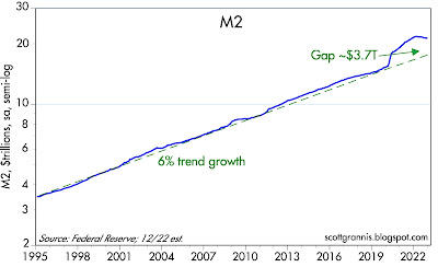

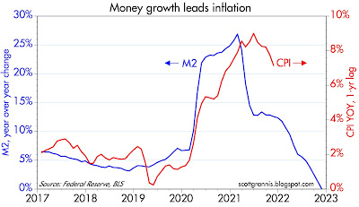
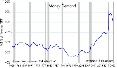
Chart #1

As Chart #1 shows, the $6 trillion M2 bulge is shrinking, both nominally and relative to the size of our growing economy. Excess money is being withdrawn, and lower inflation is the inevitable result.
Chart #2

Chart #2 shows how surging growth in the M2 money supply (blue line) was fueled by massive government deficits of equal size (roughly $6 trillion). Fortunately, over the course of the past year the money-printing press has largely shut down: ongoing deficits are no longer being monetized, and meanwhile M2 is shrinking.
Chart #3

Chart #3 compares the year over year growth of M2 (blue line) with the year over year growth in the Consumer Price Index (red line) lagged by one year, in order to show that the big surge in M2 that occurred in M2 from 2020 to 2021 explains quite well the surge in inflation that followed about one year later. The big drop in M2 growth which began a year ago is responsible for today's lower inflation. The chart further suggests that inflation could easily drop to within range of the Fed's 2% target later this year or by early next year.
Chart #4

Chart #4 is one of the most important charts, in my view, yet very few people are paying attention. It shows the ratio of M2 to nominal GDP, which I've called Money Demand. In essence, it shows how much of our annual incomes (using GDP as a proxy) we are willing to hold in the form of readily spendable cash, bank deposits, money market funds, and savings accounts (using M2 as a proxy). The ratio soared in the initial phase of the Covid era, and it has been falling ever since mid-2020. The Fed's job this past year has thus been to keep the demand for money from collapsing, since that would result in even higher inflation, and they are doing that by raising interest rates. As the next chart shows, it's working.
Chart #5

The Fed has been driving monetary policy by looking in the rear-view mirror and ignoring the explosive growth in M2. That's why they were late to react to last year's inflation surge. They have since reacted forcefully by engineering an unprecedented surge in interest rates which has kept the demand for excess M2 from collapsing. Inflation pressures have fallen significantly, and the outlook for inflation is likely going to continue to improve, thus making further rate hikes unnecessary. If my analysis is correct, the mood of the market could improve substantially in coming months.
Subscribe to:
Posts (Atom)
