Thursday, September 26, 2019

Truck tonnage update: still looking good

I've made a series of posts on this subject over the years, and they have apparently captured the interest of many readers, so here's another installment.

Truck tonnage, which is published monthly by the American Trucking Associations, has a strong tendency to track the level of stock prices over time. That's not surprising, since the physical volume of goods carried by trucks (which represents "70.2% of the tonnage carried by all modes of domestic freight transportation, including manufactured and retail goods," according to the ATA) should be a reasonable proxy for the overall economy, and stock prices tend to rise as the economy grows.

Last month's post showed a huge spike in July truck tonnage, but to be fair the series has been unusually volatile of late. The most recent datapoint, for August, registered a 3.2% drop from July, but it still shows a 4.1% year over year gain. Fiddling with the data, I discovered that a three-month moving average does an excellent job of smoothing out the inherent volatility of this index, and it shows the series to be in a definite uptrend. All of which suggests the equity market may be a bit too cautious about the current health of the economy.

Chart #1 

Chart #1 shows the raw data for truck tonnage (white line) and the three-month moving average of the same data (yellow line). Note how the volatility in the data almost completely disappears using a three-month moving average. That suggests there are some problems with the seasonal adjustment factors that are being used by the ATA.

Chart #2

Chart #2 compares the three-month moving average of the trucking data with the level of the S&P 500.

Wednesday, September 25, 2019

No housing market bubble

The worst you can say about the US housing market is that home prices appear to be consolidating after   almost four years of gains. There are few if any signs of a housing bubble waiting to pop, or a mismatch between housing supply and demand. Prices are no longer rising by 5-10% year, to be sure; instead they are rising only 2-3% per year. Nevertheless, housing construction is proceeding at a fairly modest pace, from an historical perspective, and new home sales are increasing. Mortgage rates remain at historically low levels, and housing in general is affordable. 

Chart #1

Chart #1 reminds us that the health of the housing market is closely tied to the health of the broader economy. With one exception—the mini-recession of 2001—a significant downturn in housing starts preceded every recession in the past 50 years. The current level of housing starts is weak by historical standards (40% below the peak of early 2006), but remains far below levels that have been associated with housing busts in the past.

Chart #2

Chart #2 compares a survey of builder sentiment with the level of starts. Not surprisingly, sentiment tends to lead starts. Builder sentiment today remains quite optimistic, and they are the ones closest to the action on the ground. So I would expect to see starts register further gains in the future. Labor shortages likely explain why starts are not more robust. And, it's likely that the prevailing mood of caution in the country and the markets which I've observed for years has contributed to keep the housing market sane. 

Chart #3

Chart #3 shows the supply of unsold homes, which has been very low for a number of years. The supply of unsold homes began rising in 2005, and the housing market peaked (in price and in housing starts) in early 2006. Lax lending standards (negative amortization loans, no doc loans, inverse floaters, zero down payments) and a surge in housing starts created a huge oversupply of homes and an artificially strong demand for homes that was unsustainable. There are no such signs today.

Chart #4

Chart #5

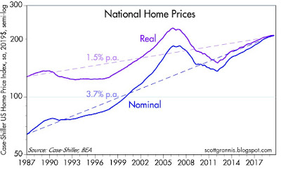
Chart #4 shows the broadest and arguably the best measure of US housing prices. Case-Shiller methodology focuses on repeat sales and covers a large portion of the country. Housing prices today are about 6% above their 2006 high, but on an inflation-adjusted basis, prices are still 12% below their 2006 highs. As Chart #4 also suggests, the real price of homes tends to rise modestly over time, due to the increasingly-larger size of houses and rising real incomes. Chart #5 simply shows the year over year increase in nominal prices. The latest datapoint in Chart #5 shows national home prices up 3.2% in the year ending July. The Case Shiller index for the 20 largest metropolitan areas shows a gain of only 2% in the past year.

Chart #6

Chart #6 shows 30-year fixed mortgage rates, which today are running around 4%, well below the ~6% rates that prevailed in 2006 when the housing market peaked. Prices are only modestly higher today than they were in 2006, but borrowing costs have plunged.
Chart #7

At today's prices and mortgage rates, homes are much more affordable than they were in 2006 (see Chart #7). 
Chart #8

Not surprisingly, new home sales (see Chart #8) are still in an uptrend, and still far below the boom-time levels of the mid-2000s. There is plenty of room to run.

Chart #9

Chart #9 shows an index of new mortgage purchases (i.e., mortgages taken out for new purchases, not for refinancing purposes). Mortgage rates have averaged around 4% during the period shown in this chart, and new buyers have been entering the market all along. 

Chart #10

Chart #10 reminds us that consumer confidence is rather strong, and that adds to the body of evidence (affordable prices, no shortage of new buyers, no oversupply of homes) suggesting that the outlook for the housing market is healthy.

Tuesday, September 24, 2019

50 years of failed climate doomsday warnings

I strongly recommend reading Mark Perry's recent blog post which documents how climate alarmists have repeatedly and disastrously failed to predict future eco-apocalypses. He provides links to 50 failed predictions of gloom going back as far as 1967. Here are just a few examples:

1970: Ice Age By 2000
1976: Scientific Consensus Planet Cooling, Famines imminent
1988: Maldive Islands will Be Underwater by 2018 (they’re not)
2004: Britain will Be Siberia by 2024
1966: Oil Gone in Ten Years
1977: Department of Energy Says Oil will Peak in 1990s
1988: World’s Leading Climate Expert Predicts Lower Manhattan Underwater by 2018
2005: Fifty Million Climate Refugees by the Year 2020
1989: Rising Sea Levels will Obliterate Nations if Nothing Done by 2000

When it comes to climate, beware of those who say it's "settled science." If your predictions end up consistently wide of their mark, you are not dealing with science. More likely, you're part of a cult.

UPDATE (10/9/19): A group of scientists and professionals in climate and related fields sent a letter to the United Nations on Sept. 23 declaring that “there is no climate emergency." Here is the letter. The full list of signatories is scheduled to be released October 18th. 

Upshot: There is no scientific consensus on the subject of man-made global warming, nor is the science settled. 

Monday, September 23, 2019

Why living standards continue to rise

For the past 25 years, inflation has averaged 1.8% per year, but that disguises the fact that prices of durable goods have been falling by a significant amount. Is that a problem? Hardly, since a big decline in the prices of durable goods has dramatically increased the purchasing power of the average worker.

Chart #1

Chart #1 it shows the three major components of the Personal Consumption Deflator index (a broader and better measure of inflation than the CPI): services (which are largely driven by wages and salaries), durable goods (e.g., equipment, computers, cars, TVs), and nondurable goods (e.g., food, gasoline, clothing). Total inflation over the time period represented here was 55% (an annualized rise of 1.8% per year), but looking deeper we see that wages rose 85% while durable goods prices fell 38%. At the risk of over-generalizing, this means that wages over the past quarter century have gone up 200% relative to the prices of durable goods (1.85/.62). That's equivalent to saying that one hour of the average person's work today buys three times more durable goods than it did 25 years ago. It's no wonder that these days nearly everyone has a smartphone and nearly every house has at least one big-screen flat TV. 

Such a divergence between wages and prices has never happened before, as I first noted in a post over 9 years ago. Prior to 1995, there was never a time in modern history when any major category of prices experienced a sustained decline. Why did this change beginning in 1995? For one, that's about the time when personal computers began to proliferate. But it's also the case that 1995 marked the beginning of China's emergence as a major exporter of durable goods. China's economy has become a powerhouse of productivity as hundreds of millions of Chinese workers have benefited from the introduction of modern equipment and capital. This in turn has raised the productivity of all workers globally, and it has resulted in a significant increase in global economic prosperity. What's good for China has been good for nearly everyone in the world.

Chart #2

Computer deflation is coming to an end, however, as Chart #2 suggests. Note that this series began in 1998; prior to that the BLS didn't consider it important to create a separate price series for personal computers and peripherals. But by then they were already plunging in price. The cost of personal computers fell 36% in 1998, 22% in 2002, 12% in 2006, and 6% in 2010, but prices are down only 1.3% in the year ending last August. Computers and related equipment are not going to become ever-cheaper for much longer. Plus, the Chinese economy is slowing down and tariff wars are like sand in the wheels of commerce. It's been a great ride, but it's slowly coming to an end.

Chart #3

On the bright side, prices of nondurable goods haven't increased at all for the past 8 years (see Chart #1). And as Chart #3 shows, commodity prices in general haven't gone up for more than 10 years. Wages, in short, continue to go up relative to things. That's another way of saying that living standards continue to rise. 

Friday, September 6, 2019

Jobs growth continues to slow, but it's not a problem

For the past several months, I've observed that the growth rate of private sector jobs was slowing. Today's jobs report—which was much weaker than expected (96K vs 150K private sector jobs) only confirmed that. It's not a cause for concern or a precursor of a recession, however. Most likely it just reflects the fact that it's getting harder for employers to find new workers.

Chart #1

Chart #1 tracks the monthly change in private sector jobs. It's pretty clear from this that jobs growth has been decelerating since last January. It's also true that jobs growth has decelerated prior to the last two recession. This time, however, things look very different. Unlike the runup to prior recessions, to date the Fed has not restricted liquidity; real interest rates are very low; credit spreads are very low; and systemic risk is very low. The only other sign of a recession is the inverted yield curve, but as I explained in a prior post, today's inverted yield is a sign of risk aversion, not a sign of an economy struggling under the burden of tight money.

Chart #2 

Chart #2 shows the 6- and 12-month rate of change in private sector jobs. I think this is the only reliable way of judging whether jobs growth is accelerating or not. Monthly numbers are way to volatile—and subject to huge revisions—to come to meaningful conclusions. What we see now is that jobs are growing at something like a 1.3-1.6% annual rate. That's down quite a bit from the 2.0% rate which prevailed around the end of last year. But it doesn't condemn the economy to a recession or even to an uncomfortably slow rate of growth. For the first six months of this year, labor productivity surged to an almost 3% annual rate. Slower growth in jobs has been accompanied by faster growth in the average worker's value added. There's nothing wrong with that, especially since productivity has been rising for the past several years after having been dismally weak for most of the current expansion.

Over the past year, productivity rose by almost 2%. Thus, a relatively weak 1.6% growth in jobs in the past year generated real GDP growth of 2.3%. If productivity continues to pick up (thanks in no small part to Trump's deregulation efforts), then a measly 1.3% growth in jobs could deliver 3% real growth or more.

Chart #3

Chart #3 tracks first-time claims for unemployment, which typically begin to rise in advance of recessions as businesses sense a deterioration in their business outlook and attempt to shed workers and cut back on expenses. That's certainly not the case today! The worst that can be said about claims is that they have been flat for the past 12 months, averaging 217K per week.

Chart #4

Chart #4 divides unemployment claims by total payrolls. By this measure, unemployment claims are much lower than they have ever been before. This is a virtual "jobs nirvana" since it means that the chance of the average worker being fired is lower than ever before. And on top of that, wage growth has been accelerating: average hourly earnings rose 3.2% in the past year, and that's up significantly from the 2.0% pace that prevailed in 2014 and the 2.6% pace of 2016.

Chart #5

Chart #5 compares job openings with the number of persons unemployed but looking for work. There are more jobs available than people looking for jobs, and that's been the cast for over a year.

Slow jobs growth these days is not a sign of a deteriorating economy, it's a sign of a healthy labor market that continues to seek out new hires, only to find it difficult due to a shortage of people willing to work.

Tuesday, September 3, 2019

Tariffs are really beginning to hurt trade and manufacturing

It should not be surprising to learn that Trump's tariff war with China is having a negative impact on the US economy and global trade. Tariffs inhibit trade, and most of the tariff hikes to date have been directed at manufactured goods. The latest data show just how much this impact has been, and it is not insignificant.

Chart #1

Today's release of the August ISM manufacturing survey data showed a big drop in export orders (see Chart #1). The August reading of 43.3 was the second lowest in history of this data series, worse than the late 1998 reading, which was negatively impacted by the S.E. Asian currency devaluations in early 1998 and the Russia/LTCM implosion in late 1998. Only the Great Recession generated a weaker number, and that, in turn, reflected the worst collapse in global trade since the Depression. (As an aside, the collapse of trade that occurred in late 2008 was largely a function of the inability of exporters to get letters of credit from a global banking system that was in complete disarray.)
Chart #2

The overall ISM manufacturing survey began to weaken in late 2018, and by now, a slump in activity in the manufacturing sector has put considerable downward pressure on US GDP, as Chart #2 suggests. Though it's not likely enough to tip the economy into a recession, it is nevertheless of concern. The bond market has not been blind to this, however, as suggested by the significant decline in real yields since late last year. By my estimates, 0% real yields on TIPS most likely are priced to a slowdown in GDP growth to 2% or possibly less for the foreseeable future.

Chart #3

As Chart #3 shows, the volume of world trade has been declining since its Oct. '18 peak. (The latest datapoint is for June '19; undoubtedly the index has weakened more since then.)

Chart #4

Chart #4 reflects Chinese trade statistics through July of this year. China's exports to the US have not been greatly harmed by the imposition of tariffs, most likely because the yuan has fallen almost 13% since Trump first began slapping tariffs on Chinese imports. Chinese manufacturers effectively have absorbed the brunt of the US tariff costs by accepting a lower dollar price for their goods while receiving more yuan per dollar of sales. The decline in Chinese imports from the US can be attributed not only to China's imposition of retaliatory tariffs on US goods, but also to the fact that the weakness of the yuan has boosted the yuan cost of US imports by over 14%. 

Chinese imports from the US have suffered significantly of late. According to Chinese statistics, July'19 imports were 19% below the level of a year earlier. US statistics confirm this, showing that June '19 exports to China were down 17% from a year earlier.

Chart #5 

Tariff-related trade tensions have plagued the markets for most of the past month. 10-yr Treasury yields have fallen below 1.5%, driven by risk aversion (Treasuries are classic hedges against a weakening economy and they are the ultimate safe-haven asset) and declining growth expectations. Meanwhile, the Vix index has risen as fear and uncertainty drives demand for the risk-reducing properties of options in lieu of outright positions. 

UPDATE (9/5/19): The manufacturing sector is definitely hurting these days, but the much larger service sector—which accounts for over 70% of total private sector payroll employment—is doing just fine.


Chart #6 

Service sector business activity rebounded strongly in August (Chart #6). July's plunge was most likely a reflection of worried sentiment (this is all based on surveys of people's opinions) rather than an actual deterioration in business activity.

Chart #7 

The employment index (hiring intentions) softened a bit in August, but remains at a healthy level (Chart #7).

Chart #8

The Eurozone service sector survey reveals a continuing improvement, albeit modest, from the depressed levels of late last year. (Chart #8)

Chart #9

The service sector New Orders index rebounded in August from depressed July levels. Like Chart #6, this likely reflects improving sentiment (less worried sentiment) rather than any fundamental change in new order activity.

The service sector remains healthy, and that is a nice offset to obvious weakness in the manufacturing sector. The economy as a whole is thus likely to continue growing, albeit at a less-than-impressive pace (~2%). 

Sunday, September 1, 2019

Another look at corporate profits

A few days ago, the second revision to Q2 GDP gave us our first look at corporate profits for the quarter. My preferred measure of profits is after-tax, with adjustments for inventory valuation and capital consumption allowances, as calculated in the National Income and Product Accounts (NIPA). As Art Laffer is fond of saying, this represents "true economic profits,” and it is a consistent measure that goes back a long time. On that basis, second quarter profits rose 5.1% from first quarter profits, but for the year ended June '19, profits were up only a modest 2.7%. Over the past 5 years, profits have grown at an annualized pace of just 1.9%. Not very impressive, right? Well, not exactly. Here's some context which puts profits in a more attractive light:

Chart #1

Chart #1 shows 60 years of corporate profits compared to nominal GDP. Note that the y-axes are both plotted using a semi-log scale, and both are scaled identically (i.e., the top value is 150 times the bottom value). Lines plotted thusly have an identical slope if their growth rates are also identical. What stands out here is that corporate profits have handily outpaced nominal GDP growth since 2001.

Chart #2

Chart #2 uses the same data as #1, dividing profits by GDP. From 1959 through 2001, profits averaged a about 6.1% of GDP, and they were mean-reverting around that value. Since 2001, however, they have averaged 8.7%, with no signs of a mean reversion to 6%. In short, corporations these days are generating profits on a scale never seen before 2001: for the past 17 years corporate profits have averaged a higher percentage (about 40% higher) of GDP than they ever saw in prior years. That translates into a roughly 40% increase in profits when measured against GDP .

Chart #3

theorized over 6 years ago that, due to globalization, US corporations' ability to boost sales and profits had increased significantly, and this explained why we shouldn't expect to see a reversion to the old profits/GDP mean. In a rapidly-globalizing world, expanding foreign markets allowed US corporations to significantly and permanently expand their sales. As Chart #3 shows, corporate profits have averaged about 2% of World GDP since 1960, with some signs of mean reversion around that mean. In other words, while corporate profits are running strong relative to our economy, they are simply keeping pace with the much-faster growth of the world economy.

Chart #4

When profits surged to over 10% of GDP in the early years of the current expansion, most observers expected them to revert again, which is why PE ratios were depressed despite spectacular growth in profits (see Chart #4 and this post for more details). Today PE ratios are about 15% above their long-term average, but then again, profits continue to be a much larger percentage of GDP than they have been over the long term. I don't see any cause for concern over current PE ratios.

Chart #5

A few years ago, in a post entitled "A better PE ratio," I discussed an alternative way to measure PE ratios using the S&P 500 index (a good proxy for total market capitalization) and dividing it by NIPA profits (arguably the best measure of total corporate profits). I've done that in Chart #5. Note that the ratio is normalized so that its long-term average is equal to the long-term average of the standard measure of PE ratios (just under 17), which divides stock prices by trailing 12-mo. earnings per share (EPS). Both PE ratios today are running about 15% above average.

Chart #6

Chart #6 shows both measures of profits, again by using two y-axes with similar ratios and a semi-log scale. Note that the "gap" between NIPA profits and EPS profits has closed rather dramatically in recent years. Much of that came about thanks to a downward revision to past years' NIPA profits announced earlier this year. In any event, both measures of profits seem now to be tracking each other more closely, and both give rise to similar PE ratios. Neither measure suggests that equity valuations are excessive. PE ratios are above their long-term average, but profits are in general much more abundant, relative to GDP, than they have been over the long haul. What's not to like about this?