Monday, September 27, 2021

Covid vs Spanish flu chart

Brian Wesbury publishes weekly a great and changing collection of charts that I find quite interesting. Here's a chart that really got my attention:

Note how the Spanish flu was a lot more lethal than Covid-19, especially among the younger members of the population. Note also how people under the age of 45 have face an extremely low level of risk of dying from Covid-19. Especially children of school age. I really think national media have done a terrible job of not reporting these facts. Why in the world were school kids ever forced to wear masks? Why do I still see people in their 30s and 40s walking around outside by themselves and wearing a mask? This is just crazy. People have no sense of the risks they face. We knew back in April of last year that the only portion of the population at high risk from Covid were the elderly. Yet I'll bet there are many millions of people who either do not know this or who are overlooking this. 

Friday, September 24, 2021

Your cash will lose at least 5% of its purchasing power in the next year


Earlier this week, Fed Chair Jerome Powell announced that the real yield on dollar cash and cash equivalents is likely to be -5% or less over the next 12 months. Yes, your cash balances will lose at least 5% of their purchasing power over the next year, and that's virtually guaranteed. So what are you—and others—going to do about it?

Assumptions: This forecast of mine optimistically assumes that 1) the first Fed rate hike of 25 bps comes, as the market now expects, about a year from now, and 2) the rate of inflation slows over the next 12 months to 5% from its year-to-date rate of 5.9%. Personally, I think inflation next year likely will be higher, if only because of the delayed effect of soaring home prices on Owner's Equivalent Rent (about one-third of the CPI), the recent end of the eviction moratorium on rents, and the continued, unprecedented expansion of the M2 money supply.

I'm a supply-sider, and that means I believe in the power of incentives. Tax something less and you will get more of it. Tax something more and you will get less of it. Erode the value of the dollar at a 5% annual rate and people will almost certainly want to hold fewer dollars than they do today.

I'm also a monetarist, and that means I believe that if the supply of dollars (e.g., M2) increases by more than the demand for dollars, higher inflation will be the result. We've already seen this play out over the past year: the M2 money supply has grown by more than 25% (by far an all-time record) and inflation has accelerated from less than 2% to 6-8%. Massive fiscal deficits have played an important role in this, but so has an accommodative Fed. Between the Fed and the banking system, 3 to 4 trillion dollars of extra cash were created over the past 18 months. At first that was necessary to supply the huge demand for cash the followed in the wake of the Covid shutdowns. But now that things are returning to normal, people don't need or want that much cash. Yet the Fed continues to expand its balance sheet, and they won't finish "tapering" their purchases of notes and bonds until the middle of next year. That means that there will be trillions of dollars of cash sitting in retail bank accounts (checking, demand deposits and savings accounts) that people will be trying to unload.

If we're lucky, the inept and feckless Biden administration will be unable to pass its $1.5 trillion infrastructure and $3.5 trillion reconciliation bills in the next several weeks. This will lessen the pressure on the Fed to remain accommodative, but it's not clear at all whether it will encourage the Fed to reverse course before we have a huge inflation problem on our hands. Non-supply-siders (like Powell) view an additional $5 trillion of deficit-financed spending as an unalloyed stimulus for the economy. Supply-siders view it as a virtually guaranteed way to increase government control over the economy and thereby destroy growth incentives and productivity.

Amidst all this potential gloom, there are some very encouraging signs, believe it or not. Chief among them: household net worth has soared to a new high in nominal, real, and per capita terms. Also, believe it or not, the soaring federal debt has not outpaced the rise in the wealth of the private sector. See the following charts for more details:

Chart #1

Chart #1 is a reminder of just how low today's interest rates are relative to inflation. Terribly low! In normal times, a 4-5% inflation rate would call for 5-yr Treasury yields to be at least 4-5%. yet today they are not even 1%. The incentives this creates are pernicious: holding cash and/or Treasuries implies steep losses in terms of purchasing power. That in turn erodes the demand for cash and that fuels more spending and higher inflation.

Chart #2

Chart #2 shows the growth of the non-currency portion of M2 (currency today is about 10% of M2). Currency in circulation—currently about $2.1 trillion—is not an inflation threat, because no one holds currency that they don't want. The rest of M2, just over $18 trillion, is held by the public (not institutions) in banks, in the form of checking, savings, and various types of demand deposits. For many, many years M2 has grown at an annual rate of 6-7%. But beginning in March of last year, M2 growth broke all prior growth records. As the chart suggests, the non-currency portion of M2 is about 25% higher than it would have been had historical trends persisted. That means there is almost $4 trillion of "extra" money in the nation's banks. This extra money has been created by the same banks that are holding it: banks, it should be noted, are the only ones that can create cash money. The Fed can only create bank reserves, which banks must hold to collateralize their deposits. Today banks hold far more reserves than they need, so that means they have a virtually unlimited ability to create more deposits. And they have been very busy doing this over the past 18 months. 

For most of the past year I have been predicting that this huge expansion of the money supply would result in rising inflation, and so far that looks exactly like what has happened. People don't need to hold so much of their wealth in the form of cash, so they are trying to spend it. But if the Fed and the banks don't take steps to reduce the amount of cash, then the public's attempts to get rid of unwanted cash can only result in higher prices, and perhaps some extra spending-related growth. It's a classic case of too much money chasing too few goods and services. And Fed Chair Powell has just added some incentives for people to try to reduce their cash balances. He's fanning the flames of inflation at a time when there is plenty of dry fuel lying around.

Chart #3

Now for some good news. Chart #3 shows the evolution of household balance sheets in the form of four major categories. The one thing that is not soaring is debt, which has increased by a mere 20% since just prior to the 2008-09 Great Recession. 

Chart #4

With private sector debt having grown far less than total assets, households' leverage has declined by 45% from its all-time peak in mid-2008. The public hasn't had such a healthy balance sheet since the early 1970s (which was about the time that inflation started accelerating). Hmmm....

Chart #5

In inflation-adjusted terms, household net worth is at another all-time high: $142 trillion. 

Chart #6

On a per capita and inflation-adjusted basis, the story is the same (see Chart #6). We've never been richer as a society.

Chart #7

Total federal debt owed to the public is now about $22 trillion, or about the same as annual GDP. It hasn't been that high since WWII. So it's amazing that, as Chart #7 shows, federal debt has not exploded relative to the net worth of the private sector. As I've shown in previous posts, the burden of all that debt is historically quite low, thanks to extraordinarily low interest rates. 

Chart #8

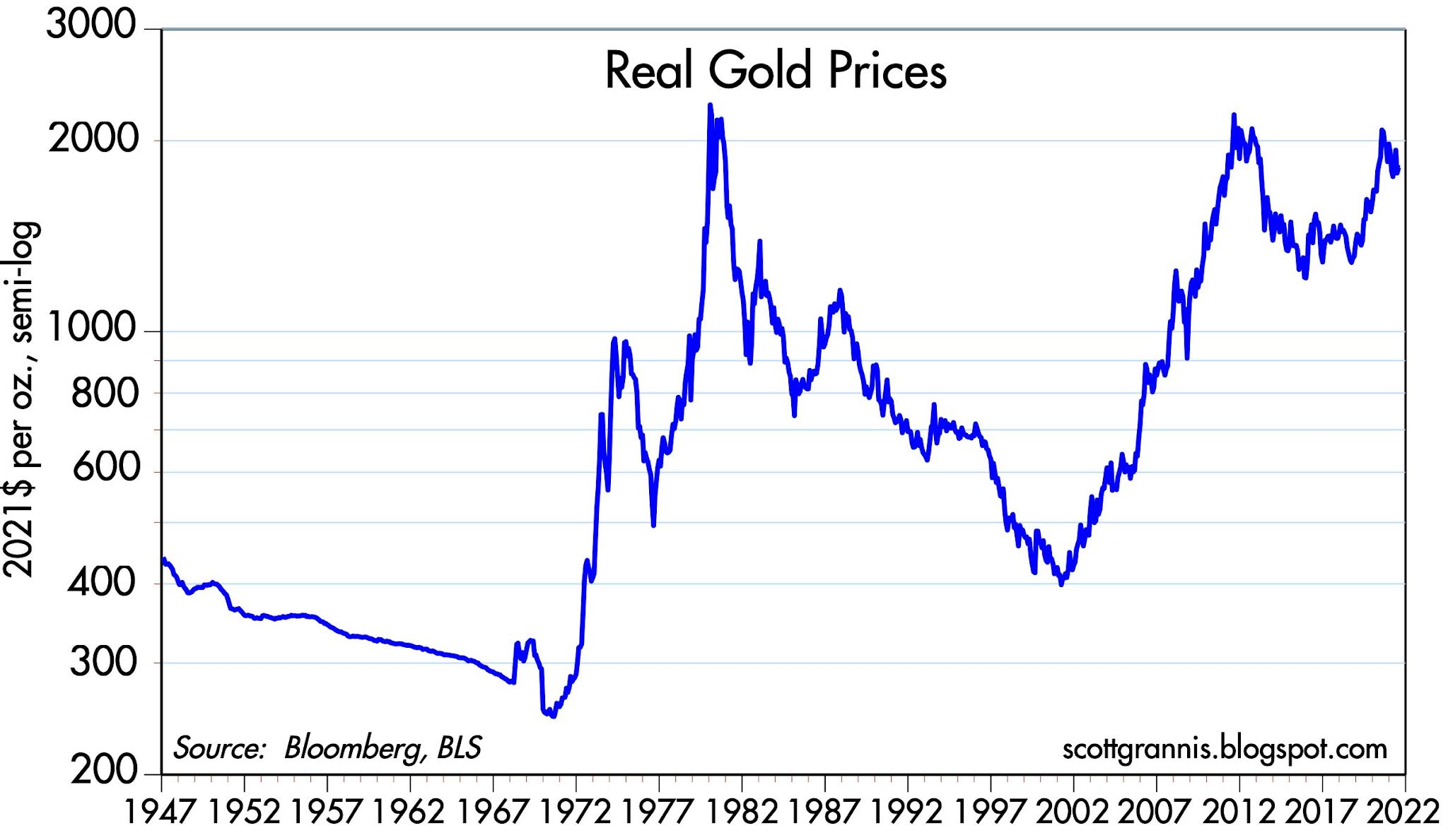
Chart #8 adds some color to my prior post, "What's wrong with gold?" What it suggests is that gold prices are weak today because the market is anticipating higher short-term interest rates. The red line shows the yield on 3-yr forward Eurodollar futures contracts (inverted), which is a good proxy for where the market thinks the federal funds rate will be in three years' time. Gold peaked when forward interest rate expectations were at an all-time low. Why? Because super-low interest rates pose the risk of higher inflation. With the Fed now talking about raising rates (albeit sometime next year, and very slowly thereafter), gold doesn't make as much sense because forward-looking investors are judging the risk of future inflation to be somewhat less than it was a few years ago.

Tuesday, September 14, 2021

Money and inflation update


With today's release of the August CPI, it looks on the surface as if inflation is moderating, much as the Fed has been hoping. Looking deeper, though, I think it still pays to be skeptical—especially since the belief that this inflation flareup is merely transitory has been fully embraced by the bond market. Witness breakeven inflation rates of 2.3% on 5-yr TIPS. 

Chart #1

At the risk of making a fool of myself, I am going to assert that Chart #1 is what really makes this time different. Never before in the monetary history of the US has there been such a huge increase in the M2 money supply. The increased M2 growth we saw in the wake of the Fed's QE1 and QE2 casings were barely perceptible, as the chart demonstrates.

Now, large and rapid growth in the money supply isn't necessarily inflationary, providing it occurs at a time when the demand for money is surging. I think that was the case a year ago, given the Covid shutdowns that virtually paralyzed economic activity and the massive increase in spending as governments worldwide attempted to keep tens of millions of displaced workers afloat. But this year, things have improved dramatically. GDP has recovered all its lost ground and then some. Corporate profits are at a new high. Nobody today wants to have as much money on his balance sheet as he had last year at this time. 

Chart #2

Chart #2 shows how the mini-surge in inflation in the sunup to the Great Recession was later reversed. That's a picture of transitory inflation, I suppose, but don't forget Chart #1. The Fed never allowed the money supply to explode back then, and they kept interest rates much higher then they are now. The Fed was tight, and that's one thing that aggravated the crisis of 2008. So it's not surprising that inflation proved transitory.

But today is different. As Chart #2 shows, the Ex-energy version of the CPI has moved well above its long-term 2% trend. For the current inflation episode to prove transitory, the blue line is going to have rise at a much slower pace in the months ahead. And the M2 money supply is going to have to do the same. So far we see no evidence of either.

Chart #3

Chart #3 shows the 6-mo. annualized growth of the ex-energy and headline versions of the CPI. This measure is much more representative, in my view, of what is happening to inflation right now. A year over year version (which shows a distinctive slowdown) is muddied by the economic chaos that occurred in the summer of last year. Better to use data from the current year. By this measure, there has been no meaningful slowdown in inflation.

Chart #4

Today also saw the release of the Small Business Optimism survey. As Chart #4 shows, small businesses reported an explosion of price increases of a magnitude not seen since the inflationary 1970s. Prices for a whole lot of things are going up. This is big. 

Chart #5

As Chart #5 shows, housing prices nationwide are up by almost 20% in the past year (blue line). The red line represents the growth rate of the CPI component called "Owner's Equivalent Rent." I have shifted the red line to the left by 18 months, in an attempt to show that big increases in housing prices are followed, about 18 months later, by big increases in the OER component of the CPI (which represents almost 40% of the CPI, by the way). According to this chart, we have only seen the first glimmerings of a pickup in OER (and the CPI as well, by inference). Robust growth in housing prices this past year already strongly suggests we'll see a significant pickup in the CPI over the next 6-9 months. 

Chart #6

Meanwhile, the real yield on Treasury notes and bonds has become deeply negative, thanks to extremely low yields and a surge in inflation, as we see in Chart #6.. This represents a stiff penalty on anyone seeking a safe haven. This penalty is discouraging people from owning safe assets. It encourages people to spend some of the extra cash they have accumulated in the Covid era. And that is what is fueling price rises everywhere. This won't stop until real yields become much more attractive. And for that to happen we need to see the Fed raise rates and we need to see inflation come down. Unfortunately, neither of those conditions are likely to occur in the next year.

Chart #7

At the suggestion of a reader, I've updated Chart #7, a chart I have been featuring for many years now. My reading of this chart is that the market is still a bit nervous about the economy going forward, because the Vix at today's level of 18-20 is still somewhat elevated. But fears have been slowly subsiding, and so money has been finding its way into equity prices, among other things. Which is logical, since equities represent ownership of tangible and productive assets, and thus are a good hedge against inflation. And anyway, corporate profits are on the moon, as I pointed out last month. Housing and the stock market are the big beneficiaries of today's money abundance. 

Thursday, September 2, 2021

What's wrong with gold?


For months now, I've been asked by friends, colleagues and readers of this blog to explain why gold hasn't moved higher on the news that inflation is rising and the Fed is sitting on its hands, doing nothing to inspire confidence in inflation returning to their 2% target.

My answer is simple: gold has already risen significantly. 


This chart shows the inflation-adjusted price of gold in today's dollars. (I've used the CPI to do the calculation.) 

In the early 1970s, just before Nixon took the dollar off the gold standard, gold was extremely cheap, which is why many of the world's central banks were demanding that the Fed redeem dollars in exchange for gold. The federal government had been ramping up social spending and deficits and monetary policy had been too accommodative—they should have been tightening in the face of declining gold reserves. Faced with a huge drain on the Fed's gold reserves, Nixon chose to devalue the dollar rather than tightening monetary policy, since he (rightly) feared it would lead to a recession. 

Gold rose significantly over the course of the next 10 years, as did inflation, oil and most commodity prices. Inflation rose from a low of 2.7% in mid 1973 to a peak of almost 15% in early 1980. Gold peaked in September 1980. Gold then fell as inflation fell, reaching a low of 1.4 % in early 1998; gold hit bottom in 1999. Gold then rose to a peak in 2011, fell to a low in 2005, only to rise again until it peaked in 2020. 

One could argue that the rise in gold which began in 2000 was driven by the expectation that the Fed was prone to be too easy (after having been demonstrably "tight" from the early 1980s) and that inflation was a potential risk. Now we are seeing the Fed validate the fears built into gold prices. It's a case of "buy the rumor, sell the fact." Gold correctly anticipated today's inflation and today's Fed error, so now gold is looking into the future to see whether things will eventually get better or worse. 

In any event, gold today is only modestly below its all-time high in real terms. It's not cheap by any stretch.