Thursday, March 22, 2018

The Fed is not tightening monetary policy

Yesterday the FOMC raised its short-term interest rate target (and the rate it pays on bank reserves) to 1.75%. This move was widely anticipated, and so it matters little. Regardless, monetary policy is nowhere near being "tight," and the Fed's plan to raise rates by another 100 bps or so over the next year is not necessarily a cause for concern. The tightness of monetary policy should always be judged in real terms (i.e., by subtracting inflation from interest rates—higher real yields increase the demand for money and when they get high enough, eventually slow economic activity). Yesterday's rate hike has already been offset by a recent rise in inflation (the PCE Core deflator rose 1.52% in the 12 months ended January, and my estimate has it rising 1.8% in the year ending this month). As result, in the past year, real interest rates have only risen modestly, in synch with a modest pickup in real growth, much as theory would predict. In short, the Fed is following the market's lead, and adjusting real rates higher in line with somewhat healthier growth. This not only makes sense, it's a welcome step in the right direction.

However, while monetary policy isn't currently threatening, trade wars are indeed a cause for concern. Trump is engaged in brinkmanship with China, in an attempt to force China to respect intellectual property rights and reduce punitive tariffs on some US exports to China. Today, some Chinese officials threatened retaliatory tariffs on US exports, particularly grains, and that raised the stakes, which in turn explains why the market fell meaningfully. Nobody benefits from tariff wars, particularly a tariff-imposing country's own consumers. If a tariff war were to escalate—heaven forbid—the results could be devastating, as happened with the Smoot-Hawley tariffs and the Great Depression. But everyone could benefit from freer and fairer trade, and I think that's what Trump is aiming for. If we've learned anything about Trump in the past year or so, it's that he is a clever negotiator who scares people from time to time. He undoubtedly believes that you've got to take great risks to achieve great results.

While we nervously await the outcome of the Trump vs. China war of nerves, it's helpful to remember that the growth fundamentals of the US economy are "beautiful," to borrow a phrase. Corporate tax cuts have set the stage for a significant pickup in investment, jobs growth, and real incomes, but it will take awhile before we see the results. The outlook is promising, but we're sweating through a lot of uncertainties at the moment. I think it pays to remain optimistic, but it's clear that uncertainty and risk are a bigger factor today than they have been in more than a year.

Here are some charts which are relevant to my comments above:

Chart #1


Chart #1 is number one on my Recession Watch list. It shows that recessions have always been preceded by a severe tightening of monetary policy. That tightening in turn consists of 1) real short-term interest rates of 3% or more, plus 2) a flat or inverted Treasury yield curve. Currently, real rates are  still unusually low, and while the yield curve has become a lot less steep in recent years, its current slope is consistent with continued growth. The curve is positively sloped because the market believes the Fed will indeed raise rates in coming years, though not excessively.

Chart #2


Chart #2 compares the real yield on 5-yr TIPS (red line) with the real Fed funds rate (blue line). The former is effectively equal to what the market believes the latter will average over the next five years. Thus, the market currently expects only a modest amount of monetary policy tightening for the foreseeable future. That is normal, and it is consistent with the slope of the nominal Treasury yield curve.

Chart #3


Chart #3 shows how real yields (blue line) have risen gradually and in line with a modest strengthening of real GDP growth. It also suggests that if economic growth were to accelerate meaningfully (e.g., 3-4%), then we should expect to see real yields move up to at least 1.5-2.0%.

Chart #4

Chart #5

Industrial production is booming, both here and in the Eurozone, as Chart #4 shows. And it's not just utilities, as Chart #5 shows: after subtracting utility output from the IP data, we see that manufacturing output has in increased meaningfully in the past year, after several years of only modest gains.

Chart #6

Billings at major architectural firms have also picked up in the past year, as Chart #6 shows. There is a lag of at least 9 months between a pickup in billings and the resultant pickup in construction, so this is a good leading indicator of better news to come in the commercial construction sector. 

 Chart #7

Chart #7 compares an index of truck tonnage (orange line) with the S&P 500 index (white line). I like the truck tonnage index because it is a fairly contemporaneous measure of the physical size of the economy]Both have improved significantly in the past year or so, and both have dipped of late.

Chart #8

Skeptics call Chart #8 the "mis-" leading indicators, since this series doesn't do a good job of anticipating important changes in the economy. It's best thought of as a good contemporaneous indicator. In any event, the Leading Indicators index is up 6.5% in the year ending February, and that is a pretty good indication that we are still in the growth phase of the current business cycle.

Chart #9

When talking about debt and deficits, it is imperative to express them as a percent of economic activity. Chart #9 does just that, showing the federal deficit as a percent of nominal GDP. Although the $706 billion that the government has borrowed in the past year sounds like a lot, it is a smaller percentage of GDP than the Reagan deficits were in the 1980s. Another thing to note about this chart is that the burden of deficits (their size relative to GDP) always declines during periods of growth, while it always increases during periods of economic weakness. Growth is the key variable when talking about debt and deficits. I've explained before that the deficit has been increasing of late not because the economy has been weak, but rather because people have been anticipating tax reform and consequently accelerating expenses and postponing income. Now that tax reform is not only a reality but significantly pro-growth, we should see faster economic growth, more jobs, and a bigger tax base that should ultimately result in an improving fiscal situation (i.e., a declining deficit/GDP ratio).

This is not to ignore the long-term risks to the fiscal outlook, which center around the growth of entitlement spending. We're not yet on a collision course with fiscal disaster, but that remains a major source of concern for the long haul. In the meantime, more growth would mitigate those concerns.
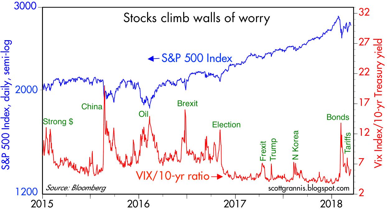
Chart #10

Chart #10 shows how market worries (as proxied by the red line, which is the ratio of the Vix "fear" index to the 10-yr Treasury yield) have affected stock prices. The current "wall of worry" is not too high; we've seen much worse in recent years.


Thursday, March 15, 2018

10 key charts updated

The economy grew 2.5% last year, which is a bit stronger than its annualized rate of growth during the expansion which began in mid-2009, and there's evidence that growth picked up a bit over the course of the year, likely due to a significant increase in business and consumer confidence. Regardless, my reading of the market tea leaves suggests that the market's expectation for future growth is only slightly higher than what we've seen in the current expansion. Although the sharp cut to the corporate income tax rate has found its way into a substantial rise in stock prices (because reducing the tax rate means that the discounted value of future after-tax earnings translates into a one-time boost to current valuations), the market has yet to price in a substantial increase in future growth fueled by the increased investment and jobs creation that the tax cut was designed to achieve. (And to be sure, there is still no convincing evidence of a significant pickup in business investment.) The market is moving in an optimistic direction, of course, as witnessed by rising real and nominal yields, but we're still in the early innings.

Chart #1

I've been posting updated versions of Chart #1 for many years now. It shows how unique the current business cycle expansion has been in the economic history of the US economy. From 1965 through 2007, the US economy grew at a trend rate of about 3.1% per year. It slipped below this trend during recessions, and exceeded the trend during boom times. But it invariably returned to trend given a few years. (Milton Friedman in 1964 wrote a paper about this, calling it the Plucking Model.) The current expansion has been by far the weakest on record. Relative to its previous trend, the US economy is more than $3 trillion smaller, in 2009 dollars, than it might have been had things played out this time as they have before.

What's the cause of this underperformance, especially considering that since late 2008 the Fed has massively expanded its balance sheet? My list of reasons lays the blame on two major factors: 1) an oppressive expansion of government, in the form of increased regulatory and tax burdens, and 2) a shell-shocked market that has only recently regained its former level of confidence in the wake of the Great Recession of 2008-9.

Chart #2

Chart #3

Chart #4

Confidence has returned, but only in the past year or so, as shown in Charts #2 and #3. This may be the precursor of increased business investment—of which there is no sign yet—but it does explain the recent surge in the labor force, as shown in Chart #4. It's only very recently that we have seen a big increase in the number of people looking for work. 

Chart #5

Thanks to TIPS (Treasury Inflation-Protected Securities), we have real-time knowledge of the market's expectation for risk-free, inflation-adjusted returns. (TIPS pay a real rate of interest in addition to whatever the inflation rate happens to be. The price of TIPS varies inversely with the market-determined level of the real yield on TIPS.) As the chart above shows, the level of real yields on TIPS tends to track the economy's trend real growth rate (I use trailing 2-yr annualized growth as a proxy for what the market perceives the current trend to be), much as common sense would suggest. When economic growth was booming in the late 1990s, TIPS paid a real rate of interest of about 4%, since they had to compete with the market's expectation for 4-5% real economic growth. But with the trend rate of growth having now slowed to just over 2%, the real rate of interest on TIPS is only modestly positive: 0.5% for the next 5 years, as of today. If the market thought the US economy were on track to deliver 3%+ rates of growth in the years ahead, I'm confident that the real yield on 5-yr TIPS would be in the neighborhood of 1-2%, if not higher. As it is, I think the market is currently priced to the expectation that real growth will average about 2.5% in the next few years. That's good, but nothing to write home about.

Chart #6

Chart #6 compares the real yield on 5-yr TIPS (red line) with the ex-post real yield on the Fed funds rate, using the Fed's preferred measure of inflation, the PCE Core deflator. This is akin to viewing two points on the real yield curve: overnight rates and 5-yr rates. Using bond market math, the red line is the market's expectation for what the real Fed funds rate is going to average over the next 5 years. And of course, the real Fed funds rate (blue) is the rate that the Fed is actually targeting. As you can see, the market expects only a modest amount of tightening from the Fed in the years to come. That makes sense only if both the market and the Fed agree that the economy has limited upside growth potential. If the market thought the economy were set to grow at a 3%+ rate for the next several years, the market would immediately assume—and the Fed would probably agree—that there would be a a more aggressive series of rate hikes in the future, not just 3 or 4. Even still, when the Fed raises rates in response to stronger growth expectations, that is not a tightening, it's more a following action. To be really tight, the Fed would have to raise real rates to at least 3%, and the yield curve would have to flatten or invert.

Chart #7

Chart #7 compares the real and nominal yields on 5-yr Treasuries (red and blue lines) with the difference between the two (green line), which latter is the market's expectation of what the CPI will average over the next 5 years. With 5-yr inflation expectations today at 2.15%, the market is reasonably sure the Fed will be able to hit its 2% inflation target (on the core PCE deflator, which tends to run about 30 or 40 bps lower than the CPI). Looking ahead, the market sees pretty much the same amount of inflation that we have seen over the past few decades. The market is thus fairly confident that the Fed is not going to do much going forward, and whatever it does, the Fed is unlikely to be too tight or too easy. You may not agree with that assessment, but that's what the market tea leaves are saying.

Chart #8

Chat #8 shows how sensitive the stock market is to bouts of anxiety, as proxied by the ratio of the Vix "fear" index to the 10-yr Treasury yield. The latest market correction was triggered earlier this year by concerns that rising nominal yields might threaten economic growth, but that quickly faded, only to worry more recently that Trump's tariffs might spark a global trade war. Whatever the case, the market is not very worried these days, nor is it very optimistic.

Chart #9

Chart #10

A general lack of concern about the economy's health is evident in Charts #9 and #10. Swap spreads—an excellent coincident and leading indicator of economic and financial market health—are up a bit of late, but still within what might be considered a "normal" range. The swap market is reflecting a relative abundance of liquidity and little if any concerns about systemic risk. Credit Default Spreads—highly liquid and coincident indicators of the market's perception of credit risk—are also up a bit of late, but still relatively low.

As I noted last October, and as has proven recently to be the case, rising growth expectations would almost surely result in an unexpected rise in real and nominal interest rates. Higher-than-expected rates would depress bond prices, and, in similar fashion, could depress the market's PE ratio (which is the inverse of the earnings yield on equities, and thus similar to a bond price), thus limiting further gains in equity prices to a rate that is somewhat less than the increase in earnings. The days of booming equity markets are fading, but there is still decent upside if and when the market begins pricing in faster growth and the business community follows through with increased investment and faster jobs creation. Meanwhile, there is no obvious reason to worry about a recession or a major stock market correction.

Thanks and congratulations, Larry!

My career as an economist began in 1980, the day I stumbled upon John Rutledge's CEI Forecasting Conference on the campus of Claremont McKenna College. At the time, I was in the midst of the MBA program at Claremont Graduate University, having previously received a BA in Philosophy at Pomona College (economics, I would learn, draws heavily from philosophy and business). Larry Kudlow happened to be the key speaker at the conference. He spoke of inflation, gold, the dollar, and economic growth, and all those things strongly resonated with me, as I had recently returned from four years in Argentina (1975-1979). I remember thinking there was nothing in the world that could be more exciting than to follow in his footsteps. Thanks, Larry, for being such an inspiration.

While living in Argentina I had the "privilege" of surviving inflation that raged at well over 100% per year, suffering gargantuan swings in the value of the peso (which lost over 95% of its value), and witnessing the military takeover of the failed government of Peron's widow, Isabel. Following macro-economic variables daily in Argentina was critical to survival, and in Larry I saw that my experiences in Argentina could serve as the foundation for an economics profession in the U.S. One year after seeing Larry speak, I was working for John Rutledge and meeting the likes of Larry, Art Laffer, Jude Wanniski, Bob Mundell, David Malpass, and Steve Moore. I grew up on the supply- and monetarist-side of the economics profession, because I became convinced that those disciplines held the key to best understanding how economies and markets work. Politically I'm a libertarian, because I'm convinced that governments and bureaucrats can never be as effective and efficient as free markets, and more government necessarily means less individual freedom, and that can never be a good thing.

Larry was the first economist who inspired me, and we've been close in our thinking ever since (he even reads this blog). Although we haven't always agreed on everything, and neither of us can claim to have forecasted the Great Recession, we share the most important values: a strong and stable dollar (which implies low and stable inflation), strong and steady economic growth, limited government, rule of law, and free markets (which imply free trade). We both know that any country that embraces those values is bound to be a place of opportunity and prosperity. Larry's whole life has prepared him for a position in which he can help influence the policies that will make the U.S. strong and prosperous. Congratulations, Larry, you've made it.

So naturally, everyone wants to know why Trump picked Larry, and why Larry chose to accept, since they have diametrically opposing views on trade and tariffs.

The best explanation that comes to mind is that Trump has persuaded Larry that higher tariffs are 1) temporary and 2) a tool with which to pressure China into opening its markets to more foreign goods and services and respecting intellectual property rights. A minor transgression, if you will, that will eventually yield a greater payoff. If nothing else, Larry's presence at the NEC will be a critical offset to Peter Navarro, and a voice of reason and experience that may keep Trump from wandering into "left" field. That Trump chose Larry, knowing his opposition to tariffs, speaks well to Trump's judgment.

Larry is a good man, an excellent economist, and a seasoned persuader. He is a great choice for director of the White House National Economic Council.

For more, today's WSJ has two excellent articles which faithfully round out the person that is Larry Kudlow: here, and here.

Friday, March 9, 2018

Early signs of a stronger jobs market

February private sector job gains were substantially stronger than expected (287K vs. 205K), and prior months were revised higher. This is good news, but we are still in the early innings of what is likely to be a more powerful and sustained improvement in the jobs market. That's what I anticipated in my 2018 predictions: waiting for GDP. For the past few months I've argued that the market has priced in the one-time impact of a significant reduction in the corporate income tax rate, but the market has still not yet priced in the expectation of a significant boost to future GDP growth. "Waiting for GDP" is still the meme to watch for, and today's jobs number is the first sign that this meme may in fact be realized, but it's too early to know for sure. Of course, once it's clear that GDP growth could exceed 3% or so on a sustained basis, the stock market will be making new highs. For now, we can be hopeful that this will be the case.

Chart #1

Chart #1 shows the monthly change in private sector jobs from an historical perspective. February was strong, but it's hardly a unique occurrence; we've seen numbers like this from time to time and in the end they have proved transitory, not the start of something big. We'll need to see more such numbers (e.g., job gains of at least 300K per month) before it's clear that the economy has kicked into a higher gear.

Chart #2
 

Chart #2 shows the 6- and 12-month annualized rate of change of private sector jobs growth. You can't come to any conclusions with just one strong number, you've got to see a series of strong numbers. Jobs data are notoriously volatile and subject to significant changes after the fact. So far, all we've see in recent months is that private sector jobs growth has risen from 1.7% to just under 2%. Hold the applause until jobs growth exceeds 2% by a substantial margin—we're not there yet.

Chart #3

Since the unemployment rate is quite low—4.1%—we need to see a sustained increase in the labor force participation rate. Many millions of workers have "dropped out" of the labor force, and they will have to elect to return if the jobs market is to generate more than 300K new jobs every month. Fortunately, today's jobs number suggests this process may be beginning. Labor force growth has picked up significantly, as Chart #3 shows. 

Chart #4

But it's still early, since the labor force participation rate (the percentage of people eligible to work who are working or looking for work) currently is only 63%, and the rate hasn't changed on balance for the past several years. We'll need to see it increase to 64% or more. Chart #4 gives you an idea of how low it has been (it started to decline in early 2009) and where it could go in the future if optimism returns in a serious fashion—as happened in the boom years of the late 1980s.


Thursday, March 8, 2018

Household net worth hits $100 trillion

Today the Fed released its quarterly estimate of household net worth. Things just keep getting better and better. Household net worth as of the end of last year was almost $99 trillion, having risen $7.1 trillion over the past year (+7.8%). As in recent years, gains have come mostly from financial assets (up $27.6 trillion since late 2007), plus real estate (up $2.8 trillion since the pre-Recession peak of 2006), offset by only a $1 trillion increase in debt (total liabilities rose from a Recession peak of $14.6 trillion in 2008 to $15.6 trillion at the end of 2017). Further details in the charts below:

Chart #1

Chart #1 summarizes the evolution of household net worth.

Chart #2

Chart #2 shows the long-term trend of real net worth, which has risen on average by about 3.5% per year over the past 65 years. I note also that recent levels of net worth do not appear to have diverged at all from long-term trends. That wasn't the case in 2007 however, when stocks were in what we now know was a valuation "bubble."

Chart #3

Chart #3 shows real net worth per capita. The average person in the U.S. today is worth just over $300,000, and that figure has been increasing by about 2.3% per year for the past 67 years. Regardless of who owns the country's wealth, everyone benefits from the infrastructure, the equipment, the computers, the offices, the homes, the factories, the research facilities, the workers, the teachers, the families, and the brains that sit in homes and offices all over the country and arrange the affairs of the nation so as to produce almost $20 trillion of income per year.

Chart #4

Chart #4 shows that households have been extremely prudent in managing their financial affairs since the Great Recession. Household leverage (total debt as a % of total assets) has declined by one-third since its Q1/09 high. Leverage is now back to the levels which prevailed during the boom times of the mid-80s and 90s. Unfortunately, while households were busy strengthening their finances, the federal government was doing just the opposite: the burden of federal debt more than doubled from June '08 to December '17 (i.e., federal debt owed to the public rose from 35% of GDP to 75% of GDP).

Thursday, March 1, 2018

Manufacturing sector ramping strongly

Earlier this year I noted that the manufacturing sector was off to a strong start. Today's ISM releases for February only underscore that point. Things look so good (if you ignore Trump's tariffs) that I'm compelled to post these impressive charts. They strongly suggest that with his tariffs, Trump could be about to snatch defeat from the jaws of victory.

Chart #1

There's been a decent correlation between the ISM manufacturing index and the health of the overall economy. February's number strongly suggests that Q1/18 growth is going to exceed current forecasts of 3-3.5% (according to the NY and Atlanta Fed's models, respectively).

Chart #2

Export orders are coming in very strong, which suggests that overseas economies are doing very well.

Chart #3

The relatively strong employment reading suggests that manufacturers are optimistic about their ability to expand.

Chart #4

This is a lovely picture of a US/Eurozone synchronized manufacturing recovery. The global economy is firing on all cylinders; why would anyone want to mess with this?

Trump's tariffs are cause for concern

Every economist worth his salt knows that tariffs are just plain bad policy. They supposedly "help" domestic producers (subsidize would be a better word), but they hurt just about everyone else. Making steel and aluminum more expensive for US consumers may temporarily help US workers who produce the stuff, but it undeniably harms all US consumers of the stuff. Ultimately there will very likely be many more jobs lost in the industries that use steel and aluminum than jobs "protected" in the steel and aluminum producing industries.

And of course the worst thing would be if this is the first salvo in what could degenerate into a global trade war. That is the stuff of nightmares, and it's the sort of thing that can cause global depressions.

Trump has always been partial to tariffs, and has been roundly and justifiably criticized for it. I was hopeful that it was just bluster, and that when push came to shove the smart people surrounding him would persuade him to desist. That seemed to work for over a year, but apparently it's no longer the case.

Will he really do something so stupid? Stock markets are correct to sell off on the news. We can only hope that a hue and cry and weak stock markets convince Trump to back off. It's hard to believe he could pull such a stupid, dumb idea out of his hat just when the economy is about to ramp up as a result of all the good things he has done.

UPDATE: Mark Perry has an excellent post which demonstrates that the losses from tariffs always exceed the gains, and by a huge margin.

UPDATE: Here's how the market is taking the tariff threat as of 8am Pacific, March 2nd. It's a genuine threat, to be sure, but not catastrophic. Trump is getting TONS of pushback, which may persuade him to back off.