


Chart #1
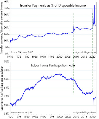
The February jobs report was quite strong, and contained the welcome news that the labor force participation rate (see the bottom chart above) has risen significantly. Chart #1 also suggests the reason for the surge, namely the big decline in transfer payments. Funny how things work: if you pay people who aren't working, you won't find very many willing to work, and when you stop paying them they are more inclined to work. (Our economy is not suffering from a lack of jobs, that's for sure.)
Chart #2
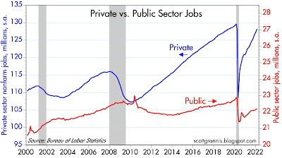
Chart #2 compares the level of private and public sector jobs. Two bright spots: private sector employment has recovered almost all its Covid-related loss, while public sector jobs have recovered less than half. (In my book, private sector jobs are much more productive than public sector jobs.) Government has become less obese, and that's good news.
On the other hand, the level of private sector jobs today is still at least 5 million short of where it might have been in the absence of the Covid crisis.
Chart #3
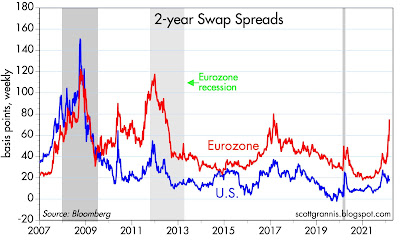
Swap spreads, shown in Chart #3, are excellent indicators of a) liquidity conditions and b) the outlook for corporate profits and economic health in general. Swap spreads have risen a bit in the U.S., but not enough to be worrisome (in a normal economy, you'd expect these spreads to be 15-35 bps). Conditions in Europe are not so good, however, with swap spreads having jumped to recession-era levels. Limiting Russia's ability to use the SWIFT payment system is a big factor reducing liquidity overseas.
Chart #4
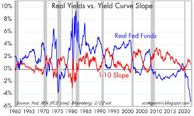
Chart #4 is my favorite chart for gauging recession risk. Every recession except the last one was preceded by very high real yields and a flat or inverted yield curve. We're not even close to either at this point. Real yields on the Fed funds rate are at record-setting (and mind-blowing) lows, which means liquidity conditions are flush and the Fed and the banks are practically begging people to borrow money. Combine this with Chart #3 and you see that all three of the indicators that normally precede recessions are not at all in worrisome territory, at least in the U.S.
Chart #5
 |
Chart #6
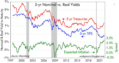
Chart #6 shows nominal and real yields on 5-yr Treasuries, and the difference between the two (green line), which is the market's expectation for what the CPI will average over the next 5 years. Inflation expectations are now at new highs (about 3.3%), as the market is slowly coming around to seeing that the burst of inflation that started early last year is not going to be transitory. I would expect these expectations to continue rising over the next year or so, which means that nominal interest rates are almost certain to rise meaningfully.
Chart #7
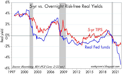
Chart #7 compares the real yield on 5-yr TIPS to the current real yield on the Fed funds rate. In effect, the red line is what the market thinks the blue line will average over the next 5 years. In short, the market thinks the Fed is going to keep short-term rates negative in real terms for a long time. Borrowing at a floating rate of interest is thus likely to be attractive for awhile.
Unfortunately, as I've explained many times in recent posts, the persistence of negative real yields helps weaken the demand for money, and this in turn adds fuel to the current inflation fires. The Fed will need to do a lot of tightening at some point to bring inflation down.
Chart #8
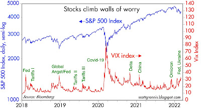
Chart #8 compares the Vix index (the worry index) to the level of the S&P 500. Whenever the market gets very worried, stock prices (unsurprisingly) decline. The level of worry today is not yet at an extreme, however, so things may get worse before they get better. On the other hand, a healthy amount of worry means the market is prepared for bad news, and that acts as a buffer.

6 comments:
Great wrap-up.
Maybe some good news out there; some smart people think the Russian invasion is going very poorly for Putin. Difficult to tell, as we are all thinking with our hearts.
Anyway this may end with Putin leaving office, and better prospects for Russia, Ukraine, and Eastern Europe.
Inflation maybe in the 5% to 6% range? Not great, but we have seen worse.
Apartment rents are up 17% in last year. That is the monthly tab, paid by tens of millions of Americans, for property zoning.
Thanks!
Thank you Scott as usual. Your thoughts and analysis are much appreciated in this turbulent time.
Scott, I have been following your analysis since September, 2008. I especially value your way of putting events into perspective. But for the first time that I can recall it seems that this time the light at the end of the tunnel is the freight train of the Fed tightening such that equity market valuations are crushed. Isn’t that where we are headed or is there another way out that can alleviate the inflation? Would really appreciate your thoughts.
Thanks for all you do to share your thoughts with all of us.
Separately, I heard your niece on Sirius/XM over the weekend. She was great!
Wow, I love these charts. Can I buy Russian oil for rubles. What a deal!
Post a Comment