Yesterday (I'm writing this in Maui just before midnight Aug. 24th) the Fed released the July '22 M2 statistics, and they couldn't have been better. Year over year growth has fallen from a high of 27% in February 2021 (unprecedented!!) to now just 5.3%. On a 6-mo. annualized basis, M2 growth is a mere 0.6%, and on a 3-mo. annualized basis it's 1.0%. In other words, M2 has essentially flat-lined since last January, which was well before the Fed began to take tightening action. This means that the behavior of M2 is obviating the need for the Fed to pursue a typical tightening, which almost always ends with a recession. As I said last June,
Fed tightening need not result in a recession.
It is now clear that the surge in money growth that began in April '20 was not due to misguided Fed policy. Instead, as I began to argue
last May, it was a by-product of massive deficit-financed fiscal spending (aka Covid-era "stimulus" payments). Trillions of dollars were sent to massive numbers of people, and most of those dollars ended up in bank savings and deposit accounts, thus swelling M2. That was fine as long as the atmosphere of the Covid crisis persisted, since the government's supply of extra money was met by an increased demand for it. But by early last year, as the Covid crisis waned, confidence returned, and the economy got back on its feet, that extra money was used to fund an explosion of demand for goods and services everywhere, since it was no longer demanded. And that launched a wave of inflation which now looks to have peaked.
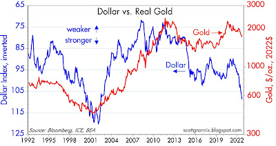
The issue of how the Fed should respond to all this is coming to a head this week, and it all happens at the Fed's Jackson Hole get-together. The market worries that the Fed will be spooked by all the confusion and tighten too much. That's why prices for equities, real estate, gold, and commodities are down. At the same time, the value of the dollar is soaring and that speaks volumes. When the price of something surges, it's a safe bet that demand for that thing exceeds the supply of it. So a very strong dollar is symptomatic of a world that is desperate for a safe haven—and one that is expected to soon yield more as the Fed panics and hikes rates even more, crushing the economy in the process. And it is also symptomatic of a Fed that is expected to be "too tight."
It doesn't need to play out this way, and I hope the Fed is listening. The world doesn't need a super-strong dollar, and higher rates are not necessary to slow inflation. Not this time, at least.
Chart #1
Since the deficit-financed spending spree stopped late last year, M2 growth has slowed dramatically (see Chart #3 in
this post). Chart #1, above, puts the slowdown in a long-term perspective. It's virtually unprecedented. So it doesn't necessarily follow that Fed tightening this time will provoke a recession.
The passage of the recent, so-called Inflation Reduction Act is a step backwards, since it too involves more deficit-financed spending, but on a much smaller scale. So it is more likely to slow the economy than it is to accelerate inflation.
Chart #2
Chart #2 shows the ratio of M2 to nominal GDP. I have called this the demand for money. It is now declining, as I have been predicting. People wanted to hold a lot of money during the Covid panic, but not so much now. People have been spending down their money balances, and this is what has caused the rise in inflation: unwanted money. It is very likely to continue, but any increase in uncertainty, such as we are experiencing these days, is likely to mitigate the drop in the demand for money. Money demand is not in free-fall, at least for now. So inflation is not likely to explode.
Chart #3
Chart #3 shows the level of 2-yr swap spreads. Although they have increased somewhat of late, they are still at a level that suggests that liquidity is abundant and the outlook for the economy is decent, if not robust.
Chart #4
Chart #4 shows the level of high yield corporate bond spreads (junk bond spreads). These too are somewhat elevated, but not nearly as much as one would expect to see if the economy were on the verge of collapse.
Chart #5
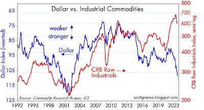
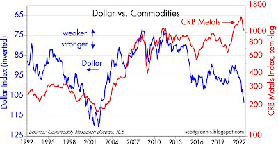
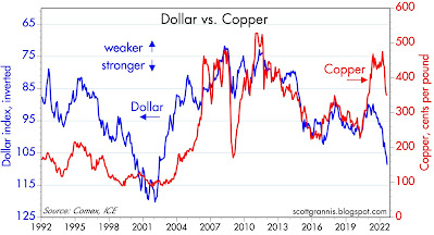
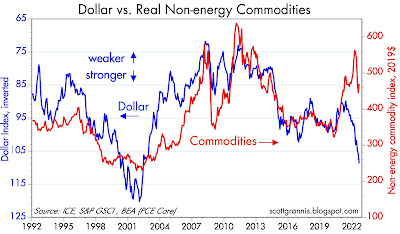
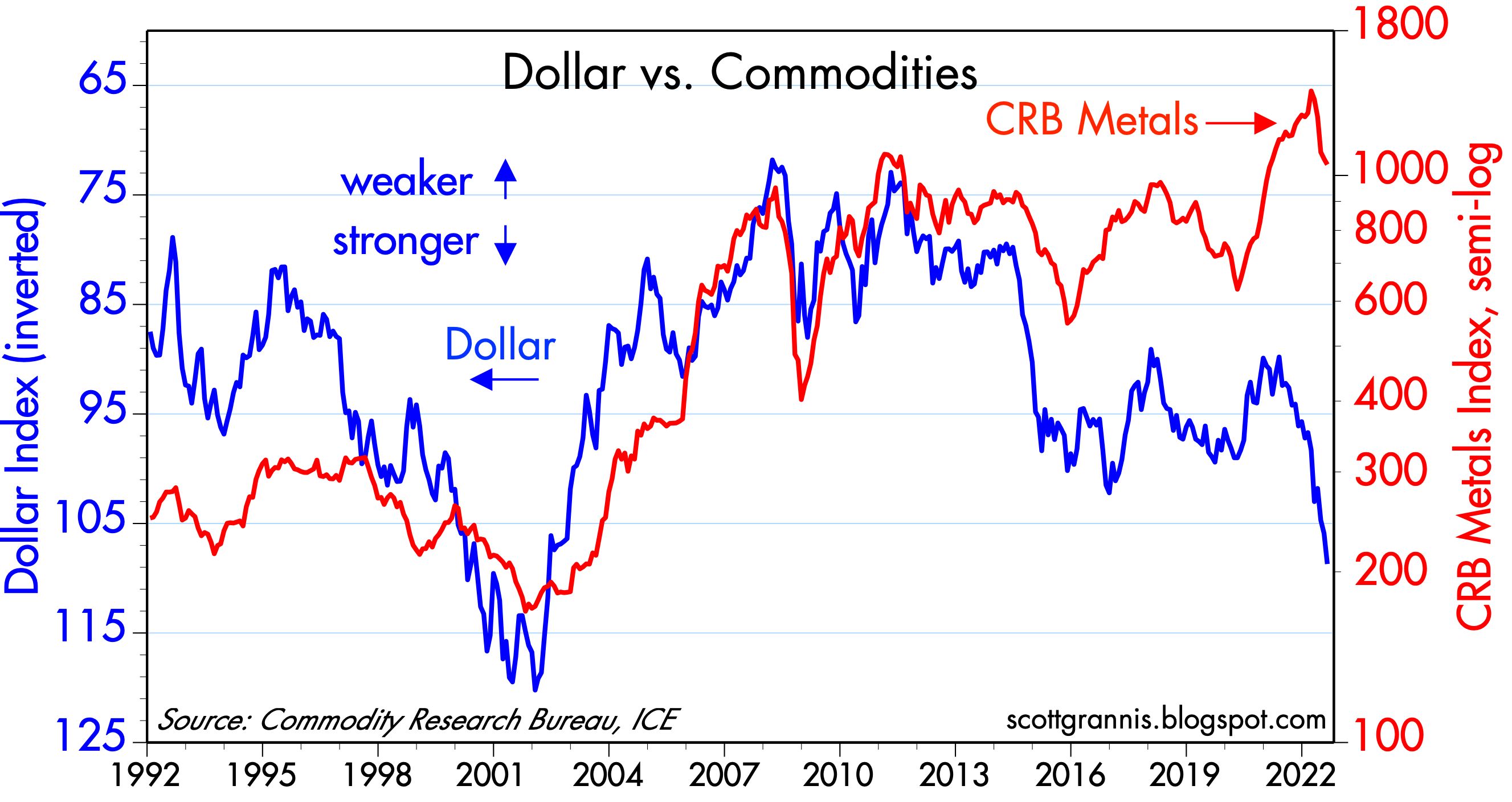
Chart #5 shows the real, trade-weighted value of the dollar vis a vis other major currencies. The dollar is very close to record-high levels. This is not likely sustainable. A super-strong dollar is very bad news for commodities and commodity producers (e.g., emerging markets).
This is arguably the most important chart of all. The dollar is surging worldwide, and that is a big problem. The Fed should look at this and decide to take baby steps to raise rates, not giant steps. Message to Fed: don't restrict the supply of dollars at a time when the world wants more dollars.
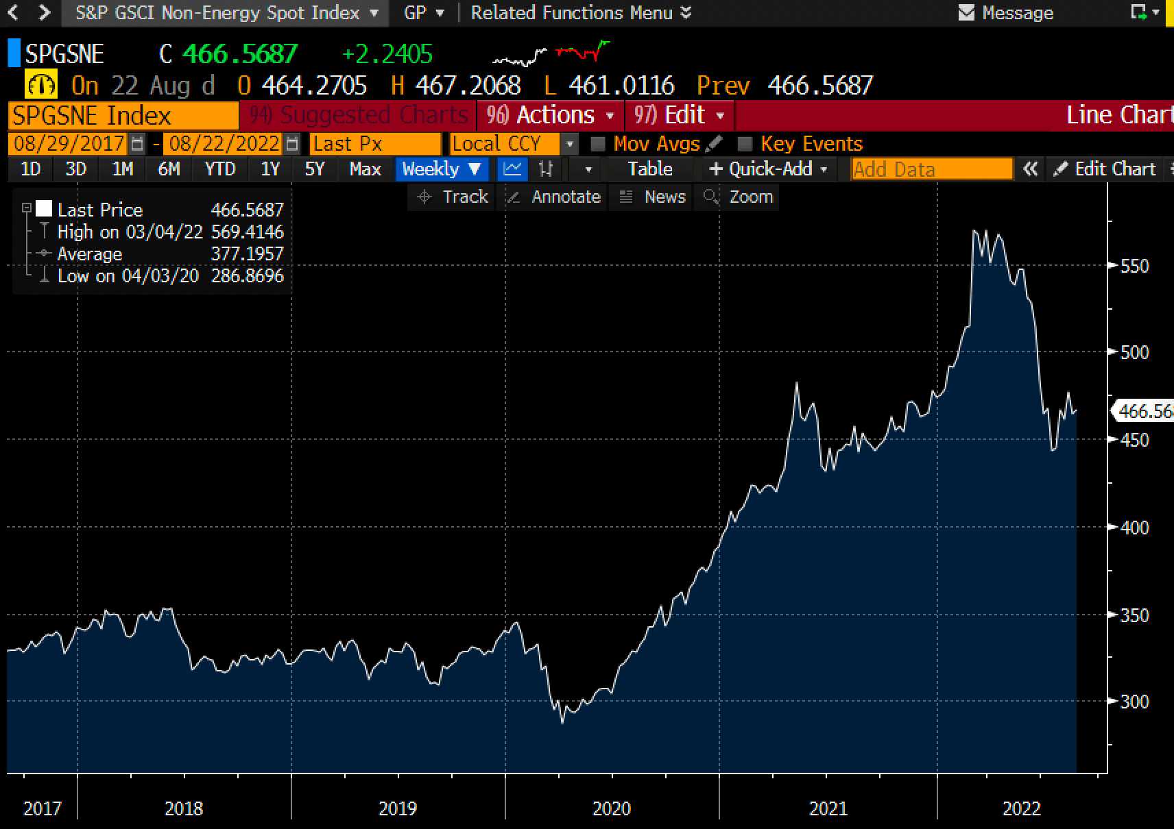
Chart #6
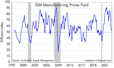
Chart # 6 shows the level of non-energy commodity prices. (Energy prices are far more volatile than most other prices, so it makes sense to exclude them at times.) These prices have experienced a sharp decline since earlier this year, at about the same time that the market began to expect the Fed to raise rates aggressively. Commodity prices are telling us that inflationary pressures have declined significantly.
Chart #7
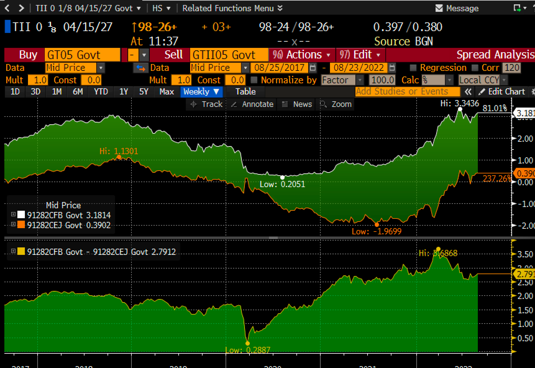
The top half of Chart #7 shows the level of 5-yr nominal and real Treasury yields. The bottom half shows the difference between the two, which is the market's expectation for what the CPI will average over the next 5 years. Inflation expectations have moved up of late, but they remain far below the current level of inflation. Thus, the bond market is telling us that the Fed is not on the verge of an inflationary mistake. I would argue instead that the Fed is on the verge of being too tight.
I note that 5-yr real yields on TIPS (the orange line on the top half of the chart) have been relatively stable at about 0.5% for the past year or so. This is consistent with a view that says that the economy is going to continue to grow, but at a relatively modest rate. Indeed, headwinds to growth abound, chief among them being Biden's Inflation Reduction Act, which is very likely to instead boost inflation and increase regulatory burdens. To me it sounds like a replay of the early years of the Obama administration, when regulatory burdens increased so much that the economy only managed to grow by about 2% per year. Look for growth in the future to be 2% or less, unless policies change for the better.


 Posts
Posts