


Here are 5 charts which illustrate some very important points about the state of the economy and the outlook for inflation.
The economy is doing "Ok", but it's nothing to write home about. The housing sector is struggling mightily, and is very unlikely to improve without a boost from lower interest rates. Jobs growth is modest at best, and unlikely to improve without immigration reform which prioritizes making hard-working illegals legal instead of deportable.
There is no longer any doubt that the Fed has tamed inflation.
Given low inflation and an economy that is struggling, there is no reason for the Fed to delay lowering interest rates. Trump is right to criticize Chairman Powell for this, but Trump could help by backing off on his egregious tariff demands and his aggressive deportations of illegals, most of whom are decent, hard-working, and tax-paying members of society. He should focus instead on lowering tax and regulatory burdens and greatly expanding immigration quotas.


Given low inflation and an economy that is struggling, there is no reason for the Fed to delay lowering interest rates. Trump is right to criticize Chairman Powell for this, but Trump could help by backing off on his egregious tariff demands and his aggressive deportations of illegals, most of whom are decent, hard-working, and tax-paying members of society. He should focus instead on lowering tax and regulatory burdens and greatly expanding immigration quotas.
Chart #1

Chart #1 is yet another update of a chart I've been featuring for the past 15 years. The green line represents the 3.1% annual growth path the economy followed from 1966 through 2007. During that time, the economy was able to rebound and regain that growth path after every recession (this is commonly referred to as the "plucked string" theory of growth). Since the end of the Great Recession in mid-2009, the economy has only managed to follow a 2.3% annual growth path (red line). If the economy had instead recovered to a 3.1% growth path it would be 23% bigger today. I've attributed this monstruous growth shortfall to increased tax and regulatory burdens and a sizable increase in transfer payments. (See my post from 11 years ago which explains this in greater detail.)
Chart #2

Chart #2 compares the year over year growth rate of private sector jobs (red line) with the year over year growth rate of real GDP (blue line). It stands to reason that without more people working it's hard for the economy to expand. Currently, jobs growth is only slightly higher than 1%, and the economy has expanded by only 2% in the past year. That 1% difference is a good approximation of productivity growth, which is less than the 1.9% annualized rate of productivity since 1966. If jobs growth doesn't pick up (and it won't if we are deporting millions of hard-working illegals), then the economy is going to continue to grow at a sluggish pace.
Chart #3

Chart #3 compares the level of housing starts (blue line) to an index of homebuilders' sentiment (red line). There is only one interpretation: the outlook for the housing market is gloomy. Housing affordability is at all-time lows (due to the combination of high prices and high interest rates), and the inventory of unsold homes is relatively high and rising rapidly. I'm hearing talk that construction sites around Southern California are having trouble getting workers to show up—they are mostly Mexican and many are likely illegally here. Everyone is afraid of ICE raids.
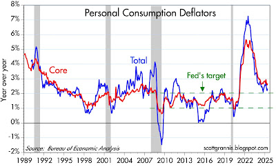
Chart #4

Chart #4 shows the year over year change in the Personal Consumption Deflators (total and core). Although both are somewhat above the Fed's target range, a closer looks says they are well within it. In the past three months (March, April, and May), the annualized rate of growth of both these inflation measures has plunged to 1.1% (total), and 1.7% (core). Powell's favorite measure, PCE core services less shelter, is up at a mere 1.1% annualized pace in the past 3 months. Note: these same three months include the impact of Trump's higher tariffs—which is to say that higher tariffs have not resulted in higher inflation by any measure. This is what I and many others predicted.
Chart #5

Chart #5 shows the three components of the PCE deflator: services, durable goods, and non-durable goods. As should be obvious, goods prices have been flat to down for the past 3 years. Inflation is only to be found in the services sector, and shelter costs make up a large portion of that sector. Lower housing costs are going to be depressing services inflation for a long time. The Case/Shiller index of national home prices peaked earlier this year and has fallen at an annualized rate of 1.8% in the most recent 3 months. Add it all up and the outlook for inflation is LOW for the foreseeable future. I think the Fed is getting very close to realizing this, so we will soon have lower interest rates and that should help.
Despite this somewhat downbeat, near-term outlook, I remain reasonably confident that we can avoid a disaster and the economy can improve with time. Trump has been a wrecking ball in many ways, which is unfortunate, but in the process he has provoked a lot of thought and shaken up things that needed to be shaken up (corruption and waste in the federal government, immigration, trade barriers, to name just a few). Between the Abraham Accords and the targeted bombing of Iran's nuclear sites, he may well have transformed the future of the Middle East for the better.

16 comments:
Sorry, Scott, but I'm not buying your call for lower interest rates. It is better for the overall economy and society to have moderate rates, as we do now. This worked fine, for example, in the 90s. Some painful adjustments are needed, especially in things that drive up the cost of housing, often political.
What were interest rates like during that period of 3.1 percent GDP growth from 1966-2007?
For additional perspective, interest rates over the years: https://www.statista.com/statistics/187616/effective-rate-of-us-federal-funds-monthly/
re "It stands to reason that without more people working it's hard for the economy to expand". You can increase productivity by channeling more savings into real investment outlets...not into funds dissipated in financial investment (the transfer of title to goods, properties, or claims thereto).
Link: “Changes in Wealth and the Velocity of Money”.
Changes in Wealth and the Velocity of Money (stlouisfed.org)
Lending/investing by the DFIs (deposit taking, money creating institutions), expands both the volume and the velocity of new money. I.e., lending/investing by the DFIs is inflationary.
Lending/investing by the NBFIs (nonbanks) increases the turnover of existing deposits (a transfer of ownership), within the commercial banking system. I.e., lending/investing by the NBFIs is non-inflationary (other things equal).
The correct solution to stagflation is the 1966 Interest Rate Adjustment Act, i.e., drive the banks gradually out of the savings business as lowering Reg. Q ceilings for the commercial banks did (which doesn't shrink the size of the payment's system), lowering deposit rates, while draining bank reserves.
This action raises the real interest rate for saver-holders outside the payment's system, by lowering inflation, while making the banking system as a whole more profitable.
Thanks Scott. Do you think US small caps will outperform large Caps? I would guess with lower interest rates, taxes and regulations, they should.
I do think small cap stocks have a decent chance of outperforming large caps in an environment of lower interest rates, lower tax and regulatory burdens, and moderate growth.
Re whether lower interest rates are necessary or not: To begin with, the level of nominal interest rates (which is largely controlled by Fed policy decisions) is not what we should be focusing on. Real interest rates (i.e., inflation-adjusted) are what really matters. Today the Fed has set the nominal yield on overnight interest rates at 4.3%. On a year over year basis, inflation is to be found in the 2-3% range, which would imply real interest rates of 1.3% to 2.4%, which is probably a bit on the high side of normal. But over the past 3 months, inflation has been running at 1.0% to 1.5%, which implies real interest rates of 2.8% to 3.0%, which is definitely in the range of what we would call "high." In the past, a 3% real federal funds rate has tended to coincide with inverted yield curves and has typically preceded every recession. If inflation cools further, real interest rates will become crushing burdens for borrowers of all stripes, especially homebuyers. Tight monetary conditions are appropriate when inflation pressures are increasing; in the current environment of rapidly cooling inflation, tight monetary policy is not only unjustified but potentially dangerous to the economy's economic health.
Hi Scott-- I hope the traveling is wearing you out only somewhat! Thank you for the blog and for the great ideas on data viz.
I'm trying to replicate one of your famous charts and I'm using FRED data.
to replicate chart #6 from:
https://scottgrannis.blogspot.com/2024/12/headwinds-and-tailwinds.html
Current Series Used:
DTWEXBGS - Trade Weighted U.S. Dollar Index: Broad, Goods and Services
DTWEXM - Trade Weighted U.S. Dollar Index: Major Currencies
Are there inherent problems with this series because my rendition (even with semi-log and base at Feb'06) is not matching yours-- likely because my data is not the same as yours.
Without permission, I didn't want to post a link to another site in your chatroom-- so I'll wait to hear back before posting my URL with the chart rendition I'm trying to create. Thanks, Scott.
P.S. If anyone in the CBP chat community is interested in doing Python financial data visualizations, I'd love to collab. The best way to dig deep into these posts is via the data!
Chart 5
It obvious to most of us that durable and non durable pricing took a huge jump when Biden and his crew took office. More regulations and threats of changing from natural gas and current hvac refrigerant changes didn’t help.
Agree to lower the rates in both the USA and Canada. Let’s go central banks . Even just a 0.25 bump for now.
The European Central Bank cut its key interest rates for the eighth time in the past year at its June 2025 meeting. The deposit facility rate, the ECB's main policy rate, was lowered to 2.00% from 2.25%. I belive the Fed is slow walking interest rate6 cuts to stall growth in the housing markets to punish Trump in the midterms.
It appears to me that the history is not that clean. Real rates (10 yr Treasury minus CPI-U) averaged 2.16% from 1952 to 2020. So your statement that values from 1.3% to 2.4% are "the high side of normal" seems strange to me. In addition, from 1990 to 2000 real rates averaged 4.2%. One can argue that that decade was a historic anomaly,. but my point is that the economy functioned quite well under the "burden" of those rates.
Even hard working illegal immigrants can enter legally. Prior to the leftist opening our borders, we had about 1 million LEGAL immigrants annually. That is what we collectively decided America could absorb. Debate if that should be more or less, but there should be no debate that every one of those should be LEGAL.
matka final ank Fix Dpboss Matka Satta global website.
.
Kalyan indian matka 420 king satta matka dpboss awesome Matka website
Post a Comment