Wednesday, October 12, 2022

Charts you probably haven't seen

Headline news can often be misleading.

The current drumbeat of news goes like this: the US economy is probably in recession, inflation and interest rates are soaring, our national debt is out of control, and the Fed needs to get tighter. Things are a mess.

The reality is very different: Financial markets are highly liquid and far from breaking down. The economy is growing, albeit slowly. Inflation pressures peaked months ago. Our national debt is still manageable. The Fed will likely adopt a less aggressive policy stance soon. 

The charts tell the story:

Chart #1

Chart #1 shows the level of 2-yr swap spreads. I pay a lot of attention to these spreads, because they are excellent coincident and leading indicators of the health of the economy and the financial markets. They are a bit esoteric for those unfamiliar with the inner workings of the bond market, which is probably why you haven't heard much about them (unless you've been a long-time follower of this blog). Here is a short primer on swap spreads if you want more information.

2-yr swap spreads currently stand at 31 bps, which is just below their long-term average of 33 bps. As the chart shows, spreads tend to rise in advance of recessions, and they tend to fall in advance of recoveries. Levels above 40-50 bps reflect an economy that is in trouble; current spreads say conditions are close to normal. 

Chart #2

The current level of spreads also reflects the fact that that liquidity is abundant, and that's extremely important. Up until recently, the Fed tightened monetary policy by shrinking the supply of bank reserves (before 2009, banks always held just enough reserves to collateralize their deposits, because reserves did not pay interest). This forced banks to bid up the price of reserves, since they needed more reserves to support a growing deposit base. Higher borrowing costs and a general shortage of liquidity put marginal borrowers and overstretched firms and individuals in a bind, and that in turn led to higher credit spreads, rising bankruptcies and eventually a recession. But since 2009, Fed tightening is very different: instead of shrinking the supply of reserves, the Fed simply raises the rate it pays on reserves, which have been and continue to be abundant, as Chart #2 shows.

Abundant liquidity is essential to a healthy financial market. And we have it in spades.

Chart #3

Chart #3 shows the level of BBB-rated corporate debt (the majority of corporate bonds are rated BBB). Although spreads here are a bit elevated, they are still well below levels that coincided with economic distress.

Chart #4

Chart #4 shows the real yield on 5-yr TIPS (red line), which is the market's expectation for what the real Federal funds rate will average over the next 5 years, and the current inflation-adjusted level of the Federal funds rate (blue line). This tells us that the market is expecting the Fed to tighten significantly in coming years (a high real funds rate is the very definition of tight money). Note also that real rates have not been as high as they are today for a very long time. High real rates mean monetary policy is tight, but they can also be a sign that the economy is very strong (as they were in the late 90s). Since a strong economy is going to be tough to come by these days, high real rates confirm that money is very tight. Very tight, and most likely tight enough to bring money supply back into line with money demand. We know that, since we can observe many sensitive prices declining (as my recent posts have highlighted)> 

Chart #5

Chart #6

Chart #7

Charts #5-7 show different measures of Producer Price Inflation (inflation at the wholesale level). Chart #5 compares the headline, year over year change of the PPI to the core (ex food and energy) change. Inflation by either measure has most likely peaked. Charts #6 and #7 compare the year over year change in the PPI to the 6-mo. annualized change. Here it becomes quite obvious that the peak of PPI inflation was several months ago. 

Chart #8

Chart #8 is the key to understanding the current state of the housing market. The top half of the chart compares the national average rate on 30-yr fixed rate mortgages to the yield on 10-yr Treasuries. The two are joined at the hip most of the time, and that's how it should be. The bottom half of the chart shows the difference between the two, which is now at a record high. 

In other words: mortgage rates today are extremely high relative to yields in the Treasury market, and this situation is very unlikely to last much longer. Prior peaks of this sort were short-lived. Super-high mortgage rates act as a brake on housing prices, since they boost the cost of home ownership. Homes today are very expensive relative to everything else, and there is mounting evidence that home prices have peaked and are now declining. Not surprising. Mortgage rates and housing prices should become more affordable before too long.

Chart #9

I'm sure you heard about the fact that Federal debt has now surpassed the staggering sum of $31 trillion dollars. Actually, that's not true. Federal debt held by the public (which is the correct measure) is only $24.3 trillion. The larger figure includes $7 trillion that the government owes itself, which is nonsensical. But isn't it huge relative to the economy? Well, yes, as Chart #9 shows. It is just under 100% of GDP, and that's big, but it's not unprecedented, and it hasn't increased in recent years.

Chart #10

What about the burden of all that debt? It must be huge, given the amount of debt outstanding and the recent rise in interest rates. Well, not exactly, as Chart #10 shows. The interest cost of our federal debt is less than 3% of GDP, and that's relatively low by historical standards. It's going to rise, to be sure, since the federal government is still running big deficits. But rising interest rates only affect debt that is issued currently, not the great bulk of the debt that was issued at lower interest rates, so interest costs are going to rise slowly. And don't forget that nominal GDP currently is rising by leaps and bounds: third quarter real GDP is likely to be at least 2% and on top of that we will likely see at least 5-6% inflation. At an annual rate, nominal GDP is increasing by at least $2.5 trillion per year, while the deficit is increasing by about half that. So we're not spiraling out of control. 

But of course we would be far better off if we weren't spending so much. The deficit today is not due to tax revenues, which are exploding higher, but out of control government spending, which acts to slow the economy because most of that spending is wasteful.

Friday, October 7, 2022

Inflation visualized


Before leaving for Argentina a few weeks ago, I arranged with Western Union to pick up $2000 worth of Argentine pesos at the "blue" rate of 300 pesos to the dollar.

I knew in advance that I was getting a great exchange rate and that things would be very cheap in Argentina, and I wasn't wrong. What I didn't know was that the largest bill in circulation is a 1000 peso note. Which meant that my $2000 would become 600,000 pesos, in the form of 600 1000-peso notes. It took the cashier at a local Western Union kiosk about 10 minutes to organize and count the bills. The photo says it all: 6 bundles of 100 notes, each bundle worth $333.33; each note worth $3.33. I needed a bag to carry all that money back to our hotel.


It took one of these bundles of peso cash to pay for a dinner for 24 family members at a great restaurant in Tucumán called Di Vino. We tried a dozen different wines, and everyone was served empanadas, salad and a traditional Argentine BBQ (parrillada). The final cost with a tip thrown in (most Argentines tip very little or nothing at restaurants), was 92,000 pesos, or about $12.80 per person. Our huge suite at a local hotel was $75 a night. A 20 minute taxi ride cost less than $5. We took some friends to an estancia in Tafi del Valle; the bill for 3 rooms for 2 nights (including breakfast) was 126,000 pesos ($420).

You can find good wine for 2000 pesos, empanadas for 250 pesos, steaks for 1,700 pesos. Expensive wines run about 8,000 pesos (the cheapest wine in a trendy US restaurant these days starts at $40). Yesterday we had lunch at Fervor, one of my favorite restaurants in Buenos Aires. There were four of us and we ordered one Parrillada de Pescado y Mariscos—a huge selection of grilled fish, shrimp, squid, and calamari. We couldn't finish it all and it only cost 10,000 pesos ($33). We enjoyed two bottles of my favorite Argentine white wine, MariFlor Sauvignon Blanc, for 8,000 each.

A brief history of the peso: Today, a dollar gets you 300 pesos; a year ago a dollar was worth 200 pesos; two years ago 150; three years ago 70; four years ago 37; and ten years ago about 5. Why has the peso lost so much of its purchasing power? The answer is simple: the government pays most of its bills with the printing press. The M2 money supply has grown from 400 billion pesos 10 years ago to now over 10 trillion pesos. That works out to an annualized growth rate of about 40% per year. M2 has increased about 70% in the past year alone. Not surprisingly, Argentine inflation this year will exceed 100%.

Argentina has actually been suffering from bad monetary policy forever. When I lived there in 1975-79, inflation averaged about 125% per year. If Argentina had not changed its currency by lopping off zeros and renaming it 5 times since 1916 (when a dollar was worth 2 of the original pesos), the exchange rate today would be 3,000,000,000,000,000 pesos per dollar.

As Milton Friedman taught us, inflation is a monetary phenomenon which occurs when the supply of money exceeds the demand for it. Argentina has proved that countless times over the past century. It's no mystery, but nearly everyone—especially the Fed—completely ignores the fact that our inflation problem today started with a huge expansion of our money supply in 2020 and 2021. Most people seem to think that the inflation is up because the economy is "running hot," and that to get inflation down the Fed needs to cause a recession. Not so: the Fed simply needs to slow the growth of the money supply and boost interest rates by enough to restore a balance between money supply and demand. As I explained in my last post, it looks like they have done enough already. 

You can read more about this in my posts over the past two years. This is a good place to start. Also see this. Last June I stopped worrying so much about inflation, and this explains why.

UPDATE (10/12/22): Below is a chart of Argentina's dual exchange rates. The current "market rate" is also known as the "Blue" rate. Note that over the course of almost 17 years, the peso has dropped from 3 to the dollar to now over 300, for a loss of 99%. Cry for Argentina.


Tuesday, September 27, 2022

Everything's down except inflation


And that means inflation has peaked and will be headed down in the months to come.

Inflation as measured by government indices (e.g., CPI, PCE Deflator) is a lagging indicator of true inflation. True inflation is defined as the loss of purchasing power of a currency. Right now that is just not the case: the dollar is soaring against nearly every currency in the world and virtually all commodity prices are collapsing.  Don't pay attention to inflation; pay attention to sensitive market-based prices—they tell you where inflation is headed.

The Fed was very slow to see the inflation problem which showed up in surging M2 growth in 2020, and they are being very slow to see that inflation fundamentals have improved dramatically this year.

Chairman Powell has it all wrong: the way to kill inflation is not to kneecap the economy, it's to reduce the supply of money and increase the demand for it by raising interest rates. The Fed has already succeeded in doing that! There's no reason at all that we need a recession to get inflation down. In fact, a growing economy can actually help to bring inflation down by increasing the supply of goods and services. I just don't see the Fed continuing on the inflation warpath for very much longer.

This bad Fed dream will be over soon. This is not the time to be cashing out of risk assets.

Chart #1

The dollar is very strong and rising against virtually every currency in the world (Chart #1). That means that most prices outside our borders are going down. Come to Argentina, where I am at the moment, and you won't believe how cheap things are. Great wine for  $3-5 per bottle. Steaks for $3. A 1-mile Uber ride for $1.  Tip a cabby with 1000 pesos (the largest-denomination bill, but worth only $3.33 US) and they will sing your praises. We have a 3-room suite in a nice hotel for only $70 a night. To worry about US inflation at a time like this is crazy.

Chart #2

The M2 money supply (Chart #2) has risen at a paltry 2.3% annualized rate over the past 9 months, and M2 has been flat for the past 6 months. If rapid M2 growth beginning in 2020 was the fuel for inflation (very likely), then the inflation fires are already dying down. The surge in M2 that began in 2020 was the spark that triggered rising inflation about a year later; the lack of M2 growth that began late last year will undoubtedly result in a decline in measured inflation before year end. 

Chart #3

The CRB Raw Industrials index (Chart #3) is down 18% since its early March high. Nearly every commodity has exhibited the same behavior, as the following charts show.

Chart #4

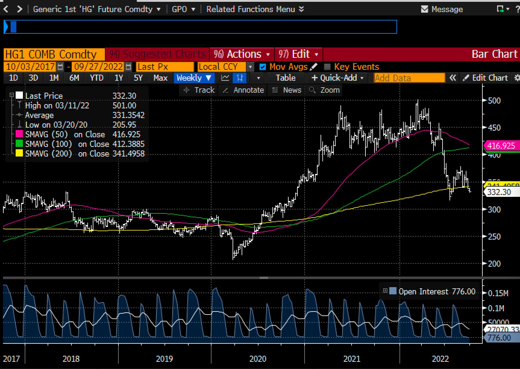
Chart #4 shows copper prices, which are down 35% since March. "Dr. Copper" is telling us that the Fed has no reason to worry. But maybe they should worry because they are threatening a whole lot more tightening when none is needed. This is what is called "closing the barn door after all the horses have left."

Chart #5

Chart #5 shows gold prices, which are down 22% from last March's high. Gold is traditionally very sensitive to changes in monetary policy. This is a strong signal that the Fed may have already tightened too much.

Chart #6

Chart #6 shows crude oil prices, which are down a whopping 35% since mid-June. This is a very significant decline that will have the effect of lowering the prices of all things that depend on energy.

Chart #7

Chart #7 shows the best measure of US housing prices. Note that prices stopped rising a few months ago according to this measure. However, since the index is based on an average of prices over the previous three months, it's quite likely that the actual peak in housing prices happened some time in the March-April time frame. And it's not at all surprising that housing prices have peaked considering that mortgage rates have more than doubled so far this year (most recent quote is 6.7% for a 30-yr fixed conventional mortgage). This is how monetary policy impacts prices and inflation: higher rates increase the demand for money and reduce the demand for borrowed money; people become much less anxious to own things when interest rates are high. It's better to hold on to your money than spend it; better to rent than buy, which is why rents are increasing as housing prices soften. 

Chart #8

Finally, as Chart #8 shows, the market's expectation for what CPI inflation will average over the next 5 years has now fallen to 2.33% (the bottom half of the chart), thanks to a huge increase in market interest rates (top half, representing 5-yr Treasury yields and 5-yr TIPS yields. 

Markets these days are a lot more worried that the Fed will needlessly kill the economy than that inflation will do anything but decline. 

UPDATE: We've been in Argentina for a week now, and it's painful to see the sorry state of the economy and the abysmal level of prices. Food here costs about one-fourth what it does in the U.S., not because unemployment is high (which it is), but because no one earns enough to afford to spend more. Those pundits who argue that the Fed needs to tighten by enough to push unemployment higher so that inflation will come down should come to Argentina to see the results of high unemployment. Prices for basic things may be low, but the inflation rate here is about 100% a year. Anything produced outside of Argentina comes in at international prices, and sooner or later the prices of basic things will necessarily rise to international levels. Things are cheap here only temporarily. The lower and middle classes are being robbed of their purchasing power by inflationary monetary policy, and the only one benefiting from the theft is the government. That's called the inflation tax. The government prints money to pay its bills, and anyone who touches that money loses purchasing power on a daily basis, while on the other side of the coin the government gets to keep on spending. Bottom line: Argentine M2 is growing by leaps and bounds—70% a year at last count, whereas in the US, M2 is flat. The US is on the cusp of disinflation, while Argentina is on the cusp of hyperinflation.

If higher unemployment were necessary to bring inflation down, Argentina would be suffering from deflation by now.