Monday, May 21, 2012

Euro update

With the world's worst fears dominated by events unfolding in the Eurozone, and with the euro's continued existence a key question, I offer some charts which perhaps provide some useful perspective. Despite all the fears of cataclysmic outcomes, the euro has actually strengthened vis a vis the dollar since its 1999 inception, and the euro today is trading about 10% above its purchasing power parity relative to the dollar by my calculations. This suggests that the ECB has been doing a pretty good job of defending the euro—better even than the Fed.
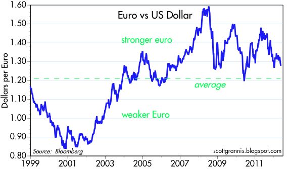

The euro today is slightly higher against the dollar than it was at its inception. It's been a long roller-coaster ride, but I see nothing here that would point to an imminent collapse. What seems more likely is a further gradual decline of the euro vs. the dollar.


The euro (using the DM as a proxy going back prior to the inception of the euro) has been trending higher against the dollar for the past 40 years, primarily because inflation in Europe has been lower than in the U.S. Purchasing power parity theory conforms with this experience; the currency with lower inflation should outperform, over time, the currency with higher inflation (the inflation differential between the U.S. and the Eurozone is reflected in the green line on the chart). The inflation differential that has favored the euro is ultimately the result of tighter monetary policy in Europe. The gap between the blue and green line suggests that the euro is about 10% "overvalued" against the dollar, which means that an American tourist in Europe is likely to find that most goods and services cost about 10% more in Europe than they do in the U.S. By the same logic, European tourists to the U.S. are likely to find that things are about 10% cheaper here.

The ECB can take credit for maintaining the purchasing power of the euro even as the world's demand for euros has weakened as a result of the Eurozone crisis, even as the world's demand for safe-haven currencies has been intense, and even as the Eurozone financial crisis has required the ECB to inject massive amounts of liquidity to shore up its banking system. But the strains are showing, and I think the euro is likely to weaken some more.


This chart shows the price of gold in the world's three major currencies. Here again we see that the dollar has lost purchasing power against the euro (because the price of gold has risen more in dollar terms than it has in euro terms). The yen has been the strongest currency of all for the past several decades; the price of gold in yen today is still less than it was at the gold's peak in the early 1980s.

The dollar is weak against the great majority of the world's currencies, and the Fed's Real Broad Dollar Index shows indeed that the dollar is very near its all time lows. But the euro's resilience in the face of great adversity, and the dollar's rather extreme weakness in general, don't mean the dollar is doomed. I've been arguing for awhile that the dollar was likely to rise this year against other developed currencies, because I think the economy is going to end up doing better than expected, and I continue to believe a stronger dollar is likely. The ECB is going to have a tough time maintaining its tight-fisted stance (relative to the dollar, that is), since the Eurozone financial system is still far from being out of the woods, and the Bank of Japan already is making a real effort to keep the yen from appreciating further. If the ECB and the BoJ have to further expand their balance sheets to achieve their goals, this could result in additional supplies of euros and yen relative to the dollar, thus supporting the dollar's value in a relative sense. And if the U.S. economy continues to beat expectations, then demand for the dollar could strengthen, and that in turn could provide a tailwind for the Fed's efforts to drain liquidity as the economy improves.

Friday, May 18, 2012

Eurozone update

It's time to look once again at the key indicators of risk in the Eurozone, especially since Eurozone fears are at the epicenter of the fears roiling world markets these days.


First, however, let's check in on the status of fears in the U.S. As the above chart shows, bond yields have fallen back to the levels they hit in late September, when the Eurozone crisis was heating up and there was lots of talk about an imminent U.S. recession. (10-yr Treasury yields hit a new all-time low of 1.7% yesterday.) I interpret this to be the result of a scramble by investors around the world to get into the safest asset that still has a measurable yield, and that sort of demand can only be driven by deep-seated fears of an extended global recession likely triggered by a Eurozone financial implosion. But: although the S&P 500 has taken a hit, it is still almost 20% above its Oct. 3rd low. Why haven't stocks tracked bonds? That's easy: earnings have continued to surprise on the upside, and the U.S. economy has shown no sign of the expected double-dip recession. Equity investors here are rattled, but they aren't nearly as fearful as global bond investors; equities have gotten a lot cheaper relative to Treasuries. Treasuries have never been more expensive. Never. I should also note that the Euro Stoxx index is now very close to its recession-era lows. Add this all up and it says that the biggest economic risks are still relatively isolated, and they can be found mainly in the Eurozone.


According to swap spreads, systemic risk in the U.S. is up a bit, but not nearly as much as in the Eurozone. There is fear of Eurozone contagion, but it's not intense by any means. Interestingly, Eurozone swap spreads are lower today than they were at the peak of the last Eurozone crisis late last year. So swap spreads are saying things are not critical at all in the U.S., and not yet catastrophic in the Eurozone. Yet 10-yr bond yields reflect an extreme degree of concern. The world's demand for Treasuries is exceptionally strong, and seems out of line with other indicators of risk.


The charts above compare 2-yr yields in various Eurozone countries. Both charts make it clear that near-term default risk in the Eurozone has declined dramatically from what it was at the end of last year. Note how the outlook for France has barely budged; the recent elections were not a surprise and the market feels moderately comfortable with near-term prospects there.


On a longer-term horizon, this chart of 5-yr CDS spreads shows that default risk in most Eurozone countries is elevated, but nevertheless equal to or lower than the default risk of the average high-yield corporate bond issuer in the U.S. (high-yield CDS spreads currently average about 700 bps). That's bad considering we're talking about the sovereign debt of developed countries, but from a global perspective it's not exactly the end of the world. Markets can live very comfortably with high-yield debt risk.


This chart helps sum things up. Europe is really struggling, but the U.S. equity market has suffered what appears to be just a correction. So far there are no signs that the U.S. economy has been dealt anything more than a glancing blow by all the turmoil in Europe. And despite all the hand-wringing and the flight to Treasuries and the Eurozone bank runs, key indicators of risk are saying that the fundamentals are not catastrophically bad by any means. I think there's a good chance the world will survive the Eurozone crisis.

Thursday, May 17, 2012

What TIPS say about the future


As the world agonizes over a Greek default/banking implosion spreading to the rest of the Eurozone, I thought it would be good to revisit what is going on in the TIPS market. The first chart above compares 10-yr TIPS to 10-yr Treasuries, while the second looks at the 5-yr version of each. Nominal and real yields are on the top of each chart, and the bottom line is the difference between the two, which is the market's expectation for annual inflation over the life of the bonds.

Not surprisingly, both charts show the same patterns. The dominant pattern is that real and nominal yields are moving down at pretty much the same pace, with the result that inflation expectations are not much different today than they have been on average over the past 15 years. The important trend here, then, is the decline in real yields, which is being tracked by the decline in nominal yields; since inflation expectations haven't changed, nominal yields must follow the decline in real yields. Real yields are falling because the market's implicit expectation for real growth is falling. Back in the year 2000 you could buy 10-yr TIPS with a 4% real yield because the market thought the economy was going to be going gangbusters forever; real yields on TIPS had to compete with the market's very bullish expectations for real economic growth.

Today, of course, things are just the opposite. Real yields are now negative, and that means the market has almost no hope for any meaningful economic growth for as far as the eye can see. Why buy 10-yr TIPS with a negative real yield (thus ensuring you will lose purchasing power with your investment, since the total return on TIPS will be less than the rate of inflation) when you could buy an equity index fund and gain exposure to the rise in corporate profits which should be at least equal to the increase in nominal GDP over time? You would be indifferent to these two choices only if you held out no hope for there being any real growth over the next 10 years. Put another way, it's as if the market is saying that since the risk of big losses on everything is huge (e.g. there may be a global depression around the corner), then risk-free TIPS which will deliver a guaranteed real loss are better than investing in anything else because at least you know that with TIPS your real loss will be limited.

If that's not a pessimistic market, I don't know what is. But maybe it's just the case that Europeans are panicking en masse, and they will pay any price for a security backed by the U.S. government. Even so, TIPS and Treasuries are priced to something like a depression. This is a replay of sorts of what we saw at the end of 2008, only this time the market is not expecting any deflation; worrying about deflation now doesn't make sense when Greece might default and the euro might disappear, and maybe confidence in currencies collapses and that all leads of course to inflation.

So: anyone who buys TIPS and Treasuries today is effectively endorsing the view that a deep recession or depression—with average inflation—is the most likely outcome.

If you think that view is too pessimistic, then that effectively makes you an optimist.