Headline news can often be misleading.
The reality is very different: Financial markets are highly liquid and far from breaking down. The economy is growing, albeit slowly. Inflation pressures peaked months ago. Our national debt is still manageable. The Fed will likely adopt a less aggressive policy stance soon.
The charts tell the story:
Chart #1
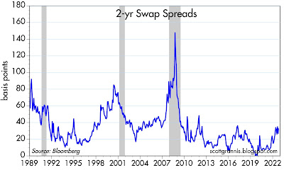
Chart #1 shows the level of 2-yr swap spreads. I pay a lot of attention to these spreads, because they are excellent coincident and leading indicators of the health of the economy and the financial markets. They are a bit esoteric for those unfamiliar with the inner workings of the bond market, which is probably why you haven't heard much about them (unless you've been a long-time follower of this blog). Here is a short primer on swap spreads if you want more information.
2-yr swap spreads currently stand at 31 bps, which is just below their long-term average of 33 bps. As the chart shows, spreads tend to rise in advance of recessions, and they tend to fall in advance of recoveries. Levels above 40-50 bps reflect an economy that is in trouble; current spreads say conditions are close to normal.
Chart #2
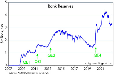
The current level of spreads also reflects the fact that that liquidity is abundant, and that's extremely important. Up until recently, the Fed tightened monetary policy by shrinking the supply of bank reserves (before 2009, banks always held just enough reserves to collateralize their deposits, because reserves did not pay interest). This forced banks to bid up the price of reserves, since they needed more reserves to support a growing deposit base. Higher borrowing costs and a general shortage of liquidity put marginal borrowers and overstretched firms and individuals in a bind, and that in turn led to higher credit spreads, rising bankruptcies and eventually a recession. But since 2009, Fed tightening is very different: instead of shrinking the supply of reserves, the Fed simply raises the rate it pays on reserves, which have been and continue to be abundant, as Chart #2 shows.
Abundant liquidity is essential to a healthy financial market. And we have it in spades.
Chart #3
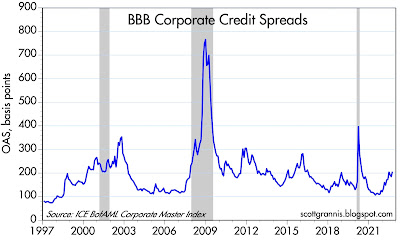
Chart #3 shows the level of BBB-rated corporate debt (the majority of corporate bonds are rated BBB). Although spreads here are a bit elevated, they are still well below levels that coincided with economic distress.
Chart #4 shows the real yield on 5-yr TIPS (red line), which is the market's expectation for what the real Federal funds rate will average over the next 5 years, and the current inflation-adjusted level of the Federal funds rate (blue line). This tells us that the market is expecting the Fed to tighten significantly in coming years (a high real funds rate is the very definition of tight money). Note also that real rates have not been as high as they are today for a very long time. High real rates mean monetary policy is tight, but they can also be a sign that the economy is very strong (as they were in the late 90s). Since a strong economy is going to be tough to come by these days, high real rates confirm that money is very tight. Very tight, and most likely tight enough to bring money supply back into line with money demand. We know that, since we can observe many sensitive prices declining (as my recent posts have highlighted)>
Chart #5
Chart #6
Chart #7
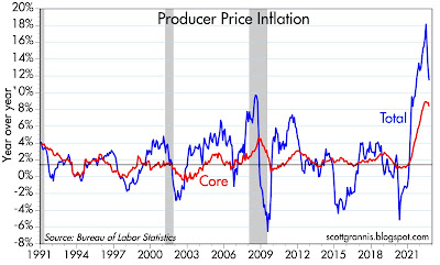
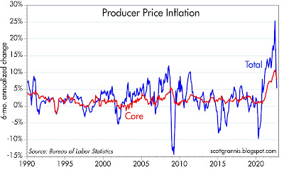
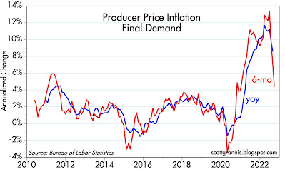
Charts #5-7 show different measures of Producer Price Inflation (inflation at the wholesale level). Chart #5 compares the headline, year over year change of the PPI to the core (ex food and energy) change. Inflation by either measure has most likely peaked. Charts #6 and #7 compare the year over year change in the PPI to the 6-mo. annualized change. Here it becomes quite obvious that the peak of PPI inflation was several months ago.
Chart #8
Chart #8 is the key to understanding the current state of the housing market. The top half of the chart compares the national average rate on 30-yr fixed rate mortgages to the yield on 10-yr Treasuries. The two are joined at the hip most of the time, and that's how it should be. The bottom half of the chart shows the difference between the two, which is now at a record high.
In other words: mortgage rates today are extremely high relative to yields in the Treasury market, and this situation is very unlikely to last much longer. Prior peaks of this sort were short-lived. Super-high mortgage rates act as a brake on housing prices, since they boost the cost of home ownership. Homes today are very expensive relative to everything else, and there is mounting evidence that home prices have peaked and are now declining. Not surprising. Mortgage rates and housing prices should become more affordable before too long.
Chart #9
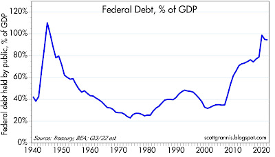
I'm sure you heard about the fact that Federal debt has now surpassed the staggering sum of $31 trillion dollars. Actually, that's not true. Federal debt held by the public (which is the correct measure) is only $24.3 trillion. The larger figure includes $7 trillion that the government owes itself, which is nonsensical. But isn't it huge relative to the economy? Well, yes, as Chart #9 shows. It is just under 100% of GDP, and that's big, but it's not unprecedented, and it hasn't increased in recent years.
Chart #10
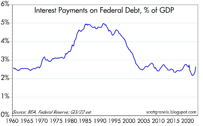
What about the burden of all that debt? It must be huge, given the amount of debt outstanding and the recent rise in interest rates. Well, not exactly, as Chart #10 shows. The interest cost of our federal debt is less than 3% of GDP, and that's relatively low by historical standards. It's going to rise, to be sure, since the federal government is still running big deficits. But rising interest rates only affect debt that is issued currently, not the great bulk of the debt that was issued at lower interest rates, so interest costs are going to rise slowly. And don't forget that nominal GDP currently is rising by leaps and bounds: third quarter real GDP is likely to be at least 2% and on top of that we will likely see at least 5-6% inflation. At an annual rate, nominal GDP is increasing by at least $2.5 trillion per year, while the deficit is increasing by about half that. So we're not spiraling out of control.
But of course we would be far better off if we weren't spending so much. The deficit today is not due to tax revenues, which are exploding higher, but out of control government spending, which acts to slow the economy because most of that spending is wasteful.




22 comments:
I'd love to see charts 9-10 with some other countries for comparison!
pangloss is smarter than everyone who is smarter than pangloss. do we have that right?
Is liquidity global? What does your analysis say about global liquidity? i.e. the UK turmoil, European rates, Credit Suisse etc.
As I think of past liquidity events over the decades, it seems like there's plenty of liquidity until there isn't. Could Europe/China problems change our situation in an instant?
Thanks
I'm here for Leibniz, not Pangloss and not Voltaire.
M2 is mud pie. Total Checkable Deposits tells the story.
https://fred.stlouisfed.org/series/TCDNS
See also the "demand for money" as Dr. Philip George posits: "The Riddle of Money Finally Solved"
http://www.philipji.com/riddle-of-money/
The expansion of our "means-of-payment" money is unparalleled.
Link: George Garvy:
Deposit Velocity and Its Significance (stlouisfed.org)
“Obviously, velocity of total deposits, including time deposits, is considerably
lower than that computed for demand deposits alone. The precise difference
between the two sets of ratios would depend on the relative share of time deposits
in the total as well as on the respective turnover rates of the two types of
deposits.”
It will take years to ameliorate this monetary policy blunder.
From an upper working class neighborhood perspective, contrary to the pols talking about pain at the pump and folks not being able to afford groceries, people around me are still working and spending money on atupid higher-end Halloween decorations.
Seems right Frederic.
Great read!
Thank you Scott, your timely topics are of interest to so many of us.
(Edited)
The injection of new money was the biggest mistake that's ever happened since the Federal Reserve System was established in 1913. To get an idea, you have to look at the old "Total Checkable Deposits" time series. I.e., "means-of-payment" money, its spike was unparalleled (money which was used to calculate legal reserves, those reserves which were driven by payments).
We'll have negative real rates of interest for a long time. And high inflation is not going away. The progress, deceleration, the market sees is delusional. There's likely to be a significant drop in the 4th qtr., but then inflation gets very stubborn.
Latest gDp estimate: 2.9 percent — October 7, 2022
Hi Scott, thanks for another great update. On Cart #4, you mentioned that "market is expecting the Fed to tighten significantly in coming years (a high real funds rate is the very definition of tight money). Note also that real rates have not been as high as they are today for a very long time. High real rates mean monetary policy is tight".
What do you expect Federal Fund rates will be in that five year window? I have seen projections that the Fed would peak at 4.25%, then hold for two years, and then begin lowering in 2025.
Dani: the market's current expectation for the Fed funds rate is 4.25% by year end, peaking at 5% sometime in Q2/23, and then falling gradually to 3.5% by mid-26.
L was a plagiarist. just ask spinoza, or was that the other guy?
If productivity is low due to boomers retiring, population aging, big oxygen sucking governments and excess consumption (vs productive activities investments) doesn't that make inflation somewhat of a potentially structural problem?
It certainly looks like we (developed nations) have been living beyond our means for a long time, doesn't that leads to a rather painful correction?
The FED has made the worst policy error since it began in 1913. Powell is the worst chairman in history. Powell sought to cover up his gargantuan mistake by reinventing the money stock figures.
R-gDp is determined by a 10mo fixed rate-of-change in short-term money flows. The roc has reversed since the 1st half of the year. Short-term flows are now up. Because Powell destroyed deposit classifications, I now have to use a disclaimer.
re: "And don't forget that nominal GDP currently is rising by leaps and bounds"
You're the only one I've seen that recognizes that fact.
Scott, would you share your opinion on "higher rates for longer" idea. Thank you for your help in navigating the Macro Ocean.
Anyone have the Bloomberg symbol for the 2 yr Treasury swap?
@minnesota nice,
"As I think of past liquidity events over the decades, it seems like there's plenty of liquidity until there isn't."
There are many kinds of liquidity, not only 'ample reserves' liquidity.
In a way, what the Fed has provided in terms of liquidity (temporary measures that became quasi-permanent), may have contributed to larger future risks concerning other types of private liquidity.
The following is from an interesting fellow who voiced unusual concerns in 2005 (going against conventional wisdom can be tough even if (and perhaps more so if) you're right). The article's main point is mostly qualitative so..
https://bfi.uchicago.edu/insight/research-summary/liquidity-liquidity-everywhere-not-a-drop-to-use-why-flooding-banks-with-central-bank-reserves-may-not-expand-liquidity/
Yes, the federal government owns much of the national debt, and the Federal Reserve owns more than $7 trillion of it.
The Fed seems to think it has a duty to sell its hoard of US Treasuries, but I do not know why. Selling UST's into global capital markets will do what?
Fight domestic inflation in the US?
The Bank of Japan has a much, much larger hoard of JGBs, relative to their economy. They talk about maybe getting to 2% inflation this year (though not on the core).
The Fed selling USTs will likely just leverage up US taxpayers.
Interesting topic.
Thanks Scott. I love your analysis.
@Benjamin
"The Fed selling USTs will likely just leverage up US taxpayers."
Please explain.
Post a Comment