Showing posts sorted by relevance for query transfer payments. Sort by date Show all posts

Wednesday, July 30, 2014

What's driving the decline in labor force participation?


One of the distinctive features of the U.S. economy's current expansion phase is that it has been the weakest recovery ever. As the graph above shows, the economy is operating significantly below its long-term growth trend; if this were a typical expansion, the economy would have recovered to its trend growth path long ago. In fact, it's only grown at a 2.1% annualized pace from mid-2009 through mid-2014. Not only is growth slow, but the economy likely has a lot of unused capacity; because of that, national income today is arguably about $1.7 trillion less than what it could or should be. 


The next most distinctive feature of the current recovery is the unprecedented decline in the labor force participation rate, shown in the graph above. Beginning in 2009, some 7 million people of working age have dropped out of the labor force or given up looking for a job. But why? One standard answer is demographics—the baby boomer generation is starting to retire. But demographics don't turn on a dime, they take many years to play out. In contrast, the current and ongoing decline in the labor force participation rate started rather suddenly in 2009. 


It may be a coincidence, but there was a significant change in fiscal policy that occurred around 2009 that might explain the decline in the labor force participation rate: a huge increase in government transfer payments. As shown in the first of the two graphs above, transfer payments (social security, medicare, medicaid, unemployment insurance, food stamps, disability insurance, veterans benefits, subsidies) rose from 17.2% of disposable income in September, 2008, to 20.1% of disposable income by September, 2009. In dollar terms, annual transfer payments rose by $300 billion, almost 16%, in just one year. Since then they have largely kept pace with the growth of personal income, and they are now significantly higher relative to disposable income than ever before. In my book, this ranks as a significant change on the margin that negatively affected people's willingness to work.

With the government paying people more than ever not to work, it should not be surprising to see fewer people willing to work. As the graphs above show, the labor force participation rate began to decline just after transfer payments rose to a new all-time high of 20% of disposable income. In the past decade, transfer payments relative to disposable income have increased by fully one-third, with most of that increase coming in 2008 and 2009. It's worth noting that the economy has not experienced robust growth for at least a decade.

With the government being generous to a fault, many folks apparently have found it easier than ever before to "drop out." 


One reason transfer payments reached unprecedented levels in 2009 was the Emergency Unemployment Claims program that Congress passed in 2008. Never before could people receive unemployment insurance benefits for so long—up to 99 weeks and even more. This program alone accounted for a $90 billion increase in transfer payment spending in the 12 months ended September, 2009. Spending peaked shortly thereafter, however, then declined by a $100 billion annual rate between early 2010 and  the end of last year, when the program expired. It's not contributing to transfer payments any more, but nevertheless they have remained historically very high. One out of every five dollars that consumers have available to spend is coming from the government, with no requirement to work.


Another reason that transfer payments rose is the increase in the number of people receiving social security disability insurance since the end of 2008. The growth in the number of recipients has declined in recent years, however, and has been relatively flat for at least a year or so. There are about 11 million recipients of this benefit, which totals almost $1000 per month on average, bringing the total annual spending to about $130 billion, or just over 5% of total transfer payments. Nothing significant changed with this program in 2008 or 2009, however, with growth in the post-recession years substantially the same as before. So it's not the culprit many think it is.


A 15% increase in the monthly food stamp benefits in 2009, plus a relaxation of the eligibility rules in April 2009, helped fuel a huge, 50% increase in the number of people receiving food stamps since the end of 2008. The average SNAP recipient gets about $125/mo., and the program is currently costing about $70 billion per year. That equates to about 2.8% of current transfer payments. In 2009, the increased spending on food stamps in 2009, relative to 2008, was about 40%, or about $20 billion per year. Not a big factor, but certainly a contributing factor.

Another big reason for increased transfer payments was the ARRA, over 75% of which consisted of an increase in transfer payments, much of which, in turn, came in the form of tax benefits, housing assistance, grants, and expanded entitlements that likely continue to exist.

One more thing: marginal income tax rates have increased in recent years, by a not-insignificant amount, especially due to the implementation of Obamacare, which imposes a 3.8% tax on earned income and another 3.8% tax on unearned income for those considered to be "rich." I know people in California who now face marginal tax rates as high as 74%. That is a powerful disincentive to work.

And as Milton Friedman taught us, "spending is taxation." Every dollar of transfer payments from the government is a dollar that comes from the private sector. More transfer payments drain more resources from the productive sector, and thus contribute to slow the growth of jobs and incomes.

I wish I could identify all the pieces of this smoking gun, but I am reasonably convinced that a significant increase in government transfer payments, combined with higher marginal tax rates, have created, on the margin, important disincentives to work, and that, in turn, is an important driver of the ongoing decline in the labor force participation rate.


Tuesday, December 6, 2022

The huge problem of transfer payments


History will record that public policy in the Covid era was extraordinarily bad. Lockdowns, school closures and mask mandates were not only ineffective, they exacted a huge toll in overall health, human suffering, learning loss, and economic damage. As we now know, Sweden, virtually the only country to eschew these policies, experienced the lowest excess mortality rate in the world and the healthiest economy.

Back in April/May of 2020 I predicted that "the shutdown of the US economy would prove to be the most expensive self-inflicted injury in the history of mankind." I believe I have been fully vindicated on that score.

In an attempt to mitigate the economic damage of these policies, many countries resorted to massive transfer payments designed to make up for job and earnings losses, and to shore up their economies. The U.S. was arguably the leader among nations in this regard. Sadly, as the dust settles we now see that massive transfer payments were the direct cause of the biggest surge in inflation since the inflationary 1970s.

As if that weren't bad enough, transfer payments (money people receive from the government for which no goods or services are exchanged; e.g., social security, unemployment insurance, stimulus payments) have seriously reduced the incentives to work, leaving the U.S. economy with a shortage of labor and an anemic economy. The Fed can't fix that—only Congress can. 

Chart #1

Federal transfer payments are now running at about a $4 trillion annual rate. Chart #1 shows transfer payments as a percent of disposable income. Over 20% of the disposable income in the U.S. now comes in the form of payments to individuals who don't have to work for it. By this measure, transfer payments have more than quadrupled since the early 1950s, and they show no signs of shrinking. 

Charts #2 and #3

Chart #2 zooms in on the percent of disposable income derived from transfer payments since 1970. Chart #3 is plotted with the same x-axis, and it shows the labor force participation rate (i.e., the percent of the population of working age that is either working or looking for work). The dashed lines strongly suggest that the big decline in the labor force participation rate since 2008 had a lot to do with a huge increase in transfer payments. Not surprisingly, paying people to not work does not encourage them to work.

If we want to restore the economy's former vigor, we need to reduce transfer payments and increase the incentives to work and invest. We need to incentivize people to work by reducing tax and regulatory burdens. 

Chart #4

I've featured Chart #4 several times in the past 6 months or so. It is designed to show that the huge and unprecedented increase in the M2 money supply was the direct result of massive increases in the federal deficit. The government "borrowed" some $5-6 trillion in order to send out a blizzard of checks to individuals. Most of that money ended up sitting in bank savings and deposit accounts (the main source of M2 growth) because a) people didn't have an opportunity to spend it, given the lockdowns, and b) the huge degree of uncertainty and fear which dominated the Covid era made nearly everyone acutely risk-averse. Trillions of dollars were stockpiled in the nation's banks as a result, and now that people don't want or need all that money it is getting spent, and that is fueling the rise in prices. 

Fortunately, the source of this national inflation nightmare is fading. The federal deficit is reverting to trend, and there doesn't appear to be a Congressional appetite for yet another round of "stimulus" checks. 

Chart #5

Chart #5 compares the year over year growth of M2 to the growth of the CPI. The CPI line is shifted one year to the left, in recognition of the fact that a) there are lags between monetary policy and its effects on inflation, and b) it took about a year from the time the first round of stimulus checks boosted the money supply until the time the Covid scare had passed and people started spending money in earnest. The chart suggests that it will take at least a year before inflation subsides to a level we're all more comfortable with. From what I can see, we are on track to a lower inflation future. 

What we've learned from all of this:

The proximate cause of our inflation problem was a huge increase in federal transfer payments that ended up being monetized, most of it at a time when people no longer wanted to hold so much cash. The economy couldn't absorb all that extra spending (think supply-chain bottlenecks and labor shortages), so unwanted cash ended up fueling inflation. That source of inflation is no longer operative, since transfer payments have reverted to trend. The excess amount of M2 is being worked off as people spend money and the economy grows (in both real and nominal terms). Chart #3 in this post illustrates the process. 

The most important thing the Fed can do today is what they have been doing: raise interest rates. Higher interest rates serve to increase the demand for all the excess money still sitting in bank deposits. Inflation happened because the demand for those deposits fell (because people preferred to spend their money rather than hold on to it) as the Covid scare faded. Without higher interest rates, people would be spending a lot more from their savings, and that would push inflation higher. With higher interest rates, savings and money market accounts have become much more attractive, and people are willing to hold on to the extra money, and that is allowing inflation to cool.

Memo to Fed: don't overdo the tightening. Inflation is receding, but it will take time to get back to 2%.

Memo to Congress: please stop spending money you don't have. It doesn't help the economy and it only threatens to keep inflation from falling.

UPDATE (12/20/22): Don't miss this article by my good friend Steve Moore: "It pays not to work in Biden's America—and here's the proof" Steve, Casey Mulligan and E. J. Antoni have documented astounding evidence that our welfare system pays too many people too much not to work. It fits perfectly with this post. 

Monday, November 17, 2014

Our hugely progressive tax code

A newly-released study by the Congressional Budget Office was designed to demonstrate that the inequality of income distribution in the U.S. has declined in recent years, thanks to increased transfer payments and higher tax rates on the rich. As Mark Perry notes, "Almost half of the income inequality between the highest and lowest household quintiles disappears when we adjust for government transfer payments and federal taxes. Before taxes and transfers, the average income of a household in the top 20% is 15.1 times greater than the income of a household in the lowest quintile, but that ratio drops to only 7.8 times after adjusting for transfers and taxes."


Reasonable people can disagree about whether a reduction in inequality achieved in this manner is a good thing or not (I'm in the disagree camp). In any case, the U.S. income tax code remains highly progressive, especially when one factors in the effects of income redistribution. That's illustrated in the chart above, which shows the percentage of total federal taxes paid divided by a comprehensive measure of income which includes labor income, business income, capital gains realizations, dividend income, and retirement income, plus all government transfer payments. The bottom one-fifth of income earners pay an average federal tax rate of only 2%, whereas the top 1% face an average federal tax rate of almost 30%. It's much worse in states like California, where top income earners also face a state income tax rate of 13.3%. Moreover, rates in the charts above for "the rich" would be higher today, thanks to a new top federal income tax rate of 39.6%, and an additional medicare tax of 0.9% for couples earning over $250K.


Mark also notes that because of the relatively high level of transfer payments these days (which are now at all-time highs relative to disposable income), well over half of all taxpayers receive more in transfer payments from government sources than they pay in taxes. That's illustrated in the chart above, where each bar represents the average household income in each quintile minus government transfers received. Furthermore, Mark notes that "the top 20% of American “net payer” households finance 100% of the transfer payments to the bottom 60%, as well as almost 100% of the tax revenue collected to run the federal government."


The chart above tells the same story, even though it is more narrowly focused, since it excludes employment taxes, business income, and transfer payments. It looks only at the percent of total federal income taxes paid by the 25% of income earners. Here we see that the top 25% of income earners pay almost 90% of federal income taxes.

How can anyone argue that the rich aren't paying their fair share? A great majority of the people are net recipients of the money paid by a relatively small majority. If anything, we have a potentially destabilizing situation, in which a large majority receive much more from the government than they pay in, and they can vote themselves still more of the money earned by a small minority. That's a classic "tyranny of the majority."

Supply-siders have argued for years that the steeply progressive U.S. tax code, with its myriad deductions, transfers, and subsidies, is extremely inefficient, and anti-growth. It's a major headwind to economic progress, and it most likely hurts the very people it's purportedly designed to benefit: the middle class. Why? Because the U.S. economy is arguably missing out on some $2 trillion each year in income—most of which would likely accrue to the middle class—because of, among other things, very high marginal tax rates and extremely burdensome regulations that discourage work and inhibit new business formation.

Monday, August 31, 2009

The non-stimulating Stimulus Bill

Forgive me if I'm a bit late with this top-down analysis of last February's faux-Stimulus Bill (aka The American Recovery and Reinvestment Act of 2009), but I have been worrying a lot of late about the gargantuan deficits that are being projected not only by the White House but also by the Congressional Budget Office.

As I detailed in an earlier post, they are talking about 10-year deficits of about $10 trillion dollars, and you've got to believe they're putting all the positive spin on the numbers that they possibly can. Plus, no one is yet talking about what would happen to the numbers if healthcare reform or cap-and-trade passes. Some folks (e.g., The Concord Coalition) are saying the 10-year deficit could be $14 trillion or more. If the deficit is anything even close to $10 trillion over the next decade, this puts us in largely uncharted waters, since it would represent the biggest deficit, in both nominal terms and relative to GDP since World War II. Deficits could range from 6-10% of GDP annually, far out of the range of anything we've seen in the post-war period.

So I began asking myself some tough questions, especially since I've been saying that the economy can grow 3-4% a years in spite of the ugly fiscal policy environment staring us in the face. Just how easily are these deficits going to be financed? Could they effectively absorb all or most of the savings of the private sector, leaving the economy with little or no private-sector investment? Could this be the real "crowding-out" of private borrowers that became a fashionable concern during the Reagan years but in the end proved overblown? How can the economy grow if the government—a chronically inefficient spender and investor—is commandeering nearly all the economy's savings? Annual deficits on the order of 10% of GDP are reminiscent of Japan in recent decades, and haven't they led to a moribund economy and a crippled stock market?

As a supply-sider I have learned that deficits aren't necessarily bad things. Art Laffer years ago taught me that if the government is faced with a shortfall of revenues, of the two alternatives to plugging the gap—higher taxes or increased borrowing—taxpayers should always prefer the latter, since that gives them at least some hope of getting their money back in the future. If taxes rise, however, then the money is lost forever. Milton Friedman taught us that the burden of government is best measured not by the level of taxes or the deficit, but by the level of spending, since the government uses the economy's resources less efficiently than the private sector.

But these trillion-dollar deficits for as far as the eye can see are being driven primarily by a big increase in goverment spending. So that leaves us with the worst of all worlds, doesn't it? How can one be optimistic in the face of this impending disaster?

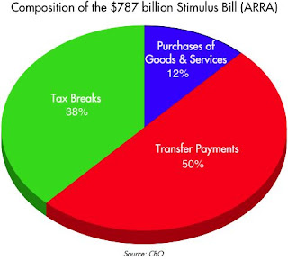
My former colleague at Western Asset, Mike Bazdarich, helped me come to terms with this apparent dilemma, by reminding me that most of the additional spending we're talking about is not really new spending. To illustrate this, the Stimulus Bill can be broken down as shown in the pie chart above. (Data based on the CBO's analysis of the bill.) As should be quickly apparent, only a very small part of the spending involves government purchases of goods and services. This is the part that will commandeer the resources of the private sector inefficiently. As Mike noted in a paper last March, of the $88 billion in federal purchases of goods and services, "only about $12 billion will be spent in the current fiscal year, with only an additional $26 billion slated to be spent in 2010." So we're really talking small potatoes here.

The vast bulk of the "spending" will just amount to reshuffling the distribution of income: $377 billion will be "spent" on transfers to state and local governments and individuals, and $284 bilion will be "spent" on tax breaks to individuals and corporations. Excerpts from Mike's paper:

In analyzing the spending initiatives in the 2009 stimulus plan, it is important to distinguish between direct purchases of goods and services by the government and transfer payments to individuals, firms or state/local governments. Increases in purchases—procurement, hiring and the like—directly boost aggregate spending. Transfer payments merely disburse funds to recipients, where they may or may not be spent. Transfers are little different in effect from tax rebates (but with incentive effects reversed), and as the transfers in the stimulus package are also one-time payments, their prospective impact on spending is similarly small.

The bulk of these transfer payments will go to state/local governments in response to the fiscal emergencies these governments are experiencing. The best this aid can do will be to prevent declines in state/local government spending. Even those prevented declines would occur only if other financing sources were utterly unavailable. If other financing avenues were available to the local governments, then the aid would merely substitute federal debt for the state and local indebted- ness that would otherwise be incurred, with no net impact on GDP at all.

The story is much the same with about $100 billion of transfer payments to persons over the next two years. These are also one-time boosts and will likely elicit only slight changes in spending behavior, mostly affecting destitute households that would have no recourse to other financing sources without the temporary aid provided in the bill.
From my supply-side perspective, 88% of the stimulus bill (transfers and tax breaks) will amount to taking money from one person and giving it to another, while only 12% (spending on goods and services) will involve new government spending that absorbs (inefficiently) resources from the private sector. And I should add that as of not too long ago, transfer payments (e.g., social security, medicare, unemployment insurance, welfare, subsidies) already accounted for over half of total federal spending. These transfer payments don't show up in the GDP accounts because they are not direct government payments for goods and services.

Transfer payments are awful things, of course, since they can and do create perverse incentives. Taking money from Peter who makes a lot and giving it to Paul who either doesn't earn much or doesn't work much is likely to result in Peter working less, while giving Paul an incentive to work less. That's a lose-lose proposition, but it's not going to shut down the economy. It's simply going to result in a slower-growing economy than we might otherwise have enjoyed. Keynesian economists fail to appreciate this, however, since they think that demand drives growth, whereas supply-siders insist that work and investment drive growth.

Almost all of the tax breaks in the stimulus bill are of the rebate variety, and that makes them not too unlike a transfer payment, since one group of taxpayers is favored with a reduced tax bill while another group will have to shoulder the burden of higher taxes in the future. The rebates are one-time, not permanent, and as such they won't do much to change behavior on the margin. Plus, a lot of the tax "rebate" money will go to those who haven't paid any taxes to begin with, so if anything, a windfall tax check could result in them working less. As supply-side theory emphasizes, the only tax cuts that can make a difference to the outlook for the economy are those that result in a positive change in behavior on the margin. Cutting the income or corporate tax would directly increase the after-tax incentive to work and invest, and likely result in more work and a faster-growing economy. Unfortunately, the stimulus bill makes no permanent cuts to income or corporate tax rates.

If I had to restate the above in economic jargon, I would be saying that the "multipliers" used by the White House and the CBO are way too high. Instead of boosting economic growth by a percentage point or two per year on average, the net effect of the bill's spending will be to reduce economic growth by one or two percentage points per year compared to what it otherwise might have been.

So, think about the trillion-dollar deficits mainly in terms of transfer payments. The government is not really going to be consuming a trillion extra dollars of the economy's resources every year that might otherwise be put to better use by the private sector. The wasteful spending is likely to be only a fraction of a trillion per year. There's still some room for private saving and investment, albeit less. Again, this is not going to kill the economy, but it is likely to slow it down.

I've always thought Obama was a socialist at heart, and he has made it very clear that income redistribution is high on his list of priorities. As these numbers show, that is exactly what he has achieved with his stimulus bill. If he manages to get universal healthcare and cap-and-trade passed, then the redistribution will be even larger and more intrusive, while wasting some additional portion of the economy's resources in the process. It's all very unfortunate from a supply-side perspective, but it's not the end of the world.

Look on the bright side: to the extent that Obama's policies lead to positive change on the margin, it will be by increasing the opposition to his policies and subtracting from the Democrats' majority in Congress in next year's elections. And that, in turn, creates more favorable conditions for positive policy changes on the margin in the future.

Tuesday, July 9, 2024

With a little luck we'll survive Biden's departure


This is one of those times when it's easy to find things to worry about, and right now they add up to a big deal. Figuring out what that means for the world of investments is the tough part.

To begin with, for years the federal government has been spending way too much money on non-productive things, thus sapping the economy's inherent strength. The federal debt is now almost 100% of GDP, and debt service costs are rising rapidly. The Fed is most likely too tight, holding short-term interest rates uncomfortably high relative to current and expected inflation. Meanwhile, the economy is growing at a modest pace that is unlikely to pick up anytime soon. Interest-sensitive sectors (particularly housing) are really being squeezed.

But the elephant in the living room is HUGE. The press and the DNC can no longer hide the fact that the president of the United States is mentally and physically unable to perform the duties of his office, and he's getting worse by the day. There is no question that he will not be the Democratic candidate for president on the November ballot (for proof of this, see this editorial in the NY Times). By all rights, and since he is unqualified to run, he is also unqualified to serve. It is thus quite likely that he will depart the Oval Office well before November, since he is now the DNC's worst nightmare. Worst of all, he poses a threat to global peace; nature abhors a vacuum, and the vacuum that pervades the White House is intolerable.

When you consider all this in the context of an equity market that has reached new highs in both nominal and real terms, it is troubling to say the least.

One way to make sense of all this is to conclude that the market is looking across the valley of despair to better times ahead. Biden's vow to allow the Trump tax cuts to expire at the end of next year and to instead raise taxes on the economy's engines of growth is now off the table. Happily, Biden will no longer be able to make foreign policy mistakes (he's been on the wrong side of every foreign policy issue for the past four decades, as Robert Gates once said). The Supreme Court recently issued decisions which will drastically curtail the power of the administrative estate, long Biden's ally, and Trump is likely to do even more in that regard. Green Energy subsidies are now an endangered species, as demand for electrical vehicles crumbles and the nation's power grid struggles to compensate for unreliable wind and solar power generation.

The charts that follow highlight some of the problems the economy is facing, as well as some of the indicators that suggest all is not yet lost.

Charts 1 & 2

Chart 1 shows government transfer payments (e.g., social security, medicare, medicaid, welfare) as a percent of disposable personal income). Since 1970, transfer payments have swelled from 10% of disposable income to now over 20%. Chart 2 shows the percentage of people of working age who are currently working, which began to collapse right around 2008-2009, when transfer payments surged in response to the Great Recession. Transfer payments essentially give money to people who aren't working. To paraphrase Art Laffer, when you pay people who aren't working, don't be surprised to find that fewer people are willing to work. 

Chart #3

It's not surprising, then, that the economy can only muster sub-par growth, as Chart #3 demonstrates. The 3.1% trend growth line (green) began in 1965, only to finally break down in the wake of the Great Recession and its avalanche of transfer payments. 2.2% per year seems now to be the new norm, as the red line illustrates. Had 3.1% prevailed, the economy today would be about 25% bigger. What a difference a 1% annual shortfall in growth can make after 17 years!

Chart #4

Chart #4 is one of my long-time favorites, since it shows two variables that have, until recently, foreshadowed the onset of every recession in my lifetime (with the solitary exception being the Covid black hole). When the Fed raises short-term rates to levels significantly higher than inflation—otherwise known as monetary tightening—and the Treasury yield curve inverts (red line), recessions typically follow. We are now very close to seeing both of these variables manifesting: real rates (blue line) are 3% and rising (still a bit shy of past peaks however), and the yield curve has been inverted for several years. If the economy avoids a recession it will likely be due to the Fed's policy of abundant reserves, an argument I've been making for the past 15 years. Abundant reserves all but guarantee that liquidity remains abundant, and that has the effect of inoculating the economy against credit busts and related recession. I've been making this argument frequently in the past 18 months.

Chart #5

Chart #5 reminds us that interest rates tend to follow inflation, albeit with a lag. (I've chosen ex-energy inflation to illustrate this since energy prices are by far the most volatile of all prices.) Note the asterisk on the lower right-hand side of the chart: inflation ex-shelter prices has been a mere 2.1% for the past year. Given the past behavior of housing prices, headline inflation is very likely to continue trending down. See this post for more information on why this is a valid point to make.

Chart #6

My no-recession-for-now call is not without risk, as Chart #6 suggests. The recently-released Small Business Optimism survey of employment intentions has deteriorated markedly in recent months, approaching levels associated with past recessions. 

Chart #7

Chart #8

Fortunately, financial markets to date show no sign whatsoever of any deterioration in the outlook for corporate profits. That's the message of Charts #7 and #8. Credit spreads on corporate bonds remain quite low.

Although the Fed's tight monetary stance is applying unnecessary pressure to the economy, it has not yet reached critical levels. And given that all signs point to a continuing disinflationary process (see my last post for more details), the Fed essentially has only one choice to make: when and by how much to lower interest rates. They are dragging their feet, but eventually they will figure this out. 

In the meantime, I think we'll need to worry more about external threats to global peace than about the US economy. Unfortunately my crystal ball holds no special insights into the minds of Vladimir Putin and Xi Jinping.

Friday, November 1, 2019

The weakest recovery and the longest expansion

If it weren't for Trump's trade wars and a dearth of business investment, the economy would be in excellent shape. As it is, growth continues along the moderate 2% path that it has followed for more than 10 years. It's been the weakest recovery ever, but also the longest business cycle expansion. And with no obvious excesses or systemic problems in view, it promises to continue. 

Chart #1

The Q3/19 GDP report—1.9% annualized growth—makes the current expansion the longest on record. Chart #1 shows the quarterly annualized growth rate of both nominal and real GDP. To be sure, 2% growth isn't a barn-burner, but it's impressive given the degree to which the manufacturing sector has been hit by Trump's tariff wars.

Chart #2

Since the recovery started just over 10 years ago, annualized GDP growth has been 2.3%; in the past year it was 2.0%, and in the most recent quarter 1.9%. As Chart #2 suggests, for most of this past year the market has been expecting growth to slow, and indeed it has. That is reflected in the more than 100 bps decline in the real yield on 5-yr TIPS since late last year. At today's real yield of a mere 0.05%, 5-yr TIPS appear to be priced to the expectation that real GDP growth will average about 2% per year going forward. Not surprisingly, Chairman Powell recently chimed in with a similar view, saying the FOMC expects moderate growth of about 2%.

Chart #3

Chart #3 compares real economic growth with private sector jobs growth. Not surprisingly, the two tend to move together: more jobs means more growth. The recent slowdown in GDP growth is reflected in a similar slowdown in jobs growth (the October jobs report was much better than expected, but it didn't do much to change the trend growth rate of jobs, which has been declining so far this year).

Both jobs and GDP have suffered from a lack of business investment, which likely has a lot to do with the uncertainties surrounding international trade. Private sector jobs currently are growing at pace of about 1.3% per year. If jobs grow at least 1% per year and productivity registers at least 1% per year (which it has in recent years), then 2% real economic growth is sustainable. (Jobs growth plus productivity growth is a decent first approximation for overall economic growth.) For growth to move higher, we would need to see a pickup in business investment, which not only creates jobs but improves the productivity of existing workers. A resolution to the tariff wars would undoubtedly prove a catalyst in that regard.

Chart #4


Demographic factors (more and more boomers are retiring) likely also play a part in this year's slowdown. Employers continue to complain that their biggest problem is finding qualified workers. Chart #4 shows that more small business owners than ever before report that "job openings are hard to fill."

Chart #5

But it's not like the economy is running out of available workers. As Chart #5 shows, the labor force participation rate (the percentage of the working age population who are either working or looking for work) looks to be increasing, albeit slowly. People who had been on the sidelines are being enticed to return, perhaps because they see better opportunities. Or in the case of not a few retired baby-boomers I know, they have decided that working is better than just sitting around watching TV. Regardless, there are still almost 6 million people out there who officially are looking for work, according to the BLS.

Chart #6

Chart #6 compares actual growth in real GDP to its long-term trend. (Note that this is plotted using a semi-log scale for the y-axis; a straight line on this chart thus corresponds to a constant rates of growth.) By only averaging 2.3% per year, the current recovery—the weakest in history—has resulted in a $3.4 trillion "shortfall" of growth relative to what might have been had the economy rebounded to its long-term trend as it did after every prior recession. Had this been a "normal" recovery, real median family income might have been almost 18% higher (~ $1000 per month) than it is today. 

Chart #7

Chart #8

Charts #7 and #8 show two measures of business investment. Both show that investment in the current business cycle has been weaker than in previous business cycles (especially in real terms, as Chart #7 highlights). Weak investment is likely major factor behind the economy's unimpressive 2% growth rate. Which is unusual, because corporate profits have been unusually strong in the past decade. 

Chart #9

What other factors might be restraining the economy's ability to grow? The size of government ought to top anyone's list. In the past 12 months, the federal government spent a staggering $4.5 trillion, almost 21% of GDP, and 8% more than the same measure a year ago. Even more staggering, though, is the composition of that spending: 72% of what the federal government "spent" in the past year ($3.2 trillion) was in the form of transfer payments (see Charts #9 and #10). That's money that is spent on things like healthcare, social security, income security, and interest payments on debt (as of last June the annual interest on federal debt outstanding was a little over $600 billion, or 13.3% of federal spending). Only 28% of federal spending was for goods and services (i.e., true purchases). Think of purchases as a proxy for what it costs to run the government, while transfers are basically entitlements—spending that is determined not by the budget process but rather by eligibility. 

Chart #10

Note how the growth in transfer payments has surged relative to the growth of purchases since the early 90s. As Chart #10 shows, since 1970 transfer payments have more than doubled relative to total spending. By far the biggest role of the federal government in today's economy is that of an income transfer agent. Needless to say, with $3.2 trillion per year (and growing) on autopilot, the potential for fraud and waste is ginormous. It's safe to say that the huge size of government transfer payments acts as a drag on overall economic growth and efficiency. And it's only going to get worse unless changes are made to entitlements eligibility (e.g., raising the social security retirement age and/or indexing social security payments to inflation rather than wage growth). 

These are problems that have been and are going to be with us for a long time. In the meantime, it's reassuring to note that financial market conditions look quite healthy:

Chart #11

The threat that an inverted yield posed to the economy (a threat I discounted long ago), has now disappeared. As Chart #11 shows, the Treasury yield curve is now positively-sloped (the 1-10 spread is about 20 bps today), and the real Federal funds rate is essentially zero. The Fed is not tight, and their recent decision to lower their target rate, while overdue, was welcome. The Fed has now caught up to the market and things are thus looking copacetic.

Chart #12


The real yield curve is actually a better thing to look at, and here too things look good. The blue line in chart #12 is a proxy for the overnight real rate, while the real yield on 5-yr TIPS is the market's estimate of what the overnight real rate will average over the next 5 years. Both are identical. By lagging the market's expectation of falling real rates for most of this year the Fed had been threatening with policy arguably "too tight." But now the Fed is neutral. A sign of relief.

Chart #13

Swap spreads (see Chart #13) are my favorite leading and coincident indicator of systemic risk, financial market liquidity, and fundamental economic health (the lower the better). Swap spreads are now low both here and in the Eurozone. Things could hardly be better.

Chart #14

Chart #14 shows Credit Default Swap spreads, a highly liquid and generic indicator of the market's confidence in the outlook for corporate profits. Spreads are quite low, which means the market is confident that the outlook for profits—and by extension the outlook for the economy—is healthy.


Monday, July 14, 2025

Charts of interest


Some charts I find of interest to the general public, and which you're unlikely to find elsewhere:

Chart #1

Chart #1 sheds light on an important input to the dollar's value: real yields. The red line shows the level of real yields on 5-yr TIPS. These are true real yields, since TIPS are bonds whose principal is adjusted by the CPI, and whose coupon is a "real" yield. (Their return to the investor is equal to the rate of consumer price inflation plus a real yield.) Real yields on TIPS are determined by market forces, and are in turn influenced by the market's expectation of future Fed policy. TIPS are not only safe from default, but also safe from the ravages of inflation. 

The blue line is an index of the dollar's value vis a vis other major currencies. That the two tend to move together suggests that higher real yields enhance the value of the dollar, while lower real yields detract from the dollar's value. The situation today suggests that the dollar is trading on the weak side of where it would normally be given the current level of real yields. This further suggests that investors aren't entirely comfortable with the outlook for the U.S. economy (e.g., tariffs, deportations).

Chart #2

Chart #2 shows my model of the Purchasing Power Parity of the dollar vs. the euro. Currently, the model suggests that the dollar is just about equal to its PPP value against the euro. That further suggests that an American traveling in Europe is likely to find that the dollar price of goods and services there is roughly equal to prices in the U.S.

Chart #3

Chart #4

Chart #3 shows the level of credit spreads on Investment Grade and High-Yield corporate bonds—higher spreads reflecting greater credit risk, and lower spreads reflecting lower credit risk. Spreads today are just about as low as they have been for the past several decades. Chart #4 shows the difference between the two, which is a simple way of judging how nervous the bond market is. Taken together, these spreads are excellent barometers of the health of corporate profits, and by extension, the health of the economy. Conditions are looking pretty good according to corporate bond investors.

Charts #5 and #6

Chart #5 shows the ratio of federal transfer payments (social security, medicaid, unemployment insurance, subsidies, food stamps, etc.) to disposable income. Transfer payments represent money the government gives people money for reasons other than to compensate for their labor. Chart #6 shows the Labor Force Participation Rate, which is the ratio of people working or looking for work divided by the number of people of working age.

The dotted vertical lines mark periods of time when transfer payments ratcheted up rather sharply. That the participation rate ratcheted down each time suggests that people are less willing to work when they receive more money for not working. Funny how that works!

Note the more-than-doubling of transfer payments as a percent of disposable income from 1970 to today. Today, one of every five dollars spent by consumers comes from the government. Viewed from another angle, taxpayers are funding 20% of consumer spending. 

Chart #7

Chart #7 shows the breath-taking growth of federal government spending and tax receipts. Revenues today are more than 5 times what they were 35 years ago, and have increased at a 4.8% annualized rate. Spending today is more than 6 times what it was 35 years ago, and has increased at a 5.3% annualized rate. Our problem is runaway spending, not a lack of taxes.
  
Chart #8

Chart #8 shows the major components of federal revenues. Individual, corporate, and payroll taxes have all increased relentlessly with the passage of time. What stands out here is estate and gift taxes, which today represent a paltry 0.6% of total revenues (~$30 billion per year), and which have not increased at all over the past 25 years. The net worth of the private sector has quadrupled over the past quarter century, but estate and gift taxes haven't budged. This tax could be abolished and the impact on federal finances would be less than a rounding error. Yet this tax gives rise to an army of tax lawyers and accountants, while at the same time diverting trillions of dollars to sheltered investments. It undoubtedly costs the economy far more than the value the government collects. We would all be better off without it.

Friday, August 5, 2016

A strong jobs number doesn't mean the economy is stronger

Today's July jobs report was substantially stronger than expected, as I suspected it would be, but it doesn't mean the economy is getting stronger. You simply can't make much of any one month's number—you've got to look at multi-month trends in order to draw any meaningful conclusions from the jobs data.

Over the past year or so the rate of jobs growth has decelerated modestly. In other words, the strong numbers of the past two months have not quite made up for the extremely weak May report. There is still no sign of a recession on the horizon, but the slo-mo nature of the current business cycle expansion remains firmly in place. This is just not a very exciting economy, but neither is it terrible or getting ready to collapse. It's steady and slow as she goes.


The outlier in this chart is not the last data point, it's the zero growth reported last May. It would take at least another two or three much-stronger-than-expected jobs reports to get us back on the trend that was in place until about a year ago. 


On a year over year basis, the growth of private sector jobs has slipped from a high of 2.6% in late 2014, to 1.9% in the year ended July.


One good piece of news is that the growth of the labor force is picking up, albeit slowly. More and more people are being enticed to either work or look for work. But despite the recent improvement, the labor force is still over 6% below its long-term trend (i.e., about 10.7 million workers have "disappeared"). Baby boomers retiring accounts for a portion of that shortfall, but there must be other factors at work as well: very high marginal tax rates, heavy regulatory burdens, and maybe even the recent wave of minimum-wage hikes. When unskilled labor becomes artificially expensive, businesses have a strong incentive to replace labor with robots, no?


I've shown the charts above off and on for the past year or two, because I think they illustrate yet another reason for the shortfall in the growth of the labor force: huge increases in transfer payments. In the year ended last June, the federal government sent out checks totaling almost $2.8 trillion to people for not working. That represents about 20% of disposable income (and a whopping 73% of total federal spending), and that is very nearly a record high. When so much is paid to so many for doing things other than working it's bound to have a perverse impact on the jobs market. The only good news here is that the growth of transfer payments appears to no longer be exceeding the growth of incomes—we're at a plateau of sorts. At the same time, the labor force participation rate appears to have bottomed. On the margin, in other words, the damage done by transfer payments is not getting worse. But we're going to have to tackle the entitlements problem in a big way, or else transfer payments relative to incomes will continue to climb, the labor force will continue to grow in a tepid fashion, and the federal budget deficit will rise to unsustainable levels. We're not there yet, but this threat looms large on the horizon.

So it's nice to know that the very weak May jobs number was most likely just an artifact of bad data. But the recent strong numbers do not tell us that the economy is getting any stronger.

I doubt this report will result in any immediate or unexpected tightening action on the part of the Fed.

Thursday, June 4, 2009

Transfer payments are growing at an unsustainable rate


These charts come from a very nice, relatively new blog by Donald Marron. The first chart shows government transfer payments as a share of personal income, and the second chart breaks out the major components of the transfer payments. "Transfer payments from the government now make up more than one-sixth of American incomes, the highest ever." And he adds, "Spending on the major entitlement programs — Social Security, Medicare, and Medicaid — is on an unsustainable course."

So many things today are growing at unsustainable rates: government spending, the federal deficit, government spending as a share of GDP, social security, medicare, etc. It's obvious that these trends
can't continue. And if a trend can't continue, it won't. At some point the public is going to be fed up with the suffocating size of government, and they are going to shout from the rooftops to STOP. I only wish I knew when this happy day would come.

Sunday, January 5, 2020

Federal debt is not a threat to the economy

Many people are saying that our national debt—which now exceeds $17 trillion and is growing by more than $1 trillion per year—is a disaster just waiting to happen. Right? Well, not exactly. Even though federal debt has soared relative to GDP in the past decade, the burden of the debt is about as low as it's ever been. Still, the growth in debt does reflect some structural problems that are working to keep the economy from achieving its full potential.

Let me put things into perspective:

Chart #1

Chart #1 shows the the swelling size of our national debt, which is correctly measured as the amount of Treasury debt that is held by the public, and that now stands at $17.16 trillion. Too often I see people saying the national debt is over $23 trillion, but that figure is inflated since it includes some $6 trillion which the government owes to itself (i.e., excess revenues that the social security administration has "lent" to the Treasury). You can see the current figures here.

Chart #1 uses a semi-log scale for the y-axis, so that means that a constant slope is equal to a constant rate of growth in nominal terms. Note that the slope of the line for the past 7-8 years has been flat (i.e., the growth rate has been constant). Note also that the slope was steeper in the mid-80s and in the 2008-2012 period. Federal debt is growing, but not nearly as fast as it was growing in other times.

Chart #2

It's common to hear people argue that with so much debt being issued, interest rates will inevitably have to rise. But as Chart #2 shows, the size of the debt (when measured relative to the size of the economy, which is essential, since a bigger economy can support a bigger debt load, just as households can with rising incomes) has tended to move in a very counterintuitive fashion with respect to interest rates. Slower growth in debt tends to coincide with rising interest rates, and faster growth in debt tends to coincide with falling interest rates. What explains this? It's tempting to search for an explanation for this relationship, and I make an attempt later in this post.

Chart #3

Nevertheless, the size of federal debt relative to the economy is far less important than the prevailing level of interest rates, as Chart #3 demonstrates. The true burden of the national debt is not the amount we owe but the ratio of interest payments on the debt relative to our national income (GDP). Because interest rates are at historically low levels, the current burden of our national debt is about as low as it has ever been, even though the debt has soared to 78% of GDP. 

Chart #4

It's worth noting that households' debt burdens (Chart #4) are also about as low as they have ever been. Everyone benefits from lower rates, but in addition, households have eschewed debt while embracing the safety of Treasuries. Total household liabilities have only increased by 11% since their peak in 2008, according to the Fed. Treasury yields are low because the demand for Treasuries is strong: households now hold over $2 trillion of federal debt, up hugely from $300 billion in 2008. Most of the rest is held by corporate and institutional investors, sovereigns, and foreign investors in general. China alone holds some $2 trillion of Treasury debt.

Chart #5

Chart #5 shows why we have come to have a $17 trillion debt. It's simple: government spending has exceeded revenues for just about forever. Note how revenues reliably weaken during recessions and pick up during recoveries. A stronger economy creates jobs, rising incomes, and rising tax payments. Tax receipts thus have a strong cyclical component. One reason for the apparent shortfall in revenues—which began at least a year before Trump's tax cuts—is that the past decade has seen the weakest growth of any expansion in history. 

Chart #6

Spending, on the other hand, is driven largely by transfer payments (medicare, medicaid, social security and income security), which now constitute about 70% of all federal spending (see Chart #6). In the 12 months ended last November, transfer payments totaled $3.2 trillion, while total federal spending totaled $4.5 trillion. No amount of budget cutting is going to make more than a modest dent to federal spending. The elephant in the spending living room is transfer payments, which are paid out according to people's "eligibility," and not according to any Congressional budget appropriations. To control spending will require that Congress change the eligibility formulas for things like social security and medicare. 

Chart #7

Chart #7 shows federal spending and revenues as a % of GDP. Here we see that the trends are relatively flat, and the current levels of spending and revenues are not greatly different from what they have averaged since WW II. Revenues do look a bit weak currently, but this is most likely due to the fact that economic growth in the current expansion has been sub-par (2.2% vs. a long-term average of about 3.1%). Revenues haven't picked up much in the current recovery because it has been a weak recovery and because tax rates were cut modestly for individuals and significantly for corporations in 2017. But tax cuts aren't the whole story: revenues weakened at least a year before Trump's tax cuts took effect, and in the past year revenues have been rising at more than a 4% rate. Corporate tax revenues plunged in 2017 and 2018, as expected, but in the first 11 months of 2019 they are up over 10% from the same period in 2018. The Trump tax cuts were a one-time event which was expected to result in much lower corporate revenues initially, to be followed by rising revenues in years to come as overseas profits are repatriated and increased business investment (of which there are few signs to date, unfortunately) results in rising profits in the future.

A digression on debt:

Broadly speaking, debt is a zero-sum game, since one man’s debt is another man’s asset. Debt is an agreement between two parties to exchange cash now with a reversal of that exchange, plus interest, in the future. If the borrower fails to repay his debt (i.e., he defaults), then the borrower benefits by being relieved of some or all of his debt service obligations, and the lender suffers by not receiving some or all of his expected cash flows. Part of the interest the lender charges the borrower goes to offset the risk of default. Most of the time, debt serves a vital economic function by linking savers with borrowers.

Ideally, the lender expects the borrower to use his money to fund a productive investment, such that the return on the investment will exceed the interest on the debt. If all the money loaned to borrowers is invested productively, everyone is happy—borrowers make money and lenders get repaid with interest. The problems with debt come not when people borrow money but when they use borrowed money to make unproductive investments or to simply finance consumption. (It's not the debt, it's the spending, stupid!) It's not clear at all whether using 70% of federal government borrowings to fund transfer payments is a wise use of borrowed money. Taking money from those who are working and giving it to those who are not working creates unproductive and anti-growth incentives. 

So it's not crazy to think that much of the federal government's debt has been used unproductively, and this is one reason why our economy's growth rate over the past decade has been sub-par. We've been squandering scarce resources (capital) and creating perverse anti-growth incentives. The potential size of this problem is staggering. In the past decade, after-tax corporate profits have totaled about $16.5 trillion, while federal debt has increased by about $9.4 trillion. In a sense, over half of the profits generated by corporate America have effectively been used to finance federal government spending. If the government hadn't borrowed all that money, it might have been used more efficiently by the private sector. Efficient investment, of course, boosts jobs, incomes, and overall prosperity. Inefficient investment leads to stagnation.

Meanwhile, slow growth has made people more cautious and that has increased the demand for money and people's demand for safety—thus the ready absorption of over $9 trillion of Treasury securities at very low interest rates. The Federal Reserve justifiably has accommodated the increased demand for money and safety by reducing interest rates. So in the current environment, slow growth and low interest rates go hand in hand, and the same conditions that drive low interest rates make lots of debt manageable. 

What will happen going forward? If the economy picks up steam, and if tariff wars begin to unwind (as appears to be the case), then money demand should decline, caution should recede, and interest rates should therefore rise. At the same time, a stronger economy would likely result in a further pickup in revenues, a smaller deficit, and slower growth in federal debt. So rising interest rates should go hand in hand with slower growth in total debt even as the burden of debt would tend to rise because of higher interest rates. This is not a recipe for disaster—it's a rosy scenario that we should dearly hope develops!

Chart #8

Meanwhile, nominal and real interest rates are unusually low, which means that the bond market does not yet expect to see accelerating economic growth. In fact, as Chart #8 suggests, the market seems priced to a further slowdown in growth; real interest rates on 5-yr TIPS moved into negative territory this week for the first time since April 2017. 

This market is not overly enthusiastic about the future, which gives me comfort that an optimistic approach to risk should be rewarded.

Things to watch for going forward; Real interest rates on TIPS are key barometers of the bond market's expectations for economic growth in the years ahead. If they rise this would be a good sign. Swap spreads are key indicators of the health of financial markets and leading indicators of economic health; right now they are very low and that is very good. Any rise above 30-35 bps on 2-yr swap spreads would be a flashing yellow light. Credit spreads on corporate debt are key indicators of the market's confidence in the outlook for corporate profits; currently they are relatively low and that is good. Commodity prices have been relatively low, but recently they show signs of perking up; if this continues that could be an indicator that the global economic outlook is improving. The residential construction has been in a period of consolidation in the past year or so, but recently appears to be picking up, and that is good. Any slowdown in the growth of bank savings deposits would be a good sign that risk aversion is declining and optimism is rising, and that would be very good. 

Looking ahead, I'm optimistic that the economy will continue to grow. I don't see a risk of recession nor do I see any significant acceleration. I'll be watching the aforementioned indicators to see if things improve enough to get really excited.