

 Posts
Posts


Chart #1

Chart #1 shows the year over year growth of real GDP, which was 1.94% as of Q3/22. This is very close to the growth rates the economy experienced from 2010 thru 2019. The Covid growth gyrations are now in the past. The economy looks to be on track to growth at about a 2% annual rate—nothing spectacular, but not bad considering all the problems that still exist in the world and at home.
Chart #2

Pay close attention to Chart #2, since you're unlikely to see anything like it elsewhere. To begin with, it's plotted using a logarithmic y-axis, which means that straight lines are equivalent to constant rates of growth. The dotted green line represents the annual growth trend which started in 1966 and persisted through 2007: 3.1% per year. That is, over this 56-year period the economy managed to grow by an annualized rate of 3.1%. Sometimes by more, sometimes by less, but over time it always came back to this trend line. The dotted red line shows the growth trend in place since mid-2009: 2.2%. Something happened during the Great Financial Recession of 2008-09 to put a permanent damper on growth, and it's not just demographics—demographics don't change dramatically from one year to the next. Instead, I think it has a lot to do with 1) the explosion of transfer payments during the Great Recession (see Charts #2 and #3 in this post), and 2) the general expansion of government influence, plus higher tax and regulatory burdens which plagued the economy during this period. These all work like headwinds to slow the economy.
It's tempting to speculate that had the economy pursued a 3.1% growth path until now, then the economy would be 24% bigger today, and average incomes might be 24% higher in inflation-adjusted terms. That's a lot of money that, arguably, may have been left on the table!
Chart #3

Chart #3 shows the quarterly annualized rate of change in the GDP deflator. This is the broadest measure of inflation that exists. Inflation in the third quarter slowed dramatically (from 9.1% to 4.4%), and that is consistent with my observations in recent posts that the peak of inflation occurred sometime around the middle of this year. This is most reassuring, and I would like to think it won't escape the Fed's notice.
Chart #4

Chart #4 shows the price/earnings ratio of the S&P 500, using trailing 12-month profits from continuing operations. The PE ratio of the market today is about 18.5, only slightly higher than its long-term average.
Chart #5
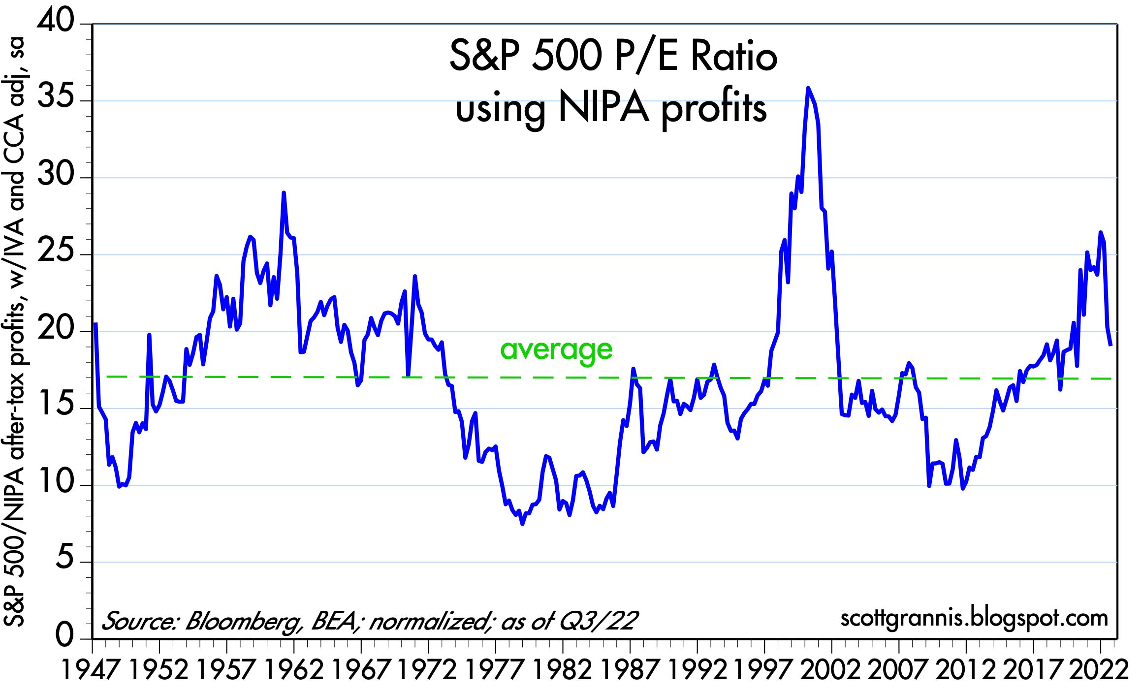
Chart #5 shows PE ratios for the S&P 500 using the National Income and Product Accounts as the source for economy-wide, after-tax corporate profits instead of trailing reported earnings. Like the current PE ratio shown in Chart #4, PE ratios by this measure are 19.5, only slightly higher than their long-term average. The advantage of this method is that the measure of profits used is a quarterly-annualized number, not a trailing 12-month average—thus it's much more timely.
Chart #6

Chart #6 shows the same NIPA measure of profits as a percent of nominal GDP. What stands out here is the consistently high level of profits in the period following the Great Financial Recession, compared to what prevailed in prior decades. It's no wonder the stock market has been so strong this past decade or so—corporate profits have never been so consistently healthy.
I think the main reason for this is globalization, which picked up speed some years after the opening of the Chinese economy in 1995. Successful corporations today can address the entire world market, whereas before most businesses were able to address only part of global market. Apple would be successful if it were restricted to just the US market, but today it can leverage its successful products by many times since its market is an order of magnitude larger today than it would have been 15-20 years ago.


