Posts
Posts


I am fascinated by the fact that these days hardly anyone is talking about the very rapid growth in both M2 and nominal GDP. Both suggest that inflation is alive and well, and very likely to continue.
The big news this week was that the Fed is doing its best to avoid an aggressive tightening of monetary policy. Which makes it strange that the market sold off on the news that the Fed plans to accelerate (ever so slightly) its tapering of asset purchases while also planning to begin to lift short-term interest rates (in gingerly fashion) in about two months. As I've been arguing for awhile, the threat of tight money is a problem that still lies well into the future; it's certainly something to worry about, but not for now. Monetary policy today is still extremely accommodative, and almost certainly the culprit behind our inflation problem.
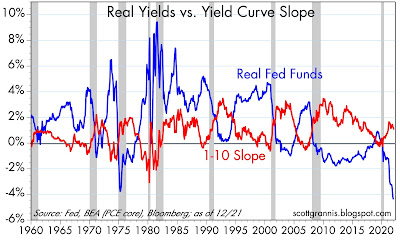
Today the Fed said that they plan to start raising short-term rates in early March. The bond market expects the Fed will ratchet up rates by 25 bps at a time until reaching a "terminal rate" for their Fed funds target of about 2.5% in about 3-4 years' time. In my book, that hardly rates as tight money. Actual tightening involves a significant rise in the real Fed funds rate (e.g., to at least 3%). It also involves a flattening or inversion of the Treasury yield curve, which is still moderately steep. We're not even close to those conditions, and the Fed has virtually assured us they are unlikely to slam on the monetary brakes anytime soon.
Most observers these days argue that inflation is the result of too much demand (fueled by government stimulus payments) and not enough supply (e.g., Covid-related supply bottlenecks). Hardly anyone talks about the unprecedentedly rapid growth of money, aside from me and a handful of other economists (e.g., Steve Hanke, John Cochrane, Ed Yardeni, and Brian Wesbury). Moreover, I'd wager that the great majority of the population doesn't understand that supply and demand shocks can only affect the prices of some goods and services, but not the overall price level. If all, or nearly all prices rise, that is a clear-cut sign of an excess of money relative to the demand for it. That is how inflation works.


There are other reasons to think the recent stock market selloff is overdone, if not premature. Credit spreads—which measure actual stresses in the economy—are still relatively low. Swap spreads—which are a good indicator of liquidity—are very low. Together, these spreads tell us that liquidity is abundant, economic stresses are low, and the outlook for corporate profits—and by inference the economy—is healthy. Ironically, the main problem for now is that the Fed is not prepared—yet—to do anything that might slow the rate of inflation or threaten the economy for the foreseeable future. They'd rather lay the blame for inflation on Congress than take the heat themselves. And don't forget that Powell is up for renomination soon.
Chart #1
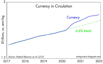
Chart #1 shows the growth of currency in circulation, which represents about 10% of the M2 measure of money. After surging at 20% annualized rates in Q2/20, the growth of currency has slowed to about a 5% annualized rate, which is somewhat slower than its long-term trend growth of about 6.6% per year. As I've explained before, the supply of currency is always equal to the demand for currency, which means that currency growth is not contributing to our recent inflation problem. Currency growth was quite rapid last year because the demand for currency was very strong, fueled by all the uncertainties of the Covid threat. But the fact that currency growth has since slowed significantly since then suggests that precautionary demand has faded: this is arguably a good leading indicator that the demand for money balances in checking accounts and bank savings account is also softening or beginning to soften. In the absence of any slowing in the growth of M2, any reduction in the demand for money in the system is precisely what fuels a rise in the general price level. If the Fed does nothing in response, such as raising short-term interest rates and draining reserves from the banking system, inflation is very likely to continue
Chart #2
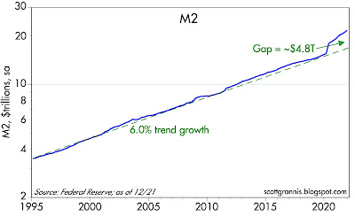
Chart #2 shows the growth of the M2 monetary aggregate. Here again we see explosive growth in Q2/20 and a subsequently slower—but still quite rapid—rate of growth which continues to this day. For the past year or so, M2 growth has been averaging about 12-13%. That is twice as fast as its long-term trend rate of growth, and it shows no sign of slowing, even though the Fed has been tapering its purchases of securities (to be fair, tapering does nothing to reduce inflation). This is good evidence that M2 is growing because banks are lending money by the bushel, which is the only way the money supply can expand. The public's apparent demand for loans is thus strong, and that is symptomatic of a decline in the demand for money.
Chart #3
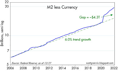
Chart #3 shows the growth of M2 less currency, which is equivalent to all the money that has been supplied by the banking system via lending operations. It's important to remember that the Fed cannot create money directly; the Fed only has the power to limit bank lending by limiting bank reserves, and to influence the public's demand for money via increasing or decreasing the overnight lending rate. Again we see the same pattern: explosive growth of M2 in Q2/20 followed by a slower (but still rapid) 13-14% pace since then that shows no signs of slowing (as of the recently-released data for December '21). The growth of money on deposit in our banks is growing at more than twice its historical rate, and that has been the case for the past 18 months. Needless to say, this is nothing short of extraordinary. And it is the stuff of which inflation is made.
Chart #4
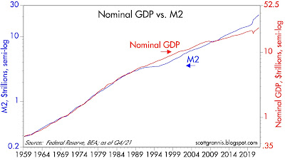
Chart #4 shows that the M2 money supply is now equal to about 90% of the economy's nominal GDP. Since the latter is roughly equivalent to national income, this means that the average person or entity today is holding almost one year's worth of his annual income in a bank deposit of some sort. This is a level that was only exceeded in Q2/20, at the height of the Covid panic, and it is far above any level we have seen for many decades. People have effectively stockpiled an unprecedented amount of money in bank accounts and savings accounts that pay almost no interest! On its face, this would suggest that the demand for money (non-interest bearing money) has been intense. But will that demand remain strong? The fact that inflation has surged in the past year is good evidence that money demand is already declining: people are trying to get rid of unwanted money by spending it, and that is what is driving higher inflation.
Chart #5
Real GDP grew by a very healthy 5.5% in 2021, but about 70% of that growth came from inventory rebuilding—so we are very unlikely to see another such number. The general price level rose by 5.9%, which means that nominal GDP grew by a whopping 11.7%, which is not surprising since the M2 money supply rose by 13.1%. As Chart #5 shows, both M2 and nominal GDP have a strong tendency to grow by about the same rate over longer periods. When they diverge from this trend it's due to a change in the public's desire for money balances. Referring back to Chart #4, we see that money demand grew by about 1.6% last year, but most of that increase happened in Q1/21 when Covid uncertainty was still raging. Money demand has been steady for the past 9 months. If M2 continues to grow at a 13% annual rate, as it has for the past year, then nominal GDP growth is very likely to continue grow at double-digit rates. And since the economy is very unlikely to sustain a 5% growth rate for much longer, inflation is going to be at least 7-10% for as long as M2 growth remains at current levels.
An important note: it is going to be many months before the Fed adopts policies (e.g., draining reserves and lifting the Fed funds rate to a level at least equal to inflation) that will slow the growth of money by increasing the public's desire to hold money. Banks have been the source of the explosion in M2 growth, and the only thing that will change this for the better are policies designed to make holding money more attractive; banks need to be less willing to lend to the public and the public needs to be less willing to borrow. Much higher short-term interest rates are thus the cure for our inflation blues. But we won't be seeing them for a long time.
Chart #6
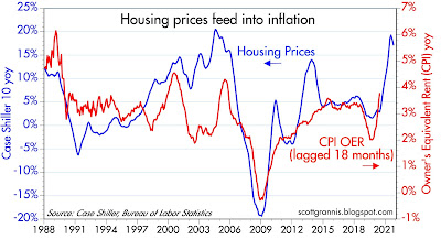
Chart #6 shows how increases in housing prices tend to lead inflation by about 18 months. Housing prices have been rising at a 15-20% annual rate for the past year or so, and that is very likely to add substantially to consumer price inflation for at least the next year. Owner's equivalent rent comprises about 25% of the CPI.
Chart #7
Chart #7 compares the real yield on the Fed funds rate (blue line) to the slope of the Treasury yield curve (red line). Note that every recession (gray bars), with the exception of the last one, has been preceded by a significant increase in real yields and a flattening or inversion of the yield curve. Both of those conditions are highly indicative of "tight money." We won't see anything like that until at least next year, given the Fed's obvious desire to avoid shocking the bond market and/or risking another recession.
Chart #8
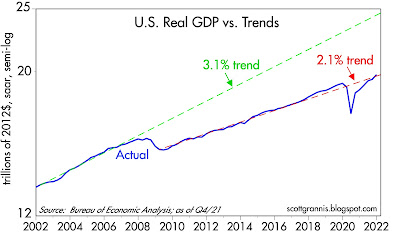
Chart #8 compares the growth of nominal GDP (blue line) with two different long-term trend lines. (Note that the chart uses a semi-log y-axis, which shows constant rates of growth as straight lines.) The economy grew by 3.1% per year[ on average from 1966 through 2007. Since 2009, it has grown by about 2.1% on average. Unless policies become more growth friendly, we are thus unlikely to see GDP exceed 2% on a sustained basis. That again highlights the fact that 13% M2 growth, if it continues, will likely result in sustained inflation of 10% or more this year.
All eyes should be glued to the growth of M2, which is released around the end of the third week of every month.
Chart #9
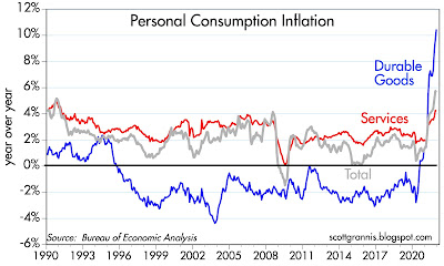
Chart #10

Chart #10 shows the behavior of the three main components of the PCE deflator since 1995. I chose that date because it marks the debut of China as a major source of cheap durable goods for the world. As the chart shows, all prices are now on the rise, with durables leading the way after decades of falling, and services prices (which are strongly correlated to wage and salary growth) now beginning to accelerate.
This is the very definition of true inflation: when nearly all prices rise, not just a few.
Chart #11
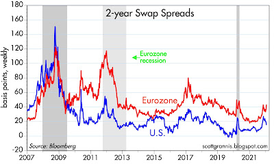
Chart #12
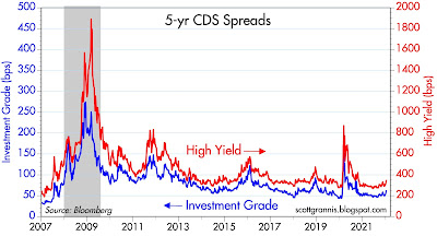
Finally, Charts #11 and #12 recap the status of swap and credit spreads. They tell us that liquidity is abundant nearly everywhere, and that the outlook for corporate profits is healthy. We are very unlikely to be on the cusp of another recession. That's the good news.
The bad news is that sustained inflation of 7-10% will cause significant problems in the months and years to come. Inflation will be a boon to federal government finances, but it will be the bane of the rest of the economy, because inflation is essentially a hidden tax that all holders of money end up paying the government. Over time that will work to sap the economy of its energy, resulting in slower economic growth.