Monday, February 8, 2021

The (destructive) power of transfer payments

This post is meant to be a companion piece to my previous post, particularly in regards to why it is that the economy has lost so much of its growth potential.


The first of these two charts shows the ratio of transfer payments (e.g., social security, welfare, unemployment insurance, Covid-related payments) to disposable personal income. Thanks to government edicts which effectively prohibited large swaths of the population form working, the government "naturally" felt obligated to take care of those individuals by boosting weekly unemployment payments and sending out one-time checks to countless millions. The result was a literal explosion of government spending that approached $3 trillion dollars. 

The second chart shows the labor force participation rate (i.e., the ratio of those working to the working age population).

To me, the interpretation of these charts is obvious: when the government pays you more for not working, you get fewer people working. Fewer people working means a smaller economy, and that goes a long way to explaining why it is that the current outlook for future economic growth is grim, as I explained in my previous post.

Corollary: As government spending consumes a greater portion of economic output, economic growth becomes weaker. 


Wednesday, February 3, 2021

Keep on borrowing and buying

Despite a catastrophic decline in GDP in the first half of last year, the US economy managed to stage an almost complete rebound in the second half. By the end of 2020 the economy was only 2.5% smaller than its year-end 2019 level. Most observers expect at least a few more strong quarters of growth, which will almost certainly allow the economy to break new high ground within the next several months.

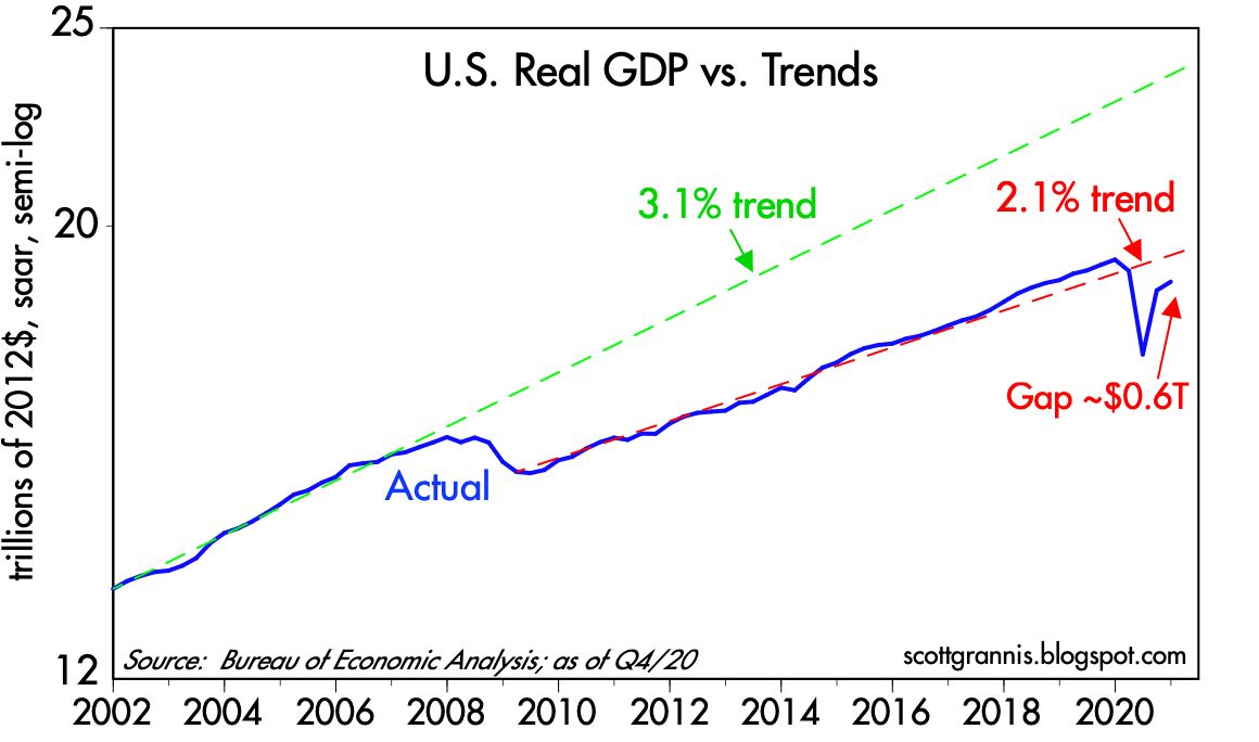
Unfortunately, economic growth is not about to set any long-term records. For 50 years, from 1966 through 2007, the US economy grew at an average annualized rate of about 3.1%—a great and dynamic expansion which saw the economy almost quintuple in size. The came the Great Recession of 2008-9. Not only did the economy fail to recover to that long-term 3.1% trend in subsequent years—for the first time ever, following a recession—it went on to post only slightly more than 2.1% annual growth in the decade from 2009 through early 2019. It was the weakest economic expansion on record, and it looks set to continue for the foreseeable future, I'm sorry to say.

Chart #1

Chart #1 uses the magic of a logarithmic y-axis to show how the US economy followed a 3.1% annualized growth track for 50 years. (With a logarithmic y-axis, a line with a constant slope represents a constant rate of growth.) Then, beginning in 2009, it managed to grow only 2.1% per year for the subsequent decade. (See this post for more details as to why.) We've been living in a sub-par recovery since I first anticipated it back in early 2009, thanks to too much regulation, high taxes, and too much government spending. Those same forces will act as headwinds for the economy in the years to come, with Biden promising a virtual replay of all of Obama's anti-growth policies—and possibly even more. Slow growth has left the economy substantially weaker and smaller (by about $4.5 trillion per year, as shown by the gap between the blue and green lines) than it might have been had the prior 3.1% growth trend persisted. 

Chart #2

Chart #2 is similar to Chart #1, but it zooms in on just the past two decades. The green line shows the same 3.1% trend growth rate that features in the first chart. The dashed red line shows the trend that persisted throughout the Obama years and into Trump's first year. Note how the economy perked up a bit in 2018 and 2019 as Trump's policies boosted growth above the 2.1%, a period which culminated in record-breaking real household median income growth, as shown in Chart #3.

Chart #3

The US economy would need to grow by 5.2% (after inflation) this year in order to reattain its 2.1% trend growth by the end of this year (see Chart #2). Most analysts are optimistic, but few, if any, expect growth to exceed 5%. I wouldn't be surprised if it did, however, but I would not expect to see more than 2% annual growth beyond this year, especially if Biden manages to implement his green energy policies and higher taxes on wealth and business. Looking long-term, we're likely to be stuck in a slow-growth world, much as we've seen over the past decade or so.

Chart #4

Near term, though, growth should be pleasantly robust, as the economy emerges from its Covid travails and a return of confidence boosts consumer confidence and business investment (see Chart #4, which shows capital goods orders, which are a good proxy for business investment). There's a lot of slack in the economy that will be put back to work as the Covid problem slowly recedes; already, daily new Covid cases are declining nearly everywhere and vaccinations are proceeding at an impressive pace. At the same time, Covid-related restrictions have forced the economy to do more with fewer resources, thus providing a one-time boost to productivity, which surged at a 7.5% annualized pace in the second and third quarters of last year and likely closed out the year on an unusually strong note.

Chart #5

Not all is sweetness and light, however. Chart #5 compares the real yield on 5-yr TIPS to the 2-yr annualized growth rate of GDP—not surprisingly, real yields tend to track the real growth potential of the economy. With 5-yr real yields now abysmally low (-1.8%), we can infer that the market sees very little growth potential for the US economy in the years ahead. A charitable interpretation of this chart would suggest the market expects real economic growth to average about 1-2% per year for the foreseeable future. Thus, although my expectation for 2% annual growth seems rather modest in an historical context, I'm only essentially agreeing with the market's expectations.

This modest growth outlook would ordinarily not provide much support for equity prices. However, in the context of a zero-percent cash environment, equities still have a better expected return than cash or cash equivalents. And with the Fed seemingly determined to keep short-term rates very low for a long time (the market currently expects the Fed funds target rate to remain roughly unchanged for the next two years), the inflation-adjusted return on holding cash is going to be negative for a long time. Holding cash is virtually guaranteed to be a losing strategy in terms of purchasing power. And that effectively boosts the demand for just about anything and everything other than cash and short-term bonds. Equity, commodity, and real estate prices are all rising, and that's not surprising given the Fed's policy stance.

Chart $6

A final note: inflation expectations embedded in TIPS and Treasury prices are now approaching 2.33%, as Chart #6 shows. This cannot go on much longer, I fear. Sooner or later Treasury yields are going to have to start rising. But in the meantime, it pays to borrow, since interest rates are so low relative to inflation, and it pays to buy, since expected returns on non-cash assets are much higher. It's not unreasonable to think we are in the early stages of an inflating "asset bubble."

All of these considerations leave me nervously optimistic about the long-term outlook for equities. I don't think the Fed's desire to boost inflation is consistent with a long-term healthy economic outlook, because higher inflation will eventually undermine confidence and the economy. Unprecedented monetary expansion in recent years has not yet resulted in any significant increase in inflation, but only because the demand for cash has been extremely strong. Sooner or later the Fed will get its way and money demand will fall (market sages are fond of saying you should never bet against the Fed's ability to get what it wants, and I think they are right). But just how long the Fed can undermine the world's demand for cash and avoid an unhealthy increase in inflation is really the only issue at this point. If the Fed doesn't thread this needle just right, inflation expectations could become "unmoored," and that eventually would lead to a significant tightening of monetary policy which in turn would most likely result in yet another recession somewhere down the road.

Meanwhile, "borrow and buy" should continue to be your mantra, even if it makes you nervous. 

Thursday, January 14, 2021

Last year in a nutshell

In April of last year I predicted that the shutdown of the US economy would prove to be the most expensive self-inflicted injury in the history of mankind. Unfortunately, I turned out to be right. We now know that an economic lockdown is virtually useless to stop a contagious pathogen, but it is powerfully destructive of economies, business, livelihoods, and the social fabric. Along the way it spawned enormous, unprecedented, and far-reaching changes in both the economy and the financial markets. 

At the risk of oversimplification, here's how I would describe, in a nutshell, what has happened this past year from an economist's perspective:

The biggest financial event of the year was when the Fed decided, correctly, to accommodate a huge increase in the public's demand for money and money equivalents by purchasing about $3 trillion of notes and bonds, transmogrifying them into T-bill substitutes by paying for them with bank reserves. This facilitated an almost $3 trillion increase in bank savings and demand deposits (banks effectively lent their cash inflows to the Fed in exchange for bank reserves), and this all worked to accommodate the public's unprecedented desire to boost risk-free savings balances in the face of massive Covid-related uncertainties. 

The demand for money now looks to be weakening, but the Fed has not yet taken steps to reverse last year's note and bond purchases. This is resulting in an excess supply of money, and that is showing up in rising commodity prices, rising real estate values, rising equity prices, and a weaker dollar (i.e., too much money chasing a relatively fixed supply of assets). Meanwhile, interest rates are very low, especially real interest rates. Very low real interest rates are not necessarily the result of Fed policy; more likely, they reflect a market that is very risk-averse (i.e., willing to pay extremely high prices for risk-free assets) and a market that expects long-term growth in the economy to be weak for the foreseeable future (risk-free real interest rates tend to track the economy's trend rate of growth). Commodity prices have rallied impressively since last March, as fears have faded and global industrial and construction demand has rebounded. Even after rising strongly for the past 9-10 months (with average PE ratios now topping 30), equities still have an earnings yield which is very attractive relative to the yields on safer assets, and that will likely help drive equity prices even higher. Stocks don't necessarily look overvalued when compared to the lower-risk alternatives available in the bond market.

With the Fed promising to keep interest rates very low for an extended period, the risk of higher inflation is rising, fueled by a continued—and probably growing—oversupply of money. This is already showing up in higher breakeven inflation rates, which are up from a low of 0.5% last March to now a bit over 2%. The market has yet to price in a significant increase in inflation beyond what we have seen in the past decade or so, however. My sense from the gist of Powell's recent comments is that the Fed wouldn't mind inflation exceeding 2% for a year or so, since that would "make up" for their having undershot their inflation target in recent years. The Fed might be content to sit back and enjoy some extra inflation, but that borders on the hubristic belief that they can fine-tune things at a later date. Color me skeptic, but for now an unexpected and painful Fed tightening is not in the cards. Meanwhile, bond yields are rising and the yield curve is steepening in anticipation of an eventual Fed tightening. Higher yields pose little threat to today's equity market because liquidity remains abundant and a growing economy naturally supports higher yields. 

As for the economy, the shutdown was the perfect "Black Swan" event which shocked the US and the global economies to their foundation. We've weathered the storm remarkably well, thanks in large part to central banks' willingness to accommodate the sharp increase in money demand that accompanied the shutdown. Many sectors of the economy have recovered most or even all of their shutdown losses, but there remain pockets that continue to suffer (e.g., restaurants, travel, entertainment). It will likely take years for displaced workers to find new jobs. Fiscal stimulus is justified only to the extent that we owe compensation to those whose lives and businesses were ruined by government fiat. Sending out more checks to everyone would be foolish. If Biden is able to push through a huge "stimulus" package I believe that would only retard the recovery. It would also work to permanently slow the path of future growth, much as happened with Obama's trillion-dollar, "shovel-ready" stimulus. Government simply can't spend money efficiently, and wasting scarce resources only serves to cripple future economic growth.

What follows are a series of charts which flesh out the story:

Chart #1

Chart #1 shows the level of the M2 money supply, widely considered to be the best measure of "money." It consists primarily of bank savings deposits (by far the largest component), currency in circulation, demand deposits, retail checking accounts, retail money market funds, and small time deposits. It's money that is safe and easily spendable by the average person. As the green line shows, M2 historically has risen about 6-7% per year on average. It dipped below that in 2018 and 2019 when the economy was growing and confidence was returning, but then it soared in the wake of Covid shutdowns. 

Chart #2

Chart #2 shows how the M2 measure of money supply tends to track the level of nominal GDP over time. That's natural: the bigger the economy, the more money it takes to turn the wheels of commerce. It also highlights just how dramatically things have changed in the past year: M2 exploded to the upside in the second quarter of last year, while GDP collapsed, only to subsequently rebound strongly in the third quarter. GDP probably grew at a 10% annualized growth rate in the fourth quarter, which I have plotted in this chart. By now, nominal GDP has most likely fully recovered its second quarter loss. Note, however, the huge and unprecedented gap that remains between M2 and GDP. This is arguably the biggest untold story of the Covid collapse and recovery.

Chart #3

Chart #3 shows the ratio of M2 to nominal GDP, which I refer to as "money demand." M2 is a good measure of money and nominal GDP is a good proxy for income. The ratio of the two can be thought as the amount of money (cash and cash equivalents) the average person wants to hold relative to his or her annual income. What we see here is a dramatic and unprecedented rise in the demand for money which occurred in the wake of the Covid shutdowns. People were panicked and wanted extra cash for security In a broad sense, personal savings exploded upwards. The Fed accommodated this as I explained above. But already the demand for money is beginning to decline. It's a good guess that by the time things return to "normal" in the economy, the ratio will drop to 70% or less.

Chart #4

Chart #4 shows the 3-mo. annualized growth rate of the largest component of the M2 money supply: demand and savings deposits. I think this is also a good proxy for money demand. Why? Because the interest rate that banks pay on savings and demand deposits is virtually zero. People currently hold $14.5 trillion of this stuff, and they don't own it because of the interest it pays. They own it because they want the safety and liquidity of this form of money. Note that money demand exploded as the economy collapsed, but since then the growth of money demand has slowed dramatically. In the past three months it's up at a mere 10% annualized rate.

It's quite possible that as the economy continues to grow and confidence gradually returns, the demand for this form of money is likely to decline. People won't want to hold such a huge amount of their annual income in the form of money. So what will they do? The problem is that money can't just disappear, even if people try to spend it. If I withdraw $10,000 from my savings to fix up my house, someone else (Home Depot, plumbers, carpenters, appliance manufacturers) will end up with the money. Key point: all the extra money that was created in the Covid collapse can disappear if the Fed reverses its asset purchases.* To date they continue to expand their balance sheet and they have given no time table for when they might begin to withdraw money or raise short-term interest rates.

*Actually, there is a way that excess money can "disappear" without any action on the Fed's part. If the economy grows and prices rise, so will incomes. If nominal GDP (i.e., income) grows by enough (especially if there is a lot of inflation), while M2 grows at a slower rate, the ratio of M2 to GDP will decline, and people will have effectively reduced their demand for money. 

The Fed can accommodate declining money demand by either 1) reversing its asset purchases and/or 2) allowing a significant increase in inflation. So this is where inflation—rising prices—comes into the picture.

Chart #5

Chart #5 shows an index of non-energy industrial commodity prices. They have surged some 40% since the end of last March. Excess dollars have found their way into a whole range of prices. Copper is up 70% since March; crude oil 170%; lumber 30%, raw industrials 25%; and Bitcoin 500%, to name just a few.

Not coincidentally, the dollar dropped over 10% at precisely the same time as all these other prices rose. 

Chart #6

Chart #6 compares the same non-energy industrial commodity price index as Chart #5 (but this time as measured in real terms) compared to the inverse of an index of the US dollar vis a vis other major currencies. That the two almost always move together suggests strongly that much if not most of the change in commodity prices is simply a function of the value of the dollar: a weaker dollar corresponds to higher commodity prices and vice versa. This is all consistent with what we would expect to see if the value of the dollar is impacted by a change in dollar supply vs. dollar demand.

Chart #7

Interestingly, and perhaps not surprisingly, gold prices soared in the past 2-3 years, as we see in Chart #7. Gold is supposedly notorious for being far-sighted. TIPS prices (the blue line, using the inverse of their real yield as a proxy for their price) also soared. Both prices have been more or less joined at the hip for many years, which is itself quite interesting. 

Chart #8

Chart #8 compares the nominal yield on 5-yr Treasuries with the real yield on 5-yr TIPS. The difference between the two is the market's expected annual rate of consumer price inflation over the next 5 years (on average). Here we see that inflation expectations have soared since March, rising from 0.5% to now just over 2%. The market is correctly interpreting the intersection of the Fed's willingness to supply money and the market's declining demand for money: higher inflation. 

Chart #9

But inflation needs to rise above 2% on a sustained basis before it catches the Fed's eye. As Chart #9 shows, the ex-energy version of the CPI has risen almost exactly 2% per year on average for the past 18 years. That's our baseline. It's also consistent with inflation according to the core personal consumption deflator (the Fed's preferred measure of inflation) of about 1.6-1.7% per year (the CPI does tend to overstate inflation by a bit because of its rigid construction, whereas the PCE deflator adjusts dynamically to changes in consumer preferences). So far, while it's true that inflation expectations have jumped, they are not yet "unmoored" or uncomfortably high.

Chart #10


Chart #11

Chart #12

Chart #13

Chart #14

As for the economy, the manufacturing sector is fairly booming, as Chart #10 shows. Manufacturing all over the world is booming, post-Covid-crash, though the US appears to be enjoying the strongest boom. A similar chart focusing on the service sector (Chart #11) is not nearly so boomy. The labor-intensive areas of services (e.g., restaurants, stores, leisure, entertainment) are having real trouble living and thriving as Covid cases and deaths surge all over the world. Vaccines will ultimately save the day, but not for at least several months. Chart #12 confirms that; service sector businesses do not expect to be in a strong hiring mode for at least awhile. Charts #13 and #14 show that while there was a welcome surge in air travel around the holidays, air travel has since returned to a path that marks a very slow recovery from the depths of last April. Currently, air travel is running about two-thirds less than what it was a year ago at this time.

Chart #15

Chart #15 is interesting because it ties interest rates to the health of the physical economy. I've plotted 10-yr Treasury yields in red, and the ratio of copper to gold prices in blue. This latter ratio is quite sensitive to changes in global manufacturing activity. The ratio has turned up sharply, as copper prices have soared alongside slumping gold prices and manufacturing and construction have surged. This presages a significant increase in interest rates which appears to have just begun. Beware bonds.

Chart #16

Chart #16 compares US to Eurozone equity prices. The US continues to enjoy a substantial advantage, but in general equity prices around the world are on the rise.

Chart #17

I know there are lots of people worried that the stock market is a bubble waiting to burst. It sure looks like easy money has helped inflate the equity balloon. But there are calculations under the surface that support further equity price gains. Chart #17 illustrates that. It shows the difference between the earnings yield on the S&P 500 (the inverse of the PE ratio) less the yield on the 10-yr Treasury (the traditional equity hedge for long-term investors). The resulting equity risk premium is still relatively high from an historical perspective. Think of it this way: equity investors today have to pay $30 to have a claim on $1 of after-tax corporate profits, but bond investors have to pay $83 for $1 per year of interest on 10-yr Treasuries. Aren't equities much more attractive than bonds? And incredibly more attractive than cash, which yields nothing? Selling stocks is very hard in the current environment, no matter what you think of the Fed's monetary policy or Biden's fiscal policy.

Chart #18

Chart #18 reminds us that, despite high and rising equity prices, the market remains fairly cautious, as seen in the still-elevated level of the Vix "fear" index. Very low interest rates in general are another sign of caution, or least strong risk-aversion, since investors are willing to pay sky-high prices for the safety of cash and Treasuries. The market doesn't yet look like it's over its skis.

A final commentary: the Democrats' margin of victory wasn't exactly compelling in the recent elections, but it was enough, apparently, to loose all of Washington's worst instincts: stimulus spending, industrial policy (think Green New Deal), free money sent to nearly everyone, and the return of many of the regulatory burdens that Trump managed to erase. To make matters worse, "cancel culture" is in full bloom, aimed at curtailing our civil liberties and silencing critics. It's nothing short of mob rule punctuated by spontaneous lynchings of anyone who dares challenge the politically correct dogma of the day. Whatever happened to the rule of law? Vaccines and subsidies are now handed out according to one's race and skin color? I am shocked and dismayed to see all this sweeping the country. This is not the unity that we were promised, it is just the opposite.

I think this all argues for a replay of the slow-growth Obama years. We probably have another 3-6 months of catch-up growth with recovery tailwinds for help, but beyond that it is tough to see robust growth. That's not an outlier forecast, though, since the current level of real yields is consistent with very weak long-term growth expectations. So I hope I'm wrong.

Finally, I would once again strongly recommend that you subscribe to my friend Steve Moore's Hotline. It''s free, and if you're like most of the people I know, you will find it to be quite refreshing, easy to read, and full of interesting information about the things that matter to the economy—even a dose of humor here and there. Many of my friends have remarked that it's one of their favorite things to read each weekday. Caveat: it may make you a target for the cancel culture.