The craziest, most depressing election in my lifetime is less than three weeks away. Half of the country will be shocked, dismayed and depressed at the outcome, whoever happens to win. One candidate is an uncouth, xenophobic buffoon, the other a congenital liar who is deeply corrupted. The policies they are proposing, if implemented, could spark an international trade war, another recession, an economic boom, or pave the way for another four years of miserably slow growth. Meanwhile, the Middle East is in terrible shape, ISIS is attacking within our borders, Russia and China are making threatening advances, and North Korea is lobbing missiles our way while testing nuclear weapons.
With so much uncertainty out there, you would expect to see markets trading at depressed levels. Many pundits, however, argue that the world's central banks are inflating asset prices by keeping interest rates artificially low. Which is it?
As I examine the facts, as summarized in the 15 charts that follow, I find little or no evidence of distorted prices, looming deflation, or another recession in the making. I see more signs of caution and risk aversion than signs of exuberance. My contrarian instincts warn me that it's unwise to expect the trends of the past seven years—slow growth and low inflation—to continue indefinitely, yet that seems to be what the market is priced to. How to proceed?
Investors face an excruciating dilemma, which can be measured by the extremely low level of short-term interest rates—even below zero in Europe and Japan—versus the much higher level of yields on risky assets. If you can't stand the risks, of which there are many, you must pay a very high price for the safety of cash and cash equivalents. In many developed economies, yields on cash and cash equivalents are meaningfully negative in real terms: even cash is risky these days!

This first chart is arguably the most important. What it shows is that the world's demand for money (using M2—currency, retail money market funds, time deposits, checking accounts and bank savings deposits—as a proxy) has soared in unprecedented fashion since 2008. The world wants to hold more cash relative to nominal GDP than ever before. People everywhere are more risk averse; caution permeates our daily lives; uncertainty abounds. People worry about QE, about the risk of another financial collapse, about the direction of politics, about the rise of terrorism, about instability in the Middle East, about the proliferation of nuclear weapons; there is no shortage of things to worry about.
Another way to interpret this first chart is to see that it was the public's increasing demand for money that essentially forced the Fed to adopt Quantitative Easing. The Fed needed to increase the supply of money in order to satisfy the world's huge demand for money. Otherwise we would have experienced deflation, which is what happens when there is a shortage of money.


The two charts above tell the inflation story. Headline inflation in the U.S. has been very low and even negative in the past few years, but that's entirely due to the plunge in oil prices. As the top chart shows, the ex-energy version of the CPI has been running at a 2% rate for the past 14 years. As the bottom chart shows, headline inflation, which reached negative levels last year, is now reversing and will likely return to 2% or higher shortly (all it would take is three more months of increases like the 0.29% increase we saw last month). It's very similar to what happened during the 1986-1988 period, when oil prices suffered a collapse and recovery of similar magnitude to what we've seen since mid-2014. The bond market already understands this: Based on the pricing of TIPS and Treasuries, the market expects CPI inflation to average between 1.6 and 1.9% per year over the next 10 years, which is very close to what we've seen over the previous 10 years.
One other important message here: since inflation has been relatively low and stable in the U.S. for a number of years, we can infer that the Fed has done a good job of balancing the supply of money with the demand for money. QE has not been inflationary. Although it might become inflationary should the public's demand for money start to decline and should the Fed fail to take timely, remedial action. That's an important and lingering source of uncertainty.

For all the talk about how oil is "cheap," the chart above shows that in real terms, today's oil prices are just about average from a long-term perspective. The chart above also shows that nearly every recession in the past 45 years has followed or coincided with a spike in real oil prices. Although oil prices have bounced significantly from their recent January lows, the operative trend that is impacting the economy is still one of cheaper prices: oil today is some 50% cheaper than it was in the 2011-2014 period. Oil prices, in other words, do not pose a threat to growth—more likely, they are supportive of growth.

I've long argued that swap spreads are excellent indicators of systemic risk and financial market health. When swap spreads are 40 bps or less, it's a sign that financial markets are liquid and systemic risk is very low. (See a longer explanation for the meaning of swap spreads
here.) U.S. 2-yr swap spreads are just about perfect at current levels. Eurozone spreads are trading at the high end of what might be termed a "normal" range, but that probably reflects the fact that conditions in Europe are not as stable as they are here. In any event, swap spreads today are far less than what they have been during times of great economic stress and anxiety. Today's level of swap spreads is symptomatic of healthy liquidity conditions and an economy with relatively low systemic risk, and that adds up to a bulwark against recession.
I should further note that any Fed "tightening" in the current environment of huge excess bank reserves is not going to put the banking system under any significant degree of stress. The Fed used to tighten by reducing the supply of reserves, but this time around they will tighten simply by increasing the interest they pay on bank reserves. Liquidity is going to be abundant even as interest rates rise, and that should mitigate recession risk.

The chart above is a reminder that swap spreads are often good leading indicators of other credit spreads, and of the health of the economy. (Note how swap spreads rose in advance of the past two recessions and fell in advance of recoveries.) Earlier this year, when swap spreads were low but high-yield spreads were high because of concerns that cheap oil would bankrupt the oil patch, I argued that healthy financial market conditions would allow the economy and the markets to adjust to the oil price shock without disrupting the economy. That appears to have been the case.

Corporate credit spreads, shown in the chart above, have declined quite a bit from their recent and past spikes, but they are still meaningfully above their historical lows. The message: markets are still cautious, because investors demand a somewhat-higher-than-normal risk premium for accepting the credit risk of corporate bonds.
As the chart above shows, the current PE ratio of the stock market is above average. This is not unprecedented, however, and we have seen much higher PE ratios in the past, although not on a sustained basis.
One problem with standard PE ratios is the way they are measured, typically by dividing current prices by profits over a trailing 12-month period. However, standard measures of earnings that conform to FASB accounting standards are not necessarily the same as "economic" profits. The chart above corrects for both these problems by dividing current prices by the most recent quarter's estimate of economic profits found in the National Income and Product Accounts. (HT to Art Laffer for pioneering this approach back in the 1980s.) Here we see that PE ratios today are only marginally higher than their long-term average. Considering how low interest rates and discount rates have been and continue to be, does it not make sense for PE ratios to be at least somewhat above average?
See
here for a more detailed discussion of PE ratios and NIPA profits.
The chart above is a relatively arcane way of measuring whether stocks are "cheap" or "expensive." The Rule of 20 says that stocks are fairly valued when the sum of PE ratios and the year over year change in the Core PCE deflator equals 20. On this basis, stocks are somewhat expensive, but still nowhere near their past extremes.

The chart above shows the difference between the earnings yield on stocks (the inverse of PE ratios) and the yield on 10-yr Treasuries. It's been higher at times, but not often. Put another way, consider the difference between the PE ratio of the 10-yr Treasury today (i.e., 57, the inverse of its 1.75% yield), and the PE ratio of the S&P 500, which is just over 20. Investors today are willing to pay $57 for a dollar's worth of annual earnings on T-bonds, but only 20 or so for a dollar's worth of corporate earnings. Wow. If this isn't risk aversion I don't know what is. In effect, the market is saying that it is extremely unlikely for corporate profits to maintain their current levels for the foreseeable future.
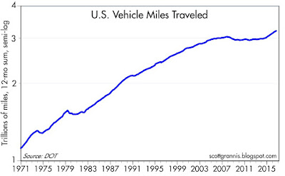
The chart above illustrates one tangible result of lower oil prices: people are driving more, after roughly 10 years of no increase at all. Prices do make a difference in people's behavior. Consider: if today's oil price has boosted the public's willingness and ability to use their vehicles, might it not also boost the economy's ability to grow?
As I've noted
before, Chemical Activity has been picking up of late, and that is a good sign that industrial production is about to pick up, after almost three years of zero growth in manufacturing activity.
In the chart above, we see that the real yield on 5-yr TIPS tends to track the real growth rate of the economy. That makes sense, because the risk-free real yield on TIPS needs to compete with the ability of investors to achieve real returns in the broader economy. For years now, real yields have been trading at depressed levels and the economy has turned in its worst recovery ever. The current relatively low and stable level of real yields suggests the market holds out little or no hope for any meaningful improvement in economic activity in the foreseeable future.

The chart above is useful for several things. For one, we see that the real yield on cash and cash equivalents (using the Fed funds rate as a proxy) has been negative for the past 8 years. The purchasing power of cash has fallen by roughly 10% since 2008, and that's a huge price to pay for "safety." Second, we see that the effective stance of monetary policy has been "easy" for the past 8 years, and continues to be so. That's because real short-term interest rates have been very low, and the yield curve (the slope of which is shown in red) has been positively-sloped. As the chart illustrates, recessions have always followed periods in which monetary policy becomes very tight (i.e., high real yields and a flat or negatively-sloped yield curve). In short, monetary policy poses no threat to the economy.
The market fully expects the Fed to raise short-term interest rates, probably by 25 bps at the December FOMC meeting, and perhaps once more sometime next year. But even at 1%, the real funds rate would be zero or negative, and the yield curve won't become flat or negative until the market realizes that the Fed has tightened so much that its next move is likely to be to cut rates. Thus, tight monetary policy is still years in the future, barring an unexpected surge in economic growth and/or a surprising rise in inflation, either of which would force the Fed to become more aggressive.
– – – – –
Investors need to weigh all these considerations against their own appetite for risk. Personally, and despite all the negatives looming on the horizon, I don't find a compelling reason to exit risky assets. Going to cash is not without risk, and the extra yield available on risk assets is meaningful—and it compounds fruitfully over the years. If I saw evidence of widespread optimism in the market I might reconsider, but so far I see more caution than optimism, and that is encouraging from a contrarian point of view. Having said that, the current environment does not present a compelling opportunity to put one's financial future at serious risk.


 Posts
Posts


