Wednesday, May 4, 2016

Productivity is still the missing ingredient

This is a re-posting, with updated data and commentary, of a similar post three months ago.


We've know for years that this recovery is the weakest post-war recovery on record, and the chart above makes the case. If this had been a typical recovery, national income (GDP) would be about $2.8 trillion higher than it is today. That's like saying that average wages and salaries would be 17% higher. For a family earning $60,000, that's over $10,000 more income per year that has failed to materialize despite all their hard efforts.


What's been lacking is productivity (the additional output that each unit of labor produces), because productivity is the key to rising prosperity. We can only earn more if we work and/or produce more. We've had about the same rate of jobs growth (~2%) during this recovery as we had in the latter portion of the 2001-2007 recovery, but GDP growth has been much weaker. The reason? Very low productivity growth, as seen in the chart above. I use a 2-yr rolling annualized growth rate to measure productivity, since it is quite volatile on a quarter-to-quarter basis. Over a 2-year period I think the quarterly volatility tends to wash out and a truer picture is revealed. Note that the productivity readings we've had in the past several years have always been associated in the past with recessions. It's no wonder that everyone keeps complaining about the economy. It's as if we've been living in recessionary conditions even though things have been slowly improving. Put another way, we've had to work unusually hard just to enjoy very modest improvements in our standard of living.


The chart above uses the same data, but instead of a two-year rolling period, it uses a 5-yr rolling period. This, I believe, captures the effect of policies put in place by different presidential administrations. It can take years for policies to be put into effect and then have an impact on the economy, and good policies can have effects that last even after they have been reversed.

The colored bars correspond to different presidential terms, with the red bars reflecting a sustained period of declining productivity growth and the green bars a sustained period of very strong and/or rising productivity growth. I would be quick to note that Republican administrations have yielded three periods of declining productivity (Eisenhower, Nixon, and Bush II), while Democratic administrations have only yielded two periods of declining productivity (Carter and Obama). No political party can lay a claim to implementing policies that consistently lead to sustained rises in prosperity.

One thing that stands out is that the Obama years have seen productivity growth that rivals the malaise that characterized the Carter administration. For the five- and six-year periods ending last March, non-farm productivity rose at a miserably slow 0.5% annualized rate. In all of post-war history, only the five-year period ending in mid-1982 was worse. (Small footnote: Reagan's announced tax cuts did not take effect for almost two years, so his faulty implementation of tax cuts—which encouraged people to delay investments—only served to prolong the declining productivity of the Carter years).

There are many factors that contribute to the slow growth of productivity, such as rising regulatory burdens that increase the cost of economic activity, high marginal tax rates that reduce the incentive to work and invest and take risk, and transfer payments that create a culture of dependency and a reluctance to seek out work. John Cochrane has an excellent op-ed in the WSJ which expands on the reasons why this has been such a weak recovery: "Ending America's Slow-Growth Tailspin."


The charts above show that a significant increase in transfer payments (money the government gives to people for a variety of reasons) beginning in late 2008 corresponded to the beginnings of a significant decline in the labor force participation rate. Many millions of workers have left the workforce, and it could be due at least in part to the fact that the benefits that accrue to those not working (e.g., food stamps, disability payments, welfare, earned income credits, assistance to single-parent families) are greater than the net benefits of working, especially on an after-tax basis. Transfer payments now equal 20% of disposable income, and that is a big number that currently totals $2.74 trillion and consumes fully 73% of all federal government spending. Maybe it's simply the case that our government has grown to the point where it is now suffocating the private sector. Too few people are working and too many are on the receiving end of federal largesse. And for those who are still working, the burden of complying with regulations and the burden of taxes is inhibiting their ability and willingness to work and invest more.

We are not going to see significant improvement in productivity and living standards unless and until we adopt policies that are more conducive to work, investment, and risk-taking. It's that simple. Unfortunately, the proposals being discussed on the left (e.g., higher taxes on income and capital, plus higher minimum wages which price many young workers out of the market and inhibit new business formation) are only going to exacerbate the current situation. Trump sensibly advocates for lower and simpler income and business tax regimes, but his calls for trade protection are misguided and could weaken the economy.

Yesterday the level of uncertainty surrounding this year's presidential election was reduced as Trump became the presumptive Republican nominee. But uncertainty remains inordinately high since future policies could take either a positive or a negative direction, and by a lot, regardless of who wins. We know one of the eventual two candidates, but Hillary's candidacy remains deeply clouded by the ongoing FBI investigations. Such a level of uncertainty is not conducive to new investment and is not likely to be inflating equity prices—small comfort.

UPDATE: There is school of thought that holds that the productivity slowdown is the result of mismeasurement; that many valuable products (e.g., GPS, VoIP) are being given away for free. Here is a paper that considers whether this argument is supported by the facts. It concludes: " the reasonable prima facie case for the mismeasurement hypothesis faces real hurdles when confronted with the data." In other words, mismeasurement problems can't come close to explaining the magnitude of the decline in productivity. (HT: John Cochrane)

Healthy service sector

The April ISM service sector report was uniformly healthy. The composite reading was a bit above expectations (55.7 vs. 54.8), and solidly in expansion territory. The service sector is home to some 70% of U.S. payrolls, so this is very good news. The mini-slump that so worried markets earlier this year appears to have faded away.


Both the services and the manufacturing ISM indices confirmed that activity picked up towards the end of the first quarter, all but erasing the earlier slump. This likely means that the economy is back on the 2% growth track that has prevailed for the duration of the current business cycle expansion.


The employment subindex is once again back above 50, but only reflects modest improvement in employment going forward.


The U.S. and Eurozone economies have been tracking each other for the past 3-4 years, with both growing moderately.


The chart above compares the growth of prices in the service, non-durable, and durable goods sectors. Since 71% of the US workforce is employed in the private service sector, and since the cost of services is largely determined by wages, we can infer that the vast majority of the US workforce has been enjoying very healthy wage gains relative to durable goods prices. Service sector prices have been increasing at a modest 2% annual rate for the past several years, but they have increased two and a half times faster than durable goods prices since 1995 (which happens to mark the start of China's huge export boom).

This is equivalent to saying that an hour's worth of work in the service sector buys 2.5 times as much in the way of durable goods as it did in 1995. We can lament the tepid growth in median incomes over the past few decades, but this significantly understates the gains in workers' purchasing power for durable goods. Practically anyone who works these days is able to afford a smartphone, a device that replaces goods that would have cost a small fortune just 20 years ago. Let's not lose our perspective: things could be a lot better, but they could also be a lot worse.


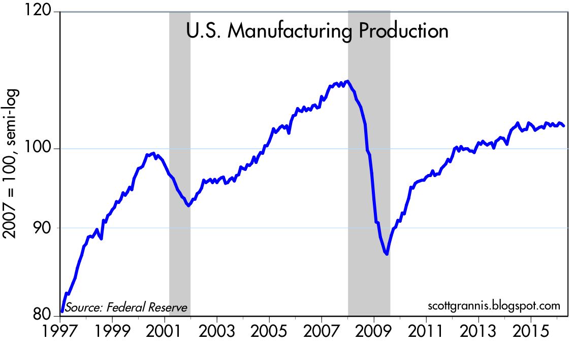
Industrial production and manufacturing in general have been the weakest sectors of the economy in recent years. Industrial production has been declining for almost 18 months now, but the lion's share of that decline can be traced back to the huge reduction in oil-related activities, which in turn are a logical response to plunging oil prices. As the next chart shows, manufacturing production has been flat for the past 18 months. Most of that weakness undoubtedly stems from declining production of energy-related equipment. Outside of the energy industry, life goes on in a relatively normal fashion, but with the under-appreciated boon that cheap energy represents to the vast majority of consumers.


Monday, May 2, 2016

Still more encouraging developments

Markets continue to recover from the growth scare that set in beginning around the end of last year. Oil prices were plunging, creditors feared a wave of defaults, commodity prices were plunging, China was thought to be on the verge of a huge slowdown, and central banks appeared powerless to avoid another recession. What a difference a few months make. "Avoiding a recession is all it takes" has been a recurring theme of this blog for more than three years, and it's still relevant. Here are some more charts which suggest that instead of tipping over into a recession, the economy is more likely picking up a bit. Growth is still slow, but slow growth is a lot better than a recession, especially when cash yields almost nothing.

Here are some more charts updated with recent statistics that present an encouraging picture:


The April ISM manufacturing index was a bit lower than expectations (50.8 vs. 51.4), but it is still at levels which are consistent with overall growth in the economy of 2% or better. It's rebounded nicely from the lows of just a few months ago.


The export orders index has also rebounded nicely, and that's especially encouraging since the market has been very worried about slowdowns in overseas markets. 


The chart above shows the price of crude oil futures. Oil prices are no longer declining and have instead rebounded over 70% from their February lows.


With the plunge in oil prices a thing of the past, we see that prices of things other than oil are still rising. (The Core CPI has been rising at an annualized rate of 2% or so for many years.) A majority of companies in April reported paying higher prices, as the chart above shows. Deflation risk is vanishing.


Construction spending in March was up 8% from year-ago levels, and has been exceeding expectations in recent months.


Industrial metals prices are up over 25% in the past three months, a good sign that global manufacturing activity is improving.


Bank lending to small and medium-size businesses has been booming for the past five years. C&I Loans are up 11% in the past year, and have surged at an annualized rate of almost 20% in the past three months. This is an excellent indicator of rising confidence, since banks are evidently more willing to lend and businesses are more willing to borrow. Total Bank Credit outstanding has been rising at a 7-8% annual rate of late as lending has increased by $767 billion in the past year (for perspective, that's equivalent to 4.2% of GDP). 


It's ironic that radically cheaper energy prices in the past year or so have been seen by many to be a source of concern (because they threaten the health of energy producers), when they have been a boon to consumers everywhere. As the chart above shows, energy has never been a smaller part of consumers' budgets than it was last March (3.67%). High and rising energy prices have tended to precede recessions, and falling energy prices have tended to coincide with periods of very healthy economic growth (e.g., the mid-1980s). This is not an ironclad rule, but it's hard to see a recession developing when energy—an essential ingredient to all economic activity—becomes very cheap.

UPDATE: And here is the current menu of yields available on different types of assets:


The chart below shows the difference between the earnings yield on equities (i.e., after-tax profits per share) and the yield on 10-yr Treasuries. Note that the current equity risk premium (i.e., what you would earn if corporate profits were to continue at the same level relative to share prices and corporations paid out all profits in the form of dividends) is still quite a bit higher than its long-term average. You don't often get the chance to pick up so much extra yield on equities. The explanation for why this is so high today is that investors don't believe that corporations will be able to sustain their current level of profitability. In other words, bad news is still priced in: