


Unfortunately, economic growth is not about to set any long-term records. For 50 years, from 1966 through 2007, the US economy grew at an average annualized rate of about 3.1%—a great and dynamic expansion which saw the economy almost quintuple in size. The came the Great Recession of 2008-9. Not only did the economy fail to recover to that long-term 3.1% trend in subsequent years—for the first time ever, following a recession—it went on to post only slightly more than 2.1% annual growth in the decade from 2009 through early 2019. It was the weakest economic expansion on record, and it looks set to continue for the foreseeable future, I'm sorry to say.
Chart #1

Chart #1 uses the magic of a logarithmic y-axis to show how the US economy followed a 3.1% annualized growth track for 50 years. (With a logarithmic y-axis, a line with a constant slope represents a constant rate of growth.) Then, beginning in 2009, it managed to grow only 2.1% per year for the subsequent decade. (See this post for more details as to why.) We've been living in a sub-par recovery since I first anticipated it back in early 2009, thanks to too much regulation, high taxes, and too much government spending. Those same forces will act as headwinds for the economy in the years to come, with Biden promising a virtual replay of all of Obama's anti-growth policies—and possibly even more. Slow growth has left the economy substantially weaker and smaller (by about $4.5 trillion per year, as shown by the gap between the blue and green lines) than it might have been had the prior 3.1% growth trend persisted.
Chart #2
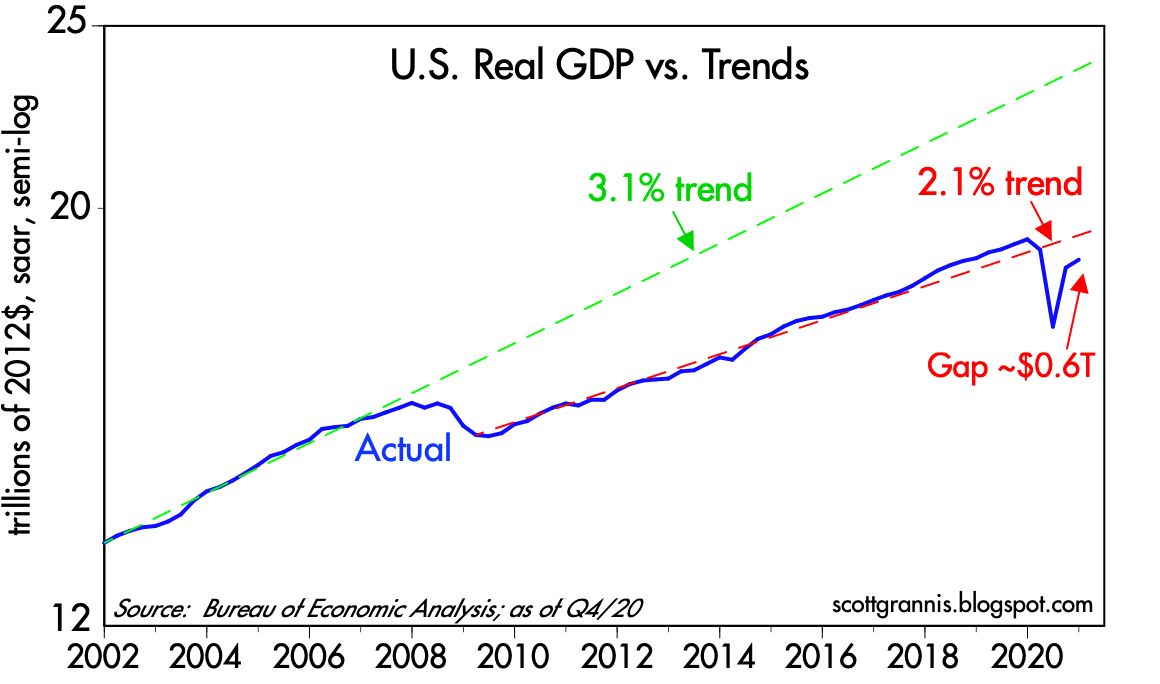
Chart #3

The US economy would need to grow by 5.2% (after inflation) this year in order to reattain its 2.1% trend growth by the end of this year (see Chart #2). Most analysts are optimistic, but few, if any, expect growth to exceed 5%. I wouldn't be surprised if it did, however, but I would not expect to see more than 2% annual growth beyond this year, especially if Biden manages to implement his green energy policies and higher taxes on wealth and business. Looking long-term, we're likely to be stuck in a slow-growth world, much as we've seen over the past decade or so.
Chart #4

Chart #5

Not all is sweetness and light, however. Chart #5 compares the real yield on 5-yr TIPS to the 2-yr annualized growth rate of GDP—not surprisingly, real yields tend to track the real growth potential of the economy. With 5-yr real yields now abysmally low (-1.8%), we can infer that the market sees very little growth potential for the US economy in the years ahead. A charitable interpretation of this chart would suggest the market expects real economic growth to average about 1-2% per year for the foreseeable future. Thus, although my expectation for 2% annual growth seems rather modest in an historical context, I'm only essentially agreeing with the market's expectations.
This modest growth outlook would ordinarily not provide much support for equity prices. However, in the context of a zero-percent cash environment, equities still have a better expected return than cash or cash equivalents. And with the Fed seemingly determined to keep short-term rates very low for a long time (the market currently expects the Fed funds target rate to remain roughly unchanged for the next two years), the inflation-adjusted return on holding cash is going to be negative for a long time. Holding cash is virtually guaranteed to be a losing strategy in terms of purchasing power. And that effectively boosts the demand for just about anything and everything other than cash and short-term bonds. Equity, commodity, and real estate prices are all rising, and that's not surprising given the Fed's policy stance.
Chart $6

A final note: inflation expectations embedded in TIPS and Treasury prices are now approaching 2.33%, as Chart #6 shows. This cannot go on much longer, I fear. Sooner or later Treasury yields are going to have to start rising. But in the meantime, it pays to borrow, since interest rates are so low relative to inflation, and it pays to buy, since expected returns on non-cash assets are much higher. It's not unreasonable to think we are in the early stages of an inflating "asset bubble."
All of these considerations leave me nervously optimistic about the long-term outlook for equities. I don't think the Fed's desire to boost inflation is consistent with a long-term healthy economic outlook, because higher inflation will eventually undermine confidence and the economy. Unprecedented monetary expansion in recent years has not yet resulted in any significant increase in inflation, but only because the demand for cash has been extremely strong. Sooner or later the Fed will get its way and money demand will fall (market sages are fond of saying you should never bet against the Fed's ability to get what it wants, and I think they are right). But just how long the Fed can undermine the world's demand for cash and avoid an unhealthy increase in inflation is really the only issue at this point. If the Fed doesn't thread this needle just right, inflation expectations could become "unmoored," and that eventually would lead to a significant tightening of monetary policy which in turn would most likely result in yet another recession somewhere down the road.
Meanwhile, "borrow and buy" should continue to be your mantra, even if it makes you nervous.

15 comments:
Another great post, Scott. Thanks for the analysis.
Can anyone recommend a good book or three on currency crises? I can't see how this ends any other way. I'm looking for stories of what it looked like as it came and what people experienced in the middle of it. Thanks in advance.
Concerns for 2021 and next few years.
1. economy recovers/reflation - don't fight the Fed
2. late 2021/early 2022 will be an interesting time- will recovery continue?
3. serious headwinds with regulatory destruction of economic activity/jobs
4. 2022: significant risk of bumps in the road (read recession)
Thanks for the hard work on these posts.
Scott a fascinating commentary, as usual.
I would suggest that demographics have something to do with the downward shift in the growth of the US economy. Something that has not been studied much since the issue is relatively recent (as in an aging population).
Other issues are excessive regulation (honestly a stronger incentive for economic participants to assume the cost of externalities e.g. pollution) means a more regulated marketplace. Look at Japan; its economic growth has dwindled as the average age (48) of its population has increased. Some would say the same problem occurs in Italy.
Until the early 00 immigration (usually the young) was greatly encouraged in the US (remember Reagan was for it!), now not so much, and that position is not strictly that of the GOP -- many many liberals want to limit immigration.
I suggest that the new normal of 2.1% annual GDP growth has some strong up limit resistance, and for America to see higher GDP growth birth rate and immigration would have to rise; the former is almost impossible policy to function and the second one is generally unappealing to the electorate!
Scott I believe you really need to focus more on GDP per capita. A major reason why growth has been slowing recently is because population growth has been slowing recently. If you pay more attention to real GDP per capita it will give you a more accurate picture of what is going on.
Frozen and John A: re demographics being a significant cause of the lower growth trend that began in 2009. I’m not an expert, but I do know that demographics don’t change on a dime. They take many years to play out, and the observed changes are gradual. How can you reconcile that with the observation that sometime between late 2007 and early 2009 the economy’s growth potential downshifted from 3.1% to 2.1%?
I find it much easier to see that fiscal policy shifted rather dramatically under the Obama administration at just about the same time that the economy’s trend rate of growth downshifted.
And yes, of course there have been some important changes in US and global demographics in the past few decades; I won’t deny that. And those changes all reflect that population growth and fertility rates are declining. So yes, I wouldn’t expect potential GDP growth rates in advanced economies today to be as strong as they were 10 years or so ago. But for the change to happen virtually overnight?
For more on this subject of demographics and its implications for the economy, there's a new book out: The Great Demographic Reversal: Ageing Societies, Waning Inequality, and an Inflation Revival by Charles Goodhart and Manoj Pradhan. I'm only a few pages into it but I'm looking forward to finishing it. The authors are financial guys with impressive resumes so their approach will likely be of interest to readers of this site.
Another great post by Scott Grannis.
The long-term decline in capital goods orders (chart #4) troubles me.
Perhaps labor is cheap in America (illegal immigration). Maybe factories are built offshore.
I recommend the book "Trade Wars are Class Wars" by Michael Pettis.
Inflation? Well, the boy cried "wolf"...but one day there really was a wolf.
Still, the Japan picture is the opposite.
For 40 years there have been long-faced predictions of inflation and accelerating inflation. No show. The edge of seat has worn a crease in my butt.
If there is no serious inflation in 2021-2, then I say that dog don't hunt no more.
Scott, great stuff! I've seen your Chart 1 in various places. But I have not been able to locate at the BEA or elsewhere the data that would allow construction of a similar chart by components of GDP. I would think that such data would point to what is driving this major change in trendline around 2007.
The declining birth rate, and aging of the US population, has reduced potential Real GDP growth by at least 0.5% a year over the past two decades.
Real GDP growth is productivity growth, plus the growth of the number of people employed, so demographics are important over the decades.
Immigration (legal) has not increased to compensate for the declining birth rate and aging population as baby boomers retire.
There are lots of reports on the subject, and charts are easy to find, but they tend to be over complicated and tedious.
Real GDP per capita is better
Labor force participation data are useful
Productivity data are useful
The chart at the link below is simple and explains the changes from decade to decade at a glance:
https://www.bls.gov/emp/graphics/2019/annual-growth-rate-of-the-population.htm
@Scott,
You are correct that demographics don't change on a dime, but it was observed that after the Great Recession began that a lot of people who were laid off decided to just get out of the labor force altogether. You can see this in the labor force participation rate. Prior to the recession, it had fallen moderately from its 1999 height, but after the recession it took a huge tumble and has never recovered. What that would tell you is that even prior to the recession, a lot of people were working who probably were increasingly marginally attached to the labor force, and then once the recession began, that was the proverbial straw that broke the camel's back.
As for fiscal policy, prior to Obama we had all kinds of differing fiscal policies under a variety of presidents - your chart shows Bush, Clinton, Bush, Reagan, Carter, Nixon and Johnson. And yet, in spite of those differences we still had GDP growth on trend at 3.1% under all of them. For that reason, fiscal policies don't appear to explain what's going on in your chart.
@scott
Demographics: I agree they definitely don't change on a dime, in fact, the trend in Japan for GDP growth (or the lack thereof) has been going on for a rather long time. Since 2015 Japan's total population has declined, it had peaked in 2010, and the slowdown in growth goes to the early (very early) 1990s.
The same trend for Italy with a few years of lag.
As for as looking at fiscal policy -- sure why not, but overreaching trends are real, the same way that the US economy exploded after WW2.
Subpar economic growth is easy to explain. It's stock vs. flow. The remuneration rate on interbank demand deposits inverts the short-term segment of the wholesale money market funding yield curve. I.e., it subverts the savings -> investment process. I.e., it destroys savings' velocity. This acts to induce disintermediation of the nonbanks, like the 1966 Savings and Loan Association "credit crunch".
The remuneration rate provides the payment's system with a preferential interest rate differential in favor of the banks (as opposed to Reg. Q ceilings which provided an interest rate differential in favor of the thrifts, in their borrowing short to lend longer savings/investment paradigm).
Economists are vacuous. They've lost all their marbles. Banks are "black holes". They do not loan out the deposits that are inherently impounded. I.e., deposits are the result of lending and not the other way around.
During the U.S. Golden Era in Capitalism (not optimized), the annual compounded rate of increase in our means-of-payment money supply was about 2 percent. The nonbanks grew faster than the commercial banks (which made Citicorp’s Walter Wriston jealous), and thereby a higher percentage of savings was utilized (through direct and indirect investment) and was also FSLIC and NCUA insured.
And during this same period, 1955-1964, the rate of inflation, based on the Consumer Price Index, increased at an annual rate of 1.4 percent. Unemployment averaged 5.4 percent. Real Disposable Personal Income increased at an annual average rate of 4.14 percent.
Things ended in 1965. That's when the commercial banks began to outbid the non-banks for loan-funds (resulting in disintermediation of the thrifts).
What you can take away from George Baily’s “It’s a Wonderful Life” is varied meanings and thus different applications. The fact is that the U.S. Golden Era in Capitalism was where small savings were pooled, expeditiously activated (put back to work), and government insured - in the Savings and Loan Associations, Mutual Savings Banks, and Credit Unions. I.e., money velocity accelerated during this prosperous period (simply by activating monetary savings outside of the payment’s system).
Economist John O’Donnell said of the U.S. Golden Era in Economics: “increased money velocity financed about two-thirds of a growing GNP, while the increase in the actual quantity of money has finance only one-third. In other words, the ratio of the money supply to GNP has supplanted velocity.
Government polices underpinned targeted real investment, aka, "the Servicemen’s Readjustment Act of 1944, the G.I. Bill was created to help veterans of World War II. It established hospitals, made low-interest mortgages available and granted stipends covering tuition and expenses for veterans attending college or trade schools"
The period from 1961 to 1981 represented the "monetization of time deposits". It represented the transition from clerical processing to electronic processing, and in the process the end of gate keeping restrictions on time deposits, or bank deposit innovation. During this transition, as time deposits grew, the velocity of the residual deposits increased as a monetary offset.
After the 1981 "time bomb", the widespread introduction of ATS, NOW, SuperNow, and MMDA accounts, the velocity of circulation was constrained by the FDIC raising deposit insurance from $40,000 to $100,000. And then the DIDMCA turned the thrifts, which were intermediaries or credit transmitters, into banks, which are credit creators.
This caused the 1985-1996 Savings and Loan Association Crisis, the failure of 1,043 out of the 3,234 savings and loan associations in the United States from 1986 to 1995, as well as the July 1990 –Mar 1991 recession
Post a Comment