


The chart above shows the PE ratio of the S&P 500, with the latest datapoint as of Friday: at 21.1, it is definitely above its long-term average of just under 17, so it's easy to look at this and conclude that the market is pricing in good news.
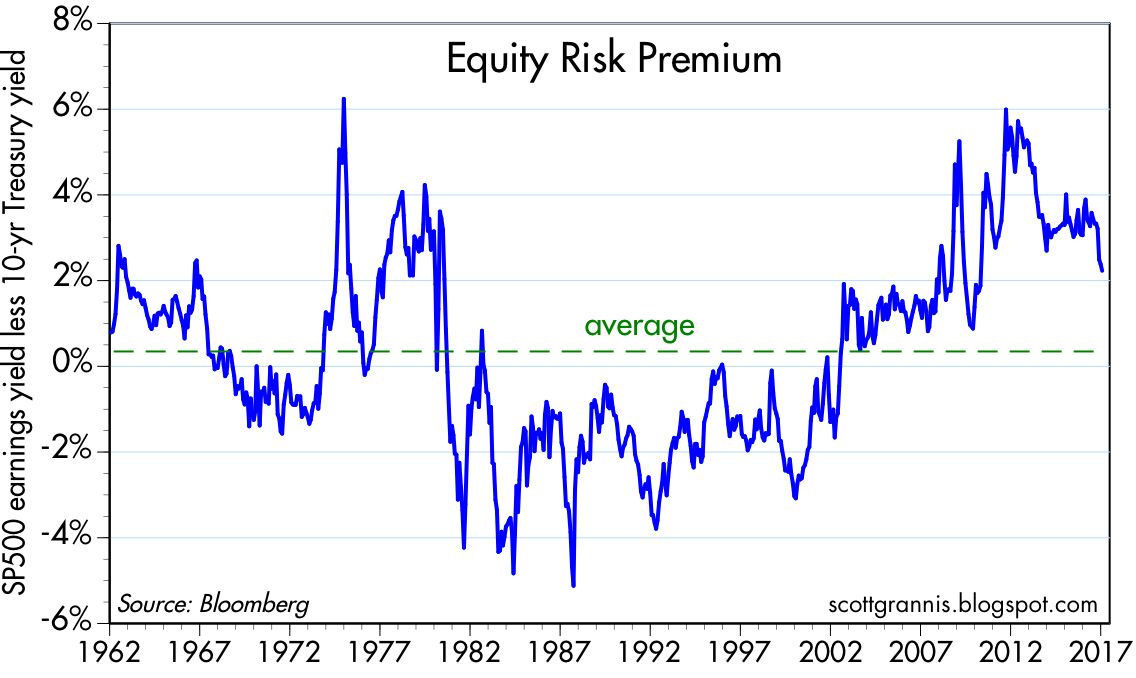
But PE ratios can't be viewed in a vacuum. The chart above compares the earnings yield on stocks (EPS divided by price, or the inverse of PE ratios) with the yield on 10-yr Treasuries, which are a proxy for long-term risk-free rates. The greater the difference between these two, the less optimistic the market is. When the difference is negative, as it was in the 1980s and 1990s, the market is quite optimistic, since investors are willing to accept a very low yield on stocks relative to their risk-free alternative, because they are confident that stocks will appreciate by more than the difference. Today, it's almost the opposite; investors are unwilling to take on the risk of stock even though their yield is about 200 bps higher than the yield on 10-yr Treasuries.

Fourth quarter GDP growth was weak, at 1.9%, and growth over the most recent four quarters was also weak, only 1.9%. Looking back to the beginning of the current economic expansion, the annualized growth of real GDP has been a modest 2.1%, which is significantly below its long-term trend of about 3.1%. The chart above shows how significant this 1% annual shortfall in growth has been: the gap between where the economy is today and where it could have been if growth had been 1% per year stronger, is about $3 trillion. If this had been a normal recovery, real incomes on average would be about 15-17% higher today than they actually are. No wonder this has been a disappointing economy, even though it has been growing rather steadily for over seven years.

The chart above compares the real yield on 5-yr TIPS to the 2-yr annualized growth rate of real GDP. It's likely not a coincidence that real yields on TIPS have been zero to negative for a number of years, while the economy has managed real growth of only 2%. Think of the real yield on 5-yr TIPS as the risk-free real growth rate that investors can lock in; it should rarely be equal to or higher than the real growth of the economy (which is best proxied, I would argue by the 2-yr annualized growth of GDP), because if it were, then TIPS would be the best risk-adjusted investment in town.
Typically, as the above chart also shows, the real yield on TIPS tends to be somewhat less than the prevailing real growth rate of the US economy. That is as it should be: risk-free real yields should normally be lower than the real returns available from a growing economy, because the latter are uncertain. When the economy was growing 4-5% per year in the late 1990s, real TIPS yields were 3-4%. Now that the economy is growing 2%, real TIPS yields have rarely been higher than 0.5%. Real yields on 5-yr TIPS are going to have to rise meaningfully before it can be said that the market has turned optimistic about the future of the US economy.

What has the economy been so sluggish for so long? The chart above is one answer: business investment has been unusually weak. Without investment it's very difficult to grow. Without investment in new plant and equipment, new software, etc., worker productivity is likely to be low. And indeed, productivity has been a meager 0.5% or so per year, on average, for the past 5-7 years.

The chart above tells the same story: capital goods orders, a proxy for business investment, have been very weak. In real terms, they haven't growth at all since the mid-1990s.

The chart above compares the real and nominal yield on 5-yr Treasuries, and the difference between the two (green line), which is the market's expected rate of CPI inflation over the next 5 years. Note how nominal yields have jumped in the past few months while real yields have been relatively flat. All that's happened, as far as the bond market is concerned, is that inflation expectations have risen from 1.3% last summer to now just over 2.1%, and most of that rise can be explained by higher oil prices.
Higher inflation expectations could arguably be a healthy development, if only because the market seems to have lost its fear of deflation. But if inflation expectations were to continue to rise, that would soon become problematic, since it would mean that the Fed was falling behind the inflation curve, and sharply higher interest rates would soon become inevitable.
UPDATE: The chart below compares the real Fed funds rate to the real yield on 5-yr TIPS. The real funds rate is today's real risk-free rate, while the 5-yr real yield on TIPS can be thought of as what the market expects the real funds rate will be in 5 years. The blue line is usually above the red line, which is the normal state of affairs because it means the market expects the Fed to "tighten" in the future. But when the red line exceeds the blue line, it means the market senses the economy is weak and will require Fed easing in the future. Note that the red line exceeded the blue line in advance of the past two recessions; this is just another way of saying that tight Fed policy plus an inverted real or nominal yield curve is a good warning sign that a recession may be on the horizon.
The market won't be "optimistic" about the future of the economy unless and until the 5-yr real yield on 5-yr TIPS moves significantly higher. Because that will be the best indication that the market senses the economy is going to improve significantly and that the Fed will therefore be accelerating its rate hikes.


28 comments:
Real yields on 5-yr TIPS are going to have to rise meaningfully before it can be said that the market has turned optimistic about the future of the US economy.
Scott,
would you mind to elaborate, why do you come to that conclusion?
Isn't it possible that we will see a phase where the already inflated monetary base will find it's way into the real economy and create price inflation?
To me it seems, that velocity of money is successfully beginning to creep out of the hole, is was stuck in since 2009.
Also the shrinking bank reserves at the Fed seem to indicate that we indeed could be on the verge of "normalization" and leave the extraordinary deflationary trap.
If that is the case, and if the Fed allows that to happen, then the normalization should be accompanied by the effect, that the inflated monetary base (correct use of the word inflation), will become visible in prices.
To leave the financial crisis behind and to reach real normalization, I argue, that some kind of overshooting inflation with negative real rates for a some time would be necessary after leaving the deflationary hole.
If the Fed does not allow to reach escape money velocity, then they would not only create the next recession, if they raise rates too early, but probably they would also throw the velocity of money back into the deflationary trap they have been trying to get out since 2009.
Long speech short, the question is:
After 8 years trying to leave the deflationary black hole, they are close to reaching escape velocity - why would they risk everything, by allowing real rates to raise faster?
Think of the real yield on 5-yr TIPS as the market's estimate for the real Fed funds rate 5 years from now. If the market senses that growth and inflation are really picking up, the market will push real yields on TIPS higher in anticipation of Fed tightening. I think it makes sense that the market demands a real yield on 5-yr TIPS that is commensurate with expectations of real growth.
The Fed can't really control 5-yr real yields, just as the Fed can't control 10-yr Treasury yields. The Fed moves short rates up and down with some guidance from the market; the Fed is more a follower than a leader in that sense.
As for velocity, I too sense that it is beginning to pick up, but the evidence is still pretty tentative. Rising velocity wil make it almost imperative that the Fed increase short-term real rates. Rising velocity is equivalent to declining money demand; the Fed must take offsetting measures to boost the demand to hold excess reserves (which are still abundant), or else risk a significant pickup in inflation. The Fed doesn't have to and shouldn't keep rates too low for too long. The Fed's role is not to stimulate the economy, it's to keep the supply and demand for money in rough balance.
Thanks for your reply, Scott.
A few weeks ago I had read an article, that the Fed could not control longer rates, just what you wrote. It contained also graphics in it, showing that QEs did not lower longer rates. This article was most impressive to me, but sadly I did not archive it and had not been able to find it again later. First I thought I had read it here, but couldn't find it. Since now you mentioned the fact again, by coincidence you don't know which article that could have been?
The S&P 500 PE Ratio is 25.6x based on Standard and Poor's as-reported earnings
Your 21x is wrong.
I get my data from Bloomberg, the most highly respected provider of financial data on the planet.
Nice summary scott.
Of course it's entirely possible that the stock market is more optimistic than the bond market. Two different types of buyers (traders). Indeed, I believe this to be so. DT is a real wildcard, love him or hate him.
steve: I've wrestled with the issue you raise, being tempted at times over the years to think that the stock and bond markets have separate and distinct motives, etc. But in the end I've come to realize that their is only one capital market, and it includes stocks and bonds. Whatever affects one must affect the other. Whatever explains one must explain the other.
endzeit14: I first posted an article about how QE did not depress bond yields back in Nov. '13:
http://scottgrannis.blogspot.com/2013/11/quantitative-easing-myths.html
I have made similar posts with updated charts since then. Here's one: http://scottgrannis.blogspot.com/2014/10/qe3-rip.html
Chances are you are referring to one or more of my posts on the subject.
Hmm, hate to argue this point with you Scott. You are far more erudite than me in these areas. I do have 25 yrs of successful bond trading behind me though. In any event, I understand your point and it makes academic sense but from a TRADING perspective, the bond markets are far more phlegmatic than stocks. It takes an '08 like market to really create utter havoc.
steve: I appreciate your comments. This is a subject about which reasonable men can and do disagree. It's one of the things that make markets exciting.
Ray Dalio is no dope:
https://www.bloomberg.com/news/articles/2017-01-31/dalio-says-trump-s-populism-may-overpower-pro-business-policies
This is exactly how I feel and why i think the stock and bond markets see things differently re DT.
Love your insight. Thank you for all you do.
Regarding Earnings Yield vs. 10-Year. I wonder what the 5 or 10 year rolling performance on S&P is relative to previous levels of "risk premium".
Another interesting article I read, from Wells Strategist James Paulsen, considers the difference between Earnings Yield and 10-Year yield to be the "earnings yield buffer." His observation is that the gap is as wide today as pretty much any time since 1960 -- and suggests that because the gap is so wide, the stock market "may persevere in the face of higher yields much longer than most anticipate."
Historically, when the 10-year yield has exceeded the S&P earnings yield, a rise in interest rates has negatively impacted the stock market. "However, interest rate increases during months when the earnings yield exceeds the 10-year bond have been associated with an almost 6% annualized price gain in the stock market."
With a potential resumption of sustained 3% GDP growth, and normalization of monetary policy, perhaps the current expansion and bull market both have legs?
I often agree with Jim Paulsen. If economic growth ramps up as a result of successful Trump policies, it is certainly reasonable to expect further equity market gains.
Hi Scott, thank you for another great post. Do you have a PT for AAPL? I'm excited that it's finally popping. Wondering if you have a sense for how much upside there is for a 1-time 10% tax on overseas cash? Thank you for any insight.
Tyler: I don't have price targets for my investments. I am still long AAPL (going on almost 15 years) because I think the company has the ability to grow and innovate, and it is a leader in its field. Being able to repatriate earnings at a 10% tax rate would obviously add to the company's value, but I'm not sure how much of that is already priced in. In any event, I note that Apple's cash-adjusted PE (based on trailing earnings) is only 12 or so.
Mr. Grannis
"I get my data from Bloomberg, the most highly respected provider of financial data on the planet."
You are presenting some kind of adjusted S&P 500 P/E Ratio to report 21x
The S&P 500 Index is owned by Standard & Poor's and they compile the as-reported earning data.
Based on "as-reported" earnings, the S&P 500 P/E Ratio is about 26x
Since you appear to be a perennial bull, you should always watch out for confirmation bias.
Bloomberg data appear to be adjusted in some way to make the P/E lower, which is what you like to see, assuming you are a value investor.
But S&P is the owner of the S&P 500 index, and earnings data for their index are available at their website.
At least mention that the S&P 500 P/E Ratio is 26x per S&P based on their recent compilation of as-reported earnings.
It is a disservice to your readers to claim the S&P 500 P/E is 21x without explaining some kind of "adjustment" is being used by Bloomberg to lower the P/E Ratio from S&P data (26x) to the Bloomberg level (21x).
It's my understanding that Bloomberg uses a consistent methodology to adjust S&P 500 earnings over time. That being the case, it is not misleading at all to compare today's adjusted PE ratio to the history of the Bloomberg series, which is all I've done in my posts. Comparing Bloomberg's PE ratio to the "as reported" ratio would, however, be comparing apples to oranges, and that would indeed be misleading.
"As reported" earnings can and do include a variety of "one-time" factors—such as write-offs of good-will—which do not reflect the ongoing operations of the business. I believe Bloomberg is trying to correct for such things, and I think it makes sense.
The Cliff, S&Ps figures may or may not be more accurate but as Scott says, the important thing here was the relative value of the P/E so it is only important to see current value compared to its mean, top and bottoms.
All P/E values are pure garbage if you want to go in to details about things. Ebit/EV would be better or to use FCF/EV.
Scott, thanks for an interesting piece. Saved to Evernote for future reference.
Stocks are MORE overvalued if you use
the Price/Sales ratio, which I prefer,
or Price/EBITDA ratio,
or Market Capitalization as a percentage of GDP, which Warren Buffett prefers
I used the 26X P/E Ratio based on S&Ps compilation of as-reported earnings to be conservative
Valuation of the median stock has never been higher
These are all useful valuations with predictive ability.
Selecting some "adjusted" PE/Ratio of 21x -- less bearish than all the other valuations I mentioned,
might be the result of confirmation bias from a perpetual bull.
I forgot to mention:
If Bloomberg reduces the P/E Ratio from 26x (S&P's number) to 21x by subtracting write-offs , why delete only bad news?
In a sample size of 500 stocks some companies will have write-offs while others will have one-time gains.
Any time someone adjusts data the result is no longer real data -- it is an estimate of what someone thinks the data should have been.
Reminds me of global average temperature calculations:
(1) Half our planet's surface has no measurements (so each empty grid gets a gets a wild guess temperature), and
(2) Half the warming since 1880 is from never-ending "adjustments" to the raw + wild guess data!
And believe it or not, important government policies are made with those data!
I believe Bloomberg's adjustments follow a theoretically sound and consistent methodology over time. If that is indeed the case, then comparing today's Bloomberg PE to the historical range of Bloomberg PEs can be a useful and legitimate measure of valuation. But Bloomberg's PE ratios can not be compared to the PE ratio "as reported.'' That would be compare apples to oranges. In any event, I did not choose Bloomberg's PE because of any bias I might have; I have used it exclusively for the past 30 years.
Bloomberg's calculation of trailing 12-mo EPS uses "diluted EPS from Continuing Operations." That is why their PE ratios are not the same as the "as reported" Price/earnings ratio from S&P 500.
Post a Comment