Thursday, January 31, 2013

Avoiding recession is all that matters

When yields on risk-free assets are close to zero, it only makes sense to hold those assets if you need liquidity and/or are highly concerned about the potential for losses in other assets, most of which are yielding substantially more. From a macro perspective, the fact that significant assets are being held with virtually a zero yield can be interpreted as a sign that the market is very worried about a recession, since that is the one event most likely to create widespread losses in risky assets. 

This has been the case for most of the past 4 years (during which time the yield on 3-mo. T-bills has averaged about 0.1%), yet the economy has avoided a recession and the returns on almost all alternative assets have been astounding. The returns on cash have actually been negative in real terms, since inflation has averaged 2.2% a year over the past four years. Cash, the risk-free asset, has produced an annual loss of purchasing power of over 2% for four years running. The S&P 500 index, on the other hand, has produced annualized total returns of 16.8% for four years running.

With almost $7 trillion sitting in bank savings deposits earning practically nothing, and with tens of trillions invested in risk-free assets around the world, there are therefore many millions of people and investors who need a recession to justify their current asset allocation.

Are there any signs of a budding recession? None that I can see in the recent data.


Weekly unemployment claims are volatile around this time of the year since the seasonal adjustment factors can be large. The 4-week average of claims, which eliminates a good deal of this volatility, is now at a post-recession low. No sign here of any recession or even an economic slowdown, to judge by this relatively fresh and sensitive indicator of conditions in the jobs market.


No sign here either of a recession, to judge by the Challenger tally of announced corporate layoffs. There is no sign of any unusual downsizing.


Meanwhile, it's almost certain that a housing market recovery is well underway. As the above chart shows, the stocks of major home builders are up over 100% in the past 16 months, and they are up 270% since their recession low. Housing starts are up 77% since the beginning of 2011. 

The zero growth reported for the fourth quarter of last year was the result of a downsizing of defense spending and a slowdown in inventory accumulation. Reduced government spending is not necessarily a bad thing, since it frees up resources for the private sector. Inventory investment is quite likely to bounce back, having been depressed in recent months by the uncertainty of the "fiscal cliff" which has since been resolved.


All of this is being repeated on a global scale. The value of global equities has more than doubled since their early-2009 low. $25 trillion has been earned by the holders of those equities, compared to a loss on the purchasing power of the tens of trillions that was held in cash over the same period.

Investors are notorious for following the money rather than anticipating where the money will be made, and $25 trillion in gains ought to be enough to get a lot of people's attention. We may finally be at the point where the private sector stops trying to deleverage and begins to releverage; when investors stop taking money out of equity funds in order to add to bond funds; and when investors try to reduce their cash balances in favor of riskier assets. The Fed and all other major central banks have been trying very hard to make this happen, and it would be foolish to think they won't be successful. By keeping interest rates on risk-free assets extremely low, the Fed is trying to destroy the demand for those assets, and trying to encourage money to find its way into other more riskier asset classes. The money can't actually  leave cash, but the attempt by the private sector to reduce its cash exposure (and/or increase its borrowings) in favor of equities or real estate could unleash a powerful change in relative asset prices. Ultimately, the yield on cash will rise significantly, while the yield on other assets will decline as their prices rise.

All it takes for this to happen is to simply avoid a recession. 

Wednesday, January 30, 2013

The economic news is not worse than expected

Everyone realizes that the very weak GDP growth (-.5%) reported for last year's fourth quarter was an anomaly and not a harbinger of recession, the product of sharp defense cutbacks and an inventory slowdown. That's why stocks today are unchanged, and Treasury yields are actually up a bit. The Q4/12 news is old history, and growth is almost certainly going to be stronger in the current quarter, and that's what counts for now. 


Today's ADP forecast of January private sector jobs growth was better than expected (192K vs. 165K), and as the chart above suggests, this points to Friday's private sector jobs gain to also be a bit better than the 169K expected. To be sure, job gains of 190K aren't anything to get excited about, but they are surely welcome, and this goes a long way to explaining why the market didn't take the GDP report as unexpectedly bad news. The economy is most likely still growing, albeit slowly.


The economy's real problem is displayed in the chart above, which compares the path of actual GDP growth (blue line) to what the long-term trend has been (red). By my calculations, the U.S. economy is now about 14% below where it perhaps could have been if fiscal and monetary policies had been more growth-friendly (e.g., lower tax burdens, less government spending, reduced regulatory burdens) and less manipulative (e.g., no QE infinity, less income redistribution). That's a shortfall of $2.25 trillion, or about $7,000 of annual income per capita, or about $20,000 per family, and that is real money to most folks. It's taken the form of a very slow recovery in jobs; if this had been a normal recovery there could have been well over 10 million more jobs by now.

So even though the economy continues to grow, we are losing ground relative to where we should or could be. This is a national tragedy, but it's not a reason for financial markets to collapse.


10-yr Treasury yields are still only 2%, and 5-yr real TIPS yields are still firmly negative. As the chart above suggests, this implies that the market is braced for GDP growth to be miserable (as low as zero, possibly) over the next few years. With expectations like these, GDP growth of only 2-3% this year might actually turn out to be a positive surprise.

Today's FOMC announcement shows that the Fed shares the market's miserable expectations. Everyone, it seems, realizes that the U.S. economy is just not performing well, and there is little reason to expect any meaningful improvement for the foreseeable future.

If there is any silver lining to this cloud, it is the almost-universal agreement that we are stuck in a rut. When sentiment shifts so solidly to one extreme or another, the market becomes vulnerable to even the smallest sign that things are not conforming to expectations. When this might happen is anyone's guess, but I continue to believe that the economy is capable of exceeding the market's miserable expectations, which is why I remain invested in risk assets.

For all the glum news, it's not worse than the market expected, and that's good news.

Tuesday, January 29, 2013

Developments in China explain the end of gold's rise

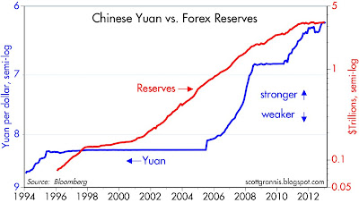
Arguably, there have been three major developments in the global economy in the past decade: 1) the Chinese economy has posted 8-10% annual economic growth; 2) China's foreign exchange reserves have soared from $170 billion to $3.3 trillion; and 3) the price of gold has sextupled. It's likely that all three are related, and that the outlook for gold is diminished as a result. 


China's economic growth has been truly impressive. There has been huge progress and prosperity gains, thanks to the introduction of free market reforms and investment-friendly policy.


China's decision in early 1994 to peg the yuan to the dollar was a key factor driving China's growth, since it brought Chinese inflation rapidly down to the level of the U.S. The prospect of a stable currency not only reduced inflation and its multiple distortions, it also increased the market's confidence in China, and helped boost investment in the country since it all but eliminated foreign exchange risk. Indeed, since the yuan has only appreciated against the dollar since 1994, foreign investors benefited from strong Chinese growth and yuan gains. China was the boom of the century.

As the first of the two charts above shows, the huge capital inflows that helped China grow needed to be sterilized or accommodated by the Bank of China, otherwise they would have caused the yuan to soar, and that could have short-circuited China's ability to grow. Massive inflows of foreign capital seeking to benefit from rapid Chinese development essentially forced the BoC to buy over $3 trillion of foreign exchange, with a commensurate increase in the Chinese money supply. Converting capital inflows into yuan is the only way foreign capital could actually enter the economy, because you can't build a factory or hire workers with dollars—the dollars need to be converted to yuan, and it is the proper role of the BoC to buy those dollars and issue new yuan in the process. Yet despite massive forex purchases, which relieved pressure on the yuan to appreciate, the BoC still had to allow the yuan to float irregularly upwards. A stronger yuan helped to keep the inflationary pressures of rapid growth under control. 

As I explained in this post, it now appears that this process of forex purchases and yuan appreciation is at an end. This is a big deal. China's foreign exchange reserves have not increased for almost two years, and the yuan has been stable against the dollar for the past two or three months. Capital flows and trade flows appear to have reached some kind of equilibrium, just as Chinese and U.S. inflation have converged.


I find the above chart fascinating. It compares the rise in China's forex reserves with the rise in the dollar price of gold, both of which have been impressive to say the least. China's central bank started buying up capital inflows in earnest in early 2001, right about the time that gold was hitting a multi-year low. This came to an end in early 2011, as net capital inflows approached zero, and shortly thereafter gold peaked. Both forex purchases and the price of gold increased by many orders of magnitude over roughly the same period.

Is there a plausible explanation for the strong correlation between these disparate variables? I think there is, but I can't say so with authority.

Gold bugs (and some supply-siders) will argue that gold rose because both the Fed and the BoC were "printing money" with abandon. The global monetary base exploded during this period, so naturally gold rose—because the world was being flooded with fiat currency. Gold was the only port in an eventual inflationary storm.

But we know that Chinese and U.S. inflation rates are still relatively low. There has been over a decade of impressive expansion of bank reserves and yuan, but inflation has so far failed to show up—outside of some impressive strength in commodity prices.

Don Luskin, a good friend, got me started down the path to an explanation for how China's forex reserves are connected to the rise in the price of gold. He argues that the outstanding stock of gold is relatively fixed—growing only about 3% per year—but that the demand for gold has jumped by orders of magnitude since China, India, and other emerging markets have enjoyed explosive growth and prosperity gains. In other words, the number of potential buyers of gold has risen much faster than the supply of gold, so naturally gold's price has increased. This is not a story about massive money printing and hyper-inflationary consequences, it is a story about a one-time surge in the demand for the limited supply of gold.

And that surge in demand for gold stopped almost two years ago as China's capital inflows have settled down to more manageable levels. Since capital is no longer flooding into China, China's growth rate is subsiding. Instead of purchasing massive amounts of foreign exchange reserves, China will in the future be purchasing more goods and services from the rest of the world as its economy continues to expand. This is "organic" growth, not super-charged, foreign investment-led growth.


Meanwhile, as the chart above shows, gold prices in real terms have reached very high levels. Should it be surprising that demand for gold is no longer accelerating now that its price has reached historically high levels relative to other goods and services? Gold is very expensive relative to other things at today's prices. Demand has its limits. At the same time, the very high price of gold is undoubtedly stimulating all kinds of efforts to increase gold production, thus bringing supply and demand into balance. As we approach two years of relatively stable gold prices, it is reasonable to conclude that the heydays of gold are now a thing of the past.

To sum up, the slowdown in Chinese growth and the end to China's massive forex purchases are good signs that the boom in gold is over.

Monday, January 28, 2013

Modest improvement in capital goods orders


December capital goods orders exceeded expectations (+0.2% vs. -0.2%), and November orders were revised up a bit (+3.0% vs. +2.7%). This proxy for business investment has now reversed over half of the decline that occurred from December through July, and thus the threat of an investment-led slump in the economy has receded significantly. Businesses are not going on strike, but they remain cautious. As of the third quarter last year, after-tax corporate profits were up 30% from their pre-recession peak, yet capital goods orders are still 9% below their pre-recession peak. Business' lack of confidence in the future—as manifested in a reluctance to invest in line with gains in profits—is one of the main factors restraining the growth of the economy.

Shipments of capital goods have risen for the past three months, and so this component of GDP will be positive in the fourth quarter, after subtracting in the third quarter. It's not a whole lot to be excited about, but it is a positive change on the margin, and when a number of those add up, the economic outlook continues to improve, albeit gradually.

Durable goods orders, meanwhile, reached a new post-recession high in December, and are only 5% shy of their pre-recession peak.

Friday, January 25, 2013

The big news is a weaker yen

It's nice that the U.S. equity market is making new post-recession highs, but one of the biggest things happening on the margin is the decline of the Japanese yen. 


The chart above offers some long-term perspective on the yen/dollar exchange rate, by comparing the spot forex rate against my calculation of the yen's Purchasing Power Parity. The yen hit an all-time high of 76 vs. the dollar just over a year ago, a value that I calculate was about 50% above its PPP. The yen, in other words, was extremely strong. A very strong currency is symptomatic of tight monetary policy, an environment that has prevailed for almost three decades in Japan. It's not surprising, therefore, that Japanese inflation has been zero or negative for the past two decades.

In the past few months there have been some big changes in Japan, with powerful political pressures being brought to bear on the Bank of Japan to adopt an aggressively accommodative monetary policy. That this may turn out to be successful in turning chronic deflation into some form of positive inflation is reflected in the yen's 14% decline—from 78 to 91—against the dollar in the past four months, most of which has occurred since mid-November. As the chart also suggests, there is plenty of room for the yen to weaken further against the dollar.


This next chart shows how the value of the yen has been an important factor driving the Japanese equity market. Beginning in 2007, the yen surged from 123 to its all-time high against the dollar in late 2011—a staggering increase of 62%. This coincided quite closely to the 55% decline in the value of the Japanese stock market over the same period. Tight money not only gave Japan a case of deflation, it severely depressed the value of the Japanese equity market. Now, with the yen down 13% since mid-November, the Nikkei 225 is up 26% in dollar terms—a remarkable reversal of fortune.


It's probably not a coincidence that spot commodity prices, as measured here by the CRB Raw Industrials index, are up over 9% since November. The outlook for Japan's moribund economy is improving as the yen weakens, which in turn is likely whetting the Asian region's appetite for commodities. The weaker yen seems to be improving the outlook for the U.S. economy as well, with the S&P 500 up 11% since mid-November.


As the chart above shows, since peaking early last year, commodity prices have lagged significantly the rise in gold prices. It could be that commodities now have some catching up to do (they would need to rise by as much as 40% to reestablish their former relationship with gold), and the latest rise is just the first chapter in that story.

I don't pretend to fully understand all of this, but the relationship between the yen, equities, and commodity prices is too powerful to ignore. 

Thursday, January 24, 2013

Economic fundamentals drive equities higher

High-frequency data continue to reflect slowly-improving economic fundamentals. But since interest rates are still priced to a recession, equity prices are likely to continue to rise as long as there is no sign of a new economic downturn.


The first two charts show seasonally adjusted unemployment claims on a weekly and 4-week moving average basis. However you look at the data, claims have reached a new low for the current business cycle. This is consistent with the pattern of every business cycle. This recovery has been miserably slow, but it is ongoing.


I first showed this chart is a post back in October 2011 (and many times since then). At the time, the market was beset by fears of a Eurozone crisis, and my point was that those fears were overblown because the fundamentals of the U.S. economy—as reflected in the ongoing decline in unemployment claims—were still improving. That's still the case today. As the above chart shows, equity prices have been tracking the improvement in claims throughout this recovery. Equities offer returns that are too attractive to resist as long as the economy fails to deteriorate, especially when compared to the extremely low yields on cash and Treasuries.

Wednesday, January 23, 2013

Apple postscript

In my post last week "Apple sure looks cheap" I argued that, at $486, lots of bad news was being priced into AAPL stock. With the stock now trading at less than $460 in after-hours trading in response to Apple's fourth-quarter earnings announcement, it looks like I was under-estimating the potential for a negative surprise.


Here's what the chart now looks like, including today's plunge of almost 11%. In the great scheme of things, the recent selloff still ranks as a minor disappointment.

In any event, I have to believe that today's after-market crash will come to be seen as an over-reaction in the fullness of time. Most companies would be thrilled to report record quarterly revenue, record quarterly net profit, a 29% gain in iPhone sales compared to last year's quarter, a 49% surge in sales of iPads compared to the year-ago quarter, and triple-digit growth in China. iPad sales would have been even stronger, but they couldn't make them fast enough. Evidently, however, expectations were inflated.

Does this mean that Apple's earnings are doomed to decline going forward? I have a hard time believing that. At the current trailing PE of 10.4, AAPL is very cheap for a stock that can post such an impressive list of accomplishments. There is every reason to believe that earnings growth will continue to be positive (as production catches up to demand and new markets continue to post growth), and new product releases will be well-received.

Full disclosure: I am still long AAPL at the time of this writing.

The amazing yield conundrum

Today's investment climate is unique, if only in one respect: the huge difference between the current yield on cash and on alternative investments.


In a time when cash is yielding almost nothing, investors are faced with alternatives that are much more attractive. Equities, for example, are yielding 700 bps more than cash. Emerging market debt is yielding 650 bps more; high-yield debt almost 580 bps more; BAA corporate bonds 460 bps more; and investment grade corporate debt 320 bps more.


Despite the huge yield advantage to be gained from alternative investments, bank savings deposits—which yield almost nothing—have surged by almost 70% in the past 4 years (13% per year annualized), and are up from $4 trillion to almost $7 trillion.

This can only mean one thing: the market is extremely risk-averse. To pass up equity yields of 7% in favor of cash yields of practically zero, you have to believe that equities are extremely risky, and might well decline at least 6-7% a year for the foreseeable future.


This pessimism is even more pronounced when you consider that on average, the S&P 500 index has increased about 7% per year for the past 60 years. Not only is the earnings yield on the S&P 500 over 7%, the above chart argues that it's expected price appreciation is about 7% a year. The market is passing over a possible equity return of 14% per year in favor of cash that yields nothing.


And it's not just U.S. equities that the market is trying to avoid, it's equity markets the world over. As the chart above shows, the market cap of global equity markets has risen by almost $30 trillion (more than double) even as interest rates on safe-haven assets have plunged and holdings of risk-free assets have soared.


Indeed, one might say that higher equity prices have encouraged a flight to safety. How else to explain that as equity prices return to their pre-recession highs, risk-free yields are approaching historical lows?

Pity the Chinese (update)

I'm happy to report that the Chinese are no longer accumulating foreign reserves, which means they are no longer running a trade deficit with the rest of the world. Markets have forced the adjustments that politicians were demanding. Perhaps this will put a stop, once and for all, to all the foolish China-bashing that has only served to increase global tensions.


After more than 15 years of steady gains, China's foreign exchange reserves have been effectively unchanged at about $3.3 trillion for the past 18 months. Moreover, for the past two years, China's holdings of Treasuries have also been effectively unchanged at about $1.2 trillion. China is no longer accumulating foreign exchange reserves because it no longer needs to keep its currency from appreciating. We're likely quite close to the end of the ever-appreciating yuan.


After appreciating by 68% in real terms against a broad basket of currencies (as shown in the chart above), the yuan apparently has no need to appreciate further. The huge effective appreciation of the yuan relative to other currencies has meant that the cost of making stuff in China is now much higher relative to other country's costs. Capital is thus no longer flooding into China, and in fact, jobs are starting to leave China for cheaper destinations. China has achieved a measure of foreign trade stability.

The money that China was spending on Treasuries and other hard-currency bonds is now available to spend on goods and services from around the world. Indeed, since China stopped accumulating Treasuries in mid-2010, U.S. exports to China have grown at a 13% annualized rate. So here's the answer to all those who worried for so many years: "What will happen if the Chinese stop buying our Treasury debt?" It's simple: when they stop buying our debt they will instead buy our goods and services. And if China should want to reduce its holdings of Treasuries, then it will perforce buy even more of our goods and services. This is simply international balance of payments math.

A little over two years ago I wrote a post titled "Pity the Chinese," in which I said "Contrary to what you read in the press—which mistakenly believes that our large trade deficit with China is something we need to worry about—China is the one that needs to worry, not us."

They sell us mountains of cheap goods, then turn around and invest most of the proceeds (equivalent to our trade deficit with China) in U.S. Treasury securities. We get the goods, and we get to keep the money.
For most of the past 10 years, the U.S. has been working hard to depreciate its currency, in the mistaken belief that easy money and a cheaper dollar would stimulate the economy. China, in contrast, has been forced by relentless capital inflows and political pressure to revalue its currency even as it bought up massive amounts of foreign currency in an attempt to slow the yuan's rise. The result has been very costly for the Chinese, since they have put trillions of dollars of wealth into bonds with very low interest rates, denominated in currencies that have lost value against the yuan. In this manner, the Chinese have effectively transferred a significant amount of their wealth to other countries.

It really has been a pity, but at least now it looks like things won't be getting any worse.

Thursday, January 17, 2013

Charting the recovery


I first created and posted this chart back in November 2008. Since then I've updated it numerous times, beginning here and here, where I noted (June 29, 2009) that "I think a recovery is underway, and it is being fueled by a restoration of confidence and the return of liquidity to the markets." That later turned out to be almost the exact date that marked the end of the recession and the beginning of the recovery. As the chart suggested at the time, the decline of fear and the restoration of confidence has indeed been one of the driving forces of the economy's recovery and the market's rally.

It's been quite gratifying (and rewarding) to see how this has played out over the years.

Is the chart now suggesting that we've seen the end of the rally? I don't think so. I think it suggests that fear and uncertainty are no longer going to be playing a very important role. Economic fundamentals and fiscal and monetary policy actions will be the dominant factors going forward.

Labor market keeps on improving


Weekly claims for unemployment last week fell to a new post-recession low. This could be due to seasonal adjustment factors, which play a strong role in January, but it's more likely just a continuation of the downward trend that has been in place for the past four years.

If there is any message here for the markets, it's that there is no sign of recession; the economy is improving, and it's doing better than the market has been expecting. Short-term interest rates, guided by a Fed that is trying very hard to goose the economy, are most likely too low to be consistent with a long-term, stable-price equilibrium.

If there is a message here for individuals, it's that you want to borrow money now before it gets more expensive, and you want to move any cash you have on the sidelines into the market.

Housing starts on fire

The residential construction sector is in full-blown recovery mode, with plenty of upside potential left.


December housing starts jumped by 12% from November, exceeding all expectations (954K vs. 890K). Starts rose 37% last year, and they are up by a very impressive 77% in the past two years. Yet despite those impressive gains, starts are only now back up to the level that has marked the low of most of the recessions in the past 50 years. That's how bad the collapse was, but it also points to lots of upside potential—starts could easily double from here over the next few years. Residential construction will be a strong force sustaining overall economic growth for the foreseeable future.


The ongoing recovery in the housing market also provides support for further gains in home builders' stocks, and in many other housing-related industries.


Just in case you haven't been involved in trying to buy a house recently, it's a seller's market. The chart above shows the Radar Logic housing price index for 2011 (orange) and 2012 (white). Housing prices have strong seasonal tendencies, and typically decline from August through January. This year, however, they aren't declining. Prices in mid-November were 9% higher than in mid-November 2011. If my personal experience and that of close friends is any guide, there are bidding wars erupting and houses (especially the more affordable ones) are going for much more than their asking price.

Wednesday, January 16, 2013

Why Treasury yields are so low


December's Consumer Price Index was unchanged, as expected. It rose 1.74% last year, which, as the chart above shows, is somewhat less than its annualized rate of 2.4% over the past 10 years. Meanwhile, the core CPI rose 1.9% last year. It's hard to find anything out of the ordinary in the inflation stats these days.


What does stand out, however, is the unusually low level of T-bond yields relative to inflation. The chart above is structured to show that 30-yr bond yields over very long periods have averaged about 2.5% more than core inflation. If that long-term average condition were to prevail today, 30-yr T-bond yields would be trading around 4.5%; instead they are 3.0%. Bond yields were arguably fairly valued for much of the decade of the 2000's (as the two lines frequently overlapped). But in the past year or so, bond yields have fallen while inflation has risen, and 30-yr bond yields today are only slightly higher than the average inflation rate over the past decade. Thus, bonds arguably are richly valued today.

It's commonly thought that bond yields are low because the Fed is buying a lot of them in conjunction with its Quantitative Easing program. But the Fed todays owns only $1.7 trillion worth of Treasuries, or 14.4% of all the Treasuries held by the public. The public, in other words, owns $9.9 trillion of Treasuries, which is almost seven times more than the Fed owns. I find it hard to believe that the Fed's ownership of only a fraction of the outstanding Treasuries, and its willingness to buy another small piece over the course of this year, is enough to significantly distort the pricing of all of those securities. Common sense tells us that the price of Treasuries is determined by the public's willingness to hold the outstanding stock of Treasuries, not by anyone's willingness to purchase the new Treasuries sold on the margin.

What is more plausible is that the Fed's repeated promises to keep short-term interest rates low for an extended period, conditioned on the economy remaining relatively weak and with a surfeit of unused capacity, are convincing enough to encourage the market to bid up the price of Treasury notes and bonds beyond a level consistent with the prevailing inflation rate.

It's a readily observable fact that the economy has managed only a tepid recovery from its worst recession in modern memory, and it's clear that the burdens of government—spending, taxation, and regulatory—are greater today than they have ever been. It's not hard, therefore, to conclude that the economy is unlikely to grow by enough in the next few years to cause the Fed to accelerate its timetable for higher interest rates. This, I would argue, coupled with the market's generally high level of risk aversion (which can be found in $1700 gold, negative real yields on TIPS, the relatively low level of equity PEs, the 70% growth in bank savings deposits since late 2008, and the huge outflows from equity mutual funds in recent years), offers a much more robust explanation for why Treasury yields are so low today. The market is scared, and confidence in the economy's ability to generate stronger growth is very weak. The market is thus quite willing to pay a premium for the safety and security of Treasuries.

Low yields on Treasuries are thus an excellent indicator of how bearish the market is, regardless of what the surveys might say.

Manufacturing activity jumps in December


December manufacturing production jumped 0.8%, exceeding expectations of 0.5%, and ending a slump that began last March. Shelve those fears of a developing recession.


Thanks to a 3.3% gain in the past two months, production of business equipment is now at a new all-time high.


Ongoing gains in U.S. industrial and manufacturing production stand in sharp contrast to weakness in the Eurozone (where industrial production fell 3.5% from August through November), and Japan (where industrial production last November was down 9% year to date). Despite all the headwinds at home and abroad, the U.S. economy retains much of its inherent dynamism. I'm reminded once again that it almost never pays to underestimate the ability of the U.S. economy to overcome adversity.

Apple sure looks cheap


Apple's decline from it most recent high of $702 to yesterday's close of $486—a decline of 30%—was brutal, but as the chart above (which is plotted using a logarithmic scale for the y-axis) shows, there have been other AAPL selloffs in the past that have been much larger in percentage terms. Long-term AAPL investors have been in this situation before and have suffered much worse, only to be rewarded handsomely in the end. Is this time going to be any different? I doubt it.


Apple closed yesterday with a trailing PE ratio of 11. That ranks as its lowest PE ratio since 1995, when the stock was trading at $9 and the company was adrift without Steve Jobs at the helm. When you consider that the company has roughly $100 per share in cash (after paying tax on its repatriated profits), then yesterday's PE ratio was less than 9. Assuming that next week the company reports profits in line with current market expectations, it's PE at yesterday's price would be 10 (or 8 if you back out the cash).


For the past 10 years, Apple's earnings have been on fire, rising at a 80% compound annual rate. For the past 7 years, earnings have grown at a 57% compound annual rate. Current expectations are for earnings to have increased 25% in the year ending December '12. So it's fair to say that Apple's earnings growth has declined significantly, especially over the past year. But for the stock to be trading at a PE ratio of 10 or less, the market must believe not only that Apple's best days are behind it and that earnings growth will continue to decline, but that earnings growth is likely to be flat or negative within the foreseeable future. The market is in effect priced to the assumption that there is almost no chance that Apple can continue to grow. In short, the stock is priced to some very disturbing developments.

The market may well be right, but the news next week is going to have to be really disappointing to push the stock much lower. Thus, the recent selloff offers new investors a risk/reward profile that is, in my opinion, quite skewed in the direction of rewards.

I think Apple's growth prospects are still excellent, especially now that it is selling iPhones and iPads all over the world, particularly in China. The global market for Apple products is almost sure to be fruitful for many years. And if Apple only has one new awesome gadget up its sleeve, earnings—and Apple's stock price—can resume their upward march for years to come.

Full disclosure: I am long AAPL at the time of this writing.

Tuesday, January 15, 2013

Retail sales recovery


Retail sales have now staged a complete recovery, both in nominal and real terms. No sign of any impending recession here, that's for sure. Indeed, the recovery in sales is impressive given that there are 4 million fewer people working today than there were at the peak in early 2008.

Friday, January 11, 2013

Federal finances continue to improve

The federal budget outlook is still dismal, but—believe it or not—there has been substantial progress. Federal spending in the past three years has increased by a total of only 1.5%, while federal revenues have increased by a total of 22.7%, despite a 2-year payroll tax holiday and no increase in tax rates!


The chart above shows the 12-month running total of federal spending and revenues. Note that since the end of 2009, spending has been almost flat, while revenues have increased steadily. Congressional gridlock gets the credit for slowing spending growth, while the economy's ongoing recovery—regardless of how unimpressive it has been—gets the credit for boosting tax revenues. It is unfortunate that President Obama has placed so much importance on increasing tax rates for the rich in order to address the still-yawning budget gap, when tax revenues have been rising quite impressively without any assistance from higher rates. Economic recovery has once again proven to be the best source of tax revenues for the federal government. The public has not gotten this message.


This next chart shows spending and revenues as a % of GDP. Note that simply stopping the growth of nominal spending is enough to bring about a fairly impressive decline in the burden of government (i.e., spending as a % of GDP). No actual cuts are needed to effectively shrink the size of government.


This chart puts the current situation in a long-term historical perspective. Note that spending as a % of GDP is still substantially higher than its post-war average, whereas revenues are only slightly below their post-war average. In order to achieve a balanced budget, this strongly suggests that the heavy lifting of policy should be focused on restraining the growth of spending while promoting economic growth. Higher tax rates are not needed. Unless, of course, President Obama's intention is to permanently increase the size of government, and increasingly it looks like it is.


We are very fortunate as a nation that the federal deficit has declined significantly in the past three years, from a high of 10.5% of GDP in late 2009 (a level that was clearly unsustainable) to less than 7% today. 7% is still very high, but it is not unsustainably high and it is on a downward trajectory.


As this next chart shows, gains in federal revenues have accreted throughout the year. Every month in 2012 showed higher revenues than the same month in prior years.


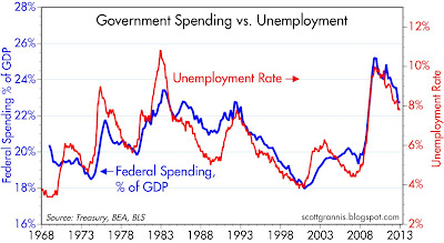
This next chart shows how there is a fairly reliable correlation between the level of government spending, as a percent of GDP, and the unemployment rate. A stronger economy reduces the need for spending of the "social safety net" variety, that much is clear. What is perhaps not so clear nor well documented is that as the relative size of government shrinks, this allows the private sector to keep more of the fruits of its efforts, and this strengthens the economy while increasing employment and reducing unemployment. This chart fairly screams its message: if we want the economy to get stronger, we need to cut back on the relative size of government! Bigger government brings with it a weaker economy, while smaller government opens up the possibility of a stronger economy. To put it another way, the private sector can spend money more efficiently and more productively than the public sector. Shrinking the public sector allows the private sector to expand, and that in turn results in more productivity and more growth.


Federal debt held by the public (including the debt that has been "purchased" by the Fed, but excluding the debt that is owed to social security and other trust funds) is now $11.6 trillion, or about 72.5% of GDP. Total debt is now $16.4 trillion, about 103% of GDP. 


At the current rate, the burden of federal debt held by the public (i.e., debt as a % of GDP) will have increased by almost 25% of GDP during President Obama's first term. That handily eclipses the increased debt burden under the two terms of President G.W. Bush (15.3%) and the two terms of President Reagan (15%).