Sunday, July 27, 2025

California Leavin'


California, with its fantastic climate, gorgeous geography and huge size, has been a mecca for millions ever since the Gold Rush. Perhaps life here has been too easy for many, and too rich for liberal politicians eager to redistribute the wealth. Democrats especially have found life to be easy, with the party having a virtual lock on state and local power centers. 

Government has become increasingly lazy and disfunctional; the roads are a mess, traffic is the bane of everyday existence, taxes and regulations are oppressive, and modest cottages start at $1 million. Famously, Los Angeles can't even keep the fire hydrants and reservoirs full. Not surprisingly, there is an ongoing exodus of state residents and many of its major corporations. The state has spent tens of billions of dollars on an absurd "bullet train" without managing to lay even one foot of track. Thank goodness Trump has put this project out of its misery. The scattered bridges and columns that have been completed should be left standing for future generations, as monuments to the stupidity and corruption of our politicians. 

As a 5th generation Californian, with ancestors dating back to the Gold Rush, it pains me to post these facts: Grok reports that "Between 2020 and 2025, approximately 500 companies have moved their headquarters out of California or shifted significant operations elsewhere, with a notable spike in relocations since 2019. From 2018 to 2021 alone, the Hoover Institution reported 352 companies relocating their headquarters out of the state."


Nuni Cademartori, my good friend and great artist, penned the above cartoon which I featured in a post almost five years ago. Back then it seemed like there was little hope for any change on the horizon.  


Sadly, things have just continued to get worse. The only thing that has changed are the names of the companies opting to move out of California, as this second cartoon illustrates. 

I especially like the signpost on the right: "Gavin Newsom Memorial Highway." Yes, Gavin Newsom deserves full credit for the deterioration of this great state. May this be a warning to the rest of the country. In case you haven't already noticed, our Guv thinks he would be an ideal choice to run the country after Trump. Heaven help us if he gets the chance!

Wednesday, July 23, 2025

Over the long haul, S&P 500 returns have been impressive


Today the S&P 500 set yet another all-time high of 6,359. 

As the chart below shows, since 1950 the S&P 500 index has increased by slightly more than 8% per year, from 16.79 to 6359. Add reinvested dividends to this and you get a total return of 11.6% per year, according to Bloomberg. If this price performance continues, and given that the current dividend yield on this index is only 1.2% a year, one could expect an investment in the S&P 500 to produce an annualized total return of almost 9.5% per year going forward. Subject, of course, to violent swings along the way, as the chart makes clear.
 

Since 1950, the Consumer Price Index has increased by about 3.5% annualized. This means that the total, inflation-adjusted return of the S&P 500 has been 7.8% annualized over the past 75+ years.

Food for thought!

Wednesday, July 16, 2025

Inflation remains low


June CPI and PPI figures were released this week, and the buzz centers around whether Trump's tariffs have boosted inflation. There is some evidence in the numbers of tariffs boosting the prices of some goods, but it would be premature—and unwise—to declare that yes, tariffs are causing a rise in inflation. 

Tariffs arbitrarily increase the price of some goods, but that is not the same as monetary stimulus, which is the only thing that can boost the overall level of prices. Absent an increase in the supply of money, higher prices for some goods will almost certainly result in lower prices for other goods. A household on a fixed budget that is faced with higher prices for food will have to cut spending on some other things.

In any event, it's difficult if not impossible to find evidence in the numbers that inflation is rising. Here are some charts to prove it:

Chart #1

Chart #2

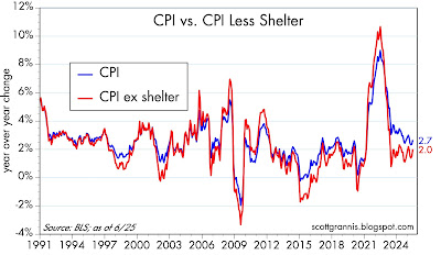
Charts #1 and #2 both focus on the CPI and the CPI without its shelter component. The first chart shows the change in these indices on a 6-month annualized basis, whereas Chart #2 shows the year over year change. I fail to see where the latest numbers have changed the overall picture. By any of these measures, inflation currently is somewhere in the neighborhood of 2-2.7%.

Moreover, according to Chart #2, the ex-shelter measure of inflation has been 2% or less for the past two years, as I've been pointing out repeatedly over the past year or so. The reason? The method the BLS uses to determine shelter costs is flawed, as illustrated in Chart #3.

Chart #3

Chart #3 is designed to show that Owner's Equivalent Rent (OER), which makes up about one-third of the CPI index, is driven by the year over year change in housing prices 18 months ago. Talk about lags! The rise in housing prices has slowed significantly over the past few years, and the most recent surveys show that housing prices are actually flat to down a bit over the past year. Yet OER purports to tell us that housing costs have increased by about 4% in the past year. Using a more contemporaneous measure of housing costs would thus yield a much lower overall rate of inflation.

Chart #4

Today the June figures for Producer Prices were released. They show inflation running at 2 to 2.5% over the past year. But as Chart #4 shows, producer prices overall have only increased 0.7% in the past three years, for a 0.2% annualized rate!

Chart #5

Chart #5 shows an index of non-energy commodity prices. Since overall inflation peaked in mid-2022, these prices are essentially unchanged

Chart #6

Chart #6 shows the price of crude oil, which is a key determinant of energy prices and which has been extremely volatile over the past 60 years. Since mid-2022, when most measures of inflation peaked, energy prices have been falling.

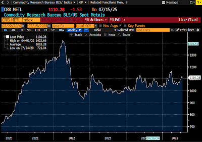
Chart #7

Chart #7 shows an index of five industrial metals prices, one of which is copper, which jumped 10% 10 days ago, thanks to a new Trump tariff. Still, metals prices overall are unchanged over the past three years. 

Inflation isn't determined by individual prices; you have to look at broad measures of prices over time. Focusing on one month's numbers is a fool's game, since monthly data are notoriously volatile.

Commodity prices have been generally stable for the past three years. This is a solid base for the conclusion that the Fed is doing a good job of keeping inflation low. 

Monday, July 14, 2025

Charts of interest


Some charts I find of interest to the general public, and which you're unlikely to find elsewhere:

Chart #1

Chart #1 sheds light on an important input to the dollar's value: real yields. The red line shows the level of real yields on 5-yr TIPS. These are true real yields, since TIPS are bonds whose principal is adjusted by the CPI, and whose coupon is a "real" yield. (Their return to the investor is equal to the rate of consumer price inflation plus a real yield.) Real yields on TIPS are determined by market forces, and are in turn influenced by the market's expectation of future Fed policy. TIPS are not only safe from default, but also safe from the ravages of inflation. 

The blue line is an index of the dollar's value vis a vis other major currencies. That the two tend to move together suggests that higher real yields enhance the value of the dollar, while lower real yields detract from the dollar's value. The situation today suggests that the dollar is trading on the weak side of where it would normally be given the current level of real yields. This further suggests that investors aren't entirely comfortable with the outlook for the U.S. economy (e.g., tariffs, deportations).

Chart #2

Chart #2 shows my model of the Purchasing Power Parity of the dollar vs. the euro. Currently, the model suggests that the dollar is just about equal to its PPP value against the euro. That further suggests that an American traveling in Europe is likely to find that the dollar price of goods and services there is roughly equal to prices in the U.S.

Chart #3

Chart #4

Chart #3 shows the level of credit spreads on Investment Grade and High-Yield corporate bonds—higher spreads reflecting greater credit risk, and lower spreads reflecting lower credit risk. Spreads today are just about as low as they have been for the past several decades. Chart #4 shows the difference between the two, which is a simple way of judging how nervous the bond market is. Taken together, these spreads are excellent barometers of the health of corporate profits, and by extension, the health of the economy. Conditions are looking pretty good according to corporate bond investors.

Charts #5 and #6

Chart #5 shows the ratio of federal transfer payments (social security, medicaid, unemployment insurance, subsidies, food stamps, etc.) to disposable income. Transfer payments represent money the government gives people money for reasons other than to compensate for their labor. Chart #6 shows the Labor Force Participation Rate, which is the ratio of people working or looking for work divided by the number of people of working age.

The dotted vertical lines mark periods of time when transfer payments ratcheted up rather sharply. That the participation rate ratcheted down each time suggests that people are less willing to work when they receive more money for not working. Funny how that works!

Note the more-than-doubling of transfer payments as a percent of disposable income from 1970 to today. Today, one of every five dollars spent by consumers comes from the government. Viewed from another angle, taxpayers are funding 20% of consumer spending. 

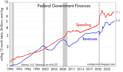
Chart #7

Chart #7 shows the breath-taking growth of federal government spending and tax receipts. Revenues today are more than 5 times what they were 35 years ago, and have increased at a 4.8% annualized rate. Spending today is more than 6 times what it was 35 years ago, and has increased at a 5.3% annualized rate. Our problem is runaway spending, not a lack of taxes.
  
Chart #8

Chart #8 shows the major components of federal revenues. Individual, corporate, and payroll taxes have all increased relentlessly with the passage of time. What stands out here is estate and gift taxes, which today represent a paltry 0.6% of total revenues (~$30 billion per year), and which have not increased at all over the past 25 years. The net worth of the private sector has quadrupled over the past quarter century, but estate and gift taxes haven't budged. This tax could be abolished and the impact on federal finances would be less than a rounding error. Yet this tax gives rise to an army of tax lawyers and accountants, while at the same time diverting trillions of dollars to sheltered investments. It undoubtedly costs the economy far more than the value the government collects. We would all be better off without it.

Thursday, July 3, 2025

The June jobs report was not strong


Today's June jobs report is being touted as strong enough to put any chance of a Fed ease on hold. That's silly, in my view. Putting things in the proper perspective, today's job report was one more in a year's worth of mediocre numbers. Private sector jobs (the ones that really count) have been growing at a 1% rate for over a year, which is consistent with real GDP growth of about 2%, a bit less than we've seen since 2010. Nothing in this report should give the Fed a reason to keep monetary policy tight.  

Friday, June 27, 2025

Big Picture charts: modest growth and low inflation


Here are 5 charts which illustrate some very important points about the state of the economy and the outlook for inflation. 

The economy is doing "Ok", but it's nothing to write home about. The housing sector is struggling mightily, and is very unlikely to improve without a boost from lower interest rates. Jobs growth is modest at best, and unlikely to improve without immigration reform which prioritizes making hard-working illegals legal instead of deportable. 

There is no longer any doubt that the Fed has tamed inflation.

Given low inflation and an economy that is struggling, there is no reason for the Fed to delay lowering interest rates. Trump is right to criticize Chairman Powell for this, but Trump could help by backing off on his egregious tariff demands and his aggressive deportations of illegals, most of whom are decent, hard-working, and tax-paying members of society. He should focus instead on lowering tax and regulatory burdens and greatly expanding immigration quotas.

Chart #1

Chart #1 is yet another update of a chart I've been featuring for the past 15 years. The green line represents the 3.1% annual growth path the economy followed from 1966 through 2007. During that time, the economy was able to rebound and regain that growth path after every recession (this is commonly referred to as the "plucked string" theory of growth). Since the end of the Great Recession in mid-2009, the economy has only managed to follow a 2.3% annual growth path (red line). If the economy had instead recovered to a 3.1% growth path it would be 23% bigger today. I've attributed this monstruous growth shortfall to increased tax and regulatory burdens and a sizable increase in transfer payments. (See my post from 11 years ago which explains this in greater detail.)

Chart #2

Chart #2 compares the year over year growth rate of private sector jobs (red line) with the year over year growth rate of real GDP (blue line). It stands to reason that without more people working it's hard for the economy to expand. Currently, jobs growth is only slightly higher than 1%, and the economy has expanded by only 2% in the past year. That 1% difference is a good approximation of productivity growth, which is less than the 1.9% annualized rate of productivity since 1966. If jobs growth doesn't pick up (and it won't if we are deporting millions of hard-working illegals), then the economy is going to continue to grow at a sluggish pace. 

Chart #3

Chart #3 compares the level of housing starts (blue line) to an index of homebuilders' sentiment (red line). There is only one interpretation: the outlook for the housing market is gloomy. Housing affordability is at all-time lows (due to the combination of high prices and high interest rates), and the inventory of unsold homes is relatively high and rising rapidly. I'm hearing talk that construction sites around Southern California are having trouble getting workers to show up—they are mostly Mexican and many are likely illegally here. Everyone is afraid of ICE raids. 

Chart #4

Chart #4 shows the year over year change in the Personal Consumption Deflators (total and core). Although both are somewhat above the Fed's target range, a closer looks says they are well within it. In the past three months (March, April, and May), the annualized rate of growth of both these inflation measures has plunged to 1.1% (total), and 1.7% (core). Powell's favorite measure, PCE core services less shelter, is up at a mere 1.1% annualized pace in the past 3 months. Note: these same three months include the impact of Trump's higher tariffs—which is to say that higher tariffs have not resulted in higher inflation by any measure. This is what I and many others predicted.  

Chart #5

Chart #5 shows the three components of the PCE deflator: services, durable goods, and non-durable goods. As should be obvious, goods prices have been flat to down for the past 3 years. Inflation is only to be found in the services sector, and shelter costs make up a large portion of that sector. Lower housing costs are going to be depressing services inflation for a long time. The Case/Shiller index of national home prices peaked earlier this year and has fallen at an annualized rate of 1.8% in the most recent 3 months. Add it all up and the outlook for inflation is LOW for the foreseeable future. I think the Fed is getting very close to realizing this, so we will soon have lower interest rates and that should help.

Despite this somewhat downbeat, near-term outlook, I remain reasonably confident that we can avoid a disaster and the economy can improve with time. Trump has been a wrecking ball in many ways, which is unfortunate, but in the process he has provoked a lot of thought and shaken up things that needed to be shaken up (corruption and waste in the federal government, immigration, trade barriers, to name just a few). Between the Abraham Accords and the targeted bombing of Iran's nuclear sites, he may well have transformed the future of the Middle East for the better. 

Friday, June 13, 2025

Household Net Worth update


Here's a quick update of charts I've been posting and writing about for a long time using recently released data for Q1/25. For more commentary, see here. The U.S. economy is an astounding engine of growth and prosperity, no doubt about it.

Chart #1

Chart #2

Chart #3

Chart #4


Wednesday, June 11, 2025

Memo to Fed: lower interest rates are overdue


The inflation news continues to get better. Indeed, inflation has beaten official expectations for the past two years—yet the Fed remains cautious. Fed-watchers are familiar with this: the Fed is always slow to catch on to the prevailing fundamentals. They waited too long to tighten (as they did throughout 2021, despite abundant evidence that M2 had exploded and measured inflation had surged), and then they waited too long to ease (not cutting rates until in late 2024, almost 18 months after inflation had fallen from 9% to 3%). 

In the past (before the Fed adopted an abundant reserves policy), such mistakes had severe consequences: once policy became tight enough to slow the inflation fueled by a delayed response to higher inflation, the economy invariably suffered a recession. Today it looks like we will avoid a recession, but that doesn't ensure we won't see some housing market turmoil. Liquidity in the housing market is terribly low and prices are unsustainably high, all on top of a surging inventory of homes for sale. And to the chagrin of would-be home buyers, 30-yr mortgage rates are hovering just under 7%—which equates to a crushing real interest rate of about 5% per year. If Fed policy had been more responsive in the past decade to swings in inflation, mortgage rates today would be far lower. 

Meanwhile, in the good news column, today's May inflation report showed that consumer prices on average rose a mere 0.1% in May, and are up only 2.4% in the past year. However, excluding shelter costs (which are now widely understood to be a seriously lagging statistic that effectively overstates current inflation), the CPI is up only 1.5% in the past year. Abstracting from shelter costs, consumer prices have risen at a 1.8% annualized rate for the past two years. In other words, inflation has been below the Fed's target for a full 2 years. Long-time readers will know that I first made this point two years ago.

Memo to Fed Chair Powell: lower interest rates are not only justified but long overdue.

Chart #1

Chart #1 illustrates the relatively large gap between headline inflation and inflation ex-shelter costs. This gap has been narrowing for the past two years (though the narrowing has been slower than I thought it would be). Excluding shelter costs, consumer price inflation has been less than 2.0% year over year in 19 of the past 24 months; on an annualized basis, ex-shelter inflation has been 1.8% over the past two years. 

Chart #2

Chart #2 shows the portion of the CPI that corresponds to shelter costs: Owner's Equivalent Rent makes up about one-third of the CPI. Shelter cost inflation by this measure has been declining for over two years. 

Chart #3

Chart #3 shows how the year over year change in housing prices 18 months ago feeds into the OER component of today's inflation. (I have shifted the red line 18 months to the left to show this.) The most recent evidence of housing prices shows that in most areas of the country, home prices are roughly flat to down. This all but ensures that the OER component of the CPI will subtract meaningfully from consumer price inflation for the next year or two.

P.S. The FOMC meets next Wednesday, so that's the earliest we could see a rate cut. However, the market is betting that there is almost no chance the Fed will lower rates next week. The market is not expecting any cuts until the September 17 FOMC meeting, and only a 20% chance of a cut at the July 30 meeting. That seems like an awfully long time to me.

Friday, June 6, 2025

Jobs growth is moderate but likely to slow


A quick post focusing on today's May '25 jobs report.

Anyone who has followed the monthly jobs numbers for a few years knows that they are volatile and subject to significant revisions from time to time. I've tried to correct for this by stepping back and trying to see the long-term trends and whether they are changing.


As this chart shows, private sector jobs (the ones that really count) have been growing at an annual rate of a bit more than 1% for most of the past 18 months. Over the past decade, private sector jobs have grown at an annualized rate of 1.3%, while real GDP growth has been about 2.3% per year. So what we are seeing today is roughly par for the course; nothing to get excited or worried about. Except that the number of immigrants entering the labor market is in the process of slowing rather dramatically, thanks to Trump's closed borders and aggressive efforts to deport illegals. My back of the envelope calculation says that without any meaningful policy changes, jobs growth is going to slow to somewhat less than 1% a year—possibly to as low as 0.6% a year by the end of this year. This is going to leave us with an economy that struggles to grow 2% a year.

This is not the stuff of booms. For a booming economy we need to see significant reductions in tax and regulatory burdens. Fortunately this is something that Trump is working hard to achieve, so there is hope for a better economy in the years to come. 

Monday, June 2, 2025

Inflation pressures were tamed a few years ago


A quick note on the latest inflation data through April '25.

Chart #1

Chart #1 shows the total and the core (ex-food and energy) measures of the Personal Consumption Deflators. The PCE deflator is a better measure than the CPI, because the weightings of its components are dynamically adjusted to account for changes in consumer behavior. Both measures are within spitting distance of the Fed's target—the PCE deflator rose only 2.1% in the year ending April '25. The big-picture takeaway here is that the surge in inflation which occurred in the wake of the Covid crisis ended in mid-2022. It's all over but the shouting.

Chart #2

Chart #2 shows the three major components of the PCE deflator. Note that durable and non-durable goods prices have been essentially flat for the past 2-3 years. In particular, raw industrial commodity prices are unchanged since October '22, while most commodity indices exhibit similar behavior, with the exception of energy prices, which have fallen significantly since mid-2022. Inflation is an issue only in the service sector, and those prices are dominated by wages and shelter costs, both of which tend to be lagging indicators of inflation pressures on the margin. Meanwhile, we know that housing prices continue to soften, and with only moderate increases in the money supply, it is likely that wage pressures will soften as well. 

Tuesday, May 27, 2025

Survey of key market fundamentals


So far, the year 2025 has been pretty wild, not least because of Hurricane Trump. I'm not the only pundit that has been struggling to make sense of things. Seven weeks ago global markets were staring into the abyss, reeling from Trump's tariff onslaught. Some degree of calm has since been restored, and even Trump is licking his wounds. 

So it's time to take a step back and survey the landscape of market fundamentals as they appear in the 11 charts which follow. With the exception of the first, all are based on variables that are driven by the interaction of market forces, rather than forecasts or policy prescriptions. Think of them as market "tea leaves" that tell a story if you know how to interpret them. The story as I see it is reasonably healthy.

Chart #1

Chart #1 shows the level of bank reserves, which the Fed creates whenever it buys mortgage-backed and Treasury securities. Prior to the end of 2008, bank reserves were measured in tens of millions of dollars; today they are orders of magnitude higher, being measured in trillions of dollars. Prior to 2008, banks were required to hold reserves (which were non-interest-bearing) at the Fed in order to collateralize their deposits. The Fed controlled short-term interest rates and the money supply by keeping the amount of reserves relatively scarce, thus forcing banks to borrow reserves if they wanted to increase their lending. 

Today, in contrast, reserves are abundant and the Fed controls short-term interest rates by paying interest on reserves. Not only are reserves now abundant and interest-bearing, they are risk-free in the bargain, making them a very attractive asset. Flush with reserves, bank balance sheets are relatively strong and the banking system has plenty of rock-solid liquidity. Gone are the days when the Fed drained reserves from the system in order to force interest rates higher, while also restricting liquidity. Abundant reserves could well explain why the economy has avoided a recession even as the Fed has tightened monetary policy. 

Chart #2

Chart #2 shows the level of 5-yr Credit Default Swap spreads. This is arguably the best and most liquid measure of the market's confidence in the outlook for the economy and corporate profits (lower spreads being good, and higher spreads bad). When investors worry about the future, they demand higher spreads (the difference between the yield on corporate bonds vs. the yield on Treasuries) to compensate for uncertainty. Today, credit spreads are only modestly elevated, which means that the market is reasonably confident in the outlook for the economy and corporate profits. Spreads today are nowhere near the levels we might expect to see if the economy were teetering on the edge of recession. Chart #3 tells the same story, using an average of the spreads on all corporate bonds. 

Chart #3

Chart #4

Chart #4 shows a measure of how much financial risk is being held by the private sector: it's the ratio of total household liabilities divided by total household assets. Private sector leverage today is an order of magnitude less than it was at its peak in 2008. This makes the economy much more resilient and able to withstand unexpected stresses. Thank goodness we have a prudent private sector to help offset our profligate public sector.

Chart #5

Chart #5 compares the level of the S&P 500 with the implied volatility of equity options. The latter is a commonly referred to as the "fear" index. Note how spikes in the fear index tend to coincide with declines in the stock market. As Hurricane Trump recedes from the headlines, fears are declining and stocks are advancing.

Chart #6

Chart #6 compares the level of real short-term interest rates (blue line) with the slope of the Treasury yield curve (red line). Note the strong tendency for recessions to be preceded by high real interest rates and inverted yield curves, both of which are the direct result of Fed monetary policy tightening actions. Those conditions have prevailed for the past several years, and so it is little wonder that there have been many predictions of imminent recession. I think we have avoided a recession this time thanks to the Fed's abundant reserves policy, as well as to the private sector's lack of appetite for leverage.

Chart #7

Chart #7 compares the level of real and nominal 5-yr Treasury yields to the difference between the two, which is the market's implied expectation for the average annual inflation rate over the next 5 years. Inflation expectations are reasonably stable these days and within spitting distance of the Fed's target. But ideally, I would prefer to see the Fed target zero inflation. A rock-solid currency is the best platform for a strong economy.  

Chart #8

Chart #8 compares the real yield on 5-yr TIPS (red) to the ex-post real yield on risk-free overnight yields (blue). Real yields on TIPS are determined by expectations for Fed tightening. That the two are roughly identical suggests the market sees Fed policy as being relatively stable at current levels for the foreseeable future.  

Chart #9


Chart #9 compares the strength of the dollar vis a vis other major currencies (blue) to the price of gold in constant dollars (red). (Note: a falling blue line represents a stronger dollar, and a rising blue line a weaker dollar.) Traditionally, gold has acted as a hedge against a declining dollar, as can be seen by the action from 1992 through 2015—a stronger dollar coincided with lower gold prices, and a weaker dollar coincided with rising gold prices. In recent years, however, this relationship has completely broken down, with gold reaching new highs even as the dollar has been relatively strong. I'm not sure what this means, but it certainly implies that gold is very expensive from a long-term viewpoint.

Chart #10

Chart #10 is constructed in a similar manner to Chart #9. It shows that until fairly recently, commodity prices (excluding oil, which is by far the most volatile of all commodity prices) have moved inversely to the strength of the dollar. I would venture to say that commodity prices look relatively expensive given the dollar's strength.

Chart #11

Chart #11 shows that real oil prices, like most commodity prices, show a strong tendency to move inversely to the strength of the dollar, even in recent years. The chart further suggests that oil is appropriately priced today given the strength of the dollar.

Wednesday, May 14, 2025

M2 charts look good


This blog is one of the few places you will find information about the all-important M2 measure of the US money supply. I've been covering this since I first began this blog in the summer of 2008. The reasons that few follow M2 are several: 1) the Fed apparently pays no attention to the money supply, 2) not many Wall Street analysts pay attention to M2, and 3) making sense of money supply is difficult in the absence of any concrete measures of money demand. I try to fill in those gaps.

These links will take you to a more in-depth discussion of this topic, but to simplify: Inflation happens when the supply of money exceeds the demand for it. M2 is arguably the best measure of money supply. Currency is arguably a proxy for money demand, as is the ratio of M2 to nominal GDP. The reason surging money supply in 2020 through early 2022 didn't create inflation is that money demand also surged. The reason that declining money supply over the past two years has not been deflationary is that money demand also declined. Today, money supply and money demand appear to be in balance, which explains why inflation has been relatively low and stable. 

Chart #1

Chart #1 shows the level of the M2 money supply. M2 grew at about a 6% pace from 1995 through 2019, a period characterized by relatively low and stable inflationm which further implies that money supply and demand were in balance. M2 then exploded from March 2020 through early 2022, but inflation started rising in early 2021; this implies that money demand started to collapse in early 2021. For the past year or so, M2 growth has picked up but inflation has slowed, which implies that money demand has begun to stabilize at a lower level (see Chart #2). 

Chart #2

Chart #3

Chart #3 shows currency in circulation (a lot of which is held overseas, by the way). I have argued that currency is a proxy for money demand because people only hold currency if they want to; unwanted currency can simply be deposited in a bank, whereupon it disappears from circulation and is returned to the Fed. Like M2, currency increased at about a 6% annual rate from 1995 through 2019. It then surged over the next year or so, even though we saw relatively low and stable inflation. The growth of currency then began to slow (and inflation to pick up) in early 2021, and has now returned to its long-term growth path, coinciding with relatively low and stable inflation.

In sum, money supply appears to be growing at a moderate but sub-normal rate, while money demand appears to be somewhat soft. That's not a recipe for rising inflation, and instead signals, in my view, that inflation will remain low and relatively stable for the foreseeable future. 

Tuesday, May 13, 2025

April CPI looking good


A quick update to my favorite CPI chart, following today's release of the April numbers:


The chart compares the year over year change in the CPI index with the same change in the CPI index ex-shelter. The ex-shelter version of the CPI has increased by 2.3% or less for the past 24 months (since May 2023), and it has averaged a mere 1.7% per year for almost two years. In the past year, overall inflation was 2.3%, and ex-shelter inflation was only 1.4%. Conclusion: only shelter costs (which I and many others believe have been overstated by faulty calculations) have kept the broader CPI from long ago meeting the Fed's objective, and their impact is continuing to fade away.

It's worth noting also that the April figures included the impact of some of Trump's tariffs, which resulted in higher prices for some imported goods. But this upward nudge to inflation was fully offset by a slower rise in prices for services. Which further illustrates how, when monetary policy is doing a good job, rising prices for some things are perforce offset by lower prices for others. 

Wednesday, April 16, 2025

More on Trump's terrible tariffs


Here is a must-read article on the folly of Trump's tariff policy: Trump’s Tariffs Are as Bad as Bidenomics, from the April 15, 2025 edition of the WSJ.

Key excerpts:

The logic of the Trump protectionist policy is that a nation can become richer by producing at home products that it could buy more cheaply abroad. Not only does this defy reason, but the administration has presented no evidence showing how the U.S. or any other nation has benefited economically from broadbased protectionist policies.

The president’s trade policies focus exclusively on manufacturing, never mentioning America’s massive surplus in the services sector, where wages are now on average higher than in manufacturing.

In 2018, Mr. Trump imposed tariffs on washing machines, raising the cost consumers paid for these appliances by more than $1.5 billion annually while bringing in only $82 million in customs revenue. Even after netting out the tax revenue, the average annual cost to American consumers of each job created by these tariffs was north of $815,000, roughly 19 times the average annual salary earned in 2018 by production-line workers employed in manufacturing appliances.

-------------
Blogging will be light for the rest of the month since I am spending some time Italy.

Thursday, April 10, 2025

Trump's Tariffic Mistake


I'm a fan of nearly everything Trump has done this year, with the exception of his Terrible Tariffs. As I and many others have explained, Trump's threat to raise tariffs is a terrible idea because they're meant to fix something that isn't broken (Trump's claims to the contrary notwithstanding).

Our trade deficit with China, for example, means that we buy more goods and services from China than they buy from us. The difference, termed the trade "deficit," is evidence, in Trump's mind, that China is "ripping us off." But by the laws of commerce, he who sells more goods and services than he buys must do something with the net amount of money he receives. In the case of China-U.S. trade, the dollars China earns from its commerce with the US must inevitably find their way back to us in the form of investment, security or bond purchases, or simply bank deposits. Simply put: you can't spend dollars in China.

China is not ripping us off because it already spends everything it earns from our trade deficit. In economic jargon, the deficit in goods and services we have with China is completely offset by a surplus in our capital account.

Where Trump has a legitimate beef with China and other countries is their use of tariffs to make US goods and services expensive and thus reduce their demand for our stuff. They would be better off—and so would all of us—if no one used tariffs. Free global trade is nirvana for everyone. Everyone wins when tariffs are zero.

Trump understood this back in 2018 when he said during a discussion with G7 leaders that all countries should eliminate tariffs and subsidies, because that would be "true free trade." Has he forgotten what he once believed in and fully understood?

You might think so after living through the global financial turmoil of the past week or so. It was a nightmare scenario. Trump was a madman determined to wreak havoc among global economies and global trade. I was so anguished I could only think that the prospects were so awful that Trump would be forced to back off. This couldn't go on. And suddenly, yesterday, it didn't. Trump gave everyone except China a 90 day reprieve and markets rejoiced. Today, however, second thoughts were creeping back in.

I agree with what Bill Ackman said yesterday. By waiting until panic set in before announcing a reprieve, Trump forced the world to see first-hand what the results of a global tariff war would lead to. And he also put tremendous pressure on China, the biggest bad actor of global trade, to change its ways. It was a master-stroke of persuasion. Until yesterday I had begun to fear that Trump was making a huge mistake. Now my fears have been assuaged. We're not out of the tariff woods yet, but the prospects for a favorable resolution have improved dramatically. Maybe those tariffs Trump threatened weren't so bad after all, if they help the world understand how bad they can be. 

Now let me comment briefly on today's CPI release, which was a pleasant surprise. The chart below says it all:

Chart #1

Chart #1 compares the year over year change in the CPI index with the same change in the CPI index ex-shelter. The ex-shelter version of the CPI has increased by 2.3% or less for the past 23 months (since May 2023), and it has averaged a mere 1.7% per year for almost two years. In the past year, ex-shelter inflation was only 1.5%. Only shelter costs have kept the broader CPI from long ago meeting the Fed's objective, and their impact is continuing to fade away. 

To repeat what I said months ago, tariffs don't cause inflation. Only monetary policy causes inflation. So far the Fed has been doing a pretty good job of neutralizing the monetary excesses of 2020 and 2021.

Chart #2

As Chart #2 shows, the M2 measure of the money supply is within shouting distance of the long-term trend growth that prevailed from 1995 through 2019. Excess money has all but disappeared, and Chart #1 goes a long way to proving it.

UPDATES (4/23/25): 
The March data on M2 continue the trend described above. M2 is basically unchanged over the past three years, and is up at a modest rate of 4.1% over the past year. Excess money has been drained from the economy. Credit spreads have backed off from their recent highs and are far short of flashing even a modest yellow signal. Bank reserves remain abundant ($3.45 trillion) and the Fed is no longer threatening to make them scarce.

Trump got schooled by the market, so now he's dialing back his tariff threats. This is very good news. Tariffs are taxes, and nobody needs higher taxes right now. Paring back spending by streamlining our bloated bureaucracy is the best way to fix what's wrong with the economy. Let's do more of it. 

Meanwhile, I won't feel comfortable until Stephen Marin, Trump's Chairman of the Council of Economic Advisers, and Peter Navarro, his tariff-loving trade advisor, are banned from the White House. Both advocate industrial policy on a global scale (e.g., devalue the dollar to promote US exports, and jack up tariffs on countries that don't buy enough of our goods) that has NEVER worked anywhere for anyone. 

I would also like to see gold fall back to $2,500/oz. The current level of $3,300 is just way too high, reflecting extreme levels of discomfort and fear that are incompatible with a healthy economic environment.