Monday, April 27, 2020

Things are looking up

The Covid-19 crisis is not over yet, but the light at the end of the tunnel is getting much brighter. Key financial indicators are moving in a healthy direction, and most countries are seeing clear signs that the viral outbreak is under control.

Here are some chart updates, followed by my impressions of the key things we have learned so far about the coronavirus:

Chart #1

As Chart #1 shows, the Fed has responded rapidly and decisively to the Covid-19 crisis by almost doubling the supply of excess bank reserves in the span of about 6 weeks. This was accomplished by massive purchases of notes and bonds. As with other periods of Quantitative Easing, this most recent move was not massive money printing: it was simply the transmogrification of notes and bonds into bank reserves, which are effectively T-bill substitutes. The economic shutdowns that were sparked by the novel virus caused a sudden and dramatic increase in the world's demand for safe assets, and it looks more and more like the Fed and other central banks have done their job and accommodated the increased money demand with an increased supply of risk-free liquidity. Central bank actions effectively short-circuited what could have been another threatened collapse of financial markets. Bravo!

Chart #2

Chart #2 shows the 3-mo annualized growth in bank savings and demand deposits. This is another way of demonstrating how strong the demand for money has become (off the charts strong) given the uncertainties of the virus and the economic shutdowns. 

Chart #3

The Fed's huge injection of bank reserves facilitated a surge of lending to small and medium-sized business, as Chart #3 shows. This in turn backstops businesses that must survive a period of zero revenues as a result of being forced to close their doors for a month or so.

Chart #4

Chart #4 shows the TED spread—the difference between 3-mo Treasury bill yields and 3-mo LIBOR. This spread is a barometer of the market's confidence in banking systems (tighter spreads = more confidence, and vice versa). Spreads are still elevated, but have come well off their initial surge, and they are nowhere near as wide as they were during most of the 2008-9 financial crisis. The main area of concern for credit markets remains the energy sector, since oil prices have tumbled.

Chart #5

The huge decline in oil prices can be traced to global economic shutdowns. In the US we saw an almost immediate 50% drop in automobile traffic, and that shows up in Chart #5, which shows the plunge in motor gasoline supplied (in thousands of barrels per day terms). Recently there are signs that drivers are beginning to return to the highways, and this will only increase as more and more states lift their lockdowns. That in turn will ease the strain on bulging gasoline inventories and sooner or later allow oil prices to move back in the direction of pre-crisis levels.

Chart #6

Chart #6 compares the level of the S&P 500 index with the Vix index, a measure of the market's fear, uncertainty and doubt. Fears have declined significantly from their peak of about a month ago, but the Vix is still quite elevated. Equities have recovered just over half of what they lost, which is not too bad, given the magnitude of the economic slowdowns that have occurred all over the world. Arguably, the Fed gets a good deal of the credit for limiting the equity market's panic. How? By supplying plenty of liquidity. Presumably, this minimizes the hurdles that economies will have to clear in order to successfully reopen. At this point, all that stands in the way of a reopening are the signatures of the nation's governors lifting their lockdowns.

Chart #7

US equity markets have fared much better than their Eurozone counterparts, as Chart #7 shows. 

Chart #8

Chart #8 shows my calculation of the burden of our federal debt (debt owed to the public, which now stands at $18.8 trillion). I've estimated total interest costs for the debt for the period April through June, and I've guessed that nominal GDP will decline by about 15% in the first half of this year. Repeat: these are my estimates and they are very likely to be wrong to some degree since it is extremely difficult at this point to judge how badly GDP will be affected by economic shutdowns. Regardless, I think the magnitude of the debt burden is very unlikely be much higher than what I estimate, and even then it will still be much lower than it was for most of the 1980s and early 90s. In short, we are not facing imminent financial disaster as a nation.

Chart #9

I used ourworldindata.org to produce Chart #12. I selected 5 countries and compared them on the basis of total covid-19 deaths per million of population. The dotted red line is the US. Note that all 5 countries (indeed almost ALL countries) have seen a pronounced slowdown in the rate of growth of covid-19 deaths. This shows up as a flattening of the curve, which uses a semi-log scale for the y-axis. In short, the growth of deaths has slowed dramatically, which proves that the virus is no longer spreading at dangerous geometric rates. Note also that the experience of Sweden, which has not resorted to the use of mandatory lockdowns, is substantially similar to that of other European countries and to the US. The virus is running its course, with or without government shutdown help.

What follows is my summary and impressions of the emerging facts surrounding the covid-19 crisis:

More and more analysts are finding that shutdowns haven’t resulted in better results than non-shutdowns. Sweden is the perfect example.

As more and more testing is conducted (especially antibody testing), the denominator of the covid-19 fatality rate (i.e., the total number of people infected) is growing rapidly, and the overall fatality rate is falling. Current estimates place it as low as 0.02% and as high as 0.2%. (The fatality rate of the common flu is 0.1%.)

As the number of those infected and with covid-19 antibodies soars, we are seeing that the vast majority of those who become infected either never experience symptoms or have only mild symptoms.

For anyone who is healthy and under the age of 65, the risk of death by covid is negligible. Thus it is foolish to quarantine everyone, especially those of school age. Isolating children only delays the buildup of herd immunity and raises the risk of a second wave when the flu season starts in October (children have almost a zero chance of dying from covid-19).

The virus is highly contagious but rarely deadly, except for those who are 65 and older and have a pre-existing health condition. 

Sunshine is the best disinfectant. Being indoors or in any confined space with others for a sustained period of time is unwise and risky, especially for those in the high-risk categories. Thus the mandate to “shelter at home”, and to close parks, beaches and trails was exactly the wrong course of action.

The number of daily new cases is growing by a much slower rate each day or declining in almost all countries and states. Thus, we have almost certainly seen the peak of the pandemic.

The number of days it takes for covid deaths to double (a bullet-proof indicator of how fast the virus is spreading) is increasing dramatically almost everywhere. Thus, we can be almost certain that the virus is no longer spreading geometrically. One factor driving this is seasonality, as temperatures warm up and people are exposed to more sun. The other factor is growing herd immunity. Better medical attention helps as well (including therapeutics such as HCQ). In the early days of the pandemic, days-to-double began at 2; in the US it’s now 23, in the world 18, in the world ex-China 15, in New York 14, In Italy 43, in France 33, in Sweden 30, and in S. Korea 67. Note that Sweden (with no shutdown) is on par with France and better than Italy, both of which instituted dramatic shutdowns.

21 states now meet the federal “reopening” criterion of a 14-day downward trajectory of daily new cases. 22 states meet the criterion of a 14-day downward trajectory in the percentage of tests with positive results. California already meets the second, but not the first. New York (yes, NY!) meets both.

The initial predictions of deaths and hospital over-crowding were so far off the mark (i.e., way too high) as to be almost criminal. The biggest problem most hospitals face today is bankruptcy because so many beds are empty. The mandate that hospitals should accept only covid patients was also criminal. Furthermore, the projected shortage of ventilators—a major factor driving the decision to shut down the economy in order to “flatten the curve”—was a criminal distraction, because it is now clear that curves have flattened everywhere and ventilators are only marginally helpful in preventing deaths. New York is now giving away tens of thousands of ventilators that were never used.

It is now painfully obvious that "The shutdown of the US economy will prove to be the most expensive self-inflicted injury in the history of mankind.™"

It should also be painfully obvious that we should reopen economies asap.

UPDATE: For more information about the risks of being outdoors, indoors, and of a certain age, see Heather Mac Donald’s recent excellent article here. It’s high time we cease wearing masks while walking outdoors or driving our cars.

UPDATE: Highly recommend watching the latest interview (April 28) with Prof Knut Wittkowski here

Thursday, April 23, 2020

The intolerable shut-down must end


Chart #1

Chart #1 shows what I estimate the total loss of private sector jobs has been since most of the country went into lockdown. It's just about the worst economic catastrophe imaginable: over 26 million people have been sent home and forced to apply for unemployment insurance. To date I am unaware of how many public sector employees have been affected, but I'd bet it's very few. Eric Garcetti (Mayor of Los Angeles) announced last Sunday that thousands of city workers will be "furloughed" beginning this July, but that only translates into a 10% drop in their incomes, not their jobs. 

The disparity between the massive suffering imposed on private sector workers and the extremely limited impact on public sector workers can only exacerbate the feelings of frustration that are building across the country. I think people are beginning to realize that we consented to the shut-down strategy in the belief that doing otherwise would result in millions of deaths. A shut-down was necessary to "flatten the curve," and that has been achieved throughout most of the US. It is pointless to continue the shut-down, since the virus can only be contained by immunity, which in turn is achieved by infection or by vaccination, and the latter is still far in the future.

So why not begin the reopening? Hospitals throughout the country are so empty (having forbidden elective surgeries and having received far fewer covid-19 patients than originally projected) that many are teetering on the verge of bankruptcy. The 14-day moving average of daily new cases (an official criterion for reopening) is now falling significantly in at least 20 states (most impressively in New York), and it has flattened in at least 14 other states. New studies reveal that many millions have already been infected, yet only a few have been sick enough to seek treatment or a test. It's becoming crystal clear that the vast majority of deaths occur only among people who were already suffering from a co-morbidity; for healthy people under the age of 65, the risk of dying from covid-19 is negligible, according to Stanford Professor Ioaniddis.

Yet we are still under the thumb of bureaucrats and politicians who were quick to impose draconian shutdown measures but are now very slow to embrace any reopening. Tens of millions are going stir-crazy, millions fear the loss of their business and/or their livelihoods, millions are standing in breadlines and virtually all students are studying at home while staring at computer screens (yet these are the ones with almost no chance of suffering serious consequences from a Covid-19 infection). But the ones calling the shots are still getting paid (and many handsomely) and still fully-employed. There is a precedent for this, and it portends more social unrest in the days and weeks to come. A good friend of mine, H. Cademartori, penned this cartoon with these thoughts in mind:


If there's a silver lining to this massive unemployment cloud, it's that Congress decided—in a paroxysm of generosity—to add $600/week to each unemployment check through the end of July. Unfortunately, the Law of Unintended Consequences promptly kicked in, as many workers suddenly discovered they would be earning far more while unemployed than they were previously making while working. This will make it much more difficult for employers to restart their businesses, especially in the restaurant industry. "Call me August 1st" will be the answer that many employers receive when asking their workforce to come back.

Recovery from this shutdown will likely be painfully slow for awhile, but it will happen, and at some point—probably on or about August 1st—it should begin in earnest. I'm still planning to take the family to Maui in August.

UPDATE (April 24): I highly recommend this article by Scott Atlas. It is a succinct and compelling summary of what we know so far about the coronavirus and why it is time to end the shutdown: "Strictly protect the known vulnerable, self-isolate the mildly sick and open most workplaces and small businesses with some prudent large-group precautions."

UPDATE (April 25): I also highly recommend this article by George Gilder. “... since the virus has already spread widely in the general population, efforts to stop further spread are both futile and destructive. So let’s stop pretending that our policies have been rational and need to be phased out, as if they once had a purpose. They should be reversed summarily and acknowledged to be a mistake, perpetrated by statisticians with erroneous computer models.” HT W. Smith

Monday, April 20, 2020

Oil prices actually have not collapsed

If you've been alarmed by the headline "Oil plunges below $10/bbl," don't be.

Chart #1
=

It's only a temporary phenomenon, brought on by the sudden collapse of oil demand (see Chart #4 in my previous post for more info). As Chart #1 shows, it's only the front-month oil contract (yellow) that has plunged. The December '20 contract (white) has actually been rallying since its March 18 low. The problem is a lack of storage, which has forced those were long the front contract to get out of their position (i.e., sell) since they have nowhere to store the oil that will be delivered to them per the terms of the about-to-expire contract. The price of oil per future contracts has remained relatively stable, averaging about $30.

The bottom portion of Chart#1 reflects the spread between the front-month contract and the December '20 contract. That spread is by far the largest that has ever occurred in decades, which is befitting the fact that the plunge in oil demand has never been so severe and so sudden. 

Sunday, April 19, 2020

The beginning of the end of the shutdown

‘This is the worst it’s ever been’: L.A. Mayor announces city worker furloughs during State of the City address.

More than HALF of Los Angeles workers are now unemployed just one month into coronavirus lockdowns.

FINALLY, politicians are realizing that the shutdown of the US economy is a huge disaster. Air travel at LAX is down 95%. City revenues are evaporating. 

This extreme and utterly depressing news is actually good news, since it means that the politicians that ordered the shutdown are now feeling the consequences. Before, they were acting nobly, to save millions of lives. Now they realize they have jeopardized everyone's lives—and their own futures—by shutting down the economy. When people discover they have skin in the game, their perspective shifts. They are no longer a spectator, they become a participant. 

Welcome to the real world, Eric.

HT: Glenn Reynolds, my nominee for Most Valuable Citizen-Journalist.

Reminder: The shutdown of the US economy will prove to be the most expensive self-inflicted injury in the history of mankind.™

Thursday, April 16, 2020

Off the charts

Here's a quick compilation of charts that exhibit never-before-seen moves in various economic indices. Taken together, they illustrate just how much the current shutdown of the US economy is something we've never seen before. And to think it was all the result of the appearance of a novel coronavirus and the decisions of politicians around the globe—egged on by supposed experts—to impose draconian conditions on the free movement and interaction of most of the modern world's population in an effort to stem the spread of the virus. Not to stop the virus, however, because at this point the virus cannot be eliminated—its spread can only be retarded. Sooner or later most of us will have been infected by the virus (and/or vaccinated) and somewhat more of us than is usual during perennial viral outbreaks will die. It's a tragic situation, but by no means does it approach the level of prior global pandemics. And, I would suggest, nor does it justify such unprecedented shutdown actions. It looks more and more like the cure for this virus is worse than the disease.

Chart #1

Based on today's March unemployment claims report, some 22 million people (almost all from the private sector) have lost their jobs and are now subsisting on unemployment insurance (see Chart #1). This virus has returned US employment numbers to levels last seen at the depths of the Great Recession in late 2009. 11 years of progress have gone down the drain in a matter of weeks.

Chart #2

Although residential construction has been deemed to be "essential" (and its workforce thus allowed to continue working), home builders (red line in Chart #2) have suddenly lost almost all confidence in the future of their business. Housing starts have collapsed, but they will most likely fall further in the months to come. Such declines are sure-fire indicators of recessionary conditions. Think of the ripple effects of this on any number of industries dependent on housing.

Chart #3

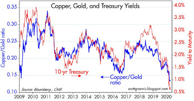
As Chart #3 shows, the ratio of copper to gold prices (blue line) has never before been so low. Traditionally, this ratio is strongly suggestive of the underlying growth dynamics of the US economy (a rising ratio being symptomatic of improving conditions, and vice versa). Moreover, 10-yr Treasury yields (red line) are now at all-time lows, which is also symptomatic of extremely weak economic growth potential. The only ray of hope I see here is that yields tend to move more at their extremes than does the copper/gold ratio, which in turn suggests that we may be at or close to the point of maximum weakness.

Chart #4

As Chart #4 shows, the shutdown of the US economy has had a profound impact on Americans' mobility. Gasoline demand has, almost overnight, fallen by roughly 50%. The only silver lining to this very dark cloud that I can see is the complete absence of traffic on Los Angeles-area freeways—and the utter disappearance of what little smog we had. This also illustrates how the law of unforeseen consequences works; force people to stay home, which forces many businesses to shut down, which sharply reduces commuter traffic, which slashes gasoline consumption, which leaves business that depend on mobile customers in the lurch (automobile dealers, gas stations, restaurants, malls, etc.) Overnight the economy has been subject to conditions that could never have been foreseen even in the worst of worst-case scenarios, and which impact almost every aspect of modern life. It's nothing short of a disaster. Thanks, politicians, for giving us a man-made disaster which surely eclipses the worst of earthquakes, tornadoes, and earthquakes. (Reminder: The shutdown of the US economy will prove to be the most expensive self-inflicted injury in the history of mankind. ™)

Chart #5

Chart #5 shows the average nationwide price of a gallon of regular gas at the pump. That it hasn't fallen  further is likely a testament to the degree to which taxes now constitute a major portion of the cost to the consumer. I've seen reports that in some areas wholesale gasoline prices are near zero, and that's likely due to the fact that storage capacity has declined to absolute minimum levels.

Chart #6

Chart #6 illustrates the ratio of gold to crude oil prices. Never before has oil been so cheap relative to gold. That's the result of extremely low oil prices (~$20/barrel) and historically high gold prices (~$1700/oz.) Either gold is too expensive or oil is too cheap or some combination of the two. Such a sudden and radical change in relative prices is unlikely to persist for long. Will politicians please put on their pants and declare the shutdown over ...

Chart #7


Chart #8

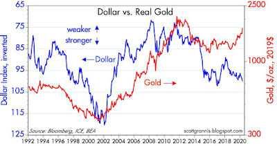
Chart #7 compares the value of the dollar (vis a vis a trade-weighted basket of other major currencies, and inverted), to the price of gold. Traditionally, periods of dollar weakness have coincided with periods of gold strength. But for the past two years or so we have seen the dollar and gold both strengthen. This is almost unprecedented, especially since, as Chart #8 shows, non-energy commodity prices have traditionally weakened as the dollar has strengthened and vice versa. Gold is the outlier these days. That could mean that the world is exceptionally risk-averse, or it could mean that the world fears that massive easing by the world's central banks will usher in a new era of rising inflation. Or both. I'll vote for the latter, but without maximum conviction.

Sunday, April 12, 2020

The crisis is over, but at terrible cost

To date, the most consequential result of this novel coronavirus has come from the hand of government, thanks to multiple decrees from governors, mayors, and public health officials mandating the closure of a broad swath of the US economy. Arguably, the cost of shutting down the economy in terms of jobs, living standards, and money has been far greater than the cost of virus-induced deaths, which have turned out to be orders of magnitude less than initially predicted, even by models which factored in severe social distancing. As I like to put it, "The shutdown of the US economy will prove to be the most expensive self-inflicted injury in the history of mankind.™"

Earlier this year. headlines were screaming that millions would die and hospitals would be overflowing with desperately ill patients. Early estimates (mid-February) pegged the fatality rate at 2-4% (20 times more lethal than the common flu!). More recently, better-informed analysts, including Dr. Fauci, have estimated the lethality rate to be 0.2%, only double that of the common flu. Several other estimates of lethality can be found here, many of which say it is far lower than most have thought, but do read the entirety of this linked page as it will amaze you. Some speculate that covid-19's lethality could be much less than the flu, based on the (still unproven) theory that it began to spread rapidly through areas such as the California economy beginning in October of last year, and has thus left millions with protective antibodies. One curious fact about this virus is that the majority of people infected never even realize they have it, while for the unlucky few (mainly the elderly and those already besieged by another grave illness) it is quite deadly. We are now learning that only 0.9% of US deaths from coronavirus correspond to people who were younger than 65 and had no pre-existing conditions!

The IMHE—which has repeatedly and greatly over-estimated the dangers of the coronavirus—now predicts that we have seen the peak in daily US deaths, and they should begin to decline. Further the IMHE now predicts total deaths in the US will be a little over 60,000, which is somewhat more than the 45,000 or so deaths we would expect from the seasonal flu. All of the current predictions are significantly lower (about one-third lower) than the IMHE predicted just one week ago.

In Europe, the evidence is strong that the worst of the viral contagion has passed. Daily new cases and daily new deaths have been declining in almost every major European country for the past week or two. Nearly every country in the world is experiencing a flattening curve; the rate of growth of daily new cases is steadily decreasing.

Meanwhile, there are multiple vaccines in the pipeline and therapeutics aplenty, most notably hydroxycholoroquine, which I noted in a post over two weeks ago.

Regardless, and unfortunately, the millions-of-dead nightmare scenario was enough to persuade public officials to take the most drastic course of action ever contemplated, with the result that at least 17 million American workers have lost their jobs in just a few weeks and economic activity has plunged so drastically that the world is awash in unwanted petroleum. To make matters worse, our federal government had no choice but to offer extraordinary unemployment benefits to tens of millions of workers who could no longer work, and many hundreds of billions in loans to otherwise suddenly-insolvent businesses. Estimates of what is deceptively called fiscal "stimulus" start at $2 trillion and the final tab could easily reach $4 trillion. The problem with all this, of course, is that it is not stimulus, it's just an attempt to compensate people who lose their jobs and businesses who were forced to shut down.

If we had known at the outset that the virus would end up being far less lethal than it was predicted to be, and instead only somewhat more lethal than the ordinary flu, would we have agreed to surrender our liberties and allow the government to order tens of millions to stop working? I seriously doubt it, and that leads to the inevitable conclusion: this shutdown was a terrible and tragic mistake.

Ultimately, the cost of this mistake will be borne by all of us. The rich will pick up a goodly portion of the tab because they always end up paying the lion's share of taxes, thanks to our very progressive tax code. Everyone will pick up part of the tab in the form of reduced living standards (and lower-than-otherwise incomes), since it will likely take many years for the economy to make up for all the ground lost as a result of the shutdown. We will also pay an invisible price in the form of less social interaction, less travel, less community, and more government control of our lives, and that is far from insignificant.

Another cost: government is likely to find it difficult to persuade itself and the public of the need to re-open the economy (which it should do now, asap), if only because the public has come to understand that the shutdown is necessary to avoid deaths. It's not. The only justification for the shutdown was to "flatten the curve," because otherwise our healthcare system would suffer a meltdown. We now know that this will not happen, as hospitals around the country have ample unused beds, and the rate of infections is declining. The virus will run its course regardless of whether we shut down the economy. It won't end until we have sufficient herd immunity, and that will be acquired only through illness (which produces antibodies and future immunity) and through vaccines (which induce the production of antibodies, but which are still many months in the future). For more details on this, see the anonymous FT reader's comment at this link. Failing to understand that more deaths are inevitable is likely to prolong the (now unnecessary) shutdown.

Bondholders might be the biggest monetary losers. They will be funding many trillions of dollars of "stimulus" at historically-low interest rates. If and when the economy recovers, interest rates are bound to rise, if only because right now they are well below the current rate of inflation. But with so much money being dumped into the economy—money which now is desperately needed and wanted—it might be difficult for the Fed to withdraw it when things improve and the demand for money returns to normal. There could be a significant excess supply of money at some point which would almost surely result in rising inflation.

A quick and dirty, back-of-the-envelope calculation:
Suppose Treasury sells $3 trillion of bonds with an average duration of about 7 years (equivalent to an average maturity of about 8 years) at the prevailing rate of roughly 0.5%. Suppose further that inflation rises from the current 2% to 4%. Bond yields would have to rise to at least 5% in a 4% inflation world (and a world that is once again growing), and that rise in yields would depress bond prices by almost one-third. That, in turn, would represent about a $1 trillion loss born by bondholders and a $1 trillion gain which would accrue to Treasury, because the effective burden of the debt—and the purchasing power of the bonds—would be reduced by inflation. Even if nothing changed, 0.5% Treasury yields represent a 1½% annual loss of purchasing power to bondholders in a 2% inflation world. Bondholders will pay an inflation tax to Treasury even if inflation and interest rates don't rise. Memo to investors: if you think this scenario is likely, you should buy assets (e.g, houses) that will benefit from rising prices, and fund the purchase with fixed-rate debt.
And now it's time for some charts, followed by some conclusions:

Chart #1

As Chart #1 shows, stocks have rebounded—recovering almost half of what they lost—and investors' fears have declined. But fear is still quite palpable: 10-yr Treasury yields are extremely low, far lower (currently 0.7%) than at any time in the past century, and the Vix, currently at 40+, is still exceptionally elevated. Conclusion: the stock market is looking across the valley of despair and seeing an exit from the shutdown and a taming of the virus, but the market has yet to conclude that much good will come of this. The road to recovery is going to be slow and bumpy, but the worst is over.

To what degree the stock market will continue to recover, and by how much, is above my pay grade. But looking out over the long-term horizon, it seems clear that the economy will recover and growth will resume. So I won't be selling. Cash is paying almost nothing and most risk-free bonds ensure you will lose significant purchasing power for years to come (see below for more about this). Stocks, distressed debt, commodities and real estate are the only sensible asset classes at this point, since they give you exposure to rising inflation and/or a growing economy.

Chart #2

Chart #2 compares private sector jobs (blue) with public sector jobs (red). Wow: almost overnight we have wiped out all the net job gains of the past 14 years, and the losses aren't over yet. Private sector jobs have dropped more than 13% to date. Here's a thought: to my knowledge not a single public sector employee has lost his or her job. Some or many may have been sent home, but have any been forced to endure a visit to the unemployment office? Would politicians have been so quick to decree a shutdown if that meant that 13% of public sector employees were fired along with 13% of private employees? Doesn't fairness demand that the public sector share in the pain of the shutdown? There is potential for great anger here.

Chart #3

As Chart #3 shows, consumer confidence has been shattered, and it's likely to fall further in the next survey, probably coming close to what happened at the depths of the Great Recession. It could take years for confidence to be rebuilt, just as it did in the wake of the Great Recession. And don't forget the younger generation, which has been traumatized by fears of catching or passing on a deadly virus. Our grandchildren won't come any closer than 10 feet from us, and they haven't had any contact with the outside world in weeks. When I see a person walking on an empty street in Southern California and wearing a mask, I see a person who won't lose his fear of social interaction for years.

Chart #4

As Chart #4 shows, the Fed wasted no time in responding to a sudden increase in the demand for money by supplying the banking system with more than $1 trillion in additional bank reserves. 

Chart #5

The virus panic, the shutdown, and the one-third drop in stock prices combined to produce a tremendous demand for the safety of cash, money, and money equivalents. The last time this happened (late 2008) global financial markets were on the cusp of collapse because there was a sudden and drastic shortage of cash and liquidity. Without functioning financial markets, which absolutely require liquidity and safe assets, there is no hope for an economic recovery; cutting off the free flow of money would be like shutting off the oxygen to a desperately ill economic patient. So it's a very good thing that the Fed has responded forcefully to the coronavirus crisis. Chart #5 shows the 3-mo. annualized growth in the sum of demand deposits and savings deposits at US banks: it's explosive, and the Fed has successfully accommodated this.

Chart #6

Chart #6 gives you the big-picture view of money, as measured by M2. Demand and savings deposits now represent about 75% of M2. As the chart suggests, about half of the recent increase in M2 was to make up for the unusually slow growth in money in recent years, and the other half was likely the result of a massive flight to safety. You may think we are in uncharted monetary territory, but we're not there yet.

Chart #7

Chart #8

As Charts #7 and #8 show, banks have been quick to expand their lending to small and medium-sized business.  C&I Loans are up more than $500 billion in the past 3 reporting weeks, and more is sure to come.

Chart #9

Chart #9 shows that 2-yr swap spreads in both the US and the Eurozone have risen of late. But they are not excessively high. Indeed, at 20+ bps in the US, they are smack in the middle of what might be called a "normal" zone. They were exceptionally low not too long ago, and I speculate that was due to a shortage physical bonds that could be used as collateral for hedges (i.e., the market had to resort to buying swap spreads instead of buying Treasury notes). Swap spreads today tell us that systemic risk is low liquidity is abundant, and that is a very good thing.

Chart #10

Chart #10 shows Credit Default Swap spreads, which are highly liquid and generic proxies for corporate credit risk. Spreads shot higher as the crisis deepened (and in particular as collapsing oil prices threatened the solvency of indebted oil producers), but the Fed's aggressive actions of late have reversed this. Today's recently-announced deal to cut oil production will surely help. The market has pulled back from the edge of the abyss, and thank goodness!

Chart #11

Chart #12

Chart #11 shows actual corporate credit spreads, which have behaved similarly to CDS spreads. Chart #11 makes the point that the energy sector has been the principal driver of higher spreads. Wider spreads are mostly about extremely low oil prices, which ought to improve as producers slash production and the economy begins to re-open.

Chart #13

Chart #14

Charts #13 and #14 show that energy prices are the principal source of fluctuations in the CPI. As Chart #13 demonstrates, if we subtract energy prices from the CPI, inflation has averaged 2% for the past 17 years. In the absence of tight monetary policy (and there is no evidence right now that the Fed is too tight), it is reasonable to expect inflation to average about 2% or a bit less in coming years.

Chart #15

Chart #15 compares 5-yr Treasury yields with ex-energy consumer price inflation. Yields are far below the current level of inflation, and that is unsustainable for the long term. Inflation is unlikely to decline significantly, given the Fed's aggressive accommodation of soaring money demand. Once the economy stops contracting and returns to growth mode, all interest rates should rise, and by a significant amount.

Chart #16

In their traditional roles, both gold and TIPS are hedges against rising inflation. As Chart #16 shows, the prices of both are quite elevated, suggesting a market that is very worried about the potential for rising inflation. This runs contrary to the relatively low expected level of inflation (about 1%) that can be inferred by comparing the yields of nominal and real yields in the Treasury market, but it is possible that Treasury prices are being skewed by the current level of panicked demand for anything deemed safe.

Conclusions:

Whether we experience a near-term recovery, and whether it's V-shaped or U-shaped or strong or weak will depend on how soon and how rapidly the economy is allowed to re-open. If it were up to me, I'd start the re-opening tomorrow. Unfortunately, I don't think the current political climate would support that, and it's doubly disappointing to hear so many people talking about a May 15th re-opening. The worst has passed, but it's going to be an agonizing wait for good news, which means continued volatility.

The Fed has done what it needed to do. It hasn't been "stimulative" because monetary policy can't create growth on the printing press. The Fed has accommodated the sudden increase in the demand for money and money equivalents, and that's their job. 

Fiscal policy to date has helped, to the degree it has attempted to compensate economic actors for their enforced losses. But it hasn't been stimulative. Stimulative fiscal policy involves something that gives workers and companies an incentive to work harder. Paying out larger unemployment checks for longer doesn't do that. A payroll tax holiday lasting through year-end would (which is what Art Laffer has been recommending), because it would increase the after-tax reward to work and reduce the cost of labor for what is left of the current calendar year. (Workers would see an immediate increase in their paycheck if they were working, and employers would see an immediate reduction in the cost of paying salaries.) If we see that policy emerging from the current mess that would be very positive. 

Even if the current mess continues for too long, the stock market should be able to look across the valley of weak-to-zero earnings and focus instead on the long-term, since eventually we will get back to something close to normal. A one-year cessation of earnings does not materially affect the present discounted value of decades of positive earnings.

The current elevated level of gold and TIPS prices is, among other things, symptomatic of a market that worries about higher inflation in the future. And as I've explained above, that is not unreasonable at all. Thus we should disregard the risks of deflation and focus instead on what will benefit from steady to higher inflation (e.g., commodities, emerging markets, distressed debt, real estate, nominal wages, and federal finances—through rising tax revenues and reduced debt burdens). The losers, of course, will be those things negatively affected by rising interest rates.

Above all, pray for a speedy re-opening of the economy.

UPDATE, as of market close April 14. I just love tracking the evolution of this chart (Chart #1 from above):


(note: you can make any chart much larger just by clicking on it.)

Monday, April 6, 2020

Covid-19 green shoots

Eighteen days ago I guessed that March 18th "marked the extremes of panic, despair, capitulation, short-covering, and anguish," and that we were beginning to see some light at the end of the tunnel. I'm feeling even better about things now, and I note here several "green shoots" that I have run across which make me quite optimistic that the covid-19 epidemic is peaking. We've seen the worst and we are now turning the corner in a positive direction, especially in hard-hit Europe.

Chart #1

As Chart #1 shows, the peak of financial panic was indeed March 18th, and the bottom of the stock market came just a few days later, on March 23rd. Since then the Vix index has subsided from the mid-80s to now 45, and stock prices have rallied almost 20%. The market is looking across the valley of despair, and seeing lots of lights at the end of this tunnel: 1) the end of the seasonal flu season, 2) the emergence of very effective therapeutic drugs (e.g., hydroxycloroquine, Azithromycin, zinc), 3) the rapid development of multiple vaccines, 4) declining new daily cases and new daily deaths in most of Europe, and 5) declining rates of feverish illness throughout the US (see below). Furthermore, increasing numbers of analysts are looking at the covid-19 data and realizing that the lethality of the virus is far less than originally feared; in that regard, Dr. Fauci's guess a few weeks ago that it is about 0.2% (as compared to 0.1% for average flu and original estimates of 4-5%) seems better and better.

The "experts" who in February were predicting millions of deaths in the US and Europe accomplished only one thing: they scared the bejeezus out of presidents, governors, and local health officials, who then found it easy to persuade the public to surrender their liberties. We must pray that this process reverses quickly.

Chart #2


Chart #2 comes from Kinsa smart thermometers around the country. I highly recommend looking at your own county using this map (healthweather.us) and its many different views. In this particular view, we see that the northeast is no longer a hot spot, and neither is Washington nor California. Spreading rates of illness are largely confined to the Rocky Mountain states. Most of the country is seeing a decreasing number of people with fevers. This doesn't necessarily correlate to cases of covid-19, but it's likely pretty close. Where there are a lot of people with fevers these days (flu season), it's quite likely that a lot of people have the flu or novel coronavirus. I highly recommend exploring this website and its many charts.

Chart #3

Chart #3 shows the data from Richmond County, NY, formerly one of the nation's "hot spots," with by far the greatest number of covid-19 cases of any region. The observed (orange) line plots the percentage of people in the county with fevers, while the blue dots represent the expected number of people with fevers given the experience of past years. Illness rates normally decline at this time of the year as flu season slowly wears off. Note that the number of people with flus started to (atypically) increase in early March (shortly after De Blasio in late February encouraged New Yorkers to enjoy themselves outdoors), but then started to decline beginning in March 21st, and is almost back to "normal" levels. This strikes me as good evidence that telling people to stay home has dramatically reduced the number of people catching the virus. Extrapolating from this, we should probably soon see a topping out of new cases in the NY area (indeed there are already preliminary signs that this is occurring), followed in a week or so by a sustained daily reduction in new deaths. In other words, this chart might well be the best leading indicator we have that quarantines are producing results, and that they are in fact "flattening the curve."

Chart #4

Chart #4 shows the data from Los Angeles County, where the number of new covid-19 cases has not been particularly alarming. Here we see that the sudden imposition of "shelter at home" orders beginning March 19th has resulted in a remarkable (especially for this time of the year) decline in the number of people with fevers. Almost no one is getting sick of late, thanks to the fact that nearly everyone is practicing extreme social distancing.

Chart #5

Meanwhile, as Chart #5 shows, the Fed's aggressive efforts to add liquidity to the financial system—in response to a sudden and dramatic increase in the demand for money and liquidity—almost immediately resulted in a $800 billion increase in the M2 money supply, most of which went to bank savings deposits and demand deposits. The abundance of liquidity will go a long way towards easing the pain of the sudden onset of depression-like conditions.

Chart #6

Yet the market overall is still extremely risk-averse, as seen in Chart #6. Treasury yields have almost never been so far below the prevailing rate of inflation. The world is so desperate for security that investors are willing to accept deeply negative real yields on Treasuries (which now guarantee that investors will lose purchasing power) in exchange for their safety and liquidity.

I am very hopeful that local authorities begin to lift their lockdown orders as soon as possible. I think the covid-19 stats are going to support that, and I think the public will soon grow increasingly restless as it become obvious that deaths from this virus turn out to be far, far less than they were told. The only sensible policy at this point is to keep vulnerable citizens (the elderly and infirm) under lockdown while allowing most other people to resume their normal lives while—of course—continuing to observe some level of social distancing and frequent hand-washing. I suggest you watch the first 8 minutes of this video, in which Professor Knut Wittkowski says the pandemic is already over. Parents (and those who are easily "triggered") take note: he is adamant that closing our schools is a bad idea.

UPDATE, from my comment yesterday on this post. I think it's important to give this more visibility:
My prediction: in the fullness of time, we will come to realize that the shutdown of the US economy was the most expensive self-inflicted wound in the history of mankind.
UPDATE: Here's a bit more from Prof. Wittkowski. He is truly an expert at epidemics, and it's a shame his voice was not heard until recently. If you haven't seen the video I linked to above, at least read this summary. If we don't reopen schools soon, we will miss the chance for the US to develop herd immunity, and that will expose us to another wave of the virus in the Fall, with yet more deaths of the elderly and infirm predominating.