


Trump is wrong about trade because he sees it through the eyes of a businessman, not an economist. A successful businessman knows that he must always work to maximize his profits, and he can do that only if the goods and services he provides bring in more money than he spends in their production. Trump incorrectly compares a business to an economy when he suggests we "win" if we export more than we import. That's what mercantilism was all about: maximizing net exports. But whereas maximizing net sales is best for a business, it's not best for an economy.
As Don Boudreaux points out, an economy is not a business. "The ultimate goal of economic activity is consumption," whereas the ultimate goal of a business is to generate profits.
As a businessman, Donald Trump understands what ails the economy: taxes are too high, and regulations are too abundant. He's absolutely right when he says that "we tax and regulate and restrict our companies to death." If he becomes president and cuts and simplifies taxes and reduces regulatory burdens, then the economy will surely boom. But if he raises tariffs on "cheap" imports he will only succeed in impoverishing us all. Buying cheap things from other countries allows us to spend more on other things that enrich our lives.
Trump is wrong when he complains that we allow other countries to export to us tax-free, and that as a result "we have become more dependent on other countries than ever before." Trade allows people to specialize in what they do best. Every person and every business in the world is totally dependent on other people and other businesses; no single person or business can produce more than a tiny fraction of what is needed to survive in today's complex and dynamic world. There's nothing wrong with being dependent on other people, other businesses, and other countries. Being dependent on others is a basic fact of life in the modern world. It's not something to reject, it's something to celebrate, for otherwise we could not enjoy the highest standard of living in the history of mankind. Maximizing net exports would weaken, not strengthen our economy.
Trump is arguably a smart and successful businessman, but that doesn't mean he understands how an economy works.
Thursday, June 30, 2016
Monday, June 27, 2016
Brexit Panic progress report
(I've posted a few updates on this report, which appear at the bottom of this post)
The UK's vote to leave the European Union has sent tremors throughout global financial markets. But keep in mind that the vote was not binding, and nothing has happened so far; it will likely take a year or so for the UK to hammer out new trade agreements, if indeed it does exit the EU. The UK is a huge net importer of goods, so the great majority of its trading partners will be loathe to lose access to its market. It's conceivable that the UK could eventually end up with better trade deals than it has currently. The EU made free trade deals with the US difficult, for example, so an independent UK might benefit from better US ties.
But anyway, who wants trade to grind to a halt? That's one of the great things about the age of globalization: the more trade there is among nations, the more incentive everyone has to coexist peacefully and prosperously. Trade barriers and tariffs exist only to protect favored interests; in an ideal world, all trade would be free, just as capital should be free to go wherever it wants. If the UK comes out of this stronger, other nations will follow (competition is a wonderful thing). In fact, that's one of the very good things that could come of a Brexit: shaking off the Eurosclerosis that has held back growth in the Eurozone for many years.
For example: once unencumbered by EU regulations, the UK could convince Apple to relocate to London under favorable tax terms that wouldn't be subject to EU rejection. Plus, with the pound so much cheaper, investment in the UK suddenly looks more attractive on the margin.
Unfortunately, we don't live in an ideal world. Global trade and prosperity are far from being maximized, thanks to politicians and special interests. The real issue surrounding Brexit is whether the gradual breakdown of the EU (others are sure to follow, especially if the UK comes out a winner) will result in trade that is freer or less free. We won't know the answer to that question for years, of course, but I suspect that competition among nations will drive better and freer trade relations, and that would be very good for growth from a long-term perspective.
In the meantime, life and trade goes on and the latter is quite unlikely to grind to halt or even slow down, for the next several months. Meanwhile, the world's productive assets are trading at a 5-10% discount all of a sudden. Absent some clear indication that global commerce is truly at risk, it will be hard for this discount to deepen much further or persist for long, especially when cash still yields almost zero.
For now, markets are actively exploring the possibilities, and risk-averse investors are getting out while others pick up assets on the cheap. To put things into perspective, I offer 10 charts which chronicle the progress as of today:

To begin with, I note that the volume of world trade, shown in the chart above, has more than tripled in the past 25 years, rising at an annualized rate of 5% from 1991 through last April. But the expansion of global trade has slowed down significantly since 2008, and it is up only 1.4% in the past year. I'd put some of the blame for the slowdown on trade barriers and eurosclerosis. The US has suffered from slow growth over the past decade or so, but the Eurozone has suffered much more; no wonder there's so much popular discontent.

In the past month, since the likelihood of a Brexit began to rise, the pound has lost about 10% of its value relative to the dollar and 9% relative to the Euro. Two years ago, at 1.70 to the dollar, the pound was expensive on a PPP basis. Now it's trading around fair value, according to my calculations. This ought to be enough to awaken interest in UK investments.

2-yr swap spreads are still relatively low, which suggests that liquidity is plentiful and systemic risk is relatively low. Spreads are quite a bit higher in the Eurozone than in the US, however, which is not surprising given all the concern over there. But spreads are much lower today than they were at the height of the PIIGS crisis back in 2011. The Eurozone is not on the verge of collapse, and no one is talking about abandoning the Euro.


Having plunged to 1.44% today, 10-yr Treasury yields are about as low, on a closing basis, as they have ever been (the all-time closing low was 1.39% in late July 2012). It's almost as if the world has lost all hope of ever enjoying decent growth or rising inflation again. Treasury yields are abysmally low not because the Fed is driving rates down artificially; rates are low because the market despairs of ever seeing stronger growth, meanwhile continuing to worry about slow growth devolving into deflation. This is one of the best barometers of pessimism that I know. Meanwhile, 10-yr government yields are -0.12% in Germany and -0.19% in Japan—both at all-time record lows. Abandon all hope, yee who live in the modern world today, the market seems to be saying. Pessimism is the order of the day.


Credit spreads have ticked up of late, but they are still far below levels that we would expect to see in a crisis.

Not surprisingly, the Brexit Panic has boosted the prices of the world's classic hedges against uncertainty: gold and TIPS. But we seen worse, as the chart above shows. Gold is up 25% so far this year, and it's up 10% in just the past month, but it is still down 30% from its 2011 high. Similarly, TIPS prices today (as proxied by the inverse of their real yield in the chart above) are up this year, but still much less than they were at their peak in 2012. Investors are crowding the exits, but we've survived worse.
 '
'

The chart above compares the S&P 500 to its Eurozone counterpart. Using these two indices as representative of stocks in the US and in the Eurozone, US stocks have outperformed Eurozone stocks by a whopping 55% over the past six years. What's bad for the Eurozone has not been bad at all for the US. The world's two economic powerhouses are no longer moving in lockstep. All the more reason for the UK to abandon the leaky EU ship.
We may well see more pain and suffering as investors worry about all the unknowns that lie down the road over the next few years. But the end result doesn't have to be bad at all, and it could in fact be very positive. The UK has just opened the door to competition in Europe, and competition almost always results in things getting better. Only politicians and bureaucrats think otherwise.
UPDATE (6/28, 13:30 PT): Stocks had a nice bounce today, while the Vix/10-yr ratio fell sharply, due mainly to a plunge in the Vix Index; 10-yr yields barely budged from their all-time lows. Note the magnitude of the move and the recent reversal of the Vix/10-yr ratio in the chart below, compared to the relatively muted response of stocks. This suggests that Brexit fear is out of proportion to the realities on the ground:


The UK's vote to leave the European Union has sent tremors throughout global financial markets. But keep in mind that the vote was not binding, and nothing has happened so far; it will likely take a year or so for the UK to hammer out new trade agreements, if indeed it does exit the EU. The UK is a huge net importer of goods, so the great majority of its trading partners will be loathe to lose access to its market. It's conceivable that the UK could eventually end up with better trade deals than it has currently. The EU made free trade deals with the US difficult, for example, so an independent UK might benefit from better US ties.
But anyway, who wants trade to grind to a halt? That's one of the great things about the age of globalization: the more trade there is among nations, the more incentive everyone has to coexist peacefully and prosperously. Trade barriers and tariffs exist only to protect favored interests; in an ideal world, all trade would be free, just as capital should be free to go wherever it wants. If the UK comes out of this stronger, other nations will follow (competition is a wonderful thing). In fact, that's one of the very good things that could come of a Brexit: shaking off the Eurosclerosis that has held back growth in the Eurozone for many years.
For example: once unencumbered by EU regulations, the UK could convince Apple to relocate to London under favorable tax terms that wouldn't be subject to EU rejection. Plus, with the pound so much cheaper, investment in the UK suddenly looks more attractive on the margin.
Unfortunately, we don't live in an ideal world. Global trade and prosperity are far from being maximized, thanks to politicians and special interests. The real issue surrounding Brexit is whether the gradual breakdown of the EU (others are sure to follow, especially if the UK comes out a winner) will result in trade that is freer or less free. We won't know the answer to that question for years, of course, but I suspect that competition among nations will drive better and freer trade relations, and that would be very good for growth from a long-term perspective.
In the meantime, life and trade goes on and the latter is quite unlikely to grind to halt or even slow down, for the next several months. Meanwhile, the world's productive assets are trading at a 5-10% discount all of a sudden. Absent some clear indication that global commerce is truly at risk, it will be hard for this discount to deepen much further or persist for long, especially when cash still yields almost zero.
For now, markets are actively exploring the possibilities, and risk-averse investors are getting out while others pick up assets on the cheap. To put things into perspective, I offer 10 charts which chronicle the progress as of today:

To begin with, I note that the volume of world trade, shown in the chart above, has more than tripled in the past 25 years, rising at an annualized rate of 5% from 1991 through last April. But the expansion of global trade has slowed down significantly since 2008, and it is up only 1.4% in the past year. I'd put some of the blame for the slowdown on trade barriers and eurosclerosis. The US has suffered from slow growth over the past decade or so, but the Eurozone has suffered much more; no wonder there's so much popular discontent.

In the past month, since the likelihood of a Brexit began to rise, the pound has lost about 10% of its value relative to the dollar and 9% relative to the Euro. Two years ago, at 1.70 to the dollar, the pound was expensive on a PPP basis. Now it's trading around fair value, according to my calculations. This ought to be enough to awaken interest in UK investments.

2-yr swap spreads are still relatively low, which suggests that liquidity is plentiful and systemic risk is relatively low. Spreads are quite a bit higher in the Eurozone than in the US, however, which is not surprising given all the concern over there. But spreads are much lower today than they were at the height of the PIIGS crisis back in 2011. The Eurozone is not on the verge of collapse, and no one is talking about abandoning the Euro.


Having plunged to 1.44% today, 10-yr Treasury yields are about as low, on a closing basis, as they have ever been (the all-time closing low was 1.39% in late July 2012). It's almost as if the world has lost all hope of ever enjoying decent growth or rising inflation again. Treasury yields are abysmally low not because the Fed is driving rates down artificially; rates are low because the market despairs of ever seeing stronger growth, meanwhile continuing to worry about slow growth devolving into deflation. This is one of the best barometers of pessimism that I know. Meanwhile, 10-yr government yields are -0.12% in Germany and -0.19% in Japan—both at all-time record lows. Abandon all hope, yee who live in the modern world today, the market seems to be saying. Pessimism is the order of the day.


Credit spreads have ticked up of late, but they are still far below levels that we would expect to see in a crisis.

Not surprisingly, the Brexit Panic has boosted the prices of the world's classic hedges against uncertainty: gold and TIPS. But we seen worse, as the chart above shows. Gold is up 25% so far this year, and it's up 10% in just the past month, but it is still down 30% from its 2011 high. Similarly, TIPS prices today (as proxied by the inverse of their real yield in the chart above) are up this year, but still much less than they were at their peak in 2012. Investors are crowding the exits, but we've survived worse.
 '
'
The chart above is one I've shown repeatedly for a long time. One curious development of late is that the market's level of fear, uncertainty, and doubt is almost as high as it has been during other crises of recent years, but the decline in equity prices has been much less. In fact, the Vix index fell from 25.8 yesterday to 23.9 today, while stocks fell almost 2%. Typically, stocks and the Vix move in opposite directions. The chart below helps explain why:

The chart above compares the S&P 500 to its Eurozone counterpart. Using these two indices as representative of stocks in the US and in the Eurozone, US stocks have outperformed Eurozone stocks by a whopping 55% over the past six years. What's bad for the Eurozone has not been bad at all for the US. The world's two economic powerhouses are no longer moving in lockstep. All the more reason for the UK to abandon the leaky EU ship.
We may well see more pain and suffering as investors worry about all the unknowns that lie down the road over the next few years. But the end result doesn't have to be bad at all, and it could in fact be very positive. The UK has just opened the door to competition in Europe, and competition almost always results in things getting better. Only politicians and bureaucrats think otherwise.
UPDATE (6/28, 13:30 PT): Stocks had a nice bounce today, while the Vix/10-yr ratio fell sharply, due mainly to a plunge in the Vix Index; 10-yr yields barely budged from their all-time lows. Note the magnitude of the move and the recent reversal of the Vix/10-yr ratio in the chart below, compared to the relatively muted response of stocks. This suggests that Brexit fear is out of proportion to the realities on the ground:

UPDATE (6/29, 13:30 PT): Stocks had yet another bounce today. The Vix fell from 18.8 to 16.6, but the 10-yr Treasury yield only rose 4 bps, ending at a very low 1.51%. So the market is getting over its fear, but has yet to regain any confidence in the outlook for growth. The bond market doesn't see any meaningful chance of an increase in short-term interest rates until some time next year. Near-term inflation expectations remain low, at 1.4%, but gold prices rose to a 2-yr high of $1319/oz.

Meanwhile, the SKEW index, shown in the chart above (a measure of how much the implied volatility of out-of-the-money equity options exceeds the implied volatility of in-the-money options—and thus a measure of how much more investors are willing to pay for protection against extreme moves, as opposed to moderate moves, in equity prices), has reached an all-time high. The market realizes that not much is going to happen in the near-term as a result of Brexit, but it is still very much concerned about the long-term consequences. HT: Zero Hedge

UPDATE (7/1, 2:30 pm): Equities have almost completely recovered the losses they sustained following last week's Brexit vote. The Vix index has declined significantly, but 10-yr Treasury yields remain at all-time lows. What this means: the market is not very nervous anymore, but optimism regarding the future is in very short supply.

Thursday, June 23, 2016
Brexit is not the end of the world as we know it
As I write this at 8:30 pm California time, some 70% of the UK Brexit votes have been counted, and "Leave" is winning 51.5% to 48.4%. The betting odds on "Leave" are now approaching 100%, up from just 11% only 24 hours ago. It appears the UK will be leaving the EU, something that as recently as yesterday was "unthinkable" according to the establishment types and many market participants. The hype mustered by those favoring "Remain" has undoubtedly fueled the panic that has sent the pound down 10% in a matter of hours. 10-yr Treasury yields are down almost 25 bps, and gold is up over $50.
I may be swimming upstream, but I don't think this is the end of the world as we know it. Matt Ridley, a very wise fellow, penned these comments in the WSJ two days ago, and they make a lot of sense to me:
The UK is right to reject the regulatory burdens heaped upon it by an extra-national bureaucracy. The U.S. would be wise to follow suit and shrink the size of our bloated government by a few notches at least. Brexit could be the beginning of a brave new world, in which trade becomes freer and business becomes less burdened by taxes and regulations. The only politician here who is talking about such "radical" ideas is Trump, but he is gaining traction, as did the "leavers" in the UK. There is room for hope.

I may be swimming upstream, but I don't think this is the end of the world as we know it. Matt Ridley, a very wise fellow, penned these comments in the WSJ two days ago, and they make a lot of sense to me:
In voting Thursday on whether to leave the European Union, the British people face perhaps the most momentous decision since Henry VIII broke from the Roman Catholic Church in the 16th century so he could marry as he pleased. Though lust is not the motivation this time, there are other similarities. The Catholic Church five centuries ago was run by an unelected supranational elite, answerable to its own courts, living in luxury at the expense of ordinary people, and with powers to impose its one-size-fits-all rules despite the wishes of national governments. We were right to leave.
A centrally planned, regional customs union ... might have made some sense in the 1950s. That was before container shipping, budget airlines, the internet and the collapse of tariffs under the World Trade Organization made it as easy to do business with Australia and China as with France and Germany.
Even worse than in Westminster or Washington, the corridors of Brussels are crawling with lobbyists for big companies, big banks and big environmental pressure groups seeking rules that work as barriers to entry for smaller firms and newer ideas. The Volkswagen emissions scandal came from a big company bullying the EU into rules that suited it and poisoned us. ... The de facto ban on genetically modified organisms is at the behest of big green groups, many of which receive huge grants from Brussels.
... the EU’s obsession with harmonization (of currency and rules) frustrates innovation. Using as an excuse the precautionary principle or the need to get 28 countries to agree, the EU gets in the way of the new. “Technological progress is often hindered or almost impossible in Europe,” says Markus Beyrer, director general of BusinessEurope, a confederation of industry groups. Consequently, we’ve been left behind in digital technology: There are no digital giants in Europe to rival Amazon, Google, Apple and Facebook.
The EU is also against free trade. It says it isn’t, but its actions speak louder. The EU has an external tariff that deters African farmers from exporting their produce to us, helping to perpetuate poverty there, while raising prices in Europe. The EU confiscated Britain’s right to sign trade agreements—though we were the nation that pioneered the idea of unilateral free trade in the 1840s. All the trade agreements that the EU has signed are smaller, as measured by the trading partners’ GDP, than the agreements made by Chile, Singapore or Switzerland. Those the EU has signed usually exclude services, Britain’s strongest sector, and are more about regulations to suit big companies than the dismantling of barriers.
The UK is right to reject the regulatory burdens heaped upon it by an extra-national bureaucracy. The U.S. would be wise to follow suit and shrink the size of our bloated government by a few notches at least. Brexit could be the beginning of a brave new world, in which trade becomes freer and business becomes less burdened by taxes and regulations. The only politician here who is talking about such "radical" ideas is Trump, but he is gaining traction, as did the "leavers" in the UK. There is room for hope.

To close, the chart above puts into perspective today's collapse of the pound vis a vis the dollar. As I see it, the current exchange rate between the pound and the dollar is reasonable (finally), and it has moved, over the past 40 years, pretty much in line with the differential between US and UK inflation (the green line is representative of how the exchange rate would have moved if it exactly reflected inflation differentials over time).
Tuesday, June 21, 2016
Chemical activity points to a stronger economy
The Chemical Activity Barometer, published monthly by the American Chemistry Council since 1919, has jumped 3% in the past 3 months, and is up 2.5% in the past year. This strongly suggests that industrial production—which has been quite weak for the past year or so (due in part to the big slowdown in oil drilling and exploration)—will pick up in coming months. This should go hand in hand with stronger GDP numbers over the course of the year as well. Definitely good news.


The index also appears to do a good job of leading the growth in industrial production, and by inference, the overall economy. For more detailed information, see Calculated Risk.

Truck tonnage, shown in the chart above, has also picked up this year. The February spike had looked a bit anomalous, but the May reading confirms that activity has picked up over the course of the year. Chemical activity and truck tonnage both track actual physical activity in the economy, and both are pointing to improvement.


The chart above shows the Chemical Barometer Activity index for the past 8 years. The recent uptick is significant.

The chart above shows the index going back to 1960. It tracks overall economic activity pretty closely.

The index also appears to do a good job of leading the growth in industrial production, and by inference, the overall economy. For more detailed information, see Calculated Risk.

Truck tonnage, shown in the chart above, has also picked up this year. The February spike had looked a bit anomalous, but the May reading confirms that activity has picked up over the course of the year. Chemical activity and truck tonnage both track actual physical activity in the economy, and both are pointing to improvement.

The chart above compares truck tonnage with the inflation-adjusted S&P 500 index. Both look on track for further gains.
Monday, June 20, 2016
Walls of worry update
For the past several years the economy has been disappointingly weak (the weakest recovery ever), and the stock market has periodically worried that things would get worse. The one reassuring constant in recent years has been 2-yr swap spreads, which have been low and relatively stable, thus casting doubt on the validity of the market's concerns. Nothing much has changed of late.

The chart above shows how peaks in the market's level of fear, uncertainty and doubt (as proxied by the ratio of the Vix index to the 10-yr Treasury yield) have coincided with lows in stock prices. As fears rise, stock prices decline, and vice versa, as the market "climbs walls of worry." I've now labeled the fits of fear/walls of worry, to help with the analysis. The latest bout of fear has centered on the fears surrounding a possible UK exit from the European Union (aka Brexit). As polls and betting markets show the probability of a Brexit declining, markets have breathed a sigh of relief and stock prices have bounced.

If a Brexit spells bad news for the U.K. and the rest of Europe—I'm not convinced it does, but the market thinks it does—it stands to reason that a Brexit would hurt the Eurozone economy more than the U.S. economy, since U.S. exports to the Eurozone are a small fraction (~10%) of our total exports. And as the chart above shows, Eurozone equities have suffered significantly in the past year, whereas U.S. equities are relatively unchanged. In fact, it's not just a Brexit that is weighing on the fortunes of the Eurozone, it's long-term economic stagnation. I note that Eurozone equities have been underperforming their U.S. counterparts for quite a few years: since mid-2010 the S&P 500 is up almost 50% relative to the Euro Stoxx index. This alone suggests that the UK might be better off if unconstrained by EU shackles.

The chart above compares the price of gold to the price of 5-yr TIPS (using the inverse of their real yield as a proxy for their price). Both are go-to investments for those worried about rising inflation, geopolitical risks, and the end-of-the-world-as-we-know-it. Gold is impervious to the elements, and TIPS are not only impervious to inflation, they are the only security that offers a U.S. government-guaranteed real rate of return. Both prices have jumped in the past 5-6 months, no doubt encouraged by Brexit worries, general economic slowdown worries, terrorist attacks, and rising geopolitical concerns. But in the great scheme of things, prices of gold and TIPS are still lower than they were in 2011-2012, during the height of the PIIGS crisis. Things are bad, but not that bad.

The real yield on 5-yr TIPS is not only a measure of the market's inflation general instability concerns. As the chart above shows, real yields tend to follow the trend growth rate of the U.S. economy. When the economy was chugging along at 4-5% rates of growth in the late 1990s, TIPS carried a monster real yield of about 4%. With the economy growing at 4-5% per year, TIPS had to compete by offering a real rate that was somewhat less (because it is guaranteed). Now that the economy has been growing just over 2% per year for the past several years, TIPS real yields are trading at about 0%. You can lock in a zero real rate of return with TIPS, or you can take your chances with an economy that only promises to deliver 2% (which presumably sets a reasonable expectation for real returns on stocks). Not much has changed in this picture of late.
Bouts of fear are also reflected in credit spreads, which hit all-time highs in 2008, and lower highs during the PIIGS crisis and the recent collapse in oil prices. They are still somewhat elevated, which suggests the market is still concerned about a weak economy getting somewhat weaker. But they are far from panic levels. Oil prices are up, oil patch credit risk is way down, and the U.S. economy still appears to be growing, albeit still slowly.

The chart above is one I've showed many times over the past 7-8 years. It compares 2-yr swap spreads to high-yield credit spreads. I think it shows that swap spreads are good leading indicators of credit spreads and the health of the economy. They rose prior to the past two recessions, and declined prior to the start of the past two recoveries. They tend to rise before other credit spreads rise, and they tend to fall in advance of a decline in other spreads.
Throughout the recent oil-price-collapse crisis, swap spreads have remained quite low. I argued several times in the past six months that the message of swap spreads was very encouraging. Low swap spreads are indicative of healthy financial conditions—lots of liquidity and very low systemic risk. Healthy financial markets serve as a shock absorber for the real economy. Functioning and liquid markets facilitate the myriad adjustments that market participants make while coping with changing economic realities. The swap spread market was telling us all along that the crisis in the oil patch was going to be resolved without great calamity, and indeed that looks to have been the case.

Finally, the chart above, which compares U.S. and Eurozone swap spreads. U.S. markets are in somewhat better shape than their Eurozone counterparts, but neither market is pointing to a significant negative event on the horizon. That further suggests that the Brexit fears will eventually pass, and the market will successfully climb one more wall of worry.
Wednesday, June 15, 2016
Our very progressive tax code
The CBO recently released its latest estimates of the distribution of household income, as of 2013. I've extracted some of the data, which I show in the charts below.

The chart above shows the share of federal income taxes paid by those whose income put them in the top 1%, 5%, 10%, and 25% of total income earned. The top 25% of income earners paid almost 90% of all federal income taxes in 2013. (Equally impressive is the fact that the top 1% of income earners paid about 25% of total federal taxes—income, capital gains, social security, and inheritance—that same year.) The chart also shows the top tax rate bracket for each year. Note that the top tax rate has declined significantly over the years, yet the share of total taxes paid by top income earners has increased significantly. This might be called the Laffer Curve in action: tax something less and you will get more of it.

The chart above shows the share of total income earned by the top 1%, 5%, 10%, and 25% of income earners. Note that these income shares have not increased at all since 2000. Income inequality is not exploding.

The chart above shows the average tax rate paid by income percentiles. The calculation is total federal taxes paid divided by market income (labor plus capital-derived income) and transfers received. The top 1% paid almost 35% of their income in federal taxes in 2013 (the highest rate recorded by this study since 1979), whereas those on the bottom of the income distribution paid only 3%. For those in the bottom quintile, transfer payments represented almost 75% of their total income, whereas transfer payments represented only 0.7% of the total income of the top 1%.
Don't let anyone tell you that the rich don't pay their fair share of taxes.
UPDATE: Mark Perry has an extensive post ("CBO study shows that ‘the rich’ don’t just pay a ‘fair share’ of federal taxes, they pay almost everybody’s share") which adds lots of fascinating detail to the discussion. Including this important tidbit: "... the US has the most progressive federal tax system among all OECD-24 countries." And this:
When the top 20% of US households are financing 96% of the transfer payments to the bottom 60% and financing almost the entire non-financed operating budget of the federal government, I’d say “the rich” are paying beyond their fair share of the total tax burden
Thursday, June 9, 2016
The U.S. is richer than ever
Today the Fed released its latest estimate of the balance sheet of U.S. households. Collectively, our net worth reached a new high in nominal, real, and per capita terms. We are living in the weakest recovery ever, and things could and should be a lot better, but it is still the case that today we are better off than ever before.

As of March 31, 2016, the net worth of U.S. households (including that of Non-Profit Organizations, which presumably exist for the benefit of all) reached a staggering $88.1 trillion. To put that in perspective, it's about 40% more than the value of all global equity markets, which were worth $62.8 trillion at the end of March according to Bloomberg.

On a real, per capita basis, the net worth of the average person living in the U.S. reached a new all-time high of $273,560. This measure of wealth has been rising, on average, about 2.4% per year since records were first kept beginning in 1951. Life in the U.S. has been getting better and better for generations. If you're hungry for more details of the steady march of progress, check out Human Progress, a worthwhile project of Cato, my favorite think-tank.

The ongoing accumulation of wealth is not a house of cards built on a bulging debt bubble either, regardless of what you might hear from the scaremongers. The typical household has cut its leverage by over 30% (from 22% to 15%) since the onset of the Great Recession in 2008. Household liabilities today are the same as they were in early 2008 (about $14.5 trillion), but financial assets have increased by one-third since then, thanks to significant gains in savings deposits, bonds, and equities. Since the peak of the housing market in 2006, the value of households' real estate holdings has not only fully recovered, but has grown by almost 4%. Moreover, the Federal Reserve calculates that owners' equity in real estate has returned to its 2006 high ($13 trillion), having more than doubled since its mid-2009 low.


On a real, per capita basis, the net worth of the average person living in the U.S. reached a new all-time high of $273,560. This measure of wealth has been rising, on average, about 2.4% per year since records were first kept beginning in 1951. Life in the U.S. has been getting better and better for generations. If you're hungry for more details of the steady march of progress, check out Human Progress, a worthwhile project of Cato, my favorite think-tank.

The debt/net worth ratio of non-financial corporate business stands at 57%, up from a post-recession low of 51% in late 2010, but down considerably from its all-time high of 82% in 1989. Meanwhile, the debt/net worth ratio of non-financial non-corporate business has fallen from 57% in 2010 to 43%. The federal government has leveraged up in the past 7 years, but not the private sector.


Income inequality is not a factor either in the ongoing rise in wealth. As the chart above shows, the share of total income earned by the top 5% and top 20% of households has been essentially unchanged for many years.
Wednesday, June 8, 2016
A wise and frugal government
While cleaning out files I ran across a favorite quote from Thomas Jefferson. We've come a long way from his vision of government, unfortunately:
A wise and frugal government, which shall restrain men from injuring one another, which shall leave them otherwise free to regulate their own pursuits of industry and improvement, and shall not take from the mouth of labor the bread it has earned. This is the sum of good government.
-Thomas Jefferson, first inaugural address, March 4, 1801
Still more encouraging signs
The economy hasn't been doing too well this year, if we judge its health by reported GDP (a mere 0.8% annualized growth in the first quarter), the latest jobs number (a gain of only 38K jobs in June) and productivity (down at an annualized rate of 0.6% in the first quarter).
I've remained generally optimistic despite the disappointing headlines. For the past two months I've had several posts highlighting encouraging developments in the economy that suggested at the very least a recession was quite unlikely, and that hinted at a bit of improvement. Here are a few more encouraging developments that keep me optimistic:


As the chart above shows, industrial metals prices are up over 25% in the past 5 months. And it's not just because the dollar has weakened. Measured against the super-strong Swiss franc and Japanese yen, these same metals prices are up over 20% and 15%, respectively. This suggests that global industrial activity has firmed.

The chart above shows that the dollar value of the Brazilian stock market is up almost 70% in the past five months, helped, no doubt, by the rebound in commodity prices and the prospect of a new, less corrupt administration.

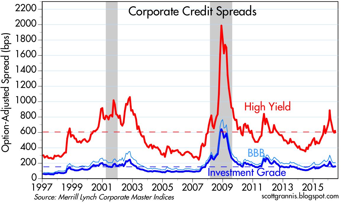
5-yr Credit Default Spreads, shown in the chart above, are an excellent indicator of credit trends. Spreads have been narrowing meaningfully for the past four months, and are now at levels that are consistent with conditions that are almost "normal." The bond market has recovered a good deal of the confidence it lost in the wake of the problems with China and in the oil patch. Spreads on high yield energy bonds have collapsed from a high of 2000 bps to now just over 800. Central banks' generous provisions of liquidity have allowed markets to adjust to wrenching changes without dragging down the entire economy. Healthy financial markets are the best kind of "shock absorber" for events in the real economy.

Bank lending has been constrained not by the Fed, but rather by a lack of confidence, a general desire on the part of businesses and households to deleverage, and by the strong, risk-averse regulations imposed on the banking industry by the Dodd-Frank law. Despite these headwinds, C&I Loans have been increasing at double-digit rates for the past several years.

Total Bank Credit has increased at an 8% annualized pace over the past 2 years. Yet despite these sizable increases in credit extended by the banking sector, leverage in the business and household sectors remains relatively low.

The news out of China has been improving on the margin in recent months. China's forex reserves (the red line in the chart above) have been relatively stable in the past four months, as has the yuan. Declining reserves would have meant that the central bank was pegging the currency at a level that was "too high" relative to the dollar. Relative to its trading partners, the Chinese currency has been stable for the past year or so.

I've remained generally optimistic despite the disappointing headlines. For the past two months I've had several posts highlighting encouraging developments in the economy that suggested at the very least a recession was quite unlikely, and that hinted at a bit of improvement. Here are a few more encouraging developments that keep me optimistic:

The folks at Challenger, Grey and Christmas keep a tally of all the publicly-announced corporate layoffs. Last month was among the four lowest monthly totals in the past 17 years, as the chart above shows. The oil exploration and drilling sector of the economy was responsible for most of the outsized layoffs over the past year, but that is now a thing of the past.

The active rig count (above) appears to have stabilized and even increased in the past week.

As the above chart of oil futures prices shows, oil prices have almost doubled since their low last February. The crisis in the oil patch is a thing of the past.

The BLS keeps a record of job openings across the economy. April's total was a record high—almost 5.8 million job openings. That's up 26% in the past two years.

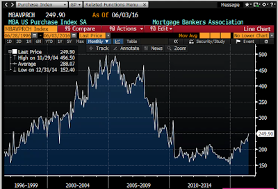
According to the Case-Shiller Home Price index, the average price of a home in the U.S. has increased over 30% in the past four years. As the chart above shows, the volume of new mortgage purchase applications (not including refis) is up over 50% since the beginning of last year. The housing market is definitely getting back on its feet.

As the chart above shows, industrial metals prices are up over 25% in the past 5 months. And it's not just because the dollar has weakened. Measured against the super-strong Swiss franc and Japanese yen, these same metals prices are up over 20% and 15%, respectively. This suggests that global industrial activity has firmed.

The chart above shows that the dollar value of the Brazilian stock market is up almost 70% in the past five months, helped, no doubt, by the rebound in commodity prices and the prospect of a new, less corrupt administration.

5-yr Credit Default Spreads, shown in the chart above, are an excellent indicator of credit trends. Spreads have been narrowing meaningfully for the past four months, and are now at levels that are consistent with conditions that are almost "normal." The bond market has recovered a good deal of the confidence it lost in the wake of the problems with China and in the oil patch. Spreads on high yield energy bonds have collapsed from a high of 2000 bps to now just over 800. Central banks' generous provisions of liquidity have allowed markets to adjust to wrenching changes without dragging down the entire economy. Healthy financial markets are the best kind of "shock absorber" for events in the real economy.

Bank lending has been constrained not by the Fed, but rather by a lack of confidence, a general desire on the part of businesses and households to deleverage, and by the strong, risk-averse regulations imposed on the banking industry by the Dodd-Frank law. Despite these headwinds, C&I Loans have been increasing at double-digit rates for the past several years.

Total Bank Credit has increased at an 8% annualized pace over the past 2 years. Yet despite these sizable increases in credit extended by the banking sector, leverage in the business and household sectors remains relatively low.

The news out of China has been improving on the margin in recent months. China's forex reserves (the red line in the chart above) have been relatively stable in the past four months, as has the yuan. Declining reserves would have meant that the central bank was pegging the currency at a level that was "too high" relative to the dollar. Relative to its trading partners, the Chinese currency has been stable for the past year or so.

Despite all these encouraging signs, 10-yr Treasury yields are down to very low levels. This suggests that the market is viewing the good news with a healthy dose of skepticism, fearful that things are more likely to deteriorate than to improve further.
As I've argued for many years, risk aversion is still the order of the day.
Sunday, June 5, 2016
Recommended reading: Ikenson on trade
Cato's Dan Ikenson has written an excellent summary of trade issues, "Trade on Trial, Again." It's timely, considering the Trump's total confusion on the subject. Hint: running a trade deficit does not mean we are "losing." Here's a short version that hits what I think are the high points, but do read the whole thing:
Not long ago, a group of Cato scholars entertained the question of whether the intellectual debate for free trade had been won.
There was near consensus that it had — in 1776 with publication of The Wealth of Nations. In the 240 years to follow, efforts to poke substantive holes and refute Adam Smith’s treatise failed and, today, nearly all economists agree that free trade, by expanding the size of the market to enable greater specialization and economies of scale, generates more wealth than any system that restricts cross-border exchange.
[But] ... how much does it really matter whether the intellectual debate has been won when, in practice, free trade remains stubbornly elusive, and the process of U.S. trade policy formulation is distinctly anti-intellectual?
If the free trade consensus were truly meaningful, trade negotiations would be unnecessary. If free trade were the rule, trade policy would have a purely domestic orientation and U.S. barriers would be removed without need for negotiation because they would be recognized for what they are: taxes on consumers and businesses that impede the global division of labor and the creation of wealth.
[Unfortunately] ... The case for free trade is not obvious. The benefits of trade are dispersed and accrue over time, while the adjustment costs tend to be concentrated and immediate. To synthesize Schumpeter and Bastiat, the “destruction” caused by trade is “seen,” while the “creation” of its benefits goes “unseen.” We note and lament the effects of the clothing factory that shutters because it couldn’t compete with lower-priced imports. The lost factory jobs, the nearby businesses on Main Street that fail, and the blighted landscape are all obvious. What is not so easily noticed is the increased spending power of the divorced mother who has to feed and clothe her three children. Not only can she buy cheaper clothing, but she has more resources to save or spend on other goods and services, which undergirds growth elsewhere in the economy.
Consider Apple. By availing itself of lowskilled, low-wage labor in China to produce small plastic components and to assemble its products, Apple may have deprived U.S. workers of the opportunity to perform that low-end function in the supply chain. But at the same time, that decision enabled iPods and then iPhones and then iPads to be priced within the budgets of a large swath of consumers. Had all of the components been produced and all of the assembly performed in the United States — as President Obama once requested of Steve Jobs — the higher prices would have prevented those devices from becoming quite so ubiquitous, and the incentives for the emergence of spin-off industries, such as apps, accessories, Uber, and AirBnb, would have been muted or absent.
But these kinds of examples don’t lend themselves to the political stump, especially when the campaigns put a premium on simple messages. This is the burden of free traders: Making the unseen seen. It is this asymmetry that explains much of the popular skepticism about trade, as well as the persistence of often repeated fallacies.
The benefits of trade come from imports, which deliver more competition, greater variety, lower prices, better quality, and new incentives for innovation. Arguably, opening foreign markets should be an aim of trade policy because larger markets allow for greater specialization and economies of scale, but real free trade requires liberalization at home. The real benefits of trade are measured by the value of imports that can be purchased with a unit of exports — our purchasing power or the so-called terms of trade. Trade barriers at home raise the costs and reduce the amount of imports that can be purchased with a unit of exports.
Protectionism benefits producers over consumers; it favors big business over small business because the cost of protectionism is relatively small to a bigger company; and, it hurts lower-income more than higher-income Americans because the former spend a higher proportion of their resources on imported goods.
[Fortunately] ... Even if there were a President Trump or President Sanders, rest assured that the Congress still has authority over the nuts and bolts of trade policy. The scope for presidential mischief, such as unilaterally raising tariffs, or suspending or amending the terms of trade agreements, is limited. But it would be more reassuring still if the intellectual consensus for free trade were also the popular consensus.
As for the TPP Treaty, we don't need it, because we should not be imposing any barriers or conditions on our trade with Pacific nations. Or any nations, for that matter.
Friday, June 3, 2016
No improvement in the jobs market
The June employment report was much weaker than expected (+38K vs. +160K), but it's not necessarily the case that the engine of economic growth has virtually shut down. We've seen a half dozen very weak numbers like this over the past 5-6 years—it's the nature of this beast to be very volatile on a month-to-month basis. The monthly payroll numbers are simply not reliable enough to make confident judgments about the health of the economy, and, moreover, they can be revised significantly in the future.
What the report does tell us is that there is no sign of any fundamental improvement in the economy or the jobs market. There had been hints of improvement in past reports (e.g., a rise in the labor force participation rate and a quickening in the growth of the labor force), but they've been largely reversed now. As a result, it's likely that the economy is still plodding along at a miserably slow pace and will continue to do so unless and until there is a meaningful change to fiscal policy.
The Fed will find it hard to raise rates given the lack of any fundamental improvement in the jobs market, but the market fully understands this and rates are priced accordingly (no rate hikes expected for at least a few months, 10-yr yields at 1.7%, very close to their all-time low of 1.4% which was registered in July '12). Inflation expectations remain subdued (at around 1.5%), notwithstanding today's jump in gold prices and drop in the dollar. Meanwhile, liquidity is abundant (2-yr swap spreads are still very low) and the market exhibits little or no sign of any systemic stress. All eyes remain glued to the presidential elections for clues to the future, few of which have been forthcoming to date.


One reason to suspect that the June numbers were artificially low—and thus likely to be reversed in coming months—is the ADP report for June, which estimated private sector job growth to be 173K. These two series have tracked each other pretty well over the years, with the BLS series typically much more volatile. If the past is any guide, we'll see surprisingly strong jobs growth in the BLS numbers in coming months.


Subscribe to:
Posts (Atom)