Tuesday, August 30, 2016

Chemical activity continues to increase

Two months ago I noted in a post that chemical activity was pointing to a stronger economy. That continues to be the case.

The Chemical Activity Barometer, published monthly by the American Chemistry Council since 1919, is up a solid 3.9% in the past year. This strongly suggests that industrial production—which has been quite weak for the past year or so (due in large part to the big slowdown in oil drilling and exploration)—will pick up in coming months. This should go hand in hand with stronger GDP numbers over the course of the year.


The chart above shows the Chemical Barometer Activity index for the past 8 years. This year's uptick is significant, suggesting at the very least that the underlying trend of economic growth (which has been a little over 2% per year since mid-2009) remains intact.


The chart above shows the Chemical Activity index going back to 1960.


As the above chart shows, the index does a good job of leading the growth in industrial production, and by inference, the overall economy. It continues to suggest that industrial production should enjoy a healthy rebound. For more detailed information, see Calculated Risk.


And as the chart above shows, it indeed looks like Industrial Production is beginning to turn up after almost 18 months of decline.


Two months ago I noted that truck tonnage (above chart) had also picked up. However, it has since dropped back down to where it started the year. Although it's not weak enough to suggest a budding recession, neither is it strong enough to suggest any fundamental improvement in the economy's growth trend. So there's not enough here to get excited about a fundamentally stronger economy. More likely, we will just see a continuation of a growth trend somewhat in excess of 2% per year—a disappointing, sub-par economy, but at least an economy that continues to grow.

Thursday, August 18, 2016

QE and the amazing demand for money

Since late October 2008, I have been arguing that the main objective of the Fed's Quantitative Easing program was not to provide monetary stimulus, but rather to satisfy very strong money demand. I've fleshed out the argument many times over the years, with a few examples herehere, and here.

A short version of the argument goes like this: The true objective of Quantitative Easing was not to "print money." Instead, it was to convert notes and bonds into bank reserves (now effectively T-bill equivalents, since they pay interest) in order to meet the economy's tremendous demand for liquid, default-free, interesting-bearing securities. QE dramatically expanded the supply of "money" at a time when the market's demand for money was almost insatiable. Milton Friedman taught us that inflation results when the supply of money exceeds the demand for it. The evidence to date speaks for itself: we have seen no increase in inflation despite an enormous increase in the monetary base, so it must be the case that QE served mainly to supply money that the market wanted to hold.

In any event, QE could never be stimulative, because you can't expand the output of an economy by expanding its supply of money; pumping money into an economy in excess of what's demanded simply serves to inflate the price level. So it makes little or no sense to argue that the Fed (or any other central bank that has engaged in QE) is powerless to stimulate the economy. QE wasn't a failure, it was absolutely necessary, and it worked: if the Fed hadn't undertaken QE there would have been a serious shortage of money, and that could have prolonged the recession and created lots of deflation.

QE was a response to something that triggered a huge demand for money, and that "something" was a major shock to confidence. Terrified of the prospect of another financial market meltdown and another global recession, people—and especially banks—wanted a safe place to hide, and there were not enough T-bills to go around at the time QE launched. (Recall that by June 2008 the Fed had sold virtually all of its holdings of T-bills in response to the market's demand for them.) Moreover, in the years following the Great Recession, Treasury significantly reduced its issuance of T-bills in favor of longer-term securities in a rational response to the historically low level of Treasury yields.

Even though confidence has gradually returned as the economy has recovered, it's quite likely that banks' appetite for excess bank reserves will remain very strong because of increased regulatory requirements, as I noted earlier this year. At least half of the $2.2 trillion of excess reserves currently held by major banks likely is needed just to meet risk-weighted capital requirements imposed by Dodd-Frank and the Basel Accords, plus the Fed-imposed requirement that banks hold highly liquid assets (mainly bank reserves) equal to 100% of the amount that Fed stress tests indicate they would need to survive another liquidity crisis. As for the rest, banks are still—obviously—reluctant to lend anywhere near as much as their abundant holdings of excess reserves would allow.

Here are some up-to-date charts that illustrate and explain the increased demand for money:


The chart above is my preferred way to measure the demand for money. It compares the level of the M2 money supply to the level of nominal GDP. The ratio of M2 to nominal GDP is akin to the percentage of annual income that the average person holds in the form of "money." For many years, from 1960 through the late 1980s, this ratio was relatively stable. It declined in the 1990s due to the fallout from the S&L crisis. Since 2001, however, it has risen steadily and is now at its highest level ever.


The chart above shows the current composition of M2: retail money market funds, small time deposits, currency in circulation, retail checking accounts, and bank savings deposits. The mix of these components has changed over time, but the sum is a good representation of the amount of highly liquid, easily spendable "money" that is held by the public.


The chart above compares the level of M2 to the level of nominal GDP, with both measured using a semi-log scale. While the ratio of M2 to GDP has wobbled quite a bit over the years, over a period of almost 60 years the two have increased by almost the same amount. (Note that the two y-axes are offset by a factor of 1.75.) This makes intuitive sense, since the larger the economy, the higher are incomes, and the more money is needed to make everything work. The gap at the right hand side of the chart suggests that there is about $2.3 trillion of "extra" M2 money in the system, most of which is held in the form of bank savings deposits, which now represent about two-thirds of M2, as compared to about 50% in the early 2000s.

In other words, people are happily "hoarding" some $2.3 trillion of extra money relative to their incomes, most of that in bank savings deposits which pay almost nothing in the way of interest. (That the public is happy to hold some $8.6 trillion in bank savings deposits despite the fact that they pay almost nothing is a powerful illustration of just how strong the demand for money is.) Should they lose the desire to hold that money, and decide instead to spend it, nominal GDP could grow by as much as $4 trillion (2.3 * 1.75) if past relationships were to reestablish themselves. Much of that growth would likely come in the form of higher prices, while some would come from stronger real growth—because declining money demand, the flip side of rising confidence, would likely go hand in hand with increased investment, which has been sorely lacking during this recovery.

The following charts demonstrate that despite all the trillions of bonds the Fed has purchased, the amount of money in the economy has not grown any faster under a QE regime than it has over the past six decades:


We start with the expansion of the Fed's balance sheet, a simplified version of which is shown in the chart above. The blue bars represent positions at the beginning of 2007, well before the onset of the 2008 financial crisis and the launch of Quantitative Easing. The red bars show positions as of the Fed's latest report. Thus, the era of Quantitative Easing, which began in October 2008, saw the Fed on net purchase almost $3 trillion of Treasuries and MBS. This resulted in an increase of about $2.4 billion in bank reserves and an increase of about $600 billion in the amount of currency in circulation. (Banks can exchange their bank reserves for currency whenever they want.)


The chart above shows the growth of bank reserves, which grew from almost $100 billion in September 2008 to just over $2.4 trillion today.


Because of the expansion of the money supply (which increases required reserves) and the modest shrinkage in the Fed's balance sheet over the past few years, excess bank reserves have declined by almost 20% since their high two years ago. And the sky hasn't fallen.


The monetary base, which is the sum of bank reserves and currency in circulation, and which in effect represents the high-powered money that the Fed has created via its purchases of notes and bonds, has expanded from about $900 billion in September 2008 to just over $3.8 trillion today.

The Fed massively expanded its balance sheet and massively grew the supply of reserves and high-powered money. But contrary to popular belief, there was NOT a similar explosion of growth in the money supply. What happened was that banks were happy to lend their deposit inflows to the Fed, rather than to the private sector. As I explained here, banks took in $4 trillion of savings deposits and used that cash to purchase notes and bonds which were in turn sold to the Fed in exchange for bank reserves. That is why Fed purchases did not create massive amounts of new money: banks were happy to boost their holdings of bank reserves.


The chart above is the proof. For almost six decades, the M2 money supply has grown at an annualized rate of 6.9%. During the period of Quantitative Easing, M2 grew at about the same rate as it has grown since 1960.


Looking more closely, in the above chart, we can see that M2 has grown by an annualized 6.5% since early 2007 and since QE began in late 2008. A slower rate, in fact, than it has averaged since 1960.

The Fed's Quantitative Easing regime is broadly misunderstood. It was not about stimulus, it was instead about satisfying an amazing and unprecedented increase in public's and the banking system's demand for safe, interest-bearing assets.

It may all end in tears, if the demand for money should decline and should the Fed fail to take timely and sufficient measures to offset the decline in banks' demand for excess reserves (by shrinking its balance sheet and/or raising the interest rate it pays on excess reserves), but for now things look OK.

Tuesday, August 16, 2016

The oil slump has passed

The collapse of oil prices that began about two years ago—from just over $100/bbl to just under $30/bbl—threw a wrench into the gears of the US economy by causing a sharp drop in oil exploration and drilling-related activity. In turn, this resulted in a slump in industrial production and a rash of layoffs, all of which subtracted meaningfully from the health of the US economy. The impact of the oil patch slump was most acute last February, when spreads on high-yield energy bonds soared to almost 2000 bps—a level matched only during the depths of the 2008 financial panic. From the beginning of the US economic recovery in mid-2009 through the third quarter of 2014, just before oil prices started to plunge, the economy grew at a 2.25% annualized rate. From September 2014 through last June, the economy grew at only a 1.7% annualized rate. Arguably, the oil price collapse subtracted half a percentage point of growth per year from the US economy for almost two years.

It now appears that the negative effects of the oil price collapse have passed. Drilling activity appears to have recovered in recent months, and oil prices have bounced from just under $30/bbl to almost $47/bbl today. High-yield energy bond spreads are back down to 740 bps, and the S&P 500 index is up almost 20% since mid-February. The ISM indices have bounced reassurringly.

What awaits us is the boost to economic activity that is likely to be fueled by cheaper and more stable energy prices. The market may already be sensing this, in fact, as equity prices probe new all-time highs, and as Treasury yields bounce off their all-time lows of last month. The significant bounce in recent months in the Chemicals Activity Barometer that I noted recently is an excellent indicator of improvement.

Here are some charts that tell the tale:


The chart above shows the collapse of oil futures prices and their more recent bounce, which equates to more than 50% since last February's lows.


The chart above shows the Baker Hughes US Active Rig Count. It suffered a monumental collapse of 80% over the course of 18 months, but it has bounced 25% in the past 2-3 months, following the bounce in oil prices.


The chart above shows the spreads on HY corporate bonds. The peak stress in the oil patch almost matched the never-before-seen peak in HY spreads in late 2008, when the market feared catastrophic default rates. '


Beginning in early 2104, US industrial production suffered its biggest non-recessionary slump, driven mainly by a sharp, 15% decline in mining activity. Today's release of July production data was much stronger than expected (0.7% vs. 0.3%), and it appears to mark the end of the industrial production slump; mining activity has now been flat to slightly up for the past three months. 


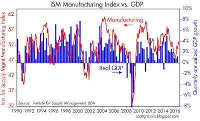
The July ISM manufacturing report confirms that conditions in the manufacturing sector have improved meaningfully in recent months. As the chart above suggests, the current level of the ISM index is pointing towards a moderate acceleration in real GDP in the current quarter. 


The chart above compares the level of the S&P 500 to the ratio of the Vix Index to the 10-yr Treasury yield. Equity prices have rallied significantly since the February low in oil prices. The Vix index has dropped considerably over the same period, but at 1.57%, the 10-yr Treasury yield is still very low. The market senses some improvement in the economy on the margin, but there is still a considerable amount of skepticism in regards to whether we are likely to see a meaningful pickup in economic activity. I think the market is too pessimistic.

Having successfully navigated the oil price collapse storm, it is not unreasonable for the Fed to be hinting at a sooner-than-expected hike in rates (I refer to Dudley's comments this morning that the market is underestimating the likelihood of a September rate hike).

One thing to keep in mind: since lower interest rates haven't boosted growth, why should higher rates be a threat to growth? The answer is simple: the Fed hasn't moved rates proactively. The Fed has been and continues to be a follower—guiding interest rates lower as the economy weakens, and higher as the economy strengthens. The market is too fearful of a rate hike, in my opinion.

If our future president would only take this WSJ op-ed to heart ("The Cure for Wage Stagnation" by Hassett and Mathur) and slash corporate tax rates, we could see an economic boom of significant proportions in the years to come. Excerpts:

More productive workers earn higher wages. Workers become more productive when they acquire better skills or have better tools. Lower corporate rates create the right incentives for firms to give workers better tools. 
... the corporate tax is for the most part paid by workers. 
Wage growth will continue to be disappointing as long as the U.S. has the world’s highest corporate tax rate. Denying the need for lower corporate rates may be effective populism, but it is causing real harm to America’s workers.

Tuesday, August 9, 2016

Productivity sucks

It's hard to pay much attention to one quarter's productivity, just as it is hard to get excited about one month's jobs number. But when productivity is consistently weak over several years, then we can be sure there is a big problem. Productivity in the second quarter was a miserable -0.5% annualized, right in line with -0.4% over the past year, and worse than the 0.4% annualized over the past two years and 0.5% over the past five years. We haven't seen such poor productivity numbers since the late 1970s, when high inflation, a weak dollar, and foreign policy disasters created a multi-year malaise. We have a big productivity problem, and it stems from a lack of business investment, pervasive risk aversion, crushing regulatory burdens, and a general anti-business, anti-growth sentiment emanating from the White House.


The chart above shows the 2-yr annualized change in the productivity of U.S. non-farm workers. This is a pretty reliable measure of the current climate, much more reliable than the quarterly productivity numbers which are notoriously volatile.


The chart above goes one step further, measuring productivity over 5-yr periods. This highlights fundamental, long-term changes in productivity. The chart also shows how productivity has behaved during different presidential administrations. The Obama years have been miserable, which is another way of saying that the current business cycle expansion has been the weakest in post-war history.

The US economy desperately needs a return to pro-growth policies. If we were to excise trade-related issues from Trump's economic policy speech yesterday, it would be an excellent remedy to what has been ailing the U.S. economy for years. Certainly far better than Hillary's proposals, which amount to doubling-down on all the mistakes of the Obama years (e.g., higher taxes, more income redistribution, more regulations).

The bad news, then, is that we have been suffering from anti-growth policies for a long time, and it's been getting worse on the margin. The good news, however, is that this means there is a deep reservoir of untapped potential in the US economy. If the political winds in the next several months start blowing in a more pro-growth direction, the stock market would be fully justified in extending the bull market which began over seven years ago.

UPDATE: John Taylor offers a more detailed, but similar, explanation for why productivity has been so weak here. HT: reader "Hans."

UPDATE: John Cochrane has nice essay on why productivity is essential for wealth generation and growth here.

Friday, August 5, 2016

Chemical activity hits a new high

For almost 100 years, The American Chemistry Council has been publishing their "Chemical Activity Barometer." The index rose 3% in the year ending a few days ago, and reached a new all-time high in the process. As the charts below show, this index has reliably tracked the performance of the overall economy and, in particular, it has been a good leading indicator of industrial production, which has been noticebly weak for the past 18 months. (See more details in my June '16 post on the subject here.)


This close-up look at the performance of the index highlights its strength in the past several months, and the fact that it finally exceeded its 2007 peak, which occurred six months before the economy entered the Great Recession.


The chart above gives you a longer-term perspective on the behavior of the index, which invariably turns down in recessions (often in advance of recessions), and invariably rises during recoveries. It would appear that the recent behavior of the index points to stronger growth than is widely perceived to be the case.


The chart above compares the year over year change in the 3-mo. moving average of the Chemical Activity Index with the equivalent change in the level of Industrial Production. The Chemical index invariably moves in advance of moves in Industrial Production. If this relationship holds, the market is going to be surprised at the new-found strength in Industrial Production in the months to come. We've been waiting for evidence that sharply lower energy prices will result in a boost in non-energy sectors of the economy, and this suggests that the evidence should be forthcoming before too long.

To be conservative, the strength in the Chemical Activity Index suggests that at the very least, a recession is not on the near-term horizon, and that the economy should prove to be at least a bit stronger, in the months to come, than the market is expecting. 

Truck tonnage in June was a bit weaker than in May, but as the chart below suggests, it remains on an upward trend. Both chemical activity and truck tonnage are good measures of the physical size and growth of the economy, and both suggest the economy continues to make progress.


A strong jobs number doesn't mean the economy is stronger

Today's July jobs report was substantially stronger than expected, as I suspected it would be, but it doesn't mean the economy is getting stronger. You simply can't make much of any one month's number—you've got to look at multi-month trends in order to draw any meaningful conclusions from the jobs data.

Over the past year or so the rate of jobs growth has decelerated modestly. In other words, the strong numbers of the past two months have not quite made up for the extremely weak May report. There is still no sign of a recession on the horizon, but the slo-mo nature of the current business cycle expansion remains firmly in place. This is just not a very exciting economy, but neither is it terrible or getting ready to collapse. It's steady and slow as she goes.


The outlier in this chart is not the last data point, it's the zero growth reported last May. It would take at least another two or three much-stronger-than-expected jobs reports to get us back on the trend that was in place until about a year ago. 


On a year over year basis, the growth of private sector jobs has slipped from a high of 2.6% in late 2014, to 1.9% in the year ended July.


One good piece of news is that the growth of the labor force is picking up, albeit slowly. More and more people are being enticed to either work or look for work. But despite the recent improvement, the labor force is still over 6% below its long-term trend (i.e., about 10.7 million workers have "disappeared"). Baby boomers retiring accounts for a portion of that shortfall, but there must be other factors at work as well: very high marginal tax rates, heavy regulatory burdens, and maybe even the recent wave of minimum-wage hikes. When unskilled labor becomes artificially expensive, businesses have a strong incentive to replace labor with robots, no?


I've shown the charts above off and on for the past year or two, because I think they illustrate yet another reason for the shortfall in the growth of the labor force: huge increases in transfer payments. In the year ended last June, the federal government sent out checks totaling almost $2.8 trillion to people for not working. That represents about 20% of disposable income (and a whopping 73% of total federal spending), and that is very nearly a record high. When so much is paid to so many for doing things other than working it's bound to have a perverse impact on the jobs market. The only good news here is that the growth of transfer payments appears to no longer be exceeding the growth of incomes—we're at a plateau of sorts. At the same time, the labor force participation rate appears to have bottomed. On the margin, in other words, the damage done by transfer payments is not getting worse. But we're going to have to tackle the entitlements problem in a big way, or else transfer payments relative to incomes will continue to climb, the labor force will continue to grow in a tepid fashion, and the federal budget deficit will rise to unsustainable levels. We're not there yet, but this threat looms large on the horizon.

So it's nice to know that the very weak May jobs number was most likely just an artifact of bad data. But the recent strong numbers do not tell us that the economy is getting any stronger.

I doubt this report will result in any immediate or unexpected tightening action on the part of the Fed.

Thursday, August 4, 2016

Another better-than-expected jobs report would be disappointing

Last month I guessed that the June private sector jobs number would be "at the very least 200K," and I got lucky, since the number turned out to be +265K. I based that guess on the fact that the BLS number for May had seriously undershot the ADP number, and that when that happens we typically see a rebound in the BLS numbers the following month. That proved to be the case.

This month I'm thinking along the same lines. The ADP private sector jobs number for July was +179, and for the past three months ADP has reported an average monthly gain of 178K. In order for the past three months of BLS private sector job growth to come even close to the ADP estimate for those same months is for the BLS' measure of July private sector jobs to increase by 200-225K, and that happens to be substantially more than the current market estimate of +171K. An upside surprise of that magnitude would be entirely consistent with the monthly volatile in the BLS numbers that we have seen for the past several decades, so it's not any pie-in-the-sky projection. Even if the BLS tomorrow reports a gain of 225K private sector jobs, the three-month BLS average would still be below that of ADP's. As the chart reminds us, both these series are volatile (with the BLS being far more volatile) but over time they do a good job of tracking each other.

So: if the BLS tomorrow reports as expected (+171K), then I would be forced to conclude that the labor market has weakened relative to its performance over the past several years, since the six-month annualized growth in private sector jobs would have dropped to 1.6% as compared to the 2.0 - 2.5% rates that have prevailed since early 2013. That slowdown is in fact already apparent in the ADP numbers, as you can see in the blue line in the above chart. It would take another huge upside surprise (e.g., +300K or even more) to keep the trend in jobs growth close to what it has been for the past few years.

Thus, it's likely that the economic fundamentals of the economy have weakened at least a bit so far this year, even if the BLS number tomorrow is higher than expected.

Today brought two announcements which were encouraging:


Announced corporate layoffs remain very low, and weekly unemployment claims also remain very low. To date there is no indication that businesses are starting to retrench; they are merely growing at a slower pace.

We can see signs of weakness and slower growth—but not recession—in other areas of the economy in the following charts:


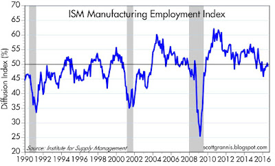
The ISM employment subindex has not indicated any desire on the part of manufacturing business to expand employment for the past year. 


The service sector has been slightly more willing to expand, not nearly as much as in previous years. In short, businesses are lacking the confidence to invest and expand their operations, and this is not supportive of growth. It doesn't necessarily imply a recession, but rather a "failure to thrive."


Still, the overall ISM manufacturing survey (first of the above two charts) has improved in recent months, and this suggests we are likely to see some stronger quarterly GDP growth numbers in the second half of this year—which could well be inventory-related given that inventories accounted for a good portion of last quarter's weak growth. It will still leave us mired in the slowest recovery on record, however, so it's nothing much to cheer about. Moreover, the service sector (second of the above two charts) continues to report generally healthy business activity.


The real yield on 5-yr TIPS, which I consider a good indicator of the market's GDP growth expectations, has declined by about 20 bps so far this year, and as the chart above suggests, this points to growth in the quarters and years ahead to dip below 2%. Not a recession, to be sure, but rather a modest slowdown in an already-slow-growing economy.


Construction activity had been quite strong up until the middle of last year, but has since gone flat, as seen in the chart above.


But as the June Co-Star indices of commercial real estate prices (chart above) indicates, activity in the CRE sector picked up a bit in June. This further suggests that the weakness we've seen so far this year has been more in the nature of a pause rather than a precursor of another recession.


At a more fundamental level, risk aversion (as proxied in the first of the two charts above by the demand to hoard cash and cash substitutes) continues to be a significant factor holding back the economy. (The rising blue line represents the fact that the growth of M2—arguably the best measure of spendable cash— has significantly exceeded the growth in nominal GDP for the past 8 years.) The Fed has been extremely generous with its provision of bank reserves, and banks have been lending at an above-average pace for over the past two years or so (see second chart above), but much of the extra money entering the economy has simply been socked away in the form of bank savings deposits, which in turn have been invested by banks in bank reserves held at the Fed—and which in turn represent banks' investment in Treasuries. For a more detailed discussion of this (which boils down to weak investment), see last week's post (The election should be all about growth).

I hasten to reiterate that the modest slowdown in an already-slow-growing economy apparent in the above charts is not necessarily cause for concern. An economy is not like an airplane, which runs the risk of crashing if it slows down too much. Slow economic growth can persist for many years (as it already has, of course). The worst thing about the past seven years of disappointingly slow growth is all the wealth and prosperity and jobs that have gone missing.

It's doubly disappointing, of course, because politicians, regulators, and bureaucrats have been the chief beneficiaries of our slow-growth malaise. More power to the public sector necessarily follows from less freedom for the private sector.

Wednesday, August 3, 2016

Charts of the week: Japanese yields soar

This story is actually a few days old, but only today did I stumble upon it. It's the biggest move in major asset prices in at least several weeks, and could be an optimistic portent of better things to come. At the very least it bears watching:


The top chart tracks the yield on Japanese 2-yr bonds, and the bottom chart tracks the yield on 10-yr Japanese bonds. Both have surged some 20 bps in the past few days, and are now only slightly below zero after being meaningfully negative. The ostensible reason for this big selloff in bonds is disappointment over the BoJ's reluctance to pursue further monetary easing measures. The yen rose about 4% as yields rose, but is no stronger today than it was several weeks ago. Meanwhile, Japanese stocks are down only marginally. The only thing that has really changed significantly is yields—which are much less negative now than they were last week.


As the chart above shows, the Nikkei and the yen have been moving inversely for quite a few years—a weaker yen being good for stocks and vice versa. So this latest non-move by the BoJ presumably makes the yen stronger (because of less monetary ease) and stocks weaker (because presumably the economy needs monetary boosting help which is apparently not forthcoming). I've never been a fan of negative interest rates, so I'm happy to see the BoJ become more realistic, and I can't see why that should be a big negative for the economy or for the stock market. The only point of forcing interest rates below zero is to weaken the demand for one's currency, and that can have negative consequences (to coin a phrase) which can destroy confidence. Scaring people into spending money hardly seems better than encouraging them to invest.

This is just one more illustration of the fact that monetary policy does not have magical powers to boost growth; at best monetary policy can facilitate growth if it moves from being too tight to just right. Fiscal policy, both here and in Japan, is what's needed in order to really boost growth and prosperity. Most major economies these days are saddled with burdensome government. If the BoJ has now decided it won't pursue extreme easing measures, that doesn't overly concern me. If the government follows through on this action by adopting genuine stimulus measures which encourage people to take on more risk and hold less money, then we could see a return to rising equity prices, higher interest rates, and perhaps a weaker yen.

For that matter, higher interest rates in all major economies would be a sign of a return to healthier economic conditions, and something to cheer.