Tuesday, December 3, 2019

The news is decidedly mixed, but it's not crazy to remain optimistic

I haven't done much posting of late, mainly because conditions haven't changed much. The economy has been growing at a modest (~2%) pace, and the economic news has been mixed: undeniably weak manufacturing data, trade frictions continuing, weak business investment, offset by healthy growth in jobs and incomes, strong financial fundamentals, and very low unemployment claims. Consumer sentiment has been generally upbeat, but uncertainties persist (e.g., impeachment, geopolitical tensions, and a global trade and manufacturing slowdown). Equity prices have been drifting irregularly higher, but safe-haven demand for bonds has driven interest rates to very low levels. Very cautious optimism best describes the market these days, with few willing to bet that things will improve.

Here are some charts and thoughts to round out the picture:

Chart #1

Chart #1 compares stock prices (blue line) with a measure of the market's fears and uncertainties (red line). When fear (the Vix index) rises and uncertainty rises (i.e., as strong demand for the safety of 10-yr Treasuries pushes yields down), stock prices have a strong (and understandable) tendency to weaken. Most of today's concerns revolve around Trump's tariff wars, as has been the case for most of the past year.

I note that the S&P 500 rose at a 14% annualized rate during 2016 and 2017, boosted no doubt by a significant reduction in corporate tax rates. But gains have been only about half as much from 2018 to today. The latter is most likely more suggestive of future returns than the former. Still, the prospect of 7% price gains plus 1.5% dividend gains going forward—while in line with long-term trends—is an order of magnitude larger than the returns on 10-yr Treasury bonds. The equity risk premium is still compelling for those willing to take the risk.

Chart #2 

Chart #2 compares an index of manufacturing health (red line) with the quarterly annualized change in real GDP growth (blue bars). The relationship between the two has weakened considerably in the past decade, however. And regardless, the huge decline in the manufacturing index over the past two years has failed to put it in territory that in the past has coincided with recessions. At current levels, the ISM index suggests that overall economic growth in the current quarter will probably be 1-2%, which not surprisingly happens to be the market's current consensus.

Chart #3

As Chart #3 shows, the big decline in the manufacturing index began early last year with Trump's imposition of punitive tariffs on Chinese goods. But as the chart also suggests, we have probably seen the worst. The Markit manufacturing index has turned up of late, as has the Eurozone manufacturing index.
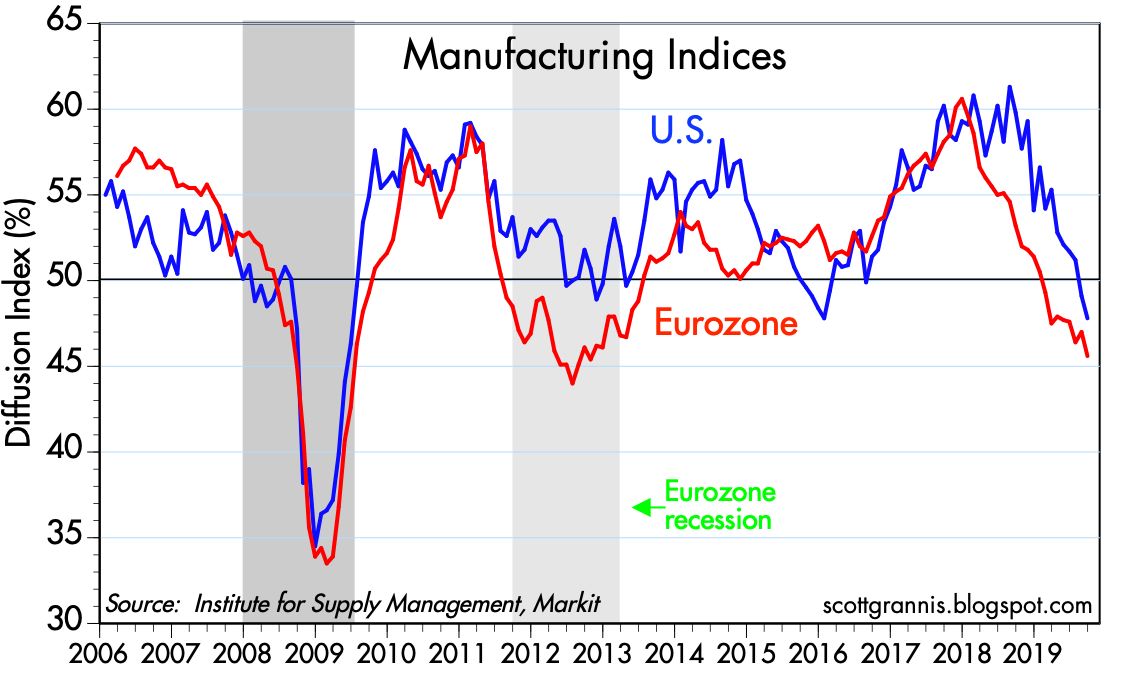
Chart #4

Chart #4 compares manufacturing conditions here and in the Eurozone. Both have weakened during the Trump tariff wars. Conditions appear to have improved a bit in the Eurozone of late.

Chart #5

Chart #5 shows the relationship between real yields on 5-yr TIPS (a good proxy for real yields in general) and real GDP growth (which I measure over a rolling 2-yr period to get a proxy for the market's perception of trend growth). Not surprisingly, real yields tend to track real economic growth trends. A very strong economy demands high real yields, whereas today's near-zero real yields point to modest 2% real growth rates. In short, the bond market is priced to 2% real growth for the foreseeable future. That's not enough to convince the Fed to raise rates, but it's slow enough to justify the current low level of rates.

Chart #6

Chart #6 compares the level of the Chinese yuan with the level of China's foreign exchange reserves. For the past several years, the Chinese central bank has been targeting stable forex reserves, which means that strength or weakness in the yuan is a direct reflection of changing demand for yuan. Under this monetary regime, if capital tries to leave the country, the central bank allows the yuan to weaken; if capital flows turn positive, the yuan strengthens. The yuan has fallen about 11% vs the dollar since Trump's imposition of punitive tariffs on Chinese goods. This reflects deteriorating expectations for the Chinese economy and it also serves to lessen the impact of tariffs on US consumers, since a weaker yuan gives exporters the ability to lower their prices (since they receive more yuan for a given level of dollar sales) in order to offset the impact of US tariffs. Bad for China, but good for the US.

Chart #7

As Chart #7 shows, the weaker yuan has caused Chinese inflation to rise relative to US inflation. A weaker yuan makes the prices of all imported goods rise, and that helps fuel a rising price level in China.

Chart #8

As Chart #8 shows, thanks to a decline in the yuan's value vis a vis the dollar, US tariffs have not impacted China's exports to the US as much as higher China countervailing duties (and a weaker yuan) have negatively impacted China's imports of US goods. The Chinese economy is suffering as a result: rising inflation, weak currency, declining imports and exports, and slowing economic growth.

Chart #9

Chart #9 shows that world trade volume has been flat to slightly down as a result of global tariff wars. Nobody is benefiting from Trump's tariffs. But if they convince the Chinese to reform their ways, and Trump responds by reducing or eliminating tariffs, then the world will be better off in the end. That's my hope.

Chart #10

Chart #10 shows that business investment has been relatively weak for the past several years. That's disappointing given the significant reduction in corporate tax rates, but it's somewhat understandable given the general climate of fear, uncertainty and doubt (FUD), which in turn is driven in large part by the potential for tariff wars to foster global economic weakness.

Chart #11

Chart #11 shows that capital goods orders—a good proxy for business investment—have been flat for the past year, thus reinforcing the message of Chart #10. Business investment has been and continues to be a disappointment, and that is keeping the economy in slow-growth mode.

Chart #12

Jobs growth in the US has slowed over the past year, but with modest productivity growth (~1%) this suggests that 2% economic growth is likely to continue. Slow jobs growth is likely the product of weak business investment and a shortage of experienced labor.

Chart #13

Chart #13 shows the remarkable and unprecedented decline in weekly unemployment claims. This reinforces the idea that the slowdown in jobs growth has more to do with a reluctance to invest on the part of business and a shortage of qualified labor, rather than businesses reacting to a deteriorating economy by cutting back. What turnover remains in the labor market is mostly a function of workers looking for new opportunities. How many people do you know who have been given an unexpected pink slip this past year?

Chart #14

Chart #14 shows Bloomberg's survey of consumer confidence/sentiment. It has risen strongly since Trump won the 2016 election. Every measure of consumer sentiment is at relatively high levels from an historical perspective. And why not? Layoffs have never been so low relative to the size of the labor force. The unemployment rate is very low. Real median family incomes are at record highs. Mortgage rates are near all-time lows.

Chart #15

As Chart #15 shows, households' financial burdens (recurring payments as a percent of disposable income) are about as low as they have ever been.

Chart #16

The housing market shows no signs of a bubble. Indeed, housing starts are still historically low and are likely still in an uptrend, judging by builder sentiment (see Chart #16). Applications for new mortgages (not including refis) have risen 67% in the past 5 years, thanks to mortgage rates that are about as low as they have ever been. Yet the the volume of new mortgage applications today is only about half what it was at the peak of the housing market "bubble" in 2005-6. The housing market is on solid ground these days.

Chart #17

It's hard to find any sign of financial distress or instability. Chart #17 shows the all-important level of 2-yr swap spreads in both the US and the Eurozone. Very low spreads imply abundant liquidity and a very low level of systemic risk. This in turn portends a healthy outlook for the economy, since swap spreads have been good leading indicators of financial and economic health.

Chart #18

Chart #18 shows Credit Default Swap spreads, a highly liquid measure of generic credit risk. Spreads are very low, suggesting that the outlook for corporate profits—and by extension the economy—is healthy.

Chart #19

Chart #19 shows the classic measure of the slope of the Treasury yield curve. It's now slightly positive. The Fed's last interest rate cut brought short-term rates down to a level below that of long-term rates. This further suggests that Fed policy is not restrictive or otherwise threatening to the economy.

Chart #20

As Chart #20 shows, real, inflation-adjusted short-term interest rates are now roughly zero. Virtually all past recessions were preceded by unusually high real interest rates. Fed policy is once again accommodative. Borrowing costs are unusually low.

Chart #21

Chart #21 underscores just how risk-averse the world is these days. It shows the 3-mo. annualized rate of growth of bank savings and demand deposits. Despite short-term interest rates trading at historical lows, both in nominal and real terms, demand for "safe" deposits that pay almost nothing has exploded. Trump's election in late 2016 kicked off an impressive decline in money demand, but Trump's tariff wars have largely reversed this. While it's unfortunate this has occurred, it's important to recognize that any improvement in the global trade outlook has the potential to unleash a tsunami of cash. 

In my judgment, it pays to remain optimistic.

Saturday, November 23, 2019

Trump's best defense against impeachment

Michael Anton, author of "The Flight 93 Election," arguably one of the most influential essays written in the runup to the 2016 presidential election, has another important essay which will be published in the next edition of The Claremont Review of Books, titled "The Empire Strikes Back." (If you're interested in the cutting edge of conservative thought, I highly recommend a subscription to this quarterly journal.)

If you're not up to reading the whole thing—it is a bit long—I'm here to help. Towards the end of the article is a solid, common-sense rationale for why, even if you stipulate that Trump did indeed withhold funds from Ukraine in an attempt to force them to investigate Burisma and Biden, that was far from being an impeachable offense. Here is the relevant excerpt:

The worst charge thus far alleged against President Trump is that he attempted to make $400 million in aid to Ukraine contingent on that country’s government investigating possible corruption by the Bidens. This is the much hoped for “smoking gun,” the “quid pro quo”—as if the foreign policy of any country in history has ever been borne aloft on the gentle vapors of pure altruism. 
… would that be sufficient to convince a majority of Americans, and a supermajority of senators, that Trump should be removed from office? 
I don’t see it. Especially since a) no aid was actually withheld; b) no investigation was actually launched; c) the American people don’t care about Ukraine and would probably prefer to get their $400 million back; and d) they would inevitably ask: so were, in fact, Joe Biden and his son on the take from a foreign government? And if it looks like they might have been, why, exactly, was it improper for the president to ask about it? 
Trump’s enemies’ answer to the last question is: because the president was asking a foreign government to investigate a political opponent for purely personal gain. Really? Is potential corruption by a former vice president—and potential future president—and his family a purely private matter, of no conceivable import or interest to the public affairs of the United States? That’s what you have to insist on to maintain that the request was improper. That’s the line we can expect the Democrat-CLM axis to flog, shamelessly and aggressively. But will a majority of Americans buy it? Especially since career officials at the Department of Justice already determined, and anti-Trump witnesses appearing before Representative Adam Schiff’s secret star chamber reluctantly conceded, that nothing Trump did or is alleged to have done was technically, you know, illegal.

I ask that any comments be focused not on Trump's myriad character flaws and tweets, but on the question of whether what he has done in Ukraine rises to the level of an impeachable offense.

Friday, November 1, 2019

The weakest recovery and the longest expansion

If it weren't for Trump's trade wars and a dearth of business investment, the economy would be in excellent shape. As it is, growth continues along the moderate 2% path that it has followed for more than 10 years. It's been the weakest recovery ever, but also the longest business cycle expansion. And with no obvious excesses or systemic problems in view, it promises to continue. 

Chart #1

The Q3/19 GDP report—1.9% annualized growth—makes the current expansion the longest on record. Chart #1 shows the quarterly annualized growth rate of both nominal and real GDP. To be sure, 2% growth isn't a barn-burner, but it's impressive given the degree to which the manufacturing sector has been hit by Trump's tariff wars.

Chart #2

Since the recovery started just over 10 years ago, annualized GDP growth has been 2.3%; in the past year it was 2.0%, and in the most recent quarter 1.9%. As Chart #2 suggests, for most of this past year the market has been expecting growth to slow, and indeed it has. That is reflected in the more than 100 bps decline in the real yield on 5-yr TIPS since late last year. At today's real yield of a mere 0.05%, 5-yr TIPS appear to be priced to the expectation that real GDP growth will average about 2% per year going forward. Not surprisingly, Chairman Powell recently chimed in with a similar view, saying the FOMC expects moderate growth of about 2%.

Chart #3

Chart #3 compares real economic growth with private sector jobs growth. Not surprisingly, the two tend to move together: more jobs means more growth. The recent slowdown in GDP growth is reflected in a similar slowdown in jobs growth (the October jobs report was much better than expected, but it didn't do much to change the trend growth rate of jobs, which has been declining so far this year).

Both jobs and GDP have suffered from a lack of business investment, which likely has a lot to do with the uncertainties surrounding international trade. Private sector jobs currently are growing at pace of about 1.3% per year. If jobs grow at least 1% per year and productivity registers at least 1% per year (which it has in recent years), then 2% real economic growth is sustainable. (Jobs growth plus productivity growth is a decent first approximation for overall economic growth.) For growth to move higher, we would need to see a pickup in business investment, which not only creates jobs but improves the productivity of existing workers. A resolution to the tariff wars would undoubtedly prove a catalyst in that regard.

Chart #4


Demographic factors (more and more boomers are retiring) likely also play a part in this year's slowdown. Employers continue to complain that their biggest problem is finding qualified workers. Chart #4 shows that more small business owners than ever before report that "job openings are hard to fill."

Chart #5

But it's not like the economy is running out of available workers. As Chart #5 shows, the labor force participation rate (the percentage of the working age population who are either working or looking for work) looks to be increasing, albeit slowly. People who had been on the sidelines are being enticed to return, perhaps because they see better opportunities. Or in the case of not a few retired baby-boomers I know, they have decided that working is better than just sitting around watching TV. Regardless, there are still almost 6 million people out there who officially are looking for work, according to the BLS.

Chart #6

Chart #6 compares actual growth in real GDP to its long-term trend. (Note that this is plotted using a semi-log scale for the y-axis; a straight line on this chart thus corresponds to a constant rates of growth.) By only averaging 2.3% per year, the current recovery—the weakest in history—has resulted in a $3.4 trillion "shortfall" of growth relative to what might have been had the economy rebounded to its long-term trend as it did after every prior recession. Had this been a "normal" recovery, real median family income might have been almost 18% higher (~ $1000 per month) than it is today. 

Chart #7

Chart #8

Charts #7 and #8 show two measures of business investment. Both show that investment in the current business cycle has been weaker than in previous business cycles (especially in real terms, as Chart #7 highlights). Weak investment is likely major factor behind the economy's unimpressive 2% growth rate. Which is unusual, because corporate profits have been unusually strong in the past decade. 

Chart #9

What other factors might be restraining the economy's ability to grow? The size of government ought to top anyone's list. In the past 12 months, the federal government spent a staggering $4.5 trillion, almost 21% of GDP, and 8% more than the same measure a year ago. Even more staggering, though, is the composition of that spending: 72% of what the federal government "spent" in the past year ($3.2 trillion) was in the form of transfer payments (see Charts #9 and #10). That's money that is spent on things like healthcare, social security, income security, and interest payments on debt (as of last June the annual interest on federal debt outstanding was a little over $600 billion, or 13.3% of federal spending). Only 28% of federal spending was for goods and services (i.e., true purchases). Think of purchases as a proxy for what it costs to run the government, while transfers are basically entitlements—spending that is determined not by the budget process but rather by eligibility. 

Chart #10

Note how the growth in transfer payments has surged relative to the growth of purchases since the early 90s. As Chart #10 shows, since 1970 transfer payments have more than doubled relative to total spending. By far the biggest role of the federal government in today's economy is that of an income transfer agentNeedless to say, with $3.2 trillion per year (and growing) on autopilot, the potential for fraud and waste is ginormous. It's safe to say that the huge size of government transfer payments acts as a drag on overall economic growth and efficiency. And it's only going to get worse unless changes are made to entitlements eligibility (e.g., raising the social security retirement age and/or indexing social security payments to inflation rather than wage growth). 

These are problems that have been and are going to be with us for a long time. In the meantime, it's reassuring to note that financial market conditions look quite healthy:

Chart #11

The threat that an inverted yield posed to the economy (a threat I discounted long ago), has now disappeared. As Chart #11 shows, the Treasury yield curve is now positively-sloped (the 1-10 spread is about 20 bps today), and the real Federal funds rate is essentially zero. The Fed is not tight, and their recent decision to lower their target rate, while overdue, was welcome. The Fed has now caught up to the market and things are thus looking copacetic.

Chart #12


The real yield curve is actually a better thing to look at, and here too things look good. The blue line in chart #12 is a proxy for the overnight real rate, while the real yield on 5-yr TIPS is the market's estimate of what the overnight real rate will average over the next 5 years. Both are identical. By lagging the market's expectation of falling real rates for most of this year the Fed had been threatening with policy arguably "too tight." But now the Fed is neutral. A sign of relief.

Chart #13

Swap spreads (see Chart #13) are my favorite leading and coincident indicator of systemic risk, financial market liquidity, and fundamental economic health (the lower the better). Swap spreads are now low both here and in the Eurozone. Things could hardly be better.

Chart #14

Chart #14 shows Credit Default Swap spreads, a highly liquid and generic indicator of the market's confidence in the outlook for corporate profits. Spreads are quite low, which means the market is confident that the outlook for profits—and by extension the outlook for the economy—is healthy.


Thursday, October 31, 2019

Quick update on truck tonnage


Chart #1

Chart #1 is an updated version of what has become a perennial favorite chart, which shows that the growth of stuff carried by the nation's trucks is decently correlated with equity prices. Truck tonnage has been rising at a 3-4% annual rate for the past several years, and equity prices have been moving higher as well. This at the very least suggests that the damage from Trump's trade wars is still relatively minor, even though the manufacturing sector has taken a noticeable hit.

Chart #2


As I explained previously, the raw data for truck tonnage has been unusually volatile of late, so I've switched to a 3-mo. moving average, which appears to do a good job of filtering out seasonal adjustment defects. Chart #2 shows both the raw data (white) and the moving average (magenta). 


Monday, October 14, 2019

Net worth and risk aversion

Recent releases of estimates of households' balance sheet and financial burdens (as of June '19) reveal that net worth continues to rise at the same time that households' leverage continues to decline. This bears repeating: asset values are rising, but risk aversion remains strong, and that's quite healthy.

Chart #1

As Chart #1 shows, the net worth (total assets less total liabilities) of the US private sector (households plus non-profit organizations) in June 2019 reached the staggering sum of just over $113 trillion. That's almost double what it was at the depths of the 2008-9 Great Recession and almost 60% above what it was at its 2007 peak, according to the Federal Reserve. This was achieved as a result of strong gains in every category of assets: savings accounts, stock and bond holdings, real estate, and privately held businesses. What is perhaps most remarkable is that liabilities today have increased by only $1.5 trillion (10%) from their 2008 high.

Chart #2

As Chart #2 shows, for the past several years, the inflation-adjusted level of household net worth has increased by an amount that is very much in line with its historical trend: about 3.6% per year.

Chart #3

Chart #3 adjusts the data in Chart #2 for population growth. Here, too, we see that recent gains in real per capita net worth are very much in line with historical trends (about 2.4% per year). If there's anything unusual about this, it is that these gains have come despite the fact that the current business cycle expansion has been the weakest ever. Fortunately, it seems that unusually strong corporate profits have offset relatively weak growth, thanks largely to globalization, as I discussed here.

Chart #4

Chart #4 shows the ratio of recurring financial obligation payments to disposable income. Thanks to modest increases in liabilities and lower interest rates on debt, the true burden of household debt has declined significantly. Household financial burdens today are lower than at any time since the early 1980s.

Chart #5

As Chart #5 shows, household leverage (total liabilities as a % of total assets) has declined almost 35% since its high in early 2009, and has returned to levels not seen since the mid-1980s.

Chart #6


In my last post, I mentioned that recessions typically follow periods of excesses. The only "excess" that's obvious today is federal debt, which has risen to 78% of GDP, as shown in Chart #6.

But that's deceptive.

As an astute reader ("Cliff Claven") recently pointed out, the true burden of debt must take into account the amount of interest being paid on outstanding debt relative to GDP. Debt outstanding is quite high relative to GDP these days, but interest payments on that same debt are relatively low, thanks to historically low levels of interest rates. Federal debt interest payments this year will total about 2% of GDP, well below the all-time highs of 3% reached in 1991, according to the Office of Management and Budget (see Chart 4.05 on the aforementioned link). This may worsen, of course, if interest rates rise. But rising interest rates would probably be accompanied by faster growth and/or higher inflation, which in turn would increase nominal GDP, and that would mitigate the burden of rising interest rates. Moreover, faster nominal GDP growth would likely boost tax revenues.

In short, while federal debt looks bad on the surface, in reality we are far from facing a disastrous situation.


Friday, October 4, 2019

Stall speed? No. Risk aversion? Yes

Do a search for "economy stall speed" and for at least the past 8 years you will find no shortage of people periodically worrying that the economy is approaching "stall speed" and thus more at risk of a recession. Just the other day Bloomberg asserted that "The US economy is approaching "stall speed" as factory gauge hits 10-year low." I've argued many times through the years that this is a flawed analogy; a slowing economy is not at all akin to an airplane approaching stall speed. Economies are perfectly capable of growing at very slow—or even zero—rates for prolonged periods, whereas planes do need a minimum velocity to stay aloft. Consider: the US economy grew at a paltry 0.9% annualized rate in the nine months from July 2015 through March 2016, during which time oil prices plunged—threatening widespread bankruptcies—and the world feared the potential fallout of a Brexit. There was plenty of handwringing and predictions of an imminent recession, but in the end the economy resumed its slow-growth, 2.1% path.

As I put it in a post three years ago, "recessions typically follow periods of excesses—e.g., soaring home prices, rising inflation, widespread optimism—rather than periods dominated by risk aversion such as we have today." It's not slow growth that precipitates a recession, it's too much risk-taking and too much optimism that eventually collide with the reality of tight money. Recessions happen when the future proves to be radically different—in a bad way—than it was presumed to be, and people are thus forced to do an about-face.

Today, risk aversion is just as abundant, or even more so, than it was in the latter half of 2015. Instead of plunging oil prices back then, today we have a global slowdown in manufacturing activity. Instead of Brexit fears, we have the fear that Trump's tariff wars will escalate and precipitate a global recession. Meanwhile, monetary policy is not even close to being tight: real and nominal yields are extremely low, and liquidity is abundant. Yes, the yield curve is inverted, but while an inverted yield curve has always preceded a recession, by itself it is not sufficient to provoke a recession. I explored this in detail in this post: Risk aversion is the big story, not the yield curve.

Risk aversion is everywhere, because for one thing it's hard to find any economy that is prospering these days. China's economy has been slowing for many years and is really feeling the pain of Trump's tariffs; manufacturing conditions nearly everywhere have been negatively affected by higher tariffs; the Eurozone is barely growing; Argentina is suffering through yet another recession; and the "Trump Bump" that propelled US growth to over 3% a year ago has faded. Fed projections of US GDP growth in the current quarter average 2.3%, which would take us almost all the way back to the 2.1% Obama-era range of growth which characterized the weakest recovery ever.

The following charts lay bare the case for economic weakness and risk aversion, and the rationale for why a recession is nevertheless not baked in the cake.

Chart #1

As Chart #1 shows, big declines in the ISM Manufacturing Index tend to coincide with periods of weak growth. The current level of this indicator suggests US economic growth could be in the range of 0-2%.  Caveats: it's important to keep in mind that this index has a subjective component, being calculated based on questionnaires filled out by the nation's purchasing managers. At the current level, it says that a little over 50% of those surveyed see conditions deteriorating. Also, there have been quite a few times in the past when the index has been as low as it is today without a recession following.

Chart #2

Chart #2 is one component of the manufacturing index, and its recent slump makes it clear that Trump's  tariff hikes, which began in the first quarter of 2018, were the proximate cause of the current weakness in manufacturing conditions.

Chart #3

Chart #3 suggests that, facing deteriorating export orders, a majority of manufacturing firms are now less inclined to make new hires. This is not good, of course, but keep in mind that manufacturing jobs represent less than 10% of US payrolls. It's a small segment of the economy.

Chart #4

Chart #4 shows that manufacturing conditions in the Eurozone have deteriorated even more so than in the US. Trump's tariffs are having global repercussions.

Chart #5

Chart #5 shows conditions in the service sector, which represents over 70% of US payrolls. Conditions have deteriorated, but not significantly.

Chart #6

Chart #7 shows that the service sector is relatively weak in the Eurozone, and has been for some time.

Chart #7

Chart #7 shows that there has been a significant decline in the hiring intentions of service sector businesses. This chart is probably the most bearish chart I can think of right now. Will there be no net new hiring in the future?

Chart #8

Charts #3 and #7 make a strong case for a slowdown or even a flattening in overall employment growth. And indeed, we've already seen a slowdown in the growth of private sector payrolls, as I've been documenting in several posts this year, and as the recent payroll numbers reflect. Chart #8 shows that over the past six months, private sector job gains have averaged 132K/mo. The September number was just 114K. Jobs growth is definitely slowing—private sector jobs currently are growing at the rate of about 1.2% per year, which is down from last year's 2.1% high—but it's far from going to zero.

Chart #9

As Chart #9 shows, there has to date been absolutely no increase in the pace of layoffs; first-time claims for unemployment today are as low as they have ever been. Moreover, today brought news that the unemployment rate has fallen to 3.5%, a level not seen since 1969. Firms in general may not be anxious to hire, but no one seems anxious to reduce their workforce. What we have today is a case of "failure to thrive," not a case of degenerative economic disease.

Chart #10

Chart #10 illustrates how real yields tend to track the real growth rate of the economy, and that makes perfect sense. When the economy is strong, real yields in general are strong. Which is another way of saying that demand for bonds is weak when the economy is strong. By the same logic, demand for bonds is strong (i.e., yields are low) when the economy is weak. Real yields have declined this year as a weakening economy has boosted demand for the safety of Treasuries. The chart further suggests that the bond market is pricing in the expectation that real growth going forward will be about 2%, a bit weaker than what we saw during the Obama years. That's a far cry from recession levels.

Chart #11

Chart #12

Chart #11 compares the level of 5-yr Treasury yields with the Core CPI inflation rate. Prior to the Great Recession, bond yields moved almost in lockstep with inflation, and yields were reliably higher than inflation. But since 2010, the bond market has virtually ignored inflation. Demand for bonds has been so intense that nominal yields have been bid down to very low levels relative to inflation. That's directly illustrated in Chart #12, which shows the difference between nominal 5-yr yields and core inflation. The current level of ex-post real yields on 5-yr Treasuries is as low as it has been in almost 40 years. By this measure (i.e., the demand for the safety of bonds), risk aversion hasn't been this high in several lifetimes.

Chart #13

Chart #13 shows a long history of 10-yr Treasury yields, which are now only inches above their all-time low. Demand for the safety of Treasury bonds is so intense that investors are willing to pay $66 for $1 dollar worth of annual earnings. (That's the inverse of the current 1.52% yield on 10-yr Treasuries, otherwise known as their PE ratio.)

Chart #14

Risk aversion can also be found in the equity market, as Chart #14 shows. The current PE ratio of the S&P 500 is 19.3, which means that the earnings yield on stocks is 5.2%, a premium of 3.7% over 10-yr Treasuries. Whoa: investors are happy to pay $66 to be assured of an annual return of $1 in Treasuries, but it only takes $19 for the promise of $1 in equities. That is another way of measuring just how risk averse this market is.

Chart #15

Finally, Chart #15 compares the price of gold to the price of 5-yr TIPS (using the inverse of their real yield as a proxy for their price). Both of these assets promise guarantees of sorts. Gold is the classic refuge from economic and political storms. TIPS are default-free and guarantee an inflation-adjusted rate of return. That their prices tend to move together makes sense, since they are both safe havens, and are thus indicative of risk aversion.

With so much risk aversion, and with no sign that monetary policy is too tight or even likely to become tighter, it's highly unlikely that today's slow-growth environment is a precursor to a recession. Maybe we'll see more economic weakness before things get better, but in the meantime there is little reason to think that today's slow growth makes a recession tomorrow more likely.