The Fed, not supply chain bottlenecks, is to blame for a significant rise in inflation. If the Fed were targeting low and stable inflation correctly, supply chain bottlenecks would result in an increase in some prices, but not all. Think of stable monetary policy as putting the economy on a fixed spending budget; if you spend more on some things, you perforce need to spend less on others. Today, consumers have a super-abundant spending budget which is allowing a wide variety of price increases, some of which are sizable. (How many prices are declining these days? Offhand, I can't think of any.) This inflation episode is not transitory, it is semi-permanent, and it will last until the Fed decides to tighten monetary policy, an event which still resides uncomfortably far into the future. Unfortunately for Biden, his administration will carry the burden of the blame for higher inflation; unfortunately for consumers, they will carry the burden of paying for the Fed's mistake.
Unfortunately, the bond market is still in the early stages of pricing in the likelihood of higher inflation. Interest rates are thus likely to rise further, and this will periodically weigh on asset prices because it increases the chances of a significant tightening of monetary policy which would inevitably lead to another recession. Fortunately, this risk is not imminent because the Fed has taken great pains to insist that it won't happen for at least another year or two.
Curiously, the bond market is currently pricing in the expectation that the outlook for economic growth in the US will be dismal. We can see this in the exceptionally low level of real yields on TIPS. I, however, remain convinced that growth will be stronger than expected, just as inflation will prove to be higher than expected. Regardless, I continue to believe that the future path of economic growth in the US will be sub-par; that is what I forecast in 2009, and that continues to be my forecast. Sub-par growth is the natural result of a burdensome tax and regulatory environment which began under the Obama administration and is now with us again in the Biden administration.
Regular readers of this blog will know that the events I'm describing are unfolding in an unsurprising fashion. I first noted the huge jump in M2 in
May of last year, and how it could boost inflation if the Fed failed to respond to a subsequent decline in money demand. In August of last year I inaugurated the mantra "
borrow and buy," as the best way to profit from easy money and rising inflation. In practice, that meant avoiding cash and buying assets with roots in the nominal economy (e.g., property, commodities, and productive assets such as equities). Last March I said the
Fed was too easy, and I also wrote about the problem of
unwanted money. I argued last April that
rising inflation was not temporary. Last May I said
the Fed was playing with fire. Last June I wrote about my
experiences with inflation while living in Argentina, and how it was a lesson for the US. I emphasized last July that
inflation had broken out to the upside. A month ago I described monetary policy as a
slow-motion train wreck.
So here we are today: despite all its exhortations to the contrary, the Fed has made an inflationary mistake which it's very unlikely to correct anytime soon. (In fact, monetary policy has never been so easy.) And despite the economy's rather impressive recovery this past year (both real and nominal GDP are now higher than just before the Covid shutdowns began), the market remains convinced that the future of economic growth is bleak.
I'm more pessimistic than the market about the outlook for inflation, but I'm more optimistic about the outlook for growth. As a result, I'll stick with "borrow and buy" until real interest rates rise significantly. I'll avoid cash and embrace debt; I'll be a seller of bonds rather than a buyer; and I'll be a buyer of property and equities.
What follows are my customary charts which illustrate many of these points.
Chart #1
Chart #1 (M2 less Currency) is the virtual elephant in the room: the biggest story not being told. The explosion of the US money supply since March of last year is unprecedented and widely unremarked. There is now some $4 trillion of extra money sitting in retail bank, checking, and savings accounts in the US—above and beyond the amount we would have expected to see at this time. At first, all this extra money was fine, since the public's demand for the safety of money was intense in the months surrounding and following the Covid shutdowns. But now that the economy is chugging along and almost fully recovered (more on that below), there are trillions of dollars that are no longer wanted. As consumers attempt to spend down their money balances, they simply push prices higher. High inflation will be with us until this begins to change, and that is not going to happen soon, so swears the Fed.
Chart #2
Chart #2 shows the 6-mo. annualized increase in the CPI (both total and "Core" versions). I believe this is the best measure of the rate at which inflation is currently running, and it hasn't been this high since the early 1980s. At this rate the CPI should post at least a 7% rise for the current calendar year.
Chart #3 illustrates how changes in housing prices impact the CPI with about an 18-month lag. The big rise in housing prices began in the middle of last year and now we're just beginning to see how this is contributing to a rise in the rental portion of the CPI (which is about one-third of the total CPI index). (It takes time for higher home prices to feed into higher rents.) This means that today's higher housing prices will contribute to higher inflation for at least another year.
Chart #4 shows the ex-inflation version of consumer price inflation. It makes sense to strip out energy prices since they are by far the most volatile component of the CPI. Yes, gasoline prices have surged, but so have a lot of other prices. In the past six months, this measure of inflation has risen at a 6.3% annual rate.
Chart #5
Chart #5 shows nominal and real 5-yr Treasury yields, and the difference between the two (green line), which is the market's expectation for what the CPI will average over the next 5 years. Inflation expectations by this measure have surged from about 0.5% in mid-2020 to now 3.1%. That's a huge increase, but it's still far below where inflation is running currently. The bond market has been slow to catch on to the rising inflation seeds that the Fed has been sowing for the past year. Expect all of these lines to rise further in the future.
Chart #6 strongly suggests that interest rates are still far below where they should be given the current level of inflation.
Chart #7
We all know there is a chip shortage which has seriously hampered the ability of factories to turn out new cars. At the same time, consumers' appetite for buying cars has surged, thanks at least in part to the $4 trillion of "unwanted" money that consumers have been accumulating in their bank accounts over the past 18 months. The result is an explosion of used car prices unlike any we've ever seen before (see Chart #7). This speaks loudly to the thesis that there is simply too much money these days chasing too few goods. A classical case of rising inflation.
Chart #8 shows us that over half of the small businesses in the US are reporting paying higher prices for a wide variety of things. We haven't seen conditions like this since the high-inflation 1970s. If there weren't an excess of money out there, higher prices for some things would perforce result in lower prices. Thus, the current inflation episode is very unlikely to prove transitory. It won't end until the Fed hits the monetary brakes, and that won't happen until we see real and nominal interest rates move up in a big way.
Chart #9 shows the finished goods version of the Producer Price Index (as contrasted to the final demand version which has become more popular in recent years). Here we see an astounding 12% increase in the past year. This foreshadows more inflation in the pipeline for the CPI, since producer price hikes tend to be passed on to consumers.
Chart #10 is a new one for me, inspired by a similar chart in a recent version of Steve Moore's daily
newsletter. The different lines represent different age cohorts. The green line represents the mature segment (over 55) and it's also the most productive (due to experience). Youngsters (the blue line) have almost all gone back to work, but a whole lot of older folks have not. As he notes, "Older workers who dropped out of the workforce when Covid hit (they were the most vulnerable) have not come back."

The reason for this looks to be related to all the transfer payments lavished on the private sector.
Chart #11 shows transfer payments (e.g., social security, welfare, food stamps, medicare, unemployment benefits, subsidies, etc., all of which are income received not in exchange for work) as a percent of disposable income. Incomes were hugely boosted by lavish benefits and profligate subsidies voted by politicians in an attempt to mitigate the damage caused by shutting down the economy.
Chart #12 shows the labor force force participation rate (the age-weighted average of the lines in Chart #10). Funny how the surge in transfer payments in the wake of the 2008-09 Great Recession coincided with the beginning of a big drop in labor force participation, and how the same thing happened last year in the wake of the massive wave of Covid payments.
Big transfer payments are thus one reason the economy is likely to grow at a sub-par pace going forward: millions of our most productive workers are staying at home, either retired or living off their Covid-era savings.
Chart #13 compares the value of the dollar (inversely represented by the blue line) and an index of industrial commodity prices. These two lines tend to move together, since a stronger dollar tends to depress commodity prices and vice versa. There's been a huge divergence in this relationship in the past year, however, as the dollar has been fairly steady against other currencies but commodity prices have surged. A possible explanation for this is that the global economy has rebounded very strongly from the Covid slump, resulting in very strong demand for industrial commodities. This is corroborated by strong capital goods orders in the US, and a noticeable increase in manufacturing activity. This foreshadows continued economic growth both here and in the rest of the world, and thus it casts doubt on the bond market's apparent belief (as shown in the form of negative real yields) that future growth will be dismal.
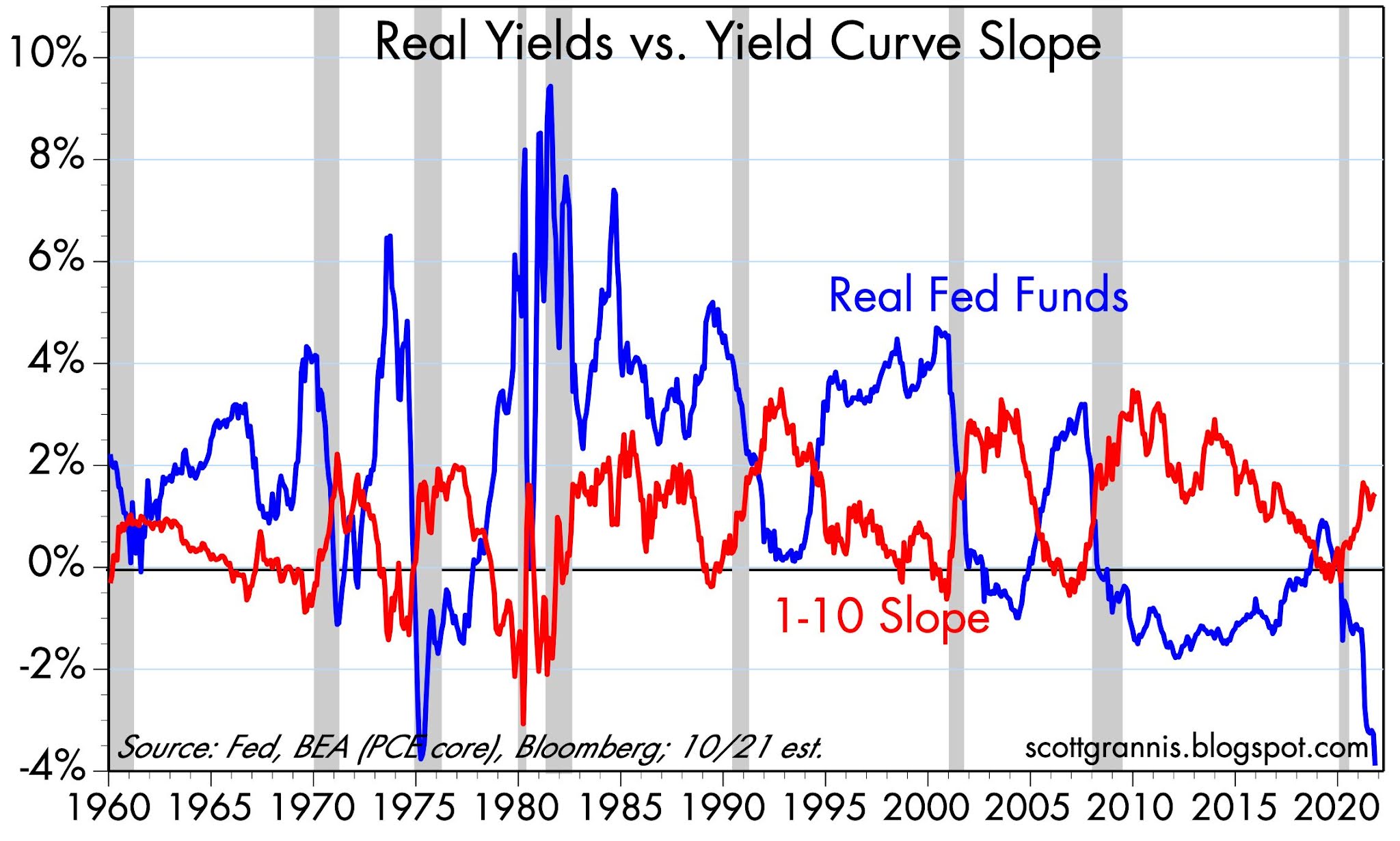
Chart #14 suggests that it is too early to worry about the negative consequences of future Fed tightening for stocks and the economy. With the exception of last year, every recession in my lifetime has been preceded by very high real interest rates (blue line) and a flat to negatively-sloped yield curve. Neither condition holds today. Indeed, this chart today suggests that the future looks bright. Unless the Fed does an about-face soon, it could be years before real interest rates are high enough to depress economic activity. In the meantime, credit spreads are very tight and liquidity is super-abundant.
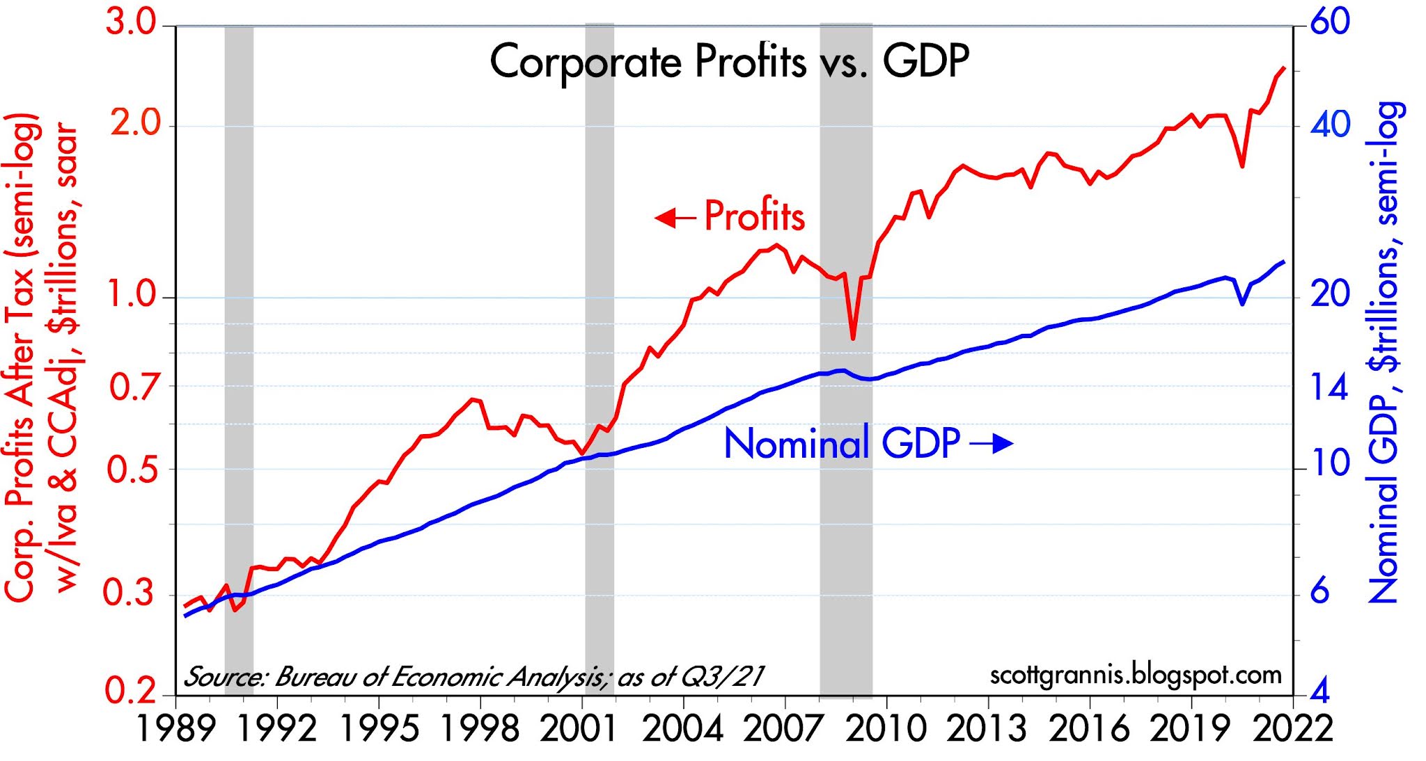
Consequently, the outlook for corporate profits is still quite positive, and the economy is nowhere near the brink of another recession.