Friday, April 28, 2017

Weak Q1 growth, but stronger growth to come

First quarter GDP statistics were disappointing, with real growth of only 0.7% annualized (real GDP increased by a mere $29 billion in the quarter, almost a rounding error). However, real growth for the 12 months ended March was 1.9%, only modestly less than the 2.1% annualized growth rate for the current business cycle expansion. More interesting, perhaps, was the rate of inflation as measured by the GDP deflator (the broadest measure of inflation available): 2.3% annualized for the first quarter and 2.0% for the past 12 months. By this measure, the Fed has achieved its target inflation goal, and is fully justified in raising short-term interest rates. The brightest spot in the quarter was a 12% annualized jump in gross private fixed investment, since weak business investment has been the root cause of the current recovery's dismal, 2.1% annualized pace of growth. This may mark the beginnings of a pickup in growth in the years ahead, especially if Trump is able to slash the corporate tax rate as he proposes.


As the chart above shows, real GDP growth has essentially been on a 2% growth path since the middle of 2009. That's about one percentage point below its long-term growth path, and the "gap" between the two is now a bit over $3 trillion. That's a disappointing result, to be sure, but it also implies that the economy has tremendous upside potential, and that is extremely encouraging. As long-time readers will  know, I consider that the current recovery has been weak primarily due to rising tax and regulatory burdens and a dearth of business investment (and the two are most likely closely entwined). Rebuilding confidence, reducing the barriers to business investment and risk taking, and increasing the after-tax rewards to investment will thus be critical to closing the GDP gap. The potential rewards to successful growth-oriented policies are hard to overestimate.


Real gross private domestic investment (shown in the graph above) grew at a 3.7% annualized rate from 1966 through 2007, over which time real GDP growth grew at a 3.1% annualized rate. From the peak of the last business cycle in 2007 until March of this year, private investment has managed to post only 1% annualized growth. It's no wonder then that growth in the current expansion has been only 2.1%. Without more investment, there will be a scarcity of jobs, and a scarcity of the tools (machines, computers, software) necessary to boost the productivity of those who are employed. Investment is the key to prosperity, and so far, in the current business cycle expansion, it has been in scarce supply.


A subset of real gross private investment is gross private fixed investment, shown in the chart above. Largely driven by strong residential investment, it jumped at a 12% annualized rate in the first quarter.


As the chart above shows, inflation as measured by the GDP deflator (the broadest possible measure of inflation) was 2% in the 12 months ended March 2017. Forget deflation. The issue now is whether inflation is likely to accelerate from its current 2% pace. It's also significant that despite the sluggish growth of the past 6 ¾ years, inflation has on balance remained well above zero, a result that runs counter to the Phillips Curve theory of inflation, which holds that weak growth and lots of unused capacity tend to depress inflation. Inflation is a monetary phenomenon, not a function of growth.

The key to the future prosperity of the US economy is business investment. Only the private sector can create prosperity; the proper role of the public sector is to uphold the rule of law, ensure personal freedom, protect private property, and maintain the peace—not to create jobs. Prosperity is the result of people working smarter and harder—and taking on risk in the process. In order to get more prosperity we need more investment, and Trump's tax proposals—while far from ideal—go a long way to incentivizing private sector investment.

Lowering the tax rate on big and small businesses to 15% would significantly increase the after-tax rewards to business investment. One simplistic example: currently a business gets to keep 65 cents on every dollar of profit; under Trump's proposal a business would get to keep 85 cents on every dollar of profit. That works out to a 30% increase in the after-tax rewards to running, starting, and expanding a business. (It also suggests that reducing the corporate tax rate to 15% could boost the stock market—which is the present value of future after-tax profits—by 30%.) When rewards increase to such a significant degree it is only reasonable to expect to see a big increase in business investment, which in turn would result in more jobs, more income, and an expanding tax base. Cutting tax rates needn't result in reduced tax revenues, and cutting the corporate tax rate is the most logical place to start if you want to stimulate the economy. And by the way, we need to continue to cut regulatory burdens and simplify the tax code; shrink the government, and give the private sector the room and freedom to grow.

UPDATE: John Steele Gordon yesterday wrote forcefully (and in much greater depth than I do here) about why Trump's tax proposals would be very good for the economy. Trigger warning: he criticizes those who oppose the proposals.

Monday, April 24, 2017

Chemical activity and trade still strong

The American Chemistry Council's Chemistry Activity Barometer continued to rise in its latest April release. This index has been a good coincident at at times leading indicator of both industrial production and overall economic growth, and it continues to point to rising industrial production and continued growth of the US economy. At the same time, there is a growing body of evidence that points to increased global trade, at a time when industrial commodity prices have been rising significantly.


The Chemical Activity Barometer rose 5.2% in the past 12 months, one of its strongest showings in seven years (the strongest being the year ended March, when it rose 5.6%).


This indicator almost always goes flat or declines in advance of recessions. Currently it points strongly to continued expansion.


This indicator has been a good leading indicator of growth in industrial production and economic activity in general. Currently it points to a substantial increase in industrial production in coming months.


As the chart above shows, US goods exports have been rising for the past year, and that is corroborated by a sharp increase in outbound container shipments from the ports of Los Angeles. It's notable that US exports to China rose over 20% in the year ending February, after contracting over most of the 2014-16 period. Japan reports double-digit growth in both imports and exports in the year ending March, after declining over most of the 2015-16 period. According to the Netherlands Bureau for Economic Policy Analysis, the volume of global trade rose at an 8% annualized pace in the six months ended January 2017. Expanding global trade is an excellent indicator of improving economic conditions worldwide. Very encouraging.


Rising prices for industrial commodities over the past year or so—at a time when the dollar has been rising—tell us that global industrial activity has generally exceeded the expectations of commodity producers. Also very encouraging.

Yet despite the good global news, the US economy seems still to mired in mediocrity (i.e., 2% growth). That's not necessarily inconsistent with global strengthening, since trade is much less important to the US economy than it is to most other economies. But improving global fundamentals nevertheless provide strong underlying support for activity here.

It's premature to worry about a US downturn, and it's not unreasonable to remain optimistic that things will improve. It pained me today to learn that Trump wants to impose a 20% tariff on imports of Canadian softwood, since all that does is make life more expensive for US residents (UPDATE: Read Mark Perry's excellent critique of Trump's tariff here). But I'm encouraged that he seems pointed in a positive direction in the area of tax reform, and that there is important progress being made on healthcare reform.

French election relieves systemic risk

This is a brief update on the status of global systemic risk in the wake of yesterday's French elections. By rejecting extremists, the French have reduced the risk of a Eurozone/euro collapse. 2-yr Eurozone swap spreads and default credit spreads on French debt, both key measures of systemic risk, have declined significantly from their recent highs. Europe is not out of the woods completely, but investors nevertheless are breathing a sigh of relief. Equity markets, understandably, have moved higher as a result.


The chart above shows the price of credit default swaps on French debt (a form of insurance against default by the French government). They reached a high of over 70 bps at the end of February, and are now down to just under 35 bps. This puts them only modestly higher than their multi-year low of 27 bps, which was registered last September. For context, CDS spreads on German debt—perceived to be ultra-safe—are a bit less than 20 bps.


The chart above compares US and eurozone 2-yr swap spreads. At 34 bps, US spreads are at the high end of their "normal" range of 20-35 bps, whereas Eurozone spreads are still somewhat elevated. The worst of the panic seems to have subsided, thanks to yesterday's elections, but concerns linger.


Eurozone stocks are now up 25% from their lows of last summer. US stocks have far outpaced their Eurozone counterparts since 2009, but Eurozone stocks are starting to close the gap, having outpaced US stocks by 7% since last summer. 


As the chart above suggests, the French election outcome was a relatively minor "wall of worry" that, now partially resolved, has allowed stocks to float a bit higher.

Thursday, April 13, 2017

Market-based chart updates

There are lots of things going on in the world, with the most significant, in my view, being the threat of nuclear war in/with North Korea, followed by deteriorating US-Russia and Mideast relations. On the domestic front, Trump has yet to make meaningful progress on an alternative to Obamacare or on tax reform, but he has made important progress with most of his nominees. However, if we don't get substantial progress on healthcare and taxes before year end, the economy could weaken as uncertainty mounts and people delay income and investment decisions. In the meantime, the nascent 
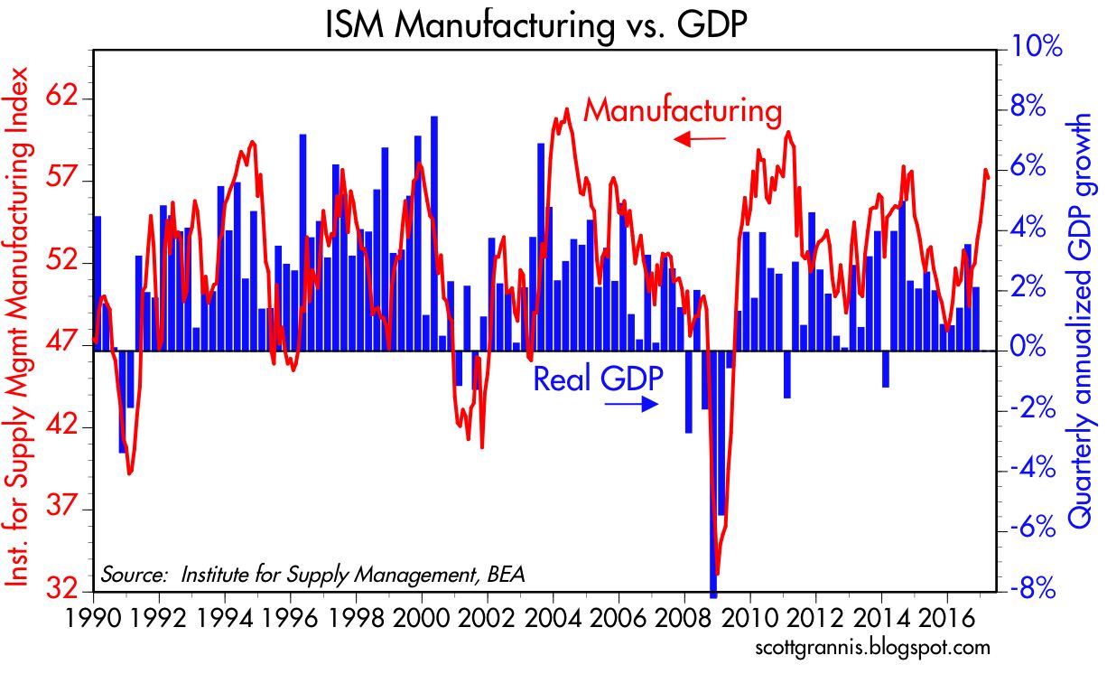
rebound in the manufacturing sector and the likelihood of improving corporate profits should sustain the economy for the next several months; but for now, the economy continues to plod along and markets are less than enthusiastic about the future.

What follows are updates of some of the more important charts—all based on market-driven prices—that I am following. These tell us what the market is thinking, as expressed in the prices of the dollar, gold, real and nominal interest rates, equity prices, volatility, swap and credit spreads, and commodity prices. As I read the charts, the market seems relatively unperturbed by all the turmoil, and hopeful that better times lie ahead. This in turn makes the market vulnerable to any shortfall vis a vis expectations, so now is one of those times to be cautiously optimistic rather than gung-ho.


If the US economy were a company, then the value of the dollar would be a good proxy for its relative attractiveness and its future prospects. The chart above shows two of the best measures of the dollar's value, on an inflation-adjusted, trade-weighted basis. By either measure, the dollar is moderately above its long-term average We can infer from this that the Fed has not printed more dollars than the world wants, though it might be guilty of supplying too few. On the other hand, it would appear that the dollar is one of the currencies in most demand, and that is encouraging since it means the US is attracting investment, and investment is the seed corn of future growth.


The chart above illustrates the tendency of commodity prices to move inversely to the value of the dollar (note that the dollar axis is inverted). In the past few years, however, both the dollar and commodity prices have moved higher. This is worthy of attention. I think it tells us that the rise in commodity prices has little or nothing to do with a monetary reflation (because a plentiful supply of dollars tends to boost the prices of most things (aka inflation), but rather more to do with a general strengthening of the global economy at a time when the US economy is expected to be one of the engines of stronger growth. Again, this is encouraging. 


The chart above shows the very strong correlation between industrial commodity prices and emerging market equities. That makes sense, because emerging market economies tend to specialize in the production of raw materials. I believe the rise in commodity prices reflects a general strengthening of global economies, so what's good for commodities is good for just about everyone, especially emerging markets. And as I pointed out in December 2015, emerging markets and commodities had been severely beaten up and prospects for their recovery were bright.


For years I've been amazed at the correlation between gold and TIPS prices, as shown in the chart above (note I use the inverse of the real yield on TIPS as a proxy for their price). The common denominator of both markets is the way they serve to protect people from risk. TIPS are a good hedge for inflation, they are default-free, and they are the only asset that guarantees investors a real rate of return if held to maturity. Gold, on the other hand, is a classic port in a storm for just about anything that makes people nervous about fiat currencies or government excesses. Gold and TIPS have been in a rough holding pattern for the past several years. Declines in gold and TIPS would likely coincide with improvements in the global economic outlook. That they have not yet fallen meaningfully is therefore a good sign that markets are still somewhat risk averse and less than optimistic.


It's almost always the case that stocks tend to weaken as fears tend to rise, as shown in the chart above. But the current level of fear and uncertainty (as reflected in the ratio of the Vix index to the 10-yr Treasury yield) is still quite modest compared to what we've seen in recent years. The Trump era seems to have brought with it a calming effect on global markets. 


Swap spreads are some of the best coincident and leading indicators of financial market and economic health. Spreads have been rising for the past year or so both in the US and in the eurozone, so that could be a sign of deteriorating economic and financial fundamentals. I've tended to dismiss the current rise in US swap spreads, however, because they are still within what we consider to be a "normal" range (20-35 bps); if anything, they were exceedingly low at the end of 2015 and only now have recovered to more normal levels. Eurozone swap spreads have moved substantially higher, however, and that is cause for concern. My guess is that eurozone swap spreads are elevated because of concerns that France could pull a "Frexit," and this could undermine the stability of the euro and the eurozone economy. This risk is not trivial, and is not one to dismiss lightly—unless you believe (as I do) that the demise of the eurozone would not be necessarily a bad thing. For the moment, I note that credit default spreads on French debt are declining (i.e., the market is worrying less about a Frexit since the political left seems to be ascendant for the moment), but this still bears watching.


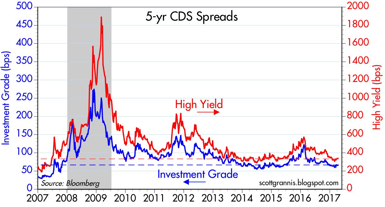
 Speaking of credit default spreads, the chart above shows that they are relatively low here in the U.S., and that further suggests that systemic risks are low and markets are relatively confident about the future.


One persistent and salient feature of the past 6-7 years has been Treasury yields in the US that are very low relative to inflation, as the chart above shows. Some observers dismiss this with the argument that the Fed is keeping interest rates artificially low, but I'm not a buyer of that line of thinking. I think Treasury yields are very low because markets still have a palpable degree of risk aversion, and are thus willing to pay a lot for the protection of Treasuries. We see this same phenomenon all over the developed world: sovereign yields are unusually low. Most investors have a choice between holding Treasuries and holding riskier assets; that the price of Treasuries is unusually high relative to other assets (e.g., the earnings yield on the S&P 500 is substantially higher than the yield on 10-yr Treasuries) must therefore mean that investors are very distrustful of the outlook for the economy and for corporate profits. In other words, very low Treasury yields are a strong and reliable indicator of a market that is less than optimistic, to say the least. Show me an optimistic/enthusiastic market, and I'll show you nominal Treasury yields that are much higher than they are today.


 The difference between nominal and real yields is a measure of the market's inflation expectations. In the chart above we see that inflation expectations over the next 5 years (the green line) are 2%, and not surprisingly, that is what the CPI has averaged over the past few decades. Markets are not concerned about rising or falling inflation right now; it's steady as she goes. Kudos to the Fed for having managed monetary policy surprisingly well over the years.


The chart above is my attempt to show that the level of real yields on TIPS can and does tell us a lot about the market's expectations for real economic growth. Real growth has averaged about 2% during the current expansion, and 5-yr TIPS yields have averaged about zero. You can invest in the economy and expect to get an average real return of 2%, or you can invest in TIPS and earn a guaranteed zero real rate of return. Guaranteed real rates of return should always be less than expected real rates of return, should they not?. If and when TIPS yields rise significantly, this will be a good indicator that the market is expecting economic growth to accelerate. For now, it may be the case that the market is buoyed by Trump expectations, but to judge from TIPS yields, there is little or no evidence of much optimism.


The chart above shows the 6- and 12-month growth rates of private sector jobs in the US. If anything, jobs growth has slowed over the past few years, from just over 2% to currently about 1.7%. The manufacturing sector looks to be picking up, but the overall economy remains on a sluggish growth trend that of late has been declining modestly on the margin. No sign here of a Trump bump, and it's premature to expect one: we need to see meaningful tax and regulatory reform (or solid reasons to expect such) before getting excited.

Wednesday, April 5, 2017

The two major sources of our healthcare problem

As I noted two weeks ago, the problem with Obamacare is that "it attempted to rejigger a huge fraction of the U.S. economy, and that is something that is virtually impossible to accomplish in a successful fashion by government diktat. Only a freely functioning market economy can make something so huge and so complex work in an efficient manner." So the solution is to restore a freely functioning market to the healthcare industry. That sounds easy, but the complexities involved with undoing Obamacare are nearly intractable, and that is what has bogged down Congress' attempts to repeal and replace.

When faced with very complex problems, the best solution involves simplifying things as much as possible. Fortunately, John Cochrane has taken a giant step in that direction with his recent post. He has come up with what he refers to as the "two original sins" of healthcare regulation. These two sins explain most if not all of the problems that we face with healthcare today. 

The first original sin appeared in the 1940s, when the government agreed to allow companies to deduct the cost of health insurance, but neglected to allow individuals to do the same. (I've discussed this in a number of posts over the years.) This made health insurance provided by employers much cheaper than health insurance purchased by individuals. Not only that, but it created a strong incentive for employers to offer health insurance which covered a whole lot of things; and why not, if the costs were uniquely deductible by companies? Not surprisingly, the vast majority of us today get our health insurance either from our employer or the federal government, and most of the healthcare policies offered (or mandated) today cover all sorts of trivial expenses—it's like buying car insurance that includes oil changes. As a result, only 10.5% of healthcare expenses are paid for out of pocket, while the vast majority of expenses are paid for by third parties—consumers don't know what medical services really cost, and they don't care, so free market forces are absent. This tax distortion is also largely responsible for the problem of portability, since employees can't take their insurance with them when they change or lose their job. We could fix this problem easily by simply changing the tax code to allow everyone to deduct their healthcare insurance costs. 

The second original sin, Cochrane argues, is that "Instead of straightforwardly raising taxes in a non-distortionary way (a VAT, say), and providing charity care or subsidies -- on budget, please, where we can see it -- our political system prefers to fund things by forcing cross subsidies. Medicare and medicaid don't pay what the service costs, because we don't want to admit just how expensive that service is. So, large hospitals make up the difference by overcharging you and me instead." 

Instead of levying a tax designed to cover the cost of healthcare for the unfortunate among us, we have chosen instead to use a system of cross subsidies:

Cross-subsidies are dramatically less efficient than taxes. Cross-subsidies cannot stand competition. Low prices, efficiency, and innovation in the provision of services like health care come centrally from competition, and especially disruptive competition. With no competition -- especially no entry by new doctors, hospitals, clinics, insurance companies -- costs spiral up. As costs spiral up, the cost of the charity care spirals up. As that spirals up, the size of the cross-subsidies spirals up. As that spirals up, the need to restrict competition spirals up.

Read the whole thing.

ADP report not a blockbuster

Lots of hoopla today about the "blowout" ADP employment report. Yes, it greatly exceeded expectations (+263K vs +185K), but lost in the shuffle was the fact that the prior month's number (+298K), which was a true blockbuster, was revised down to +245K. As the chart below shows, what we're left with is nothing out of the ordinary. The economy is still on a moderate growth path, but it is probably getting stronger bit by bit, thanks to a revival in the manufacturing sector.


As the second chart above shows, there has been a burst of employment growth in the manufacturing sector in recent months. This is where the strength in the ADP comes from. It also corroborates other reports that show manufacturing is rebounding after sustaining an oil patch-related setback.


As the chart above shows, the service sector—which employs almost 10 times as many workers as the manufacturing sector—shows only modest improvement over the past year. It's too early to get excited about substantially stronger growth in the broad economy. There's excitement in manufacturing, but it's a very small piece of the GDP pie. 


Service sector industries do not have particularly impressive hiring plans, as the chart above suggests.


Nevertheless, it's still the case that the economic fundamentals have improved somewhat over the past year, particularly in the Eurozone, which had languished for a long time.

In order to get really excited, we're going to have to see Trump pull off a significant reform of the U.S. tax code. I'm still optimistic in that regard, but it's not going to happen soon. 

Tuesday, April 4, 2017

The importance of oil prices

In several recent posts—most recently here—I've noted that the collapse of oil prices which began in mid-2014, and their subsequent rebound which began about a year ago, have had a significant impact on corporate profits, industrial production, and the economy in general. I offer here a chart that puts some meat on that argument:


Note that changes in crude prices tend to lead factory orders (ex- the volatile transportation sector) by about one month. Crude prices bottomed about a year ago, and since then factory orders have risen almost 8%. In the six months ending February, factory orders are up at an annualized rate of almost 11%. That's significant. The positive effects of cheaper oil prices on demand (if you spend less on energy you can spend more on everything else) are now far outweighing the negative effects of lower oil prices on drilling and manufacturing activity. The problems of the oil patch have faded away and the economy is now enjoying a new spurt of growth thanks to cheaper energy.

Monday, April 3, 2017

Strong manufacturing report

The March ISM manufacturing indices released today were uniformly strong, pointing to an improving economic outlook in the months to come. In this context, the Fed's recent moves to raise short-term rates do not yet constitute a tightening of monetary policy, nor are they a threat to growth.


The ISM manufacturing index does a pretty good job of tracking quarterly GDP growth, as the chart above suggests. Recent strength in the ISM index is consistent with Q1/17 growth of at least 3-4%, substantially higher than Q4/16 growth of 2.1%.


The strong reading for export orders, shown in the chart above, is particularly encouraging, since it likely reflects improving conditions overseas.


The prices paid index registered its strongest level in many years (first chart above), and that is corroborated by the strength in the industrial commodity prices (second chart). Prices are rising because global demand has proved stronger than commodity producers had anticipated.


Manufacturing firms are becoming more confident about the future, as seen in the chart above which reflects optimistic hiring plans.


It's nice to see that both Europe and the U.S. are experiencing improving manufacturing conditions. Coordinated recoveries can reinforce themselves.


The chart above suggests we are likely to seeing rising revenues per share in the months to come, since the ISM manufacturing index has a strong tendency to lead year over year gains in S&P 500 company's revenues per share.


The chart above shows the inflation-adjusted level of the Fed's short-term interest rate target, using the Fed's preferred measure of inflation, the Core PCE Deflator. This is the true measure of the impact of Fed policy, as the Greenspan Fed made clear in the late 1990s. Short-term rates have been negative in real terms for almost 10 years, and are still quite negative despite three rate hikes since late 2015. Negative real short-term borrowing costs incentivize borrowing (because borrowers can repay their loans with cheaper dollars), thus increasing the supply of money (because banks create money by increasing their lending activity) and reducing the demand for money (because negative real interest rates make holding cash equivalents unattractive). The net result is accommodative monetary policy. If the Fed persists in keeping short-term interest rates negative while economic activity and confidence rise, it risks allowing inflation pressures to rise.


The chart above compares the real Fed funds rate to the level of real yields on 5-yr TIPS. The latter is a proxy for what the market believes the real Fed funds rate will be in 5 years' time. A positive spread between the two indicates an upward-sloping real yield curve, and that in turn reflects the market's expectation that the Fed will likely continue to raise rates in the years to come. The time to worry is when the spread becomes negative (as it did prior to the last two recessions), since that means the market expects the Fed to lower rates in the future because the market senses a significant weakening of economic activity. In short, the chart above tells us that the market is comfortable with the Fed's actions to date.


The chart above shows the level of real and nominal 5-yr Treasury yields and their difference, which is the market's expectation for inflation over the next 5 years. So far we see nothing unusual afoot; the Fed has been managing policy in a manner consistent with relatively low inflation.