Sunday, December 23, 2018

Equity valuations have improved dramatically

With the price plunge which started in early October, the PE ratio of the S&P 500 (using Bloomberg's measure, which is based on 12-mo. trailing earnings from continuing operations) has fallen from a high of 23.3 last January to 16.48 currently. To put this into perspective, consider that today's PE ratio is below the 60-yr average of this measure (16.9), and it is about equal to the market's PE ratio just prior to the onset of the Great Recession. Relative to the current yield on 10-yr Treasuries (2.79%), stocks now boast an earnings yield (the inverse of the PE ratio ) which is 3.3 percentage points higher, whereas it was only 2 percentage points higher at the end of 2007, and it has averaged only 0.4% over the past 60 years. Looking ahead, the S&P 500 is priced to a mere 14.2 times 1-yr forward expected earnings. In short, and during the course of a year in which the economy has grown 3%, stocks have fallen from an arguably over-valued level to now outright cheap. And the Fed hasn't even begun to tighten monetary policy (though the market certainly fears they will).

Clearly, the market has lost a tremendous amount of confidence in the staying power of earnings and the health of the economy. Otherwise, stocks today would be a screaming buy relative to just about any other risk asset. Sure, there are lots things to worry about: Trump, China, tariff wars, a US slowdown, and another government "shutdown." But there is nothing preordained about how these worries will be resolved. Lots of things can change, and meanwhile the economy's fundamentals remain rather healthy (fabulous corporate profits, very low unemployment, rising wages, a reasonably strong dollar, unusually high consumer confidence, and very low swap spreads). It's not hard to be optimistic when the market is suddenly so pessimistic.

Chart #1

As Chart #1 shows, PE ratios last January climbed to a high of just over 23 on the strength of corporate tax cuts (and the promise of higher after-tax earnings). Now that the tax cuts are a reality and we've seen the growth in corporate profits, It makes sense for PE ratios to back off a bit. But to a level that is below the long-term average?

Chart #2

Chart #2 shows the difference between the earnings yield on stocks (the inverse of the PE ratio, and the dividend yield that would accompany stocks if corporations paid out all current earnings in the form of dividends), and the risk-free yield on 10-yr Treasury bonds, is 3.3%. Investors currently demand an additional 330 bps of yield in order to accept the perceived additional risk of stocks vis a vis Treasuries.   More often than not, however, the equity risk premium is far lower than it is today. During the boom times of the 80s and 90s, the equity risk premium was negative. Investors were so confident in the stock market that they were willing to give up yield in order to benefit from an expected price appreciation. Once again, investors are consumed by pessimism and fear.

Chart #3 

Chart #3 shows the latest estimate of after-tax corporate profits (this accompanied last week's revision to Q3/18 GDP figures). Profits surged some 20% in the year ending last September. Similarly, 12-month trailing reported (GAAP) profits grew almost 23% in the year ending last November. And now the market seems to be thinking that all of this will go up in smoke.

Chart #4

Chart #4 shows the ratio of corporate profits to GDP (using the ratio of the two lines in Chart #3). Profits have been running at the historically unprecedented level of 10% of GDP for most of the past 9 years. Maybe this is unlikely to continue; maybe profits fall back to 8% of GDP. That would still be well above the long-term average. Why shouldn't PE ratios also trade above their long-term average, especially considering the generally low level of interest rates?

Chart #5

Chart #5 compares the earnings yield on stocks to the yield on BAA corporate bonds (a decent proxy for all corporate bond yields). Corporate bondholders get first claim on corporate profits, with equity holders last in line. Since the yield on corporate bonds is safer than the returns promised to equity holders, it only makes sense for equity investors to accept a lower earnings yield—as they did for most of the 80s, 90s, and early 00s—because they expect to receive capital gains in the future (which in turn implies an optimistic outlook). The periods during which the reverse held (i.e., when earnings yields exceeded bond yields) were generally dominated by fear: e.g., the late 1970s, and the years following the Great Recession, and now. Today, the fact that earnings yields exceed corporate bond yields is a sign that investors are worried about the future and are thus willing to pay a premium for the safety of corporate bonds. (Note: This paragraph has been re-written from its original version to more accurately and correctly describe the message of Chart #5.)

Chart #6

Chart #6 compares the market's worry levels (the Vix/10-yr ratio) to the level of stock prices. We're deep within another bout of anxiety, and prices have fallen some 18% from their recent all-time high. It's not hard to imagine fear reaching even higher levels—commensurate with prior episodes of panic attacks—and prices even lower levels. But at today's levels prices are "vulnerable" to any good news.  Maybe the Fed will reconsider its plan to raise rates twice next year; maybe China will deal (actually they already are offering concessions); maybe the government shutdown won't prove any more painful than before. 

Some words of wisdom distilled from several famous investors: 1) The price of a stock is only important on the day you have to sell it. 2) One should delight when stocks become cheap, not despair.

UPDATE (12/24/18: 10:00 PST) Looks like the panic is close to reaching levels associated with the worst of past selloffs. Here's the latest version of Chart #6:


Thursday, December 20, 2018

The Fed screwed up badly

In the comments section of an earlier post (http://scottgrannis.blogspot.com/2018/12/clouds-and-silver-linings.html), I said:

The interaction of the Fed and the market is a complicated dance, where one leads the other and vice versa. The bond market has been telling the Fed to back off on its plans for higher rates, and I think the Fed has been getting this message. At the same time the Fed has been trying to reassure the market that it has confidence in the economy and the outlook for inflation, but that at the same time it is not willing to do anything rash.

To extend this analogy to the disastrous market reaction to yesterday's FOMC announcement and Powell's subsequent comments, I would say I made the mistake of believing the Fed knew how to do this dance. Unfortunately, the Fed seems to be dancing with two left feet, and has in the process severely injured the feet of its dancing partner, the market. The Fed did not take the bond market's advice to back off on its tightening agenda. The Fed ignored the obvious signs of angst that are playing out around the globe, and it ignored the evidence pointing to declining inflation and declining inflation expectations. A pause was called for and warranted; instead the Fed preferred to tighten and to project a further two tightenings next year, in spite of the fact that the market was not prepared for any further tightenings. And on top of that, Powell said that the unwinding of the Fed's balance sheet was on "auto-pilot," as if nothing could go wrong in the interim.

To make matters worse, former NY Fed Chief Bill Dudley spoke to Bloomberg this morning and essentially seconded everything Powell said yesterday, i.e., the Fed was right to hike rates and there is every reason to think that more hikes are warranted. 

In short, the Fed now has convinced the market that it is more likely than not to over-tighten policy, and that, in turn, raises the spectre of another Fed-induced recession. (Very tight monetary policy is directly responsible for every recession in modern times, as I've repeatedly noted in this blog.)

If the Fed does not reverse course or otherwise clarify its intent, soften its stance, or display more concern for the market's angst, then the chances of a recession will increase significantly. It's hard to believe that Powell would insist on snatching defeat from the jaws of victory, but that's the message he has inadvertantly sent the market. 

There is still plenty of time for Powell to set things straight, because the key financial market and economic fundamentals are still intact. But in the meantime things are likely to get uglier.

Chart #1

Chart #1 shows what in my opinion is one of the most important financial indicators of all: 2-yr swap spreads. These have been excellent leading and coincident indicators of liquidity, systemic risk, and economic health. At current levels (~15 bps), swap spreads are exactly where you would expect them to be in a normal, healthy world. Eurozone swap spreads are on the high end of normal, however, but we know the Eurozone economy is struggling, and possibly flirting with another recession, if recent guidance from Fedex is a guide. As I mentioned yesterday, the US economy appears strong, and swap spreads support that view. They say that systemic risk is low, liquidity is abundant, and the financial and economic fundamentals are healthy. You couldn't ask for anything more.

Chart #2 

Unfortunately, Chart #2 shows that Credit Default Swap spreads are somewhat elevated. I think the main reason for this can be traced to the huge and recent decline in oil prices: it's a replay in a sense of what happened in late 2015, when collapsing oil prices created tremendous pressure on the bonds of energy-related companies. We can't rule out the negative impact of Fed tightening, but for now the main driver of wider spreads seems to be falling oil prices. That can be very painful for oil producers and related industries, but we survived worse just a few years ago, when oil prices truly plunged, from $110/bbl to a mere $30. More recently, the drop has been from a high of $75 to $46. 

Chart #3

Chart #3 compares the price of crude oil to the market's expectation for what the CPI will average over the next 5 years. Inflation expectations have fallen in direct proportion to the decline in oil prices, much as they did in late 2015. Inflation expectations are down mostly due to cheaper energy, and not, as one might fear, to the Fed being too tight. If the Fed were really squeezing market liquidity, 2-yr swap spreads would be high and rising.

Chart #4

Chart #4 compares the value of the dollar (inverted) to the level of industrial metals prices. There is a strong tendency for commodity prices to be inversely correlated to the value of the dollar, and that is easy to see during the period 1997-2014. More recently, from 2015 thru 2018, the correlation has declined significantly, as a much stronger dollar has resulted in only a modest decline in metals prices. I think this shows that the dollar is not "too strong," and that in turn implies that the Fed has not been too tight. If the Fed were intent on creating a shortage of dollars in order to slow the economy, the dollar would be much stronger and/or commodity prices would be much weaker.

Chart #5

Chart #5 shows the market's projection over the past six months of what it thinks the Fed's target funds rate will average in December 2019. Of note is the huge decline beginning last month, from 2.93% to 2.55% today. This is completely at odds with the Fed's current expectation, as announced by Powell yesterday, that the funds rate will be 3% by the end of next year (i.e., two more tightenings in 2019). This is the market's way of telling the Fed that it is on course to over-tighten and thus risk a big economic slowdown or even a recession. You don't need an inverted yield curve (which is still modestly positive) to know that the market is worried about the Fed and the economy. This chart tells you all you need to know. If yesterday Powell had announced a pause and conditioned future tightening to the health of the economy and the state of global markets (e.g., trade tensions) the market would have reacted positively instead of negatively. 

Chart #6

As Chart #6 shows, there is blood in the streets. Fear and uncertainty are surging, and the stock market has plunged almost 16% from its all-time high of last September. At this rate we're likely to see more blood unless and until Powell walks back yesterday's comments. We're not yet in a full-blown panic.

On the positive side, all it takes is a few words to put things right. The damage done to date is not significant or permanent, and it is reversible.

Wednesday, December 19, 2018

US economic activity looks robust

As a general angst continues to grip global markets (Are China and Europe headed for a recession? Are we facing a debt crisis? Is Trump not only guilty but insane?), and while the world awaits the FOMC's rate-hike decision later today with a degree of trepidation, I want to briefly show some charts that suggest the US economy is doing quite well, actually. All of these charts measure recent, actual, physical economic activity—not surveys, not sentiment, not estimates.

Chart #1 

As Chart #1 shows, US industrial production stands out for its ongoing strength, a phenomenon that emerged almost immediately following the November 2016 elections. Eurozone activity, in contrast, has stagnated, and this jibes with the recent announcement by Fedex that its overseas earnings outlook has deteriorated significantly. There's little doubt the US economy is doing better than most others.

Chart #2 

 Chart #2 is a composite of truck, rail, waterways, pipeline and air freight shipments as of October '18. As with industrial production, physical shipment activity has surged in recent years.

Chart #3 

Chart #3 focuses on shipments by train, and includes data as of a week ago (btw, this does not include shipments of crude oil). Here too we see that activity has picked up in the last year or so.

Chart #4 

Chart #4 compares truck tonnage with equity prices. Here we see a dramatic divergence between physical activity and the mood of the stock market. Financial markets appear to be completely out of step with the economy's physical fundamentals.

Friday, December 7, 2018

Clouds and silver linings

Markets have been unusually nervous and volatile since late October, driven by fears of an escalating trade war with China, emerging weakness in European economies, tighter monetary policies from most major central banks, the post-election realities of a divided Congress, and a growing sense that the US economy is struggling and/or possibly staring a recession in the face. I've called it "global angst" in my current favorite chart (see Chart #16 below), "Stocks climb walls of worry."

Without doubt, things could be better than they are, but there are silver linings to a lot of the clouds. Business investment is relatively weak, but corporate profits are at record levels. The housing market and residential construction have softened, but this is being at least partially offset by the recent 40 bps decline in mortgage rates. Today's jobs number was disappointing, but jobs growth this year still is stronger than it was last year. The Fed says it plans to raise short-term rates in gradual fashion, but the market has priced out two of the tightenings it expected earlier this month (the market now expects only one more tightening in the next 12 months, and no more after that). The yield curve has flattened in some areas, but remains positively sloped, and real short-term interest rates are still very low (only slightly above zero). Inflation expectations have fallen below the Fed's target, but this is almost entirely due to a recent sharp drop in oil prices. None of this points to recession.

The problem is not the Fed, not deflation (or even low inflation), and not the yield curve. I think the main problem is a general angst that finds its strongest expression in the outlook for the US-China conflict. This creates uncertainty which acts as a headwind to growth and risk-taking in general.

Regardless, we are besieged by worries of all sorts these days. What follows are 16 charts which help put things in a useful perspective:

Chart #1

Chart #2

Chart #1 compares real and nominal 5-yr Treasury yields, and the difference between the two. Note how real yields (blue line) remain in a gradual uptrend: this is a direct reflection of the market's perception that the US economy remains healthy and is likely to continue growing at a 2.5-3% pace, in my estimation. Note also the recent decline in expected inflation: it's entirely due to the decline in nominal yields. And as Chart #2 shows, the decline in oil prices fully explains the drop in inflation expectations. No problems here.

Chart #3

Chart #3 shows two points on the real yield curve, which is the most important yield curve to watch (real yields are the true measure of how high or low interest rates are). The blue line is the overnight real rate, and the red line is effectively the market's forecast for what the blue line is going to average over the next 5 years. The time to worry is when the blue line exceeds the red line. There's still a healthy spread between the two.

Chart #4

Corporate credit spreads have widened a bit as oil prices have plunged. But as Chart #4 shows, credit spreads are still relatively tight, and the most important measure of spreads (swap spreads, because they tend to lead other spreads) remains very low. Swap spreads are also a good measure of financial market liquidity, and at today's levels they continue to suggest that liquidity is abundant. That's very important, since liquid markets allow for market participants to exchange risk freely. Note how the sharp rise in swap spreads priced the Great Recession; they got so high that the market was almost paralyzed, and that contributed significantly to the meltdown of mortgage-backed and other risky securities. Liquid markets can deal with all sorts of problems, just as free markets maximize economic efficiency.

Chart #5

Chart #5 shows the very impressive reduction in private sector leverage that has occurred since the end of the Great Recession. The average household today has very strong financial fundamentals, and that is effectively a buffer against negative shocks.

Chart #6

Nominal and real net worth of the private sector reached an all-time high as of the end of September: $109 trillion. As the above chart shows, recent increases in household net worth are very much in line with the long-term, inflation-adjusted historical trend. This was not the case with the asset price "bubble" that occurred prior to the Great Recession, and prior to the 2001 recession—markets and households got overextended. Note also the 10-fold increase in real net worth in the past 66 years! This is nothing short of breathtaking progress.

Chart #7

Chart #8

Chart #7 shows that the increase in private sector (household) net worth since 2008 has been driven mainly by rising stock prices and increased savings (i.e., financial assets). Real estate values and debt levels have increased only modestly. In turn, as Chart #8 shows, rising stock prices have been supported by rising corporate profits. It's not at all obvious that we are living in a bubble that threatens to pop.

Chart #9

The ISM manufacturing and service sector indices provide very timely insights into current economic activity. Both have been very strong of late. Chart #9 compares the ISM manufacturing index and quarterly GDP growth. The current strength in the manufacturing sector points to very strong economic growth overall, at least 4% for the current quarter. That contrasts significantly from the modest 2.4% Q3/18 growth rate projected by the NY and Atlanta Feds' forecast models.

Chart #10

As Chart #10 shows, hiring intentions in the all-important service sector (70% of the economy) are strong. This bodes well for future jobs growth.

Chart #11

Chart #11 suggests that the US manufacturing sector is outpacing Europe's handily; it also shows how much the Eurozone economy has suffered of late. That's not necessarily bad for the US, but it is another headwind to worry about.

Chart #12

As Chart #12 shows, the US service sector these days appears to be stronger than it has been for a long time. As with Chart #11, it also highlights the weakness in the Eurozone economy.

Chart #13

Today's release of the November jobs numbers was weaker than expected (+155K vs. 198K), but as Chart #13 shows, this series is notoriously volatile on a month-to-month basis. One month's data is hardly significant. I prefer to look at the 6- and 12-month averages. Private sector jobs growth averaged 180K per month in 2017, and so far this year it has averaged 200K: that's an 11% improvement!

Chart #14 

Chart #14 shows the 6- and 12-month rates of growth for the monthly private sector jobs numbers. Here we see the modest uptick in growth rates this year relative to last year. By these measures, private sector jobs currently are growing at a 1.8-1.9% rate, and that's only marginally less than the 2.0% average annual growth rate for the past 8 years.

Chart #15

Chart #15 shows the year over year growth rate of the labor force (the total of those working plus those looking for work). Today's 1.4% annual growth rate is substantially higher than 0.5% average growth rate we've seen since the economy bottomed in mid-2009.

Chart #16

Stock prices today are down a tad over 10% from their all-time highs of last September, as shown in Chart #16. That's mostly due to an increase in the market's worries (as measured by the ratio of the Vix index to the 10-yr Treasury yield), but it also reflects the fact that the economy has failed to accelerate as supply-siders (like me) had expected. Growth has picked up modestly in the past two years, but not as much as we would have liked to see considering how much deregulation and tax-cutting there has been in the interim.

China is the wild card these days, but it's also the case that for the next two years we're going to have a divided Congress that is unlikely to pursue a pro-growth agenda, and there are few signs, if any, that global growth is picking up.

The market has priced in a lot of slowdown expectations. According to Bloomberg, the current PE ratio of the S&P 500 is 18, and that's as low as we have seen since February '16. Today's equity premium (the difference between the earnings yield on stocks and the yield on 10-yr Treasuries) is 2.7%, and that's as high as we've seen since November '14. This rather substantial repricing of equities is a potential positive, since it makes taking risk more attractive, and that in turn helps offset the de-risking forces of uncertainty emanating from places like China and Congress. Clouds and silver linings.

The question confronting investors today is not whether the economy is going to slow down (that's priced in already); the question is whether it is going to slow down by a lot, and how certain one is of that future. In this regard I remain optimistic that things won't be as bad as the market already fears. That's been my position for the past 10 years, actually: always thinking that the market was too pessimistic in its assumptions about the future. 

Friday, November 30, 2018

The yield curve is not forecasting a recession

By now, most anyone who keeps up with financial matters knows that a flat or inverted Treasury yield curve is a good predictor of an impending recession. I've blogged extensively on this subject for almost 10 years. Recently, a few industrious pundits have found evidence that the front end of the Treasury curve is "close to flat." While it's hard to argue with their facts, an almost-flat curve is not the same as a flat or inverted curve. The latter occur only when the market looks into the future and sees good evidence that the Fed will no longer tighten policy and will very likely ease policy at some point. We're not there yet.

Here's a quick recap of where the yield curve stands:

Chart #1

Chart #1 shows us what the market has thought the target Fed funds rate will be in December of next year. One year ago, on the left end of the chart, the Fed funds futures market expected the funds rate to be 2.0% by December '19; it now expects the funds rate will be 2.7% by December of next year. That is essentially equivalent to two more Fed tightenings, from the current 2.25% to 2.75%. Currently the market does not expect the Fed to do anything more beyond December '19. "Two more rate hikes and the Fed is done" is the current meme. That implies that the economy is quite likely to continue growing for the foreseeable future, but not at a very impressive (nor worrisome) pace. Note that expectations for the future target rate have dropped by almost one tightening in past few weeks, and that in turn has been driven by news suggesting the economy is proving a bit weaker than previously thought. 

In any event, it's hard to get worried about a mere 50 bps increase in short-term interest rates for the foreseeable future.

Chart #2

Chart #2 looks at the front end of the real (inflation-adjusted) yield curve. This is arguably the only yield curve that really matters; real interest rates are the true measure of the cost of borrowing, not nominal rates. The blue line is the real Fed funds rate (the target funds rate (2.25%) less the year over year rate of inflation according to the Core PCE Deflator (1.8%), the Fed's preferred measure of inflation. The red line is the real yield on 5-yr TIPS (Treasury Inflation-Protected Securities), which can also be thought of as the market's forecast for what the real Fed funds rate will average over the next 5 years. This measure of the yield curve is still positively-sloped. Note that it has been inverted (i.e., when the blue line exceeds the red line) prior to the past two recessions. We're not there yet. This chart tells us that the market fully expects the Fed to tighten monetary policy further (by increasing the real funds rate), but not by much.

Chart #3

Chart #3 shows the most common and generally most-favored measure of the yield curve: the difference between 2-yr and 10-yr Treasury yields. The top portion shows the history of these two yields, while the bottom portion shows the difference between the two (i.e., the slope). Note first that the 2-10 slope quite often becomes flat or almost flat, and it does so sometimes many years in advance of recessions. It's almost flat now (20 bps), but that's hardly unusual during a period in which the Fed is raising interest rates.

Chart #4

Chart #4 effectively zooms in on Chart #3, showing the behavior of these yields and their spread over the past year. Note that this portion of the curve was actually a tiny bit flatter back in August than it is today.

Chart #5
 

Chart #5 is where things get more interesting. This shows the difference between 10- and 30-yr Treasury yields. This portion of the yield curve has been steepening since last July. Inversions in this portion of the curve have been reliable predictors of recessions, but we're definitely not there yet. To judge by this chart, a recession, if one is in the cards, might not occur for at least several years. And to judge by Charts #3 and #5, what is going on today in the yield curve is similar to what happened in the mid-1990s. Back then the economy was in the early innings of what would prove to be a very strong growth phase, which was followed by a mild recession in 2001.

In any event, it's possible, and likely, that good news on the global trade front could alter the bond market's expectations rather dramatically, resulting in a steeper yield curve and ultimately a stronger economy. 

Thursday, November 29, 2018

Steady as she goes

Fed Chairman Powell yesterday made it clear that Fed policy is not a threat to the economy or to the market. He's not on the rate-hiking warpath, and he's not worried that the economy, which is growing nicely, is in danger of overheating. Not surprisingly, markets breathed a sigh of relief. The economic and financial market fundamentals are healthy, and the market's recent spate of worries are just that: worries.

Yesterday's release of the second estimate of Q3/18 GDP growth was largely unchanged from the first (+3.5%). If there's anything disappointing in the news, it's that the economy is not stronger, given that corporate profits are very strong. According to the latest NIPA data, after-tax corporate profits rose 19% in the year ending Sept. '18. According to GAAP (reported) profits, earnings per share for the S&P 500 rose over 22% in the year ending Oct. '18. Fabulous profits, indeed, but business investment remains moderate, and that is a big reason the economy is not stronger.

Trump has managed to reduce tax and regulatory burdens in impressive fashion, but his tweets and his tariff threats have created unnecessary distractions and unfortunate uncertainties, not to mention higher prices for an array of imported consumer goods. He's made America better, but not Great. Getting past the threat of trade wars, especially with China, will be the key to unlocking the future growth potential of the US economy, which remains Yuge. All eyes will be watching for the results of Trump's meeting with Xi in Buenos Aires later this week.

Chart #1

Thanks to plotting real GDP on a semi-log scale, Chart #1 makes it easy to see that the ongoing economic expansion has been the weakest in history. For many decades the economy averaged 3.1% annual rates of growth. But since the Great Recession ended in mid-2009, the economy has averaged only 2.3% annualized growth. Things have picked up a bit of late: in the year ending last September, growth was 3%. A decade of sub-par growth has created a potential GDP "gap" of at least $3.2 trillion. In the past year alone, the US economy has missed out on over $3 trillion in income—which averages out to over $20,000 per worker—that could have been earned if the economy had kept up with its previous trend.

Chart #2 

Chart #2 compares the 2-yr annualized growth rate of GDP with the real yield on 5-yr TIPS. There's a strong tendency for real yields to track the growth rate of the economy. Real yields began to rise just after the November '16 election, from -0.4% to 1% today. The outlook for the economy has improved, but we're still looking at moderate rates of growth in the 2.5-3% range. To get excited we'll need to see growth rates of 3-4%, and real yields of 2% or better. I remain optimistic that this will occur, but we aren't there yet. More confidence and more investment are what's needed, and a lower-tariff solution to our mounting China angst would be a wonderful tonic in that regard.

Chart #3

Chart #3 shows real gross private domestic investment. Like GDP, investment has been rising at a sub-par rate for the past decade. We need to see a lot more investment for the economy to get exciting. Chart #18 in my previous post shows a proxy for business investment—capital goods orders. They've been very unimpressive by historic standards. We've seen some nice improvement since late 2016, but this needs to continue.

Chart #4

Chart #5

Chart #6

Chart #4 compares after-tax corporate profits to nominal GDP, and Chart #5 shows the same profits as a percent of GDP going back 60 years. Corporate profits these days are close to their strongest levels ever relative to the economy, roughly 50% higher than their long-term average. Is it any wonder that the PE ratio of the S&P 500 (18.76 today, according to Bloomberg) is higher than average (16.85)? (see Chart #6)

Chart #7

If there is any message in the charts #4-6, it's that the market doesn't believe all this good news will last—despite record-level profits, valuations are only moderately above average. Chart #7 shows the risk premium that investors demand to hold stocks instead of risk-free 10-yr Treasuries. If PE ratios remained at today's level (18.75), and if corporations paid out all their profits in the form of dividends, then the dividend yield on stocks would be the inverse of the PE ratio: 5.33%. Yet if this were certain to persist, then only a fool would pass up stocks in favor of lower-yielding Treasuries. Instead, investors apparently figure that the corporate profits are likely to decline meaningfully relative to GDP. I made this same point three years ago and also seven years ago.

Chart #8

Chart #8 is one of my favorite recession-watch charts. Every recession has been preceded by a significant tightening of monetary policy, and that tightening can be measured by 1) a relatively high real Fed funds rate (2-3%), and 2) a flat or inverted Treasury yield curve. Currently the real funds rate is a bit less than 0.5%, and the yield curve remains positively sloped. Neither are threatening a recession, and neither is the Powell Fed. (I should note that the recent increase in the real funds rate is mainly the by-product of a decline in the PCE Core inflation rate.)

Chart #9

Finally, Chart #9 updates one of my favorites. 

Thursday, November 22, 2018

Still looking like a panic attack

A little over 3 weeks ago I opined that the the big October decline in US equity prices still looked like a panic attack. Shortly thereafter, equity prices climbed over 6%, but have once again returned to their late-October lows. I haven't made further comments because I didn't see that anything had changed. I'll comment now, but it still looks like a panic attack. Key economic and financial fundamentals remain healthy, but fear still dominates the landscape. One new development is the very recent 24% plunge in AAPL, driven by fears that demand for new iPhones is much weaker than previously thought. This has led many observers to theorize that global demand in general may be flagging, increasing the risk of a global recession that might spread to the US. To be sure, equity markets in Europe and Japan have dropped around 10% since late-October, but Chinese equities, surprisingly, have actually picked up a bit of late. It's not an easy diagnosis, but a global or even a US-only recession is far from an inevitable conclusion.

What follows is a recap of the same charts I featured October 29th, plus a few extras:
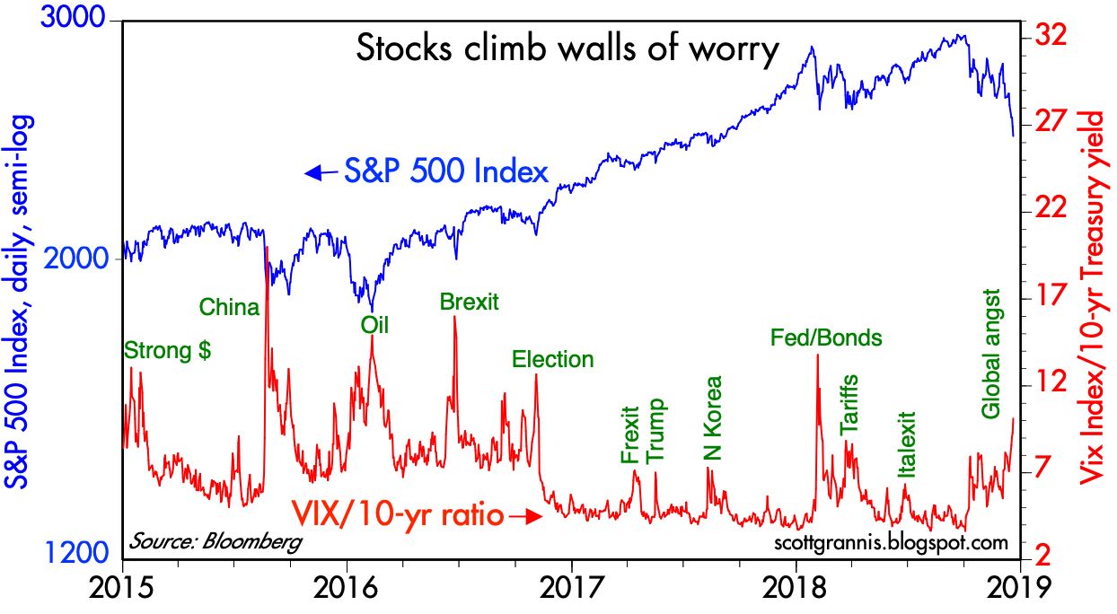
Chart #1

As Chart #1 shows, market selloffs are typically accompanied by a rise in the market's fear and uncertainty. (The ratio I use to capture that is the Vix index divided by the 10-yr Treasury yield. The former is a direct measure of fear and also a measure of how expensive options are, while the latter is a proxy for the market's confidence in the outlook for the economy; higher yields typically reflect more confidence, while lower yields reflect uncertainty about the future.) It's worth noting that the "worry" level these days is significantly less than it has been at other times in the past several years, even though the market's response has been of similar magnitude.

Chart #2

Chart #2 shows the level of 2-yr swap spreads in the US and in the Eurozone. Swap spreads are excellent coincident and leading indicators of systemic risk and financial market liquidity. At today's levels, swap spreads tell us that liquidity in the US is abundant and systemic risk is low. The Eurozone isn't quite as healthy, however, since it struggles with Brexit and the Italian budget outlook, among other things such as generally sluggish growth.

Chart #3

Chart #4

Chart #3 shows the level of real and nominal 5-yr Treasury yields and the difference between the two, which is the market's expected annual inflation rate over the next 5 years. Inflation expectations today are very close to the Fed's 2% target. They have dipped a bit in the past week or so, and Chart #4 suggests that the reason is simply a sharp drop in oil prices. We have seen this pattern quite a few times in recent years. Today's 1.8% forward-looking inflation expectation is nothing to worry about. Indeed, it tells the Fed that there is no pressing need to tighten monetary policy, and that should be a source of comfort to the market. Indeed, in the past two weeks the bond market has priced out one Fed tightening, and now expects only two rate hikes (from 2.25% currently to 2.75%) by the end of next year, with no more rate hikes after that.

I note that gold has been flat for the past 5 years, and the dollar is only 4% above its 5-yr average. Neither suggest that the Fed today is too tight or too loose. The Fed is not likely the main source of the market's concerns.

Chart #5

Chart #5 compares the value of the dollar, relative to other major currencies, to an index of industrial metals prices. Note that there is tendency for these two variables to move inversely—a stronger dollar tends to coincide with weaker commodity prices and vice versa. The "gap" between the dollar's current level, which is on the strong side, and commodity prices, which are still relatively strong, suggests that the global economy is still healthy (i.e., demand for commodities is still relatively strong despite the relatively strong dollar). This runs directly counter to the current meme which holds that the global economy is slowing down meaningfully. 

Chart #6

Chart #6 shows 5-yr Credit Default Swap Spreads. These are highly liquid and generic indicators of the market's confidence in the outlook for corporate profits—wider spreads equate to more concern, tighter spreads to less concern. These spreads have increased somewhat as equities have experienced a sharp correction. But they are still relatively low from an historical perspective. This further suggests the market is still reasonably confident in the outlook for corporate profits and the health of the economy, despite all the concerns floating around.

Chart #7

Chart #8

Charts #7 and #8 show various measures of corporate credit spreads. Spreads in the energy sector have been hit the worst, due to the recent decline in oil prices, but the damage is nothing compared to what happened when oil prices collapsed from $110/bbl in mid-2014 to $30/bbl in early 2016. The recent decline has brought oil prices back to where they were a year ago. This is not a major problem.

Chart #9

Chart #10

Chart #9 shows Bloomberg's measure of the S&P 500's PE ratio, which uses trailing 12-month profits from continuing operations. Since January of this year PE ratios have plunged rom 23.3 to now 18.1 (-22%). This reflects a rather sudden loss of confidence in the long-term outlook, especially considering that profits continue to rise, and are in fact up 22% versus November 2017, as Chart #10 shows. Curiously, the bond market appears to be much more confident about the future than the stock market (given that credit spreads are up only modestly, whereas equities have suffered a significant correction). This further suggests the equity market may just be in the throes of a panic attack. Looked at from the positive side, the recent decline in PE ratios has made the market that much more attractive.

Chart #11

Chart #11 shows the equity premium of the S&P 500 relative to the 10-yr Treasury yield. The current earnings yield of the S&P 500 is 5.5%, whereas the current 10-yr Treasury yield is only 3.1%. That investors are apparently indifferent to an equity yield that is more than 200 bps higher than the risk-free yield on Treasuries suggests that the market doesn't have much confidence in the outlook for earnings. Risk aversion has been an important part of the market's behavior in the current business cycle expansion, and it hasn't gone away even as economic growth has picked up of late. Consider how optimistic the market was back in the 1980s, when the equity risk premium was solidly negative for many years. It's been solidly positive for most if not all of the current expansion. Selling equities in favor of bonds today means giving up yield, so sellers must have the courage of their convictions.

Chart #12

Chart #12 compares the real Fed funds rate (a good measure of how loose or tight monetary policy is) with the slope of the Treasury yield curve. Recessions have always been preceded by a substantial tightening of monetary policy and a flattening or inversion of the yield curve. We're a long way from those two conditions today. Neither of these variables have changed meaningfully since late October. Real short-term yields are still very low, and the yield curves still positively-sloped. 

Chart #13

Chart #14

Chart #13 compares the value of the Chinese yuan with the level of China's foreign exchange reserves. The yuan rose relentlessly from 1994 to 2013, despite the central bank's repeated interventions (i.e., buying dollars and selling yuan) to keep it from strengthening even further. But since then the yuan has been under pressure, and the central bank has had to sell foreign currency (any buy yuan) to keep it from declining further. This represents a sea change in the outlook for the Chinese economy. Before 2014 it was a magnet for capital, whereas now capital is fleeing the country. Still, capital flight has not been severe; the central bank has "lost" only about $1 trillion of its once $4 trillion in forex reserves.

As Chart #14 shows, the real value of the yuan vis a vis the world's currencies is still much stronger than it was throughout most of China's modern past. But on the margin it has been weak for several years now, and China's economic growth rate has slowed from 12% in 2010 to now only 6.5%. The bloom is off the Chinese rose, and if recent trends continue, China's economy could prove to be the world's weakest link.

Chart #15

Chart #15 shows how incredibly weak the Chinese equity market has been relative to the US equity market since China first entered the developed-country world in 1995. Chinese equities have suffered significantly more this year than any other developed countries' equity markets. This once again makes the point that China is the country that is hurting the most. If China doesn't find a way to deal with President Trump, what's bad for China could prove to be bad for everyone. I continue to believe that a deal is possible, since it would be in everyone's best interests to have lower tariffs and more respect for international property rights.

Chart #16

Chart #16 compares the US and Eurozone equity markets. The US has been outperforming Europe for the past decade, and to a sizable degree.  

The global winds are at our back, but that doesn't mean we can ignore local headwinds. The following charts highlight some areas of weakness in the US economy that bear watching.

Chart #17

As Chart #17 shows, there has been a remarkable tendency for the physical volume of goods transported by US trucks and the level of the S&P 500 stock index. As the economy grows, so do equity prices. Truck tonnage was weak in the third quarter, and that appeared to foreshadow the October-November weakness in the stock market. But the latest reading of the Truck Tonnage index shows a significant 2.2% increase. On the surface, this would suggest that the economy is entering the boom phase that supply-siders have been looking for ever since Trump's impressive reduction in corporate tax rates. But it's also possible that trucks these days are scurrying around trying to deliver a flood of imports that were purchased in the hopes of avoiding increased tariffs scheduled for January.

Chart #18

Chart #18 shows the real and nominal level of capital goods orders, which in turn are a good proxy for business investment. By this measure business investment has increased by an impressive 16% since the November 2016 election. But investment has gone relatively flat in recent months, and it is far from impressive by historical standards. This could and should be better. What are companies doing with all their new-found profits? Buybacks are one answer, but they are still only a fraction of the current market value of US equities and thus not a satisfying answer. 

Chart #19

Finally, Chart #19 shows how the wind has been knocked out of the residential construction industry in recent months. Most disturbing is the big decline in homebuilders' sentiment last month. We know that rising prices and higher mortgage rates have made housing much less affordable. But the current level of new housing starts is still far below its 2006 peak, and still below the level required to replace aging structures and accommodate new families. I've argued that this adds up to a pause or consolidation, not the beginning of another crash. Why can't prices stop rising or decline a bit, without that leading to the wholesale collapse of everything like what we saw in 2006-2008? Why can't the relatively strong economy continue to boost incomes and drive demand for more housing? Household leverage today is far below the levels that preceded the Great Recession, and mortgages are not being extended on ridiculous terms as they were back then. Still, it remains the case that what's bad for housing tends to be bad for the economy.

The horizon is not empty of threats, but the worst one (China) can be avoided or seriously mitigated by a trade "deal" that is in everyone's best interests. Free trade is a wondrous tonic for global growth, and free trade benefits all parties, contrary to what Trump's clueless Peter Navarro happens to think. All we need is for clearer heads to prevail. How hard is that?