Tuesday, June 30, 2009

Europe is expensive this summer


This is my chart of the purchasing power parity (PPP) of the euro versus the dollar. The green line is the PPP value of the euro, as I calculate it. It assumes a base year when prices in the U.S. and Europe were roughly comparable, and then adjusts that value according to inflation differentials between the U.S. and Europe. Since the line has an upward sloping trend, we know that Europe has for a long time had less inflation that we have had in the U.S.

Whenever the actual value of the euro is above the green line, the euro is "strong" relative to the dollar and U.S. tourists will find that things in Europe generally cost more than they do in the U.S. By my calculation, things cost roughly 20% more on average in Europe right now. If you go to Europe on vacation this summer, tell me if I'm right or not.

The coming fiscal train wreck


The Congressional Budget Office recently put together a document detailing the dreadful state of fiscal affairs. This chart shows the projections in their "Extended Baseline" scenario, which assumes that policies continue on their current course. It appears to me that they have borrowed a lot of the numbers for the next several years from Obama's budget; as such I figure that they are being overly optimistic about the decline in revenues as a share of GDP that starts next year, and they are also being overly optimistic about the surge in revenues next year. Therefore, the budget deficit is going to be far worse than the CBO's estimates, which are already absymally bad:

The current recession has little effect on long-term projections ... CBO estimates that in fiscal years 2009 and 2010, the federal government will record its largest budget deficits as a share of GDP since shortly after World War II. As a result of these deficits, federal debt held by the public will soar from 41 percent of GDP at the ned of fiscal year 2008 to 60 percent at the end of fiscal year 2010.

If outlays grew as projected and revenues did not rise at a corresponding rate, annual deficits would climb and federal debt would grow significantly. Over time, the accumulation of debt would seriously harm the economy.

They go on to note that it is almost unimaginable to think that, in the absence of spending cuts, taxes could rise by enough to keep the deficit within reasonable ranges, since "tax rates would have to reach levels never seen ... (and) would slow the growth of the economy, making the spending burden harder to bear." As they further note, the most important factors driving the mega-expansion of federal spending in coming decades are Medicare, Medicaid, and Social Security.

Obviously these trends are unsustainable, so something will have to change. Roger Altman made the case for higher taxes in today's WSJ, and it's a safe bet that Obama realizes he is going to have to break his campaign pledge to not raise taxes on anyone making less than $250K a year. But taxes can't possibly close the gap we're looking at here. Something is going to have to be done to curtail the growth of federal entitlement programs.

And that's a very good reason why Obamacare is about the most irresponsible thing our "responsible" president could possibly come up with. It would only make a very bad situation impossible.

There is no shortage of alternatives, fortunately, but there is a shortage of political will. Here are some relatively simple solutions that could go a long way to avoiding the train wreck: 1) privatizing social security (allow people to opt out if they want), 2) raising the retirement age for social security benefits, 3) adjusting retirement benefits for inflation instead of the growth of real wages, 4) changing the tax code to eliminate the third party payer problem for healthcare, and 5) allowing insurance companies to sell healthcare policies across state lines.

The net effect of these measures would be to get government out of the business of providing retirement and healthcare benefits, thereby letting individuals and private markets find a more efficient and workable solution.

Obama's approval rating goes negative

Rasmussen Reports has a daily tracking poll which shows that Obama's overall Approval Rating has dropped from 30 to -2. The Approval Rating (blue line) is the difference between the percentage of respondents who Strongly Approve and the percentage who Strongly Disapprove of the job he is doing as President.

Note that the main reason his approval rating has dropped is that the number of people strongly disapproving of his performance has risen significantly. His star appeal has waned somewhat, but the bigger story is that more and more people feel pretty strongly that he is not doing a good job.

I view this as a positive for the outlook, since it means that his ability to continue pushing a radical left-wing agenda is diminishing daily.

In Spanish there is a saying which describes this: El que mucho abarca, poco aprieta. It's not easy to translate, but it goes something like this: "He who tries to take on a lot ends up not doing very much." In a word, it would be "overreach."

Monday, June 29, 2009

The cap and trade delusion


HT: Rich Karlgaard

The Waxman-Markey bill that was rammed through the House last Friday—so fast that no one had a chance to read the 300 pages that were added to the bill in the wee hours of the morning, much less to give the thing some healthy debate since it purports to do nothing less than drastically alter the way the U.S. economy uses energy while saving the planet—makes some heroic assumptions that really need exposing before the Senate takes up debate on cap and trade legislation later this summer.

The whole purpose of cap and trade is to raise the cost of hydrocarbon fuels so that a) we use less of them and more of other fuels, and b) thus reduce mankind's carbon footprint in the hopes of saving the world from destructive climate change. We all know that the U.S. economy depends heavily on oil for its transportation needs. We are less aware that electricity is absolutely critical to just about everything else that takes place in our modern economy.

As this chart (which uses wikipedia data) shows, about 70% of the electricity consumed in the U.S. comes from carbon-based fuels, and 19% comes from nuclear power plants. 10% comes from renewable energy sources, while the lion's share of that comes from hydroelectric dams. Nuclear power plants are not going to be increasing in number any time in the foreseeable future, even if Washington should suddenly turn nuke-friendly. Similarly, we're not going to be adding appreciably to the number of hydroelectric dams.

So most of the hopes of Waxman-Markey for the salvation of the planet rest on whether we can make really monumental changes in the mix of electricity generation: way less from hydrocarbon fuels and way more from renewable sources. If we want to cut hydrocarbon fuel consumption for electricity generation by, say 50%, we're going to have to increase renewable fuel use by a factor of more than 10 (i.e., from 3% to 35%). That's just not going to happen in one or even two lifetimes. And to even attempt it would be monumentally costly, since carbon-based fuels are much cheaper than renewable fuels.

Waxman-Markey also makes the huge mistake of neglecting the consequences of forcing the U.S. economy to use more expensive energy. As Peter Huber points out in his excellent essay "Bound to Burn," the poor countries of the world are the ones that control most of the world's carbon (e.g. petroleum, coal, and rain forests). Any attempt by us to limit our use of carbon-based fuels could be easily overwhelmed by poor countries' decision to use more. And as even Obama now realizes (thank goodness for small favors), we can't resort to tariff barriers to keep out cheap goods produced by countries that continue to use cheap carbon-based fuel.

Heroic attempts to push the U.S. economy in a direction that is going to be very difficult if not impossible to achieve, in the name of saving the planet based on climate models that have never proven their predictable power, are misguided to say the least, most likely extremely costly, and almost certainly ineffective in the end. Meanwhile, it is a given that they will be massively inefficient, while leading to widespread corruption and waste. Can someone please save the planet from the politicians?

UPDATE: Peter Ferrara has written an excellent article exposing the absurdities of the cap and trade legislation: Cap and Trade Dementia.

Fear subsides, prices rise (8)

Here's yet another installment in a long-running series. The main thesis is that fear—with the VIX index being a good proxy for the market's level of fear, uncertainty and doubt—played a big role in the economy's collapse last year. Fear, counterparty risk, deleveraging, cash hoarding, declining money velocity, safe haven refuges: all were part of the same story. So as fear declines (shown in this chart as a rising red line) and confidence returns, the economy ought to be able to recover a lot of the ground it lost.

Some of the lost ground may not be recoverable, however, and that would be the portion attributable to misguided policy actions of the Bush administration (e.g., the Paulson/Geither bailouts), and the Obama administration (e.g., the $800 billion stimulus package, the Chrysler takeover, the trillion-dollar-deficits budget, and more recently the cap and trade bill, all of which were rammed through with the mantra "there's no time to look at the details, just vote yes"). These policy actions all share two dreadful features: they dramatically expand the scope and power of government, and they promise a significant increase in future tax burdens. And that, in turn, means that the future growth prospects of the U.S. economy have been diminished. Profits will be less than they otherwise might have been, and living standards will be less than they otherwise might have been.

But those are long-range considerations. For now, the main issue is getting the economy back on a recovery track. I think a recovery is underway, and it is being fueled by a restoration of confidence and the return of liquidity to the markets. There are still legions of skeptics out there, however, and we will undoubtedly be barraged for many months by bad news, as more companies and banks fail and as more and more underwater homewowners default on their obligations. Still, the fact that the VIX index, as well as other key and leading indicators such as swap spreads, are returning to "normal" tells me that there is still room for improvement in the economic fundamentals and in the pricing of risky assets. So I think we will see equity prices continuing to drift higher in coming months.

Full disclosure: I am long IVV (S&P 500 ETF) at the time of this writing.

Japanese industrial production bounces (2)

Japan's industrial production surged 14% in the three months ending May 2009. That's one more green shoot that demonstrates the global economy is not in free-fall and in fact is rebounding from the sharp decline of late last year. The down-sequence goes something like this: global demand collapsed as fear of widespread bank failures swept the markets; counterparty risk blew sky-high, with the result that banks stopped writing letters of credit; without letters of credit, global trade ground to a halt; as inventories built up, production was slashed. The up-sequence began early this year: Financial markets began to recover, as swap and credit spreads declined and liquidity returned; with counterparty risk rapidly declining, banks began writing letters of credit again; with letters of credit, global trade resumed; with confidence returning, demand started picking up; inventories began declining; and finally, with inventories declining, manufacturers are once again ramping up production. Evidence of this process can also be found in the rise this year of the prices of commodities, energy, and equities.

Honduras: a victory for Constitutional Democracy

Just in case you are still thinking that a military coup was staged in Honduras over the weekend, ending in the exile of the president, you ought to read Mary Anastasia O'Grady's article in today's WSJ: "Honduras Defends Its Democracy." The military threw out the president because he had repeatedly and unconstitutionally violated orders from the Supreme Court.

This will be something to worry about only if our government sides with Chavez against the Honduran patriots.

UPDATE: Start worrying. According to Reuters, "U.S. President Barack Obama said on Monday the coup that ousted Honduran President Manuel Zelaya was illegal and would set a 'terrible precedent' of transition by military force unless it was reversed."

Here's a good way to understand just what Zelaya did and why the government of Honduras was within its right to exile him.

Friday, June 26, 2009

Money velocity is likely stabilizing (3)

Here's yet another look at the issue of money (in this case M2 money) and nominal GDP. Velocity is a measure of how many times a dollar of M2 changes hands in order to produce a given level of output (i.e., nominal GDP divided by M2). As this chart makes clear, money growth surged in Q4/08 and Q1/09, while nominal GDP fell. That means velocity collapsed as people suddenly decided to boost their holdings of cash, CDs and money market funds instead of spending the money. This was a prime example of a sudden shock to confidence.

In recent months, however, M2 growth has slowed quite a bit, and my estimate of nominal GDP in the second quarter (-1% real growth and 2.5% inflation) shows that in nominal terms the economy is once again growing. This same estimate of growth coupled with recent data on M2 suggests that velocity essentially stopped falling in the second quarter. Going forward, spending habits will continue to revert to more normal relationships. Confidence is returning. The recession has essentially ended, as the economy is very likely to register positive real growth in the third quarter.

As I've mentioned before, there is a strong positive feedback relationship at work now. As confidence rises, money that was stored up in M2 is released, and that supports stronger growth and stronger cash flows. That in turn boosts confidence, etc. With cash yielding almost zero, the demand to hold that cash will decline since a growing economy offers a lot of more attractive alternatives.

I remain steadfastly and viscerally opposed to the spend-and-tax policies of the Obama administration, but for the moment they can't do as much damage as the good that is now coming from the simple fact that the economy is no longer shrinking and confidence is rising. The economy was able to heal itself without any meaningful help from the stimulus bill (indeed, I should say in spite of the stimulus bill, since it was essentially a massive negative shock to confidence since it telegraphed a huge increase in future tax burdens), and there is every reason to think we will see modest growth (on the order of 3% a year) going forward.

That's probably not enough to boost corporate profits much, but even if they don't grow at all for the next year, that doesn't rule out a rise in equity prices, since PE ratios are relatively low.

Core inflation update

This chart shows the core rate of inflation (ex-food & energy) according to the Personal Consumption Deflator, on a year-over-year basis, as well as the annualized rate over rolling two-year periods. Once again, it's a "dog that didn't bark" story, since core inflation has not fallen this year as conventional wisdom would have predicted. In fact, the core deflator is up at a 2.4% annual rate for the first five months of this year, despite a significant slump in demand which has left consumer spending today about 5% below where it would have been if the trend of the past few years had not been interrupted. So much for the theory that economic "slack" should result in falling prices, or at the very least a slower rate of price inflation.

The import of this is that the Fed continues to believe in a theory of inflation that isn't very good at predicting inflation. The Fed's theory is telling them that inflation risk is extremely low because the economy is so weak. Thus, they are likely to remain very easy, or too easy, until it becomes obvious that the economy has picked up. That strategy is likely to result in higher-than-expected inflation over time, especially in the current environment: key inflation indicators such as 1) the value of the dollar (weak), 2) gold prices (nearing $1000/oz.), 3) commodity prices (up strongly across the board), and 4) a very steep yield curve are all signaling that measured inflation is likely to be rising in the coming months and years.

Thursday, June 25, 2009

Equity prices have not kept up with profits

I've been arguing for a long time that U.S. equities were substantially undervalued. One of the reasons has been, and continues to be, the relatively strong underlying profits picture of U.S. corporations, as shown in this chart. The data for this chart come from the National Income and Product Accounts, and contain various adjustments which are designed to ensure that they reflect true "economic profits," not just those that are reported using GAAP. The y-axis for the red line (nonfinancial domestic profits) is exactly twice the scale of the y-axis for the blue line (total profits). That the two lines have changed by the same order of magnitude over the years shows, I think, that there are no other unusual factors involved (e.g., overseas profits, or the outsized losses of financial firms).

Simply put, profits have increased significantly since the last recession, and the decline in profits in this recession is not (at least so far) as bad as was the decline in the last recession, which was relatively mild. But as we also know, the level of equity prices has retreated to 1997 levels. So even if we take out the tech bubble that developed in the late 1990s, stock prices have lagged significantly the huge gains in corporate profits.

One obvious explanation for this is that the market is discounting some pretty awful, very bad, terrible news (e.g., Obama's spending, tax and regulatory policies, and/or the Fed's potentially inflationary monetary policy). And that means that any good news, such as even a modest recovery, should be very bullish for stocks.

Swap spreads back to normal

This chart shows that we have reached an important milestone: 5-year swap spreads are now under 40 bps, a level that is fully consistent with what we might term "normal." Swap spreads first deviated from normal in early 2007 as credit market difficulties began to appear. Spreads shot up well in advance of last year's financial market crisis, thus establishing once again their value as a leading indicator of financial market and economic health. They then plunged in December, effectively forecasting the unwinding of the recessionary forces we have been witnessing in the past several months.

Skeptics will say that the decline in swap spread is all due to the Fed's massive liquidity injections, and thus represents an artificial and presumably temporary improvement. But I would counter with the observation that swap spreads represent real transactions between market participants, and the swap market is very large in size. Plus, we see confirming action in the decline of the VIX index (reflecting sharply lower fears on the part of investors), in the decline of credit spreads in general, and in the rise of equity prices in recent months. I would also note that the Fed's liquidity injections are nowhere near as large as the trillions that are bandied about. The vast majority of the increased reserves that the Fed has supplied to the system are still sitting in the Fed's accounts, unused. The main role the Fed has played so far has been to take some of the risky assets off the books of the banking system, and to supply reserves to facilitate the desire and the need of many institutions to deleverage.

As a result of the big drop in spreads we can now say that counterparty risk has declined materially; risk aversion has declined dramatically; systemic risk has declined significantly; and liquidity conditions in the bond market have improved substantially. These are all necessary conditions for a revival of confidence, and that is important because a lack of confidence was one of the key drivers of this crisis.

It is regretable that bond market volatility (as represented by the MOVE index) is still elevated. However, I think this is due primarily to the uncertainty that surrounds the Fed's program to purchase long Treasuries and mortgages in order to keep rates low. As I explained in a post yesterday, it is not at clear that the Fed can successfully implement such a program. The more bonds the Fed purchases, the higher the risk that debt monetization will lead to higher inflation and erode the value of all bonds.

So while the normalization of swap spreads is a significant milestone, all is not yet perfect. Monetary and fiscal policy leave a lot to be desired, and the real estate mess will take years to clean up. But at least there are clear signs of progress, undeniable green shoots.

(A short primer on swap spreads can be found here.)

Cap and trade nightmare

The cap and trade bill that is being rushed through the House this week can be boiled down to three essential elements: 1) a massive increase in Federal Bureaucracy, as illustrated in this chart (HT: Club for Growth), 2) a forced increase in the cost of hydrocarbon fuels, via scarcity and rationing created by bureaucratic fiat, and 3) an assumption, adopted by these same bureacrats, that reduced consumption of hydrocarbon fuels will save the planet.

What the bureacrats and politicians ignore, however, are the unintended consequences of this bill, which are many: 1) the potential for corruption, as those who depend on hydrocarbon fuels lobby politicians in order to be exempt from rationing or to increase their permit allocations, 2) the potential for inefficiency, as politicians and bureaucrats make faulty assumptions about who should be granted exemptions or more permits, 3) the likelihood that reduced hyrdocarbon fuel use in the U.S. might result in even greater carbon emissions in countries that don't artificially raise the price of hydrocarbon fuels (because their energy costs would be lower and their use of fuel is not as efficient as ours), 4) the likelihood that the U.S. would lose jobs as energy-intensive industries relocated to countries that have cheaper fuel costs, 5) the likelihood that whatever reductions in carbon emissions might eventually result from this monstrous apparatus might make no difference whatsoever to the global climate, and 6) the likelihood that voters (especially those in colder climates who consume more energy than those in temperate climates) might be very upset when their fuel bills escalate. (I'm sure that readers will be able to supply many more unintended consequences.)

All of this cost, and all of this effort, for something that has an extremely small probability of bringing benefits to anyone except those who will be running the program. Are our Congresscritters nuts, or what?

UPDATE: Don't miss reading Kimberley Strassel's excellent WSJ article "The Climate Change Climate Change" that describes the rising tide of global warming skepticism.

Wednesday, June 24, 2009

Foxes guarding the henhouse

Freddie Mac and Fannie Mae plan to tighten the standards under which they would guarantee mortgages in new condominium developments.

Democratic Representatives Barney Frank and Anthony Weiner have asked them to reconsider, arguing that tighter lending and guarantee standards "may be too onerous."

Read the whole story here.

It's proof that lawmakers have yet to understand some of the fundamental causes of the recent housing market bubble/bust.

If our leaders do not understand that government interference in private markets was a principal cause of last year's financial crisis, what chance is there that Obama' proposed expansion of our regulatory apparatus will do any good?

FOMC stuck in the "slack" rut


The Federal Open Market Committee today told us that while they see signs that "the pace of economic contraction is slowing," they anticipate that economic conditions will be so bad for so long as "to warrant exceptionally low levels of the federal funds rate for an extended period." The main reason they cite for this conclusion is that "substantial resource slack is likely to dampen cost pressures."

In other words, they are likely to make the same mistake they made in late 2003, when they telegraphed their intention to keep the funds rate at 1% for an "extended period." From their statement today we can infer that the line on this chart will be somewhere in the range of -1 to -3% for the next few years. And that, in turn, means monetary policy will be about as easy as it's ever been. Easy enough to create at least another bubble or two, the main question being where.

In essence, the Fed is offering the world a free lunch: borrow overnight and buy just about anything that moves—move out the curve and pick up yield, buy real estate, buy stocks of companies that can merely survive, buy commodities. This is the closest thing to a risk-free arbitrage that one can imagine.

If this doesn't result in the banking system putting all those excess reserves that are currently sitting idle at the Fed to work, I don't know what will. Banks themselves now have the ability to engage in almost riskless arbitrage, using their reserves to buy all sorts of things—especially Treasury notes and bonds—that yield more.

As this 
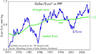
op-ed in yesterday's WSJ reminded us, the Fed made a similar decision in late 2003 which ended up contributing to the bubble in housing prices, oil prices, and commodity prices. At the time, the economy was turning up, and there were plenty of warning signs that the Fed was too easy: the dollar was down, gold was rising, commodity prices were rising. Instead of tightening, they kept the fed funds rate at extremely low levels, in both real and nominal terms, for about two years. Although the signs of a recovery today aren't as strong as they were in late 2003, the warning signs of too much money are much stronger: the dollar is 10% weaker, gold has more than doubled, commodity prices are up 30%, oil has more than doubled, and the yield curve is steeper.

The rationale for all this ease is "slack," which is a codeword for the Phillips Curve theory of inflation. This theory, which has been discredited by several studies by the Fed's own economists and by others, holds that inflation has little or nothing to do with monetary policy, and everything to do with how strong or weak the economy is. The Fed's role, according to this theory, is to raise and lower rates in order to fine-tune how fast or how slow the economy grows, thus indirectly controlling inflation by first controlling economic growth. Unfortunately, hubris has trumped common sense, since no person or committee is smart enough to know what magic overnight interest rate will produce the desired level of growth. And it is arguable whether the Fed has any ability at all to fine-tune growth with its interest rate too. Plus, no one really knows how to estimate "slack," whatever that is. It's a fool's game, but the Fed just keeps playing it.

The bond market sold off today, ostensibly because the FOMC announcement ruled out any increase in the Fed's planned purchases of T-bonds and mortgage-backed securities. That's a fool's game as well, since the Fed has no ability to influence the level of bond yields. Indeed, the more bonds it purchases, the less likely that bond prices will rise; the market will realize that the Fed is monetizing debt, and that will render Treasury bonds instantly less attractive by increasing future inflation.

So the real message of the FOMC today was not that it won't increase its bond purchases, it's that the FOMC still believes in the wrong theory of inflation. Consequently, it is more likely to make a monetary error. This error could show up as another asset price bubble somewhere, a faster rate of inflation, a weaker dollar, higher interest rates in the future, and/or higher gold and commodity prices. It is not going to be of great help to the economy today, just as Obama's stimulus plans are more depressing than they are stimulative (because of the very real threat of a significant increase in tax burdens). Quantitative easing made sense when the financial markets and the economy were on the ropes. But now with the economy beginning a recovery and the warning signs of too much money growing, easy money is a fool's game. It only fuels speculative activities, while at the same time reducing investment in the U.S. because it undermines the strength of the dollar and by inference reduces the return on U.S. investments.

Despite this nasty combination of bad fiscal and monetary policy, however, I do remain optimistic. I think the economy can still manage to grow, just not as much as it otherwise could. I think the market is still priced to the belief that growth is going to be almost nonexistent or very weak, so even a modest 3% rate of growth (very modest given how much economic growth has fallen in the past year) going forward would be a welcome surprise.

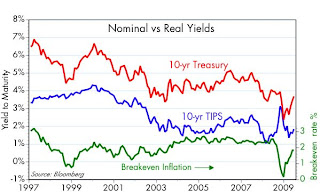
In the meantime, the Fed is sending investors and households several messages: 1) buy that house you were thinking of buying sooner rather than later; 2) get rid of some of the cash you have stockpiled—since it will likely pay a negative real rate of interest—and buy just about anything else instead; 4) for the money that you want to keep in a really safe place, consider TIPS; and 5) avoid lending any of your money to Treasury (i.e., don't buy Treasury notes or bonds).

Full disclosure: I am long equities, long TIPS, long housing, and short T-bonds as of the time of this writing.

Capital goods orders aren't falling


Capital goods orders—the seedcorn of future productivity—have been relatively stable to somewhat higher so far this year, as the first chart shows. That's another "dog that didn't bark," since with all the doom and gloom out there it shows that businesses are not completely retrenching. When confidence in the future once again builds, businesses have a lot of profits that they have been accumulating which can be used to fuel new capex. As the second chart shows, corporate profits after tax have doubled since late 2001, but as the first chart shows, capex has not risen at all on balance.

If the stimulus plan had been thought through instead of rammed through, it would have paid attention to details such as this. It would have given businesses an incentive to invest in the future by cutting corporate taxes, and that would probably have resulted in lots of new spending on the "shovel-ready" projects any good corporation has sitting on the shelf, waiting for the right environment.

So this is all a sad story, one of opportunities passed over. But it is not a story of collapse. It goes back to one of the key factors that drove this financial crisis, and that was a lack of confidence. If confidence can be restored, new investment spending will follow. It's never too late for that.

Tuesday, June 23, 2009

Very steep Treasury curve (2)


As this chart shows, the Treasury yield curve is extremely steep. Steep curves are almost always a sign of easy money, and they traditionally signal recovery or the onset of recovery. That the curve today is so steep, at a time when short-term rates are at generational lows, the dollar is generally weak, gold is over $900/oz., credit and swap spreads are narrowing and commodity prices are rising across the board, is a clear sign that the Fed should be thinking very seriously about tightening monetary policy. If they don't then inflation pressures are going to be rising.

This sounds like heresy, I know, since economic pessimism is still in abundant supply these days. No one believes the green shoots, no one believes the banks are lending, many argue that the money supply hasn't increased enough, the unemployment rate is still rising, etc. But the things I mention above (e.g., the slope of the yield curve, gold, the value of the dollar, commodity prices, swap spreads) are good leading indicators of what is going to show up in the economy and the headlines in the months to come. If the Fed wants to do a good job they need to be forward-looking, not driving by looking in the rear-view mirror.

Mortgage rate update (2)

Despite continued fears (typical quote: "the sales pace will likely come down as a result of the surge in mortgage rates." –Ted Wieseman, Morgan Stanley), the backup in T-bond yields is not likely to derail the U.S. housing market. Current rates on 30-year fixed-rate conforming mortgages are up by three-quarters of a point from their recent all-time lows. Rates on jumbo mortgages are at their lowest level in three and a half years. Not a big deal. Indeed, buyers on the fence should view this as a good reason to act now before rates go higher.

I should also mention that the narrowing of the gap between conforming and jumbo rates is a very good sign, since it means that the mortgage lending business is functioning in a more normal fashion.

Existing home sales haven't fallen for the past year


This goes in the category of "the dog that didn't bark." Despite all the gloom in the housing market, sales activity has been essentially flat (well, actually, this measure of sales fell 3% from year-ago levels, but that's pretty close to flat in my book) for the past year. Prices are down, but falling prices have enabled the market to clear. We are not in free-fall; markets are working. Lots of people are losing lots of money as prices fall, but there is still demand to own the existing stock of housing. Lots of people are buying homes at prices that are far more affordable than they were a few years ago.

ECRI Leading Indicator shoots up

Here's a multi-year view of the Economic Cycle Research Institute's Weekly Leading Indicator. "With WLI growth rocketing up almost 30 percentage points in six months, it's virtually pounding the table about the recession ending this summer," said Lakshman Achuthan, managing director at ECRI.

This is another one of those undeniable green shoots, in my view. HT: James Pethokoukis

Monday, June 22, 2009

TIPS update


The major trend in the Treasury bond market this year has been a reversal of the deflationary expectations which dominated sentiment at the end of last year. As this chart shows, inflation expectations have risen but are still lower than they were going into this crisis. The market still believes that pervasive economic weakness will keep inflation suppressed.

Forward-looking inflation expectations, meanwhile, have adjusted by more than is reflected in this chart. The Fed's favorite indicator of inflation expectations is the 5-year, 5-year forward inflation rate. That has now returned to 2.4%, which is just about where it was for several years leading up to last summer's financial meltdown. Putting these two observations together, it would appear that the market is expecting the next several years to be tough sledding, with things (inflation and growth) finally returning to normal in, say, 3-5 years from now.

Sunday, June 21, 2009

Calafia Beach on Father's Day


The sun is out today, which is nice because it's been awfully gloomy at the beach for a long time (typical May-June gloom, as it's called). It's a little brisk, however, which may explain why there aren't many people on the beach. In any event, we've got the grandchildren here and they are having a great time playing on the beach. No more blogging for today.

Another look at shipping


A reader recently pointed me to the Harpex index of container shipping rates, with which I was unfamiliar. The first chart here shows the entire history of the index, while the second chart shows the last year. Some observations: 1) the index does not reflect actual charter rates; rather, it reflects charter rates relative to the full cost of operating a vessel, which in turn includes a return on capital—a value of 1.000 indicates that rates are equal to the full cost of operating a ship; 2) the index is extremely volatile, and has been close to today's levels in the past; 3) the index in my view is not a leading indicator of economic activity, but rather a lagging indicator (it didn't turn up until quite a few months after the end of the 2001 recession); and 4) the behavior of the index in the past month or two is suggestive of a bottom.

While this index presents a view of shipping activity that is indeed grim, as compared to the significant bounces in the Baltic Dry Index and the number of outbound containers from the Ports of Los Angeles and Long Beach, it is not necessarily inconsistent with the view that we have seen the worst of the global recession. No single indicator can tell the whole story, in any event, and I would simply note that there are many "green shoots" that suggest that global economic activity is rebounding: e.g., commodity prices of all sorts, and oil prices.

But since I don't pretend to know much about this particular index, I invite comments.

Friday, June 19, 2009

Money velocity is likely stabilizing (2)


This chart is a followup to an earlier post, whose point was the velocity of M2 is probably close to beginning to turn up. The slowdown in M2 growth we have seen in recent months is most likely an indicator of that very phenomenon. Money velocity is the inverse of money demand, so a decline in money demand shows up as an increase in velocity. It has long been my belief that M2 is a much better indicator of money demand than it is of money supply. The best measure of money supply would be the monetary base, which is composed of bank reserves and currencies, and those are directly controlled by the Fed. So slowing M2 growth is a good indicator of declining money demand.

As this chart shows, money growth (i.e., money demand) typically reaches a peak in the wake of recessions. That's because people's risk aversion declines dramatically in recessions, and since most recessions have been the by-product of tight money, money demand is in part driven by a desire to deleverage. Money growth rises as people accumulate cash and pay down debt, and the Fed accommodates this increase demand for money by reducing interest rates. Then, when conditions start to improve, the opposite happens, and people start to want less and less money and more debt. The M2 that was stored up during the recession is unleashed and spent, and that is one of the things that powers the subsequent recovery.

In the three months ended June 8th, the annualized growth rate of M2 fell to 2.3%. If nominal GDP growth in the current quarter is 1.7% (I'm assuming growth of -0.8% and inflation of 2.5%), then velocity will be only modestly lower than it was in the first quarter. If the slowdown in M2 continues and the economy starts to recover, it will be because M2 velocity is starting to pick up. In short, there's an M2 mountain of cash out there that could power the economy for the foreseeable future.

Emerging markets stage a dramatic comeback


The year 2002 was the worst of times for emerging market economies. Argentina devalued its peso by over two-thirds and then defaulted on over $100 billion of debt. Commodity prices were extremely low. Since then most emerging market economies have come roaring back. As the first chart shows, an investment in the Brazilian stock market in 2002 has produced a return, measured in dollars, of over 1000%. As the second chart shows, about half that return is due to a dramatic appreciation of the Brazilian currency.

Looking behind the scenes, the big thing that drove emerging markets down in the early 2000s was deflationary monetary policy in the U.S. The dollar hit a high in 2002, thanks to very tight monetary policy from 1996-2001; the world was starved for dollars. Commodity prices were extremely depressed because of the strong dollar; the world preferred dollars and dollar bonds to commodities. Gold presaged the deflation, hitting a low of $255/oz in early 2001.

Since then the dollar has plunged and commodity prices have soared. Instead of a shortage of money, the world is awash in cash. Interest rates everywhere are extraordinarily low. This is nirvana for most emerging market economies, since they are typically important commodity producers and most have large debt burdens (with the notable exception of Chile, which has virtually no debt and a huge sovereign wealth fund). Easy money is a debtor's and a commodity producer's best friend. Emerging market economies and stock markets have also breathed a great sigh of relief this year as evidence continues to support the view that the global economy is going to avoid a depression and is likely already on the mend.

It would seem to me that further gains in these markets are still quite likely from a macro perspective, especially as evidence of a U.S. recovery continues to come in. The major risk they face is either a) a double-dip U.S. recession or b) a significant tightening of monetary policy around the globe. I don't think either of those is likely for the foreseeable future.

Full disclosure: I am long SLAFX and EMD as of the time of this writing.

Thoughts on Obamacare (3)

The good news is that people are balking at the $1.6 trillion cost of the mandated healthcare "solution" that Congress is currently debating.

The amazing news (to me, at least, and perhaps to you) is the degree of deception and bait-and-switch that is going on, as detailed by Betsey McCaughey in her article in today's WSJ. Excerpts:

Last September Sen. Barack Obama promised that under his health-care proposal "you'll be able to get the same kind of coverage that members of Congress give themselves." On Monday, President Obama repeated that promise in a speech to the American Medical Association. It's not true.

The president is barnstorming the nation, urging swift approval of legislation that is taking shape in Congress. This legislation ... will push Americans into stingy insurance plans with tight, HMO-style controls. It specifically exempts members of Congress (along with federal employees; the exemptions are in section 3116).

Members of Congress "enjoy the widest selection of health plans in the country," according to the U.S. Office of Personnel Management. They "can choose from among consumer-driven and high deductible plans that offer catastrophic risk protection with higher deductibles, health saving/reimbursable accounts and lower premiums, or fee-for-service (FFS) plans, and their preferred provider organizations (PPO), or health maintenance organizations (HMO)." These choices would be nice for all of us, but they're not in the offing. Instead, if you don't enroll in a "qualified" health plan and submit proof of enrollment to the federal government, you'll be tracked down and fined (sections 3101 and 6055).

For a health plan to count as "qualified," it has to meet all the restrictions listed in the legislation and whatever criteria the Secretary of Health and Human Services imposes after the bill becomes law. You may think you're in a "qualified" plan, but the language suggests that only plans with managed-care controls such as the "medical home" will meet the definition (sections 3101 and 2707).

The president has promised that if you like your plan you can keep it. Mr. Kennedy's bill says that too. It's doubletalk, as the consequences of nonenrollment make clear. How big a fine will you face? The bill doesn't specify or set a limit. It says the fine will be enough to "accomplish the goal of enhancing participation in qualifying coverage" (section 161).

Once again, those who advocate universal healthcare are running up against Milton Friedman's observation that "there is no free lunch." And that's very good news. The American people don't want Obama's socialized medicine.

UPDATE: To put the whole problem of healthcare in perspective, I highly recommend Milton Friedman's 2001 essay, "How to Cure Health Care." Only a politician could fail to understand the simple yet powerful logic that MF brings to bear on this issue. HT: Greg Mankiw

Clarification on gold (2)


One of the appeals of gold is that it maintains its purchasing power over long periods, even though its price in real terms (see chart in preceding post) can vary significantly at times. Some gold-standard advocates say that gold should be the reference point for all things, since it is a forward-looking indicator of the dollar's purchasing power. (A rising gold price means the dollar is likely to lose value in the future as the prices of all things rise—a process otherwise known as inflation.)

This chart is an example of using gold to measure the value of oil. The chart is simply the price of a barrel of oil (Arab Light, in this case) divided by the dollar cost of one ounce of gold. In short, the chart shows how many barrels of oil one ounce of gold will buy. Once again we have what looks like a mean-reverting process, with the average "price" of an ounce of gold being 18 barrels of oil. When an ounce of gold buys less than 18 barrels of oil, oil is expensive relative to gold, and when it is more than 18 barrels of oil, oil is cheap relative to gold. Right now oil seems somewhat expensive (oil has risen from $40/bbl at the end of last year to just over $70 today, while gold has only risen from $882 to $935).

I'm not trying to draw any conclusions from this, just throwing it out for possible discussion.

Thursday, June 18, 2009

Clarification on gold


In the Seeking Alpha discussion earlier today (see previous post), I mentioned that I thought gold was trading at a significant premium. I guessed that the mean-reverting value of gold today was about $500, but in updating this chart I realized now that $450 sounds better (and that is the average real price on this chart). Regardless, I think the chart makes it obvious that when you adjust for inflation, which gold seeks to offset, you are paying a pretty high price relative to the historical average.

When money is easy, it finds its way into the gold market and gold prices rise. Gold is an advance indicator of official inflation. Jude Wanniski argued that gold was a real-time indicator of the true inflation rate. Either way, rising gold prices are the market's way of saying that there is an imbalance between the supply of and the demand for money, and that imbalance is undermining the value of the currency. The market is aware of the inflation problem, and so you need to pay a premium to hedge that problem with gold. Gold is expensive today, and it doesn't pay interest. So even if you know for sure that inflation is going up, it is not obvious that gold is a good investment. For gold to rise the inflation problem has to be worse than what the market already thinks it is.

Live discussion on the dollar and inflation

I'll be participating in a live online discussion sponsored by the Seeking Alpha folks, starting at 12:30 pm EDT today (9:30 am my time). I'll be joined by Peter Shiff, Mark Sunshine, and David Goldman, and our starting point will be the debate between Art Laffer (who thinks inflation is going way up) and Paul Krugman (who disagrees); we'll also discuss the different things you can do to protect your portfolio in the event inflation does prove to be a problem. You can follow the discussion here if you wish.

Readers of this blog will know that I am quite concerned about inflation rising. I think the action in commodities, gold, the dollar, and the yield curve is telling us that the Fed has been too easy for a little too long, and that they should have already begun to reverse their liquidity injections.

UPDATE: The discussion was pretty lively, and lasted almost an hour and a half. You can read the whole thing at the link above.

Weekly claims still pointing to a bottom (4)

An update to the chart I posted last week. It's now pretty clear that weekly unemployment claims peaked near the end of March. They are unchanged now from the levels of late January. I've been saying for many weeks that downturn in claims was a good sign that we'd seen the worst of the economy, and all the green shoots out there have been supportive of that claim. The market has been reluctant to buy into the notion of improvement, though, until today. What got everyone's attention was the unexpected decline in continuing claims. That is very clear evidence that we've seen the worst.

While we have very likely seen the end of the recession, the question going forward is how strong the recovery will be. So far, numbers like this don't say much more than that it will a gradual recovery, not a V-shaped one. But even a gradual recovery is far, far better than the depression everyone was worried about at the end of last year. The reality has proved to be orders of magnitude better than the fears, and that is the big reason that equity markets are up and bond yields are up. Even though the reality (modest growth from a low base) seems not very exciting.

Wednesday, June 17, 2009

Thoughts on Obamacare (2)

Holman Jenkins has a nice op-ed piece in today's WSJ on the fundamental problem with trying to reform healthcare, and it got me to thinking about why the current system has everyone in a tizzy. It's all about the tax code. "... tax reform, in the American context, is health-care reform."

If we just changed the tax code so that either everyone could deduct the cost of healthcare, or no one, then businesses would not feel obliged to buy health insurance for their employees (the current system almost forces everyone to get their health insurance from an employer, since it is tax-free to the employee, and the employer can deduct it as a compensation expense). Employers could pass the money they are spending on to their employees, and everyone could buy their own. That solves the portability problem (you can take your insurance with you whereever you go), and it would encourage everyone to think about whether they were spending their money on a policy that made sense for them.

The biggest problem this would solve is the "third-party-pays" problem. Currently, those who use healthcare are not the ones who pay for it. To understand why this is a problem, consider the following thought experiments:

I give my child a credit card when he goes to college, telling him that it is for emergencies and for special purchases such as books and supplies. What are the chances that he will use it for all manner of things, since I am the one paying the bill? How careful will he be about his purchases, even if for legitimate purposes? How likely am I to be shocked at how much he ends up spending each month?

The government decides that no one should go hungry, and that it is not fair for the rich to be able to eat more than the poor or middle class. Everyone should have access to affordable, quality food. To that end, the government gives everyone a "food card," modelled after popular healthcare plans, and paid for by everyone's employer. Those with the card can buy all the food they want, but they do have a $15 co-pay every time they go to the market. What are the chances that a decent number of people will end up buying more food than they really need? How much food will go rotten sitting in people's refrigerators? What will prices matter to those with cards, if a pound of filet effectively costs the same as a pound of hamburger? How long will it take before stores run out of filet? What are the odds that the cost of the program chronically exceeds the government's estimates?
Jenkins writes from the point of view of an historian looking back on the huge changes that followed from tax reform that put everyone in charge of spending their own money on healthcare:

Eyes newly opened, they demanded cheaper insurance options, covering fewer services (cancer wigs, family counseling, in-vitro fertilization), and opted for plans with higher deductibles and co-pays in return for much lower monthly rates.

Because consumers were now spending their "own" money on health care, doctors and hospitals found it necessary to publish and even advertise their prices. A hospital that specialized in heart surgery, performing thousands of procedures a year, found it had both the highest quality and lowest cost -- and now marketed itself as such. Ditto specialists in cancer, diabetes and other conditions.

For the first time, Americans spent less and got more. Spending fell overnight by 13%, which happened to be exactly what economists had predicted if the price tags were restored to health care and consumers were allowed to see clearly what they were getting (or not getting) for their money. As predicted, too, spending thereafter rose only in line with incomes.

What's more, many fewer people remained voluntarily uninsured now that health insurance was no longer a gold-plated extravagance affordable only by those in the top brackets who could slough off 40% of the cost on other taxpayers. Existing programs for the needy, in turn, could be downsized and revamped into voucher programs. The federal budget benefited twice over -- from fewer claimants and from medical care that was less costly. Fiscal wreck was avoided.
In order to reform healthcare, we first need to reform the tax code. It's that simple. No amount of late-night tinkering by senate and house committees can possibly come up with a better or cheaper solution than can the American consumer turned loose in a truly free healthcare market.

Monetary policy insights


Japan's central bank was the first of the major central banks to practice "quantitative easing" in order to rid its economy of deflationary pressures. Following years of very low and negative inflation, and a severely depressed housing market and equity market, the BoJ began force-feeding reserves to the banking system in late 2001. It took them a long time to admit that they had been way too tight since the early 1990s. Within a few years of easing, the results came in: Japan's CPI went from being -1.6% in early 2002 to over 2% in 2008. They subsequently reversed themselves beginning in 2007, and, not surprisingly, inflation returned to negative levels by early 2009. Like all central banks, they have recently shifted to a more expansive policy in order to ward off deflationary pressures.

The U.S. Fed followed a fairly restrictive monetary policy throughout most of the 1990s, with the result that deflationary pressures began to build in the late 1990s and the economy fell into a recession in 2001. Inflation by several measures reach a low ebb in mid 2002, when the Personal Consumption Deflator fell to 1.0%. The Fed then relaxed policy beginning in 2003, and inflation drifted higher, to more than 5% in 2008. Then came the great financial crisis and the global economic slump, which subsequently prompted the Fed to pull out all the stops and more than double the amount of bank reserves in the system beginning in September 2008. Despite a severe recession and, according to most traditional estimates, a huge amount of economic slack, core inflation (as measured by the CPI) rose at a 2.3% annual rate in the three months ended May, 2009—up from a low of 1.7% for the fourth quarter of 2008.

The point here is that bank reserves—the most high-powered form of money that only a central bank can create—can and do have a significant impact on the inflationary climate of an economy. Which is to say that monetary policy can be very powerful if it wants to be. Moral of the story: never underestimate the power of a central bank to get what it wants. Monetary policy is one of the most powerful, if not the most powerful, of the tools that are available to government bureaucrats. Today, the Bernanke Fed wants very much to avoid deflation, and they would not be displeased if inflation were to rise a bit.

Caveats: Monetary policy works with long and variable lags, as Milton Friedman noted many years ago. Plus, monetary policy actions must be judged according to the context in which they are applied. To date, the Fed's aggressive expansion of bank reserves has probably only just barely offset the market's incredible desire to hold more dollar liquidity. In other words, Fed policy hasn't been as inflationary (yet) as one would expect given the degree to which they have expanded bank reserves. Similarly, the fairly rapid increase in bank reserves in the early 1980s coincided with falling inflation, since at the time the market's desire for dollar liquidity was very strong—stronger than the Fed's desire to relax monetary policy.

Bonds are priced to 2% inflation


This chart is set up so that when the two lines overlap, a 30-year T-bond will pay you 2 percentage points more than core inflation, as measured by the CPI. Many would consider that to be "fair value," since over long periods that is about what the real return on long-term Treasury bonds has been. As you can easily see, however, for most of the past 20 years T-bonds have yielded much more than their fair value yield, until recently. Right now you could say that T-bonds are trading at fair value, if you believe that core inflation is going to remain around 2% forever.

If inflation rises, however, T-bonds are going to deliver miserable returns. Either their yield will remain low, lagging the rise in inflation (in which case their real yields will be less than 2% per year or even negative), or yields will rise as inflation rises and the price of the bonds will fall. In the case of the current 30-year T-bond, its price will fall about 17% for every 1 percentage point rise in yields. Just a modest rise in inflation and yields could wipe out several years of coupon payments.

Since early 1980 and up to the end of last year, T-bonds delivered excellent returns, but that was mainly because their yields were much higher that inflation, and declining. Returns were excellent because the bond market was chronically over-estimating the rate of inflation. Now the bond market is betting that inflation will remain around 2% forever. Importantly, the fears of deflation which pulled bond yields down at the end of last year have all but vanished. But the bond market is not at all prepared for an eventual rise in inflation.

Caveat emptor.

Full disclosure: I am long TBT at the time of this writing.

Tuesday, June 16, 2009

Revolutionary evolution of the financial industry

The Financial Times has put together a very interesting interactive chart that shows you how dramatically things have changed in the financial industry in the past 10 years. Citigroup was the largest financial institution by far from 1999 through 2007. Then it fell to 8th place in 2008, and now is not even among the top 20. Note that 5 of the top 20 institutions are now Chinese, whereas only three are from the U.S. Schumpeter's creative destruction is alive and well.

HT: Yashpal Agrawal

Money velocity is likely stabilizing

A reader's comment made me realize I have not addressed the velocity question directly, so here is a chart of what is arguably the best measure of velocity, which is calculated by dividing nominal GDP by M2. The last datapoint uses my estimate of nominal GDP and M2 for the second quarter. I might be off by a little, but even considering a decent margin of error it is clear that the decline in velocity has really tapered off in recent months. Velocity fell by 7.6% last year, with the drop being the greatest in the fourth quarter: -5.6%. Velocity then fell 3.1% in the first quarter, and my guess is that it will fall only 0.5% in the current quarter.

The big drop in velocity is simply the result of consumers and businesses deciding to hang on to their money instead of spending it; a natural reaction to the sudden onset of the financial crisis which followed in the wake of the Lehman bankruptcy last September. The turnover of money (velocity) slowed dramatically as everyone sought to either increase their money holdings or pay down debt.

It's not unreasonable to assume that as the level of fear declines, people will resume spending their money. As everyone attempts to reduce their money balances, money will turn over faster, and nominal GDP will rise at a faster rate than money balances. Velocity, in other words, will rise. For the time being it looks more like velocity is stabilizing, but it will rise by the end of the year if the economy picks up speed.

One reason that M2 velocity is arguably the best measure is that it is the only velocity measure that has proven to be relatively stable over long periods. Note how today's velocity is back to the levels that prevailed from 1959-1989. Looks like one more thing that is "returning to normal."

Monday, June 15, 2009

U.S. exports are rebounding (3)


Here's an update to a chart I've posted before, using the recently-released May data on container shipments and the April data on goods exports. It purports to show that the recent rise in outbound container shipments from the ports of Los Angeles and Long Beach portends a significant improvement in U.S. goods exports in coming months, something which would be unquestionably good news for the economy. We haven't seen improvement in the export data yet (blue line), but that data undoubtedly lags the ports' container count by at least a month or more. Outbound containers from Los Angeles have now reversed more than two-thirds of the precipitous drop in shipments that occurred from August last year through January of this year. That is an excellent indication, in my view, that last year's slump was largely temporary in nature. As Brian Wesbury notes, government mishandling of the financial crisis last year "set off a rare financial panic, the velocity of money plummeted, and economic activity collapsed." The panic started receding many months ago, and there are plenty of green shoots out there which suggest that the global economy is now coming back to life.

Turning 60

I've been pleasantly tied up the past several days with the events surrounding my 60th birthday party. This otherwise dubious milestone was made quite enjoyable by my excellent wife's tireless preparations and the ministrations of my devoted family. It started last Thursday with the surprise arrival of my son from Hawaii and my daughter from New York. For the next three days we had all four children with us for the first time in over two years. With sons-in-law in tow, we all went out for a great seafood dinner Friday night.

Saturday was the party, which included over 30 close friends and family members, and a delicious dinner prepared by my cousin. This party launched his novel idea for a catering business (Food Dudes: they buy the food, cook it at your house, and charge you the cost of the food plus a flat rate per person). I'm lucky that my best friend, whom I have known since we were 7, was there to help me celebrate, and his cousin, a professional photographer, gracefully offered to record the event. Yesterday we enjoyed our three grandchildren during the day and a nice asado with Argentine wine at night.

My fortunes are great and many. My wife is the heart and soul of the family and did the lion's share of raising our children in excellent fashion. We are all healthy—though I would be deaf if not for the wonders of technology to be found in the cochlear implant I received 5 years ago—and as far as I know we all enjoy each other's company. We have a rich and varied circle of friends in Argentina and the U.S. Over 40 members of my extended family (siblings, spouses, mother, father and nieces and nephews, aunts and uncles and cousins) live within easy driving distance in So. California. We're fortunate to have our own little beach house (on Calafia Beach), something we had wanted for many years.

Our family is bucking the trend in the economy, but we have suffered blows just like everyone. My youngest daughter recently landed a full-time job with Moody's in New York, after six months of looking and in spite of the awful financial recession there. One son-in-law recently accepted a position with money manager Payden & Rygel in Los Angeles, several months after losing his postion at an equity firm that couldn't withstand the market collapse. My investment portfolio is still way down from its highs, but I've done better than the market. Our recently-minted lawyer son-in-law accepted his first case, but probably won't make any money on it even if he wins.

I couldn't and shouldn't ask for anything more. But I do hope that the country rejects Obama's big government policies, and that the markets and the economy get back on their feet.

Argentina: a lesson for the US

The Wall Street Journal's Mary Anastasia O'Grady is, in my opinion, the world's best journalist covering Latin America. I've kept close watch on developments there since living in Argentina in the late 1970s and covering the region as an analyst, so I can vouch for her deep understanding of the problems that have plagued the countries to our south. Today she writes about the ongoing disaster that is Argentina's government. A succession of presidents have vastly expanded the power of the executive branch, all in the name of resolving crises precipitated by the actions of previous administrations. The parallels to the Bush bailouts, the Obama stimulus spending, the Obama GM takeover, the Obama urge to control executive salaries, and the Obama proposal to create a vast new financial regulatory appartus are obvious and, needless to say, profoundly disturbing.
In the wake of the country's 2002 economic collapse, the Argentine Congress gave the executive immense powers on the grounds that the circumstances called for extraordinary government action.

Seven years later those powers have not been rescinded and the state dominates the economy as an owner and regulator. Argentina now faces the threat of a further consolidation of control by President Cristina Kirchner through means similar to those employed by Hugo Chávez. As in Venezuela, free speech and the free press are being targeted for increased repression.

Let this be a lesson to any modern democracy that cedes broad power to government in a time of crisis: Granting power to the executive is easy; getting it back isn't.

Friday, June 12, 2009

Undeniable green shoots (2)

I return to this subject to clarify what I think is driving commodity prices. There's been lots of back-and-forth on this in the commentary. People who are skeptical that rising prices signal a recovering economy invariably allege that speculators, fueled by easy money, are driving prices higher, and so rising prices tell us nothing about the health of the economy but a lot about how easy the Fed is and how much inflation (ultimately an economy-killer) we'll have going forward. I've countered that it is difficult for speculators to amass sufficient stockpiles of a lot of the commodities contained in this index. After some brief research I even uncovered data showing that inventories of copper at the London metals exchanges have dropped significantly in recent months even as prices have risen.

In any event, here's how I would describe what has happened with commodity prices:

Global demand suddenly collapsed around September, as fears of a collapse of the global banking system brought markets to a halt and fearful consumers stopped spending on nonessential items. To make matters worse, banks stopped making letters of credit, and that shut down global trade. The global economy basically hit an air pocket as demand fell off a cliff. Producers soon found themselves with rising inventories as demand fell, and so they cut back production and prices fell. They cut production by a lot, fearful that the global economy was going into a depression. Early this year things started to normalize and demand stopped falling. World trade resumed after banks once again figured out how to write letters of credit. Demand proved to be stronger than everyone had feared. Production of commodities was slow to react as inventories began to drop, so prices started to rise. Higher prices today are surely encouraging commodity producers to ramp up production. Sooner or later production will rise enough to keep prices from rising to the stratosphere. Commodity speculation has likely played a role in rising prices in the past month or so, since confidence has returned, equity prices have boomed, but the Fed has yet to take steps to reverse its liquidity injections, thus creating rising inflation expectations.

I say again that rising commodity prices are an excellent indication that things are getting back to normal, and that growth is returning. Easy money may drive prices into another bubble, but if so we are still in the early stages. The important thing is that demand is back and production is undoubtedly ramping up in response to higher prices.

Mortgage rate update

I see lots of concerns out there about how the rise in bond yields and mortgage rates is going to kill the nascent recovery. To keep things in perspective I offer this updated chart, which contains data as of today from BanxQuote, and reflects "U.S. & Regional composite mortgage rates."

I note that conforming rates have jumped by a full percentage point from their lows of last March. But current rates (5.75%) are still well below the average rate (6.5%) of the past 11 years. I don't see that as a killer, and jumbo rates have hardly risen at all from their lows. Rates have been pushed up by rising confidence that the economy is coming out of a recession, and signs that housing markets are bottoming in many areas of the country. As such, rising rates represent rising demand for loans (the flip side of which is falling demand for bonds, especially the Treasury bonds that drive investor desire for mortgage-backed securities). Rising demand shows no signs of carrying with it the seeds of its own destruction. It would take a concerted effort by the Fed to push rates up to nip this recovery in the bud.

Swap spreads essentially back to normal


This blog is chock full of posts describing how swap spreads have been excellent leading indicators of economic and financial market conditions. As these charts show, rising swap spreads predicted the onset of the last two recessions, and declining swap spreads predicted the end of these same recessions. We can now say that the chapter is almost closed on the recession which had its roots in the deterioration of the housing market and rising swap spreads in the latter half of 2007. Swap spreads have essentially returned to levels that are considered with "normal" market conditions. We should expect to see continued improvement in the economy and in the financial markets as the year progresses.

I would reiterate what I've said before: the recovery from this crisis began with the big decline in swap spreads that occurred throughout the fourth quarter of last year. Obama's "stimulus" package had nothing to do with it. Only about 5% of those funds have been spent so far, and the bulk of the stimulus spending will happen after the economy is well on its recovery path. We don't need the stimulus and we don't need bigger government.

I think the timing of the recovery was set back by at least several months due to the huge shock to confidence that arose as a result of the mad dash to sign the stimulus bill, followed by Obama's budget plans which revealed an enormous expansion of government. The market was suddenly forced to anticipate an equally large rise in future tax burdens, and capital went into hiding as the market fell in February and early March. Since then Obama's ambitions have been scaled back somewhat, and Congress is beginning to push back on many of his initiatives. Cap and trade seems unlikely to pass this year, and opposition to universal healthcare is mounting rapidly. This has been excellent news for a market shell-shocked by an explosion of anti-market legislation earlier in the year. Let's hope the bad news for Obama continues.

Thursday, June 11, 2009

Thinking about GDP growth


If I had to venture a guess as to what the consensus opinion among economists and pundits is about the future prospects for the U.S. economy I would say it is that the economy is going to have trouble growing in the years ahead. Some people are saying we ain't seen nothin' yet, that we're headed for a double-dip recession and possibly a global slowdown of unprecedented magnitude. A lot are saying that the economy will probably start growing in the second half of this year, but at a relatively tepid pace. Some optimists like Brian Wesbury at First Trust are calling for growth on the order of 4% or more beginning right now. I agree with Brian that a recovery is now underway, but I'm not sure how strong it will be.

If there is a unifying theory for why most people are not very optimistic about the future it probably involves the unprecedented degree to which the size of government is going to expand under the Obama administration, and the sharply higher tax burdens that will inevitably result from that expansion, not to mention the burden of additional regulations and the potential for price and wage controls applied to certain industries. I consider it axiomatic that more government and higher tax burdens will give us a less efficient economy and thus slower growth. How much slower, however, is anyone's guess.

What follows is a humble attempt to come up with a projection for future GDP growth without being overly optimistic or pessimistic, and without injecting any liberal, conservative, or supply-side bias into the calculations. I do this more to establish a baseline for further discussions than to try to come up with anything that might be accurate. I draw importantly on a long-ago insight from none other than Milton Friedman to get started.

Milton Friedman in 1964 wrote a paper describing a novel theory describing how the business cycle worked, called the Plucking Model. He theorized, and the data have since lent credence to his theory, that the economy has a strong tendency to revert to trend following business cycle disruptions. The deeper the recession, the stronger the recovery; the milder the recession, the less dynamic the recovery. The economy is not a random walk: recoveries follow recessions, and the degree of recession is a good predictor of the strength of the recovery. He came up with an analogy to describe the model, which says that the path of the economy is like a string that is fastened at both ends of a board and rests on the bottom side of the board, hugging it tightly. The board is set at an upward sloping angle, with the angle being proportional to the economy's long-term trend rate of growth. Recessions occur when the string is "plucked" downwards from the board. Once the shock that caused the recession goes away, the string is released, and snaps back to the board.

A former colleague, Mike Bazdarich of Western Asset Management, uses a different analogy to describe the same theory. He calls it the "Beach Ball Theory."
If you hold a beach ball below water level in a pool and then release it, it quickly moves back to the surface and then hugs the surface without popping above it. The analogy to the economy is that GDP tends to hug closely to full-employment levels. After a severe shock, GDP can veer away from full-employment levels, but as soon as the shock subsides, the economy moves back to full-employment on its own. The farther away from full-employment it starts, the faster it will snap back, but it doesn't overshoot from recession to inflationary boom.
The chart above uses this theory to generate a forecast for growth. The green trendline represents the economy's long-term trend growth (3.1% per year) from 1966 to 2000. Note that every time the economy falls below its trend (i.e., when the string is plucked downwards from the board), it subsequently speeds up and eventually returns to trend. After 2000, however, the trend appears to have slowed down. I extrapolated what appears to be a new, slower trend rate of growth (2.3%) through 2016, as shown by the purple line. I then calculated how fast, on average, real growth would have to be over the next 8 years for the economy to return to trend: 3.1% growth per year (trust me, it is a pure coincidence that that is the same as the economy's trend rate of growth from 1966-2000). I chose 8 years because that was not overly aggressive, and it is consistent with the amount of time it took for the economy to return to trend in the 1980s and 1990s.

So, relying on Friedman's observation and the data that supports it, and making some rather conservative assumptions (e.g., the new trend rate of growth will be only 2.3% per year, and it will take 8 years for the economy to fully snap back to trend), I find that it is not unreasonable at all to expect the economy to grow a little more than 3% a year for the foreseeable future.

Households' balance sheet update


The Fed today released its always-fascinating look at the state of household finances, which is summarized in this chart. Some quick observations of mine:

Even though the S&P 500 fell 12% in the first quarter, household net worth fell by only 2.5%, thanks in part to an increase in Treasury bond holdings and a reduction in liabilities, which is indicative of a higher savings rate.

The big drop in net worth since 2007 (-$12 trillion)was due mainly to the decline in the equity market (-$10 trillion), and secondarily to the decline in housing prices (-$3 trillion).

With the stock market up almost 20% so far this quarter, net worth is likely up significantly, even after assuming a continuing decline in housing prices.

Even after all the destruction in financial and real estate holdings the in the past year or so, household net worth was still almost 20% higher ($8 trillion higher) at the end of the first quarter than it was at the end of 1999, at about the time the economy and the markets peaked.

The ratio of household liabilities to disposable personal income has fallen by 8% since 2007. Households are deleveraging, and they will probably continue to do so, since homeowners' equity as a percentage of household real estate has fallen from 58.5% in 2005 to 41.4%.

Increased savings, however, does not mean a shrinking economy. Money saved by one person must necessarily be spent by another.

Global equity markets up $11.7 trillion

With a HT to Mark Perry, here's a weekly chart of the market value of global equity markets using Bloomberg data. Measured from the bottom, which was March 9th of this year, global equity markets are up $11.7 trillion, or 45%. That's real money we're talking about!