Thursday, September 27, 2018

More impressive financial milestones

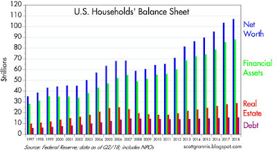
The Fed last week released its Q2/18 estimates for Household Net Worth and related measures of prosperity. Of note, households' leverage (liabilities as a % of total assets) fell to a 33-yr low, and households' net worth hit hit a new all-time high in nominal, real, and per capita terms. Total household net worth is now almost $107 trillion, up over 50% from pre-2008 highs, whereas liabilities are up only 7% from their Great Recession highs. Housing values have increased by about 15% since their 2006 bubble highs, but are still about 6% lower in real terms. Households have been busy deleveraging, saving, and investing, and the housing market is back on its feet and healthy. Major trends are all virtuous and consistent with past experience.

Chart #1

As Chart #1 shows, private sector (households and non-profit organizations) leverage (liabilities as a percent of total assets) has now fallen 36% from its early 2009 high, and has returned to levels last seen in early 1985, when the economy was in full bloom. Our federal government, in contrast and very unfortunately, has borrowed with abandon, raising the burden of federal debt (federal debt owed to the public, as a percent of GDP) from 37% to 83% over the same 33-year period. If our government were run with the same discipline as households have displayed, that might be termed nirvana. We're as well off as we are today despite the ministrations of our government.

Chart #2

Chart #2 summarizes the evolution of aggregate household balance sheets. Note the very modest increase in liabilities over the past decade, the gradual recovery of the real estate market, and the strong gains in financial assets, driven by increased savings and rising equity prices.

Chart #3

Chart #3 shows the long-term trend of real net worth, which has risen on average by about 3.5% per year over the past 66 years. Note that recent levels of real net worth do not appear to have diverged appreciably from this long-term trend. That wasn't the case in 2000 or 2007 however, when stocks were in what we now know was a valuation "bubble."

Chart #4

Chart #4 shows real net worth per capita. The average person in the U.S. today is worth about $327K, and that figure has been increasing by about 2.2% per year, adjusted for inflation, for the past 67 years. (Note: the difference in the trends of Chart #3 and #4, 1.3%, is the average rate of population growth over this period.)

To be sure, there are lots of mega-billionaires these days who are skewing the statistics upward, but that doesn't imply that the average person's living standards have declined. Virtually all of the wealth of the mega-rich is held in the form of equity or real property investment, and all of that is available to everyone on a daily basis. A person making an average income in the U.S. enjoys all the advantages that our nation's net worth has created. Regardless of who owns the country's wealth, everyone benefits from the infrastructure, the equipment, the computers, the offices, the homes, the factories, the research facilities, the workers, the teachers, the families, the software, and the brains that sit in homes and offices all over the country and arrange the affairs of the nation so as to produce over $20 trillion of income per year. Would the average wage-earner (or, for that matter, the average billionaire) in the U.S. enjoy the same quality of life if he or she earned the same amount while living in a poor country? I seriously doubt it.

Tuesday, September 25, 2018

An emerging and important secular trend

I've mentioned the demand for money countless times in the 10-yr history of this blog, because it's a very important macro variable. The Fed controls the supply of money, but the demand for money is a function of a variety of factors, some of which are beyond the Fed's ability to control. The secret to any central bank's ability to deliver low and stable inflation is to keep the supply and demand for money in balance. For, as Milton Friedman taught us, inflation is always and everywhere a monetary phenomenon, and inflation results from an excess of money relative to the demand for it. It's that simple. Unfortunately, you don't see many people, including the Fed, talk about this. That's one of the things this blog brings to the table.

For the first 9 of the 10 years I've been following it, the demand for money (which I define as the M2 money supply divided by nominal GDP) was in a secular uptrend: M2 growth exceeded nominal GDP growth. During this same period, inflation remained low and relatively stable. I interpreted this to mean that the world was in effect "hoarding" money, and that hoarding, in turn, was being driven by risk aversion and a general preference for caution and safety, leftovers from the monstrous shock to confidence that the Great Recession produced. Moreover, I thought the Fed was correctly responding to this money hoarding by rapidly and dramatically expanding the supply of bank reserves. You won't hear this same story from many others either.

Towards the end of the Great Recession, the Fed adopted a radically new monetary policy which they dubbed Quantitative Easing (QE). Most people erroneously believed, and still believe, that the objective of QE was to stimulate the economy by printing money and otherwise making money cheap (i.e., by keeping interest rates low). I have argued in numerous posts that this was most definitely NOT the case. The purpose of QE was to accommodate the market's seemingly-insatiable demand for risk-free, liquid assets.

Think of it this way: in the wake of the near-collapse of the global financial system, the world was desperate to acquire more T-bills, the gold standard for cash/money/safety. The demand for T-bills was so extreme that there were not enough in supply. Without enough safe liquidity to satisfy the demand for such, the financial system was in serious danger of imploding. The Fed solved this problem by buying trillions of dollars of notes and bonds and paying for them with bank reserves, which they also announced would for the first time ever begin to pay a risk-free rate of interest. Bank reserves, crucially, are not "money" that can be spent like dollars can. The banking system was happy to use strong inflows of savings deposits to invest in and hold all these new bank reserves, which had suddenly become a valuable asset, being risk-free and interest-bearing (just like T-bills). Banks were risk-averse too. In the end there was no "money-printing."

QE essentially amounted to the Fed transmogrifying notes and bonds into T-bill substitutes. And it worked. Now that the crisis of confidence has finally passed, the Fed can safely reverse the QE process, because the demand for money is declining. There is nothing mysterious or sinister about this. In fact, if the Fed does NOT reverse QE, they would run the serious risk of allowing there to be too much money relative to the demand for it, and that would lead to a destabilization/devaluation of the dollar and an unwanted rise in inflation. Especially today, when all the evidence points to rising confidence, more optimism, and more risk-taking appetite. The demand for money is declining, and that fully justifies higher interest rates and a reduction in the Fed's balance sheet. Expect interest rates to continue to rise across the yield curve.

Beginning about one year ago, the demand for money appears to have peaked, and it has since fallen by 1.9%. I take this as evidence that risk aversion and caution are giving way to risk-seeking. If I'm right, and this trend continues, this has profound implications for future economic growth and the conduct of monetary policy.

What this means in practice is that measures of "money," the classic being the M2 money supply, are likely to grow at a slower pace than nominal GDP for the foreseeable future. One dollar of money supply will be associated with an increase in total nominal output (and national income) of greater than one dollar. Put another way, a given amount of money will support a larger economy, as the velocity of money (the inverse of money demand) increases. The only way that people can reduce their holdings of money relative to other things is to spend it on something else, or invest it, such that the volume of transactions (akin to GDP) grows. Interest rates will continue to rise, and the economy will continue to grow, and inflation may rise as well, depending on how the Fed manages monetary policy. Many people will mistakenly worry that higher interest rates will kill the economy; they will be wrong, because higher interest rates will be a by-product of a stronger economy, more confidence, and more investment.

As always, here are charts that provide the evidence for my story:

Chart #1


The M2 measure of money supply is generally considered to be the best measure of "money." As Chart #1 shows, M2 consists of currency, checking accounts, bank savings deposits, and retail money market funds. The largest component by far is bank savings deposits, which grew from $4 trillion at the end of 2008 to now $9.2 trillion. This is significant, because until recently bank savings deposits paid almost nothing in the way of interest. Yet people were happy to hold them because they offered safety and liquidity. The demand for this type of money was very strong, and that is evidence of the world's strong desire for safety in the wake of the Great Recession.

Chart #2


As Chart #2 shows, the growth rate of M2 has slowed significantly in the past year or so.

Chart #3

As Chart #3 shows, the main reason for the big slowdown in M2 growth is a big slowdown in its main component, savings deposits. This, despite the fact that banks have been increasing—albeit slowly—the interest rate they pay on deposits. Conclusion: the demand for safety has declined meaningfully in the past year or so.

Chart #4


As Chart #4 shows, the growth rate of nominal GDP (shown in the blue bars) has picked up quite a bit in the past few years, even as the growth of money has declined.

Chart #5

Chart #5 is the main exhibit. This shows the ratio of M2 to nominal GDP. To understand this chart, think of M2 as a proxy for the amount of cash (or equivalents) that the average person, company, or investor wants to hold at any given time. Think of GDP as a proxy for the average person's annual income. The ratio of the two is therefore a proxy for the percentage of the average person's or corporation's annual income that is desired to be held in safe and relatively liquid form (i.e., cash or cash equivalents). In times of uncertainty, it stands to reason that most people would want to hold more of their assets in cash, and in times of optimism they would want to hold less.

I believe that, beginning one year or so ago, the dominant narrative switched from one in which people were willing to pay up for safety and liquidity (by accumulating cash) to now one in which the average person (or company, or investment manager) wants to reduce their holdings of "money" in favor of increasing their holdings of risky assets or just spending it. (Note: I have estimated the ratio for the current quarter by assuming a 6.5% annualized rate of growth for GDP and a 3.5% annualized rate of growth for M2, both in line with recent experience and other estimates.)

The demand for money was extremely strong beginning with the Great Recession (2007), and it reached an all-time high a year or so ago. If it reverts to the levels which prevailed from 1959 through 1990, there is the potential for declining money demand (and increased risk-seeking) to generate potentially an extra $4 trillion of nominal GDP as people direct a greater portion of their income to expenditures and/or investments.

Chart #6

As Chart #6 shows, consumer confidence has surged since November 2016. With increased optimism naturally comes a reduced desire to accumulate cash, and an increased desire to spend money and/or invest it. There is every reason to believe that the demand for money will continue to decline.

This all has very important implications for the Fed, because the Fed will need to take actions to offset the decline in the demand for money, or else it will risk igniting an unwanted increase in inflation. The Fed will need to raise short-term interest rates, and probably by more than the market currently expects (higher short-term rates have the effect of making savings deposits more attractive). The Fed will also need to continue to reduce the size of its balance sheet in order to reduce the supply of bank reserves as banks' demand for those reserves declines. This may cause the market consternation, but it will be exactly what is needed to ensure continued low and stable inflation and in turn a strong economy.

Wednesday, September 12, 2018

Can optimism make America great again?

It sure can't hurt. Thanks to sharply reduced tax and regulatory burdens, small business owners are more optimistic about the future than ever before. If we can make it through the current tariff wars, the US economy could experience surprisingly strong growth in the years to come.

Chart #1

Chart #1 shows how dramatically small business optimism rose in the wake of Trump's election. The index shown stood at 94.9 as of September '16. It now stands at a record-high level of 108.8. Trump gets pretty much all the credit for this, in my book.

Chart #2

Small businesses account for the great majority of jobs in the US. An index of the hiring plans of small business owners, shown in Chart #2, stood at 10 just before the November '16 elections. That has subsequently soared to a record-high 26 as of last month. New job creation is almost sure to increase as a result.

Chart #3

Not surprisingly, job openings already have increased by over 24% since October '16. I see no reason why this can't continue.

Chart #4

Since job openings now clearly exceed the number of people looking for a job (Chart #4), it is reasonable to think that companies that want and need more workers will inevitably have to entice more workers (that are currently on the sidelines, and which could conceivably total 8-9 million) to enter the workforce via better wages/salaries. What's not to like? All those new companies and expanding companies need more workers because they have, thanks to Trump, become more efficient and more productive. That alone justifies higher wages and salaries.

If Trump can turn his tariff wars (which I and others have argued are essentially negotiating tactics in the pursuit of more and freer trade) into tariff truces, then the future could hold very surprising and promising growth prospects. As I've said before, it makes little sense to bet against what could prove to be a win-win for all parties (i.e., if the threat of higher tariffs results in concessions that lead to lower tariffs, then all parties to international trade can win).


Monday, September 10, 2018

Key indicators are still healthy

This post recaps the market-based indictors that I think are very important to follow. On balance things look quite favorable. As always, all charts contain the most recent data available as of today (with a few exceptions, as noted, where I have estimated the latest datapoint).

Chart #1

I like to begin with 2-yr swap spreads (Chart #1), since they have proven to be excellent leading and coincident indicators of the health of financial markets and of generic or systemic risk (the lower the better, with 15-35 bps being a "normal" range). A more lengthy discussion of swap spreads can be found here. Currently, swap spreads are almost exactly where one would expect them to be if markets were healthy and the economy were growing comfortably. The current level of swap spreads also tells me that liquidity is abundant; i.e., the Fed has not squeezed credit conditions nor tightened enough to disturb the underlying fundamentals.

Note that swap spreads have increased meaningfully in advance of past recessions and have declined in advance of recoveries. At current levels, swaps are consistent with healthy financial markets and an improving economy.

Chart #2

Chart #2 shows the same 2-yr swap spreads over a shorter period, and it adds Eurozone swap spreads for comparison. I note that conditions in the Eurozone have not been as healthy as in the US for some time now, but conditions do appear to be improving on the margin of late. Not surprisingly, Eurozone stocks have underperformed significantly over the past decade. All eyes are thus on the US as the world's growth engine.

 Chart #3

Bloomberg publishes an index of financial conditions which incorporates a wide variety of market based indicators, shown in Chart #3. In contrast to the swap spreads chart, higher values of this index are good. Here again we see that financial conditions are healthy and have rarely been better.

Chart #4

Chart #4 shows 5-yr CDS spreads (credit default spreads). These instruments are widely utilized by institutional investors, and are considered to be a highly liquid proxy for generic credit risk. Today, CDS spreads are rather low, which is good, though they have at times been lower. As with swap spreads, these spreads tend to rise in advance of economic trouble. So far they show not sign of any threats.

Chart #5

Chart #5 shows average credit spreads for investment grade and high yield corporate bonds. They tell the same story as CDS spreads: conditions today are healthy. The bond market is not concerned about credit risk, nor is it concerned about downside risks to the economy.

Chart #6

Chart #6 is a classic, since it shows how Fed tightening has preceded every recession in the past half century. Monetary tightening shows up in different ways: 1) in the level of real short-term interest rates, over which the Fed has direct control, and 2) in the slope of the yield curve. When real short rates rise significantly and the yield curve becomes flat or inverts, a recession eventually follows. Today many worry that the yield curve is almost flat, but it's important to view this in the light of very low real short-term rates. This combination tells me that the Fed has not yet begun to tighten monetary policy. The current slope of the yield curve tells us that the market expects the Fed to raise rates gradually, and not excessively. To date, the various hikes in the Fed's target rate have served mainly to offset a gradual rise in inflation over the past year or so. At its current pace, the Fed is likely years away from becoming "tight."

Chart #7

Chart #7 compares the nominal yield on 5-yr Treasuries to the real yield on 5-yr TIPS (inflation-indexed bonds). The difference between the two is the market's expected average rate of consumer price inflation over the next 5 years. Inflation expectations are relatively stable, and at 2%, they are almost exactly what the Fed is targeting. From this we can assume the Fed is doing a reasonably good job of balancing the supply and demand for money. This should be comforting and reassuring to a market that continually frets that something might be on the verge of going wrong.

Chart #8

Chart #8 compares the real yield on 5-yr TIPS to the inflation-adjusted (real) yield on the overnight Fed funds rate. The latter is the same series shown in the blue line of Chart #6 above. The comparison of the two here is important, since the red line is effectively the market's best guess as to what the blue line will average over the next 5 years. This is thus another way of judging the slope of the yield curve. A true yield curve inversion would almost certainly find the blue line exceeding the red line, as it did prior to the past two recessions, since this implies that the market expects the Fed to ease monetary policy in the future, presumably because of deteriorating economic health. According to Chart #8, the front end of the real yield curve is steepening, not flattening, and that is good.

The market is mistakenly focusing too much attention on the nominal yield curve. The real yield curve is more important, and its current message is definitely positive.

Chart #9

Real yields are driven in large part by the Fed's actions, especially in the very front end of the yield curve. However, 5-yr real yields are also driven by the market's perception of the health of the economy. Chart #9 shows how the level of real yields tends to follow the economy's trend growth rate. Currently, real yields are rising slowly, in line with the gradual strengthening of economic growth. There is no sign here of excessive optimism. If anything, both the market and the Fed are behaving in a cautiously optimistic manner.

On balance, all of these indicators are in healthy territory. Consequently, it is reasonable to assume that the economy is going to be growing for the foreseeable future. Systemic risks are low, inflation expectations are low and stable, and liquidity is abundant. The Fed has been doing a good job, and there is no sign they are going to upset any applecart. There's not much more you could ask for at this point.

We don't live in a risk-free world, however. For now, what risks there are, are concentrated in the trade-related sectors, thanks to the tariff wars that Trump seems to relish. Trade risks are undoubtedly acting as a headwind to growth, without which the market might be getting quite enthusiastic about the future.

UPDATE (9/11/18): Chart #10, below, shows just how dramatically US stocks have outperformed their European counterparts. An investment in the S&P 500 has returned 22% more than a similar investment in the Euro Stoxx 600 since just before Trump's election.

Chart #10


Thursday, September 6, 2018

Bullish charts: Manufacturing and corporate profits

The bullish case for the economy (and by extension the stock market) is getting stronger. Here are some charts using recent data releases that tell the story. Manufacturing activity has definitely picked up, and corporate profits are not only strong but rising, leaving equity valuations only moderately above average. All of this is symptomatic of an economy that is slowly but surely ramping up its growth engines, and an equity market that is cautiously pricing all of this in.

Chart #1

Chart #2

Chart #1 compares the ISM manufacturing index with the quarterly annualized growth of GDP. The manufacturing index is about as strong as it has ever been, and in the past, numbers like this have been consistent with GDP growth of at least 4-5%. Expect Q3/18 to be at least 4%, which in turn would make year over year growth in GDP the strongest in 13 years. Meanwhile, Chart #2 shows that the service sector remains quite healthy as well, more so than in the Eurozone.

Chart #3

Chart #3 shows the ISM new orders index, which is also rather strong. The October 2016 reading was 53.3 (just before the November '16 elections), and it has since jumped to 65.1. This is a good sign that business confidence has surged and that businesses are ramping up spending on new plant and equipment. This is the seed corn of future productivity growth and an excellent portent of a stronger economy to come.

Chart #4

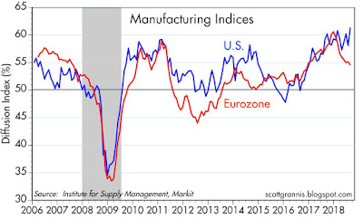
Chart #4 compares the ISM manufacturing index to its Eurozone counterpart. Things aren't looking so good overseas of late, which is unfortunate. But this could simply be a reflection of the fact that with the big drop in corporate tax rates in the U.S., businesses are pouring resources into the US at the expense of Europe, where tax rates are still high.

Chart #5

Chart #5 shows the ratio of after-tax corporate profits (as measured by the National Income and Product Accounts, which in turn are based on data submitted by corporations to the IRS) to nominal GDP. By this measure, corporate profits have rarely been so strong. This is of course due in large part to the reduction in corporate tax rates. Skeptics will say that lower tax rates have simply lined the pockets of the fat cats, and that little or none of this will trickle down to the little guy. I think this is a very short-sighted way of looking at things. What is the first thing that corporations do when they find that their profits are growing? From my experience, having known and worked with many senior corporate executives, increased profits are the trigger for increased investment. No one wants to leave profitable activities unexploited.

Chart #6

Chart #6 compares the yield on BAA corporate bonds, which I use as a proxy for the overall yield on all corporate debt, to the earnings yield (the inverse of the PE ratio) of the S&P 500, which I use as a proxy for the earnings yield of all corporations (i.e., the rate of return on a dollar's worth of investment in US corporations). As the chart shows, the past decade or so has a lot in common with the late 1970s; during both of those periods corporate bond yields and equity yields were very similar. During the boom times of the 80s and 90s, however, the earnings yield on stocks was much less than the yield on corporate bonds.

If the economy was humming along and confidence was high, you would expect the earnings yields on stocks to be less than the yield on corporate bonds. Why? Because corporate bonds have the first claim on corporate earnings—it's safer to own bonds than it is to own equity. Equity investors have a subordinate claim on earnings, but they are generally willing to give up current yield  in exchange for greater total returns.

The fact that earnings yields and corporate bond yields are roughly equal these days tells me that investors aren't too confident that corporate profits will remain as strong as they have been for much longer. That's a sign of risk aversion, and risk aversion has been one of the hallmarks of the current business cycle expansion. I've been arguing for a while that risk aversion is slowly on the decline, and I expect that to continue.

Looking ahead, earnings yields will probably stay flat or decline (i.e., PE ratios will probably remain steady or rise), while the yield on corporate debt should rise in line with rising Treasury yields, which in turn will be driven by more confidence and less risk aversion.

Chart #7

Chart #7 shows the current PE ratio of the S&P 500. This is calculated by Bloomberg using 12-mo. trailing earnings from continuing operations. At just under 21 today, PE ratios are somewhat higher than their long-term average.

Chart #8

Chart #8 shows the PE ratio of the S&P 500, but using the NIPA measure of all corporate profits instead of reported GAAP earnings. Here we see that equity valuations are only slightly higher than average, and far less today than they were during the "bubble" of 2000. 

Chart #9

Chart #9 shows the difference between the earnings yield on equities and the yield on 10-yr Treasuries. That's a measure of how much extra yield investors demand to bear the risk of equities instead of the safety of long-term Treasuries. In the boom times of the 80s and 90s, investors were so confident in the value of equities that they were willing to accept an earnings yield that was substantially below the interest rate on Treasuries. For the duration of the current recovery, however, that has not been the case at all. That's another way of appreciating just how risk averse this recovery has been.

Chart #10
 

Chart #10 shows the PE ratio of the S&P 500 using NIPA profits (instead of GAAP profits), and Shiller's CAPE (cyclically adjusted price to earnings ratio) method of calculation. (Current prices divided by a 10-yr trailing average of after-tax quarterly profits.) Here we see that PE ratios are only slightly above their long-term average. That's another way of saying that equities are far from being over-valued.

Saturday, September 1, 2018

Chart of Shame

Courtesy of Newsalert and MarketWatch, here is a chart that memorializes all the bearish calls of well-known analysts over the past six years.

For the record, I have been consistently optimistic/bullish since December 2008. That call was a bit early (the bottom came three months later), but anyone who bought then and held through today is undoubtedly very happy with the results.

click to enlarge

HT: Brian H.