Thursday, January 31, 2019

Waves of worry recede

Since last October I've been arguing that the equity selloff had more to do with a "panic attack" than to any serious deterioration in the economy's fundamentals. Waves of worry (e.g., a China economic slowdown, tariff wars, Trump's unpredictability, a weakening Eurozone economy, stumbling emerging market economies, collapsing oil prices, weaker corporate earnings, rising credit spreads, and Fed tightening) converged into a "perfect storm" just before Christmas, causing the S&P 500 to fall almost 20% from its late-September high.

Since then, the "worry headwinds" have abated. Oil prices are up almost 28%. Emerging market economies have bounced (the dollar value of Brazilian stocks is up almost 25% in the past 5 weeks). Commodity prices have firmed. Credit spreads have tumbled. Corporate profits have firmed. Key financial fundamentals in China are improving (the MSCI China index is up 14%). And the S&P 500 has rallied some 15%.

One big reason for the improvement: Yesterday the Fed reiterated in detail the apology it made earlier this month. The Fed no longer expects to raise rates twice this year. Instead, Powell has promised to wait for a reason to tighten (e.g., rising inflation, which to date remains very much under control). Shrinking the Fed's balance sheet has morphed from being on "autopilot" to now flexible, a very reassuring sign for future market liquidity conditions. In short, the Fed is paying attention to its dancing partner (the market), and everyone is happier. The bond market doesn't see the Fed doing anything for the foreseeable future. Inflation expectations are in the sweet spot (1.7% per year over the next 5 years). The yield curve is doing just fine.

Another big, but under-appreciated reason: Liquidity has been abundant in the U.S. financial market, as reflected by low and stable swap spreads—a fact that I've been highlighting consistently. Liquid financial markets are a major antidote to financial panics, since they allow market participants to quickly and easily alter their risk exposure as their appetite for risk changes. Put another way, liquid financial markets act as a shock absorber for the real economy.

Chart #1

Chart #1 shows how big changes in oil prices affect the market's inflation expectations. Currently, the bond market expects CPI inflation to average 1.7% per year for the next 5 years. That's a bit below the Fed's "target," but it is nothing to worry about. In my book, lower inflation is always better. Meanwhile, the recent bounce in oil prices dampens concerns about the solvency of oil producers, and it is also evidence that the Fed is not too tight, nor is it expected to be too tight.

Chart #2

Chart #2 compares the real Fed funds rate (blue line) to the market's expectation for what the real funds rate will average over the next 5 years (red line). In the wake of the Fed's apology, the market now assumes the Fed is going to be in "pause" mode for an extended period. This makes sense if you don't expect economic growth to pick up meaningfully from the 2-2.5% range we've seen over the past decade. However, if the economy performs better than that—something we won't know for sure for at least the next 3-6 months)—then it's very likely that real interest rates will rise and that will require the Fed to adjust nominal rates upward from current levels. In the meantime, I take this to mean that the market is not very optimistic about the economy's ability to strengthen from "new-normal" rates of growth.

Chart #3

Chart #3 compares the value of the dollar (inverted) to the level of industrial metals prices. Over time there has been a strong inverse relationship between the two. In recent years, however, commodity prices have held up very well despite a noticeable strengthening of the dollar. This suggests to me that the global economy is, and remains in, fairly good shape. It also is evidence that the Fed is not so tight as to artificially push up the value of the dollar. The dollar is relatively strong not because money is tight, but because the outlook for the U.S. economy is better than that for most other major economies, and that's a good thing.

Chart #4

Chart #4 shows the dollar value of Brazilian equities. As with the case of most emerging market economies, tight U.S. monetary policy and a strong dollar (which prevailed in the late 1990s and early 2000s) pose substantial risks, since those two factors combine to crush the prices of the commodities on which those economies depend. Today that's not the case. At the same time, Brazil is enjoying a new, more market-friendly government. Emerging market economies appear to have substantial upside potential.

Chart #5

Chart #5 provides evidence that the Chinese central bank has managed to stabilize the value of the yuan (blue line), while at the same time arresting the outflow of capital which threatened China's ability to grow. Forex reserves (red line) are basically a barometer of net capital flows, which have been close to zero for the past few years—after being very negative from mid-2014 through late-2016. The recent rise in the yuan is likely an indicator that the market senses a U.S.-China trade truce in the offing. Since their late-October lows, the yuan has appreciated 4% and the MSCI China index is up some 3%. Baby steps, to be sure, but at least they are moving in a positive direction.

Chart #6

The front end of the Treasury yield curve has been pretty flat in recent months, a reflection of the market's belief that the economy will grow at a moderate pace and the Fed will remain on hold for an extended period. But the long end of the curve, shown in Chart #6, is nicely positively-sloped. This is reminiscent of the mid-1990s, when the Fed was non-threatening and the U.S. economy was picking up speed. It's a healthy sign of long-term growth prospects.

Chart #7

Chart #7 is one of the most important. Swap spreads in the U.S. have been rather low for a long time, and this is a reflection of healthy liquidity conditions, low systemic risk, and a non-threatening Fed. It's nice that Eurozone swap spreads have been moving lower of late, especially given the pronounced weakness we've seen in Europe in the past year. As I've emphasized for many years, swap spreads tend to be excellent coincident and leading indicators of economic and financial market health.

Chart #8

Credit default swap spreads are a highly liquid and generic indicator of the market's outlook for corporate profits and the future health of the U.S. economy. They have fallen significantly since just before Christmas, suggesting in turn that the market has become much less worried about the future.

Chart #9

The trailing 12-month earnings yield on the S&P 500 is now a rather robust 5.5%. That is about 2.9 percentage points higher than the current 2.6% yield on risk-free 10-yr Treasuries. As Chart #9 shows, the extra yield on stocks is relatively high when viewed from a historical perspective. This is a sign that the market is still priced to a skeptical view of the ability of corporate earnings to continue rising. The market has lost a good deal of its former fear, but it's still far from being optimistically-priced.

Chart #10

Chart #10 shows how surging bouts of fear (panic attacks, red line) have coincided with equity selloffs (blue line), and how receding fears lead to rising stock prices. 

It's not yet possible to be confident that the recent selloff was just another panic attack, but it's looking that way for now.

Friday, January 18, 2019

Key financial indicators are healthy

Monday's post focused on key economic indicators. Today's post focuses on key financial indicators, which for the most part are market-driven and available in real-time. As such, they should carry more weight in one's assessment of the economy's fundamentals. They aren't subject to estimates or adjustments or revisions, and they are the net result of the fears, hopes, judgment and actions of countless millions of economic agents and investors. Right now, they paint a picture of a market and an economy that are fundamentally healthy, even though investors are still worried about the future.

Chart #1

If I were stranded on a desert island and could only access one chart to tell me what was going on in the world, Chart #1 is the one I would pick. There are many ways of thinking about swap spreads. (For a detailed explanation, see this post of mine from many years ago.) Swap spreads are excellent coincident and often leading indicators of financial market and economic health. When spreads are low, liquidity is generally abundant, risk aversion is low, systemic risk is low, and the economic outlook is generally healthy. 2-yr swap spreads today are unusually low, less than 20 bps. Among other things, this tells me the banking system is healthy and there is no shortage of liquidity. Morever, market participants are willing and able to manage risk in a variety of ways. That's an essential function of markets: to redistribute risk from those who don't want it to those that do. When markets are free to operate and those who worry are free to reduce their risk, panic is short-circuited, and there is no rush for the exits. Low swap spreads act like grease for the wheels of finance, and healthy financial markets are a necessary, if not sufficient, condition for a healthy economy. This is very positive.

Chart #2

After swap spreads, I'd want to know what the Fed was doing. For that, I'd pick Chart #2. Although they rarely mention it, the Fed's primary monetary lever is the real Fed funds rate (the nominal rate minus inflation according to the Core PCE deflator). That's the rate that really matters to the economy, not the nominal rate; 5% interest rates in a zero inflation world are much more onerous than 5% rates in a 4% inflation world. As Chart #2 shows, it turns out that every recession in the past 60 years has been preceded by a significant rise in the real Fed funds rate. What was the Fed doing to make real short-term rates rise? It was draining reserves from the banking system. Faced with a shortage of reserves, banks needed to bid in the Fed funds market for reserves (reserves are required to collateralize deposits), and that had the effect of pushing up overnight lending rates. Rising real rates made borrowing more expensive, and it made holding cash or cash equivalents more attractive: the net result was an increased demand for money. So, prior to every recession the Fed effectively starved the markets and the economy for money (because the demand for money exceeded the supply of money), until economic activity slowed down and a recession set in. Then the Fed began to ease, and the economy began to recover. Lather, rinse, and repeat.

It's going to be different this time, however, because since late 2008 the Fed has changed the way it operates. Bank reserves used to pay no interest, so banks always tried to minimize their holdings of reserves. Today the Fed does pay interest on reserves, so now reserves are a potentially attractive asset class, not a deadweight burden for banks. Reserves today are essentially T-bill substitutes that the Fed created by buying notes and bonds from banks: they pay a floating rate of interest and they are default-free. Not surprisingly, today the banking system is happy holding some $1.6 trillion of excess bank reserves. Banks have all the reserves they could possibly need to cover a potentially huge increase in lending activity, but they are content to hold excess reserves in lieu of making more loans. Bank lending is expanding today at a reasonable rate, and inflation is low.

The main reason the Fed has been trying to reduce its balance sheet is to minimize the risk that a huge amount of excess reserves might encourage banks to lend too much and to thus over-expand the money supply, which in turn could cause a lot of inflation. But so far, raising the interest rate it pays on reserves has been sufficient to induce the banks to view excess reserves as a valuable asset, not as a means to expand lending.

Chart #3

In the 5 years preceding the crash of 2008, Bank Credit grew at a 9.4% rate (see Chart #3). Since the economy began to recover in mid-2009, Bank Credit has expanded at a 4.1% annualized rate; over the past 5 years, Bank Credit has expanded at a 6% rate. Bank Credit growth has picked up a bit in the past few years, but it is clear that banks are not creating new money with abandon, as they seemingly did in the run-up to 2008. The Fed, in other words, has managed to find the interest rate that appears to balance the supply and demand for money. That helps explains why inflation has been low and relatively stable, and the dollar has been reasonably strong and relatively stable.

Chart #4

But the real Fed funds rate is only part of the story. The other part is how the Fed's actions affect interest rates across the maturity curve and across the risk spectrum. Chart #4 adds the shape of the yield curve (red line) to Chart #2. This gives us a more complete look at the impact of Fed policy on the economy. Now we see that every recession in the modern times has been preceded by a significant rise in real short-term rates AND a flat or inverted yield curve. Inverted yield curves are the bond market's way of saying "uncle." It's saying that money is so tight it's affecting the economy, and things are likely to get so ugly that the Fed is going to have to start lowering rates in the foreseeable future. (An inverted yield curve occurs when markets expect short-term rates to fall in the future.)

Chart #4

The yield curve today has become a lot less steep than it was not too long ago, but real short-term interest rates are still relatively low. All that tells us is that the market now expects the Fed to be on hold for the foreseeable future. Consider Chart #4, which shows the Dec. '19 Fed funds futures (i.e., the market's expectation for what Fed funds will trade at come December). Fed expectations a few months ago called for two more tightenings, but the economy's weakness and concerns over trade tensions, etc., have convinced the market (and also the Fed, which recently apologized for threatening to raise rates more) that this won't happen. Today's funds rate target is 2.4%, and the Dec. '19 Fed funds futures rate is trading at just under 2.5%. So the market expects the Fed to essentially be on hold for at least the rest of this year. This is an important variable to watch, since it is tied directly to the market's perception of whether the economy is gaining or losing strength; for example, any tendency towards a stronger economy would cause the market to raise its expectations for where the funds rate will be come December.
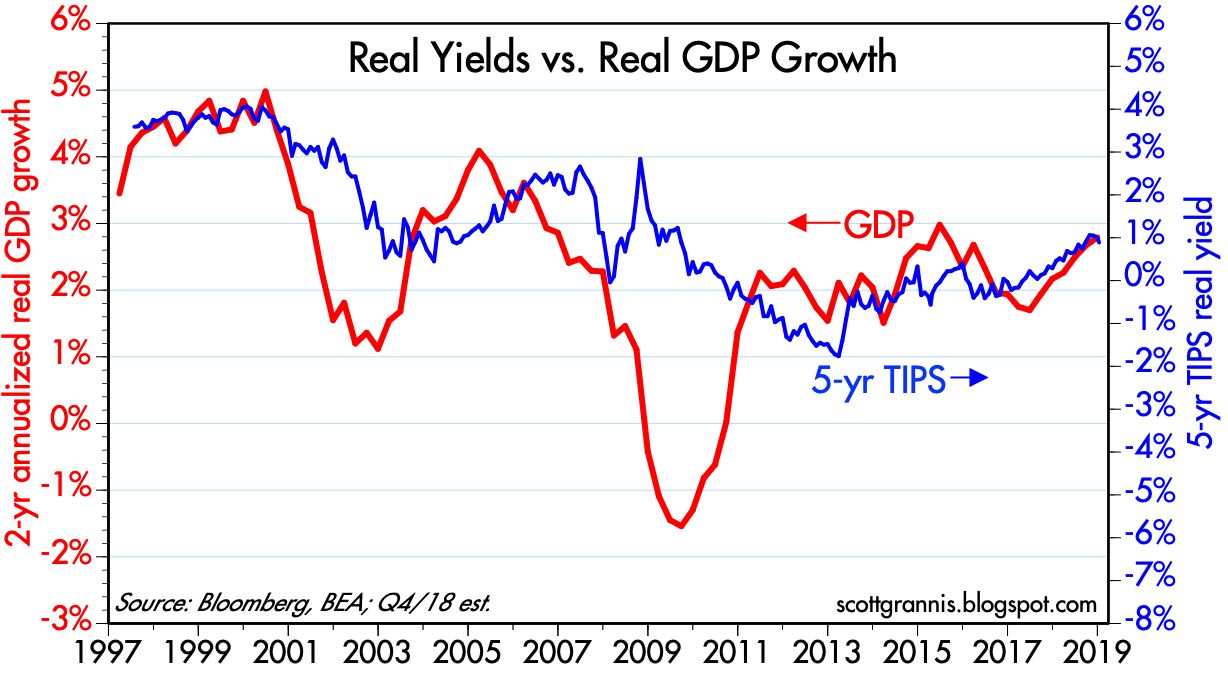
Chart #5

Chart #5 sheds further light on market expectations for Fed policy. The real Fed funds rate (blue) is the overnight real interest rate that sets the floor for all other rates (it's also the same rate that appears in Chart #2). The real yield on 5-yr TIPS (red) is a good proxy for what the market expects the real Fed funds rate to average over the next five years. The current real funds rate is about 0.6% (a 2.4% Fed funds target minus a core PCE inflation rate of 1.8%). The market expects the real funds rate to average about 0.9% over the next 5 years—a very modest tightening of policy, but certainly not an easing.

Note the relationship between these two variables. The real yield curve tends to invert prior to recessions (i.e., the blue line exceeds the red line). This happens because the bond market senses that the Fed is so tight that it is undermining the economy, and that in turn will lead to a recession and much easier Fed policy in the future. Currently the real yield curve is still positively sloped. The bond market is not signaling a recession, but neither is it signaling strong growth—real yields are still relatively low.

Chart #6

Chart #6 shows one popular measure of the slope of the nominal yield curve: the difference between 2- and 10-yr Treasury yields. By this measure the curve is pretty flat, but it's not inverted. It's been like this several times before in recent history without a recession immediately following.

Chart #7

Chart #7 is another measure of the slope of the yield curve, with the key difference in this case being that the market's expectation of where the funds rate is going to be in the near term does not play a role (as it does in Chart #6, since the 2-yr Treasury yield is effectively the market's expectation for what the Fed nominal funds rate will average over the next two years). The difference between 10- and 30-yr yields is a function of the market's long-term expectations for economic growth and inflation. A positive slope is the norm, and a negative/inverted spread is a sign of trouble. What we see today is fairly routine for an economy in mid-cycle. Indeed, there are lots of similarities between today and the mid- to late-1990s, when the economy was booming and the Fed was beginning to tighten. 

Now let's look at credit spreads, which are a measure of the market's confidence in corporate profits (the lower the better) and by inference the market's outlook for the health of the economy. (Credit spreads are the difference between the yield on a corporate bond and the yield on a Treasury bond of similar maturity.)

Chart #8

Chart #8 shows 5-yr Credit Default Swap Spreads. The market for CDS is highly liquid, much more so than for individual corporate bonds. Buying CDS contracts is equivalent to buying a basket of bonds, and selling CDS is equivalent to selling a basket of bonds. If you have a portfolio of corporate bonds and become nervous about a general weakening of the economy, you can hold on to the individual corporate bonds you like and sell CDS to cover your risk of a generic rise in credit spreads, for example. Currently, CDS spreads are relatively low, and down from their recent highs. As we'll see in Chart #10, one of the main drivers of wider corporate bond spreads is the recent, sharp decline in crude oil prices, similar—though to a much lesser extent—to what we saw in late 2015.

Chart #9

Chart #9 shows credit spreads for Investment Grade and High Yield corporate bonds, which tell a similar story to that told in Chart #8. Credit spreads are somewhat elevated, reflecting caution, but not signaling great risk. And they have declined meaningfully in the past week or so.

Chart #10

Chart #10 shows that the recent sharp decline in crude oil prices closely tracks the decline in expected inflation. Lower expected inflation is thus not the result of overly-tight Fed policy. 

Chart #11

Chart #11 compares 2-yr swap spreads to the spread on high-yield corporate bonds. Note how swap spreads tend to lead credit spreads. For the past several years swap spreads have been relatively low (a normal trading range would be 15-30 bps). Throughout that period swap spreads have correctly diagnosed the "problem" behind wider credit spreads to be due to nerves, not fundamentals (i.e., fears that lower oil prices would threaten the oil-related sectors).

Chart #12

Chart #12 shows that the level of real yields tends to correspond to the economy's real growth trend. When the economy was booming (4-5% GDP growth) in the late 1990s, real yields were 3-4%. More recently, the economy has been growing at a 2-2.5% pace, and real yields are about 1%. This reflects the market's belief that it is quite unlikely that the economy will pick up significantly from its recent pace. I happen to think the market is being too pessimistic on this score. I think there is a lot of untapped potential in the economy that could be realized if and when tariff wars recede and some today's pressing problems are gradually resolved. 

Chart #13

Chart #13 shows that there tends to be an inverse correlation between the value of the dollar and the level of industrial commodity prices. But not always. Currently, the dollar (blue line) is reasonably strong, and commodity prices are also relatively strong. I interpret this to mean that the global economy (and thus global demand for commodities) is relatively strong. This runs counter to the prevailing narrative which claims that the global economy, in particular the Eurozone and the Chinese economies are very weak. It also runs counter to the prevailing fears that a strong dollar will prove destructive to emerging market economies, since a strong dollar tends to push commodity prices down, and that in turn punishes those economies most dependent on commodity exports.

Chart #14

Chart #14 is another one of my favorites. What we see here is that the primary driver of equity selloffs in recent years has been FUD (fear, uncertainty, and doubt). As most of the charts above show, the economy's fundamentals remain sound. The Fed is not threatening, inflation is not too low nor too high, the economy appears to be gaining strength, the outlook for corporate profits is healthy, and financial markets enjoy plentiful liquidity. So far this theme seems to be holding for the latest selloff: as fears (as proxied by the ratio of the Vix index to the 10-yr Treasury yield) subside, prices are rising. The equity market has already recovered a bit more than half of what it lost since early October. 

Chart #15

Chart #15 compares Warren Buffet's favorite measure of equity valuation (blue line) to the inverse level of 10-yr Treasury yields (red). It suggests that equity prices had reached high levels relative to nominal GDP earlier this year, but that this has been "corrected" by the recent decline in equity prices combined with ongoing growth in the economy. The chart further suggests that the current valuation of the market is consistent with the level of interest rates (compare the current period to the late 1950s and early 1960s). That equity valuations using the Buffet measure tend to inversely track the level of interest rates over time is not surprising, since lower lower rates result in a higher discounted present value of future profits, and vice versa.

Chart #16

Finally, let's look at something interesting from China. Chart #16 compares the value of the Chinese yuan to the level of China's foreign exchange reserves. Here we see that the yuan has taken a beating in the past year or so (undoubtedly as a result of a significant reduction in the pace of China's real growth and a significant increase in uncertainty surrounding the Trump tariff wars). But it's very interesting to see that China's forex reserves have been holding fairly steady for the past two years. This tells me that China's central bank has been successfully stabilizing its holdings of reserves by allowing the yuan to fluctuate within reasonable limits. This further implies that the central bank is keeping the supply of and the demand for yuan in balance, which should keep China's inflation low, help stabilize the economy and in turn restore confidence in the currency. The recent upturn in the value of the yuan likely reflects the market's belief that a resolution to the US-China Trade War could be in the offing. I wouldn't be surprised at all, since Trump's ultimate objective is a reduction in tariffs and subsidies, and that in turn would be good news for both the US and Chinese economies.

Despite all the worries, there are reasonably strong signs in the financial market's entrails that things will work out well in the end.

Monday, January 14, 2019

Key economic indicators are mostly positive

Lots has transpired since equity markets hit their lows the day before Christmas '18. Markets were panicked over a number of things: the shutdown of the federal government, mounting trade tensions with China, slowdowns in the Eurozone and Chinese economies, downward revisions to profit forecasts (e.g., Apple), the proximate return of trillion-dollar federal deficits, the path of monetary policy (e.g., the flatness of the yield curve), the plunge in oil prices (from $77/bbl in early October to $42 by Christmas), and the rise in credit spreads. Over the past two weeks these fears have lessened, but the market is still worried.

The following charts (all of which include the most recent data available as of today) present a good overview of just where key economic indicators stand today. (My next post will feature key financial indicators.) We're not out of the woods, since the indicators are not uniformly positive, but it remains the case, as I've said several times in recent months, that the U.S. economy's fundamentals remain healthy. The recent turmoil is thus more likely a panic attack than the beginnings of another recession.

Chart #1

The labor market has rarely been so healthy, as suggested by Chart #1. The number of job openings now exceeds the number of people looking for work! Today is arguably the best time to be looking for a job in generations.

Chart #2

Chart #3

Small businesses employ the great majority of Americans, and small business owners are still very optimistic about the future (see Chart #2), despite the market turmoil of the past several months. In fact, the biggest problem facing most small businesses is the difficulty in finding qualified people to fill their job openings. Hiring plans, as shown in Chart #3, remain very expansionary. Optimism among those capable of creating growth is very important.

Chart #4

If we consider the less numerous number of manufacturing/industrial concerns (Chart #4), the ISM manufacturing survey reveals a disturbing drop in sentiment in December. This unfortunately coincides with the weak numbers coming out of the Eurozone in recent months. Undoubtedly, the recent market turmoil has made corporate executives a bit circumspect in regards to the future. This doesn't necessarily mean we're on the verge of another recession however: these surveys have experienced several periods of weakness in prior years which were subsequently reversed without an intervening recession. Whatever the case, Chart #4 is probably the least optimistic chart in this collection.

Chart #5

Nevertheless, and despite the weak ISM surveys, Chart #5 shows that industrial production in the US reached an all-time high last month, and it has made impressive strides since late 2016. The Eurozone, in contrast, has stalled and weakened on the margin, as uncertainty over the future of the EU, coupled with an oppressive tax and regulatory environment, has plagued sentiment and confidence. China has slowed down as well. Most data point to the Chinese economy growing at its slowest pace (4-5% or even less) in over two decades, and the stock market is down some 30% in the past year. For that matter, it is hard to name any country outside of the U.S. that is enjoying healthy growth. Does this mean the U.S. is doomed? Or does it just mean that conditions here are so favorable that we are likely to once again be the world's engine of growth in coming years? As an optimist, I'm inclined to the latter interpretation; in my experience it always usually pays to give the U.S. economy the benefit of the doubt.

Chart #6

US freight shipments, shown in Chart #6, have surged over 14% since Trump's election. This is one of the most impressive signs I have seen that the US economy is growing at a healthy, and perhaps surprising pace. The rest of the world is having problems, but we are doing about as well as could be expected, to judge from this chart.

Chart #7

Chart #7 shows a subset of freight shipments—truck tonnage—which is also quite strong. But it also shows how the recent surge in physical activity in the US economy is at odds with the recent decline in equity prices. This could be a very good sign that the market selloff is due more to "panic" than to any actual or impending economic slump.

Chart #8
   

As Chart #8 shows, car sales in the US have been relatively flat for several years. I had expected to see sales rise above previous record levels, if only to make up for the extensive and extended decline in sales that began in 2008 (i.e., years of very weak sales plus an aging fleet should have translated into above-average new car sales for at least a year or two). Regardless, flat car sales do not necessarily imply future economic weakness, and could simply reflect a pause. Bear in mind that jobs are growing at a healthy 2% pace, real incomes are rising, and the population continues to increase.

Chart #9

As is the case with car sales, housing starts have stalled in the past year or so. Furthermore, builder sentiment (the red line in Chart #9) has slumped of late. Does this portend the beginnings of another housing crash? I doubt it. I think it just reflects the fact that housing supply had run a bit ahead of demand, which began to be hurt by rising prices and rising mortgage rates. In other words, housing had become less affordable, a problem which is naturally solved by a combination of flat to lower prices, slower growth in new home construction, and a reduction in borrowing costs (mortgage rates have dropped almost half a point in the past several weeks). This all smacks of a market-driven adjustment process, not the beginnings of another housing crash. It's also important to note that in recent years the housing market has not been distorted by government mandates, unlike the boom of the early 2000s, when Congress forced banks to make un-sound loans which were subsequently purchased by Fannie Mae and Freddie Mac.

Chart #10

The Fed recently updated its estimates of household financial burdens, as shown in Chart #10. Here we see that financial obligations (monthly payments for mortgage debt, consumer debt, auto loans, rent, homeowners' insurance and property taxes) are about as low, relative to monthly disposable incomes, as they have been for many decades. Households have been unusually responsible in the management of their finances. This puts a very important sector of the economy on solid footing.

Chart #11

The economic outlook is far from perfect, but there are numerous signs of strength and general health. Things would be better if there weren't so many headwinds. Regardless, at the very least the above observations are consistent with current Fed estimates of 2.5% GDP growth in the fourth quarter. And it is reasonable to expect growth of at least as much in coming quarters, as Chart #11 suggests (i.e., the current 0.9% real yield on 5-yr TIPS is consistent with a real GDP growth trend of 2.5 - 3%). That's not gang-buster growth, but it's better than we've seen for most of the past 9 years. 

In my next post, due out shortly, I will review a number of key financial indicators: interest rates, spreads, volatility, the dollar, and commodity prices.

Friday, January 4, 2019

The Fed apologizes, and the outlook improves

Two weeks ago I noted that the Fed had screwed up badly. But all was not lost: "all it takes is a few words to put things right. The damage done to date is not significant or permanent, and it is reversible." Today we got those words: according to Powell, the Fed is "listening carefully to the markets." The threat of an overly-tight Fed has now all but vanished. The Fed and the market are dancing together again, with both participants expecting no further Fed tightening moves for the foreseeable future, but with a possibility of an ease later this year (i.e., the market is relieved, but still cautious).

Prior to this welcome Fed news, the Labor Dept. earlier today released a surprisingly strong December jobs number which was way above expectations (+312K vs +184K). This put the kibosh on concerns the US economy was slowing down, at least for the foreseeable future. Credit spreads have rallied from their highs, though they are still somewhat elevated.

For the time being some of the market's worst fears are being calmed. What remains to be seen is the result of the ongoing negotiations with China, which get underway next week (and in which my good friend and excellent economist David Malpass will be participating). If Trump can turn down the tariff-war heat, the entire world will be breathing a huge sigh of relief, and risk markets will move decisively higher. Already, the Brazilian and Argentine stock markets are up some 15% in just the past week in dollar terms, though they remain deeply depressed.

It bears repeating that what Trump hopes to achieve is NOT higher tariffs, but rather lower or zero tariffs, lower or reduced export subsidies on the part of China, and a reduced likelihood that China will continue to expropriate US intellectual property. Any move in this direction will be a direct benefit to global trade, and that in turn will benefit all concerned. Trump is putting at risk US prosperity (by raising tariffs as a negotiating tactic) in order to force China to do something that in the end will be of great benefit to both China and the US. It's a risky gambit, to be sure, but the potential rewards are Yuge. It's also worth repeating that it seems China must be threatened in order to do the right thing, and the threat must be not only palpable but terrifying. And China won't feel that kind of pressure unless you and I (and the market) also get to the point that we are terrified of the consequences of a tariff/trade war. With luck, we may have seen the worst of this deal-making process.

Chart #1

Chart #2 

Long-time readers know that I routinely focus on more than just one month's worth of job statistics and on just the private sector job numbers. The monthly numbers are so volatile as to be almost worthless, and private sector jobs are the only ones that matter. But a six- or twelve-month average of the numbers can give us valid insights into the broad trends of the labor market. Charts #1 and #2 show that today's number, however surprisingly strong it was, was not out of line with past experience. Yes, monthly jobs growth was at the high end of its range, but as Chart #2 shows, the trend growth rate of jobs has been only slowly picking up over the past year or so. Both the 6- and 12-month growth rates of private sector jobs are now slightly above 2.0%, but that's up from a low of 1.6% in September 2017. The economy really is getting stronger, albeit slowly. The momentum of a gradual strengthening of the mighty US economy is much more significant than the ongoing marginal slowdown in the Chinese economy.

In addition to a pickup in US jobs growth, we also are seeing a pickup in the growth of the labor force, which increased 1.6% last year—up significantly from 0.5% growth in 2017. It's also welcome news that the unemployment rate ticked up to 3.9%, since that means that despite the outsized growth in jobs, the number of people entering the labor force was even greater (i.e., many of the new entrants to the labor force are still looking for a job). A stronger economy and rising wages are attracting people who were formerly on the sidelines of the jobs market. This is terrific news, since it means the economy has plenty of untapped upside potential. (Doomsayers had been insisting that the low rate of unemployment meant that it would be difficult if not impossible for the economy to grow at a 3% or better pace.)

Chart #3

News of a stronger economy has contributed to a meaningful reduction in credit spreads, as Chart #3 shows.  High-yield, 5-yr credit default swap spreads (arguably the most liquid and meaningful indicator of the outlook for corporate profits) have tightened by some 60 bps in the past week or so, thanks to perceptions of a stronger economy coupled with rising commodity prices and a reduced threat of an overly-tight Fed. Swap spreads remain very low and firmly in "healthy" territory. So not only is the outlook for corporate profits improving (as indicated by declining credit spreads), but also it is the case that liquidity remains abundant in the financial markets and systemic risk remains quite low. In other words, we are most likely on the recovery side of another case of "panic attack."

Chart #4

As Chart #4 shows, the market is now much less worried (as measured by the ratio of the Vix index to the 10-yr Treasury yield) than it was just a week or so ago (the ratio has declined from a high of 13.2 just before Christmas to now 8). Last week we had the threats of 1) an overly-tight Fed, 2) a slumping economy, plus sundry other worries: China slump, trade wars, Eurozone weakness, collapsing oil prices, and the federal government shutdown. We can now scratch the first two off this list. There are still a lot of concerns out there, but we are moving in a positive direction.

Happy New Year!