Chart #1

As Chart #1 shows, real GDP growth has been on a downtrend for the past several quarters. I had expected Q1/18 growth to exceed 3%, as it had in previous quarters, but it was not meant to be. A number of observers have noted that first-quarter growth tends to be on the weak side, perhaps due to faulty seasonal adjustments, and that may well be the case.
Chart #2

Nevertheless, as Chart #2 shows, year over year GDP growth (which avoids seasonal adjustment flaws) has been trending significantly higher for the past year or so. At 2.9% currently, it meaningfully exceeds the 2.2% average annual growth rate for the current expansion.
Chart #3

Despite the recent pickup in growth, the big picture is far from impressive. As Chart #3 shows, the big picture is dominated by an ever-widening "gap" between where the economy is and where it might have been had past growth trends continued. By my estimate, the size of the gap is about $3 trillion.
Chart #4

Chart #5

As Charts #4 and #5 show, one of the biggest things that has happened in the past year or so is a sharp rise in business and consumer confidence. Confidence jumped almost immediately following the November 2016 elections.
Chart #6

As I've argued for many years, one of the defining characteristics of the current business cycle expansion has been risk aversion and a lack of confidence. People were so shocked by the near-total collapse of the financial markets and the global economy that they began to stockpile money. Money demand surged, as shown in Chart #6, beyond anything we had seen previously. That is now beginning to reverse; people are beginning to spend down their money balances and to use their cash to finance increased spending and investment.
Chart #7

Chart #7 tracks the two components of money demand shown in Chart #6: M2 money supply and nominal GDP. I calculate that if the relationship that prevailed between M2 and GDP for the decades prior to 1990 were to re-establish itself, this could result in an additional $4 trillion of nominal GDP. In other words, if the stockpiled cash were to be released into the economy, this could support an additional $4 trillion of national income. That's equivalent to an increase in national income of roughly 25%.
Chart #8
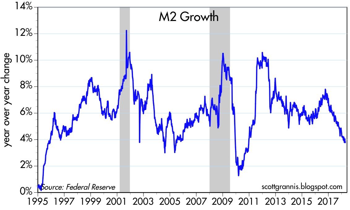
Chart #9

The rise in confidence directly coincides with a decline in the growth of M2 and Bank Savings Deposits, as shown in Charts #8 and #9. Bank savings deposits, I have argued, are an excellent measure of money demand, since in the current expansion they have paid little or no interest. People have put trillions of dollars in the bank because they want it to be safe, not because they want the interest. Bank savings deposits were about 50% of M2 prior to the 2008 recession, and they have now grown to be almost two-thirds of M2. From the end of 2008 until the end of 2016, bank savings deposits more than doubled, from $4 trillion to $8 trillion, for an annualized rate of increase of almost 10%.
Savings deposit growth has now fallen to about 3%, which is similar to the decline in M2 growth to 3-4%. In the past several quarters, M2 growth has been less than nominal GDP growth, with the result that the demand for money (i.e., M2/GDP) has declined. This is potentially just the beginning of something that could continue for years. The Fed no longer needs to force-feed liquidity to the economy; the increased willingness of people to spend what they have accumulated is sufficient to do the trick.
Chart #10

Chart #10 shows the other important and recent change in the economy: a pickup in investment, which began early last year, coincident with rising confidence and fueled of late by tax reform. Private fixed investment rose by almost 7% in the year ending March 2018. By historical standards, investment is still relatively weak, as Chart #10 shows, but it is increasing at a healthy pace. Increased investment enhances the likelihood that we will see a pickup in productivity and living standards in the years to come. As Chart #10 also shows, there is plenty of upside potential here.
Q1/18 growth may have been a bit disappointing, but a look inside the numbers shows that there is reason to remain optimistic.