Friday, March 27, 2020

Maybe it's not a pandemic after all

For about 4 weeks, beginning in late February, stock markets around the world faced the growing realization that the virus that originated late last year in China (AKA coronavirus, covid-19, Chinese virus, CCP virus, and Kung Flu) might prove to be a global pandemic that could kill tens of millions of people within the span of several months. Epidemiologists frantically revved up their models to calculate how fast it might spread and how many lives might be affected. Geometric growth, it was noted (e.g., a doubling of cases every 2 days, as many feared) gets you from 100 to a million cases in less than 2 weeks. Yikes!

The peak of the prediction frenzy probably occurred around the time I turned on the TV and saw California's governor, Gavin Newsom, declare (on March 10th) that in the absence of strong countermeasures, 25.5 million Californians could contract the covid-19 disease within the next 8 weeks, resulting possibly in a million deaths and many hundreds of thousands of seriously ill citizens flooding California's hospitals. Obviously, as he and many other governors, presidents, and prime ministers around the world concluded, something had to be done—and quickly—to "flatten the curve," to delay the spread of the infection in the hope that therapeutics and vaccines could be developed, and to avoid dangerously overcrowding hospitals in the meantime. The result was the rapid onset of shutdowns, lockdowns, closures, and quarantines that caused economic activity around the globe to plunge almost overnight. Meanwhile, the media's anti-Trump bias and love of all things terrifying combined to fan the panic.

Perspective: After at least one month on the job, this killer disease has resulted in the deaths of only 85 Californians out of a population of 40 million. Since the normal flu season began last October, the CDC estimates that as many as 45 million Americans have come down with one form or another of the flu, and roughly 45,000 have died from complications of the flu. That works out to about 250 deaths per day. In all of the US, and for the year to date, covid-19 has been tied to only 1700 deaths. Simply put, this is not a pandemic, and is very likely not going to become one, especially given the draconian measures that have been imposed across the country to date.

Nevertheless, pandemic panic sent interest rates into free-fall, stock markets entered bear market territory in a matter of days, corporate bonds (especially those issued by oil producers, who faced near-extinction as plunging demand caused oil prices to return to collapse) cratered, and fear and panic resulted in a sudden and unprecedented demand for money and safe assets. Fear and panic, as measured by the Vix index, reached a peak in the mid-80s on March 16th, a level last seen at the height of the 2008 global financial market meltdown, when investors feared the imminent collapse of global markets and an extended global depression.

And now here we are, just 11 days after max panic, and the stock market is up almost 14% from last Monday's low.

What is driving the sudden onset of optimism, at a time when global covid-19 cases are on their way to 600,000, global deaths are almost 27,000, and Italian and Spanish deaths are more than 4 times China's deaths? Ah, you might say, the answer is easy. It's the passage this week of a $2 trillion US virus rescue plan, coupled with central banks' massive injections of liquidity. Maximum fiscal stimulus and maximum monetary stimulus surely have saved the day! (No doubt markets are also looking forward to Spring weather in the Northern Hemisphere, since that will most likely render the virus less potent.)

But you might be wrong. Fiscal and monetary "stimulus" doesn't send consumers out en masse to work and spend as if nothing had happened; stimulus surely doesn't cure the flu. Fiscal stimulus of the sort cooked up in the Senate only works as a backstop for all those who have been laid off, locked up, and shut down. Monetary "stimulus" only ensures that all those who want the safety of cash can find it, and all those who fear the onset of a global credit collapse can worry less. The virus rescue package is like a strong pain reliever, but not a cure.

What is beginning to make a real difference is the growing realization that the covid-19 virus is not nearly as deadly as the early projections suggested. That, and the rapidly growing list of therapeutics—led by chloroquine—and the accelerated development of vaccines and the fact that covid-19 test kits are on the verge of being distributed by the millions. The private sector really is coming to the rescue, and the media hype is being eroded by the reality on the ground. Dr. Birx herself is coming to this conclusion.

The shutdowns have certainly helped "flatten the curve," but it's impossible to purge this virus from our shores. Sooner or later most people will be infected, as has happened with nearly every new virus.

What we really need right now is to recognize that this virus is not a pandemic or a mass killer. It's probably more like an unusually nasty flu. We need to lift the economic shutdown as soon as possible and get back to work. Trump is right.

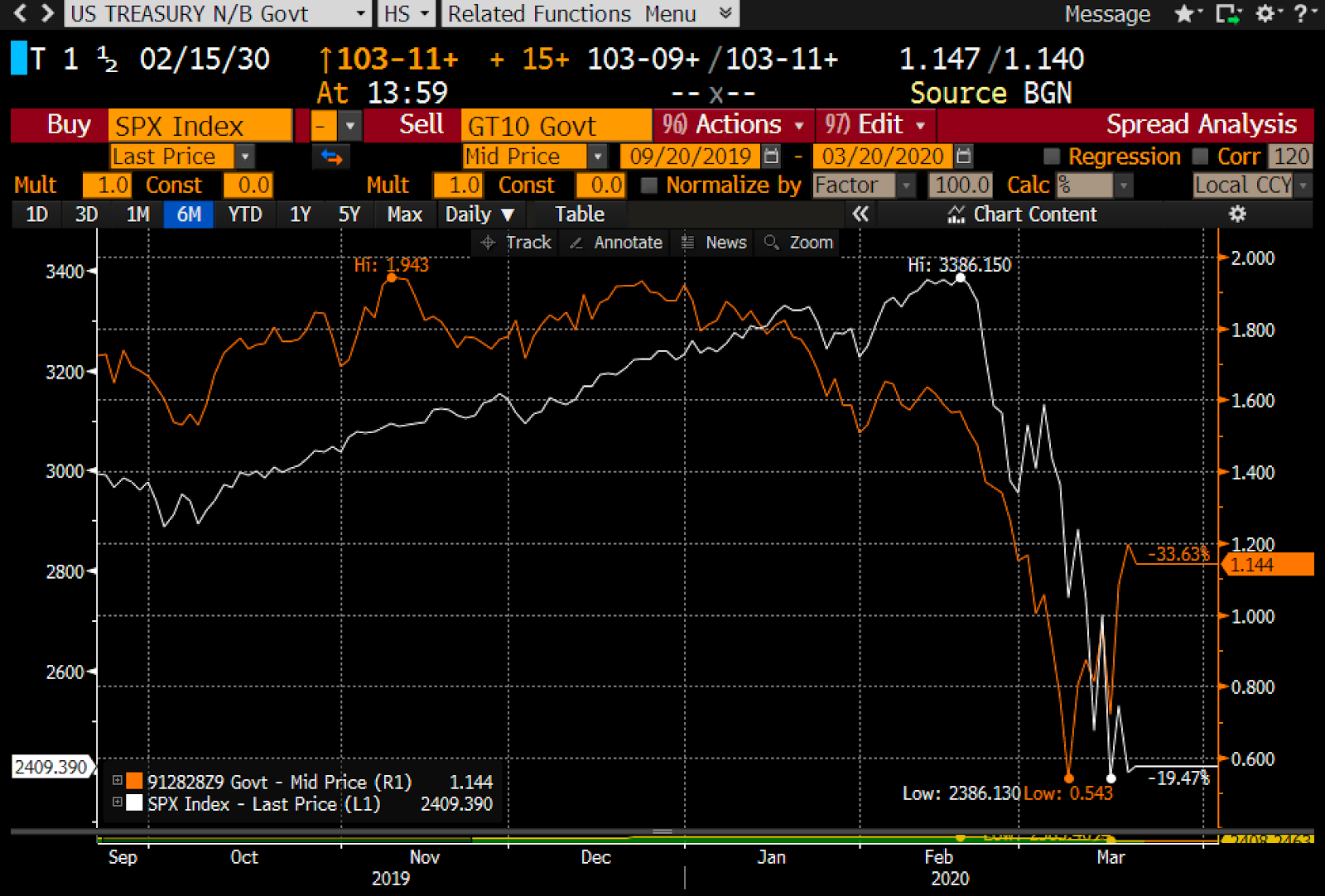
Following is a collection of updated charts which track the financial progress of what I believe will become our national nightmare, from which we will most likely wake up soon.

Chart #1

As Chart #1 shows, we reached peak panic on March 16th, and stocks bottomed a few days later (March 23rd). Since then the S&P 500 is up almost 14%. The Vix index has backed off from its eye-popping highs, but remains very elevated as stocks see-saw daily. I'm guessing the market will remain very nervous for at least another week or so, but eventually we'll see prices moving higher and the Vix moving lower.

Chart #2 

Chart #2 shows a macro definition of money demand: the ratio of M2 to nominal GDP. I've estimated the GDP number for the first quarter, and it is a conservative estimate. What stands out is the incredible surge in the demand for money and money equivalents relative to income. It's a replay of what we saw in the wake of the 2008-2009 Great Recession. This is likely to persist for awhile and increase further as nominal GDP is likely to drop significantly in the second quarter. When the market wants tons of money, central banks are compelled to supply it, lest disaster ensue.

Chart #3

Chart #3 shows another measure of money demand: the 3-mo. annualized growth in the sum of bank savings and demand deposits. There's been a literal explosion in the demand for safe money in recent weeks.

Chart #4

 Chart #4 shows the spreads on 5-yr Credit Default Swaps, which are a highly liquid and timely indicator of the market's concerns about the health of corporate profits. Peak panic saw these spreads soar, but they fell sharply in the wake of the Fed's announcement of massively accommodative monetary policy and a 100 bps cut in short-term interest rates. The Fed is doing the right thing.

Chart #5

As Chart #5 shows, the demand for 3-mo. T-bills has been so intense that their yields have gone negative (i.e., they sell at a small premium to their face value). By cutting the rate it pays on excess reserves to near-zero, and by stepping up its purchases of notes and bonds massively, the Fed is effectively supplying massive amounts of T-bill equivalents to the market in the form of the bank reserves it uses to purchase securities from the banking system. This is the right thing to do in a panic.

GAME CHANGER:
Coronavirus cure: French researchers completed new additional study on 80 patients, results show a combination of Hydroxychloroquine and Azithromycin to be effective in treating COVID-19

We now have a very effective treatment protocol for covid-19. This renders obsolete all previous projections/forecasts of the disease's evolution. This is a very big deal. There is a bright light at the end of the tunnel.

Monday, March 23, 2020

Chart updates

Stocks made new lows today, but fear is receding. So far, my guess that last Thursday marked the worst of the crash seems to be holding up. The Vix has peaked, but stocks have yet to bottom, which calls to mind what happened in the 2008-9 period, when the Vix peaked months before stocks bottomed. I'd like to think th. On the margin, things continue to improve. The news has become less bad: there are now quite a few therapeutic drugs available, testing is rapidly ramping up in the US, Italy's new daily cases appear to be declining, the US shutdown has been extensive (and painful), mortality rates are trending lower than feared, the Fed has pulled out all the stops, and Congress will likely soon approve a massive and reasonably-effective stimulus and aid package.

Chart #1

In Chart #1 we see that the Vix hit a peak of 80+ last Thursday, whereas stocks have fallen further since then, This is not an all-clear signal, but it is somewhat reassuring. Panic is subsiding, and concrete solutions are being implemented.

Chart #2 

Charts #2-4 show what is arguably the best measure of equity market capitalization. Note that this calculation comes from Bloomberg, and it excludes ETFs and ADRs in order to avoid double-counting (it is also in dollar terms). Note also that although the current crash has been extremely rapid and steep, it is still noticeably less, on a percentage basis, than the financial market disaster of 2008-2009. Back then the world feared the collapse of global financial markets and a global depression. At one point in late 2008, one Wall St. firm calculated that credit spreads were priced to the expectation that something like 25-30% of all US corporations would be out of business within a few years. We are NOT talking about that kind of destruction this time, thank goodness. This virus is almost certainly not going to wipe out a huge chunk of the world's population.

Chart #3

Chart #4

UPDATE: I highly recommend this letter from the Association of American Physicians & Surgeons to President Trump, dated March 21st. Very impressive and encouraging!

UPDATE: as of 12:30 EDT. My forecast above that "we'll see the bottom in stocks sometime in the near future" looks to be coming true just two days later. Here's an updated chart:

Chart #5


Thursday, March 19, 2020

We've probably seen the worst

My sense is that yesterday marked the extremes of panic, despair, capitulation, short-covering, and anguish.

As emotions cool, even as covid-19 cases soar and deaths rise, we are beginning to see the light at the end of this tunnel. There are several drugs that are now available as therapeutics, thanks to Trump twisting the reluctant FDA's arm. Trump knows, and everyone does also, that maximum pressure needs to be applied to the Saudis and the Russians to encourage them to end their mutually-destructive crude oil price war. Even as Italian virus cases soar and mortality rates exceed what happened in China, the numbers in the rest of the world are becoming more realistic. High fatality rates appear to reliably coincide with colder climates, older and sicker populations (99% of the Italians who died from covid-19 deaths had at least one other infirmity or illness!), populations with high rates of smoking, and populations with centralized healthcare systems. Mortality rates in Germany, the US, Germany, Japan, France, the UK, Canada, Australia, Switzerland, So. Korea, and Singapore are much lower. All mortality rates are most likely overstated in any case, since it appears that only about half of those infected with coronavirus show symptoms, and those are the only ones that tend to be tested.

If nothing else, the extreme measures already adopted by most of the U.S. and the rest of the world will almost certainly result in a slower progression of contagions in the weeks to come. Testing kits—essential to effectively control the disease, but tragically lacking in most of the US until recently—are now being widely distributed.

I'm not saying this is the absolute bottom. The Vix index has probably hit its peak, but that doesn't guarantee that risk assets have hit their bottom. The Vix peaked in October of 2008 but the stock market didn't hit bottom until early March '09. Oil prices surged almost 25% today, but they remain extremely low. The dollar continues to march higher, and that puts pressure on all commodity prices and most emerging market economies.

But the anguish that permeated everything yesterday seems to have faded to an important degree today. On the margin, the news is no longer uniformly bad; there are pockets of relief and glimpses of improvement beginning to show up here and there.

Some relevant charts:

 Chart #1

 Chart #2

As Charts #1 and #2 show, the Vix index has reached a high that is just shy of the worst levels we saw at the height of the 2008 global financial crisis. Back then, many thought that we were on the edge of the abyss, about to witness the collapse of the entire global financial system, coupled with a global depression. Can a little tiny virus be worse than that? Chart #1 shows that the market has effectively given up the gains it registered over the past three years. Three years of record-setting profits, decent growth, rising prosperity, lower taxes, and record-low levels of unemployment—all for naught.

 Chart #3

Chart #3 highlights the price action of the S&P 500 over the past six months. It also shows (bottom bars) how trading volume has soared as prices have plunged. Record levels of panic, record levels of trading, and plunging prices are the hallmarks of a panic-driven market, and they are also typical of bottoms. Let's hope this is as bad as it gets.

 Chart #4

Chart #4 shows the spreads on high-yield, energy-sector bonds as of yesterday (Mar. 18th). We've never seen worse, and it is directly a function of the enormous decline in oil prices, which have created near- fatal conditions for most of the world's oil producers. But thanks to a 24% gain in oil prices today, we've probably seen the high-water mark for energy sector credit spreads. Importantly, Trump today announced that he is going to "apply pressure" to the Saudis and the Russians, in order to force them to cut their output.

 Chart #5

Chart #5 shows 10-yr Treasury yields (red line) and the level of the S&P 500 index (white line). It looks very much like Treasury yields have been leading the stock market. If that is indeed the case, the big jump in yields over the past several days suggests the stock market is likely to experience some welcome relief in the days to come. 10-yr yields have traditionally been a good barometer of the market's degree of confidence in the outlook for the economy. Most commentators will probably attribute the rise in Treasury yields to the market's expectation of huge federal deficits being funded to pay for fiscal "stimulus" plans. I have yet to see anyone of late come up with any fiscal plan that looks genuinely stimulative. Sending checks to everyone does nothing to change incentives to work or to keep idle workers on the payroll. I would get excited about a payroll tax holiday. In any event, it's just as likely that the market is reading the virus tea-leaves and concluding that the pandemic hype has been overblown.

 Chart #6

Chart #6 shows the spread between 10-yr and 30-yr Treasuries. Rising spreads are typical of economies that are growing and healthy. I think this chart reinforces the argument that the market is beginning to look across the valley of despair, and anticipating better times ahead.

 Chart #7

One troubling fact remains: the strong dollar. As Chart #8 shows, the strength and weakness of the dollar tends strongly to coincide with the ups and down of commodity prices. The dollar is now at an 8-year high, and commodity prices are uniformly weak. (Note that the dollar is plotted using an inverted scale.) That's bad news for emerging market economies, and it's even pulling down the price of gold—which is remarkable given all the bad news that's out there. For that matter, gold stands out among all commodities for its resistance to the strength of the dollar. Gold investors should be wary.

Wednesday, March 18, 2020

Recession + deflation = real panic

What's worse: a steep recession or falling prices? Answer: A steep recession AND falling prices. That's is the underlying reality that is shaking markets to the core right now. There are three factors which are creating those conditions: the coronavirus, government-ordered shutdowns, and a war between Saudi Arabia and Russia over oil production, and they are all inter-connected. We have to be getting very close to a resolution of this conflict, because the level of panic is rapidly approaching an intolerable extreme.

The news could hardly be worse. We're in the midst of a global pandemic that, apart from a handful of countries (China, S. Korea, Singapore) is spreading geometrically. Governments everywhere are ordering quarantines and outright shutdowns of activity. Global travel has collapsed, potentially bankrupting nearly every cruise ship and airline company. The entire restaurant industry is teetering on the edge of failure, and take-out is only a band-aid solution. Vaccines and therapeutics won't arrive for many months. Millions of people are being laid off. GDPs are sure to plunge at dizzying rates.

Bottom line: fear, uncertainty and doubt have reached epic heights. The market cap of global equity markets has plunged by over $30 trillion in just the last month. Nearly every major equity market is down between by 30-40% year to date, and some prices are plunging and surging at double-digit daily rates.

To continue on the present course—shutdowns, price wars—until the virus is vanquished is madness. Something has to give. Saudi and Russia need to declare a truce. Politicians need to call off the shutdowns: at some point the economic damage caused by shutdowns will greatly exceed the possible damage from the virus, which is already losing intensity thanks to shutdowns, hand-washing, and social distancing. The contagion curve is already beginning to flatten in Italy and Spain, and it can't be long before the U.S. also sees a slowing in the growth of new cases.

Yes, 8,000 people have died around the world as a result of the coronavirus in the past three months, but more than 20,000 people in the U.S. died last year of run-of-the-mill flu and no one sounded any alarm. Let's keep things in perspective, please.

When conditions become intolerable, as they are today, something's gotta break. And it will, soon.

Here's a look at the key variables impacting the markets today:

Chart #1

Chart #2

As Charts #1 and #2 show, fear has reached the same extreme as we saw at the height of the 2008 financial panic. Equity prices are down over 30%. It's a rout; everyone's headed for the exit. 

Chart #3

Chart #4

As Charts #3 and #4 show, plunging oil prices have caused inflation expectations to collapse. We are very close to the deflationary expectations that existed at the height of the 2008 panic. We are living in extreme times. No amount of QE will fix the virus threat, but QE will help the market cope with dislocations caused by extreme panic. The Fed needs to accommodate the market's need for safety and liquidy. Inflation is NOT a problem. Fiscal stimulus fueled by new Treasury issuance is NOT a problem and will directly help the consumer and small businesses to survive the (largely unnecessary in my opinion) government-mandated shutdowns.

Chart #5

Recession is now likely, and credit spreads agree, as shown in Chart #5.

Chart #6

As Chart #6 shows, it's plunging oil prices that are at the root of the credit market's concerns. High yield energy-related bond spreads (shown here as of yesterday) are most likely now at record-breaking levels, higher even than we saw at the height of the 2008 panic. Oil prices MUST stop falling; Saudi and Russia MUST call a truce. Both need to cut production dramatically, and SOON.

Chart #7

As Chart #7 shows, the prices of gold and TIPS are plunging. That's odd, because both are safe--haven assets. The explanation for their decline can be found in mounting deflation fears: who needs inflation protection if prices are falling? On the bright side, however, rising real yields on TIPS suggest that the market is beginning to look to the future and beginning to expect that fiscal and monetary stimulus—combined with a cessation of the oil price wars—will lead to a much stronger economy tomorrow. There IS light at the end of this dismal tunnel!

Chart #8

A marked steepening of the Treasury yield curve is also good news. The curve is steepening not because the Fed is easing, but because the market  sees better times ahead. And anyway, 10-yr yields are ONLY 1.25%, hardly a level to worry about. The Treasury has plenty of room to sell loads of bonds and at a very low cost. And they should.

Chart #9

Chart #9 shows one other problem that is plaguing markets today: a strong dollar (blue line). A strong dollar is the result of global panic, and it is also one source of deflationary pressure on all commodity prices. More QE, please, because the world wants and needs more dollars.

Friday, March 13, 2020

Private sector and deregulation to the rescue

Markets were very pleasantly surprised today when Trump unveiled a new public-private partnership designed to respond to the rapid and devastating spread of the coronavirus. Our federal government for too long has had an anti-business attitude as well as an unhealthy infatuation with regulations. This led, among other things, to severe and even absurd problems with tests for coronavirus. These problems were very clearly laid out in a great NY Times article that I referenced in my comments two days ago. Dan Mitchell of Cato yesterday added more meat to that article.

Federal regulations are simply not up to the task of designing and directing activities in a huge and complex economy like ours. The private sector, in contrast, is relatively adept at doing so. I think the market agrees, which is why stock prices surged 7% in the last hour as Trump's press conference unfolded.

Chart #1

This morning we likely saw the point of max panic. The Vix index surged to a new, recent high of 77.6, then closed down significantly at 57.8. The S&P 500 index opened a bit higher, then traded down to yesterday's low, which was almost 27% below its recent all-time high (i.e., a genuine bear market). But in the last hour prices surged as Trump unveiled a new approach to the coronavirus based on public-private partnerships and a serious and much-needed deregulation of the healthcare market's ability to innovate in times of emergency.

Chart #2

Chart #3

Charts #2 and #3 zoom in on the daily activity of the S&P 500 index and the Vix index (because it's a little hard to see in Chart #1). Yesterday, it now seems clear, was a day of maximum panic and pessimism. I felt sick to my stomach, and unable to imagine things ever getting better, and I'm sure many felt the same way. What a difference a day can make!

Chart #4

Chart #4 shows the daily action of high-yield credit default swap spreads, which are largely dominated these days by the bonds of energy producers. Spreads have soared in the past week or so, driven primarily by the abrupt plunge in oil prices. This added to the market's level of angst, since it greatly increased the risks of a cascade of bond defaults in the all-important energy sector. Trump's announcement at the press conference that the US will be taking advantage of cheap oil prices to fill the Strategic Petroleum Reserve saw these spreads contract almost immediately by 60 bps or so, which is the market's way of saying thanks. It's another demonstration of the power of market-based thinking: cheap oil prices present a great opportunity to buy, so why not have the government, with its gargantuan storage capacity, take advantage of the moment?

Wednesday, March 11, 2020

Not out of the woods yet

Markets are still very worried, and pricing is distressed. But no signs yet of a panic peak. Too many virus-related variables remain to be resolved. Here's a quick chart dump as of 10:30 PST:

Chart #1

Prices and fear are very close to their worst to date.

Chart #2

High, low, and closing price of the Vix index.

Chart #3

High, low, and closing price of the S&P 500 index.

Chart #4

Chart #4 shows that inflation expectations have plunged of late, as nominal yields have fallen while real yields are higher.

Chart #5

Chart #5 compares the real Fed funds rate (blue) with the market's expectation of what the real funds rate is likely to average over the next 5 years (red). The red line now exceeds the blue line, which means the real yield curve is once again positively-sloped, though not by much. The market expects the Fed to behave rationally in the face of a major decline in the price of oil. In other words, short-term interest rates are likely to decline by an amount roughly equal to the decline in headline CPI for a period.

Chart #6

Chart #6 shows how big swings in oil prices (blue) correspond to big swings in inflation expectations (red). 
Chart #7

Chart #7 shows how the big oil price declines of the mid-80s and mid-10s resulted in a significant, but temporary decline in headline inflation (blue). Underlying inflation was not much affected. We can expect to see a replay of these oil price shocks over the next year or so. Note that ex-energy inflation is currently running a solid 2+%. The Fed does not need to worry about inflation being too low. But a failure to cut rates as inflation falls would increase the real Fed funds rate, which is not called for given a virus-weakened economy.

UPDATE: as of 3pm EDT. It's getting VERY UGLY. The mood of the market could hardly be worse. The number of cases is shooting higher, deaths are mounting, air traffic is shutting down, public events are folding their tents, test kits are in very short supply in the U.S., it's a full-fledged global pandemic that can't be stopped, it's a real bear market ....  the Fed stepped in with both feet, but that only slowed the panic, nothing is going to work, we're all doomed .... there's no light at the end of this tunnel ....

If we aren't at max panic now, we're getting awfully close.

Chart #8

The current panic is right up there with some of the worst ever. The Vix index shot to over 100 briefly during the October 1987 crash, briefly hit 90 in late-2008, and registered a closing high of 80+ in November 2008 at the height of the financial panic. Back then, not only was the global economy in the grip of a deep recession, financial markets were melting down and big banks were evaporating. Today the markets are still functioning and there is plenty of liquidity. Yet the Vix is over 70 and rising.


Monday, March 9, 2020

Thoughts on market crashes

Back in October of 1987 I was one year into my job at Leland O'Brien Rubinstein (LOR), the firm that was later accused of having caused the biggest stock market crash in modern times (that's a story for another day). Sunday night, October 18th, I remember thinking "tomorrow is going to be very ugly." And indeed it was, as the stock market went on to lose more than one-third of its value in the span of just two months. Last night I thought the same, and this morning the market opened almost 20% below its all-time high registered a bit less than 3 weeks ago.

The Crash of October 1987 shocked the world, but—to me—the most surprising result of all the angst and turmoil was that it didn't precipitate a recession. Indeed, real GDP growth in Q4/87 was a rather spectacular 7%. There's a lot of fear behind the current selloff, but there is also something tangible to worry about, and that is of course the potential of a teeny-tiny virus to upset—and possible even to derail—the global economy. Back in 1987 it seemed inconceivable that we would avoid a recession, and it seems that way now too.

Today's Vix index didn't exist in 1987, but I recall that calculations of implied stock market volatility at its peak were in the neighborhood of 100+. Earlier this morning the Vix shot up to 62, but it's still lower than the all-time high of 90, which was registered in October 2008. We're not at record levels of panic yet, but we're pretty close, and so far the number of American victims of the virus is practically de minimis, but sure to soar.

Scientists are working furiously on vaccines and therapeutics. Markets are consumed with risk sharing—those willing to bear downside risk are being compensated handsomely, while those with low risk tolerances are locking in huge losses. Liquid markets act as shock absorbers for the physical economy, and there is no sign to date that liquidity is drying up. Central banks are supplying needed liquidity, and another round of Quantitative Easing seems like a no-brainer. Fiscal policy, however, is a clumsy tool at times like this; better to let market pricing solve problems by directing resources to their highest and best use.

How all of this sorts in the next few days and weeks is anybody's guess. But it's a sure bet that we are nowhere near the end of the world as we know it.

Here are some relevant charts with prices as of 12:30 pm Eastern time:

Chart #1

The current decline in stock prices seems tame compared to other periods of panic.

Chart #2

Short-term interest rates have collapsed to near-zero. The demand for safe assets is intense.

Chart #3

Credit spreads have jumped, similar to what happened when oil prices collapsed in 2015-16. The market is concerned that sharply lower oil prices will bankrupt many oil producers.

Chart #4

Systemic risk is still relatively low, especially in the U.S. market, and liquidity is still abundant. Markets are not freezing up as they did in late-2008. That is a very good sign.

Chart #5

The dollar today is pretty close to its average over the past 5 years, and nowhere near being dangerously weak nor worrisomely strong. Oil prices have suddenly become cheap again. Good for consumers, bad for producers. In any event, we've lived through this sort of thing before and the world didn't end.

Chart #6

The Vix jumped to 62 at the open, and is currently trading at 53 or so. Options on stocks are extremely expensive for those who want to minimize risk, and extremely attractive for those willing to bear risk. This is the proper function of markets—using prices to shift risk to those who are willing to bear it.

Friday, March 6, 2020

Pretty good payrolls


The good news contained in today's February payroll report was unfortunately eclipsed by the ongoing bad news of the Corona virus. February private sector jobs rose much more than expected (228K vs 160K), and prior months were revised strongly upwards. Job growth since last summer has almost doubled, strong evidence that the headwinds of Trump's tariff wars have sharply diminished. 

If, as seems likely, the Corona virus hits the old and infirm much harder than the young and healthy, this means the U.S. economy should be able get through this pandemic scare without lasting structural damage. This light-at-the-end-of-the-tunnel, coupled with today's second-highest-in-decades reading on the Vix index, was enough to move markets back from the edge of the abyss in the last half hour. 

Chart #1

At the weakest point in the current business cycle expansion, the 6-month annualized growth rate of private sector jobs (red line in Chart #1) fell to 1.16% last July. As of February '20, this measure of jobs growth had surged to 1.95%. Pretty good! Undoubtedly this number will decline in the months to come, but at least it shows that the U.S. went into the Corona virus storm with good forward momentum. 

Note also that focusing on private sector jobs growth is especially important this year, as public sector jobs begin to accelerate due to Census hiring. Census jobs add nothing to the underlying strength of the economy. Private sector jobs do.

Just the Vix

In my oft-repeated "Wall of Worry" chart, I've been using the Vix Index divided by the 10-yr Treasury yield as a proxy for the market's level of worry. With 10-yr yields now down to record-setting lows (0.75% as of this writing), putting the 10-yr in the denominator slot makes it the dominant variable. Yields have been pushed to unbelievably low levels because the world is not just pessimistic about the prospects for growth, the world is desperate for a safe-haven hedge against the great unknown which is the Corona virus. The entire Treasury universe has become the most desirable hedge for investors worldwide.

So I'm switching back to just using the Vix index (i.e., the implied volatility of stock index options, which is essentially a measure of how expensive options are). In the past 20 years, stock options have only been more expensive than they are today once, and that was near the end of the 2008 global financial panic.

Chart #1

Chart #1 compares the level of the S&P 500 to the level of the Vix index. The Vix index is a measure of the implied volatility of stock index options. That's a good proxy for the market's level of fear; it's also a measure of how much investors are willing to pay for the safety of options. Owning an option on stocks  is less risky that owning the stocks outright, because the worst that can happen to an option you own is that the option's price can fall to zero—and you lose only what you paid for the option, which in turn is only a fraction of the value of purchasing the underlying stocks.  

It should be clear from this chart that as the Vix index soars, stock prices approach sharply depressed levels. Stock prices then advance as fear subsides (i.e., the market climbs a wall of worry). Peaks in fear coincide with lows in stock prices.

Chart #2

Chart #2 looks at the Vix index going back 20 years. Each vertical bar represents the high, low, and closing value of the Vix index during each month. A value of 50 marks the biggest stock selloffs. The biggest one of them all happened at the end of 2008, when investors feared that global financial markets and global economies were on the verge of collapse. Things aren't likely to get that bad again, we hope, just because of a nasty little virus.

I'm tempted to say that today's Vix value of 50 is probably the high-water mark for the Corona scare. But that temptation is checked by my guess that I'm not the only one to make this observation. There's lots of money available to buy today's "dip." The bottom will occur when "buying the dip" becomes almost intolerably scary.

Chart #3

As Chart #3 shows, credit risk fears (using credit default swap spreads as a proxy for corporate credit risk) have indeed jumped, but they are still short of true panic levels.

Chart #4

As Chart #4 shows, 2-yr swap spreads have also jumped, but not by very much. Systemic financial risk is still relatively low and there is still plenty of liquidity in the system. Central banks are working hard to accommodate the market's desire for safety and liquidity. The global economy may be at great risk of a recession, but, unlike 2008, global financial markets are still relatively healthy.

Back near the end of 2008 it was hard to imagine how the world would avoid collapse and "the end of the world as we know it." Today it's not very hard to imagine how the world can avoid a global pandemic: all it takes is the development of a vaccine and/or therapeutic drugs. And work to that end is already well underway.

UPDATE: after hours, March 6th: Dramatic change just prior to the close today, with the Vix index plunging and stock prices soaring. Just prior to the reversal, the Vix index had surged to 54 (only to subsequently decline to 42), and that was enough to encourage bottom-fishing and buy-the-dippers. Maybe we have seen peak panic.

Chart #5

Chart #6

Note that Chart #6 reflects the intra-day high of the Vix, whereas Chart #5 shows the closing level of the Vix.