Saturday, April 27, 2019

Better than expected growth, but not yet a boom

First quarter GDP growth surprised on the upside by posting 3.2% annualized growth. That brings growth over the previous 12 months to (also) 3.2%, and that is substantially better than the 2.3% annualized growth we have seen since the current expansion started in mid-2009. Still, it's nothing to get excited about yet, especially since a portion of the growth surprise was due to a buildup of inventories, which in turn was probably the result of the loss of confidence—and postponed demand—that occurred in the wake of the 2018 year-end plunge in equity prices. Regardless, the economy does appear to be gaining momentum, and more importantly, there is no hint of any recession lurking around the corner or under the rocks.

If there is anything unusual out there, it's the fact that short-term interest rates have dropped some 70 bps this year, presumably because the bond market is guessing that there may be a Fed rate cut or two in the foreseeable future. I don't see the rationale for a near-term cut, but many argue that the global economy remains quite weak, and in any event our recovery—now in its 10th year—is growing long in the tooth. In short, markets are still quite cautious despite lots of encouraging news: swap and credit spreads remain quite low and stable, liquidity is abundant, real yields are low, the dollar is moderately strong and relatively stable, gold and commodity prices are relatively stable, and the threat of a trade war is receding almost daily.

I don't see the Fed doing anything near-term, but as the year progresses, I think the odds favor higher interest rates as the economy continues to build momentum.

Chart #1

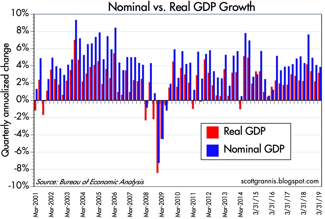
Chart #1 shows the quarterly annualized rates of growth of real (red) and nominal (blue) GDP. The red bars have been trending higher ever since 2016, but real growth is still weaker than we saw in the boom years of the mid-1990s.

Chart #2

Chart #2 shows the year over year growth of real GDP. Here we see a sustained spurt of growth beginning in late 2016 and continuing. Trump can claim to have delivered 3% growth as promised.

Chart #3

Chart #3 is my famous GDP Gap chart. It plots the level of real GDP on a semi-log axis, which makes a straight line equivalent to a constant rate of growth. Note that the economy grew on average by just over 3% per year from 1966 through 2007. Sometimes it exceeded that rate and sometimes (during recessions) it fell below that rate, but recoveries always brought the economy back to its 3.1% long-term trend. Unfortunately, the economic recovery since 2009 has failed, for the first time ever, to reattain a 3.1% growth path. In fact, it has only managed a bit over 2%, and that has led to a potentially huge shortfall. The economy today is about $3.3 trillion smaller (in terms of total annual output) than it might otherwise have been. That's a lot of annual income that potentially has been left on the table.

This of course begs the question of why the economy has failed to thrive as it did in every other recovery in the past. Demographics (e.g., baby-boomers retiring) probably accounts for some of the shortfall, but I'm suspicious of that argument: why is it that over the course of a year or so (2008-9) there was a mass exodus of workers from the workforce? Demographics work over multiple years, not just one or two. Why is it that business investment has been weaker in the current expansion than it was in the 1990s? Could it have something to do with the fact that federal debt is now almost 80% of GDP? Could it have to do with the  increasing burdens of taxes and regulations? Could it have something to do with the expansion of federal transfer payments (money taken from some people and given to others) from $2 trillion in late 2008 to now $3.1 trillion?

For years I've been blaming the shortfall in growth on Big Government (i.e., growing tax and regulatory burdens, anti-business climate, burgeoning entitlement programs), but it's a tough argument to prove. However, it's encouraging to see that growth has picked up since Trump arrived on the scene and began to reduce tax and regulatory burdens. Supply-side economics is being vindicated; the economy is responding positively to lower tax and regulatory burdens.

Chart #4

Chart #4 compares the burden of federal debt (debt owed to the public as a percent of GDP) to the level of 10-yr Treasury yields. A few things stand out. For one, more debt does not necessarily lead to higher interest rates. In fact, the relationship appears to be just the opposite: interest rates tend to rise as debt burdens fall, and vice versa. Second, beginning in late 2008 the burden of federal debt has surged to its highest level since the post-war period. Surely this must have had a dampening effect on economic activity, if for no other reason than the fact that the government spends money much less effectively and less efficiently than the private sector.

Chart #5

As Chart #5 shows, after-tax corporate profits also surged over the past decade, reaching record levels relative to GDP. Federal deficits have averaged about 5.3% of GDP for the past decade, while corporate profits have averaged about 9.4% of GDP over this same period. Corporate profits have been an important source of funds for the financial markets, but federal deficits have effectively consumed the equivalent of more than half of those profits. If the federal government had not borrowed so much, in part to fund a massive increase in transfer payments (which now consume almost three quarters of federal spending, up from 65% in mid-2008), the private sector would most likely have found more efficient uses for those funds and the economy would thus be stronger.

Chart #6

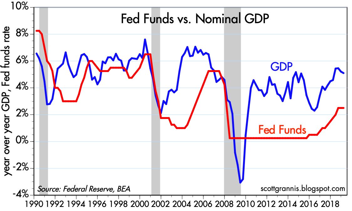
Some good news: Chart #6 compares the Fed funds target rate with the growth rate of nominal GDP. Recessions tend to follow periods in which the Fed pushes short-term interest rates up to and above the rate of nominal growth. That's otherwise called "tight money." It's similar to the flattening and inversion of the yield curve, which also typically precedes recessions (though as I pointed out recently, it also takes high real interest rates in combination with an inverted yield curve to do the trick). In short, it takes very tight monetary policy to kill the economy. Today, monetary policy is nowhere near tight. 

Chart #7

Chart #7 shows 5-yr nominal and real yields, and the difference between the two (green line), which is the market's expectation for the average annual rate of inflation over the next 5 years. Here we see that inflation expectations are very much in line with historical experience, at just below 2%. We also see that there has been a pronounced decline in short-term interest rates this year: 5-yr real yields are in fact down about 70 bps from their high last December.

Chart #8

Chart #8 compares the trend growth rate of GDP with the level of 5-yr real yields. Real yields have a tendency to rise and fall in line with the economy's underlying strength. When the economy was booming in the late 1990s—growing an impressive 4-5% per year—real yields were trading in a range of 3-4%. By the mid-2010s, the economy was growing at a much more modest 2% rate, and real yields were around zero. Real yields picked up over the course of 2017 and 2018 as economic growth started to accelerate. So the 70 bps decline in real yields this year is the bond market's way of saying that the economy's growth rate is going to be on the decline for the foreseeable future, averaging perhaps 2 - 2.5% instead of the current 3%. Put another way, the bond market thinks the economy is going to be so weak that the Fed is going to have to cut interest rates. Inflation is not an issue, as Chart #7 shows; it's all about real growth and real yields.

If there's anything out of the ordinary here, it's interest rates, which appear too low given the fact that the economy appears to be picking up speed.

Friday, April 19, 2019

Update on money demand, currently stable

(This is an updated and rewritten version of a post I wrote about seven months ago.)

I've mentioned the demand for money countless times in the 10-yr history of this blog because it's a very important and under-appreciated macro variable. The Fed controls the supply of money, but the demand for money is a function of a variety of factors, some of which are beyond the Fed's ability to control. The secret to any central bank's ability to deliver low and stable inflation is to keep the supply and demand for money in balance, even though it is difficult to track the demand for money without the benefit of hindsight. As Milton Friedman taught us, inflation is always and everywhere a monetary phenomenon; inflation results from an excess of money relative to the demand for it. It's that simple. Unfortunately, you don't see many people, including the Fed, talking about this, because it's not easy or straightforward. That's one of the things this blog tries to bring to the table.

From 2008 through the summer of 2017, the demand for money (which I define as the M2 money supply divided by nominal GDP) was in a pronounced uptrend, because M2 growth exceeded nominal GDP growth. This in turn was driven by a widespread desire on the part of individuals, investors, and corporations to increase their holdings of money relative to their incomes and as a share of their portfolio, which in turn was a natural reaction to the profound shock of the global financial crisis and the Great Recession of 2008-9. Everyone wanted the safety of money, and they wanted more of it.

During this same period of rising money demand, the Fed engineered an astounding and unprecedented increase in the monetary base, expanding its balance sheet by buying trillions of dollars of notes and bonds. The fact that inflation remained low (~1.5 - 2%) and relatively stable throughout this period can only mean that the Fed correctly responded to strong money demand by dramatically expanding the supply of money. Inflation was not a problem because the Fed kept the supply and demand for money in balance. 

The Fed was unfortunately a bit slow to react to the surge in money demand, but by late 2008 they adopted a radically new monetary policy which they dubbed Quantitative Easing (QE). Most people erroneously believed, and still believe, that the objective of QE was to stimulate the economy by printing money and otherwise making money cheap (i.e., by keeping interest rates artificially low). I have argued in numerous posts over the years that this was most definitely NOT the case. The purpose of QE was to accommodate the market's almost-insatiable demand for risk-free, liquid assets.

In the wake of the near-collapse of the global financial system, the world was desperate to acquire more T-bills, the gold standard for safe money. The demand for T-bills was so extreme that there were not enough in supply—in fact, the Fed was essentially forced to sell virtually all of its T-bill holdings in the first half of 2008 in an attempt to satisfy demand. Without enough safe and liquid securities to satisfy the demand for such, the financial system was in serious danger of imploding. The Fed solved this problem by buying trillions of dollars of notes and bonds and paying for them with bank reserves, which they also announced would for the first time ever begin to pay a risk-free rate of interest. (Bank reserves, crucially, are not "money" that can be spent like dollars can.) The banking system was happy to use their strong inflows of savings deposits to invest in and hold all these new bank reserves, which had suddenly become a valuable asset, being risk-free and interest-bearing, just like T-bills. Banks were risk-averse too, just like the general population. Bank reserves today are best thought of as T-bill equivalents.
Now, however, it makes sense for the Fed to reverse the QE process at least in part, because the crisis of confidence has begun to reverse, risk aversion has begun to fade, and the demand for money appears to have stabilized, at least for now. The Fed already has reversed some of its QE, by reducing excess reserves from a high of $2.7 trillion in 2014 to now $1.5 trillion. In fact, if the Fed had NOT reversed at least some of its QE, they would have run the serious risk of allowing there to be too much money relative to the demand for it, and that would have led to a destabilization/devaluation of the dollar and an unwanted rise in inflation.

If the demand for money weakens from its current level, as it likely would if confidence rises and economic growth remains healthy, then the Fed will be justified in further reducing the size of its balance sheet and raising its short-term interest rate target. And while the market may fret again about rising rates, it needn't be problematic if rising rates are tied to rising confidence, and declining risk aversion.

As always, here are charts that provide the evidence for my story:

Chart #1


The M2 measure of money supply is considered by most economists to be the best measure of "money." As Chart #1 shows, M2 consists of currency, checking accounts, bank savings deposits, and retail money market funds, all of which are liquid, safe, and easy to spend. The largest component by far is bank savings deposits, which grew from $4 trillion at the end of 2008 to now $9.4 trillion. In fact, the growth of savings deposits far outstripped the demand for the other components of M2: savings deposits were about 50% of M2 at the end of 2008, and now they are almost 65%. This is significant, because until 2017 bank savings deposits paid almost nothing in the way of interest, yet people were happy to increase their savings deposits because they offered safety and liquidity. Bank savings deposits in an era of zero interest rates were thus an excellent measure of money demand. 

Chart #2

As Chart #2 shows, the growth rate of bank savings deposits has slowed significantly in the past two years, beginning in early 2017, despite the fact that banks have increased—albeit slowly—the rate they pay on savings accounts over this same period. Prior to 2017, the rate on savings accounts was essentially zero, whereas now most banks are paying around 2%. That's significant: savings accounts on the surface have become more attractive (because they pay a higher rate of interest), yet demand for them has weakened. Why? Because risk aversion is declining and confidence has improved. In other words, slower growth in bank savings deposits today is a direct reflection of a decline in money demand.

It's noteworthy that the big decline of money demand in 2017 coincided with a surge in equity prices. People wanted less money, and they evidently wanted to put some of their money to work in the stock market. Money demand has been flat for the past year or so, so it's not surprising that equity prices have yet to meaningfully exceed their 2017 highs. (See Chart #9 below for a detailed look at equity prices in recent years.)

Chart #3

As Chart #3 shows, it's not just the demand for savings deposits that has declined—the growth rate of the larger M2 measure of money has also declined. M2 currently is growing at a 3-4% annual rate, which is meanin agfully less than the 6.5% annualized rate which has prevailed for most of the past several decades.

Chart #4

As Chart #4 shows, the growth rate of nominal GDP (shown in the blue bars) has picked up a bit in the past few years. Meanwhile, as Chart #3 shows, the growth in M2 has declined. This means that people are unwinding their holdings of cash. Since money can't disappear without help from the Fed (i.e., tight monetary policy), the only way that we collectively can reduce our money balances is by pushing up the price and the volume of transactions of everything else.

Chart #5

Chart #5 is the main exhibit, and it shows the ratio of M2 to nominal GDP. To understand this chart, think of M2 as a proxy for the amount of cash (or cash equivalents) that the average person, company, or investor wants to hold at any given time. Think of GDP as a proxy for the average person's annual income. The ratio of the two is therefore a proxy for the percentage of the average person's or corporation's annual income that is desired to be held in safe and relatively liquid form (i.e., cash or cash equivalents). In times of uncertainty, it stands to reason that most people would want to hold more of their assets in cash, and in times of optimism they would want to hold less.

The demand for money appears to have peaked in the summer of 2017, after rising strongly for the previous decade. Money demand has since fallen a bit, and that is good evidence that risk aversion and caution are slowly giving way to increased risk-seeking. The last two data points in this chart are Q4/18 and Q1/19, the latter of which I've estimated using known data for M2 growth (currently running at a 3-4% rate) and the market's current estimate for nominal GDP, which is roughly 4%. Money demand didn't change much last quarter, which I view as a function of the severe downdraft in equity prices that occurred late last year, which in turn was driven by concerns that the Fed might over-tighten monetary policy.

Going forward, however, I suspect that money demand will resume its decline, since the economic and financial fundamentals remain healthy. If this trend continues, it has profound implications for future economic growth and the conduct of monetary policy.

I believe that, beginning one year or so ago, the dominant narrative switched from one in which people were willing to pay up for safety and liquidity (by accumulating cash) to now one in which the average person (or company, or investment manager) on the margin wants to reduce their holdings of "money" in favor of increasing their holdings of risky assets or just spending it. I think that narrative remains the operative one that will continue, barring, of course, unforeseen disasters.

Chart #6

So it will be very important to monitor consumer confidence, among others. As Chart #6 shows, consumer confidence surged beginning in late 2016 (not coincidentally this was shortly after Trump's election). With increased optimism naturally comes a reduced desire to accumulate cash, and an increased desire to spend money and/or invest it. The rise in confidence was interrupted late last year however, and that is why economic growth in the first quarter of this year was almost certainly mediocre. 

This all has important implications for the Fed, because the Fed will need to take actions to offset the decline in the demand for money, or else it will risk igniting an unwanted increase in inflation. The Fed will need to raise short-term interest rates, and probably by more than the market currently expects (higher short-term rates have the effect of making savings deposits more attractive, thus counteracting the declining demand for same). The Fed will also need to resume the reduction in its balance sheet in order to reduce the supply of bank reserves as banks' demand for those reserves declines. This may cause the market consternation, but it will be exactly what is needed to ensure continued low and stable inflation and in turn a strong economy.

Chart #7

Chart #8

Chart #9

For now, things look fairly stable. Money demand and money supply are likely in balance. The economy is growing at a modest/moderate pace, and few expect that to change. Real and nominal interest rates are priced to the expectation that economic growth will be 2.5% (see Chart #7) and inflation will be about 2% for the foreseeable future (see Chart #8). Fear, uncertainty and doubt have fallen almost to normal levels (see Chart #9), and the bear market of late last year has been reversed. But a resumption in the decline of the demand for money, which would likely accompany a pickup in confidence and stronger growth, would change that dynamic, and almost certainly result in higher-than-currently-expected interest rates and higher equity prices.

Sunday, April 7, 2019

10 key charts say there's little to worry about

By now, just about everyone knows that an inverted yield curve is a sign of an impending recession. It may be a necessary sign, but it is not sufficient. It takes more than an inverted yield curve; it also takes very high real interest rates, which are the Fed's most powerful tool, to trigger a recession. Today the yield curve is only slightly and partially inverted, while real yields are still relatively low. 

An inverted yield curve is the bond market's way of saying that the Fed is expected to cut rates in the future, usually because the economy is fragile and weakening on the margin. While today there are some signs that the economy may be weakening, there are still numerous signs that the financial and economic fundamentals of the US economy are healthy, and thus the outlook for the future is still positive.

In short, the raw material for an impending recession is still lacking. We'd need to see the Fed get a lot tighter before starting to worry.

Chart #1

Chart #1 shows how every recession was preceded by an inverted curve (red line) and high real short-term interest rates (blue line). High real interest rates are symptomatic of a strong economy, but also of a shortage of liquidity. Before 2008, the Fed tightened monetary policy by restricting the supply of bank reserves. This caused the price of reserves to rise as banks competed for the reserves they needed to expand their lending activity. A scarcity of bank reserves caused liquidity conditions to deteriorate, while expensive (to borrow) money weighed heavily on weaker borrowers.

Today, it bears repeating that the Fed no longer drains reserves in order to tighten: they simply raise the rate they are willing to pay on bank reserves. Bank reserves remain abundant, with excess reserves totaling about $1.5 trillion. If the economy falls into a recession it won't be the Fed's fault.

Chart #2

Chart #2 shows the all-important spread on 2-yr interest rate swaps. Swap spreads in the US have been low for the past several years, and they are especially low today. Swaps spreads in the Eurozone are still a bit above what one would consider "normal" (10-25 bps), but they are declining on the margin. As I mentioned in my last post, declining swap spreads and rising equity prices in Europe suggest that the Eurozone economy may be pulling out of its long slump. That would obviously be very good news for everyone.

Chart #3

Chart #3 shows spreads for 5-yr generic Credit Default Swaps. This is a timely and liquid indicator of the market's outlook for corporate profits—with lower spreads reflecting increasing confidence. Credit spreads today are quite low. The market may profess to be worried about a weaker economy, but the appetite for credit risk remains strong. 

Chart #4

Moving on to the yield curve, Chart #4 shows overnight real yields (blue line) and the market's expectation for what overnight real yields will average over the next 5 years (red line). Here we see a modest inversion of the front end of the real yield curve (because 5-yr real yields are less than overnight real yields), which further suggests that the market believes the Fed will lower its funds rate target once or twice in the foreseeable future. This is arguably evidence that the market thinks the Fed is "too tight" and will be forced (or coerced?) into cutting rates at some point. But it is not a prediction that the economy is going to suffocate for want of liquidity and high borrowing costs. 

Chart #5

Chart #5 is the most popular measure of the shape of the yield curve: the difference between 2- and 10-yr Treasury yields. Here we see the curve has had a mildly positive slope for the past several months. But it is not flat or inverted. We've seen periods like this in the past that were not followed by a an imminent recession. 

Chart #6

Chart #6 looks at the slope of the long end of the Treasury curve (over which the Fed has very little control or influence). Here we see that the curve is definitely upward-sloping. It was like this for several years in the mid-1990s, when the economy was booming.

So: yes, parts of the yield curve are flat or inverted, but it's not necessarily because the market expects or senses that a recession is looming. Meanwhile, real yields are still relatively low and liquidity conditions could hardly be better. This is not the stuff of an impending recession.

Chart #7

Chart #8

Moving on to the labor market, Chart #7 shows that first-time claims for unemployment are at record lows. Relative to the size of the labor market, claims are an order of magnitude lower than they have ever been before. This is nirvana for the average worker, since it means the likelihood of losing one's job today is as low as it has ever been (see Chart #8). No wonder consumer confidence remains high.

Chart #9

Chart #9 shows the growth rate of private sector jobs (the ones that really count) over rolling 6- and 12-month periods. (It's foolish to look just at monthly numbers, since they are notoriously volatile.) Here we see a modest weakening in growth of late, but nothing serious.

Chart #10

Finally, Chart #10 shows that the market's general level of concern/anxiety (as measured by the ratio of the Vix index to 10-yr Treasury yields) has been declining as equity prices have almost completely retraced their 2018 year-end selloff.

I can't say the economy is booming, but I do think the economy's fundamentals remain healthy. The Fed is not making any obvious mistakes, the dollar is reasonably strong and relatively stable, overseas equity markets are rallying along with ours, regulatory burdens are declining, consumer confidence is high, tax burdens have been cut, especially for businesses (the ones who are the job creators and the drivers of rising prosperity), gold prices are relatively flat and trendless, industrial commodity prices are rising, and it appears that we are gradually coming to an agreement with China on trade and intellectual property rights (i.e., the risk of a trade war is definitely declining). Thus, it pays to remain optimistic.

P.S. Sorry it's been so long since my last post. We've had a rather busy travel schedule (Chile, Argentina, and Italy) which will be winding down over the next few days.