Tuesday, March 26, 2024

M2 update—still looking good


Today the Fed released the February money supply data, and there were no unwelcome surprises. M2 continues to shrink relative to the economy, and that's the reason inflation is likely to continue to fall.

Chart #1

Chart #1 shows the recent history of currency in circulation, which represents about 10% of M2. It rose at a fairly constant 6.6% annual rate from 2010 until early 2020, then surged (as did M2) from March 2020 through early 2021. I've assumed for years that this measure of the money supply is also a reliable measure of money demand, because people hold currency only if they want it. (Important note: there is no direct measure of money demand, and that's why it's hard for the Fed to keep the supply of and the demand for money in balance.) Any rational person with unwanted currency would simply return it to a bank in exchange for an interest-bearing deposit of one form or another. 

So the message of currency is that the demand for money exploded in the wake of the Covid crisis; everyone wanted more cash because there was so much uncertainty. And besides, it wasn't easy to spend money back then if you couldn't leave your home. But things started changing in early 2021 with the introduction of vaccines. Life slowly started getting back to normal. The demand for money began to subside. Today, currency in circulation has fully reversed its "bulge," and is back on its 6.6% annual growth track. 

Most important is the fact that if money supply and money demand are now roughly in balance, as seems to be the case, there is no reason to expect a meaningful change in inflation.

Chart #2

M2 grew at a 6% annual rate from 1995 through 2019. It then surged by some $6 trillion over the next two years, propelled by $6 trillion of government "stimulus" spending which was monetized. Deficit spending at all other times in recent history has been financed by selling Treasury debt. Not so this time, when the spending was effectively financed by newly-printed money. 

The initial surge in M2 was not inflationary because, as currency in circulation tells us, the demand for M2 was intense in the first year of soaring M2. But as the demand for money began to decline in 2021, excess money became inflationary as people began spending their surplus cash. This, coupled with supply bottlenecks, created a classic "demand-pull" inflation: too much money chasing too few goods.

M2 growth since early 2022 has been flat to negative, thanks in large part to the Fed's belated decision to jack up interest rates. Higher interest rates made M2 money more attractive, effectively neutralizing in large part the huge excess of M2 at the time. Although there is still some "excess" money according to this chart, it is not a source of inflation because interest rates remain high: extra money supply is countered by the extra demand for money that results from high interest rates.

Chart #3

Chart #3 illustrates how changes in M2 growth tend to precede changes in the CPI by about one year. That relationship appears to have broken down over the past 6-8 months, however. I think the reason for that is that the CPI is being overstated by the way the BLS calculates shelter costs. The red asterisk shows the year over year change in the CPI ex-shelter (1.8%) as of February '24; that's much more in line with the growth of M2. And it further suggests we have continued disinflation in the pipeline since shelter costs are almost surely going to decline over the next 6-8 months. 

Chart #4

Chart #4 shows another way of calculating the demand for money. It is simply the ratio of M2 to nominal GDP. You can think of it as a measure of how much of one's annual income one wants to hold in the form of money (cash, and cash equivalents). Here it is easy to see the sudden and tremendous surge in money demand in the early months of the Covid crisis. Then, starting about a year later, we see money demand plunging. At the current rate it should return to pre-Covid levels over the next year or so. We're almost out of the Covid woods, in other words.

Many will call this a "soft landing" or "no-landing" scenario. Because it will be the first time the Fed has wrestled inflation down from uncomfortably high levels without also triggering a recession. And the reason for that is the Fed's "abundant reserves" policy, which avoids creating a shortage of liquidity in the banking system. 

Monday, March 25, 2024

U.S. energy efficiency has soared


Since 1970, U.S. consumption of crude oil and petroleum products has increased by only 38%, yet the U.S. economy has expanded by a factor of 4.2. As a result, U.S. oil consumption per unit of output has fallen by two thirds. This is simply astounding. Do we really need to continue subsidizing "green" energy?  Do we really need to regulate internal combustion engines out of existence?

Chart #1

Chart #2

Saturday, March 23, 2024

Financial Conditions look excellent


Here’s a very short post to highlight the excellent shape of today’s financial conditions. At the very least this adds up to one important conclusion: there is NO shortage of liquidity, and financial markets are thus free to do what they do best: namely, to redistribute risk away from those that don’t want it to those who value risk. This is a very important function of free markets, since it reduces the market’s overall level of anxiety, thus minimizing the risk of disrupting influences and panic.

Chart #1

Chart #1 shows Bloomberg’s index of financial conditions. The components of this index are at the bottom in fine print, and they represent a comprehensive array of risk indicators. By this measure, today’s markets have almost never been so healthy.

Chart #2

Chart #2 shows corporate credit spreads, the difference between the yield on corporate bonds of different quality and Treasury yields of comparable maturity. Spreads have rarely been tighter than they are today, which adds up to a strong vote of confidence on the part of the market regarding the future health of corporate profits, and by extensions, the prospective health of the economy. 

I would only add that the Vix Index (aka the Fear Index) is about as low as it gets. We are living in “untroubled” times by these measures. 

Sunday, March 17, 2024

COVID lessons learned


Our COVID national nightmare began just four years ago, so now is a fitting moment to step back and review what happened and what we have learned as a result. The Committee to Unleash Prosperity, headed up by my good friend Steve Moore, recently published a study which compiles all that we have learned about COVID and the egregious attempts of many to deal with it. This needs to be widely distributed. I've summarized the 10 major lessons learned here:

  • Leaders Should Calm Public Fears, Not Stoke Them
  • Lockdowns Do Not Work to Substantially Reduce Deaths or Stop Viral Circulation
  • Lockdowns and Social Isolation Had Negative Consequences that Far Outweighed Benefits
  • Government Should Not Pay People More Not to Work
  • Shutting Down Schools Was a Major Policy Mistake With Tragic Effects on Children, Especially the Poor
  • Masks Were of Little or No Value and Possibly Harmful
  • Government Should Not Suppress Dissent or Police the Boundaries of Science
  • The Real Hospital Story Was Underutilization
  • Protect the Most Vulnerable
  • Warp Speed: Deregulate But Don’t Mandate

The 48-page study, authored by Scott Atlas, Steve Hanke, Phil Kerpen and Casey Mulligan, is chock-full of charts and footnotes. We cannot allow government to repeat these grievous errors ever again. Print this out and give it to your children.

If you haven't already, do subscribe to Steve's excellent newsletter Hotline (it's free). It comes out every weekday and is always full of interesting information that you might not see elsewhere.

Thursday, March 14, 2024

Inflation is NOT running hot


Don't jump to conclusions based on one month's number.

The Final Demand version of the Producer Price Index rose 0.6% in February, and that was twice the amount the market expected to see. A Bloomberg headline this morning said "Bond Yields Jump as Hot Inflation Curbs Fed Wagers." Worse still, the full version of the PPI rose 1.4% in February. OMG! 

Well, the reality is VERY different, as these two charts show.

Chart #1

Chart #1 shows the level of the Producer Price Index. As the line in the upper right-hand corner suggests, prices have been unchanged since June '22. Monthly datapoints jump up and down quite a bit, but on balance, prices are going nowhere. In fact, the PPI is down 0.2% since June '22. Want more? Prices for unprocessed goods for intermediate demand (another subset of the PPI) have plunged by 31% since June '22. 

Chart #2

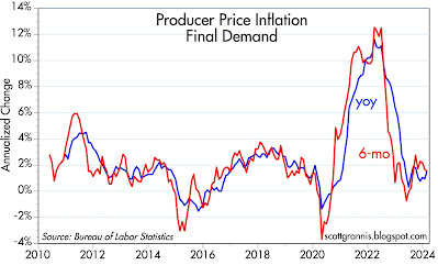
Chart #2 shows the 6-mo. annualized and year over year change in the Final Demand version of the PPI—the one that has given the market the willies this morning. What do we see? The year over year change in this measure of inflation today is 1.55%, and it has been less than 2% since April '23. 

Inflation at the producer level has not been a concern for many months. It's effectively dead.

If the Fed gurus have any sense at all, they will realize that there was nothing in today's news that would argue against a cut in short-term rates. 

Tuesday, March 12, 2024

Ex-shelter inflation has been less than 2% for 8 months


"Hot CPI" read the headlines today, referring to the 0.4% rise in the February CPI and the 3.2% year over year change in the CPI. My take: inflation is running hot only if you think it makes sense to look at the year over year rise in nationwide housing prices 18 months ago. If you omit that one item (which comprises about one-third of the CPI), then you find that the year over year change in the CPI has been less than 2% for the past 8 months.

Chart #1

Chart #1 illustrates how the BLS calculates the shelter component of the CPI. It's almost entirely driven by the year over year change in the Case Shiller National Home Price Index 18 months ago. To explain: the blue line is the year over year change in home prices. The red line is the year over year change in Owner's Equivalent Rent, which dominates the shelter component of the CPI, shifted 18 months to the left. That the red and blue lines track almost perfectly for the past several years is virtual proof that the BLS is using 18-month-old housing price changes to calculate one-third of the value of today's Consumer Price Index. It's crazy, and it's a well-known flaw in the calculation of the CPI.

Chart #2

Chart #2 compares the year over year change in the CPI and the CPI less shelter. There is a huge gap between the two which has persisted for over 8 months. That gap will almost certainly disappear over the next 6-7 months, since that will mark the zero % change in the blue line in Chart #1. 

Given that the stock market today shrugged off the disappointing CPI news, we can reasonably conclude that the world is aware of this problem. The world knows that inflation is under control and that sooner or later the Fed will begin reducing short-term interest rates.

Will someone please mention this to the members of the MSM?

Monday, March 11, 2024

A quick recap of the February jobs report


The February jobs report was impressive on the surface (+275K), but nothing to get excited about. Most of the recent strength in jobs comes from government hiring, which is the least likely to boost the economy's growth potential. Private sector jobs growth—the main source of the economy's vitality—has decelerated significantly over the past two years, and is now growing at a modest 1.6% per year. At best, this suggests the economy remains on a 2+% growth path. 

Chart #1

Chart #1 compares the growth of private and public sector jobs. Public sector jobs have grown by a robust 2.8% over the past year, while private sector jobs are up only 1.6% in the past year. The best that can be said of public sector jobs growth is that it has been very modest on balance since 2008. 

Chart #2

Chart #2 shows the year over year growth of private sector jobs. They were going gangbusters two years ago (up almost 6%), but for the past few months have eked out only 1.6% growth, which works out to monthly gains of about 180K per month. Very ho-hum.

Chart #3

As for the unemployment rate, it's quite low, and that's good. But it's no longer falling and could be on the verge of rising. This bears watching, since rising unemployment from very low levels is a classic sign of impending recession. 

Thursday, March 7, 2024

Big Picture: private sector financial health excellent


Today the Fed published its estimates of the private sector's balance sheet and net worth, and it's nice to see that the numbers reflect very healthy conditions. (This is not a pitch that you will find in tonight's State of the Union address, but if Biden were smart he would reference these charts.)

Chart #1

As of year end 2023, the net worth (total assets minus total liabilities) of the US private sector was $156 trillion. As Chart #1 shows, most of the gains in net worth resulted from increased holdings of financial assets, which in turn represents savings and investments. Since 2007 (just before the onset of the Great Recession) financial assets have increased by 120%, while real estate assets increased 90% and debt increased by only 41%. 

Chart #2

But we can't ignore inflation, especially since we are only just now coming out of the highest inflation episode this country has experienced since WWII. Chart #2 adjusts the net worth numbers for inflation, and here we see that the inflation-adjusted peak in net worth was $164 trillion in late 2021. But as the chart also shows, the upward trend of real net worth remains unbroken.

Chart #3

We can't ignore inflation and we can't ignore the fact that the US population continues to grow; with more people working, it's natural to expect improvement in nearly all measures of net worth. So Chart #3 adjusts the net worth data in Chart #1 for both inflation and population growth. Here we see that per capita real net worth today is about 10-15% above its long-term trend. 

This chart is saying that the net worth of the average resident in the US is about $460K. While of course there are many billionaires and many with little or no net worth, the value of the homes, buildings, factories, roads, infrastructure, etc. in this great country add up to about a half million dollars per person. Everyone is able to enjoy the benefits of these assets, and our economy is able to employ just about all who are looking for a job. (The BLS recently reported that there are currently almost 9 million job openings and a little over 6 million who are actively looking for work. An individual's skills don't always match what employers are looking for, and salaries are not always as much as an individual might like, but there is no shortage of jobs in this country right now.)

Chart #4

Total federal debt owed to the public has reached almost 96% of GDP, and that is up by a staggering amount since 2007 when it was only 35% of GDP. But it is still only a fraction of the private sector's net worth, as Chart #4 shows. To simplify, households are asset-rich at a time when the public sector is heavily indebted. A large part of the government's debt, of course, is owned by US residents. 

Chart #5

Since the Great Recession, the private sector has reduced significantly its financial leverage. The Great Recession was caused in large part by a borrowing binge on the part of the public which imploded when real estate prices collapsed. We do not face that same problem today, that's for sure. Households' finances haven't been this solid since the late 1970s. 

Chart #6

Chart #6 shows the financial burdens of the household sector, defined as payments for mortgage & consumer debt, auto loans, rents, homeowner's insurance, and property tax as a percentage of disposable income. Looked at from an historical perspective, things have never been so good, except for the Covid era, when government stimulus payments temporarily showered the private sector with liquidity.

All of this is not to say the state of the union is wonderful. There is a litany of social and political problems that need addressing, and many people today are facing hard times if only because of the fallout of our recent inflation binge. I think the message here is that things aren't as bad as people seem to think they are. And of course, it's also true that things could be a whole lot worse than they actually are. 

I think the stock market is in substantial agreement with me on this.

Tuesday, March 5, 2024

M2, inflation & economy update


This post includes important updates on the M2 money supply, inflation, and key economic indicators.

The all-important M2 money supply continues to come back into line with long-term trends, key inflation measures are very close to the Fed's target, and money demand is returning to pre-Covid levels. The service sector (dominated by housing-related costs) is the only area of the economy suffering from above-average inflation at this time, but this should gradually subside over the next 6-9 months. Memo to Fed: you can start reducing short-term interest rates anytime, and the sooner the better.

Surveys of purchasing managers and capital goods orders suggest the economy is on an unremarkable (~2%) growth path. 

Fiscal policy is dominated by an excess of spending and a sharply worsening debt financing problem. While deficit-financed spending may have helped the economy in recent quarters, too much spending can only act as a productivity-sapping headwind to growth in coming years.

Chart #1

Chart #1 compares the level of the M2 money supply to its post-1995 trend line. $6 trillion of deficit spending was monetized in 2020-21, pushing M2 sharply higher and eventually causing a sizable surplus of money. Too much money then drove inflation higher. This has largely reversed over the past two years, thanks to the restrictive Fed policy which has kept short-term interest rates high. 

Chart #2

Chart #2 compares the level of currency in circulation to its post-1995 trend line. Currency is a key measure of the money supply because it is the only direct measure of money demand; people hold currency only if they want to. Unwanted currency can be returned to banks in exchange for deposits and ultimately be absorbed by the Fed. The 2020-21 pickup in currency growth confirms my view that rising money demand initially neutralized the monetization of $6 trillion of Covid stimulus spending, but that was followed by declining money demand which fueled rising inflation as people sought to reduce their money balances.

Chart #3

For many years I have called Chart #3 the most important chart of monetary conditions that hardly anyone looks at. It measures what I call "money demand." It is calculated by dividing the M2 money supply by the level of nominal GDP. Conceptually, this is similar to calculating how much of one's annual income is held in cash and cash equivalents. For many years (1959-1987) this ratio was remarkably stable, but since then it has become quite volatile. It is now closing in on pre-Covid levels, which likely presages a return to stable money demand—and by extension, in the context of very slow M2 growth—low and stable inflation.

Chart #4

Chart #4 shows the year over year change in the Core and Total version of the PCE deflators. By these measures, inflation is within inches of returning to the Fed's target level.

Chart #5

Chart #5 shows the three major categories of PCE prices: services, durable goods, and non-durable goods. Note that the latter two have exhibited essentially NO increase for the past two years! The inflation that shows up in the PCE deflator (Chart #4) comes exclusively from the service sector, and that sector in turn is dominated by calculations of the cost of "shelter." As I and others have been pointing out for the past year or so, these calculations are highly correlated to housing prices 18 months in the past. If they instead were correlated to changes in housing prices over the past 6-9 months, service sector inflation today would be approaching zero.

Chart #6

Chart #7

Charts #6 and #7 show survey results from purchasing managers in the US and Eurozone. Based on these surveys, it is clear that the manufacturing sector is suffering from very weak growth conditions. The much larger service sector, on the other hand, appears to be experiencing average growth conditions, at best. 

Chart #8

Chart #8 shows the nominal and real (inflation-adjusted) level of capital goods orders. Capex spending is a good proxy for business investment in new plant and equipment, which in turn provides the seed corn for future productivity gains. Stagnant capex spending in recent years suggests meager productivity growth in coming years, and only modest overall economic growth.

Chart #9

Chart #9 shows the level of federal government spending and revenues (calculated using a 12-month rolling total of each). Note the y-axis is logarithmic, which means that straight lines reflect constant rates of growth. How many are aware that federal spending has grown almost six-fold since 1990?

Chart #10

Chart #10 puts federal spending and revenues into an appropriate context, by comparing them to nominal GDP. Here we see that the growth of spending and revenues has largely tracked the growth of nominal GDP. Spending today is significantly higher than its post-war average, while revenues are only marginally lower. Spending is what's driving deficits, not a lack of revenues.

Chart #11

Federal debt owed to the public has now reached $27.4 trillion, or about 95% of nominal GDP. That's very high from an historical perspective, but the true burden of the debt is how much it costs to finance, which is shown in Chart #11. It won't be long until interest costs swell to a record level relative to GDP, even if the Fed starts to lower short-term interest rates as the market expects.

Important point that most people are unaware of:

Our mountain of federal debt is the source of much gnashing of teeth and cries of impending doom. What's missing from all the shouting is this: making payments on a gargantuan amount of debt does not equate to flushing money down the toilet. Interest paid on federal debt is a burden to taxpayers, to be sure, but it is a source of income to those holding the debt. It's a zero-sum game: no money is destroyed in the process, it simply changes hands. 

What is important, however, is this: when the debt is the result of excessive government spending, this means that the economy is squandering its resources. Why? Because government spending is almost always less efficient and less productive than if the private sector were spending the same amount of money. Just think of all the hundreds of billions of fraud that accompany every big government spending program. 

To paraphrase Milton Friedman: debt is not the problem; spending is the problem. 

UPDATE (3/6/24): Chart 12 below illustrates the economy's growth path in recent years, which has been slightly more than 2.2% per year. The 3.1% trend line comes from the economy's growth path from 1965 through 2007; the economy is currently about 19% smaller than it would have been had we continued on a 3.1% annual growth path. Whichever policies caused the economy's growth path to downshift from 2008 on have proved terribly expensive. My working hypothesis is that the culprit is a big increase in transfer payments beginning in 2008 which in turn coincided with a significant drop in the labor force participation rate. 

Chart #12