Monday, July 19, 2021

A closer look at the Covid-related surge in M2


In my previous post I referenced the huge increase in the M2 money supply over the past 16 months, noting that much of the increase that occurred in the wake of the Covid panic (I estimated as much as $3 trillion) was money that likely was no longer wanted by its holders, given the improvement in confidence, the rapid decline in Covid cases, and the subsequent improvement in the economy. I further argued that this unwanted money was the likely fuel for the rising prices of many goods and services. This post provides some data to back up my point.

Chart #1

Chart #1 shows the level of Bank Reserves provided by the Fed to the banking system. Reserves are the only type of money the Fed can directly "create," and reserves can only be created for the purpose of buying high quality assets, which typically means Treasury securities—but more recently has come to include mortgage-backed securities and some corporate bonds. The Fed purchases these assets from the banking system, and the reserves it uses to pay for them are credited to the banks' accounts at the Fed. Reserves cannot be used to buy anything else, and they are only and always held on the Fed's books (i.e., they are liabilities on the Fed's balance sheet). Banks have traditionally held reserves as collateral for new lending, since by law banks must hold reserves equal to about 10% of their deposits. Today, however, banks hold reserves far in excess of what is required, and they do so because in 2008 the Fed started paying interest on reserves—and that, in turn, made bank reserves functionally equivalent to T-bills: high quality, liquid, default-free and carrying a floating interest rate. Prior to 2008, reserves were "dead" assets since they paid no interest yet banks were required to hold them—so banks tried to hold as few reserves as possible. 

The current huge amount of bank reserves means that banks have effectively lent boatloads of money (about $5 trillion)  to the Fed, and most of that money has come from huge deposit inflows to checking and savings accounts. Banks also lend money to the private sector, of course, but lending to the Fed carries no risk while paying a very modest rate of interest—currently 0.15%. If banks decide that the 0.15% interest they receive from the Fed has become unattractive relative to what they could earn by lending to the public sector (on a risk-adjusted basis), today's huge level of reserves means that banks have a virtually unlimited capacity to expand their lending—which is what expands the money supply. Only banks can create spendable money under our fractional reserve banking system. When a bank decides to lend you money, they simply credit your account with newly-minted money. You then use that money to buy other things, and that money enters into circulation as someone else receives it in their bank account.

As the chart also shows, the Fed has expanded its issuance of reserves by about $2.24 trillion since February of last year. This is almost as much as the $2.8 trillion of reserves created by three previous waves of Quantitative Easing from late 2008 through mid-2014. Those three waves of Quantitative Easings didn't lead to an unusual pickup in inflation, but QE4 did. Why is that?

Chart #2

Chart #2 provides the answer. It shows the level of the M2 money supply (which consists mainly of currency and bank checking and savings deposits, plus ) plotted on a semi-log y-axis to make it easy to see constant growth rates (a straight line means a constant rate of growth). For the 25 years prior to Covid, the M2 money supply expanded by a little over 6% per year, and consumer price inflation averaged about 2.2% per year. (See Chart #4 in my previous post.) Then in 2020 everything changed: banks apparently used their abundant supply of QE4-provided reserves to increase their lending, which in turn has resulted in a significant increase in currency and bank deposits. The "gap" I highlight is the result of a surge in money creation well above and beyond previous growth rates. M2 grew by about $5 trillion (33%) from the end of February 2020 through the end of June this year, and the lion's share of that increase came from an increase in retail bank savings and checking accounts, plus about $300 billion the form of currency in circulation.

At the beginning that was fine, since everyone scrambled to stockpile money as the economy shut down. But now people's desire to hold money is very likely declining as life gets back to normal. I'm guessing there's as much as $3 trillion of money in the banking system that is now "unwanted."

The problem, of course, is that money can't just disappear if people don't want it. If I want to reduce the balance in my bank savings account, I need to spend it on something else. The person who receives my money must then do something with the money. 

There are three ways the banking system can get rid of unwanted money: 1) Borrowers can pay off their bank loans (since bank lending is the fount of all money supply growth), 2) the Fed can drain reserves from the banking system by selling some of the bonds it bought (thus reducing excess bank reserves and banks' ability to increase lending), and 3) inflation can increase the price level and the level of incomes by enough to return people's desired cash balances (e.g., the ratio M2 to annual incomes) to reasonable levels. I think #3 is going to be the dominant factor.

What we have seen in the past 16 months is unique in the monetary history of the US: a massive and sudden expansion of M2 that far exceeds anything we've seen before. To me, it's no surprise that inflation is surging.

Tuesday, July 13, 2021

Big changes in inflation and government finances

Today's data releases brought some real surprises for the market, both good and bad: consumer price inflation in June came in much higher than expected (+0.9% vs. +0.5%) and federal revenues surged. 

I've been predicting higher than expected inflation for some time now, so today's numbers were not a surprise to me. The market barely budged, since there appears to be an overwhelming consensus—reinforced by the Fed numerous times—that higher inflation is merely transitory and in fact, welcome, given the Fed's desire to see inflation average well over 2% a year for a few years. I don't see the rationale for these views, however, and I expect to see big changes in market expectations in the next year.

My thesis has been, and continues to be, that the huge increase in M2 that we saw over the past 16 months was initially not worrisome, since the world's demand for M2 money (mostly cash and bank savings deposits) was driven through the roof by the panic and uncertainties generated by the Covid-19 crisis. The peak of the Covid crisis was arguably last November, when successful vaccine trials were announced. Since then new Covid cases have plunged, confidence has soared, and the economy has rebounded sharply, which in turn means that the demand for all that extra money has all but vanished. Unfortunately, the Fed has taken no steps to offset this. This has left the economy with upwards of $3 trillion in unwanted cash (as I have explained in previous posts). Now that prices are surging, the interest rate that the holders of all that cash receive is hugely negative. Who wants to hold $3 trillion in extra cash that is losing purchasing power at the rate of 10% a year? No wonder prices are rising, and they will continue to rise as the public attempts to reduce their money balances in favor of things (e.g., commodities, property, equities) that promise much better returns.

It's simple: The economy is loaded with unwanted cash, and the real (inflation-adjusted) return on that cash (and the real return on almost all fixed-income instruments) is hugely negative. This is an untenable and unsustainable situation which will cause inflation to rise even more. It will only end when the Fed realizes it has made a mistake and starts jacking short-term rates higher, and/or starts draining cash by selling trillions worth of bonds. 

On the bright side, the June Treasury report saw a huge surge in revenues that was largely unexpected. The catastrophic budget deterioration that we saw for the past 16 months now looks to have turned the corner. There is hope for the future! Unless, of course, the Biden administration succeeds in passing another multi-trillion spending lalapaloosa. Fortunately, the likelihood of that is diminishing by the day—in my opinion.

Here's a huge and very under-appreciated fact: an unexpected and significant rise in inflation is a boon to federal finances. Why? Because it creates an "inflation tax." Anyone who owns a Treasury security these days is effectively receiving a negative rate of interest that could be as high as 10% per year. The average yield on Treasuries today is somewhere in the neighborhood of 1 - 1½%. So at the current rate of CPI inflation (almost 10% annualized), Treasury debt is "costing" the government -8 ½ to -9% per year. That is, the real value of the debt is declining by that amount. With debt owed to the public now just over $22 trillion, that's like a gift of roughly $2 trillion per year to the federal government! In the 12 months ending June '21, the federal deficit was $2.6 trillion. This year's inflation tax will pay for about 75% of that. In other words, inflation this year will take about $2 trillion out of the pockets of those owning Treasuries and give it to the federal government. Why bother with raising taxes? (Did I mention that this is the way the Argentine government finances itself?)

So it is with mixed emotions that I detail some of this story with charts:

Chart #1

Chart #1 shows how consumer confidence has surged since late last year. The wild gyrations of confidence in the past year explains why the demand for money rose in the first half of last year and is now falling. The future looks much less scary now, so who needs a ton of money sitting in their bank account earning nothing? 

Chart #2

Chart #2 looks at the ratio of gold to oil prices. This ratio has been remarkably stable—on average—over time, with an ounce of gold buying about 20 barrels of oil. Another thing this chart shows is that the prices of these two very different commodities have tended to rise by about the same amount over time.

Chart #3

As Chart #3 shows, crude oil today costs about $75 a barrel, which is not a lot more than its long-term inflation-adjusted value of $59. Oil arguably is thus a contributing factor to today's rising prices, but not significantly so.

Chart #4

Chart #4 shows the level of the ex-energy version of the Consumer Price Index, plotted on a semi-log scale in order to show that the rate of increase in the prices of goods and services in this basket has been remarkably stable at about 2% per year—until this year, that is. The index so far this year has surged at a 7.4% annualized rate. This cannot be explained away by referring to the fact that prices were soft in the second quarter of last year. We are looking here at an inflation breakout.

Chart #5

Chart #5 shows the 6-mo. annualized change of both the total CPI and the ex-energy version. We haven't seen inflation like this since the period just before the Great Recession. Recall that the Fed tightening needed to rein in that inflation episode was, I would argue, the proximate cause of that recession.

Chart #6

Chart #6 shows the 3-mo. annualized rate of inflation according to the Core CPI (ex-food and energy). This measure of inflation now stands at 10.6%, a level not seen since the early 1980s. 

Chart #7

No matter which sub-index of inflation you look at, prices are surging. Chart #7 shows that 47% of small business owners report seeing a meaningful rise in prices. That's a level we haven't seen since March of 1981, when the U.S. economy was still suffering from double-digit inflation. 

Chart #8

Chart #8 shows the level of real and nominal yields on 5-yr Treasury securities, and the difference between the two (green line) which is the market's expected average rate of inflation over the next 5 years. It's amazing to me that inflation expectations still appear to be relatively tame, despite today's blowout inflation report. 

Chart #9

Chart #9 compares the real yield on 5-yr TIPS to the current real yield on the overnight federal funds rate, which is now much more negative than it has ever been. The real yield on TIPS is equivalent to what the market expects the real fed funds rate to average over the next 5 years. It's nothing less than astonishing that the market calmly expects the real fed funds rate to average -1.8% per year over the next 5 years! Does it make sense for anyone to hold overnight and short-term Treasuries if they are going to generate a significant loss of purchasing power for the next 5 years? This is unsustainable and illogical in my book.  

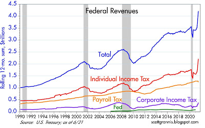
Chart #10

Chart #10 should warm the cockles of many politicians' hearts. All of these lines represent the rolling 12-month total of Treasury revenues from different sources. Note the spectacular increase in individual income tax receipts and corporate income tax receipts in recent months!

Chart #11

Chart #11 shows the trend of federal spending and revenues. The gap between the two (the deficit) has narrowed in the past few months.

Chart #12

Chart #12 puts federal finances into a proper perspective by measuring each as a % of GDP. Revenues are now coming in at a higher level than the post-war average! Spending is still absurdly high, but declining.

Chart #13

Finally, Chart #13 shows the federal budget deficit as a % of GDP. The deficit soared to an unheard-of level of more than 18% of GDP thanks to trillions of dollars of checks sent out all over the place. The deficit currently is back down to 12% of GDP, which is still absurdly high, but at the rate things are going we should see a further dramatic improvement in the budget outlook in the months to come. 

And don't forget the inflation tax, which doesn't show on any of these charts. It could contribute about $2 trillion—effectively—towards paying down the debt this year alone. 

It's going to be a wild ride for the foreseeable future, but it's difficult to quantify and it's difficult to recommend a course of action. Despite the potentially huge amount of uncertainty we are likely to be facing in the coming months or years, one thing does not recommend itself, and that is holding cash. Cash has traditionally been the best port in a storm, but that is most definitely not the case today, and neither is holding any short- or medium-term Treasury security.